
 Hmm. I don’t really know what to make of this. In the months after September 11, when no one knew what shape the WTC site would take in the future, but when people were at least entertaining the possibility that architecture and contemporary art might be able to make some sense of what’d happened, John Powers’ ideas from a show about memorials earlier that year kept coming to my mind.
He proposed aggressively political minimalist gestures for sites in Manhattan (Penn Station, the now-defunct East River Guggenheim) and DC (the WWII Memorial) that upset prevailing notions of public space, spectacle, sentimentality, order and control, and history, among other things. [Although more successful and uncompromised by virtue of its sheer impossibility, Powers’ proposal for a WWII memorial eerily prefigures Michael Arad’s original fountain pit design, transposed to the end of the Reflecting Pool on the Mall.]
Powers never pursued any direct responses or proposals to the WTC site, either for Max Protech’s early display of (as it turned out) architectural impotence and hubris, or for the WTC Memorial ‘competition.’ Still, I thought of Powers when I saw Ellsworth Kelly’s collaged proposal for the WTC site–a NYT aerial photo with a trademark Kelly trapezoid superimposed on it.
Meanwhile, I followed along (or obsessed over, take your pick) the WTC rebuilding issues and saw the craven folly and political machinations unfold before my eyes–and anyone elses? I often wondered. Then I found Philip Nobel’s book Sixteen Acres, the first unsentimental look at what was actually transpiring behind the scenes and in front of our still-teared up eyes. It’s harsh in places, mostly as it should be, and I only wish it could’ve brought some things to light sooner. It’s the same kind of weary wishfulness that allows you to entertain fleeting thoughts of disaster averted, “what if we’d–” and “if only we’d–” before snapping back to the grim reality of our political failures.
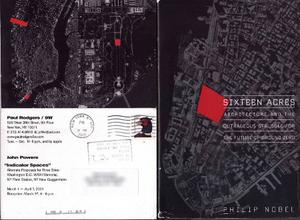
Anyway, I only bring this up now because a friend showed me Powers’ early 2001 invite with details of his projects and then pulled out their own copy of Sixteen Acres. [They’re scanned side by side above.]
I am a solid fan of both peoples’ work, but there was clearly something going on in the design process for Nobel’s 2005 cover which needs some explaining. The frontispiece says “Design by Fritz Metsch, Map by David Cain,” with cover design by Raquel Jaramillo. But to me, it’s clearly John Powers’ work.
Buy Nobel’s excellent Sixteen Acres : Architecture and the Outrageous Struggle for the Future of Ground Zero at Amazon
Previously: Ellsworth Kelly on Ground Zero
UPDATE: I emailed Philip Nobel about this. Here is his reply:
Thanks for the heads up. I’ve been on both sides of this sort of
accusation before (this time, I guess, I’m a bystander). But I can
assure you there was no foul play. Re “explaining to do”: Before the
book was written, the Holt art department had cooked up something that
looked like a Bob Woodward book (still posted around online in spots).
My editor and I didn’t think it made sense with the feel of the
finished thing, so we cooked up the idea of a map (sitting in her
office on 18th Street; no graphic cues on hand). I said “black” and
that it had to go as far north as possible (in the spirit of that
Borges quote and the first lines of the prologue), and she said we
should just box out the shape of the site like a symbol. Raquel worked
from those directions. She’s good people, and i don’t think so mobbed
up in the art or architecture worlds that she would have seen your
friend’s work, which, of course, looks really interesting. I imagine
“map” led her to an aerial view, “black” led her to the one in
question, and “box out/symbol” led her to treat the site as she did.
You know from reading the book that I’m all about seeing the worst in
our fellow men. But this sort of convergence reminds me of the recent
forced frenzy (Lock was tracking it) over Freedom Tower cognates. Might
it not just be a case of two people with good taste seeing the graphic
possibilities of applying a color field (red, an obvious choice) to
what appears to be the same publicly available (via the Library of
Congress) image?
Also, timely but not quite directly related: With Covers, Publishers Take More Than Page From Rivals [nyt]