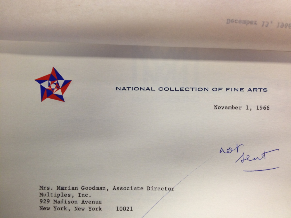
I was doing some research in the Smithsonian Archives this afternoon, and I stumbled across this letterhead from the National Collection of Fine Arts, the precursor to the American Art Museum. That kaleidoscopic star is fantastic, and it still looked like it had been engraved yesterday.
I tried to find the designer, so far to no avail. But I did find this rather slapdash 1965 NCFA flag, where the design of the star outshines the star-eats-earth logo of the Smithsonian itself.
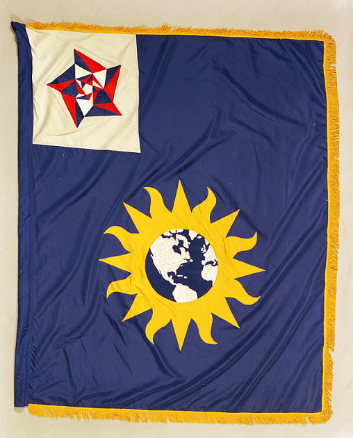
National Collection of Fine Arts Flag, 1965, image: siarchives
That star-within-a-star reminds me of the US Bicentennial logo, which was created by Bruce Blackburn, the same guy at Chermayeff & Geismar who designed NASA’s mod “worm” logotype.
![]()
It also kind of reminds me of Gabriel Orozco’s geometric drawings and paintings. Orozco, of course, shows with Marian Goodman.
Skip to content

the making of, by greg allen