
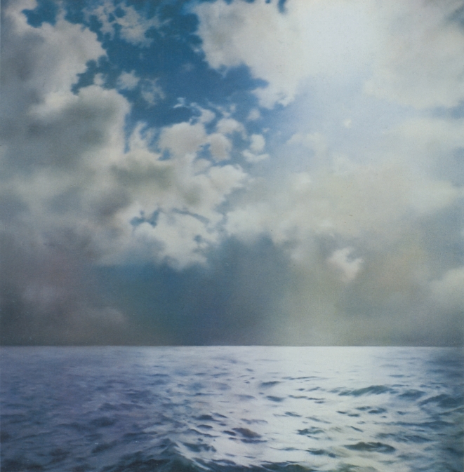
Though he described them in 1991 as appearing “endlessly repeatable and without end,” Richter only made ten large, square Seascape paintings in 1969, and three in 1970:
Just about all the seascapes (many of which were included in the Atlas) depict collaged motifs. The sea and cloud sections came from different photographs then collaged together in a single image. The successful paintings were dependent on finding exactly the right mood between the combined images. There were also a couple of paintings, for example, where I used two halves of the same image of the sea [CR: 244, CR: 245]. Although I had a rather bad feeling about them, I was visited by George Maciunas, who thought they were absolutely wonderful and for that reason I allowed them to survive, despite feeling they were very decorative.
[Sidebar, but this phrase “I allowed them to survive” jumped out at me. Richter’s quote comes from “Comments on some works, 1991” which was prepared for the artist’s (earlier) Tate retrospective. It is not too much to say that a throughline in Richter’s comments is destruction, both as a subject and as a process. So for Richter a retrospective is an occasion to review a bunch of art you haven’t seen in a while, and try to remember why you didn’t destroy it when you had the chance.]
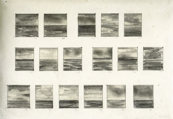
A 1969 drawing, 17 Seascapes, shows Richter experimenting to find the best size, proportion, and composition for seascape paintings, which 2009 Tate retrospective curator Mark Godrey notes, were conceived as serial works. [It was the 60s, after all.]
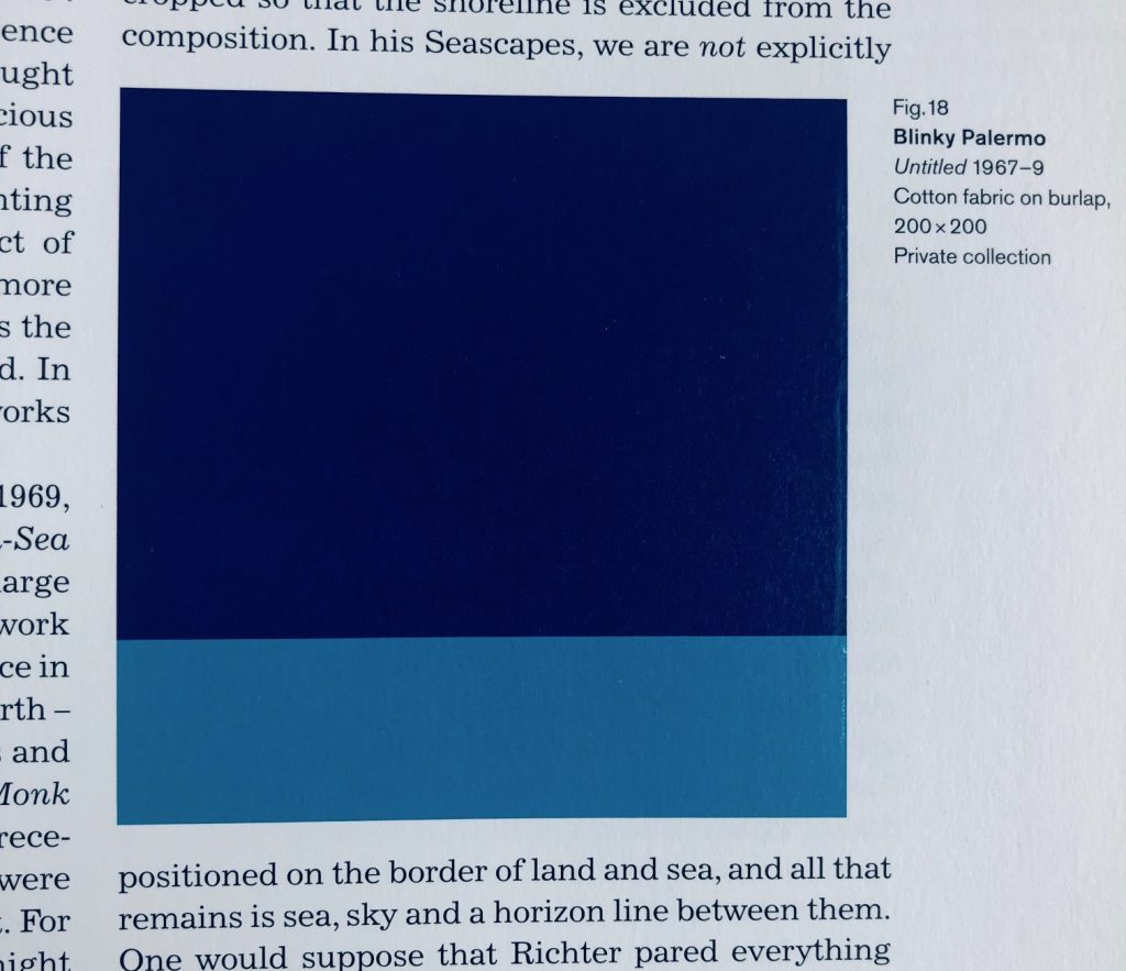
Godfrey also notes that the size, shape, and horizon line Richter settled on for Seascape (Contre-Jour) [yes, from the stamp, where the cropping now feels like a crime] were identical to a work by his closest friend and collaborator at the time, Blinky Palermo. Palermo’s Untitled (1967-69) is a 200 x 200 cm Stoffbild (Cloth Picture), a painting of bands of monochromatic commercial fabric–which was sewn together by Richter’s first wife Ema.
“Richter was crossing Friedrich with Palermo to make the Seascapes,” Godfrey wrote. Palermo and Richter were actually working in the “chasm” that the 20th century wars had opened between their 1960s Germany(s) and Friedrich’s.
Writing about their collaborations in the Dia catalogue for To The People of the City of New York, Christine Mehring associates Palermo’s Pop-related, readymade cloth pictures with Richter’s color chart paintings. The Seascapes, meanwhile, call out the landscapey cloth paintings’ claims for abstraction.
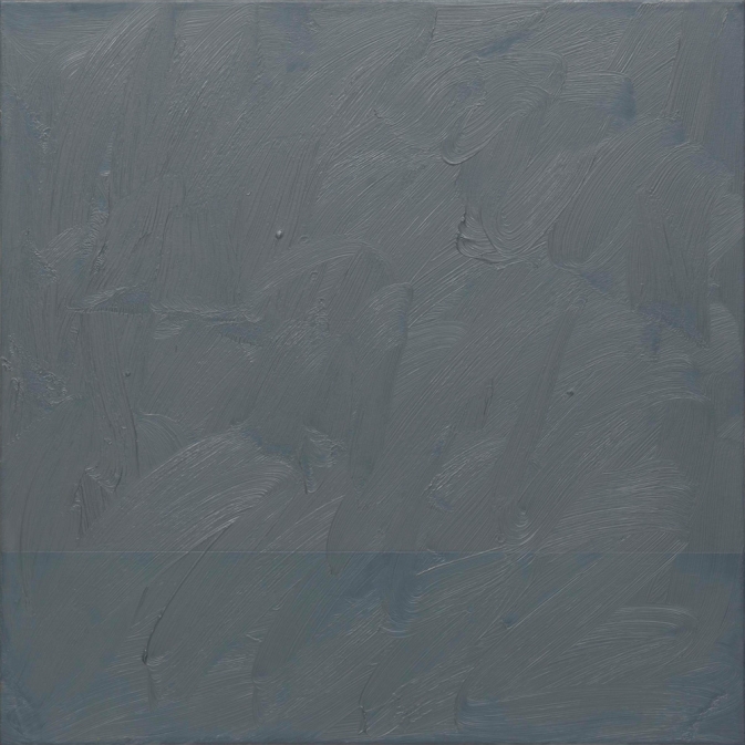
Meanwhile no one mentions this 1969 painting, titled Seascape (Grey) [CR 224-16]. At 70 x 70 cm it feels bigger than a study. A geometric seascape of Palermo-ish composition is overpainted with grey, to near illegibility. Knowing how Richter gets about overpainting, the nearness of illegibility is just. right.
Anyway, you can see this little painting or the drawing in Bilbao for two more days; the Guggenheim’s exhibition of Richter’s Seascape works closes on the 9th. [h/t Sharon Butler for the impetus to wade into the Seascapes this morning.]