
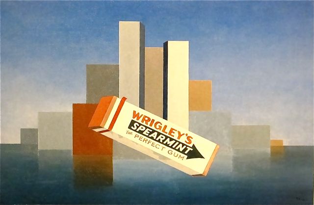
Wrigley’s, 1937, Charles Green Shaw, Art Institute of Chicago, image: poulwebb
The banner on J.S. Marcus’s WSJ story about American painting in the 1930s is Charles Green Shaw’s Wrigley’s, which is in the Art Institute of Chicago collection. Also, it is awesome.
With its unafraid abstraction mixed with proto-Pop, it reminds me of Gerald Murphy’s paintings from the 1920s. Shaw and Murphy both enjoyed privileged, Manhattan-based, continental lifestyles that involved painting, and according to Adam Weinberg’s 1997 exhibition brochure, they were friends in Europe.
But his AAA history doesn’t mention Murphy at all. Shaw didn’t get into abstraction until he came back to New York, well after Murphy stopped painting. And Shaw doesn’t seem to have been very involved in the artist community of New York in the 30s, despite having a couple of gallery shows, and being on some committees at The Modern. He was more a writer.
Which makes it tricky to gauge the quality/influence/familiarity of his work. It’s nice, some of it, like Wrigley’s, even looks great, but it doesn’t seem to have been important or impactful. The historical upside is limited, is how it feels. This, even though he was apparently friends with Ad Reinhardt. I guess it’s complicated?
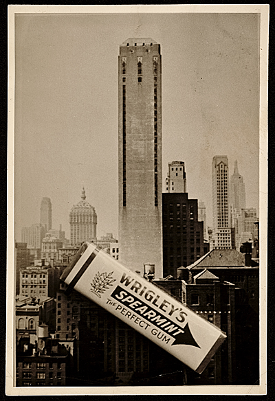
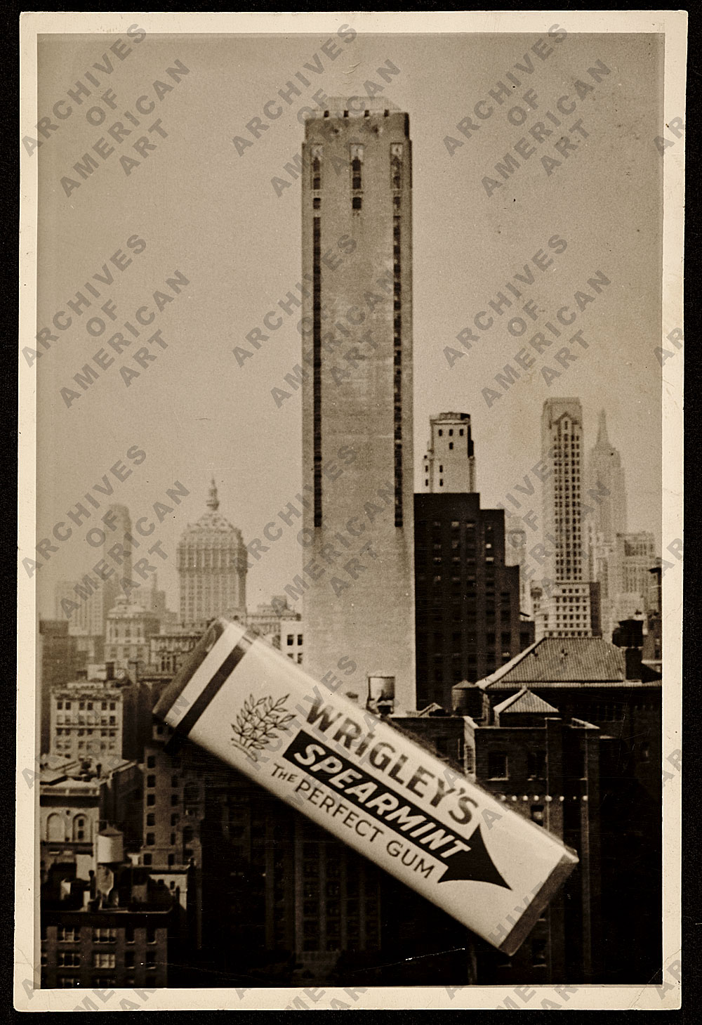
Still, it’s good to see this photo of a pack of gum sitting on a postcard, which looks like source material for the painting. It’s among the digitized collection of Shaw’s papers at the Archives of American Art. As the larger version of the image so ably informs us:
Maybe it’s hard to put an emphasis on Shaw’s painting because he had so much else going on. He wrote for the New Yorker, did slim books of verse, cranked out some children’s books, took photographs.
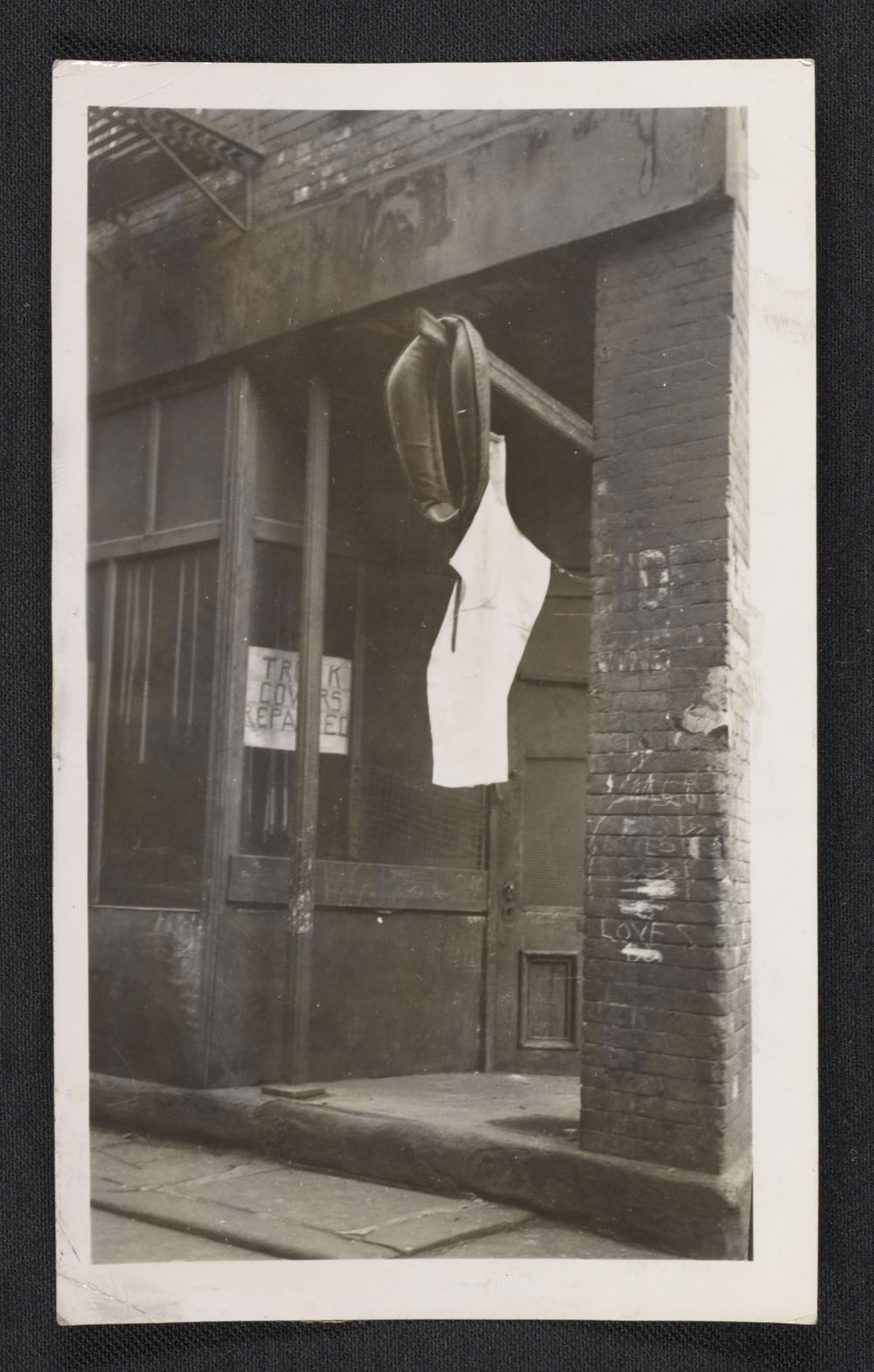
Charles Green Shaw, photo of NYC harness store, c.1940s?, collection aaa.si.edu
We might call Shaw an artist fluent in multiple mediums today, but his is the kind of peripatetic practice that we’re conditioned to look askance at when we see it in the past. Or maybe it feels like he did not take much of anything seriously, except for mixing drinks. Maybe it’s because he was rich and a “bachelor” in a time and art world where that didn’t help?
I don’t really know, but I like the work.
Oh here we go. In 2007 Roberta Smith also called him peripatetic and wondered, more clearly than I, about his legacy. His group of well-heeled colleagues, the American Abstract Artists, who were abstract when abstraction was un-American, “were often called — and not always benignly — the Park Avenue Cubists.”
When he died in 1974, Shaw left his art to a surprised friend, the collector Charles H. Carpenter, who became its posthumous shepherd. A bunch of paintings went to the Whitney, and the Art Institute bought Wrigley’s. And apparently, he’s been an overlooked American minor master ever since.
Charles Green Shaw papers [aaa.si.edu]
Charles G. Shaw’s artist page at Michael Rosenfeld Gallery [michaelrosenfeldart]
[nyt]
Category: dc
Monochrome House
Study for Monochrome House Red, 2016
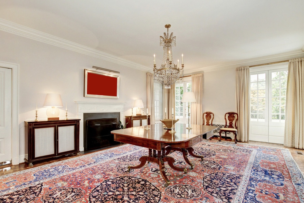
I’m consistently amazed at the photos in real estate listings, which turn someone’s private space and life inside out and propagate it across the web, where it just stacks up. It makes the case for real estate staging and swapping out all your belongings that much stronger; the photos may be intrusive, but at least they’re not intruding on you.
There’s another way, though.
While flipping quickly through the listing of a nearby house, I was stopped by an extraordinary artwork on the dining room wall: a bright red monochrome. Which, what?

Study for Monochrome House Beige, 2016
Scroll back, and there is a beige monochrome in the living room. The master suite has two monochromes in different shades of blue. Except for a couple of posters in the rec room, in fact, all the art in the house is monochromes. It looks fantastic.

Study for Monochrome House Blue #1, 2016
Way better than the “Art Panels” offered by that NY stager last year, which I think are basically giant sheets of gatorboard, the merest ghosts of actual objects.

Nothing. Meh. Keep scrolling.
No, these monochromes can really hold their walls.

Study for Monochrome House Green, 2016, this one has a serious Prina vibe
Kudos to the photoshop artist who devised this solution for the seller, who did not care to have his actual-and, for DC, surprisingly not insubstantial-art collection blasted out to the world in such an exhibitionistic/voyeuristic way. And if the seller, or the eventual buyer of the house wishes, I’m glad to realize the whole houseful of monochromes in time to close the deal.
[2021 update: this house sold in 2017, without either party assenting to the realization of this work. Now it is back on the market, and it is full of large, greige, monochrome hotel concourse art, so I guess the joke’s on me.]
Free As In America

The thing about Cassandra was she was right.

In the Summer of 1990 Michèle Cone talked with Cady Noland about the intimations of violence in her works:
Michèle Cone: Practically every piece I have seen of yours in group shows or in your one-person shows projects a sense of violence, via signs of confinement — enclosures, gates, boxes, or the aftermath of accident, murder, fighting, boxing, or as in your recent cut-out and pop-up pieces — bullet holes.
Cady Noland: Violence used to be part of life in America and had a positive reputation. Apparently, at least according to Lewis Coser who was writing about the transition of sociology in relation to violence, at a certain point violence used to describe sociology in a very positive way. There was a kind of righteousness about violence — the break with England, fighting for our rights, the Boston Tea Party. Now, in our culture as it is, there is one official social norm — and acts of violence, expressions of dissatisfaction are framed in an atomized view as being “abnormal.”
Cone: There are clear references to extreme cases of violence in the United States, Lincoln and Booth, Kennedy and Oswald, Patricia Hearst, etc. . . .
Noland: In the United States at present we don’t have a “language of dissension.” You might say people visit their frustrations on other individuals and that acts as a type of “safety valve” to “have steam let off.” People may complain about “all of the violence there is today,” but if there weren’t these more individual forms of venting, there would more likely be rioters or committees expressing dissatisfaction in a more collective way. Violence has always been around. The seeming randomness of it now actually indicates the lack of political organization representing different interests. “Inalienable rights” become something so inane that they break down into men believing that they have the right to be superior to women (there’s someone lower on the ladder than they) so if a woman won’t date them any more they have a right to murder them. It’s called the peace in the feud. In this fashion, hostility and envy are vented without threatening the structures of society.
And so it is that in the Summer of 2016 Anheuser-Busch InBev has announced that, for promotional purposes, from Memorial Day until the US presidential election in November, it is renaming and relabeling Budweiser, its flagship beer, America.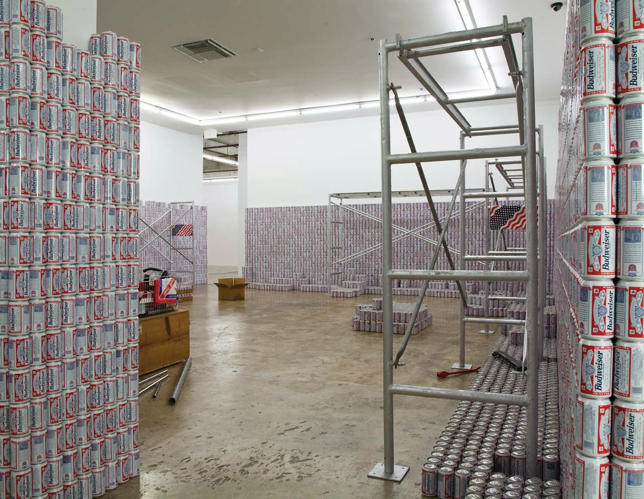
Budweiser bottles and cans are prominent elements of many of Noland’s works, from small baskets and milk crates of detritus to the epic 1989 installation, This Piece Has No Title Yet, where six-packs of Budweiser stacked 16 high line the walls. Noland saw already that Budweiser was America. Or that it inevitably would be.
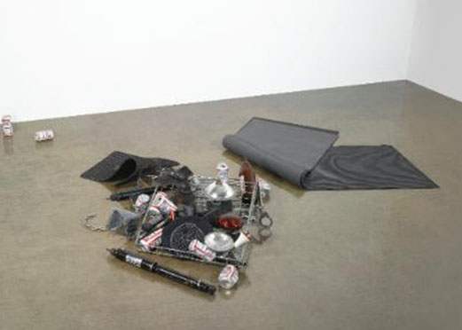
Bloody Mess, 1988, carpet, rubber mats, wire basket, headlamp, shock absorber, handcuffs, beer cans, headlight bulbs, chains and police equipment, dimensions variable
And so as a tribute to Noland’s foresight and to America’s future, I am honored to announce Untitled (Free As In America). For this series I will replicate any Noland sculpture that uses Budweiser, using America cans or bottles, and I’ll do it for cost. The series will be available during InBev’s America campaign, and will obviously be subject to the availability of America brand cans, bottles, and cartons.
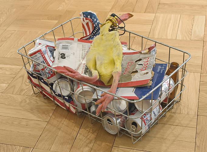
Chicken in a Basket, 1989, “twenty-seven elements, wire basket, rubber chicken, boxes, bottle, flags, baster, bungee and beer cans”, offered for sale this afternoon at Christies, image via Skarstedt
I am obviously not recreating Nolands a la Triple Candie, but I don’t want to merely approximate them, either. So I’ll only make pieces based on Nolands whose elements are suitably documented, such as in photographs and auction catalogue copy:
Noland once described America as a gestalt experience…In the case of Bloody Mess, disparate objects, including Budweiser cans, car parts, police equipment, and rubber mats collectively comprise a quintessential American image. These cans of “The Great American Lager,” for instance, are scattered to the outreaches of the piece, so as to provide a sort of abstract framework around the inner compilation of a paraphenalia [sic] law enforcement and an uncanny selection of automobile parts.
If substitutions are needed, they will be considered on a case-by-case basis. Every work, in fact, will be devised, specced and costed out individually, in consultation with the collector. So get in touch, and God Bless America.
A-B InBev Looks to Replace Budweiser With ‘America’ on Packs [adage]
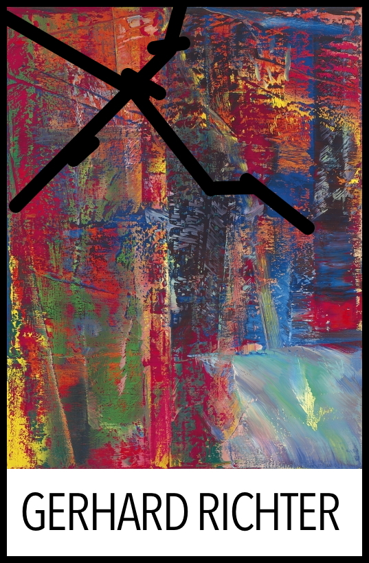
Untitled (Damaged Richter Poster), 2010-2016
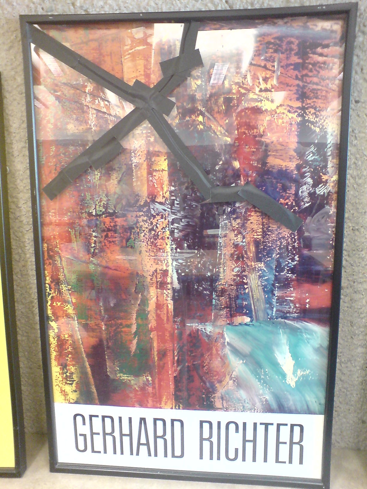
In 2010 the kid took a weekly studio class at the Hirshhorn with Dan Steinhilber. It was fantastic, but unfortunately, it was the last one the museum offered for non-teens. It was held in the education space in the sculpture garden, a space which could connect under the road to the museum, but for various logistical reasons, does not.
This incredible framed poster from Gerhard Richter’s 1987-8 exhibition was there. The painting in it, A B Dunkel, or Abstraktes Bild Dunkel (Dark), (CR: 613-2), 1986, is from what is considered Richter’s breakthrough year for squeegee painting. For me, though, it’s the gaffer’s tape that makes it special.
Now that I have declared it a work, I called the Hirshhorn. It is still there. There are no plans for it at this time. I called the museum shop, which has an endlessly interesting selection of books and exhibition catalogues for sale from the museum’s own library, but which does not, it turns out, have any 28-year-old Richter exhibition posters lying around.
It’s possible that it’s not even a product, but marketing material or signage; I couldn’t find another example of this poster mentioned online. So for now, it is ed. 1/1. Plus a study.
Artificial Tuft Of Grass
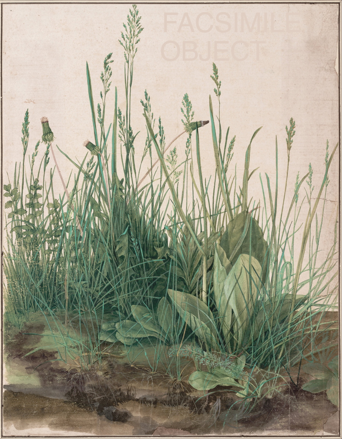
Would you believe me if I told you this was Dürer’s Great Piece Of Turf and not an altered jpg?
In a fascinating and frustrating essay on aeon, art historian Noah Charney tries to very diplomatically address the fact that major museums are displaying reproductions of major works on paper by the likes of Egon Schiele and Albrecht Dürer. The museums often disclose this non-trivial fact very obliquely, or not at all:
That evening, art forgery was the subject of conversation in the museum’s stylish black marble restaurant. The patrons of the Leopold lamented that they could show their best Schiele drawings (the ones that drew pilgrims) only for a few months at a time. The rest of the time they were in darkened storage, to minimise their exposure to light, and reproductions were displayed in their place. Someone from the Albertina sympathised. She explained that Dürer’s marvellous watercolours, Young Hare and Tuft of Grass, are shown to the public only for three-month periods every few years. Otherwise they reside in temperature-, light- and humidity-controlled Solander boxes in storage. Had I had the chance to see them?
Indeed I had, and while I had been suspicious that something wasn’t quite right about them, I would be flattering myself to say that I immediately knew they were reproductions. Today’s printing technologies make it difficult to distinguish high-quality facsimiles from originals, at least not without taking them out of the frame and examining the back (which holds a wealth of clues about an object’s age and provenance), or looking at the surface in detail, without the interference of protective glass. In an intentionally shadowy alcove I could sense that something was off, but not exactly what.
“Three months every few years“? Did the Albertina leave the reproductions up when they loaned the originals to the National Gallery in 2013? Wouldn’t it have made more sense to just loan the reproductions, and let the originals rest in safety?
I wish Charney would have brought more contemporary notions of reproduction to bear here, beyond a namecheck of Benjamin. And the aeon context doesn’t help, teeing up with a clickbaity question “Is there a place for fakery in art galleries and museums?” and soliciting comments with a moot one: “When it comes to art, can a reproduction stand for the original?” When some of the world’s leading museums swap facsimiles as a matter of course, the answer is obviously yes. I’d just like to find out more about how they do it.
Is there a place for fakery in art galleries and museums? [aeon.co]
Previously: The Great Piece of Merch
Craft + The World =
The Renwick Gallery’s neon sign is utter garbage, and they’re defending it like it’s made of gold. It’s a ridiculous institutional embarrassment.
The Washington Post reports that the Smithsonian is concocting its own legal theories for stiffarming DC’s official preservationist fussbudgets, who are demanding the unapproved [and banal and tacky as hell] sign be removed immediately.
This groundless tantrum can only end badly. And for what? For WHAT? Some dumb slogan cooked up around some marketing department conference room, and then gee whizzed into existence at some misguided museum executive’s whim? This is the fight you’re going to pick, Smithsonian and Renwick?
Because it seems pretty clear where the Renwick got the idea for slapping a garish sign on a building: from Ugo Rondinone at the New Museum [lmao, Fred Bernstein sure hated the hell out of that sign, but wins for calling it “Hello, Kitschy.”]
image: dominiqueb/flickr
Or from Martin Creed at Tate Britain.
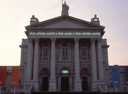
Work No. 232, the whole world + the work = the whole world, 2000, installed on Tate Britain, image: kunstkritikk.no
Or from Martin Creed at the National Gallery of Scotland.

Ibid., image: contentcatnip
Or from Martin Creed at the Christchurch Art Gallery (NZ).
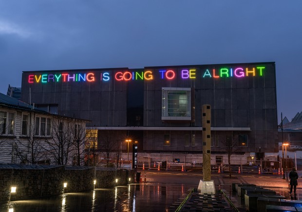
Work No. 2314, 2015, image: radionz.co.nz
The difference between these signs and the Renwick’s is everything. Can they not see that? Is that what craft is now: arty minus artists? This will not end well, but it should end soon.
Signs of rebellion? Renwick Gallery is flouting signage rules, groups contend [washingtonpost]
Sforza, Heizer. Heizer, Sforza.
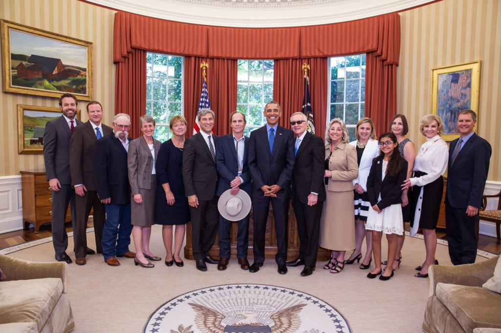
If I had to make a list of photo ops I could never imagine, Michael Heizer standing alongside Pres. Obama and Sen. Harry Reid would be right up there. And yet here we are.
Heizer, along with LACMA director Michael Govan and others, gathered to celebrate the designation of the Basin & Range National Monument, which protects 704,000 acres of Nevada wilderness, ranchland, and Heizer’s decades-long project, City, from oil extraction or encroaching development.
Spiral Jetty‘s on 10 acres. Lightning Field‘s on a few thousand, plus DIA’s bought up 9,000+ surrounding acres to protect the view. With 700K plus a high-powered entourage at the White House, it’s as if Heizer has out-Earthworked all the Earthwork artists with the biggest Earthwork on Earth.
[via @RepDinaTitus]
The Daily Practice Of Erasing

This is a great photo, btw. I love the edge, the space, the painting’s objectness. I assume it’s old, pre-frame, but I don’t really know; and the site I ganked it from didn’t seem to have any awareness, much less answers. Anyway, it’s here on purpose.
I’m not sure when I knew that the blur in the center of Gerhard Richter’s Tisch/Table (1962, CR:1) isn’t a brushstroke, but a smear, but I didn’t give it any thought until I started looking hard at Rauschenberg’s work on Erased deKooning Drawing. Then it completely changed for me.
The first time I saw it in person was 2002. Richter told Rob Storr that he had “canceled the painting by blurring.” I read Table‘s blob alongside the brushy blur of the early photopaintings. And those soupy loopy Vermalung paintings whose AbEx-style gestures preceded but didn’t exactly prefigure the squeegees.
But that’s not what’s happening.
In trying to understand what Jasper Johns did to Erased deKooning Drawing, I also had to figure out what Rauschenberg had done:
He was trying to make a mark with an eraser. It’s the difference between erasing a drawing, and drawing with an eraser. And when he was done, the result was both an erased de Kooning and a drawing.
At just that moment I read John J. Curley’s essay, “Richter’s Cold War Vision,” in Gerhard Richter: Early Work, which tied them together:
Richter’s Informel-esque brushstroke was not painted over the image of the table (as some have suggested), but was the product of erasure. The artist attacked the canvas with a solvent (perhaps turpentine) after the initial image was already painted. The new mark has diminished the original painted surface, leaving traces of bare canvas showing through.
But as with Rauschenberg, this is not negation; cancelation is not rejection. [Richter would later designate Table as the first work in his Catalogue Raisonné, even though it is not.] As Curley wrote, the erasure “naturalizes a false realism” in Tisch; its abstract disruption provides cover and credibility for the table’s “off-kilter” representation and “structural impossibility.” Erasure becomes “the crux of both the table and the painted gesture.”
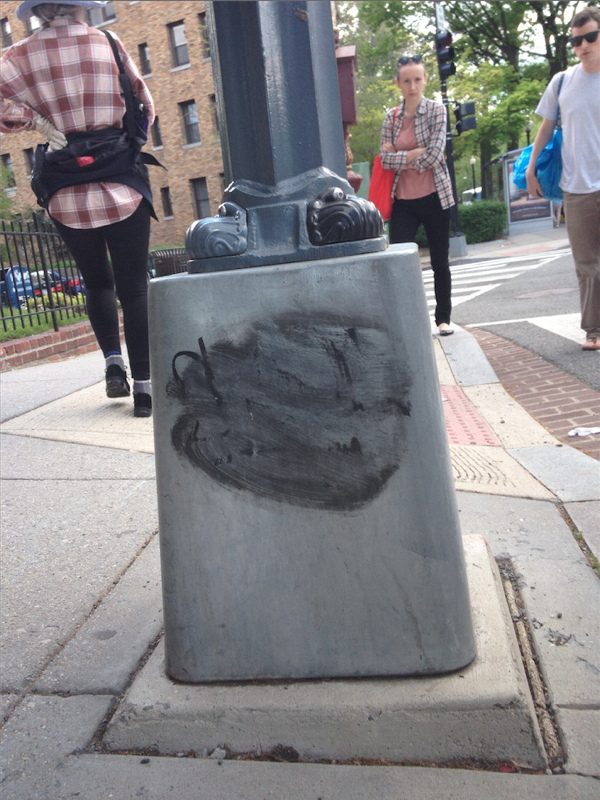
Well that blew my mind. I’ve ended up thinking about Tisch all the time, at first because of the blogging, and then the Destroyed Richter Paintings project. But then mostly because there’s a lamp post near our place in DC that I pass almost every day on my way to the train or the store. It has a basic graffiti tag that someone tried to erase–I was about to say unsuccessfully, but I think it looks a hundred times better like this.
The History of Tilted Arc Is Long
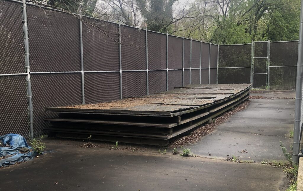
The General Services Administration commissioned Tilted Arc from Richard Serra in 1981 as part of a Percent for Art program. The GSA’s regional manager guided the campaign to have it removed in 1985. It was finally removed at night on March 15, 1989 after Serra’s contract- and free speech-related lawsuit was dismissed. The three Cor-Ten steel plates that comprised the sculpture were taken from the Javitz Building plaza in lower Manhattan to a government-owned parking lot at 3rd Avenue & 29th St in Brooklyn. The site was adjacent to the Metropolitan Detention Center. In 1999 the Bureau of Prisons built a new joint on the site, and the pieces of Tilted Arc were sent to a GSA depot at Middle River, Maryland. And there they stayed, on a loading dock, stacked and separated by pressure-treated lumber, as the GSA put it, “indefinitely.”
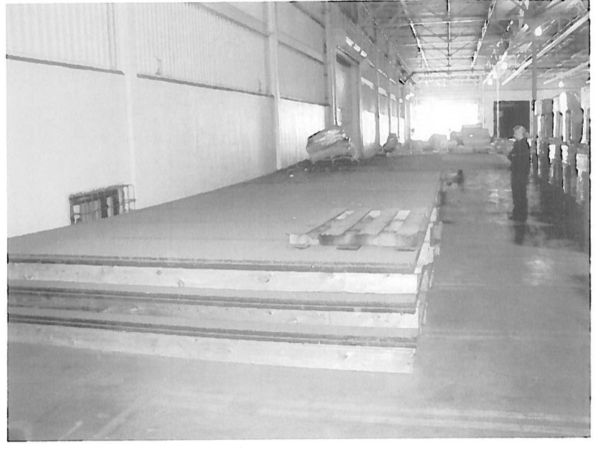
Which is not the same as forever. The government sold the Middle River site, and Tilted Arc was moved to the GSA’s Fine Art Storage facility in Virginia in the summer of 2005. [18 pallets of relief sculpture molds by Ray Kaskey for the World War II Memorial were also moved, but in different trucks.] It remains there to this day. I saw it yesterday, in fact. [The molds were not to be found.]
Continue reading “The History of Tilted Arc Is Long”The Social Mirror, Recycled (2015)
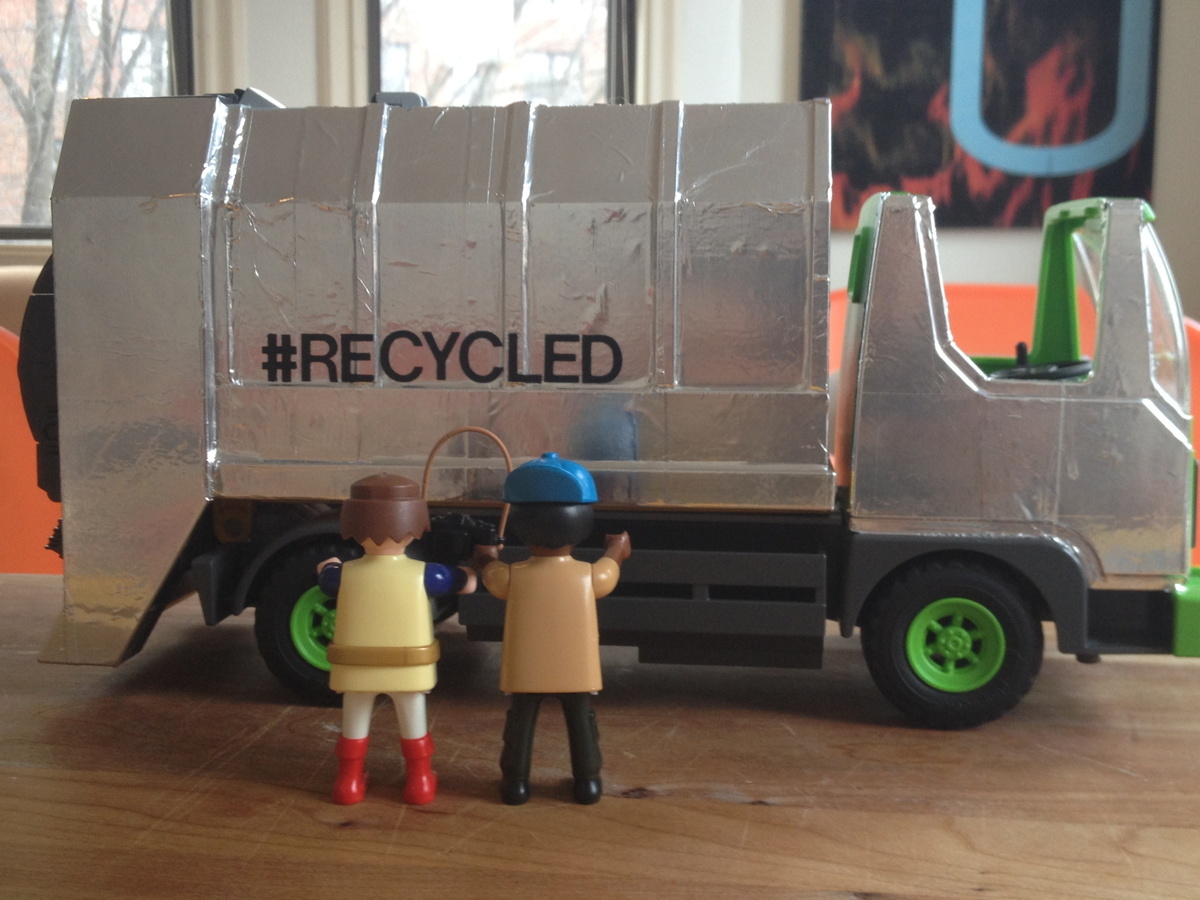
study for The Social Mirror, Recycled, 2015
Recently I entered an open call for a public art commission. It was sponsored by the District of Columbia’s Department of Public Works, which was looking for designs in which to vinyl wrap DC’s single-stream recycling trucks.
I was compelled to enter for several reasons. One is my own long-standing interest in the highly under-utilized medium of vinyl wrapping vehicles. The other is a strong sense of responsibility and history surrounding any artistic endeavor involving garbage trucks.

The Social Mirror, 1983, Mierle Laderman Ukeles, image: feldmangallery.com
The examples shown in the RFP of vinyl wrapped garbage trucks in other cities were, to put it mildly, atrocious. Maybe underwhelming is more politic. Whatever, it turns out there are jurisdictions in this country who have been putting art on garbage trucks without the slightest apparent regard for the alpha and omega of garbage truck art: Mierle Laderman Ukeles’ 1983 The Social Mirror. It just didn’t seem right. It didn’t seem possible.
The Sign Of Las Cruces, Or How Ya Like Me Now? LAND Edition

Chapter 7: Pending Cipher for the Open Present, image: Daniel R. Smalls via hyperallergic
Daniel R. Small’s contribution to LAND’s land were installed in New Mexico, where they have upset the locals with their scary symbols and indecipherable glyphs. From an email Small sent to Hyperallergic’s Kemy Lin:
There was also a very hostile reaction from a local neighborhood when the installers from Lamar were up the billboard ladder. A group of locals surrounded the base of the pole shouting obscenities and claiming that the billboards were either Satanic or Islamic.
Which sounds a lot like what happened when the Washington Project for the Arts installed David Hammons’ How Ya Like Me Now? across from the National Portrait Gallery as part of Richard Powell’s 1989 exhibition on Black Culture and Modernism:
But a billboard-size portrait of a pink-cheeked Jackson suddenly appearing on the streets of DC with no explanation and a Kool Mo Dee lyric for a title was bound to arouse controversy. And when WPA curator Powell, who is black, left three white staffers to finish installing the piece, a crowd of young black men formed, voiced their protest against the artwork–and then took a sledgehammer to it and tore it down.
On the bright side, that work ended up in Glenstone, so maybe Small should just ride it out.
Billboard Art Project Sets Off Terrorism Scare Near US/Mexico Border [hyperallergic]
previously: How Ya Like How Ya Like Me Now?
Richard Nixon’s Last Look
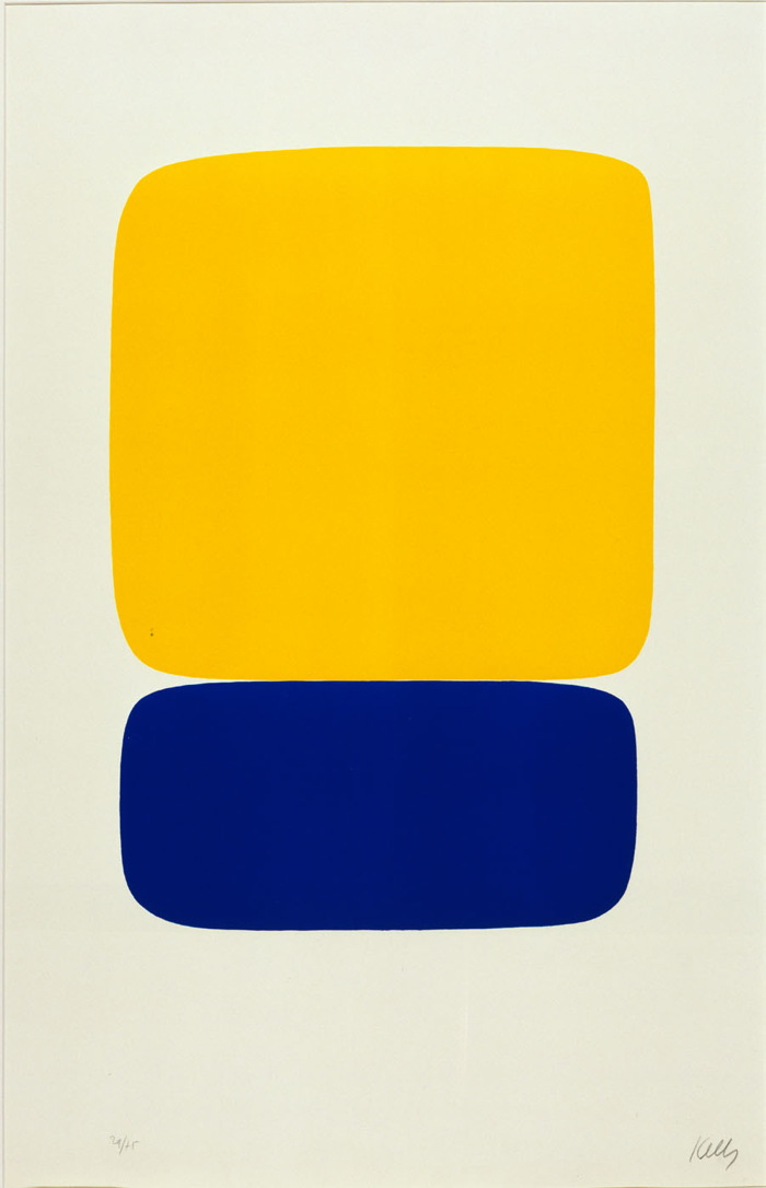
Ellsworth Kelly, Yellow over Dark Blue, 1964-5, from a suite of 27 color lithographs, ed. 29/75, loaned to Henry Kissinger for display in his White House office. Collection: SAAM
Who was Henry Kissinger’s favorite artist? Ellsworth Kelly. But that’s not important now.
While searching through the White House art loan records for the Nixon administration yesterday, I noticed that over the years, Kissinger borrowed several Kelly prints for his office, including the one above. It was a gift of the artist in 1966 to the National Collection of Fine Arts, which became the Smithsonian American Art Museum.
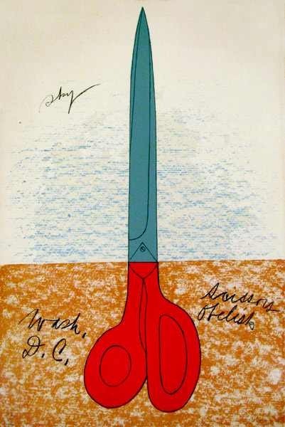
Claes Oldenburg, Scissors Obelisk, aka Scissors as Monument (Scissors Obelisk, Washington, D.C.), 1967 or 1968, ed. 144. Collection: SAAM
I first started wondering about art in the Nixon White House a couple of months ago, after I stumbled across a NY Times article describing a 1978 NCFA White House Loan inventory that showed hundreds of artworks missing, mostly from the Nixon era:
More than 100 prints, including a Claes Oldenburg poster, “Scissors Obelisk,” and an Andy Warhol “Flowers” poster, borrowed and displayed in the White House, at Camp David, and in the Presidential helicopter during the Nixon Administration, have not been found where they were supposed to be.
The reason I’m writing this should now be clear: Richard Nixon had art on his helicopter.
The National Collection of Fine Arts Logo Was Awesome
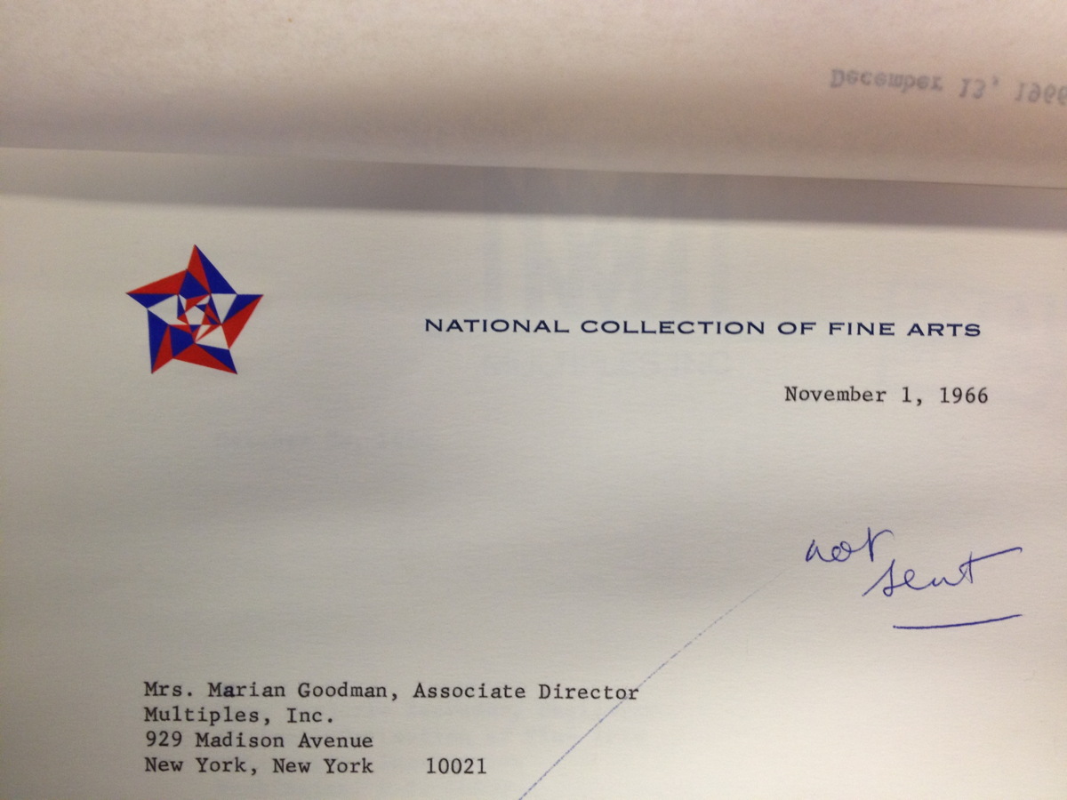
I was doing some research in the Smithsonian Archives this afternoon, and I stumbled across this letterhead from the National Collection of Fine Arts, the precursor to the American Art Museum. That kaleidoscopic star is fantastic, and it still looked like it had been engraved yesterday.
I tried to find the designer, so far to no avail. But I did find this rather slapdash 1965 NCFA flag, where the design of the star outshines the star-eats-earth logo of the Smithsonian itself.
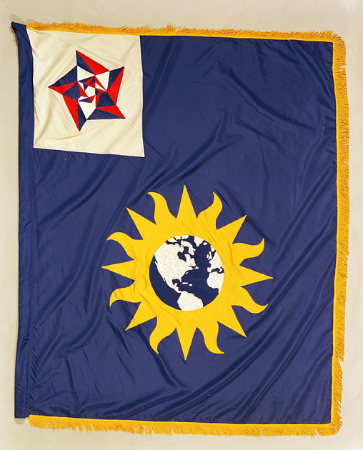
National Collection of Fine Arts Flag, 1965, image: siarchives
That star-within-a-star reminds me of the US Bicentennial logo, which was created by Bruce Blackburn, the same guy at Chermayeff & Geismar who designed NASA’s mod “worm” logotype.
![]()
It also kind of reminds me of Gabriel Orozco’s geometric drawings and paintings. Orozco, of course, shows with Marian Goodman.
In Defense Of The Center For Political Beauty
In bizarre news, an artist collective stole part of the Berlin Wall memorial and repositioned it along the EU border https://news.artnet.com/art-world/collective-steals-berlin-wall-memorial-ahead-of-anniversary-154457
— artnet (@artnet) November 5, 2014
It’s just one word in one tweet, so it really shouldn’t become the point, but those who follow me on Twitter know I have a thing for the language of art news sites, and their poetic idiocies of the market. This, however, just pissed me off.
Clarification! @Sothebys staked its own money in the Giacometti but says different bidder won it. Repped by David Norman, not Ben Dollar.
— Kelly Crow (@KellyCrowWSJ) November 5, 2014
It is as pure a sign as you’ll find of the pathology of current money-fixated art world that last night a half dozen media outlets filed hundreds of bid-by-bid tweets from an Impressionism auction, yet the “bizarre news” is that artists are literally trying to save lives by drawing attention to one of Europe’s existential political crises.
I had never heard of the Center for Political Beauty before this morning. They are the artist collective whose mission is to engage “in the most innovative forms of political art: a type of art that hurts, provokes and rises in revolt in order to save human lives.”
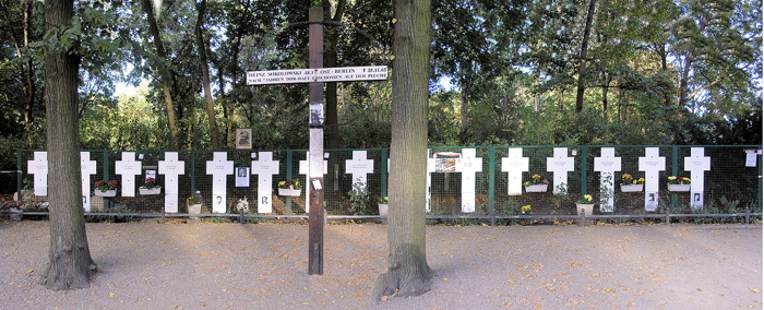
They removed crosses commemorating some of the East Germans killed while trying to cross the Berlin Wall, and have reinstalled them on what they’re calling the European Wall. The Center for Political Beauty has announced that they will cut down portions of the EU’s border fence on November 9th, during the official ceremonies surrounding the 25th anniversary of the fall of the Berlin Wall.
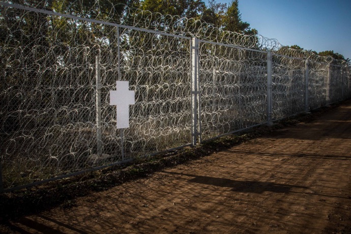
politicalbeauty.de: Keine Benutzung der Bilder ohne vorherige Genehmigung!
The photo above of a cross on a fence along the Bulgaria-Turkey border is circulating with the AFP wire service story that is the lone, primary source of English-language coverage of CPB’s project. I’ll never look at a Cy Twombly chalkboard painting the same way again.

The images and details that don’t circulate, though, are more damning: At least 136 people died or were killed trying to escape across the Berlin Wall between 1961 and 1989. The UNHCR says over 2,500 Africans trying to reach Europe have drowned or gone missing this year alone. The CPB says the number of people who have died trying to enter the EU since 1989 stands at over 30,000.

Here is a photo by Massimo Sestini of a boatful of African and Syrian asylum seekers who were intercepted by the Italian navy last June. This situation is anything else–an outrage, a humanitarian crisis, a “rendering void of the legacy of the Holocaust,” as the CPB puts it, but it is not bizarre.
And artnet should be shamed for their tendentious attempts to mock and marginalize artists pursuing something beyond the callow complacencies of the market.
UPDATE: I’m still not satisfied with this yet, or how or why it bothers me, but I’m reading Thierry du Duve’s “Art in the Face of Radical Evil” [October, Summer 2008, pdf], about MoMA acquiring and showing photos of Khmer Rouge execution victims from Tuol Sleng, and about whether they’re “art,” and what are the implications if they are:
Sobriety in exhibition design, noncommittal wall texts, and clever avoidance of the word “art” in press releases won’t succeed in hiding the fact that our aesthetic interest in photography is shot through with feelings, emotions, and projections of sympathy or antipathy that address the people in the photos beyond the photos themselves. I am convinced that something of that emotional response to the properly human ordeal of the subjects in the Tuol Sleng photos had a say in MoMA’s decision to acquire them. To suppose otherwise would be to lend the acquisition committee undeserved cynicism.
This feels like it’s inching closer.
Welcome Back, Gwenfritz
[The] Gwenfritz is back where it belongs. The National Museum of American History has conserved Alexander Calder’s site-specific stabile and reinstalled it in a reflecting pool on the building’s west end, 30 years after it was displaced by a vintage band shell from a mental hospital.
The removal of Gwenfritz in violation of the artist’s intentions was cited as a contributing precedent to attempts to move Richard Serra’s Tilted Arc from its site in Federal Plaza a few months later.
Anyway, it all sounds good, and from the NMAH’s flickr feed, it looks good. “It’s always great when you’re able to honor the artist’s vision,” said Smithsonian American Art Museum sculpture curator Karen Lemmey, in a way that unsettles me, perhaps because it reminds me of the offhandedly mercenary Lumbergh in Office Space.
Conservation of Alexander Calder’s Gwenfritz [eyelevel.si.edu]
Previously, 2010: After 26 Years, The Smithsonian Will Put Alexander Calder’s Gwenfritz Back Where It Belongs.