I am kind of deep in an assignment, and so cannot really give the space right now to process the news of Jean-Luc Godard’s death and the impact of his work.
But as an absolute fan of Agnes Varda who has not seen Faces Places because I detest JR’s work, Manohla Dargis’s interpretation here of Godard’s refusal to even come to the door makes sense to me.
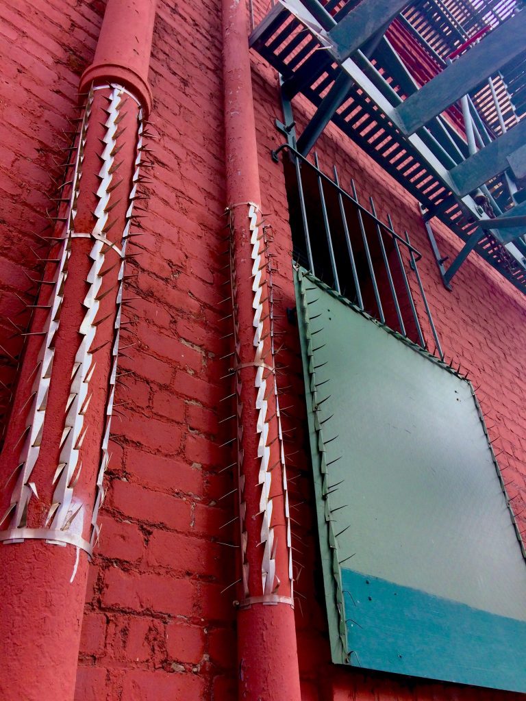
Untitled Palermo (South Park), 2019, enamel and latex on wood and steel, enamel and steel on cast iron and brick, installation image by Bryan Finoki, aka @subtopes
When he first tweeted this photo from San Francisco, Bryan Finoki saw #fortressurbanism. I saw metal af Blinky with a Melvin Edwards twist.
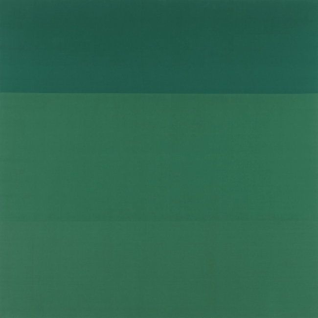
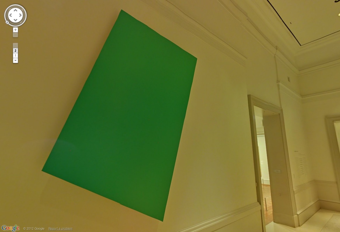
Untitled, Palermo, 1970 image ganked from wherever (it is not so easy to tell in this jpg, there are actually three bands of green. hashtag metadata, but I can’t tell if this is a different work from the Untitled, 1968, belonging to Grand Duc Jean)
My principled stand against buffing is not softening, and I don’t condone it, but I can’t not appreciate the occasional aesthetic results. Until I’m able to source the exact anti-climbing spike strips in this installation, to see this work you’ll have to go–or google your way–to 2nd & Brannan streets.
Which is fine. Palermo was very into site specifics, which I can appreciate. The painted wall and pipes here feel especially significant.
I’ve recently been taking a long look at the work of Sam Gilliam. There was one drape installation he made in the 1970s at a gallery, and when he reinstalled the piece in a museum, he added a vertical beam to stand in for the gallery’s steam riser. I think this painting, though standalone, would benefit from a similar treatment [chef’s finger kiss emoji].
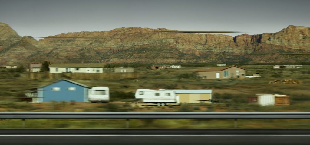
Andreas Gursky, Utah, 2017, at the Hayward Gallery, London, thru Apr 2018
Whether it heals all wounds, time does cool all hot takes. When the Gursky show opened at the Hayward Gallery in January, I was immediately set off by this kicker from Laura Cumming’s review in The Guardian:
But the show’s masterpiece is unlike almost anything Gursky has made before. It is a new work, a single shot of some prefab houses skimmed on a mobile phone while driving through Utah. The photograph registers the speed of the car racing through the landscape – and modern life – in all its random glitches and blurs. At the same time, the houses look perilously ephemeral against the ancient mountains behind them. This fragile little thing, a spontaneous and disposable shot, is enlarged to the size of a cinema screen – a monumental homage to the mobile phone and the outsize role it plays in depicting our times.
Not just Gursky using a phonecam, but Gursky doing something new? Now that is news.
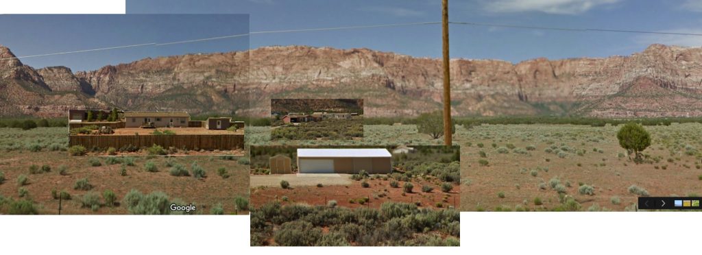
In addition to the phone and all its quotidian implications, what caught my attention was the subject: Utah. I had, just a couple of weeks before, driven along the very road in southern Utah as Gursky. I was also in the middle of a two-month mess on my server, which necessitated rebuilding my blog and its underlying software and databases. But that could wait until I identified the precise stretch of highway Gursky had captured. So I set out again, on Google Street View.
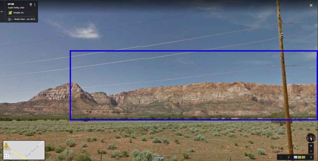
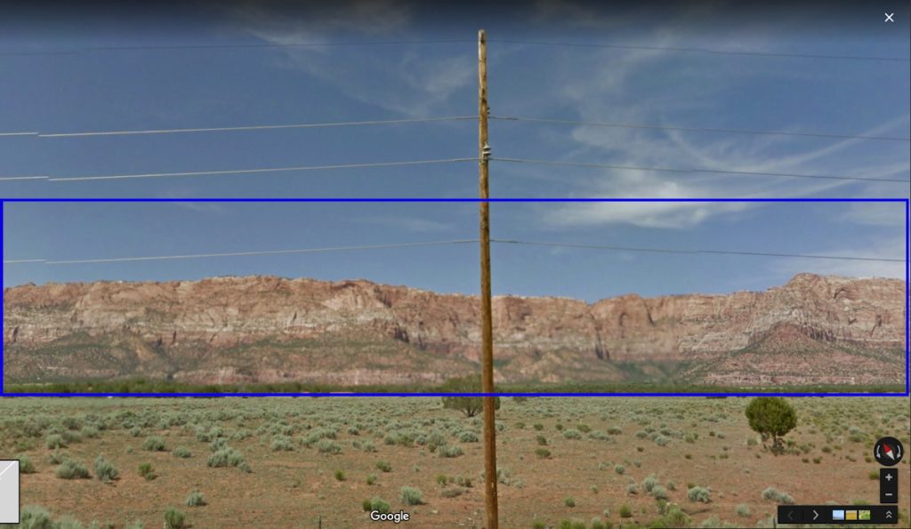
From the geology and the development, it was possible to narrow down the site of Gursky’s photos to the roads around Zion National Park, and east from Zion and Kanab, toward Grand Escalante and Staircase National Monuments. The sections of this rural, two-lane highway with guard rails and fresh blacktop were even fewer. And none of it matched.
This section of Utah is very sparsely populated, and very few roads cross it at all. So the options dwindled very quickly. But on the road between St George and the border-straddling polygamist towns of Hildale, UT and Colorado City, AZ, I recognized the striated mountain range immediately. But there were no houses at all.
outside Hildale, UT, image: gsv
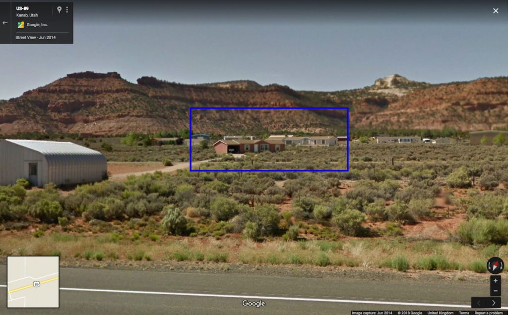
Which, two things: it’s now obviously a composite. But before that, those poles. Gursky’s original image is full of blurs and artifacts, including what are apparently some disembodied pole fragments. These artifacts, coupled with the disparate blur on houses, patios, guard rail, etc., led me to assume Gursky had experimented with an iPhone’s panorama feature from a moving car. That he was exploiting the stitching algorithm of the phone, a source of found digital manipulation.
Google Street View saw what Gursky saw, or vice versa
But of course, this turned out not to be the case. What hit me during these first few days was that this Gursky was being presented as a single image when it was now obviously a composite.
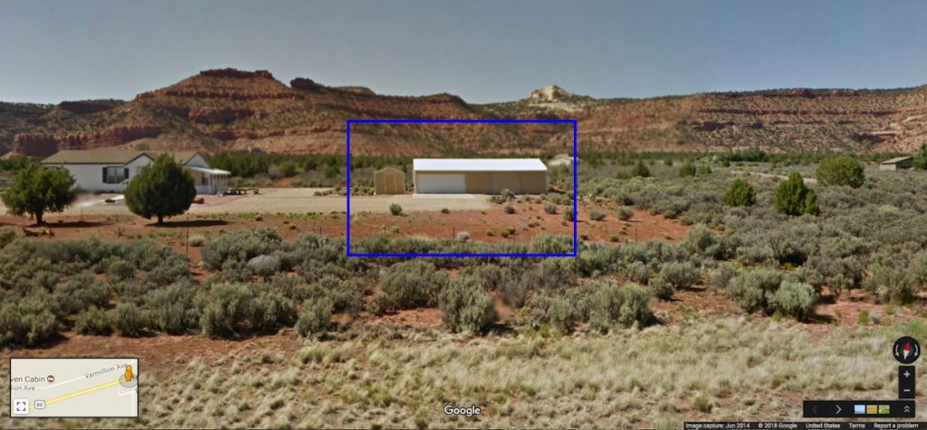
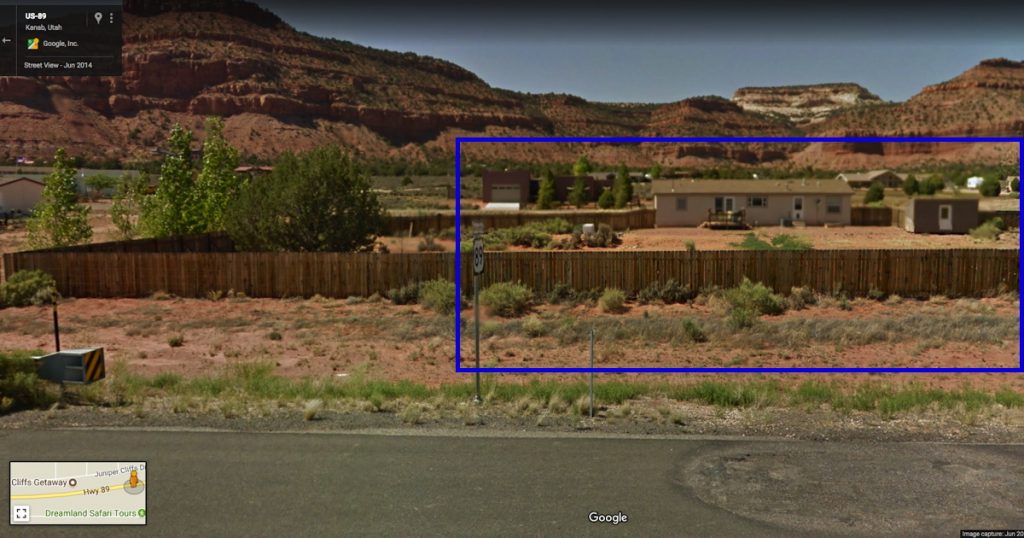
And so I set out to find the site of the other, lower half. Which, with every Streetviewed mile, was turning out to be an entirely fictional, constructed composition. While trying to rebuild my webserver I wandered the highways again, finding this or that house; meanwhile the more accurate version of Gursky’s process emerged: that he’d taken photos with a phone, and then returned to reshoot sites with his regular camera, and–like always–he just fixed the whole thing in post.
So my Gursky bust turned into a Guardian factcheck. And I was left dissatisfied, again, by Gursky’s view, even as I grew intrigued by Google’s. I found myself indexing the differences: vantage point, height, date, blur, glitch, and stitching. I imagined Streetview’s rooftop, panoramic compositor, and Gursky’s passenger driveby–which turned out to be a tripod on the shoulder. And I tried to imagine what it’s like for a maker of ambitiously scaled images to work in a world where giant companies are constantly taking a picture of the entire earth. Maybe the better digital analog for Gursky’s practice isn’t Google at all, but etsy.
Gursky Street View, v.1, 2018 –
In good etsy form, I have knocked off Gursky’s image by collaging the elements I’ve found. If/as I find more, I’ll add them until…until what? I don’t know, I guess until it’s done, or I get bored. If you see something say something.
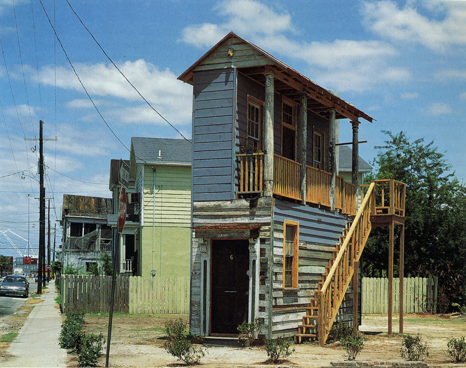
David Hammons & Albert Alston, House of the Future, 1991, photographed in 2006 by ksenia_n
In 1991 the artist David Hammons was invited by Mary Jane Jacobs to create a site-specific work in Charleston, South Carolina for a new, visual arts program linked to the Spoleto Festival. Jacobs had patterned the exhibition, “Places With A Past”, after the Skulptur Projekt Münster. Spoleto founder Gian Carlo Menotti hated the whole thing; the exhibition divided the board and got the director fired (he came back a couple of years later, after Menotti quit), but the show’s art historical reputation has only grown.
That said, Hammons’ is the only one of 61 installations left standing, thanks in large part to his early decision to collaborate with Albert Alston, a local builder, who seems to have maintained and championed the work over the ensuing 27 years.
Hammons and Alston built House Of The Future on a vacant, city-owned lot on Charleston’s segregated East Side using architectural fragments and materials from renovation and demolition projects nearby. It is a 6×20-foot teaching model of Charleston’s signature style, with labels for each component. At some point, a young, local artist used the ground floor as studio space, and Alston oversaw other public programmatic uses. On the back of the House, Hammons painted a quote from African American writer Ishmael Reed:
The Afro-American has become heir to the myths that it is better to be poor than rich, lower class than middle or upper, easy going rather than industrious, extravagant rather than thrifty, and athletic rather than academic.
[Though Reed gets–and takes–credit for the quote, it seems that it actually originates with musician/composer/sociologist Ortiz Walton. Reed quoted Walton’s critical history of cultural exploitation, Music: Black, White & Blue in a 1973 review for Black World Magazine. Reed & Walton seem to have been frequent collaborators and interlocutors, so maybe this is one more of those Hammons/Alston situations. In any case, the quote itself was criticized by some in the community, and it has disappeared and reappeared from the wall of House Of The Future with various repaintings. According to an unrelated 1995 lawsuit by a disgruntled muralist, though, it was integral to the community’s embrace of the installation that helped preserve it after the Spoleto Festival ended.]
Oh, say, can you see?
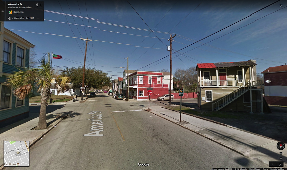
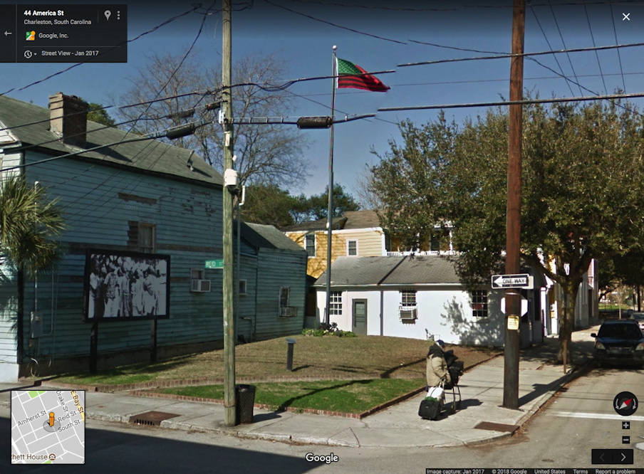
At some point after the May 1991 opening of “Places With A Past”, Hammons’ second element was realized kitty corner from House of The Future. America Street is a small, grassy bump of a park on another vacant lot, where Hammons’ iconic African American Flag flies from atop a 40-foot pole. A black and white photo of a group of children looking up, as if at the flag, filled a sidewalk-scale billboard that had previously featured ads for liquor and Newports. From this 1996 account of the Spoleto fallout over “Places With A Past”, it sounds like the works survived some entropy, if not straightup neglect. But both the flag and the picture have been replaced over the years.
Hammons’ America Street, January 2017
Detail of David Hammons’ America Street, 1991, a billboard photo of local kids looking up, img: gsv, jan 2017
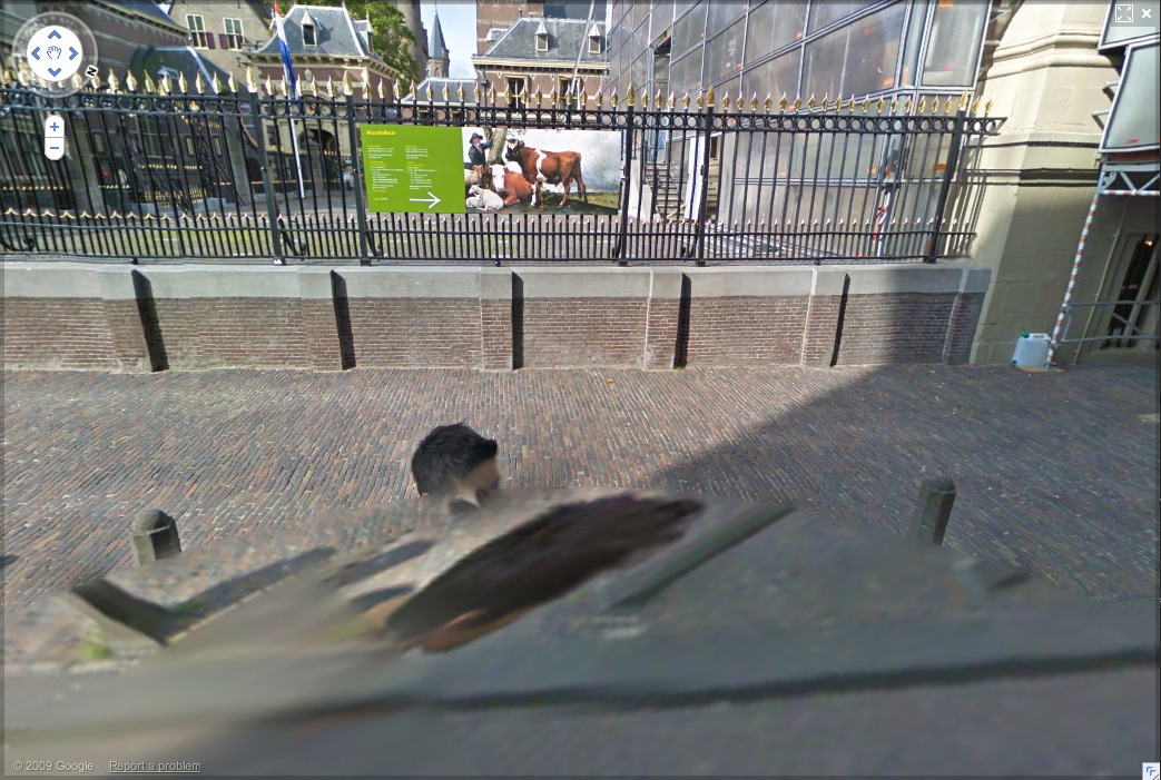
I have not visited Hammons’ piece(s), except in Google Street View. The first thing I noticed was they differed in appearance from the historical photos. I realized GSV’s own decade of historical imagery is useful here, for marking the changes this tiny house and its neighborhood have undergone.
Clicking through the changes wrought by time on a piece of Southern vernacular architecture, I immediately thought of the work of my late neighbor, the photographer William Christenberry. He would travel back to his native Alabama year after year for decades, photographing the same houses, churches, and stores, usually documenting their deterioration and subsumption by kudzu.
William Christenberry, Red Building in Forest, Hale County, Alabama, 1983, image: Hemphill
What I was seeing in Hammons’ and Alston’s piece was the opposite: a structure built from the castoffs of renovation and gentrification, surviving thanks to a small but persistent maintenance effort. And through it all, year in and year out, no matter the storms or racial strife that battered some other flags in South Carolina, Hammons’ star-spangled banner is still there.
In the spirit of Christenberry, I decided to make some historic GSV printsets [prints of screenshots; GSV is a screen medium] of Hammons’ and Alston’s House Of The Future and America Street. I’ve followed Christenberry’s format, but I’m skipping the traditional photographer’s approach of making editions of a bajillion in a thousand sizes. Each set of 7-9 images is printed small (8×10 in.), in an edition of 2, plus 1 AP: one for you, one for the museum, one for me. Because srsly, why overthink it? If anyone actually wants to buy them, I turn into some kind of crazed Amazon artworker pick&packing prints all day? Hard pass right now, thanks. If you don’t move in time to get it, just make your own.
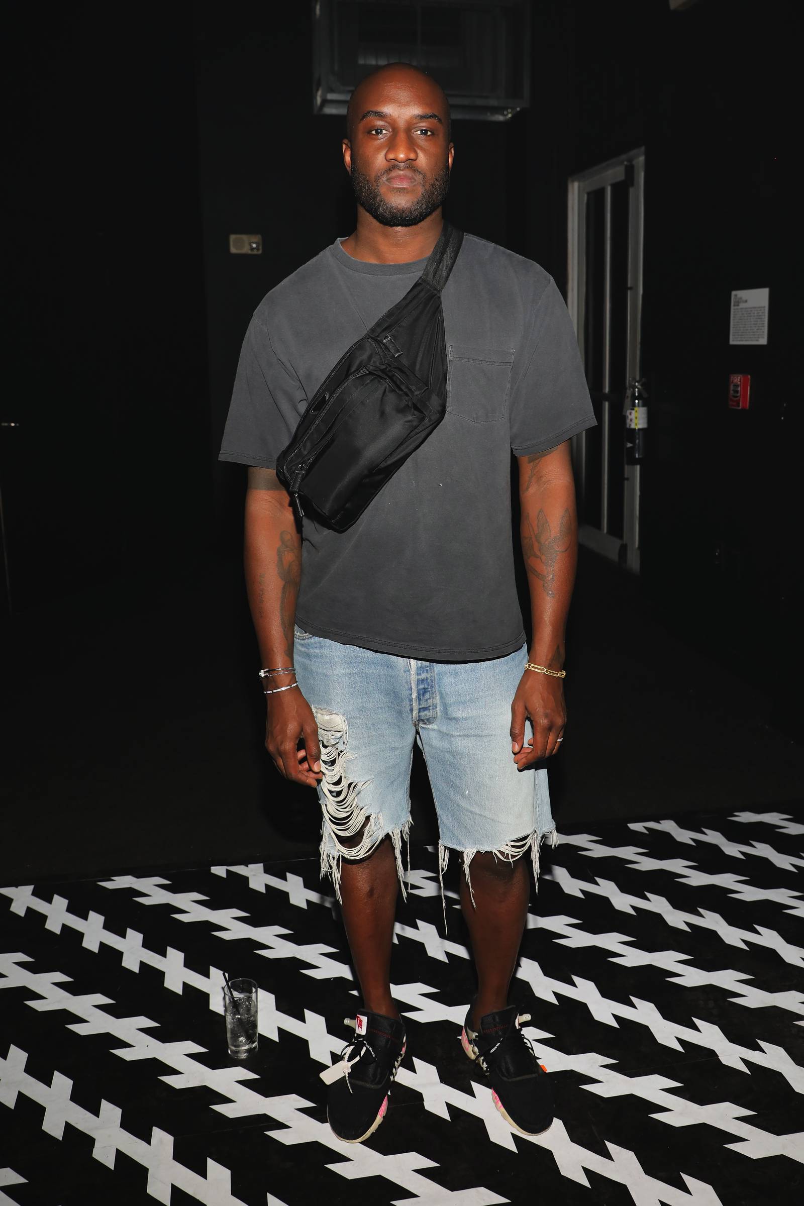
virgil Abloh, J.W. Anderson, Diplo e Ricky Martin erano tutti presenti al progetto di partito di Carsten Höller
Benzoino Luccello
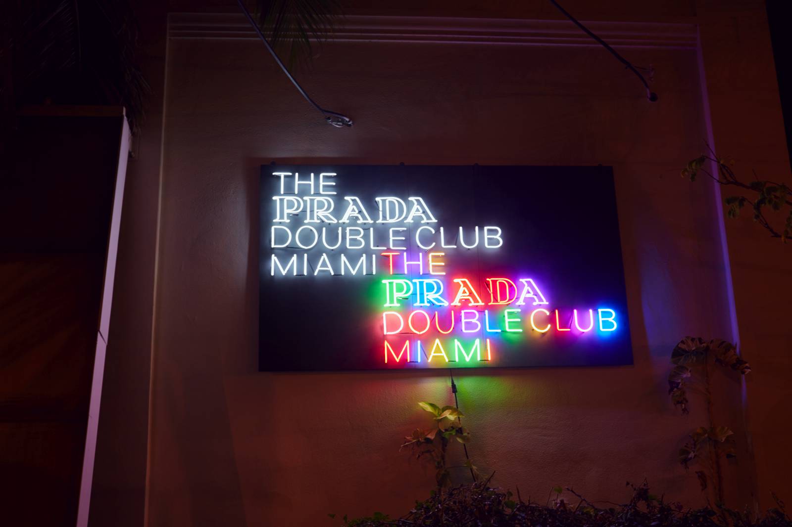
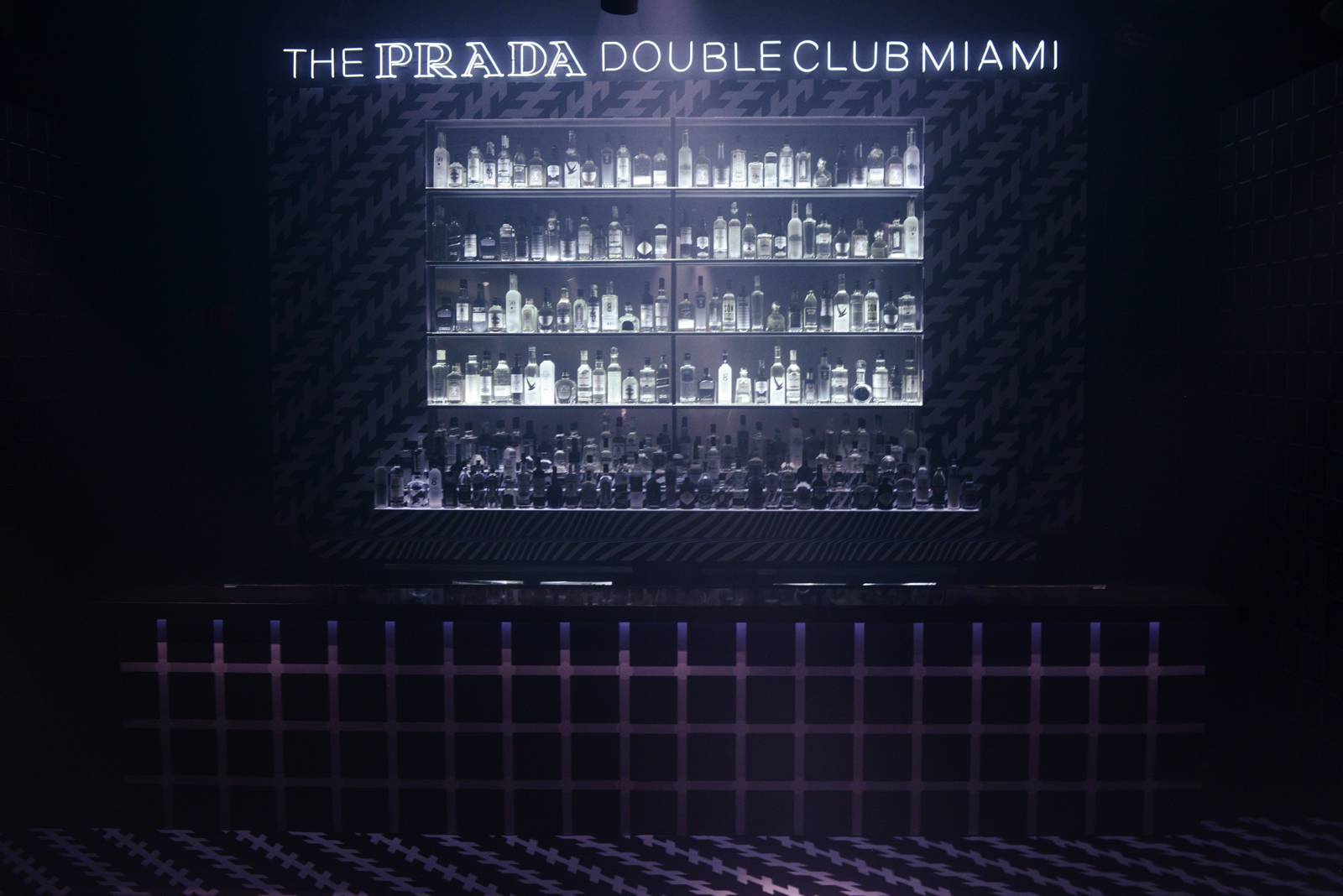
Se fossi a Londra intorno al 2008, potresti ricordare Il Doppio Club: un incongruo pop-up a tema congolese, ospitato in un magazzino del nord di Londra. Creato dall’artista Carsten Höller e bizzarramente sponsorizzato da Prada, il club / bar / ristorante temporaneo ha attratto celebrità, modaisti e club per oltre otto mesi. Probabilmente passerà alla storia come la più eccitante esperienza della vita notturna mai vista nella capitale.
L’EVENTO DI APERTURA DI MIAMI DOPPIO CLUB DI PRADA. FOTO: PIETRO BJORK
Quasi un decennio più tardi, Il Doppio Club è riportato in vita per la sedicesima edizione di Arte Basel Miami. Per soli tre giorni, questa seconda iterazione dell’installazione artistica esperienziale ha preso il sopravvento in uno studio cinematografico degli anni ’20 con un’imponente line-up, titolata dalla Principessa Nokia, Metodo Uomo e la Madonna Nera. È stato lanciato con una prestazione di Wyclef Jean, che ha radunato Miuccia Prada, Hans-Ulrich Obrist, Chloe Saggio e Ricky Martin nel suo giardino tropicale illuminato al neon.
Il Prada Doppio Club Miami – in contrasto con la sua edizione originale di Londra – ha una divisione estetica, tra monocromatico e iper-policromatico. Mentre lo spazio esterno sabbioso e il suo palapa bar sono illuminati da neon colorati perfettamente proporzionati, la sezione interna sembra di entrare in un film di Tim Burton – nero, bianco e nient’altro consentito. “Prendo particolare attenzione ai dettagli”, spiega Höller, che aveva incaricato i buttafuori di confiscare le cannucce colorate all’ingresso del secondo spazio, per preservare la sua identità estetica.
VIRGIL ABLOH. FOTO: GETTY
L’artista tedesco nato in Belgio è noto per la natura interattiva del suo lavoro – spesso associato al movimento dell’estetica relazionale – in cui la percezione e il processo decisionale sono centrali. Per il suo sondaggio presso la Hayward Galleria nel 2015, i visitatori sono stati confrontati con una serie di scelte: tra la porta A e la porta B per entrare nella galleria; inghiottire una pillola da una pila sul pavimento o no (pensa Il Matrice blu e rosso); è stato buttato giù dal museo da una delle due gigantesche diapositive attaccate alla facciata della Rivasud (che ha fatto il suo acclamato debutto alla Tate Moderno nel 2006). Lo stesso concetto si applica al club di Miami, dove le persone dovevano scegliere tra due contesti drasticamente contrastanti (sebbene fossero liberi di viaggiare da uno all’altro).
E mentre il “divertimento” gioca chiaramente un ruolo importante nel lavoro di Höller (è in qualche modo sconcertante pensare di essere stato addestrato come scienziato agricolo), Il Doppio Club va ben oltre il puro divertimento. È un viaggio in cui arte, design e musica coesistono.
“IL PRADA DOPPIO CLUB MIAMI”, UN PROGETTO DI CARSTEN HÖLLER PRESENTATO DALLA FONDAZIONE PRADA MIAMI, 5-7 DICEMBRE 2017. FOTO: CASEY KELBAUGH CORTESIA FONDAZIONE PRADA
“A volte vengo a conoscere le culture attraverso la musica”, ci dice Höller, indicando la line-up caraibica e sudamericana del palcoscenico all’aperto (un momento saliente del secondo giorno è stata una performance del locale, 7-pezzo Tallawah Mento Banda ). “Volevo celebrare queste comunità, che sono così centrali nel tessuto culturale di Miami”, continua. Nel frattempo, la musica elettronica pesante ha dominato lo spazio al chiuso, grazie a spettacoli come Mimi Xu (conosciuto anche Coniglio Nebbioso) e il produttore di Chicago la Madonna Nera.
Allo stesso modo, nel 2008 a Londra, il dialogo tra culture occidentali e congolesi è stato al centro dell’attenzione. Höller (che divide il suo tempo tra la Svezia e il Ghana) ha viaggiato in Congo estensivamente negli ultimi 20 anni. Questo interesse, senza dubbio, fu alimentato dalla sua educazione in Belgio, la cui violenta eredità coloniale segnò profondamente il paese centro-africano. “Volevo adottare un approccio più positivistico”, racconta Höller. “Il Congo è un posto enorme. Volevo celebrare quella cultura in tutta la sua vitalità e potenza. ”
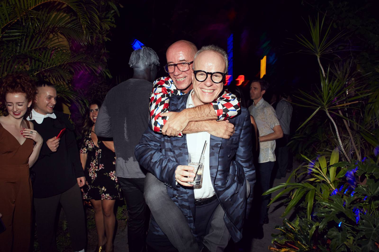
HANS ULRICH OBRIST E CARSTEN HÖLLER. FOTO: PIETRO BJORK
Ora, Arte Basel Miami – uno dei momenti più esclusivi dell’agenda culturale internazionale, in cui l’uno per cento affluisce da tutte le parti del mondo – non è esattamente l’ambiente ovvio per un autentico scambio culturale. Quindi, la diversità ha in qualche modo abbandonato l’agenda, a favore dell’esperienza esperienziale glamour e guidata dal marchio? “Tu hai l’intrinseca diversità di Miami, e in più la natura internazionale di Arte Basel”, spiega l’artista. “Era una folla molto variegata, imballata dall’inizio alla fine.”
Indipendentemente da ciò, Il Doppio Club sarà probabilmente ricordato come la cosa più bella che è successo a questa edizione di Arte Basel Miami. E, chissà, potrebbe anche creare un campo in una città vicino a te in futuro: “È certamente una possibilità”, dice Höller, che ritiene che gran parte del suo lavoro possa essere concepito come un doppio club. Si spera che la prossima tappa duri abbastanza a lungo per segnare davvero la coscienza collettiva locale.
“IL PRADA DOPPIO CLUB MIAMI”, UN PROGETTO DI CARSTEN HÖLLER PRESENTATO DALLA FONDAZIONE PRADA MIAMI, 5-7 DICEMBRE 2017. FOTO: CASEY KELBAUGH. CORTESIA FONDAZIONE PRADA
previously, suddenly related: Rem Casafresca
In writing yesterday’s post, I realized I’ve come back to Ellsworth Kelly’s “Notes of 1969” before.
What strikes me now, besides the quote I used for yesterday’s title, was this:
Everywhere I looked, everything I saw became something to be made, and it had to be exactly as it was, with nothing added. It was a new freedom; there was no longer the need to compose. The subject was there already made, and I could take from everything. It all belonged to me: a glass roof of a factory with its broken and patched panels, lines on a road map, a corner of a Braque painting, paper fragments in the street. It was all the same: anything goes.
Lot 247: Jacob Kassay, Untitled, 2010, two 14×10 silver on acrylic (not gesso?) canvases, est $10-15,000 [image via christies]
Scanning the catalogue for this month’s Christie’s sale turned up something unexpected: an affordable Jacob Kassay painting. Two of them, in fact. After his ominously seductive debut show opened at Eleven Rivington in the wake of the 2008 financial crisis, Kassay’s silvered gesso canvases were transmuted into auction gold. Shiny objects reflecting distorted images of their viewers, Kassay’s paintings were the first to get churned and flipped in a frenzied art market obsessed with declaring-and cashing in on-a steady stream of new stars.
It’s the kind of limelight that can wreck a girl’s practice, if not her complexion, and Kassay has been reticent, even diffident sometimes, of the hype. He’s generally refused to engage the art market star process, at least on anything other than his own terms. For a while he refused to have his picture taken. His website, a kaleidoscope of semi-transparent images, would kick you off after a few seconds, presumably when you’re just tryna do some research for an upcoming auction.
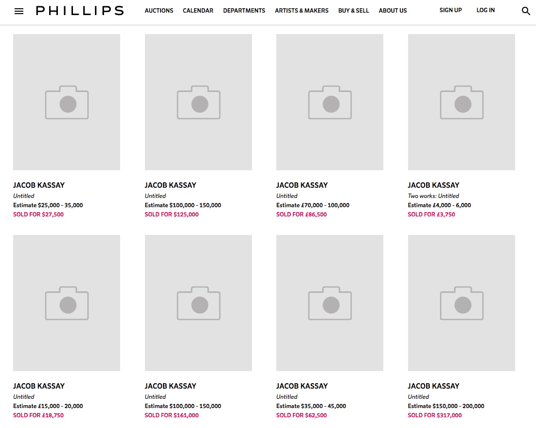
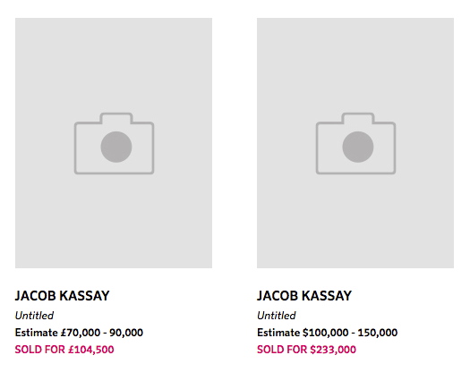
Kassay has also always been fairly specific about images of his shows, especially photos of his silvered paintings. So it should make all the sense in the world that he’d care about the proliferation of auction-related reproductions of his work. What was more surprising, though, was the apparent removal of all images of his work from Phillips’ website.
Sotheby’s has done this for a while now, removing images of works shortly after the sale is completed, but this is the first time I’ve seen all of an artist’s images removed from a site. Or should I say, replaced. If you thought Kassays all looked the same before, well, brother, you’re in for a treat. I’d like to see these in mirror finish, please.
[FWIW, this particular pair, from 2010, was flipped at Phillips in 2011 for $104,500. If there’s anything more alluring than a shiny object, it’s two. And if there’s anything more seductive than that, it’s a 90% discount. [Update: indeed, they sold for $8,000 bid, $10,000 with premium. That is some Cady Noland-level collector anxiety inducement and value erasure. Well played.] Sept 28, 2017, Lot 247: Jacob Kassay diptych, 2010, est. $10-15,000 [christies] 8 Nov 2011, Lot 205: Jacob Kassay, Untitled diptych, est. $30-40,000, sold for $104,500 [phillips]
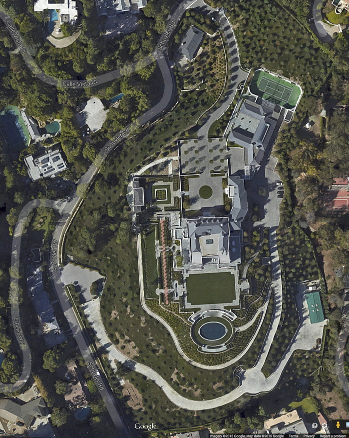
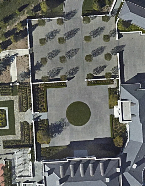
Wow, I’m sure they’ll grow in–what’s the date on this Google Maps image? Maybe they already have–but the trees at Katzenberg’s place have an incredible, all-over, Ben-Day dots feel, like they were laid out by Sigmar Polke. Hope that’s what they were going for.
Bonus points for those courtyards, though; that’s a landscape photo for our times.
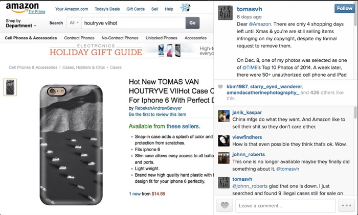
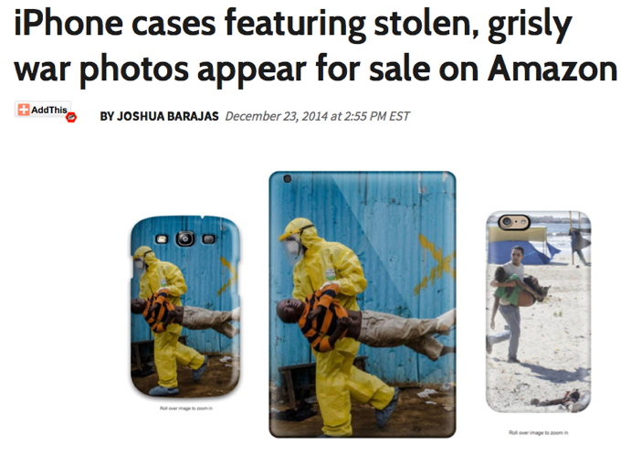
“Who wants to buy a picture with a dead child on it,” said Tomas van Houtryve…”If any human being in the process had seen that, I don’t see how it could possibly get through”.
Which is exactly the wrong question and the right answer for this situation. They and the outrage associated with them only exist once they’ve been searched for, and the product will only exist after it’s been ordered. Because these images, like tens, hundreds of thousands more, have been scraped from the web and turned into products by bots.
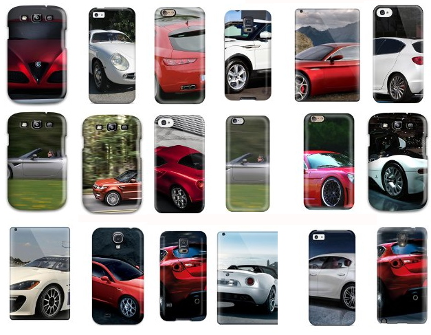
By focusing on the laughably limiting category of public domain images, Spamerican Apparel was too timid and deserves to fail. For these Amazon iPhone case sellers copyright’s no object, and Google Images is just the start. Cropping is strictly default settings, actual image be damned. Among the 6,324 phone cases offered for sale by Lynn A Carter are hundreds printed with the center of PR photos of various cars. They have descriptions like, “Daly R Martinez NVDWiaj2848OHOgq Case Cover Iphone 5c Protective Case Alfa Romeo Giulietta 36.” Daly R Martinez is another Amazon seller. The string is a product ID, different from Amazon’s ASIN. Then there is product + the data that was scraped with the image. SEO enough for Amazon.
They really do just grab any damn image at all. Like this, LvukQDp7415hnQVt Snap On Case Cover Skin For Iphone 6 Plus(kerry Washington). It’s a red carpet photo from October 2013. There are nearly 300 other Kerry Washington phone covers like this.
L to R: “Corner Blocked Kitchen With Stainless Countertops Sleek White Cabinets”; “Kitchen Peninsula With Quartz Countertop In Kitchen”; “Eclectic Kitchen With Artistic Pendant Lights” iphone cases
My favorites so far have to be the kitchens. The scrapers have found Pinterest, and have turned it into iPhone covers. Here’s the one on the right, on a Pinterest board called “Junk Ideas.” Scrapers are turning the great image vortex of our digital ocean into an actual island of plastic garbage on demand. Who are these people?
I will wager they are not the people listed on Amazon, but more digital simulacra. Searching for the sellers turns up a Chinese-language website run on a free .tk domain which is used to manage case returns for various Amazon IDs. Poking around the domain also turns up a quick&dirty Amazon upload management dashboard. It looks to me like a Chinese case manufacturer is flooding Amazon with hundreds or thousands of bogus sellers, each with thousands of scraped data-derived products. That award-winning photographers’ images and names got scraped as well should come as no surprise.
What Amazon will do about this vast, digital garbage dump of a retail offering is not clear. Maybe this is just the way it’s going to be from now on, every image always available on every product. Maybe we will adapt to Scraper Capitalism by becoming Sifters, consumers attuned to the surreal moments, the horrific, the sublime, the sea glass and driftwood of the web. We’ll develop tools for surfacing them, and critical faculties for appreciating them. If we do, Amazon will have them, just 1-Click away.
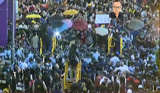
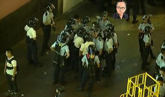
Police in Hong Kong have deployed a new mobile pepper spray platform against protestors near Mong Kok. I start with this image via @krislc, Kris Cheng, because it gives nice context, also the guy is watermarking it with his face? I’m filing that trick away for future use. At first it looked like it’s made out of PVC pipe, but it’s surely painted steel. Actually, it looks like a smaller variation of the stairs in Home Depot. Most of the info comes from @galileo44, Galileo Cheng. Like this picture of the police conferring on Portland St. With their pepper spray cannons on their backs. Unless those are #umbrellas.
Here is krislcc’s Vine of the new platforms in use on her. Galileo calls them castles. They’re hand pumped. Like Super Soakers or something. Incredible.
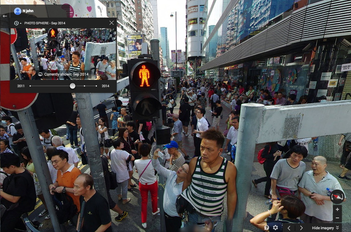
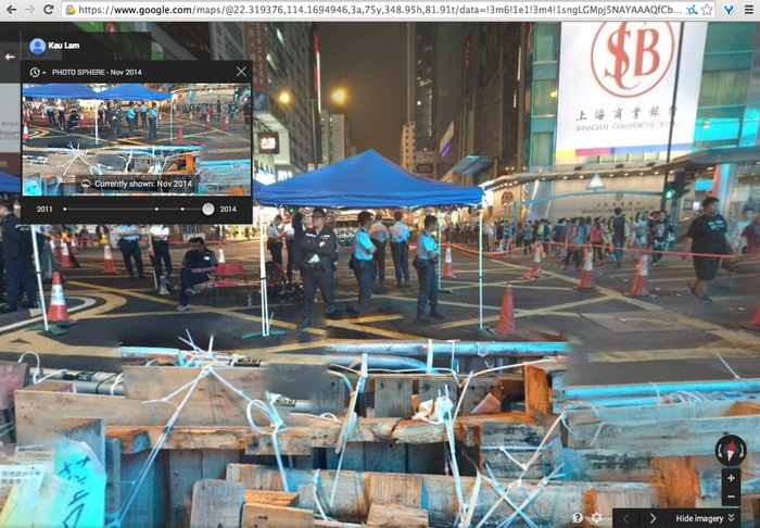
It was startling to be met by an unblurred face. And the vantage point was so high. But turn around. This is a pano. Or a “Photo Sphere.” From September, of the intersection blocked by a sit-in. It’s credited to nJohn.
There are more recent Photo Spheres, too. Including November, by Kau Lam. The protestor-decorated police barricades are stitched together pano-style. Google Maps as a reporting platform. When will it go live? Will Google get castles of its own, or will cameras on long sticks suffice?
This is just so fantastic. Last month Eugene, OR photographer Blake Andrews wrote about this 2004 photo by Lyza Danger, which has gradually become confused and conflated with Andreas Gursky’s 99 Cent photos.
Danger’s photo, an unaltered image of a Fred Meyer in Portland, is CC-licensed on flickr, which has aided its circulation and re-use. Andrews discovered several instances where Danger was accused of both ripping Gursky off, and of claiming Gursky’s image as her own. But the best part is that Google Images include Danger’s photo in searches for Gursky’s 99 Cent. The authoritativeness of Google, coupled with the plausible Gurskyness of Danger’s image, create a virtuous cycle of re/mis-attribution that may or may not be slowed by Andrews’ investigation.
And basically, I love it. Clearly, it’s Gursky enough. Or rather, Danger’s verite’ image shifts what makes a Gursky a Gursky from the grand scale of globalist capitalism to the artist’s manipulation of the same.
Danger’s photo is not a Ghetto Gursky, or a Shanzhai Gursky either; those terms don’t fit this scenario. It’s an image made in the wild, a Found Gursky, which we now recognize and appreciate because of Gursky’s influence. It’s an example of a shift from Gursky as author to Gursky as worldview. It’s of a piece with the photo that Brent Burket flagged last year, Taylor Swift’s selfie with a Dallas stadiumful of people.
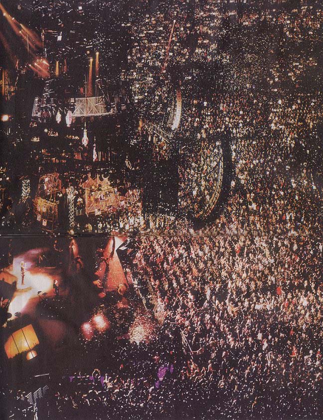
Andreas Gursky photo of a Madonna concert in Los Angeles on Sept 13, 2001, image via centre pompidou
And now I see a connection to the ruins of the World Trade Center I’d wanted to see Gursky photograph in September 2001, except he was touring with Madonna. 99 Cent | Blake Andrews [blogspot via petapixel, thanks giovanni garcia-fenech for the heads up]
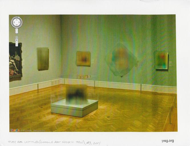
Study for Untitled (Google Art Noguchi Table) #3, 2014, 8.5 x 11 in, inkjet and water on archival matte finish paper
I was very happy to donate this study to the benefit auction last week for Franklin Street Works, the Stamford, CT art space where some Destroyed Richter Paintings and Shanzhai Gursky photos were in a show.
FSW had asked for furniture- or design-related works on paper. I have been trying for a couple of years to figure out how to make sense of the real-world, real object anomalies of Google Art Project panos, like the blurred out paintings, and especially the blurred out Noguchi game table [furniture!] at the Art Institute of Chicago. And I thought this would be a good opportunity to experiment, rather than simply print out the GSV image [not that there’s anything wrong with that, as Paul Soulellis’s very nice Webdriver Torso-related print demonstrates].
What mattered to me was getting the blur just right. Years ago, in the early Iris Print era, I’d seen some amazing Gabriel Orozco works–which I can’t find a trace of now–where he’d dripped and brushed water onto inkjets of lush Baroque paintings of the Madonna, dissolving the center into an abstract mess. Very non-archival, but very beautiful.
And all but unreproducible. In terms of inkjet and paper coating technology, we’ve come a long way, baby. I tried several printer & paper setups, but nothing would bleed like I wanted. Finally, in desperation, I emailed my sister, who had a clanky old [2003] desktop printer in her basement, and she printed some images for me. Even this modern paper resists staining and dissolving like the inkjets of old. After several test, though, I found if I let water sit on the paper long enough, it’d give me a blur. Study #3 was the first one to be successful enough to let out of the house. I don’t know where it went yet, but I hope it stays out of the rain. A Benefit Auction for Franklin Street Works [paddle8] Opening In Stamford: It Narratives, at Franklin Street Works
Previously: Google Art Institute Project