Awesome Marijuana Plantation/Land Art

Reuters’ Jorge Duenes’ cropped aerial shot of a 300-acre marijuana plantation “discovered” in Mexico last July that The Atlantic’s InFocus photoblog ran today was dramatic and awesome enough to make me want to see the full thing.
Here it is:
pot01_duenes_reuters.jpg
Stunning, right? Ellsworth Kelly himself couldn’t have done better. But the full caption bears analyzing a little more closely:

An aerial view shows parts of the biggest marijuana plantation ever found in Mexico, in San Quintin, about 350 km (220 mi) away from Tijuana, on July 13, 2011. Mexican soldiers discovered the plantation in a remote desert, a top army officer said on Thursday. Soldiers patrolling the area found 300 acres (120 hectares) of pot plants being tended by dozens of men.

Because I have a hard time seeing how parts of it can be simultaneously true. For the plantation to be in the “remote desert” and in “San Quintin,” for example. Or for it to be in “San Quintin” and “discovered.”
350km from Tijuana does sound remote. But San Quintin turns out to be on the northern part of the Baja Peninsula, the part where the highway runs between the mountains and the sea. On Google Maps, it’s clear the landscape is characterized by agriculture–and airstrips. To still be in San Quintin, the terrain in Duenes’ photos almost certainly has to be just off the main highway, and one of the largest crops of any kind in town. Saying it was discovered, then, implies that its existence was not known beforehand, which, holding other factors constant, seems impossible.
Still, the important thing is, it does look awesome.

Google Art Institute Project

gmap_kelly_artic_02.jpg
MoMA’s not the only museum on Google Art Project to show works by artists living–or recently dead. The Art Institute of Chicago’s stunning Sculpture Court is right there, too, with nothing less than Ellsworth Kelly’s Chicago Panels, six monumental, shaped aluminum paintings from 1989-99. And they look fantastic.
gmap_kelly_artic_01.jpg
Their geometric precision makes Kellys almost ideally suited for marking Google’s pano distortions. I love this double Kelly. How would that even exist as an object? Maybe we should get Bob Irwin on the horn.
gmap_kelly_artic_06.jpg
Even when they’re not unevenly stitched, a Kelly in a Google Museum View pano is still distorted. Just tilting around inside a single pano sphere, you can watch the painting’s dimensions pulsate and shift.
gmap_kelly_artic_green2.jpg
On Google, the kind of perceptual, perspectival changes a shaped Kelly goes through as you move around/along/towards/away from it now happen while you’re standing still [sic], or whatever the term is for not warping to the next spot. This is what our art looks like on Google.
gmap_kelly_artic_green1.jpg
And this is what our culture looks like on maximalist copyright. Any questions?
gmap_kelly_artic_05.jpg
Just in these tchotchke-filled vitrines alone, the Art Institute may actually have more blurred out objects and paintings on Museum View than MoMA. Here’s what we cannot see: products, design, ashtrays and pots.
gmap_kelly_artic_04.jpg
For these vitrines, I have to wonder if they just decided that clearing all these doodads from 20+ designers and their estates/mfrs was too much administrative work.
gmap_gok_artic_03.jpg
The spotty blurring in the Georgia O’Keeffe exhibit, though, indicates that something else was clearly afoot. It looks like the museum has repro rights for some works, perhaps those in their own collection, but not for others. Or maybe the Estate didn’t give permission for some subset? Loaned works?
gmap_gok_artic_02.jpg
Including this probable landscape, which, hey, goodlookin’, I’ll be back to paint you up later. [update: it’s Abiquiu Sand Hills and Mesa, 1945. Interestingly, it’s from a 2002 gift–many of the AIC’s O’Keeffe’s came from the artist herself or Stieglitz–and it’s one of two listed online as being “© Georgia O’Keeffe Museum.” With no image, even a thumbnail, on the Museum’s website. I think we have our explanation.]
gmap_gok_artic_01.jpg
Here is a 94-year-old Paul Manship sculpture [and pedestal], now, thanks to Google and the Manship Estate, remade very much for our time.
gmap_manship_artic.jpg
Now you know I love the blur, but even so, this shot actually kind of bummed me out. O’Keeffe hung on until 1986, but every other artist in Gallery 271, the Early 20th Century American gallery, has been dead for more than 40 years. I guess we should be glad Kelly was still alive to give his permission, because it looks like the estates put that kind of thing on lockdown. Or on the meter. [Not you, grandfils de Lachaise!]
gmap_lachaise_artic.jpg
Here’s an awesome but depressing view from Postwar, Gallery 262. I can’t figure out the far left, but there’s Jacob Lawrence, Ilya Bolokowsky, and Beauford Delaney on the wall there.
gmap_noguchi_artic.jpg
The unblurred Lawrence is nicely reflected in the plexi on the–seriously–blurred out Herman Miller table by Isamu Noguchi.
Previously: Blurring of Google Art Project comes as no surprise
Google Art Project v1.0: Les Blurmoiselles d’Avignon [Feb 2011]
Blurmany and the Pixelated Sublime [Nov 2010]

Blurring Of Google Art Project Comes As No Surprise

It looks like Les Blurmoiselles d’Avignon have some company.
The Google Art Project has released a new batch of 134 museum participants, bringing the total to 150, though only 51 institutions are offering Street View Museum View. And a couple of those, like Tate Modern and the Crystal Palace at the Reina Sofia, have basically no art, just space. [Tate Modern Museum View rather brilliantly drops you into the Turbine Hall, facing a blank temporary wall. ]
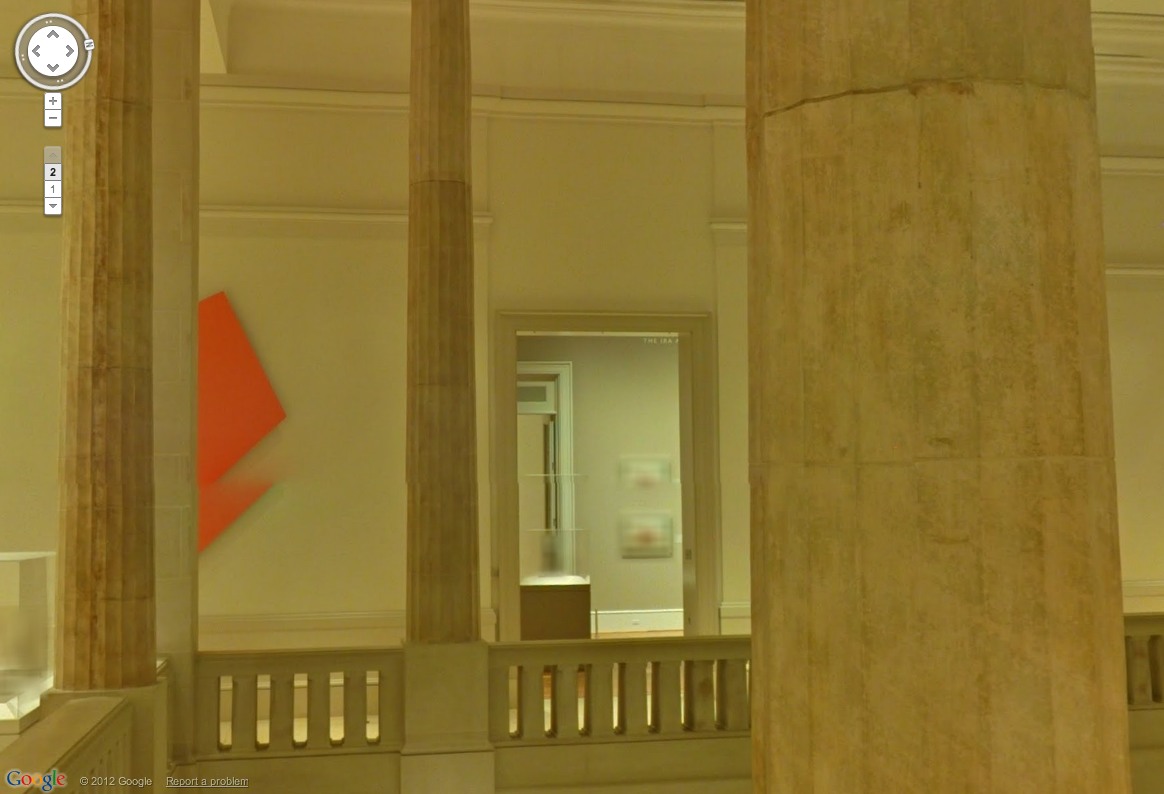
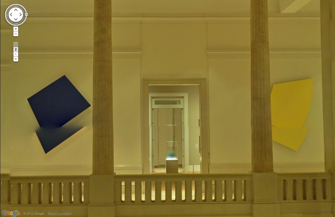
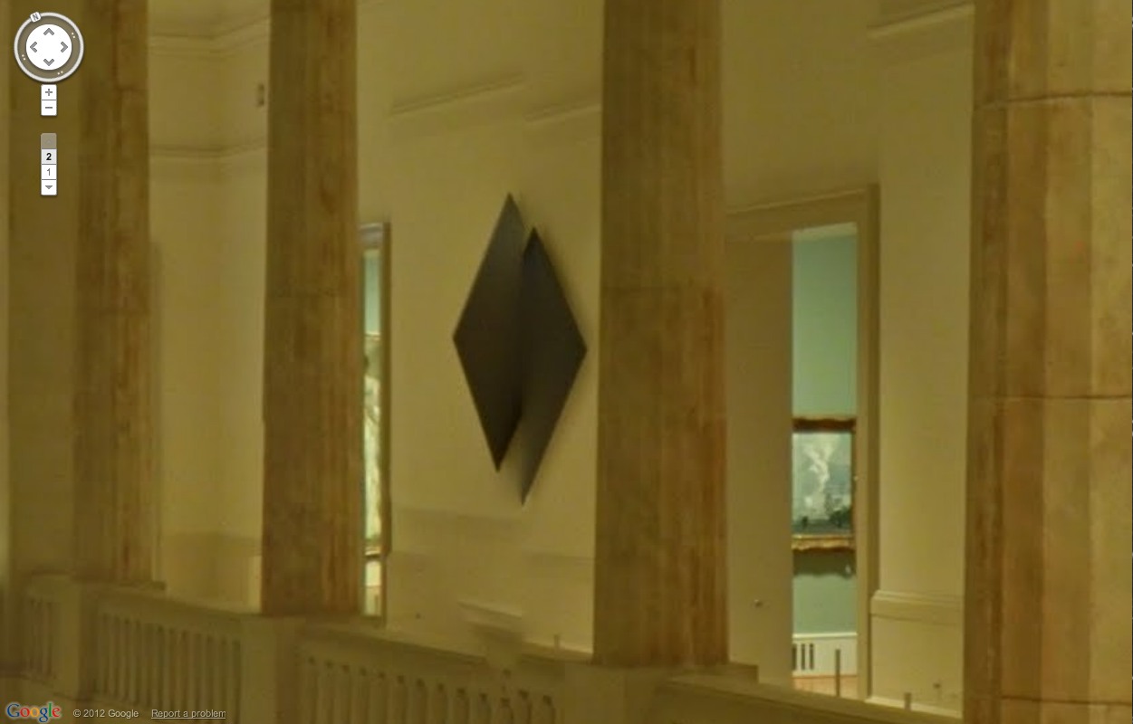
But if any museums besides MoMA gave to deal with living artists, or works still under copyright, I haven’t been able to find them. And so MoMA wins this round for adding a rotating show–Kathy Halbrecht’s contemporary installation in the 2nd floor Kirk Varnedoe Galleries [I am calling them this forever now, btw]–of contemporary art, thereby demonstrating that living artists are easier to get clearances from than estates.
moma_gmap_rosa1.jpg
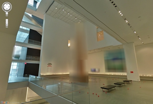
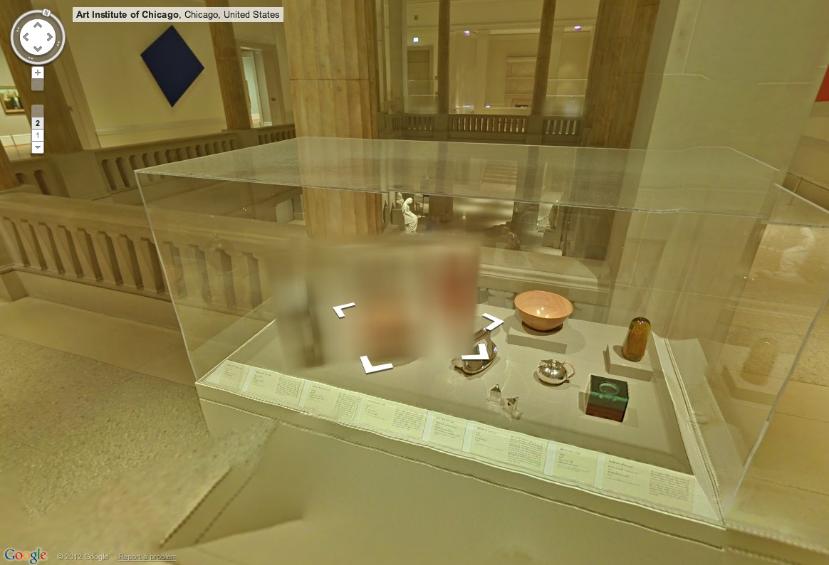
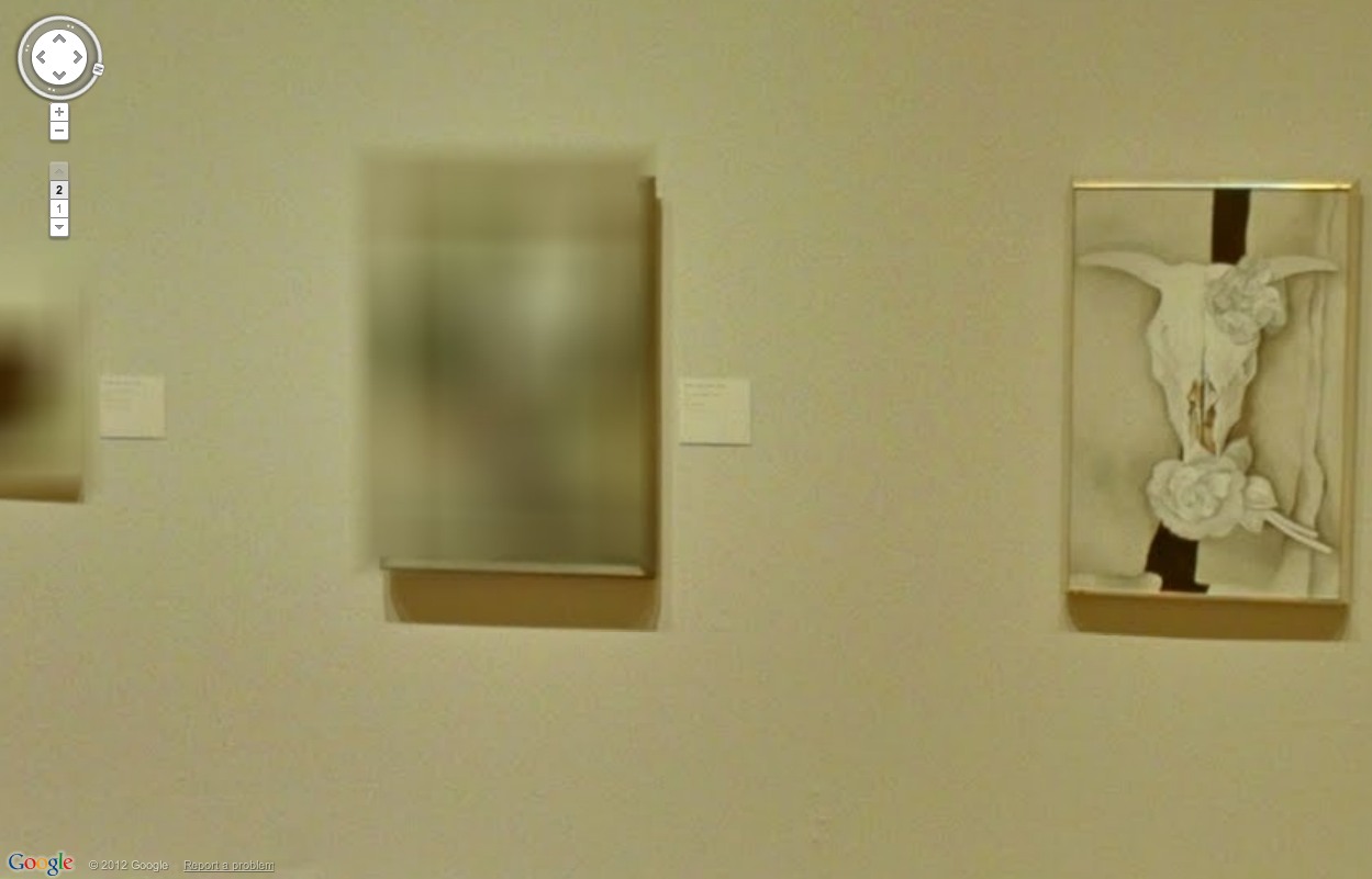
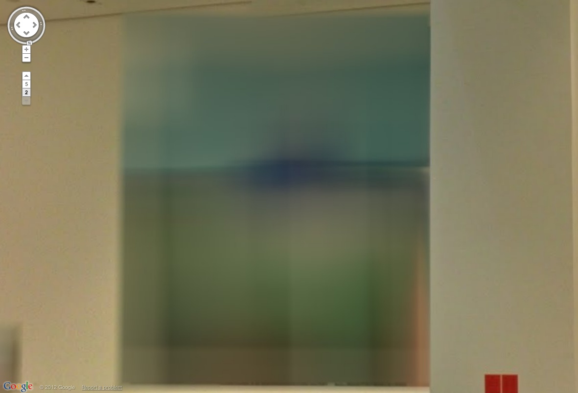
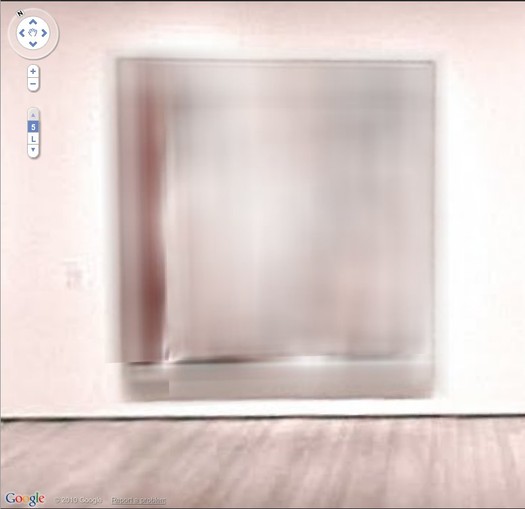
Most of them, anyway. Fortunately, there are some exceptions, and they look awesome cloaked in Google’s Blurmany-style algorithms. Oh the first really is the best, too. Sanja Ivekovic apparently didn’t sign on to have her atrium installation, Rosa of Luxembourg become Rosa of Luxembourg of Google Art Projects.
ivekovic_rosa_install_moma.jpg
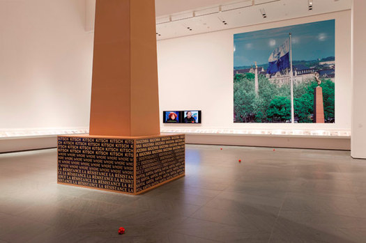
Lady Rosa of Luxembourg (foreground), with the Gëlle Fra (background). Photograph by Christian Mosar. Courtesy Casino Luxembourg–Forum d’art contemporain , via moma.org
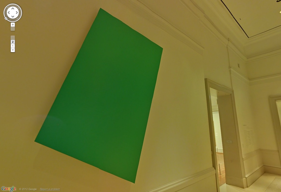
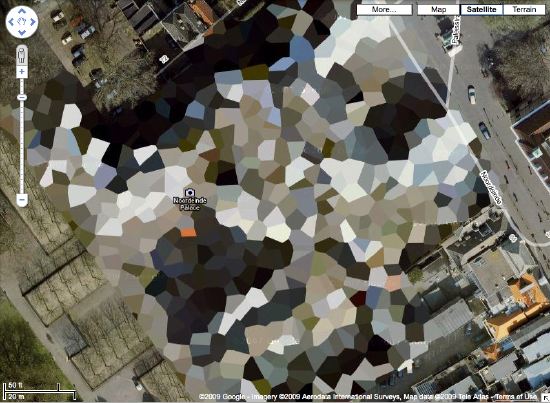
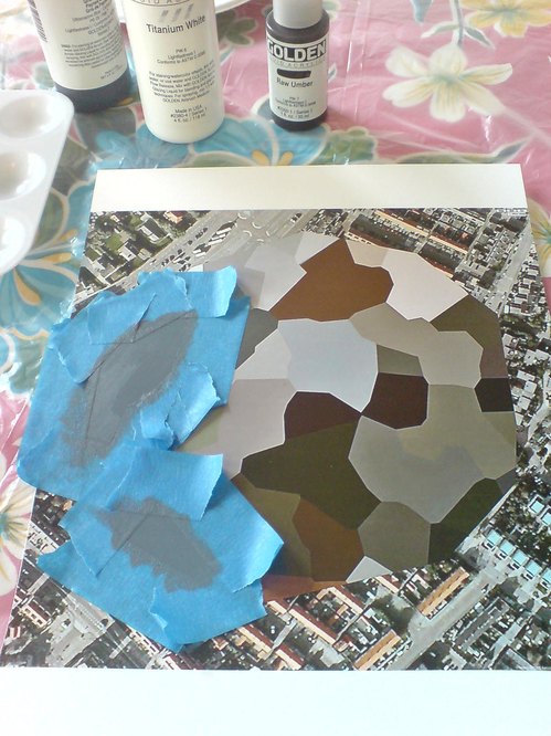
The monumental column is nice, of course, but the colors on that giant photo are utterly fantastic. That’s the first one I’ll paint.
moma_gmap_rosa4.jpg
Also, is the Bell & Howell helicopter over the staircase blurred out, too? Is that a fluke? Anyway, stepping back into the Varnedoe Galleries…
haveyouseenme.jpg
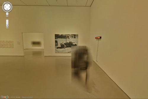
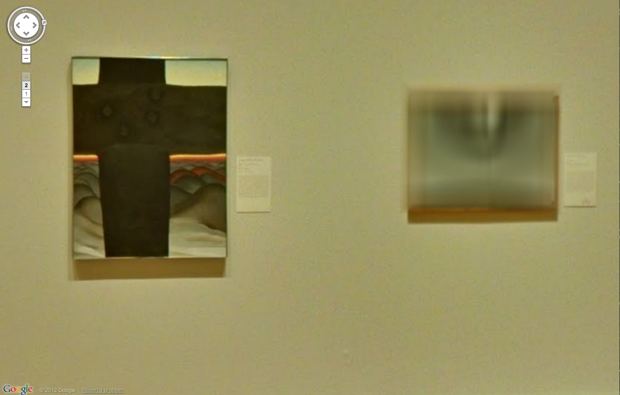
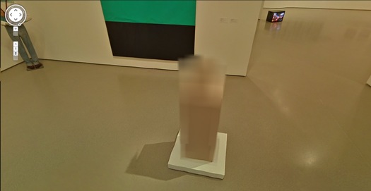
Still waiting to hear back on this one. I can’t remember what it was, though from this angle, it looks like the bastard lovechild of Louise Bourgeois and Gerhard Richter raised by Thomas Houseago. Of course, after a speculative mashup like that, whoever it turns out to be will almost inevitably disappoint. Sorry, artist. That’s a Reinhard Mucha in the back, though.
moma_gmap_muchaherold2.jpg
And when you head back there, both the Georg Herolds are also blurred. For a moment. Because you take another click/step, and they’re not. The blur disappears. It’s an unexpected reveal as Google’s sheets of virtual ribbed polycarbonate clatter to the ground.
moma_gmap_muchaherold.jpg
Or is it like that stuff on the facade of the Issey Miyake Pleats Please store in SoHo? You’re walking along, blur blur blur, and then you align with the material, and for an instant, you can see in. At least, in this case, for one pano. I suspect this is an oversight, so go try it quickly.
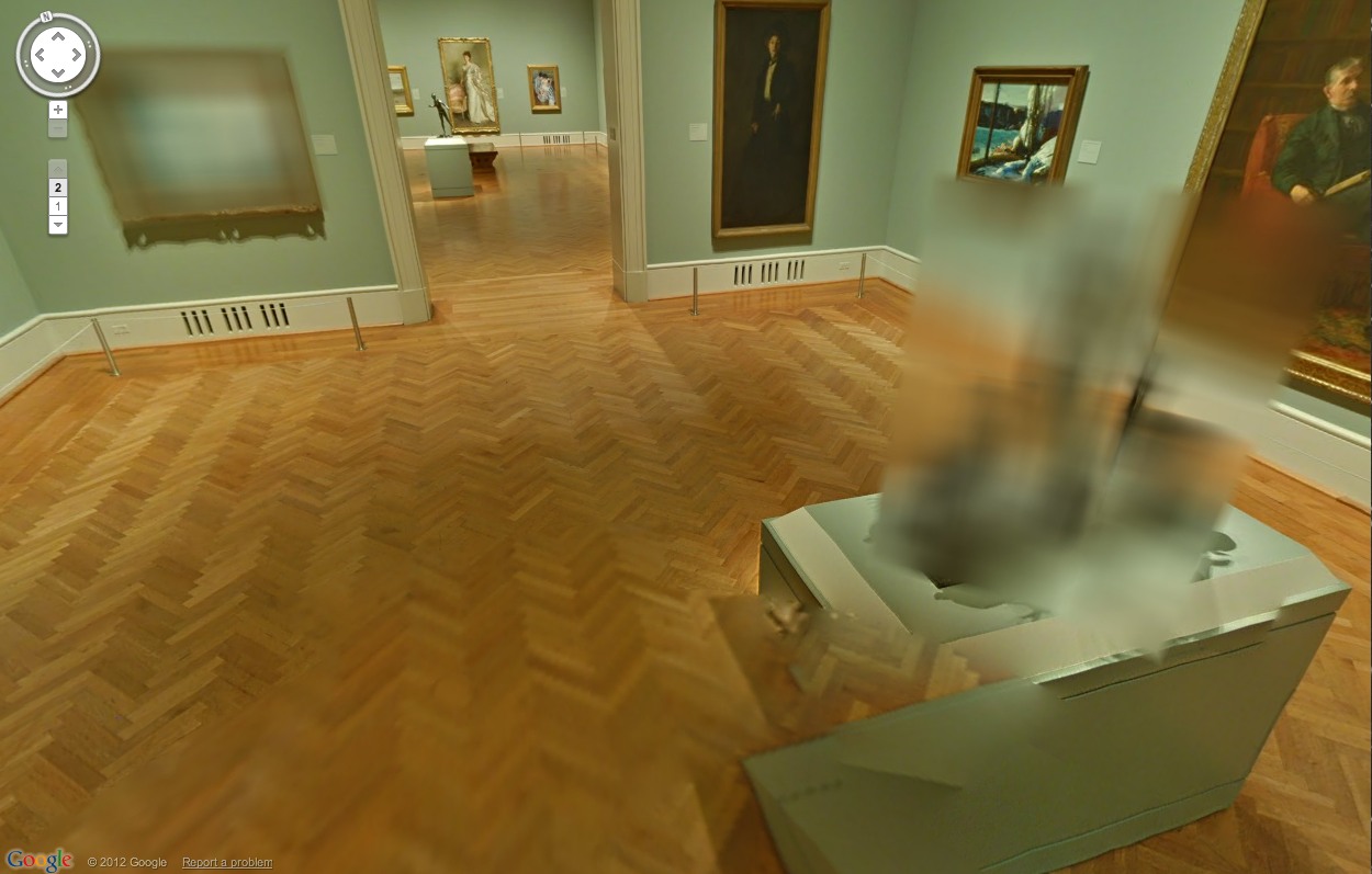
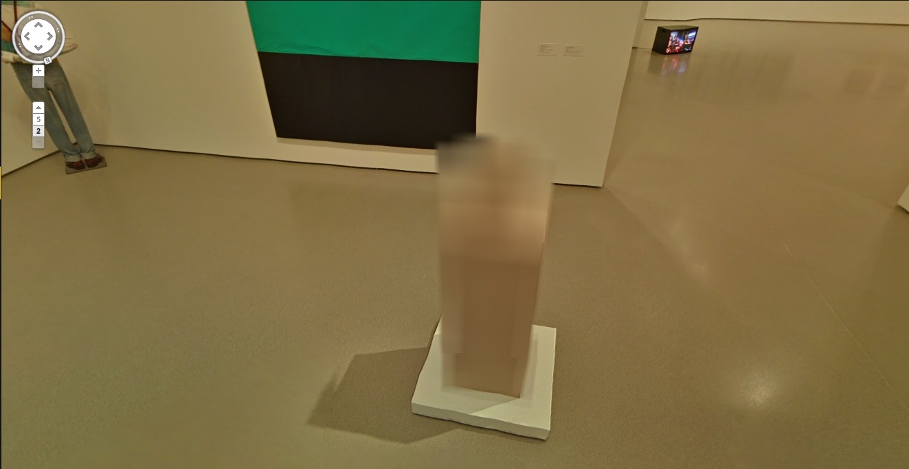
And no offense to Herold, because his underpants dome is quite fetching, but I’d totally get one of those LA acrylic guys to cast me one of these first:
moma_gmap_herold3.jpg
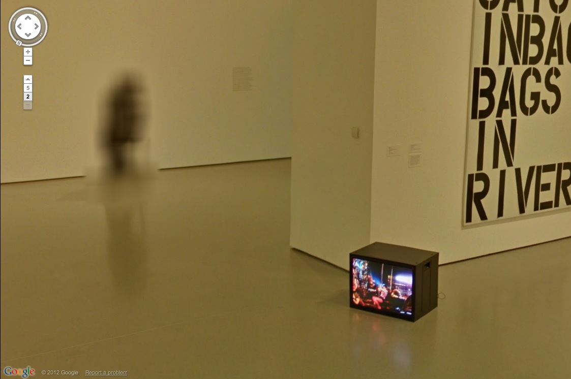
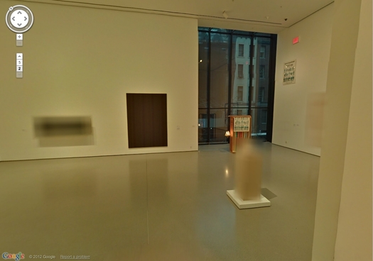
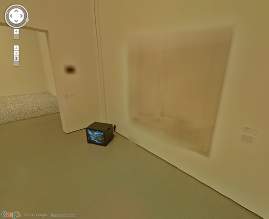
It’s like an ethereal Anne Truitt. Also, don’t you kind of wish that Kippenberger wasn’t turned to the corner, so Museum View could blur its face? Also, it’s interesting that the video monitor on the floor always has the same image in every pano. Was it on pause? Did they ‘shop it in? Does it unsettle you, too, to have the simulation of moving through space without the simulation of moving through time? That is so Street View.
moma_gmap_sculpture.jpg
The Keith Haring mural and the Koons look great. [Which, Pace Prints just opened a show of another Haring mural, a unique silk screened scroll of his Blueprint Portfolio.]
moma_gmap_holzcondo.jpg
Ahh, but we’re here for the blur. Ooh, a very nice double blur from George Condo [right, really?] and Jenny Holzer [left, really? REALLY? Did she maybe insist on the obscuring blur to promote her redacted documents-as-minimalist-paintings show at Skarstedt?]
moma_gmap_holzcondo2.jpg
But take another click forward, and the veil drops again, momentarily, whatever that means on GSV’s frozen timeframe.
moma_gmap_holzer1.jpg
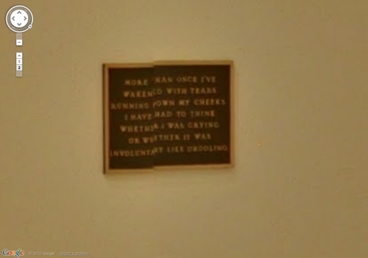
This is awesome, what the algorithm stitching this pano together did to this Holzer bronze plaque. Perfect, really, and such a conveniently discrete, little object. I think I could have that 3D printed before I have it cast.
Such Google Maps-generated anomalies are ususally site-specific by definition. And recreating them is entirely dependent on the alignment of anomaly, real space, and aesthetics. Like the piece I installed in Brian Dupont’s Extra Gallery last fall which translated the [fortunately] misaligned Street View seam running through their window into real space.
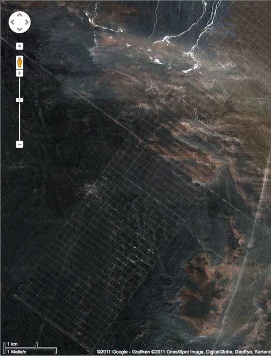
As Google Maps gets more hi-res, these noticeable differences between the real world and its corporate map simulacrum will diminish, if not disappear altogether. So it seems important to map them, or at least to note them, and to be able to read them while we can.
MoMA Museum View [googleartproject]
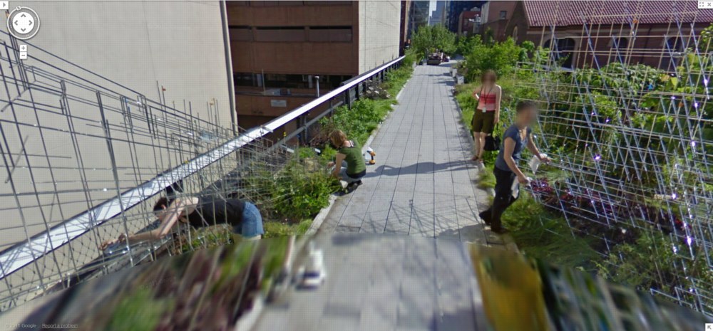
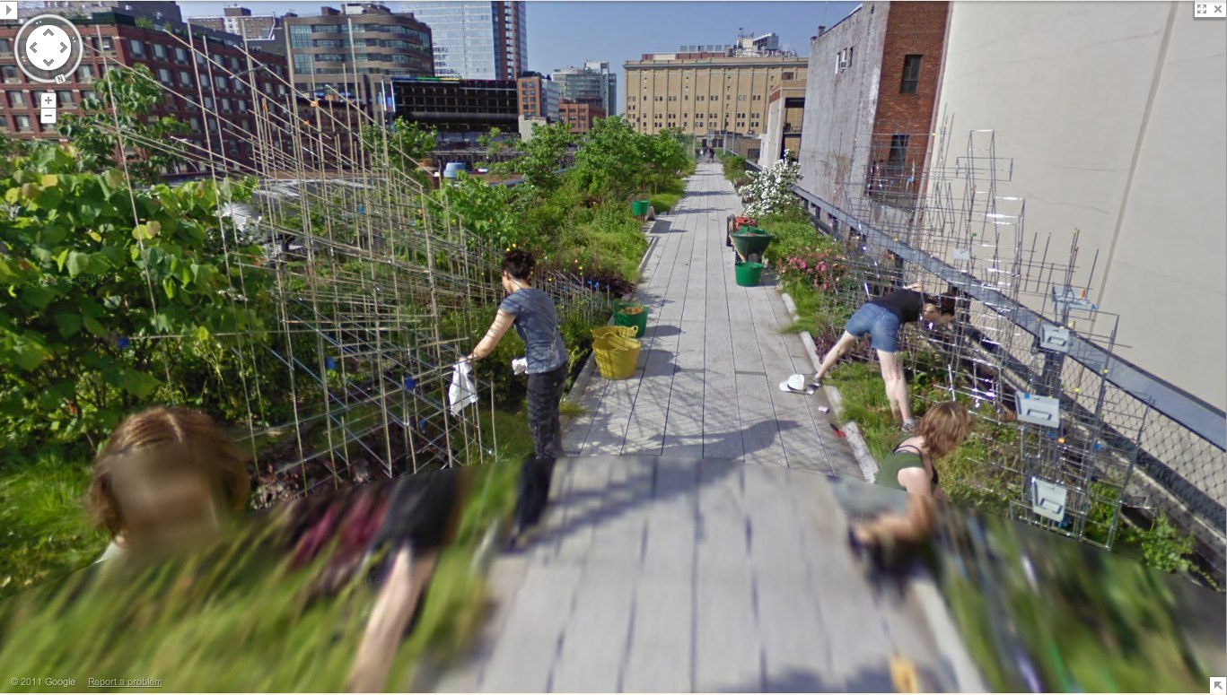
Previously: les Blurmoiselles d’Avignon
Blurmany and the pixellated sublime

Google Street View, Wide-Eyed

andrea_bosio_gsv_domus.jpg
Jon Rafman’s got his 9 Eyes, but maybe what we really need is a 5 Stages of Google Street View, something to account for the process by which people awaken to the aesthetic, social, conceptual, and ultimately, political implications of Google’s worldmapping project.
Urban architecture photographer Andrea Bosio has passed Stage 1: Looking up your own house on GSV, and has managed to turn Stage 2: Visiting famous places–in his case, name brand architecture–into a photo essay for Domus:

I have always used Google’s Satellite and Street View system to view cities and principally to identify the urban drift areas featured in some of my photographic projects. In these cases, I use software as if it were a map made of pictures to find my way through the reality at times of direct experience. This is also the approach I adopted for the photographic project presented here although, on this occasion, the subject of my shots was the representation of the city supplied by Google Street View on my computer screen. I treated this new pixelated reality as a territory up for exploration and managed to compile a true photographic record of it by selecting different points of observation in this virtual space. I photographed the city without ever actually being there.

Which, shooting screens, hmm. Also: “We are able to experience the reality in an objective and non-interpretative portrayal.” Which, hmm.
At least Bosio demonstrates the potential of GSV for creating postcard views.
I’ve never been there, by Andrea Bosio [domusweb.it]

Robot Readable World, Or Human Is A Symptom Of Robot


I think part of my fascination with Google is the way it is reprocessing the way we see the world. It has its own way of looking, and that, it turns out, is what we see.
Timo Arnall‘s Robot Readable World goes wide and deep, documenting the “robot eye aesthetic” through an awesome collection of “found machine-vision footage.”
Robot Readable World, (5’09”) by Timo Arnall [vimeo via city of sound]

On Man-Made Painting After Google

I haven’t yet decided whether to more proactively engage the growing numbers of people who use Google as medium or subject for their artmaking, or to forge ahead alone, buoyed up by the certainty of my own unequaled, Googly aesthetic and conceptual brilliance.
manbartlett_gregorg_det.jpg
detail of Reconciliation (after @gregorg after thompson after allen [maybe])…
CanvasPeople® probably non-archival inkjet print on canvas
11″ x 14″
2012
Signed Edition of 1 (+ infinite unsigned APs), POR

But then Man Bartlett comes up with a sharp, funny project that turns out to relate directly to my lingering anxiety over what I think of, what I make, what I try to get out there, and how well [or not] I do it.
Thumbnail image for blurmoiselles_moma_goog.jpg
study for Untitled (After Google Art Project, les Demoiselled d’Avignon), 2011
So last year–a year ago today, in fact–my immediate reaction to the launch of the Google Art Project was to zoom in on the blurred out paintings that MoMA hadn’t gotten copyright clearance for–including les Demoiselles d’Avignon and several other iconic Picassos–and to suggest they must now be painted as Google had–there’s no other word–overpainted them.
And then last month, I see that an artist named Phil Thompson had sent screengrabs of the blurred paintings to one of those Chinese painting factories, and has now unveiled the work as his Copyrights project. Which is fine, if not at all how it should be done I’d do it.
But which nonetheless made me tweet about the twinges of annoyance caused by my no-doubt outmoded sense of authorship and originality:
gap_gregorg_tweet.jpg
Which prompted Man to take a screenshot of my blog post, pixel-blur everything but the blurred Google Art Project image, and order a print-on-canvas of it. AND a Chinese painting mill cover version. All of which are for sale, and which are hilarious. Though I will let him reveal the Chinese copy in his own good time. It really is awesome.
Reconciliation (after @gregorg after thompson after…) [manbartlett.tumblr.com]
Previously, painfully related, feb 2011: les Blurmoiselles d’Avignon
nov 2010, because it really does come back to Richter, it seems: Blurmany and the pixelated sublime

Dutch Camo Landscape Painting Painting – 2

Another Sunday painting. Or another Sunday spent painting.
noordwijk_camo_20120115.jpg
I did another round of taping off and painting on the Dutch Camo Landscape photo of Noordwijk today. The first time, I did two identical gray polygons This time, I did three, with different greys.
The taping is the most time-consuming aspect of the process, the mixing the most uncertain, and the painting itself the most anti-climactic.
Not really knowing anything about color systems or theory, I’m just eyeballing each match. At the moment, there’s something going on, I think, with the way the polys get grouped; I mix one grey, then change it for the next, and then the next. They end up being sequential in a way, related to each other, composed of the same constituent pigments. Until they’re not; the last poly was turning out to be not just lighter, but pinker, redder, and so I gambled and added a new paint, a single drop of red oxide, which blew the whole thing. It eventually came around, though.
Though I’m clearly counting on it somehow, I don’t know what’ll happen when I try to paint next to an already-painted polygon. I mean, on the one hand, I don’t know how paint will handle the tape. On the other, there’s a ridge there now. So I could just paint up to it. But that’d mean some edges will be taped and crisp, and others will be brushed.
At this point, I guess I’m still seeing if paint actually does what I think it’ll do when I do it.
In unrelated news, that brown poly in the center of the photo looks kind of like Iraq.

Dutch Camo Landscape Painting Painting

dutch_palace_gmap3.jpg
While moving some art around this week, I found a bag of acrylics I bought early last year, when I planned to paint the Dutch camo landscapes. Trying to figure out how to do it led me to start looking more closely at the painting techniques of a whole range of works–from Dutch Golden Age landscapes to Picabia to Hard Edge to Douglas freakin Coupland–and to various paint/photograph combos.
I wanted to match the ploygonal camo colors right, so I’d looked at various digital-to-analogue conversion strategies, to extracting the Pantone colors from each polygon, then sending an autogenerated list off to some paint company, who’d produce each one for me. I was going to have the colors matched by someone. I studied the various color theories, from Goethe forward. My master painter brother-in-law would tell me about the different companies’ different pigments mixing and drying differently. I took notice just last month of how Richter knows and manipulates the drying rates of the various layers of the various paints he squeegees.
I basically ended up trying to get the painting perfect in my head. First.
noordeinde_gmap_shadow.jpg
Anyway, with the collection of paints I’d bought fresh in my head, after I put away the Rijksoverheid paintings, I just decided to paint one of those camo things. So I got one of the smaller prints, of the crazy camo ball over Noordwijk–yep, it’s still there— taped off the two polygons that were an identical gray, and I mixed the paint in a little tray. By looking at it, and seeing when it was done. And it matched. And so I painted those two polygons in a few minutes. And that was it.
dutch_lndscp_20111217.jpg
At the second I was done, I realized I coulda/shoulda taped off some more polys and kept going, some of the other gray-family ones. I can see how the project could proceed like that, working the paints in succession to match a little family of colors. And wow, acrylic dries so fast, I could just keep right on going. Though I still have to see whether I can tape over painted photograph, or if it requires something else. Whatever, the point is, it works, and I did it, and seriously, what the hell was taking me so long to get started?
Whether it turns out to be interesting or good, of course, is another question. Which now I know I’ll be able to find out.
Previously, 09/2009: Houses of Orange

The New Aesthetic On Stage

Here’s video of James Bridle giving a live, keynote speech version of his awesome tumblr, The New Aesthetic, at a web conference in Australia. Lots of good stuff, though not much that will be new to TNA followers.

There are a few greg.org favorites in there, too, including lots of camo, Dutch Google camo, Blurmany, that crazy Google Books book, Google Google Google camo camo camo.
Waving At Machines, at Web Directions South, Sydney AU [booktwo.org]

Chinese Google Earth Art Project

I confess, I haven’t checked out Utah’s Dugway Proving Grounds since the Terraserver era. But I just checked them out again
This crazy, Toyo Ito-ish tangle of 20m-wide white lines in the desert of Gangsu province have been stumping folks on Googlesightseeing for 2+ years. [Scrolling down, they found Google Earth images of the feature under construction in the spring of 2005.]
chinese_desert-earthart_2.jpg
This is my favorite, though, an 18-mile-long grid [!] in Xinjiang. The speculation is that it’s a calibration grid for Chinese spy satellites. I like to think of it as the world’s biggest Agnes Martin painting.
Gizmodo’s been adding more Chinese Google Earth oddities to their original post. I’d still put Dugway into the top 3, or at least the top 5.
[thanks ryan, patrick, dt, and a couple of other people who also consider me their go-to guy for oddball Google earth art links.]

Sarah Sze Street View

Just this morning, while I was watching Sarah Sze’s 2010 lecture at the Smtihsonian American Art Museum, and she was showing videos of her installations for the first time [borrowed, with permission, she said, from various YouTube users, which is nice]. And I found myself thinking, “Hah, try running the Google Street View Trike through that!”
But of course, Google already did.
sarah_sze_street_view1a.jpg
Street View just announced the release of imagery from The High Line, which was apparently captured by the Trike this spring, just before the second, Northern section opened.
sarah_sze_street_view2.jpg
And whaddyaknow, there’s Sarah Sze and her crew, installing her bird city, Still Life with Landscape (Model for a Habitat). That’s Sze and her updo on the left. On the LEFT. Focus, people, focus.
And I do believe that is dearly departed High Line curator Lauren Ross with the lanyard, checking in on things. [Happily, Ross isn’t dead; she just moved to Tulsa.]
These photos are actually in reverse order; the Trike was driving south. I haven’t spotted any traces of a Google Guide yet. But I do notice that with this early morning shoot, the Street View pano stitching algorithm erases the Trike’s shadow. Leave no trace.

Doug Rickard At Pier 24


Via Wayne Bremser comes this nice interview with Doug Rickard, who talks about his Google Street View photo project, A New American Picture. Rickard is in HERE, an exhibit of at Pier 24 Photography in San Francisco. [Bremser’s notes on HERE are here.]
UPDATE Rickard also led Ken Johnson’s NYT review of New Photograpyh 2011, where his GSV photos are called “the most intriguing conceptually” in the vein “revolv[ing] around photography’s relationship to truth.” Johnson’s read of Rickard’s “strangely blurry and bleached, high-angle pictures of decrepit urban and suburban neighborhoods identified with high poverty and crime rates” make you wonder if he actually got the concept:

Resembling stills from surveillance videos, the images speak to the kind of forensic truth that concerns law-enforcement personnel.

Previously: On Bremser’s notes on Street View
on Doug Rickard at MoMA’s New Photography 2011