
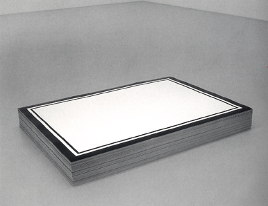
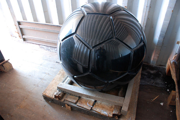
“Untitled” (Republican Years), 1992
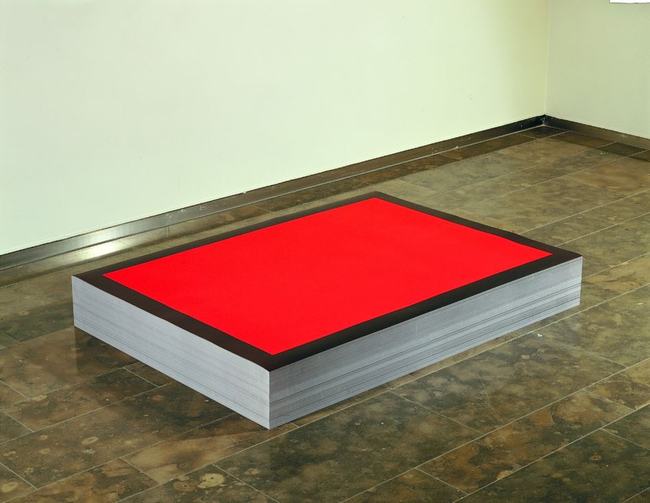
“Untitled” (NRA), 1991, collection: Astrup Fearnley Museet
25 years of this.
Category: memorials
⌘S
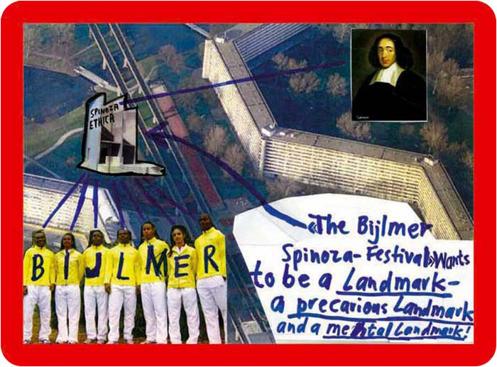
About five years ago I began collecting dead websites. It started in 2010 with Thomas Hirschhorn, after his first website, made for the Bijlmer Spinoza-Festival in Amsterdam, disappeared from the net. The Spinoza project was the third in a series of temporary projects dedicated to philosophers.
Hirschhorn calls these “presence and production” works. Here is a 2009 interview with Ross Birrell:
“Presence” and “Production” are terms I use for specific projects which require my presence and my production. It means to make a physical statement here and now.
I believe that only with presence – my presence – and only with production – my production – can I provoke through my work, an impact on the field.
When the project is over, the programs end, the materials are dispersed, the artist moves on, and a couple of months later, the website where the entire thing had been documented disappears. Then the links go dead, the URL expires, and gets scooped up by some zombie ad network. All that remains are some jpgs illustrating Marcus Steinweg’s Bijlmer lectures.
I’d been to the first at Documenta, the Bataille Monument, in 2002, but not the Spinoza Festival, and so the website was it for me. I’d wanted to read and see more, longer. And then I discovered I couldn’t. It was gone.
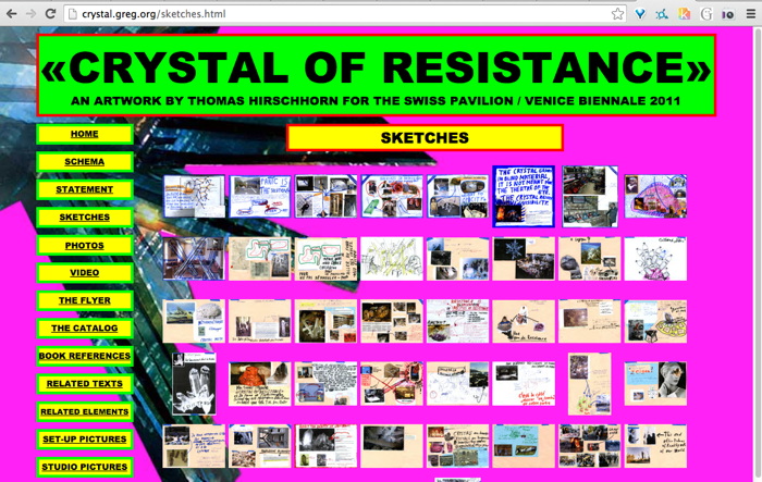
So when Hirschhorn launched his second website the next year, for CRYSTAL OF RESISTANCE, the Swiss Pavilion at the 2011 Venice Biennale, I was ready. Almost. I grabbed the whole site several times, but l missed some galleries. And then it was gone.
The GRAMSCI MONUMENT site in 2013, I definitely got that one. And Hirschhorn’s project at the Palais de Tokyo in 2014, FLAMME ETERNELLE, I got that one too.
When the greatest website in the world got edited into oblivion, I grabbed it from the Internet Archive and made a piece out of it last year: Untitled (Embroidery Trouble Shooting Guide).
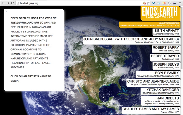
Then a few months ago I heard MOCA had deleted the informative and interactive mini-site for Philipp Kaiser and Miwon Kwon’s Land Art show, so I rebuilt that one. Or I’m in process. I still have to reconnect the Google Earth links. [Google’s deprecated KML API may have led to the page’s demise.]
This is how I started posting them as subdomains, similar to found texts or found web objects. In the case of Hirschhorn, I was very aware since Venice that these were different, and very much not his work: “This website is neither an artwork, nor part of the artwork <>”, it said on the front of the site.
But wasn’t, but now it was, but of a different work. Hirschhorn’s projects required his presence and his production, and my sites had neither. They appeared the same but were the opposite.

They weren’t just for me anymore. At least I didn’t have to think so.
I do edit them, leave my mark, track changes, in the text somewhere, or the source, in ways that are invisible or imperceptible, where I imagine literally no one will ever know or care. At one point, in a more cynical mood, I rewrote the entire Gramsci Monument to be entirely about me. But the more I consider Hirschhorn’s practice, the less sure I am that the gesture works as critique. [Of him, anyway. Of me, OTOH… At least I kept a clean version too.]
For example, here is something I wrote in the source of Ends of the Earth:
Though it is still available on the Internet Archive, this is the kind of thing that should, I feel, exist within an art context. It is too off-the-cuff to imagine these two mirrors as a site and non-site, but that is an apt reference, I won’t throw it out. What ultimately motivates this repetition of the site is a bafflement at why MOCA removed it in the first place. Huge shoutout to Kimberly Drew (@museummammy) for calling this to my attention.
I just feel like I have to grab these things, even the ones that get scraped into the Internet Archive. It’s an urge that I can’t dismiss, even when I can recognize the futility of it. I have to save them.
In Defense Of The Center For Political Beauty
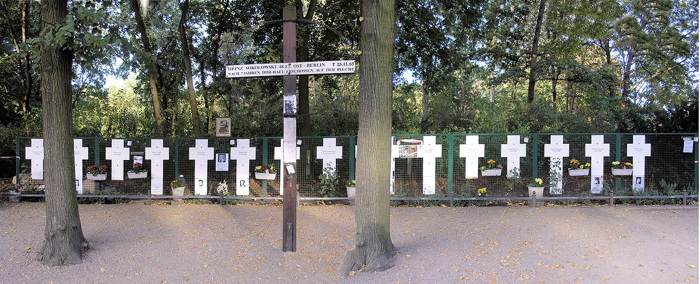
In bizarre news, an artist collective stole part of the Berlin Wall memorial and repositioned it along the EU border https://news.artnet.com/art-world/collective-steals-berlin-wall-memorial-ahead-of-anniversary-154457
— artnet (@artnet) November 5, 2014
It’s just one word in one tweet, so it really shouldn’t become the point, but those who follow me on Twitter know I have a thing for the language of art news sites, and their poetic idiocies of the market. This, however, just pissed me off.
Clarification! @Sothebys staked its own money in the Giacometti but says different bidder won it. Repped by David Norman, not Ben Dollar.
— Kelly Crow (@KellyCrowWSJ) November 5, 2014
It is as pure a sign as you’ll find of the pathology of current money-fixated art world that last night a half dozen media outlets filed hundreds of bid-by-bid tweets from an Impressionism auction, yet the “bizarre news” is that artists are literally trying to save lives by drawing attention to one of Europe’s existential political crises.
I had never heard of the Center for Political Beauty before this morning. They are the artist collective whose mission is to engage “in the most innovative forms of political art: a type of art that hurts, provokes and rises in revolt in order to save human lives.”
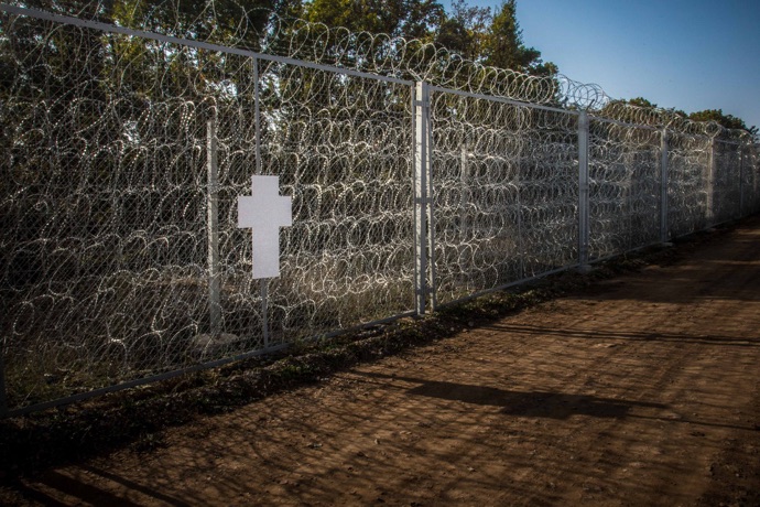
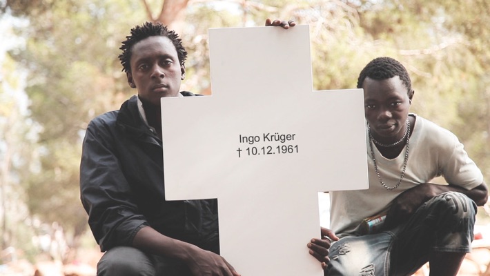
They removed crosses commemorating some of the East Germans killed while trying to cross the Berlin Wall, and have reinstalled them on what they’re calling the European Wall. The Center for Political Beauty has announced that they will cut down portions of the EU’s border fence on November 9th, during the official ceremonies surrounding the 25th anniversary of the fall of the Berlin Wall.
politicalbeauty.de: Keine Benutzung der Bilder ohne vorherige Genehmigung!
The photo above of a cross on a fence along the Bulgaria-Turkey border is circulating with the AFP wire service story that is the lone, primary source of English-language coverage of CPB’s project. I’ll never look at a Cy Twombly chalkboard painting the same way again.
The images and details that don’t circulate, though, are more damning: At least 136 people died or were killed trying to escape across the Berlin Wall between 1961 and 1989. The UNHCR says over 2,500 Africans trying to reach Europe have drowned or gone missing this year alone. The CPB says the number of people who have died trying to enter the EU since 1989 stands at over 30,000.

Here is a photo by Massimo Sestini of a boatful of African and Syrian asylum seekers who were intercepted by the Italian navy last June. This situation is anything else–an outrage, a humanitarian crisis, a “rendering void of the legacy of the Holocaust,” as the CPB puts it, but it is not bizarre.
And artnet should be shamed for their tendentious attempts to mock and marginalize artists pursuing something beyond the callow complacencies of the market.
UPDATE: I’m still not satisfied with this yet, or how or why it bothers me, but I’m reading Thierry du Duve’s “Art in the Face of Radical Evil” [October, Summer 2008, pdf], about MoMA acquiring and showing photos of Khmer Rouge execution victims from Tuol Sleng, and about whether they’re “art,” and what are the implications if they are:
Sobriety in exhibition design, noncommittal wall texts, and clever avoidance of the word “art” in press releases won’t succeed in hiding the fact that our aesthetic interest in photography is shot through with feelings, emotions, and projections of sympathy or antipathy that address the people in the photos beyond the photos themselves. I am convinced that something of that emotional response to the properly human ordeal of the subjects in the Tuol Sleng photos had a say in MoMA’s decision to acquire them. To suppose otherwise would be to lend the acquisition committee undeserved cynicism.
This feels like it’s inching closer.
One Does Not Simply Walk Into Portbou
Now that I’ve read up on it, and on the philosopher’s harrowing last days, I think I experienced the Walter Benjamin Memorial in Portbou, Spain the only way it really should be experienced: by total accident. Which is almost impossible.
We’d been visiting family in Provence, and one of the kids, the one who has been taking Spanish, not French, was wanting to go somewhere they spoke her language for a change. Plus, they wanted to go to the beach. Relenting, I pulled up the last town I knew in France, Banyuls, and looked to see what, if anything, was across the border.
The answer was Portbou. Google Maps said it was 3.5 hours away; we figured we’d drive to Spain for lunch and a couple of hours on the beach, send a postcard, and head home for dinner. Extraordinary traffic which had the autoroute backed up for several kilometers before the border, and the caravan of caravans winding along the 1.5 lane coastal mountain road, easily doubled our drivetime, and we arrived in Portbou starving and almost late for lunch.
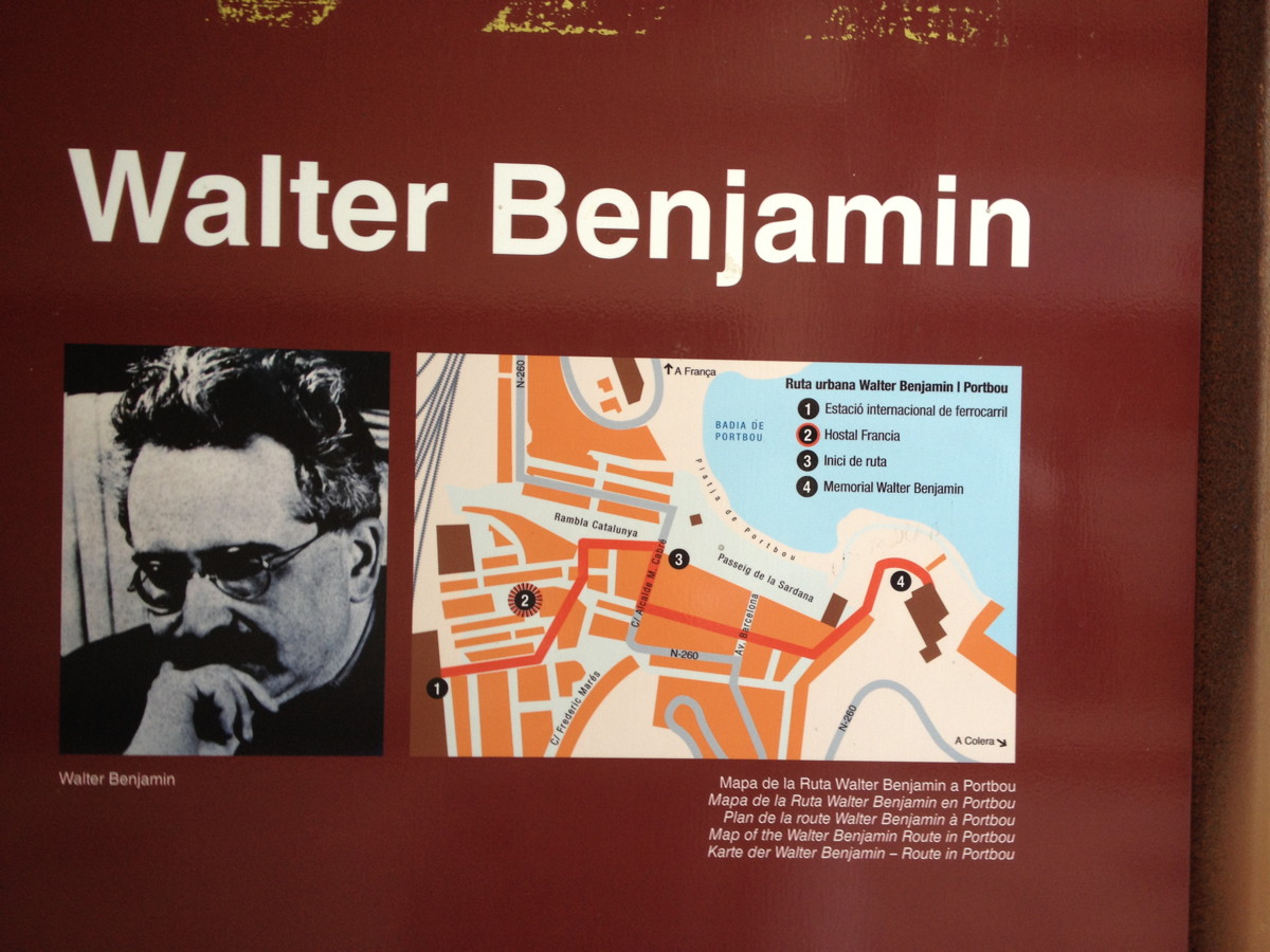
We quickly parked in a massive tunnel-turned-one-way parking lot, and wandered back through town to find any open cafe. And that’s when I spotted the Walter Benjamin information panel. It turned out to be No. 2 on the town’s four-stop Ruta Walter Benjamin, the Hotel de Francia, where Benjamin and his fellow refugees stayed after sneaking across the Spanish border in September 1940. And where he, where, well, as the panel puts it, “What happened over the next few hours is a striking illustration of all of the tragedy of barbarism.”
This town has erected a plaque in front of the hotel where Benjamin killed himself.
A Vested Interest
Josh Marshall solicited “What’s Your 9/11” thoughts from the readers of Talking Points Memo. I’ve avoided reading them, and most such other efforts this week. But the title he gave to reader DE’s submission really encapsulated my own ambivalence about what the Memorial Industrial Complex has metastasized into, and why I’m reluctant to turn myself over to it:
So my personal unease with 9/11 memorials is the feeling that there are a lot of people in this country with a vested interest in the country not moving on, even though the two main perpetrators of the attack are either dead or in US custody and the organization they led has been soundly defeated. They want our leaders to keep delivering the Gettysburg Address every year, to keep us on that war footing, so that they can misdirect our resources and some Americans’ lives in the service of foreign and domestic policy goals that have nothing to do with what happened on 9/11.
This manipulation of memorialization by keeping the wounds open was quickly apparent to some, of course. For all the good that did.
“A Vested Interest in the Country Not Moving On.” [tpm]
Louis Kahn’s Monument To The Six Million Jewish Martyrs
I recently came across this photo of Louis Kahn’s “Monument To The Six Million Jewish Martyrs,” which, I had no idea. And it was to be built in New York City, Battery Park, to be exact, and was perhaps the last best chance for an apparently serially disastrous effort to build a Holocaust memorial in the city. Ultimately, of course, the city did get the Jewish Memorial Museum in the 1990s, in Battery Park.
There is no doubt a story to tell about the tumultuous history of that process. And I’m sure someone has already written a decisive history of how people attempted to grapple with the Shoah and Holocaust as history, and how and when those concepts took hold. Because they’re absent from the contemporary discussion of this memorial. But what really sticks with me is the story and particulars of Kahn’s memorial design, and how resonant it seems with memorials followed it.
Kahn was recommended by an Art Advisory Committee [via Philip Johnson] that had been brought in in 1966 to help the Committee to Commemorate the Six Million Jewish Martyrs solve their seemingly impossible charge: creating a suitable memorial to genocide. The NY Times’ architecture critic Ada Louise Huxtable complained that the previous designs were full of “wrenching angst” in which “the agony and the art were almost too much to bear.”
After the City Art Commission approved it, Kahn’s 6-foot model was put on impromptu display in the lobby of the Museum of Modern Art for month, from Oct-Nov. 1968. Which is when Huxtable praised as architecture and sculpture “of the highest order”:
In an age that has made a flat mockery of conventional memorial values and platitudes, Mr. Kahn’s solution is a cool, abstract, poetic, powerful and absolute statement of the unspeakable tragedy. It could rank with the great works of commemorative art in which man has attempted to capture spirit, in symbol. for the ages.
And in case you needed any more reminder that memorials are as much an expression of the time they’re created, not just the history they mark, here’s Huxtable’s final judgment:
The generation that lived through the time and events the monument proposes to commemorate will never forget them. We have that memorial seared in our souls.
The generations that are innocent of this kind of totalitarianism and ultimate tragedy will find no monument meaningful. That is one of the anachronisms of art and history in an age of violence.
This memorial could work, as art and as history, and as a lasting expression of the human spirit. In a nihilistic, value-destroying society, that is no mean artistic accomplishment.
Yow, no Summer of Love here.
Kahn’s Monument was to consist of seven 10×10 squares, 11 feet high, made entirely of elongated, cast glass brick, and arranged 2-3-2 on a 66-ft square grey granite plinth. [His original design, presented to the Committee in 1967, called for nine 12x12x15 squares in a grid. I think the switch to 6+1 was a way to Judaize and particularlize the memorial’s content.] The translucent bricks meant that the blocks would change with light, weather, and the presence and movement of people around the site. Only the center cube would be inscribed and accessible; as Kahn put it, “The one, the chapel, speaks; the other six are silent.”
I think Kahn’s 1967 proposal is at least one of the earliest, if not the first, deployments of Minimalism in a memorial context. Or maybe Post-Minimalism is more accurate, since Kahn’s evocative forms and their deliberate emotional and experiential evocations were anathema to the objective Gestaltism of orthodox Minimalism as it was being argued out at the time.
If the history of using a Minimalist formal vocabulary for intractable memorials typically began with Maya Lin’s Vietnam Memorial, then Kahn’s Monument pushes it back 15 years–to the conflict-torn heart of the Vietnam era. And though it wasn’t realized as he envisioned, Kahn’s proposal was influential. It’s the best explanation I can see for for the use of glass block in New York State’s disappointing Vietnam Veterans Memorial on Water Street in lower Manhattan. [That memorial’s plaza siting was probably also influenced by Huxtable’s unequivocal condemnation of the Battery Park site for Kahn’s memorial, an insurmountable criticism which probably doomed the design she praised so highly.] More directly, though, Kahn seems like a direct progenitor for the two most prominent Holocaust memorials built in Europe to date.
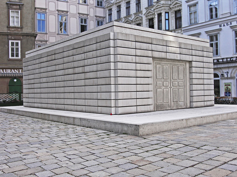
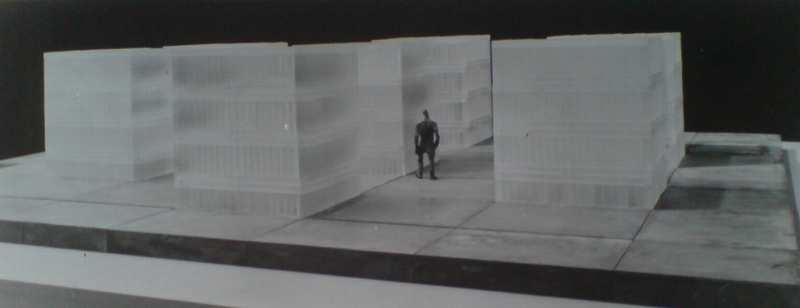
Kahn’s formal references to the silenced, the room-scale, and the bookshelf-like bands of glass brick are all echoed in Rachel Whiteread’s Judenplatz Holocaust Memorial, where a ghostly library of books the city’s murdered Jews will never write stands on a plinth in a public square in Vienna. Whiteread’s memorial has obvious precedents in her own sculptural practice, and I’ve never seen her mention Kahn as an inspiration, so it’s entirely possible that these resonances are natural and widely held, and which the artist and architect arrived at separately.
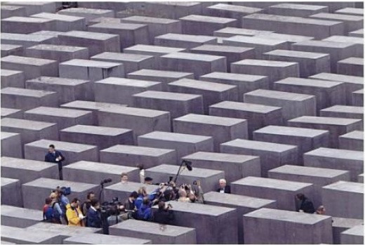
Amazing shot of Peter Eisenman at the 2004 opening of his Berlin Memorial from Mark Godfrey’s book, Abstraction and The Holocaust
I can’t believe that’s what went down, however, with Peter Eisenman and Richard Serra. From its central formal device–passages between impenetrable, figure-dwarfing blocks–to its title, Memorial to the Six MIllion Murdered Jews of Europe, Eisenman and Serra [who subsquently removed his name from the project] had to have been very familiar with Kahn’s proposal, and with the politically fraught development process that spawned it.
Oh, look, Mark Godfrey’s 2007 book Abstraction and the Holocaust has an entire chapter on Kahn’s Monument. [amazon, google books]
Anthony Vidler wrote about Kahn’s memorials [cooper.edu]
The Louis Kahn Collection at UPenn has drawings and a different model of the memorial. [upenn.edu]
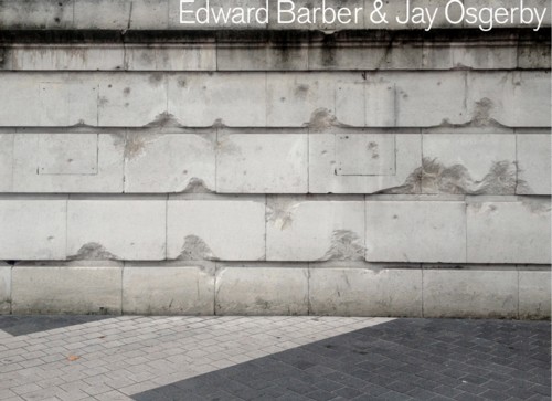
Shrapnel Bench By BarberOsgerby
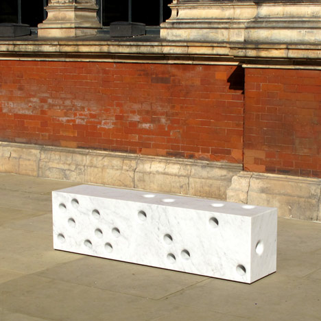
Speaking of violence and sculptural street furniture, the design team of Edward Barber and Jay Osgerby and Tor Studios made one of a series of commissioned benches for the Victoria & Albert Museum during the London Design Festival. It is an elegantly pockmarked block of Carrara marble.
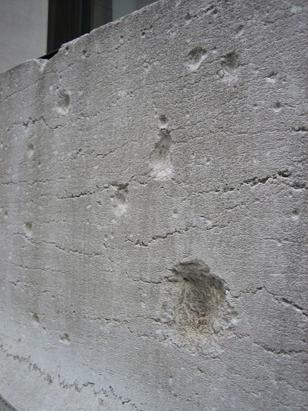
They were inspired by shrapnel marks left in the V&A museum’s western facade after the Second World War. “It’s something that always fascinated me and Ed on the way from South Kensington tube up to the Royal College when we were students, and so when this project came up we thought it was a nice way to reference that,” explained Jay Osgerby at the opening.
Indeed, the splash page for the duo’s website is currently an image of the shrapnel marks.
Which, of course, immediately brings to mind the facade of JP Morgan’s former headquarters, 23 Wall Street. The building was damaged by an explosion on Sept. 16, 1920, that was believed to be carried out by Italian anarchists. A donkey cart laden with 100 lbs of dynamite and 500 pounds of cast-iron window sash counterweights exploded at 12:01, killing 38 and injuring more than 143 people on the street and in the building.
Morgan refused to repair the shrapnel marks, which are still visible on the pink marble Wall St. facade to this day. The building, long vacant, is currently being marketed as a retail site, perhaps for a department or Apple store.
Bench Years by Established & Sons at the V&A museum [dezeen]
Running Presidential Fence
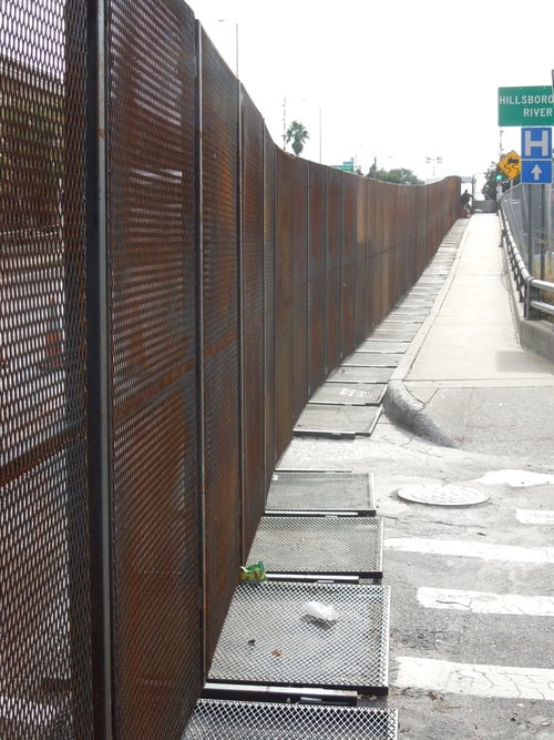
I’m really trying to get this writing thing done tonight, but I just have to point out that Richard Smith’s photo of the Secret Service’s six-mile perimeter fence at the RNC in Tampa is awesome. It’s like if Christo and Serra were cellmates and Cady Noland was their baton-wielding guard.
Fence Comes Down [narrativemag]
UPDATE:
Speaking of Running Fence, there are two historical markers in Marin County commemorating Christo & Jeanne-Claude’s 1976 project.
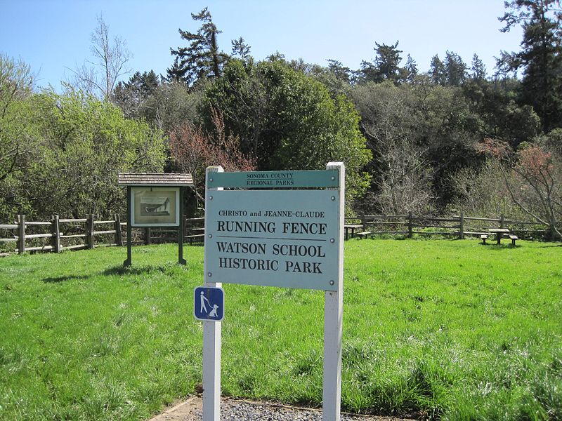
see full size images at the Wikipedia entry for Running Fence. Please.
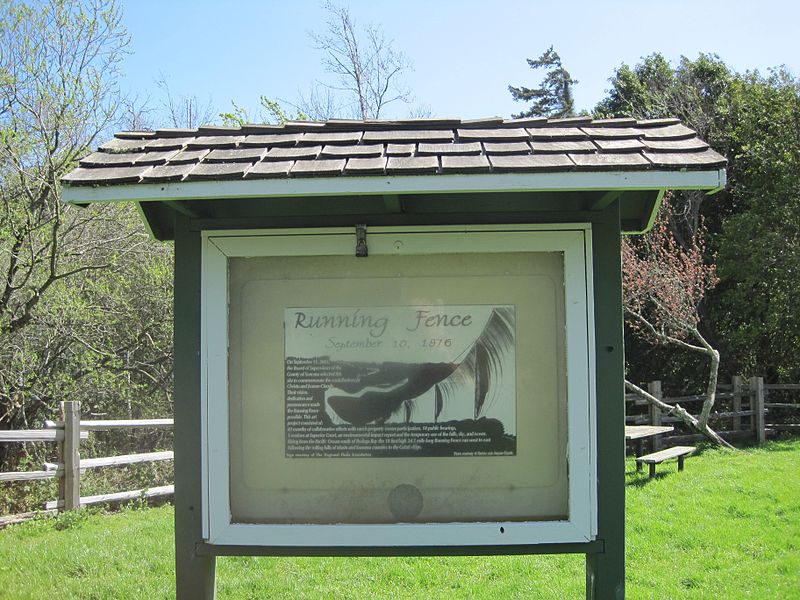
This anniversary marker is located in the quarter-acre Watson School Historic Park in Bodega. An outdoor vitrine contains an installation photo by the artists onto which was added the following text:
Running Fence
September 10, 1976
On September 11, 2001,
the Board of Supervisors of the
County of Sonoma selected this
site to commemorate the contributions of
Christo and Jeanne-Claude.
Their vision,
dedication and
perserverance made
the Running Fence
possible. This art
project consisted of:
42 months of collaborative efforts with ranch property owner participation, 18 public hearings,
3 sessions at Superior Court, an environmental impact report and the temporary use of the hills, sky, and ocean.
Rising from the Pacific Ocean south of Bodega Bay the 19 foot high 24.5 moile long Running Fence ran west to east,
following the rolling hills of Marin and Sonoma counties to the Colati ridge. [Format and italics original.]
Watson School Park is currently listed as closed for renovation. It is not known whether the marker is affected.
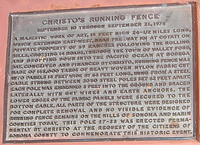
Meanwhile, in December 1976, the County Landmarks Commission in Sonoma designated Pole #7-33 as Historic Landmark #24, and installed a bronze plaque [above] that reads:
CHRISTO’S RUNNING FENCE
September 10 through September 21, 1976
A majestic work of art, 18 feet high 24-1/2 miles long, which extended east-west, near Freeway 101 at Cotati on private property of 59 ranches following the rolling hills, crossing 14 roads, through the town of Valley Ford, and dropping down into the Pacific Ocean at Bodega Bay. Conceived and financed by Christo, Running Fence was made of 165,000 yards of heavy woven nylon fabric cut into panels 18 feet wide by 68 feet long, hung from a steel cable strung between 2050 steel poles set 62 feet apart. Each pole was embedded 3 feet into the ground and braced laterally with guy wires and earth anchors. The lower edges of the fabric panels were secured to the bottom cable. All parts of the structure were designed for complete removal and novisible evidence of Running Fence remains on the hills of Sonoma and Marin Counties today. This pole #7-33 was erected permanently by Christo at the request of the citizens of Sonoma County to commemorate this historic event.
The County’s landmark information lists the site as “containing steel pool [sic] from original art installation.”
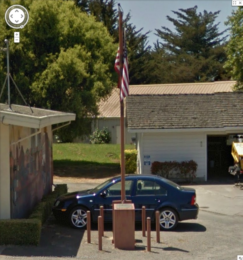
I believe this is it, next to the post office. Looks like it’s presently being used as a flagpole.
Oh, the Bodega bay Heritage Gallery has a photo of the fancier plaque on the other side of the pole. Also, Running Fence was acquired by the Smithsonian American Art Museum. Remembering Running Fence was on view in 2010.
If moving it away from that mural didn’t destroy its context, I would definitely replicate that, as is, stanchions, flag and all. Maybe a vinyl wallpaper photomural would work.
Forever Moore
The other day I had to laugh while watching one of the Thomas Houseago interviews Andrew Russeth posted to Gallerist NY, and the artist was talking about sculpture and time and the universe, and then he taps on his own work and goes, “in this case, bronze, which will definitely live longer than me, right? I mean, I’m gonna die much faster than that. So you have this uncanny feeling…”
Riiight. I guess Houseago hasn’t had this Guardian article open in his browser tab for the last two weeks then?
“Stolen memorials: melted down means lost for ever”
Though Sarah Bakewell’s hook is a recent uptick in the theft for scrap of bronze memorial plaques, and the loss of community and cultural memory that entails, the article is illustrated by Henry Moore’s Reclining Figure, 1969-70, (LH 608):
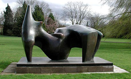
“This huge bronze Henry Moore sculpture, worth £3m, was stolen in 2005, chopped up and sold as scrap. Photograph: Hertfordshire Constabulary/PA”
In 2005 thieves chopped up a two-tonne sculpture by Henry Moore, managing to reduce its value from £3m to about £1,500 in scrap bronze. Yet it would seem odd to say that £2,998,500 somehow fell out of the metal and vaporised when the axes cut into it. A small part of its value does survive in images and memories of the lost work. Conversely, the attack damaged something not precisely located in the work itself: our confidence in the safety of large public sculptures.
Odd indeed. And it made me wonder what had, in fact, been lost, when this sculpture we expected to exist for thousands of years, was carted off in the night on a stolen flatbed truck.
And whose fate was unknown for several years until its hacked remains were tracked to a scrap exporter in Rotterdam.
And yet whose date and title–Reclining Figure, 1969-70, LH608–the Guardian never saw fit to mention.Though accounts do report that the Henry Moore Foundation, from which it was stolen, acquired it in 1987, which, let’s come back to that.
The 3.5m-long piece had only been installed the year before (in 2004) at the Foundation’s Perry Green sculpture garden. It had been brought ‘home’ from an extended loan to the Snape Maltings concert hall in Suffolk.
In 1977, when he was nearing 80, Moore created a foundation to manage his body of work and legacy and to preserve his property in Hertfordshire. He passed away in 1986 at the age of 88, but he had taken ill and by the mid-80s, he had all but stopped working.
And yet activity at his company only intensified, with what the Foundation’s collection catalogue calls a “sudden late rush” to cast and sell everything possible while the artist was still alive:
The amount of casting during Moore’s final years was considerable, and not just of new work, since the Trustee [of the new Foundation] had become aware that many artist’s copies of sculpture made before 1977 remained uncast.
Reclining Figure LH608 was one of nine late 1986 castings of artist copies of large, pre-1977 works to move into the Foundation’s Collection.
And it’s an edition.
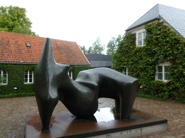
Reclining Figure LH608 in the entrance courtyard of the Louisiana Museum, image via, jaime silva’s flickr
There are other examples of LH608 in at least three public collections: at the Hakone Open-Air Museum in Japan; and at the entrances to the Louisiana Museum in Denmark [above], and the Tel Aviv Museum. And presumably, there’s a maquette somewhere, and who knows if there are other examples in whatever other sizes, in private hands. So we’ve got plenty beyond just “images and memories” to rely on
Which, I confess, though it makes it logistically easier, kind of takes the urgency out of my blindingly obvious idea: to recreate the lost Henry Moore sculpture. Which has only not been recast already because of the evolved, arbitrary constraints of the [non-Rodin] sculpture industry, which views posthumous casts differently from casts made 25 years late, while the artist was on his deathbed.
Anyway, we have the technology to bring Reclining Figure LH608 back, to rebuild her. A 3-D computer model capable of driving a CNC milling machine or a 3-D printer can readily be derived from snapshots of the sculpture. All that’s missing right now is a shot of the backside, and we can help the world’s culture recover from its hypothetically tragic £2,998,500 loss.
So, please, visitors to Denmark, Israel or Japan, send photos, so that Zombie Henry Moore Figure can recline once again.
The Grid-Sphere Satellite And The Doomsday Stone
Last year I picked up this extraordinary photograph, and then didn’t have immediate results researching it, so I put it away until now. Then, wow.
NASA launched the first Project Echo communications satelloon in 1960 to much fanfare, but the 100-foot diameter inflated Mylar sphere’s actual performance as a reflective signal relay fell short of predictions. Echo IA launched in 1960 and stayed aloft and visible from earth until 1966, but it partially deflated within a few weeks, which weakened its reflectivity. And the drag of such a large object decayed its orbital speed in ways that made it an unreliable relay.
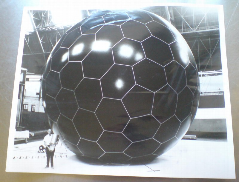
Soon after Echo II’s launch in 1964 by NASA and Bell Labs, the US Air Force began pursuing a next-generation technology with one of its leading military contractors, Goodyear Aerospace: the grid sphere.
The grid sphere satellite was designed, near as I can tell, by Goodyear Aerospace engineer Howard Barrett. The 30-food diameter sphere of rigidized, laminated aluminum wire was embedded in a UV-sensitive plastic, which would photolyze, or disintegrate, after inflating in space, leaving the open grid sphere intact. The sphere was calculated to produce a backscatter reflection signal more than 5x as powerful as the Mylar solid sphere three times its diameter, and would be immune to its puncture, deflation, and solar radiation drag effects.
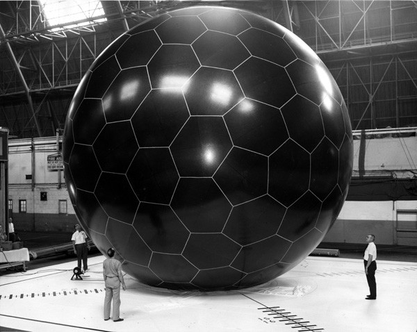
image via National Museum of the US Air Force
I’ve found mention of both 2-foot and 14-foot diameter grid sphere models, and another image of this 30-foot test inflation. Good gravy, did they really just inflate it using that tiny, leaf blower thing? I think it goes without saying, but I’ll say it anyway, that when it launched in 1966 from Vandenburg AFB on an Atlas rocket, the grid sphere satellite became the second-most beautiful object ever put into space. Between July 13, 1966 and May 24, 1968, when Echo IA burned up in the atmosphere, there were two satelloons and this open grid sphere, all orbiting the earth together, in Minimalism’s awesomest group show.
Which would be cool enough on its own. And then Andy Beach sends me this.
It’s Nicholas Mangan’s 2008 photo of Ed Grothus’s Doomsday Stone. Grothus was the atomic technician-turned-anti-nuclear peace activist-and-retail-icon who ran The Black Hole, the legendary military/scientific surplus store in Los Alamos, New Mexico. Grothus died in 2009 without being able to realize his decades-in-the-making Doomsday Stones memorial, a set of massive black granite obelisks carved with warnings in 15 languages about the destructive power of nuclear weapons.
The obelisks I’d heard about, but not this insanely awesome 1-meter, 1.5-ton, black granite sphere, which rests alongside them in a shipping container in Grothus’s backyard. Mangan:
In late 2007 Ed went to the Art in Public Places board in Los Alamos to offer them his monuments for public display. They rejected them stating that ‘they couldn’t think of anywhere in Los Alamos where they would fit in’. They backed up their rejection by claiming that Ed was not an ‘Artist’ according to their set of definitions and requirements.
There is something about a prophet in his own country here. Grothus’s Doomsday Stones are art in every sense of the word, and his work is an artistic practice of the highest kind, and should be recognized as such.
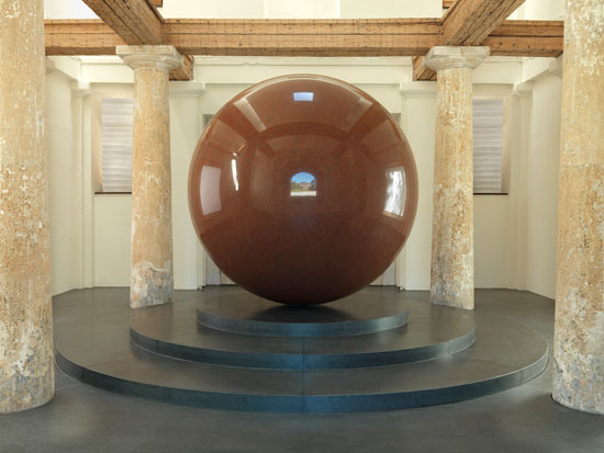
Large Red Sphere, Walter de Maria, 2010, permanent installation at Kunstareal, Munich, image: e-flux
The self-proclaimed art world ignores Grothus at the peril of its own credibility and relevance. If it’s just a matter of the research not being done, let’s get on it. If we need to inflate the critical balloon to give Grothus’s reputation the structure it is obviously meant to have, let’s start blowing. From his quixotic minimalist megalomania in the desert [Heizer, Turrell, De Maria] to his performative taunts in high Catholic regalia [Klein], to his fantastical historical dumpsterdiving [Dion], Grothus is Los Alamos’ own Simon Rodia. It’s just a question of how long it’ll take everyone to realize it.
Great Minds Think Alike, But Only Some Of Us Write For The New Yorker
I’m a bit embarrassed to admit I didn’t read it earlier, and I have to read it now, obviously, now that it’s finally been published in the US. But I wonder if my first short film may be an inadvertent adaptation of Geoff Dyer’s 1994 essay on World War I and the Memorial to the Missing of the Somme at Thiepval, France.
The Millions has a nice interview with him about it:
TM: You write in the book, “The issue, in short, is not simply the way the war generates memory, but the way memory has determined – and continues to determine – the meaning of the war.” Can you describe the meaning of the war?
GD: Always in the book I’m just trying to articulate impressions of it. It’s certainly not a history book. I always have faith in this idea that if I remain honest and open about my own confusion, the blurriness of my impressions – it’s not because I’m short-witted or stupid – the chances are those feelings will be shared by other people. And I just had this very distinct sense of the First World War as being something rather buried in its own memory. There’s so much discussion, as the war is going on, about how it will be remembered, or if it will be forgotten. So right from the start it just seems preoccupied with how it will be remembered. The other crucial thing is that distinction I make with the Robert Capa pictures of D-Day, where it all seems to hang in the balance and there’s a great sense of immediacy. With the First World War there’s no immediacy to it. It comes buried in so many layers of myth and memory.
Hmm, actually, maybe not. Or maybe the opposite. In 2001-2, I was looking at what a place of horrible destruction was like when there was no one left who did remember it. The difference between remembering and knowing, perhaps. Or the past and the experience of the present.
Also, Spiral Jetty first re-emerged in 1994, not 1999. I’d have thought the New Yorker would’ve caught that.
The Millions Interview | Geoff Dyer on the London Riots, the Great War, and the Gray Lady [themillions.com]
The Missing of the Somme (Vintage) [amazon]
Rauschenberg Currents Event
Robert Rauschenberg’s massive 1970 silk screen edition, Currents sure is hard to miss. And not just because it’s 18 meters long.
MoMA’s copy from the edition [of just six] has been wrapped around the corner of the second floor galleries for a while now. Which may have helped coax Peter Freeman into bringing out another of the screenprints last week for Art Basel.
But it’s also at the end of the Rauschenberg’s segment in Emile de Antonio’s documentary, Painters Painting [above], which I rewatched recently. Bob unfurls it with a slightly soused, earnestly glib voiceover about how, even though there’s so much information packed into a daily newspaper, most people don’t read it. But if someone spends $15,000 on the info, the artist can get him to pay attention. Or at least not wrap the fish in it and throw it out.
Which is ironic, I guess, because I’ve found that the size and visual uniformity has caused me to stroll by Currents without ever even slowing down. I register it as reworked newspaper content, on a giant roll, just like the real newspaper itself–but I don’t slow down to look closely. I mean, really, at that scale, how much of my time does Rauschenberg really think he’s gonna get?
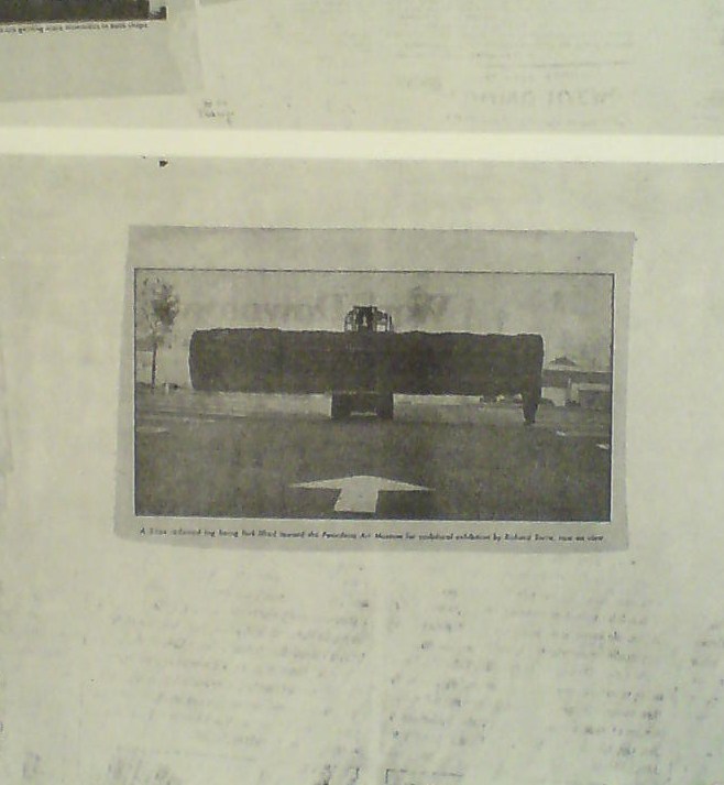
So maybe it was because I’d just run into Richard Serra moments before in the atrium, or because I came at the work head-on this time, instead of from the side. But I’d never noticed, for example, that there is a news photo of a frontloader bringing a massive fir tree trunk to the Pasadena Art Museum for Serra’s 1970 work, Sawing: Base Plate Template (Twelve Fir Trees)
Above it and to the right, I’d swear that row of tract houses is a Dan Graham photo.
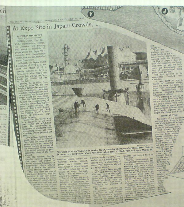
And hey, there’s a story about construction progress on Expo 70 in Osaka, where E.A.T., the collaborative Rauschenberg founded with Billy Kluver, was creating the Pepsi Pavilion, and where Rauschenberg was still thinking he’d show his own work, a plexiglass cubeful of bubbling drillers’ mud called Mud-Muse, which he’d developed with Teledyne for LACMA’s Art & Technology show and the US Pavilion.
If I can spot these now-obvious contemporary art references in Currents, what else must be lurking in there? Was incorporating other artists’ images Rauschenberg’s way of tipping his hat to artists and work he liked, or was he assimilating and subsuming it in his own, sprawling scroll? Was he engaging in a dialogue with the Conceptual and post-minimalist kids coming up or putting them in their place? Or trying to put himself in theirs?
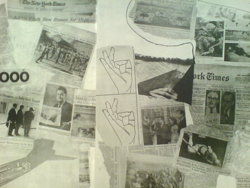
The most intriguing references now, though, turn out to be a little trickier. There are multiple instances of diagrams showing hands throwing the OK sign which remind me of nothing so much as the sign language woodblocks used in the prints at Jasper Johns’ latest show at Marks.
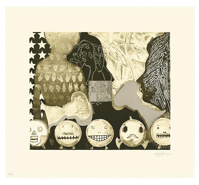
Shrinky Dink 4, 2011, intaglio print, image via
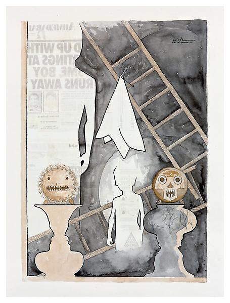
I remember thinking immediately of Rauschenberg when I saw the mirrored newspaper transfer appearing in the upper left of this Johns drawing, Untitled, 2010.
Rauschenberg began using the technique in the mid-60s, and it’s all over Currents. Remind me again how long MoMA’s had their print on view?
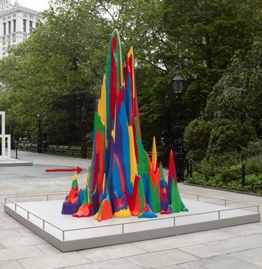
What I Looked At: Sol LeWitt Structures
I finally made it down to City Hall Park to see the Public Art Fund’s installation of Sol LeWitt structures. Which, first or now, you must watch the discussion of working with LeWitt at the New School. Go ahead, I’ll wait.
OK.
So along with the general admiration and pleasure of seeing so many LeWitts, the first thing I think is: picturesque.
Double Modular Cube, 1969
Lewitt introduced human proportions into these modules, which may somehow account for why it feels like an idyllically sited pavilion or garden folly. But it’s definitely activating something in the landscape, too.
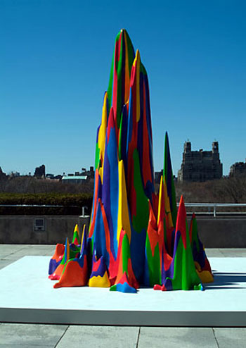
Then there is Complex Forms, 1987:
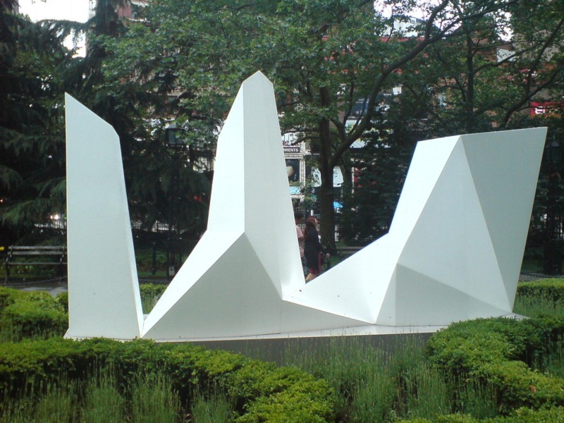
Which, I know, I know, every algorithmically-generated polygon around here gets tied to Dutch Camo Landscapes. But:
For the Complex Forms, the artist drafted a two-dimensional polygon and placed dots at various locations within it. As the form is projected into three dimensions, those interior points are elevated into space at different heights. The elevated points dictate the seams of the object’s multi-faceted surface.
So these things turn out to be topographies “projected” from two dimensions into three. Maps. So it is not a stretch.
The way I found the Dutch Camo Landscapes in the first place was through architecture. They were 2D patterns generated from photos of 3D structures, which read as 3D structures themselves. As camo deployed against aerial surveillance, I’ve also imagined them as crystalline structures or surfaces, topographies, installed above whatever site is being obscured.
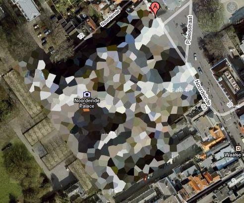
It’s to the point that last fall, I actually went to the Noordeinde Paleis [above] in The Hague, not *really* expecting, but kind of hoping, to see it sitting, safe from terror or whatever, under a giant, polychrome, polygonal tent. It was not. I’ll add that to my project list, though. [note to self: call Queen Beatrix.]
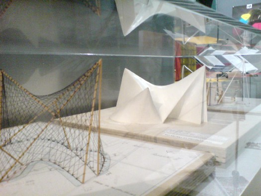
It also reminds me, even more explicitly, of Le Corbusier and Iannis Xenakis’ 1958 Philips Pavilion in Brussels, which, as these two models I found displayed shoved into a corner at ARCAM in Amsterdam one night show, was similarly constructed from 2-dimensional curves and points projected into space.
“The Complex Forms introduce irregularity into LeWitt’s work,” we are told, “which is further explored, for example,” in the Splotches. Which, again, two-dimensional drawing projected into structure via formulas for generating color and height. I can really dig these things, except–I didn’t photograph it, didn’t want to be a crank, but holy crap, I can’t stop staring at that seam.
Splotch 15 [with giant $#)%ing seam], 2005
It was not like this when it was exhibited on the Met’s roof garden in 2005, was it?
No, I do not think it was. What gives?
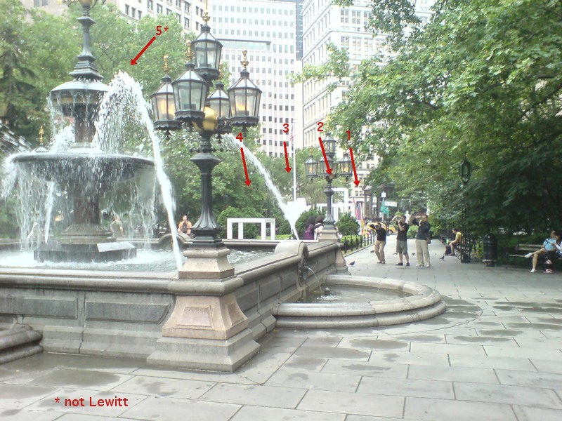
The next thing is how lush and classical City Hall Park is. Since this incarnation dates from 1999, I guess historicist is the right word. I don’t remember noticing this as acutely as I do now.
Maybe because so many LeWitts are installed along the park’s radial axis, lined up with that replica fountain just so.
In his opening remarks at the New School, Nicholas Baume described the Public Art Fund’s program as “looking back at radical practices dating from the 1960s and registering their contemporary resonance.” He goes on to cite the appeal of seeing “the interesting juxtaposition of natural landscape [sic], New York City skyscrapers, and the architectural and decorative elements of the park,” which “provide a fascinating and rich context.” But now this installation, I get less sense of juxtaposition, and more assimilation. Radial historicism: 1. Radical practice: 0.
As I’m walking around, trying to figure out how to process this situation, I suddenly looked at the Complex Structures head-on, i.e., the “wrong” way.
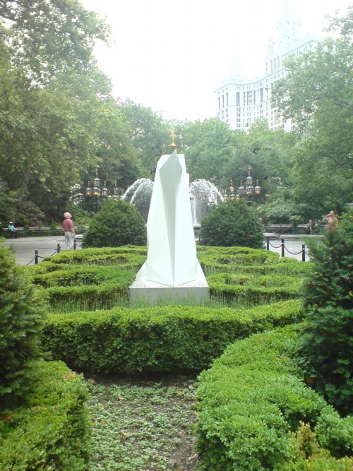
And it turns out to be radially symmetrical itself. A mirror image. And I remember writing about laughing at first at Chinese tourists who didn’t “get” the Iwo Jima Memorial, and who posed for photos at the head of the statue, only to realize they didn’t have the same LIFE Magazine photo-mediated historical context as Americans.
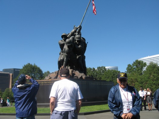
Connecticut veterans at the front of the Iwo Jima Memorial, image: ct.gov
Which, suddenly, LeWitt’s practice of projecting a 2D image into a 3D structure has an entirely new, complicated legacy which I’ve never seen addressed before, but maybe this City Hall Park is a good place to start.
The Free Speech Movement Monument Was Censored.
In 1989, a group of veteran activists organized the Berkeley Art Project to create a monument marking the 25th anniversary of the Free Speech Movement. Mark Brest van Kempen’s conceptual proposal won the elaborate national competition and dialogue. It is a 6-inch diameter circle of earth surrounded by a granite circle that reads, “This soil and the air space extending above it shall not be a part of any nation and shall not be subject to any entity’s jurisdiction.”
Remarkably, the Berkeley University administration only accepted the monument on the condition that any reference at all to the Free Speech Movement be stricken from the work and any surrounding publicity.
A podcast I’d never heard of but really like now, 99% Invisible, has the story of the Free Speech Monument, and an interview with the artist.
For added perspective, check out the 1992 statement by FSM leader Michael Rossman, who opposed the selection of a conceptualist monument–until Berkeley’s president added to its conceptual power by censoring it:
If this story be remembered as part of the work, it will stand for the ages, or until a censorious jackhammer erases it from the Plaza. A century hence, our descendants may read the truth written in stone: What happened here in 1964 was so significant and so deeply contested that nearly thirty years later the university administration still would not permit faculty and students to honor its name, but instead insisted on censoring their political expression. In this perversely perfect monument to the FSM, they may read a larger truth applying far beyond the campus: that the issues opened in that conflict and era, of civil liberties and rights, had still not been resolved, but continued deeply contested.
The Invisible Monument To Free Speech [99percentinvisible.org via someone awesome I can’t remember who, but probably Geoff Manaugh, since he’s the subject of the previous episode]
The Berkeley Art Project, by Michael Rossman [mrossman.org]
Andrea Bowers On The Political Landscape
Thomas Lawson’s 2010 interview with Andrea Bowers is like five kinds of great. It concerns the works in her show at Susan Vielmetter in Los Angeles, “The Political Landscape.” Bowers’ story of making a video piece about activist and Bush-era public land auction-saboteur Tim deChristoph has some nice critiques of the Earth Art Boys. And it’s surprising how surprising so many of the reactions were to her immigration- and border-related drawings.
But I can’t not post a bit of the discussion of the centerpiece of the show. Titled No Olvidado – Not Forgotten, the 10-foot-high, 23-panel mural/drawing contains the names of several thousand people known to have died crossing the Mexican-US border:
AB: Yes, it’s a hundred-foot drawing.
TL: And it is set up as a memorial, it’s a very grand piece. Let’s talk about it. Since it is monumental, it presumably required a different way of working?
AB: Right. I worked with a graphic designer and several assistants. It resulted from a conversation with an activist, Enrique Morones. He founded an organization called Border Angels. They started off in I think ’86, providing water and blankets to people crossing the border.
TL: And many die in the attempt–are they killed out there in the desert, or do they die from exposure and thirst?
AB: It’s both, but in many cases nobody knows. A lot of people die from dehydration or temperature, but there are also people who are killed. So Enrique collects names of anyone who dies migrating from Mexico to America. He actually has about ten thousand names. He finally admitted that the group of names he provided to me, a list of four or five thousand, is only up to the year 2000.
I’ve always been making memorials in one way or another, but memorials that I thought would never be made, or memorials that were kind of impossible to make. I’m fascinated by the Vietnam Memorial in DC, and how listing names functions in general. An important part of what I do concerns this documentary-type collection of information.
A Story about Civil Disobedience and Landscape: Interview with Andrea Bowers [eastofborneo.org]