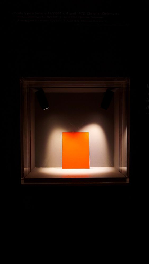
The designer and colorist of the TGV, Jacques Cooper, passed away at the age of 93. An industrial and auto designer, Cooper created the distinctive wedge-shaped face of Alstom’s prototype high speed train for SNCF, the TGV-001, in 1972. Cooper picked the orange color. In 1977 a brighter orange, known as SNCF 435, was approved for the livery of the TGV Sud-Est.
TGV Orange col0r sample, Cité du Train, Mulhouse, photo: Aurélien Vret
The TGV Orange SCNF 435 livery was retired in the 1990s, but was brought back for a nationwide tour in 2020 for the 40th anniversary of the TGV. Otherwise it lives on in the model train painting community.
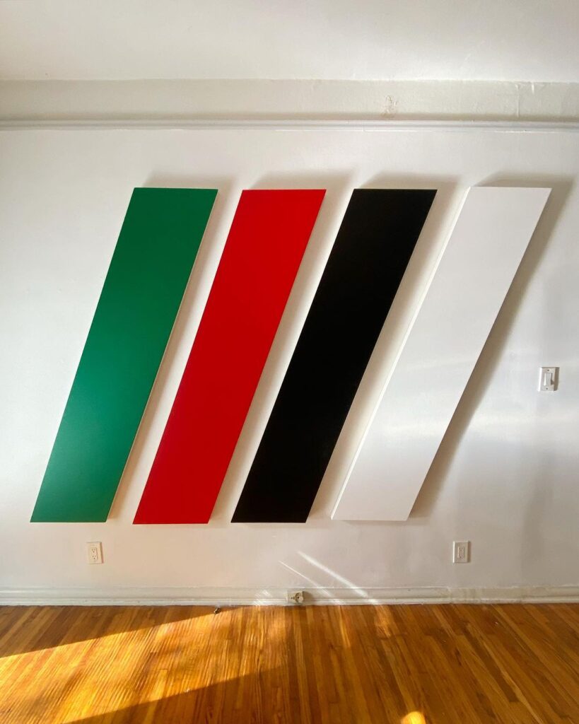
Joshua Smith, Untitled (Forbidden Colors), 2024, via IG/@joshuasmith1983
Untitled (Forbidden Colors) has been realized again, this time as a work by Joshua Smith. The parallelogram of Los Angeles sunlight coming in might be my favorite thing about this photo, after the work itself. It would be great if it draws out the Felix Gonzalez-Torres original from MOCA’s storerooms, and even better if there can be a stop to the killings in Gaza.
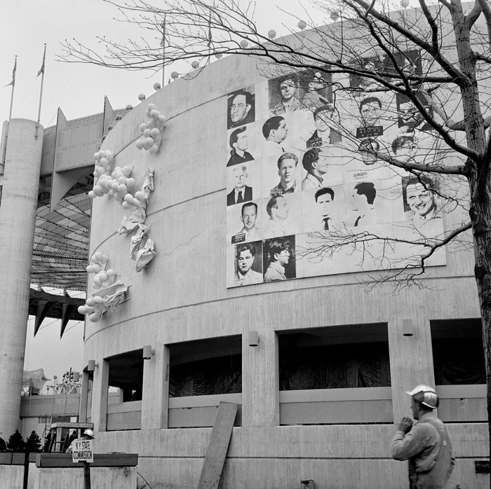
April 15, 1964, publicity photo of Thirteen Most Wanted Men released by the World’s Fair
This morning Michael Lobel brought some art historically significant mug shots to the social media discourse, including one of my long-time favorites, Andy Warhol’s Thirteen Most Wanted Men, a grid of 22 mug shots mounted on the facade of the New York State Pavilion Theaterama at the 1964 World’s Fair. Within two days of its unveiling, the work drew complaints from officials, and the 25 panels were painted over with silver aluminum paint.
It seemed so bold and promising. Bettmann dates the release to the press of the image above to April 15, 1964. The original caption gives the piece a different title, but it also had World’s Fair officials—and Johnson—on record explaining and promoting Warhol’s project—for one day:
A Place at the Fair. Flushing Meadow, N.Y.: Photos of New York City’s 13 Most Wanted Criminals -resplendent in all their scars, cauliflower ears and other appurtenances of their trade, unabashedly adorn masonite facade of the New York State Pavilion at the World’s Fair. The display an arrangement of official Police Department “mug shots,” forms a 20×20 foot mural mounted on the pavilion. Philip Johnson, a designer of the pavilion, said the mural is “a comment on the sociological factor of American life.”
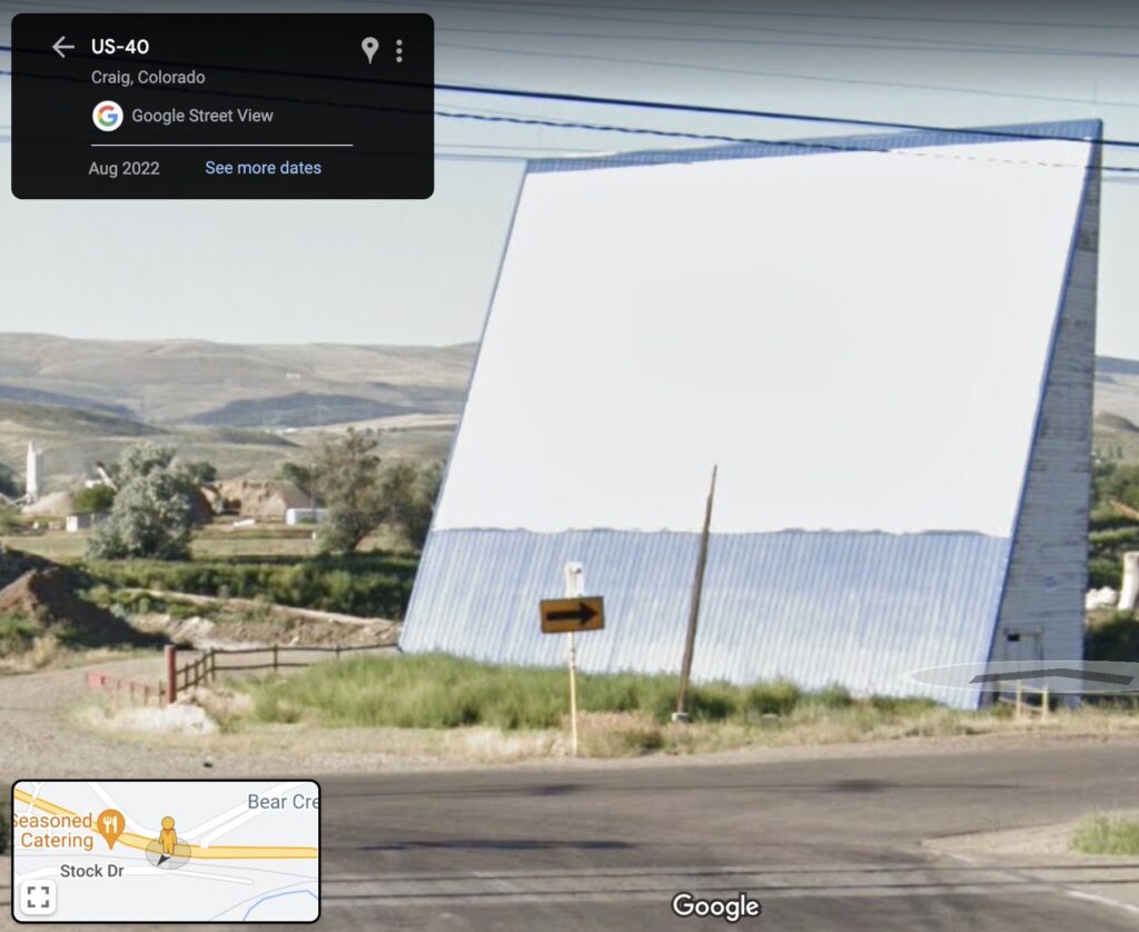
Whoops, not me having to change the folksy billboard lede to past tense when I found a 2022 Google Streetview shot from the highway
You know the gravel pit on the east end of town? Where there used to be the big vinyl billboard you could see from US-40, that says Welcome To Moffat County? The one that made Gail from the Chamber of Commerce tear up with delight first time she saw it because it “really says Moffat County”?
Well that wedge-shaped building, which the Chamber helped paint white a ways back, wasn’t always a billboard. It used to be the screen for a drive-in movie theater. On the other side, of course. And til the projection booth and snackbar burned down, and 3B Enterprises expanded the pit.
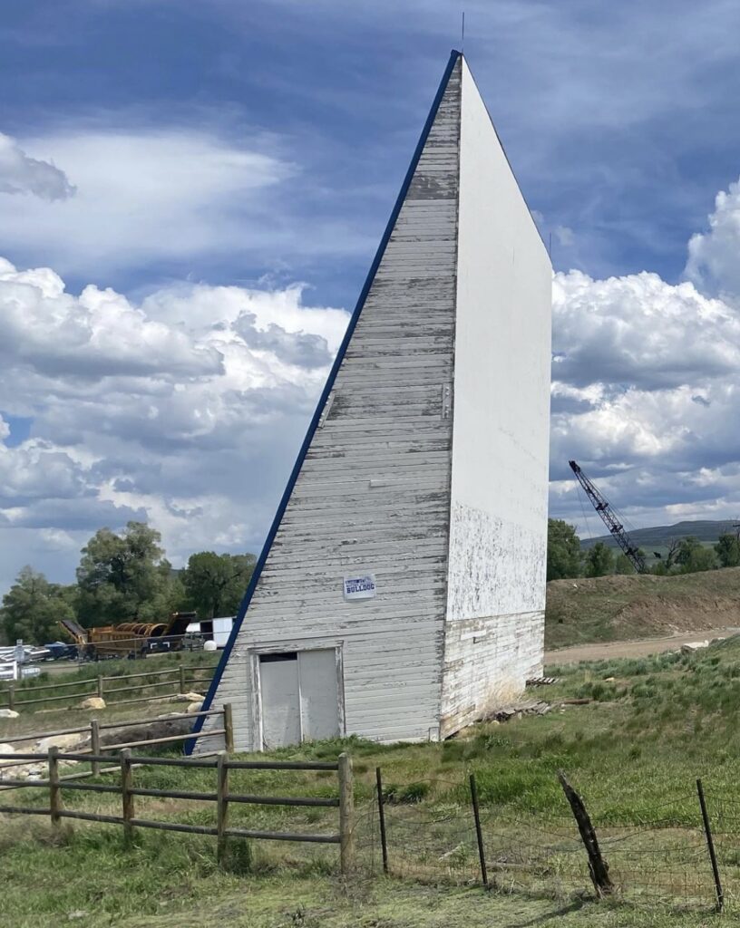
from @fromkindra’s western photolog, as regrammed by @ndybeach
In fact, this used to be a typology: drive-in movie screens with interiors. Do a reverse Google image search of @fromkindra’s Instagram road trip posts if you don’t believe me; they’re all over.
Yves Klein: With the Void, Full Powers, installation view at the Walker Art Center, 2011
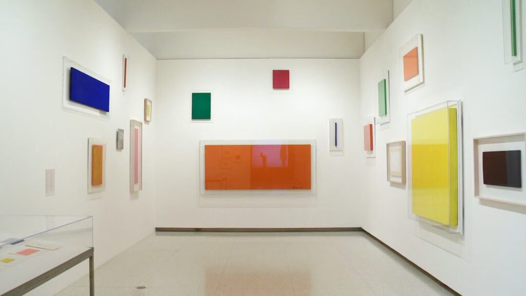
In the 2010-11 retrospective of Yves Klein’s work organized by the Hirshhorn and the Walker Art Center, there was a wall (in DC) and a nook (in Minneapolis) filled with early, small-ish monochromes in a variety of colors that weren’t blue. They surrounded a vitrine with Klein’s amazing 1954 catalogue for an imaginary monochromes exhibition, Yves Peintures.
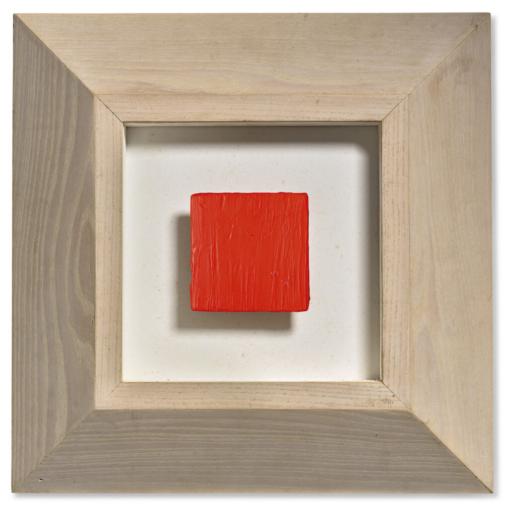
Yves Klein, untitled (M 109), 1955, 10×10 cm, oil on gauze on panel, being sold at Christie’s Paris
This little red square was not among them, but can you imagine if it was, looking like an emergency button in its gigantic, beveled frame?
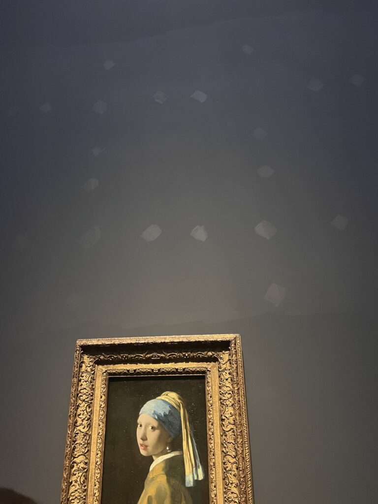
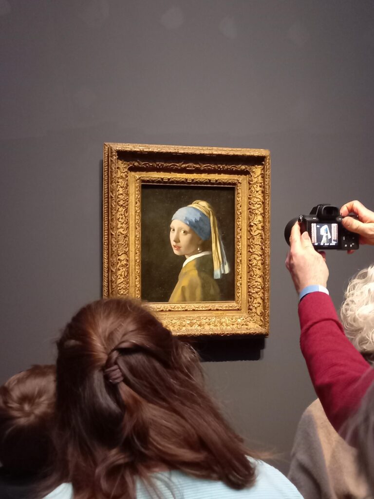
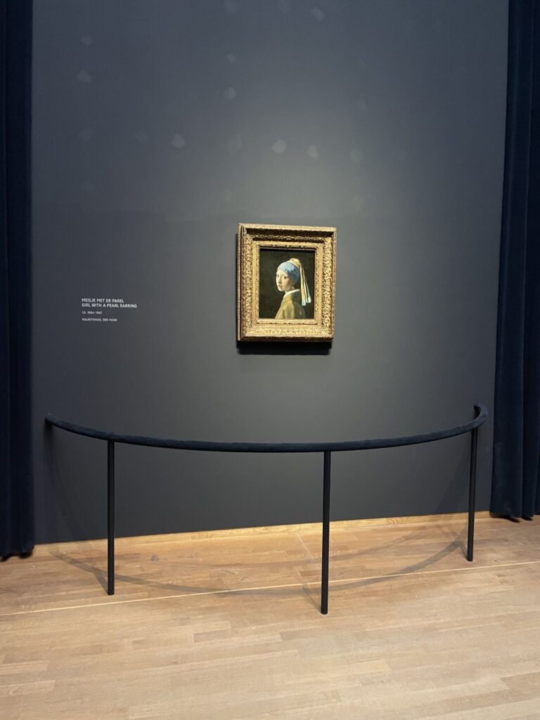
Mural With Girl With A Pearl, 2023, paint on plaster, Vermeer, dimensions variable (installation view via @BMPMurphy)
I’m not sure I could think of a greater honor than to have work in a two-artist exhibition with Vermeer. I certainly didn’t think of anything before today.
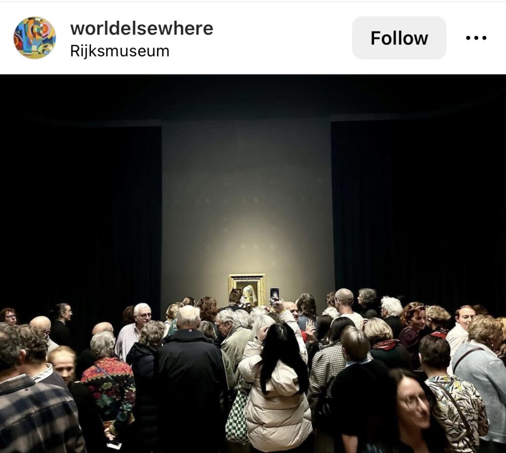
But now I am beyond thrilled to announce my site-specific installation, Mural With Girl With A Pearl is on view at the Rijksmuseum in Amsterdam. It comprises a painting on the wall holding Girl With A Pearl, and the painting Girl With A Pearl itself. It’s hard to say how long it will be there; certainly this incarnation won’t go past March 30th, when Girl With A Pearl goes back to The Hague. Tickets to see it are definitively not available. [But if you do go, SEND PICS!]
Like Vermeer’s work, which it incorporates, it is an exploration of the subtle effects of light captured in built up layers of paint. And like those light effects, it may be fleeting, perceived only in the periphery of vision, occupying the liminal spaces around the older work that is the predictable draw of our attention.
Mural With Girl With A Pearl, 2023, paint on plaster, Vermeer (installation view via @blogexhibitions)
But for now, if you look up, and the gallery lights hit at the right angle, you will feel your field of view, and with the close looking you’ve exercised, you’ll recognize the changing world beyond the frame.
Mural With Girl With A Pearl, 2023, paint on plaster, Vermeer (installation view via @BrothersCammy)
You’ll see the new horizon coalesce just above Girl with a Pearl Earring‘s head. The loose grid of brusquely brushed forms —pearls? lights? ships? celestial figures? yet too big to be stars?—shimmering in formation in the graying sky.
While the current installation involves Girl with a Pearl, I am happy to discuss how to make the piece work for your Vermeer, too. Or, if you’re at the Mauritshuis, we can recreate the Amsterdam magic. Just because the Vermeer show is once-in-a-lifetime doesn’t mean this collab has to be, too.
Mural With Girl With A Pearl, 2023, installation view via @worldelsewhere/ig
April Update: Thanks to @worldelsewhere, I am able to say that the installation stayed up until Girl With A Pearl left for the Mauritshuis. Thank you all for your engagement.
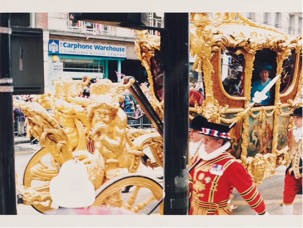
Wolfgang TIllmans, Regina, 2002, ed. 1/1+1AP, inkjet on paper, 137 x 206cm, sold for GBP68750 at Christie’s London during Frieze Week 2018
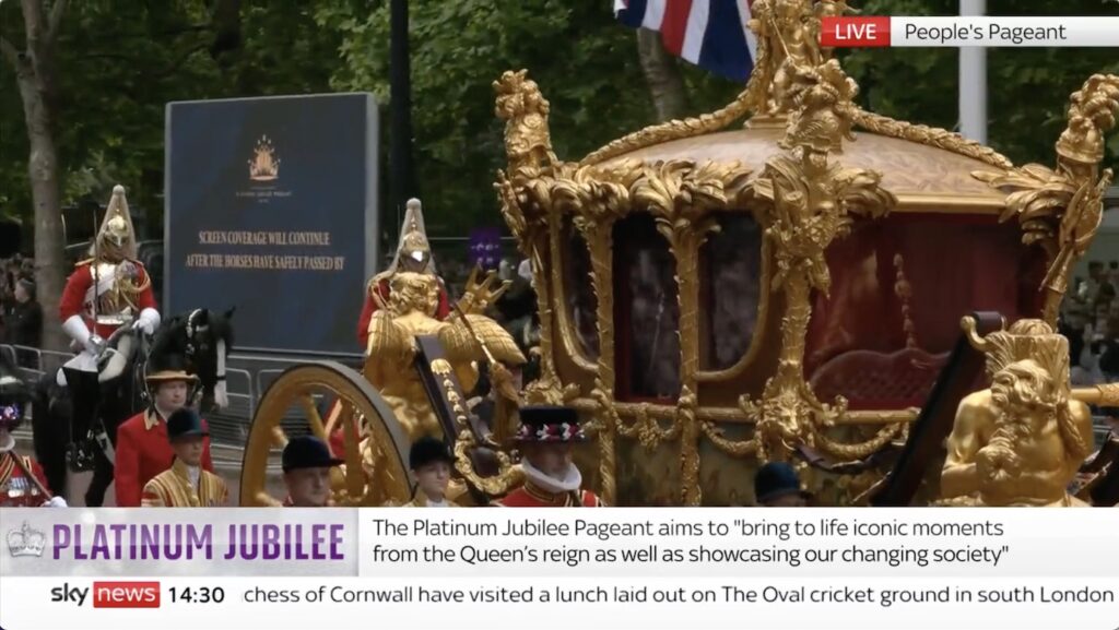
The last time the Queen of England rode around London in the Gold State Coach was for her 50th anniversary, and Wolfgang Tillmans was there.
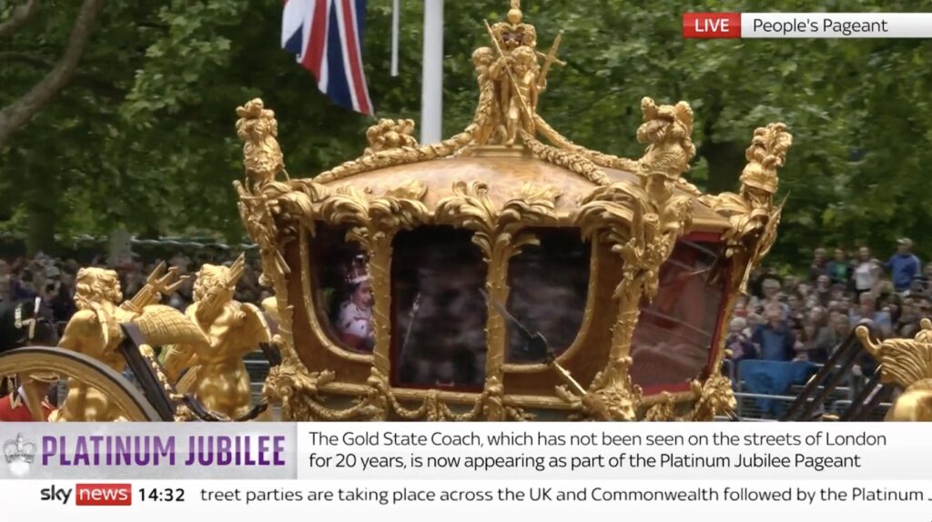
Halberds out: Study for Tillmans Regina, 115 x 206 cm, 2022, sky news screencap, which, alas, does not include the giant
If he was there today to see the Queen’s subjects waving at a hologram of her riding in the GSC, it might look a little something like this. Protip: the way you can tell my Tillmans from Tillmans’ Tillmans is the aspect ratio.
Study for SCREEN COVERAGE…, 2022, it’s a diptych
And while mine will ship with a separate SCREEN COVERAGE WILL CONTINUE AFTER THE HORSES HAVE SAFELY PASSED BY monochrome, I feel like Wolfgang would have been able to get both screens in one shot.
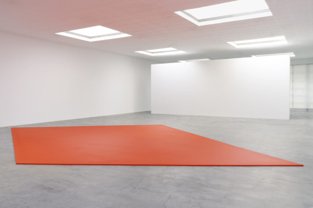
Ellsworth Kelly, Red Floor Panel, 1992, acrylic on canvas on wood panel, installed at Matthew Marks
I remember the experience of walking into Matthew Marks and seeing one stunning work: the 1957 Sculpture for a Large Wall, which Marks had basically rescued from the Philadelphia Transit Building for which it had been commissioned. (The Lauders bought it for MoMA in 1998.) Anyway, now there will be another, though it seems like this time, seeing won’t be enough.
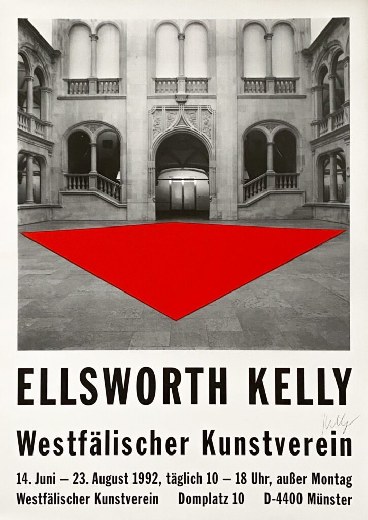
Ellsworth Kelly Westfälischer Kunstverein exhibition poster, A1 offset print, signed, via Susan Sheehan Gallery
Red Floor Panel (1992) is one of five floor paintings Kelly made, beginning in 1990. [Glenstone got the first, but how can this not be the best?] It is being shown for the first time since its original appearance at the Westfälischer Kunstverein in Münster.
How does this object exist? And how is it possible that each of these pictures is of the same object? I mean, it’s at once the most obvious and confounding thing. [update: I’ve learned the answer to the first question, and it will astound you. It did me.]
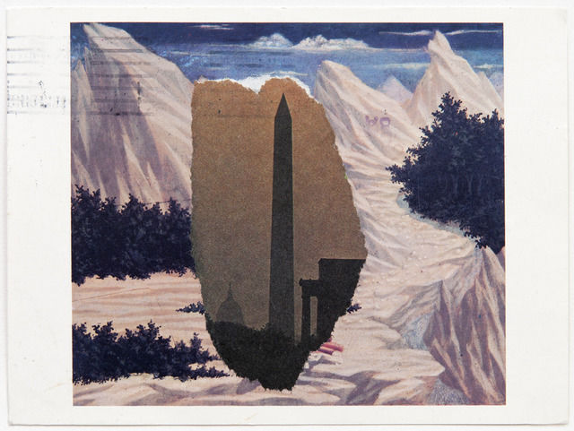
Domenico Veneziano/Washington Monument, 1984, newspaper on NGA postcard, via Peter Freeman back in the day
Though a couple we included in his Guggenheim retrospective in 1996, most of Kelly’s 400 or so postcards made between 1949 and 2005 have never been shown or published. Each venue will show a distinct selection of 150 of the works, and the catalogue reproduces 216 postcards at full scale. It is a veritable facsimile object blockbuster–but I still want to see the real things in person.
Ceci n’est pas un miroir noir, image via like ten hot takers on twiter
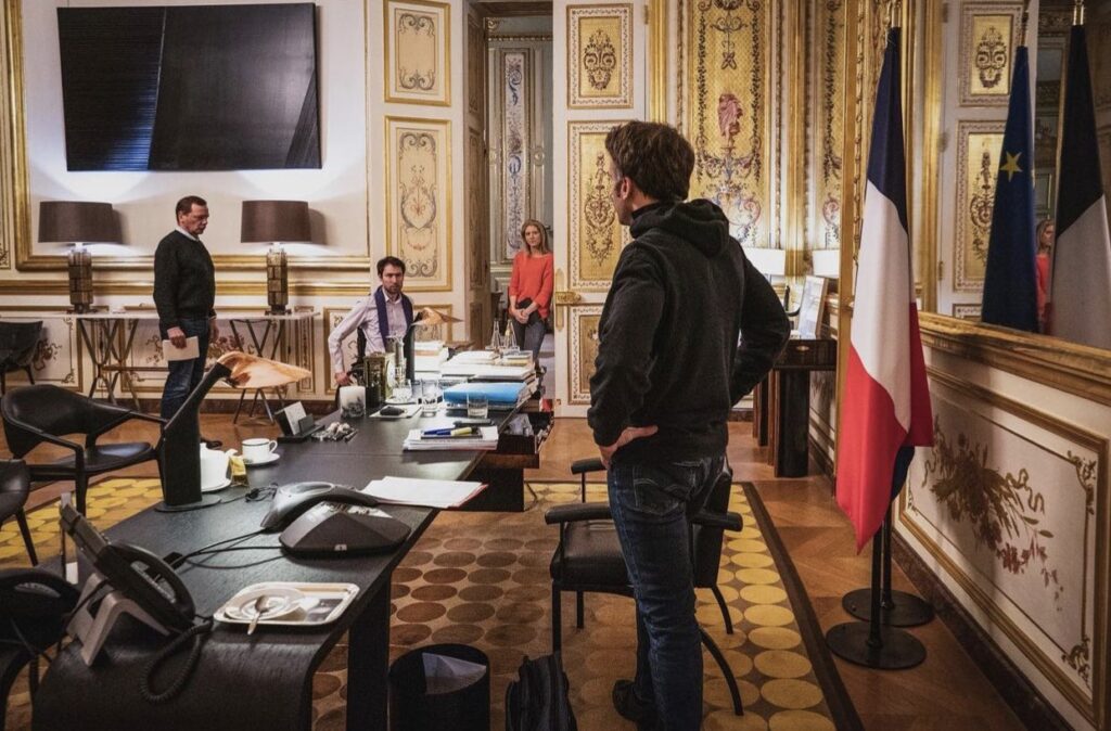
Some might say this warrior president Golden Roommise-en-scène feels like a very special Continental episode of Black Mirror come to life. Me, I say, that’s no black mirror: it’s a Proposte Monocrome Macron! Srsly, though, the Struth fan who took this photo deserves a Légion d’Honneur.
UPDATE WTF: I just zoomed in to make myself an Ellsworth Kelly-style rhomboid crop, and it appears that is not a flatscsreen TV with a reflective image on it at all, but an image? Non, but it is a picture. It is a Soulages.
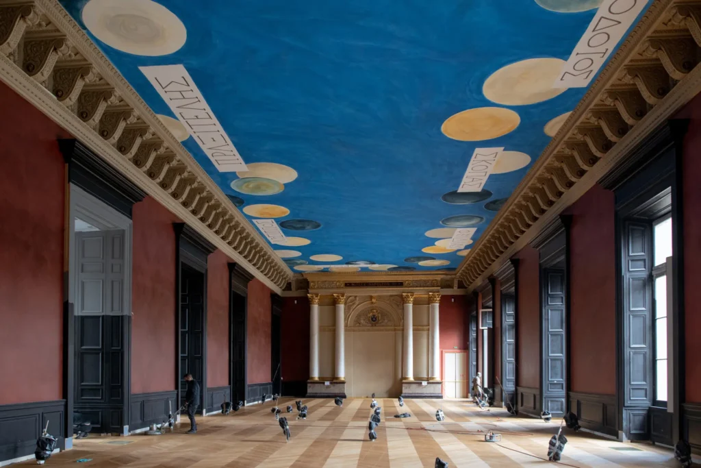
The Wall (2021), dimensions and The Ceiling (2010), installed in the Salle des Bronzes in the Louvre, photographed in Feb. 2021 for the NYT by Dmitry Kostyukov
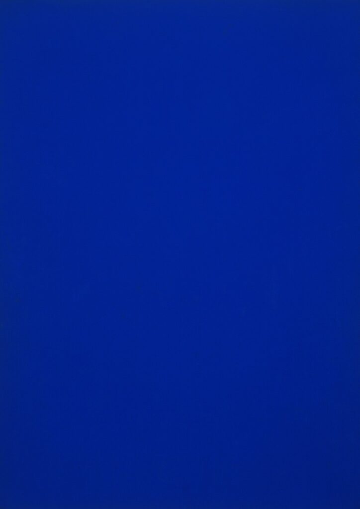
As 2021 is finally shown the door, I am pleased to announce The Wall, which was next to The Ceiling. The Wall is a Marron Côte d’Azur and Noir painting executed directly on a wall or a discrete section thereof. Even more than the 19th century neo-classicist aesthetic of Napoleon III, who first executed it in his Salle des Bronzes Antiquites, it evokes the historic moment during the pandemic when leaks about the work’s installation drew the litigious ire of The Cy Twombly Foundation.
study for The Wall, 2021, dimensions variable, an altered 150 x 100px svg ganked from a hexcolor website for Marron Côte d’Azur (#A75949)
For a few months this year, the first realization of The Wall was installed alongside–or underneath, really–The Ceiling, Cy Twombly’s ceiling mural at the Louvre. In Napoleon III’s day, the Noir was the display cases. In the 2021 installation, the boundary between the two colors was demarcated by a dado. The composition of future installations may take cues from the space, and condition of the wall and its elements.
While it is available for individual purchase or commission, The Wall will also be free with the purchase of nine other works, as a treat.
There are other works associated with both The Ceiling and The Wall, the details of which are at present insufficient.
While making The Ceiling, Twombly friend Barbara Crawford and French painters Laurent Blaise and Jean de Seynes joked “that the unique, precise blue for this particular sky, which they’ve spent weeks fine-tuning, should be trademarked and given the name Twomblu.”
According to Grant Rosenberg’s account of this process in The American Scholar, in late 2008, the Louvre produced “several” “big” panels of monochrome blue for color testing during a Twombly site visit. It is not clear what blues these were, but we know what they were not: Pas Twomblu.