


I’m not sure I have anything to say about them yet, but I’ve been looking at Peter Saville’s color code from his New Order album covers, which he developed with Brett Wickens.

The outer two rows of the color wheel on the back of Power, Corruption & Lies is the key to deciphering the one- or tw0-color blocks that represent both the numbers 1-9 and the alphabet. It’s clearer, perhaps, in the cover for the 12″ release of Blue Monday, that the design is based on a 5 1/4-inch floppy disk, but this reference is already lost in some design discussions.

The code on PC&L just says FACT75, the Factory Records release number, but the wraparound code on Blue Monday says more, I guess, and with spacers, is more legible: FAC73 BLUE MONDAY AND on the front, and THE BEACH NEW ORDER on the back.
One thing that struck me while looking around is the album covers as artifacts vs images, the physical album in MoMA’s collection, for example, or the collectible copies on discogs, vs Wikipedia. Colors fade or change over time, which makes reading the squares more or less difficult, or rather, which changes the information being communicated.

One thing I love is that a 21-year old jpg mathmandan took at the Design Museum’s Peter Saville Show in 2003 is still on flickr. It shows a hand-drawn diagram of the color code, and though the colors themselves don’t seem to match, they’ve each been translated, encoded into their CYMK values for offset printing.
“At the time I was interested in the juxtaposition of historical culture and modern technological culture, and I was interested in the idea of what did history look like when it came up on a retrieval system on a computer screen, and I wanted to juxtapose the kind of hieroglyphics of technology with historical classicism.” Is a quote attributed to Peter Saville in a deleted blogpost from 2007, which until now only survived in a 2021 post on Dennis Cooper’s blog. It does sound like it benefits from some retrospection.
This feels like the right spot to include the original 1983 music video for Blue Monday, which looks like history, the news, and the band members pulled up on a computer screen. The aesthetics of this video feel like they have a lot of resonances, if not references, to Gerhard Richter works, which I’m not going to get into just now.
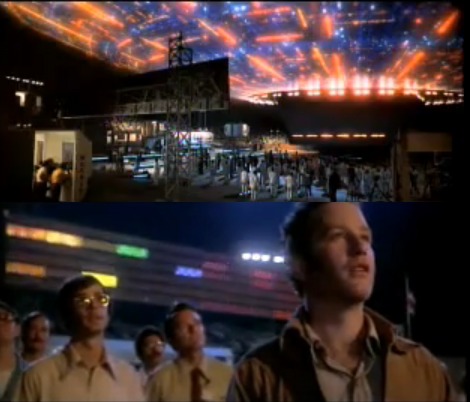
The Wikipedia page for the song says the video includes clips from Close Encounters of The Third Kind (1977), which I am going to get into just now. Because the synthesizer-linked light board used to communicate with the aliens in a “jam session” was premised on a language of color and sound. I geeked out about it in 2011, when I resolved to recreate it [looks around fifteen years later, glad to not have to store it, at least].
And speaking of Wikipedia, it was the lowkey dismissive vibe of this line that made me diverge from my previous research subject, to spend a moment with Saville’s iconic and influential design and code: “Derived from the public domain image File:Fantin-Latour Basket of roses 1890.jpg, with the minor addition of some squares in the corner. Therefore, this image is in the public domain.”

I can’t find the clips from Close Encounters yet. I realize I’m much more familiar with the video for the Quincy Jones 1988 remix of Blue Monday, which includes William Wegman’s Weimaraners intercut with flipbook animations by Robert Breer.
I didn’t know the Blue Monday Official Lyric Video, which encodes the whole song in Saville’s code, and which was released with the Power, Corruption & Lies Definitive Edition in 2020, at all.

In 1983 New Order’s Bernard Sumner produced another Factory release, Section 25’s From The Hip (1984). “The band name and/or album title are spelled out” on the cover using Saville’s same color code on the tops of ten painted poles on a craggy hillside. The bars on the back don’t obviously map to Saville’s colors. [later that day update: on a newly printed 2012 reissue, it is clear they are laid out to match the poles on the front. That link comes from a 2025 reddit thread identifying the site of the photo, which greg.org hero Wayne Bremser surfaced.] On a day Google stops returning offsite search results as a default, it’s Wikipedia’s “and/or” that gets me, an indifference to the extremely elaborately produced information lost with a shrug as contemporary modern technological culture consumes historical modern technological culture.

I’m surprised at this point to find there’s not a font, but Mathew Lodge has created savillecode.com, a website for encoding text into Saville’s color code.
Previously, related: Close Encounters Jam Session
On Close Encounters, Scriabin, Schoenberg, Bernstein