
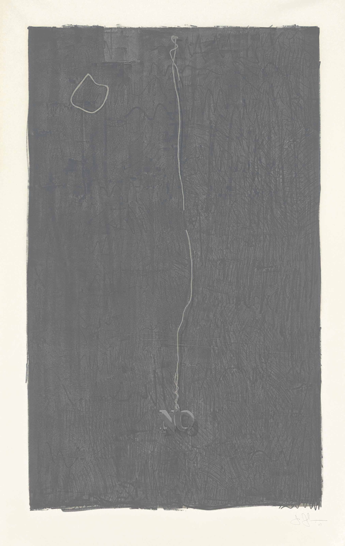
Jasper Johns, No, 1969, litho and lead on Arjomari paper, 56 x 35 inches [BIG], published by Gemini G.E.L.
This really seems like a lot of Jasper Johns for the money.
No is a four-color lithograph from Gemini G.E.L. made in 1969, and based on the 1964 painting of the same name. I hear four colors and think CYMK, but apparently the colors are three shades of dark gray and silver.
On the painting, the NO is made of lead, and attached to a long wire, hovering precariously over the unpainted spot it popped up from. In the print, the wire is printed, but there is a lead NO glued to the embossed surface.
Christie’s has this example, no. 20/80, for sale online for a couple of weeks, but who knows whether the link will keep working.
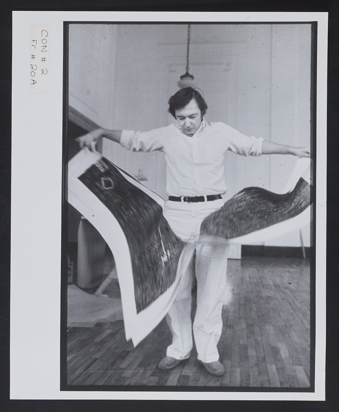
UPDATE: While poking around in the digitized photos of the AAA’s Leo Castelli Archive, I found this portrait of Gianfranco Gorgoni, where Johns is flourishing copies of No.
First Open online only: Lot 468, Jasper Johns, No ULAE 71, Gemini 128, est. $4-6,000, sale ends July 28, 2016 [christies]
Gemini CR Catalogue No. 26.22, No, 1969 [nga]
Author: greg
Sforzian Recycling

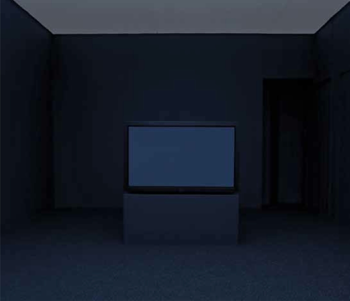
image of yahoo tv via @thegarance
Those who don’t build a functioning campaign organization, including media and advance teams, are doomed to recycle 15-year-old Sforzian Backdrop techniques.
Yahoo’s Garance Franke-Ruta rightly called this “the most passive-aggressive work of campaign advance” she’s ever seen. This extraordinary wide shot of the scene comes from her Yahoo colleague Holly Bailey.

image via @hollybdc
Alumisource is in Monessen, PA, down the Monongahela from Pittsburgh, but this backdrop is straight out of the early Sforzian playbook. I’m not sure if we’re ready for a GWB election renaissance, or, frankly, if that kind of schtick even still works.
Better Read #009: Single Man Looking To The Right (1979), By Richard Prince
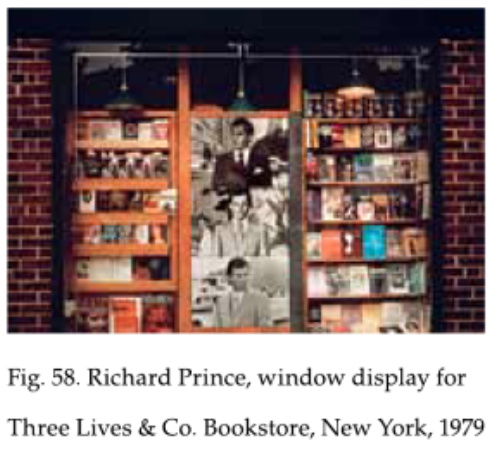
Exhibition announcement card for Richard Prince’s window installation, “Single man looking to the right”, 1979, at the original location of Three Lives & Company bookstore, New York, via the catalogue for Edward Cella’s exhibition, “Richard Prince: The Douglas Blair Turnbaugh Collection, 1977-88”
This is starting to become a habit.
This edition of Better Read features “Single man looking to the right,” a 1979 text by Richard Prince, for a window installation he made at Three Lives & Co., a now-legendary neighborhood bookstore in the West Village. It’s included in a show Prince recently announced/denounced, a huge pile of early stuff saved by an early friend and supporter, the dance critic Doulas Blair Turnbaugh. The show is at Edward Cella in Los Angeles through July 2016.
My interest was piqued by the light this early work sheds on Prince’s development of his practice, on his experimentation and the paths not taken, and less for the possible insights into Prince’s psyche or autobiography. This text seems to me both in sync with and apart from Prince’s Bird Talk texts, just as the rephotographed works Prince showed at Three Lives resonate with yet differ from what’s now generally thought of as his standard operating procedure. If anything, it’s freedom from an S.O.P. that tips the scale for these photos; they’re evidence of Prince’s experimentation.
installation photo for Richard Prince’s window at Three Lives & Company, 1979, from Doug Eklund’s The Pictures Generation, p. 157
A small photo of the Three Lives installation in Doug Eklund’s The Pictures Generation catalogue also makes me wonder about the fate of these large, black & white, and differently “ganged up” Single Men prints. They’re not in Turnbaugh’s collection/show, and I’m thinking if they’re destroyed, they may have another life coming.
Download Better_Read_009_Single_Man_20160627.mp3 from Dropbox
greg.org [dropbox, mp3, 7.3mb, 4:57]
Previously:
Better Read #008: Death By Gun
Better Read #007: Spinoza’s Ethica from Sturtevant’s Vertical Monad
Better Read #006: The Jetty Foundation Presents, Send Me Your Money
Better Read #005: Frank Lloyd Wright Speaks Up
Better Read #004: Why We Should Talk About Cady Noland, a Zine by Brian Sholis
Better Read #003: Sincerely Yours, An Epic Scholarly Smackdown By Rosalind Krauss
Better Read #002: A Lively Interview With Ray Johnson, c.1968
the Ur-Better Read: W.H. Auden’s The Shield Of Achilles, Read By A Machine
Podcast: Play in new window | Download
Subscribe: RSS
Play It Where It Lies
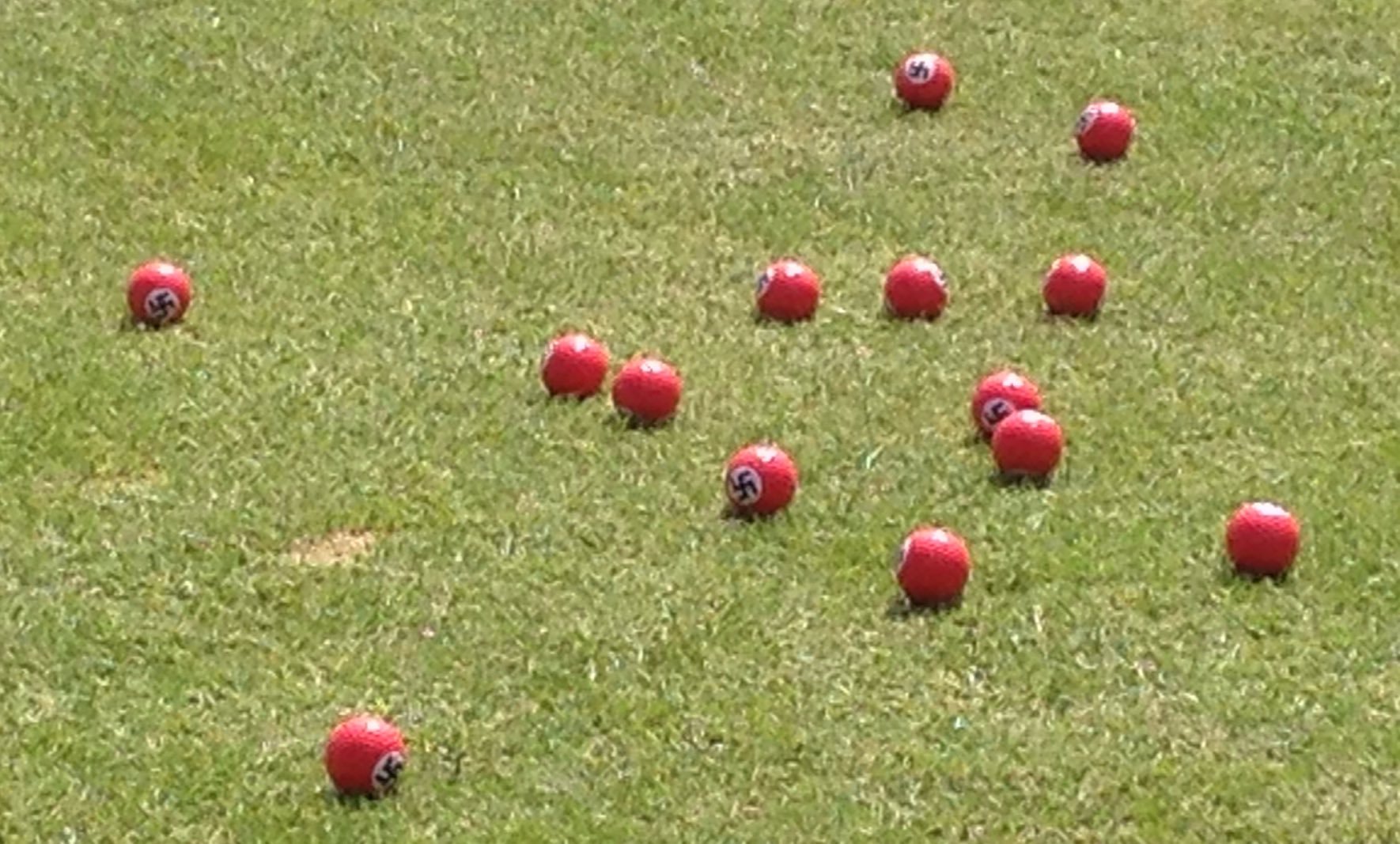

Trump gave most of his press conference in Scotland surrounded by these Nazi golf balls pic.twitter.com/UsUoVK3nkW
— Naomi O’Leary ⚡️ (@NaomiOhReally) June 24, 2016
I have tried to avoid the Sforzian analysis of this election. It feels like we’ve moved, or morphed, or devolved, or fallen, so far beyond, away, from the days of cannily placed powerpoint backdrops.
Sometimes, though, attention must be paid. As when comedian Lee Nelson threw a bucketful of Nazi golf balls at Donald Trump’s Scottish golf course press appearance.
Trump, who multiple sources confirm literally studied and embraced the speeches of Adolf Hitler-he kept them on his nightstand-was “surrounded by Nazi golf balls.” Nazi golf balls. Nazi. Golf. Balls.

From The Journal:
After around ten minutes, Trump campaign operatives decided it might be a good idea to start clearing them away – and set about scooping them up with a few of his branded baseball caps.
Make America Great Again Filled With Nazi. Golf Balls.
OH PROTESTER BONUS: Nelson was also the guy who showered corrupt FIFA head Sepp Blatter with money [thejournal.ie]
Au Bout De La Nuit
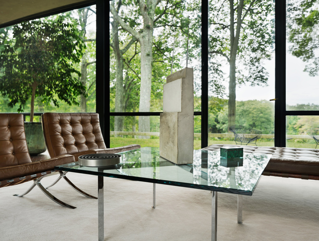
Isa Genzken’s World Receiver in “Night” at The Glass House, image: Amanda Kirkpatrick
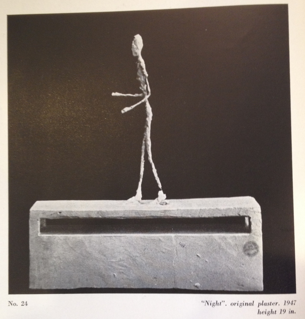
I was talking to a friend who recently got his first work by Isa Genzken, a World Receiver, (which really is the best first Genzken to get, and the third, and the seventh-they look great alone or in groups!) and it reminded me of one of the best installations ever of the radio-shaped cast concrete sculptures. Last fall a World Receiver was the last work in a fascinating 3-year exhibition called “Night”, which took place on the coffee table in Philip Johnson’s Glass House.
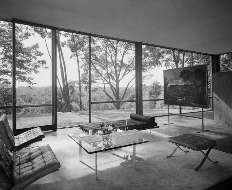
The Glass House is kept pretty much as Johnson left it, and that means almost no art. The Poussin on its stand is the famous exception. But for the first fifteen or so years, there was another work, a small plaster sculpture which sat on the Mies coffee table, and it appears in early photos of the Glass House, such as the 1949 Ezra Stoller image below. It was called La Nuit, and, obviously, it was by Alberto Giacometti. Johnson bought it in 1948 from the artist’s first postwar US show at Pierre Matisse Gallery.
By the mid-1960s, the plaster figure had begun to deteriorate, and Johnson sent the sculpture back to Giacometti’s studio in Paris for repair. The artist’s brother Diego worked on the figure, but Alberto was apparently dissatisfied and stripped it to its metal wire armature in order to remake it. Then he died. That was 1966.
And that might have been the end of it, if independent curator artist Jordan Stein hadn’t gone archive diving in preparation for “Night”. The Times’ Randy Kennedy tells this story of “Night” and La Nuit in a 2012 article which I am trying mightily not to retype from start to finish.
Stein, who worked on “Night” with the Glass House’s curator Irene Shum Allen, found a 1974 letter from James Lord in Matisse’s archive at the Morgan Library, that discussed the restoration of La Nuit. Lord’s idea was to have Diego remake the plaster figure, and then to have it cast in bronze as a posthumous edition that somehow noted both brothers’ involvement. “What would you think of having Diego remake the figure?” Lord suggested. “He-and he alone-could do it so that it would be virtually-but of course not absolutely-as if it had been done by Alberto. Indeed, there are more than a few pieces, if the truth were known, in which Diego had as much of a hand as that…I have spoken of this to Diego, and he would be prepared to do the restoration…Would Annette have to be consulted?”
Which, well, yes, Annette would have to be consulted, though in 1974 she was in no position to decide. I just re-read Marc Spiegler’s 2004 ARTnews article [pdf] on the decades-long conflict among the Giacomettis’ assistants, family, collectors, Associations, Fondations, and Stiftungs that had only then begun to settle down. This seemed like a stretch in 1974, and any possible restoration was mooted by Diego’s death in 1985, and no resolution over its ownership was likely during the posthumous shitstorm over Giacometti’s work. It was basically gone.
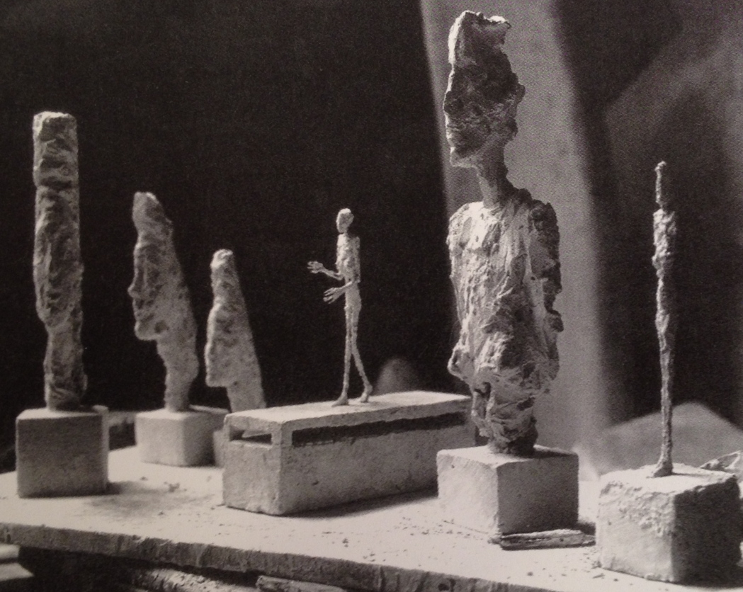
1946 photo of La Nuit, early state, in Giacometti’s studio, by Marc Vaux
Until 2007, when it turned up at the Pompidou in « L’Atelier d’Alberto Giacometti » a show organized with the new Fondation Alberto et Annette Giacometti. The catalogue had 1946 photos by Marc Vaux (above) and Cartier-Bresson of La Nuit in the studio. It was originally a maquette for an unidentified monument and, most amazingly, the walking figure was a woman. Or as Alberto originally put it, “a lanky girl groping in the darkness.” I can’t think of another walking female Giacometti of this postwar style; his attenuated women were always rooted in their spots.
By the time La Nuit was shipped to Matisse’s New York Gallery in 1948, though, it lost its outspread fingers and its “opulente poitrine”; the Pompidou catalogue said it had been “asexualized,” but defeminized or regendered seems more apt, especially in retrospect. Giacometti also made a second maquette La Nuit, with a similar footed platform, but no box base. Both were included in their stripped/deteriorated states at the Pompidou.
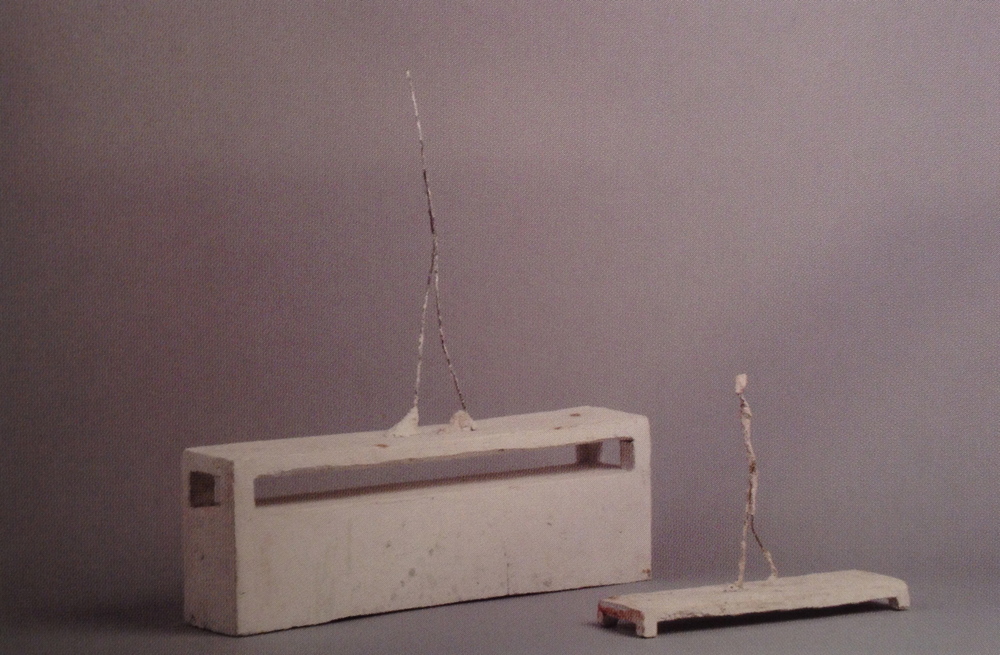
La Nuit original and second version, in current state, from the Pompidou’s 2007 exhibition catalogue
With the bare metal armature protruding from a solid base, Johnson’s La Nuit looked like nothing so much as a World Receiver.
Better Read #008: Death By Gun
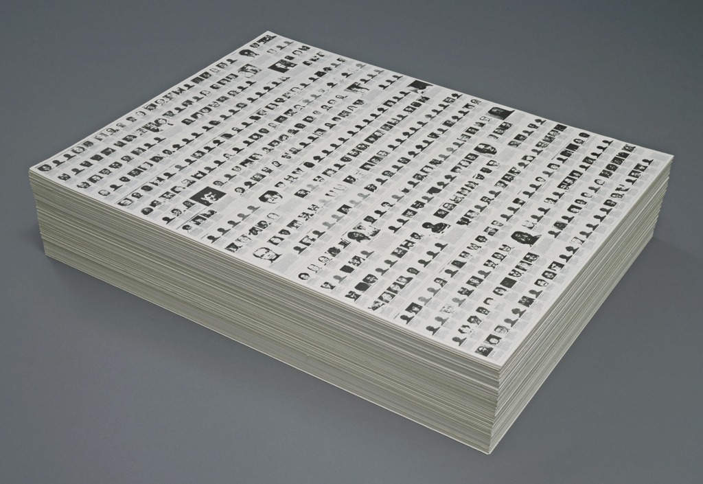
“Untitled” (Death By Gun), 1990, endless. collection: moma.org
We’ve come to reading the names of the dead, to intone them, as a form of memorial.
I’ve never felt Felix Gonzalez-Torres’ “Untitled” (Death By Gun) was a memorial per se, more a statement. Remembering for different ends. But following the massacre of Latinx gay people at Orlando’s Pulse night club, and the subsequent readings of their names, it occurred to me that I’d never read and did not remember the names of the people who appeared on Felix’s 1990 stack piece.
I looked for the original Time magazine article that was the artist’s source, and I couldn’t find it online. I couldn’t find it in libraries. I ended up buying an old print edition of the magazine itself on eBay. July 17, 1989.

And I transcribed the names of the 460 people who were killed in the US the first week of May 1989, the week Time chose to document, in the order Felix chose to lay them out, and had them read aloud by a computer.
Download Better_Read_008_Death_By_Gun_20160620.mp3 from dropbox greg.org [dropbox greg.org, 16.7mb mp3, 11:37]
Previously:
Better Read #007: Spinoza’s Ethica from Sturtevant’s Vertical Monad
Better Read #006: The Jetty Foundation Presents, Send Me Your Money
Better Read #005: Frank Lloyd Wright Speaks Up
Better Read #004: Why We Should Talk About Cady Noland, a Zine by Brian Sholis
Better Read #003: Sincerely Yours, An Epic Scholarly Smackdown By Rosalind Krauss
Better Read #002: A Lively Interview With Ray Johnson, c.1968
the Ur-Better Read: W.H. Auden’s The Shield Of Achilles, Read By A Machine
Podcast: Play in new window | Download
Subscribe: RSS
“Untitled” (Republican Years)
“Untitled” (Republican Years), 1992
“Untitled” (NRA), 1991, collection: Astrup Fearnley Museet
25 years of this.
Better Read #007: Spinoza’s Ethica From Sturtevant’s Vertical Monad
Sturtevant’s Vertical Monad, 2008, installed at Anthony Reynolds Gallery, London
In case the last Better Read was too mainstream podcasty for you, here are the first few pages of Spinoza’s Ethica Ordine Geometrico Demonstrata, in Latin, which Sturtevant included in her 2008 installation Vertical Monad, read by a computer.
Better_Read_Sturtevant_Spinoza_20160610.mp3 [dropbox greg.org, 35Mb, 24:28]
Podcast: Play in new window | Download
Subscribe: RSS
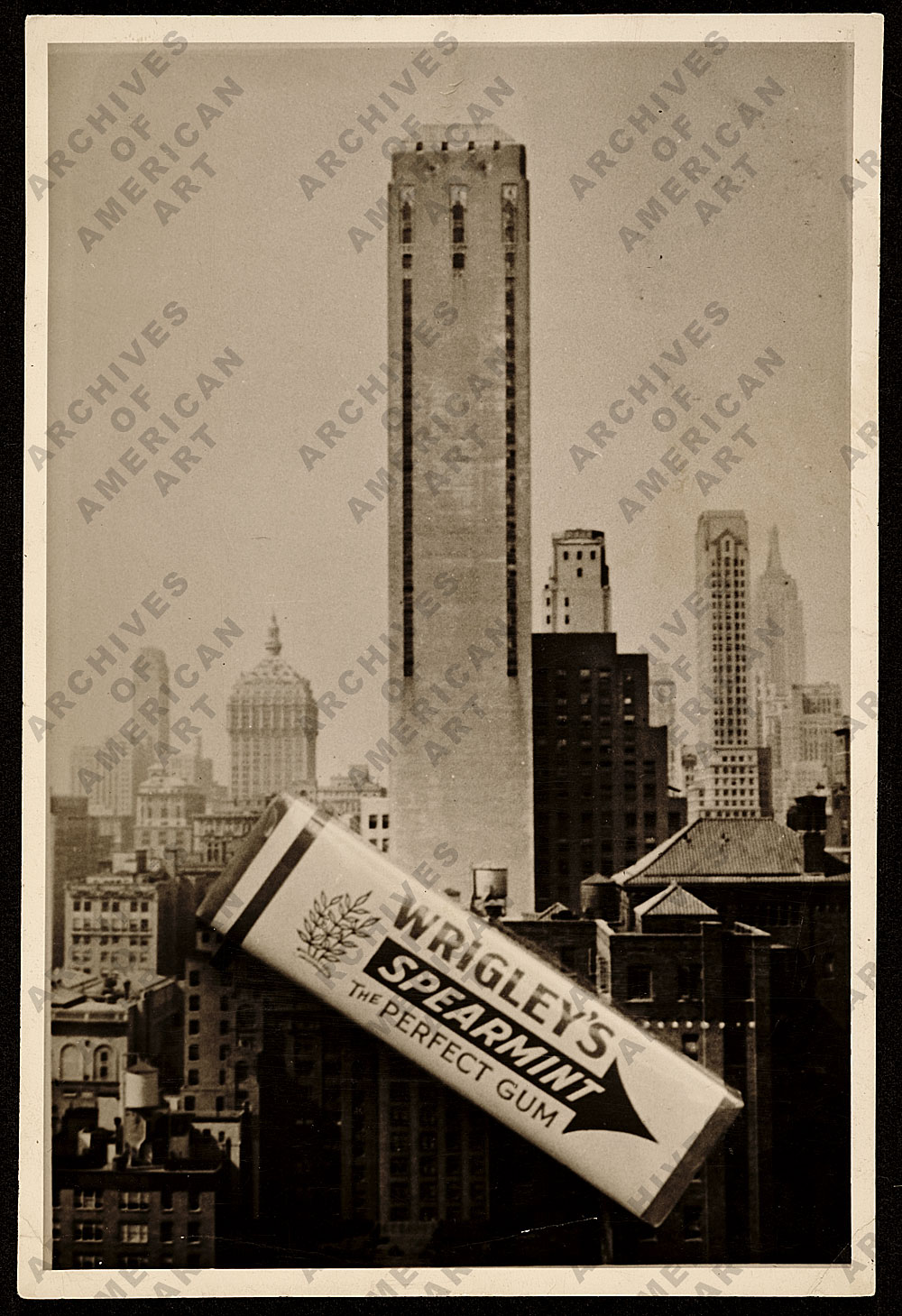
Charles Green Shaw’s Wrigley’s
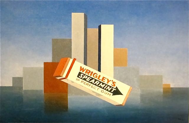
Wrigley’s, 1937, Charles Green Shaw, Art Institute of Chicago, image: poulwebb
The banner on J.S. Marcus’s WSJ story about American painting in the 1930s is Charles Green Shaw’s Wrigley’s, which is in the Art Institute of Chicago collection. Also, it is awesome.
With its unafraid abstraction mixed with proto-Pop, it reminds me of Gerald Murphy’s paintings from the 1920s. Shaw and Murphy both enjoyed privileged, Manhattan-based, continental lifestyles that involved painting, and according to Adam Weinberg’s 1997 exhibition brochure, they were friends in Europe.
But his AAA history doesn’t mention Murphy at all. Shaw didn’t get into abstraction until he came back to New York, well after Murphy stopped painting. And Shaw doesn’t seem to have been very involved in the artist community of New York in the 30s, despite having a couple of gallery shows, and being on some committees at The Modern. He was more a writer.
Which makes it tricky to gauge the quality/influence/familiarity of his work. It’s nice, some of it, like Wrigley’s, even looks great, but it doesn’t seem to have been important or impactful. The historical upside is limited, is how it feels. This, even though he was apparently friends with Ad Reinhardt. I guess it’s complicated?
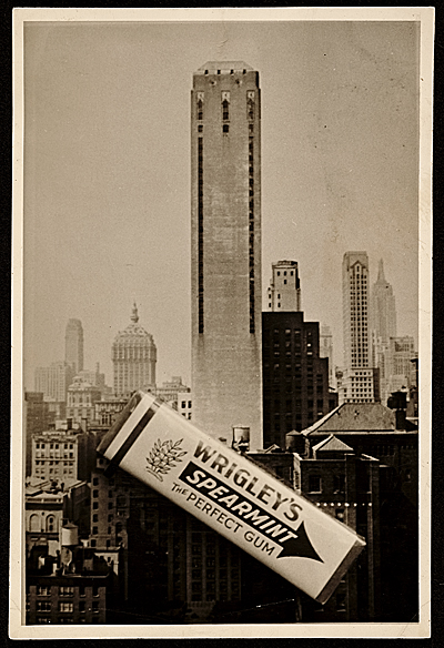
Still, it’s good to see this photo of a pack of gum sitting on a postcard, which looks like source material for the painting. It’s among the digitized collection of Shaw’s papers at the Archives of American Art. As the larger version of the image so ably informs us:
Maybe it’s hard to put an emphasis on Shaw’s painting because he had so much else going on. He wrote for the New Yorker, did slim books of verse, cranked out some children’s books, took photographs.
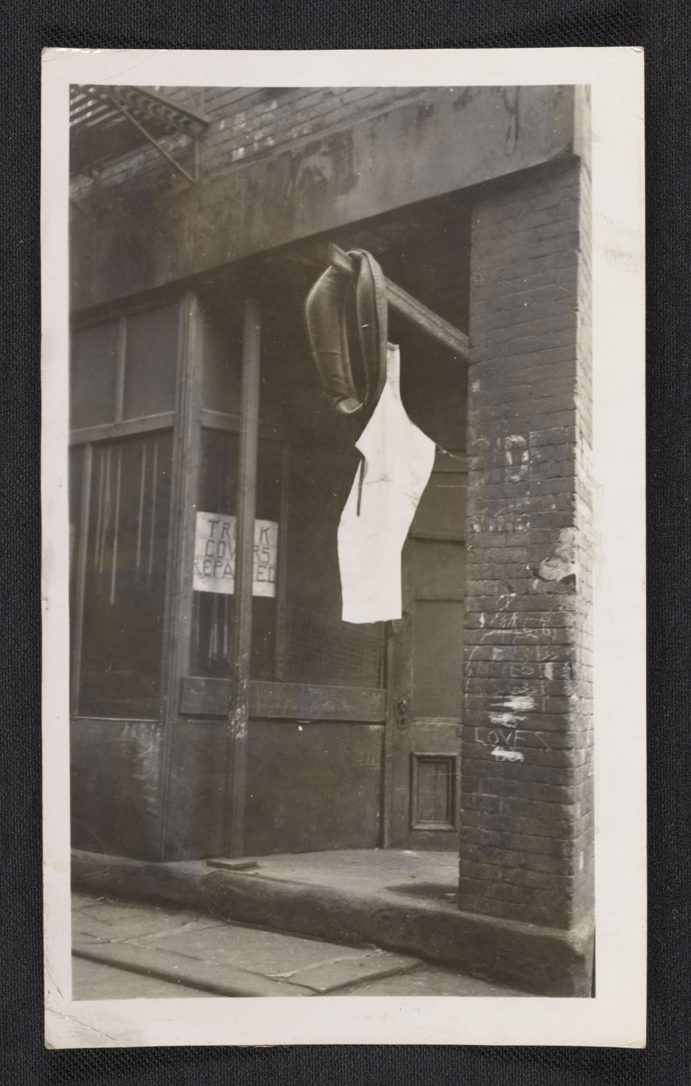
Charles Green Shaw, photo of NYC harness store, c.1940s?, collection aaa.si.edu
We might call Shaw an artist fluent in multiple mediums today, but his is the kind of peripatetic practice that we’re conditioned to look askance at when we see it in the past. Or maybe it feels like he did not take much of anything seriously, except for mixing drinks. Maybe it’s because he was rich and a “bachelor” in a time and art world where that didn’t help?
I don’t really know, but I like the work.
Oh here we go. In 2007 Roberta Smith also called him peripatetic and wondered, more clearly than I, about his legacy. His group of well-heeled colleagues, the American Abstract Artists, who were abstract when abstraction was un-American, “were often called — and not always benignly — the Park Avenue Cubists.”
When he died in 1974, Shaw left his art to a surprised friend, the collector Charles H. Carpenter, who became its posthumous shepherd. A bunch of paintings went to the Whitney, and the Art Institute bought Wrigley’s. And apparently, he’s been an overlooked American minor master ever since.
Charles Green Shaw papers [aaa.si.edu]
Charles G. Shaw’s artist page at Michael Rosenfeld Gallery [michaelrosenfeldart]
[nyt]
Machine-Generated Blade Runner, By Terence Broad
Blade Runner – Autoencoded: Full film from Terence Broad.
This is fascinating. Artist/computer scientist at Goldsmiths Terence Broad has created a film using a neural network. It “watches” and encodes a film frame by frame, then it re- or autoencodes the film from the resulting data. It’s the data equivalent of printing from a negative, or casting from a mold. Except it is not a copy, per se, but a re-generation. Does that make sense? I’m trying to understand and explain it without resorting to cut&pasting his medium blog post about it. The point is, his network generated images from the encoded data that they’d been reduced to. For an entire film.
The film he chose for his algorithmic network to watch and re-create: Blade Runner. Broad goes into some of the philosophical reasons for choosing Blade Runner, but the best explanation comes from Vox, where Aja Romano reports that Broad’s freshly generated film triggered Warner Brothers’ DCMAbot, which temporarily knocked the film off of Vimeo. It was put back:
In other words: Warner had just DMCA’d an artificial reconstruction of a film about artificial intelligence being indistinguishable from humans, because it couldn’t distinguish between the simulation and the real thing.
It all reminds me of the work done at UC Berkeley a few years ago that reconstructed images from brain scan data taken with an fMRI. Which in turn reminded me of the dreamcam and playback equipment in Wim Wenders’ Until The End of The World.
As Roy Batty said, “If only you could see what I’ve seen with your eyes.” And now you can.
Autoencoding Blade Runner | Reconstructing films with artificial neural networks [medium/@Terrybroad]
A guy trained a machine to “watch” Blade Runner. Then things got seriously sci-fi. [vox]
Previously: The Until The End Of The World Is Nigh
Dada’s Great, If It Weren’t For The Dadaists
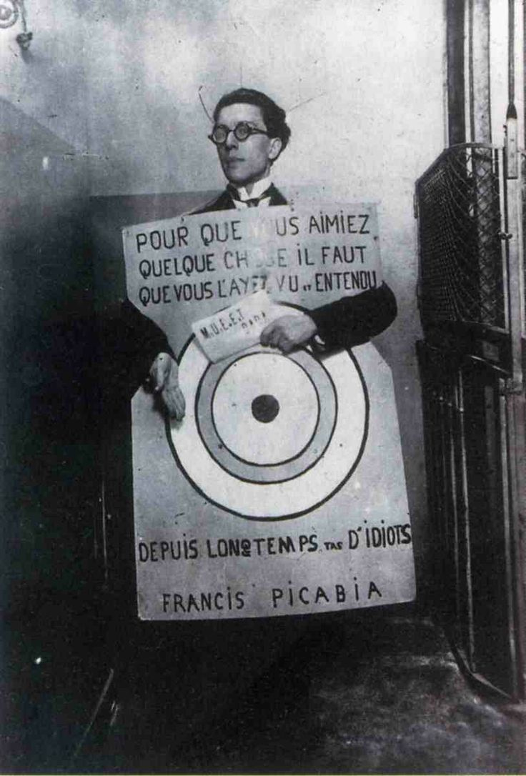
I love dada, I support it entirely. But dadaists themselves seem kind of tiresome to be around. Dead founding dadaists, on the other hand, we could hang out all day.
If I understand the history correctly, Francis Picabia painted this signboard which André Breton wore at the Festival Dada held on 27 March, 1920 at the Theatre de l’oeuvre. The quote comes from Picabia’s Manifeste Cannibale [2025 archived link], which Breton read that night in the dark: “For you to love something, you must have seen and heard it for a long time, you idiots.”
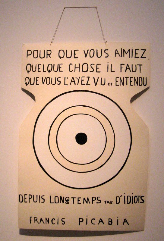
Ernest T. Bande d’Idiots, apres Picabia, 1985, acrylic on cardboard, collection FRAC Limousin
agnès b. says that Picabia took the photo, though the succession André Breton is not so sure. b. has reissued a 2004 t-shirt with the photo printed on it. b. also owns one of three replicas of the sign painted in 1985 by Ernest T., a 73-yo pseudonymous French artist whose dada appropriationist practice inspired the title of this post. Another is in the collection of the FRAC Limousin, which gave Ernest T. a retrospective in 2001. [pdf checklist].
That leaves one unaccounted for, but maybe I’ll just make it myself. Ernest doesn’t seem to have tried to guess the colors Picabia used anyway. That creme & greige palette does not strike me as very Festival Dada.
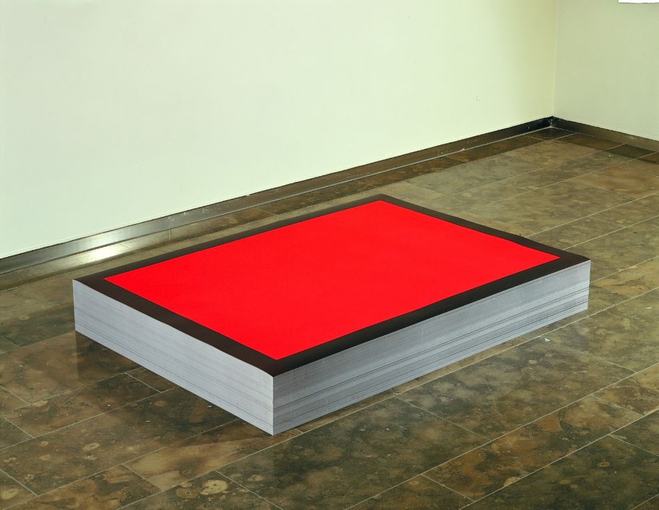
Monochrome House
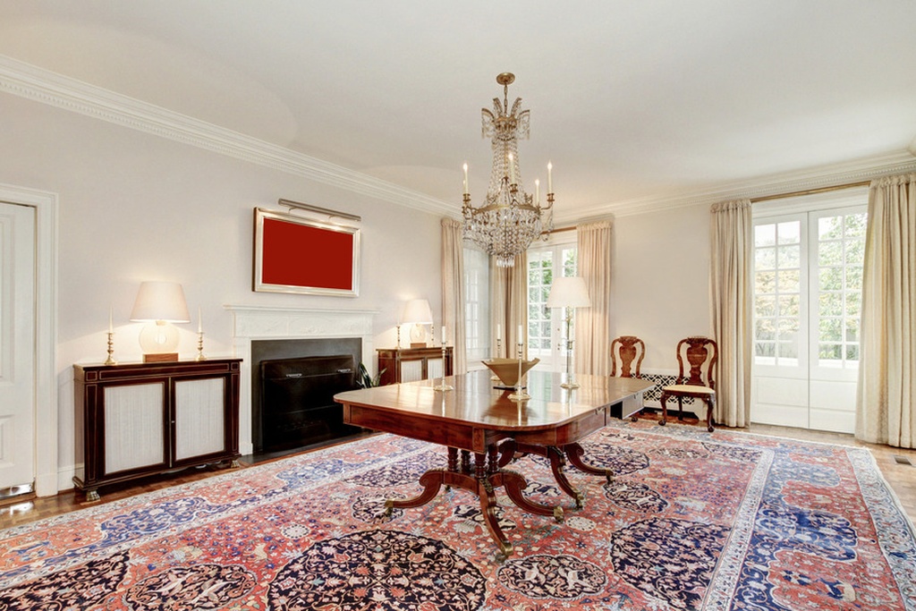
Study for Monochrome House Red, 2016
I’m consistently amazed at the photos in real estate listings, which turn someone’s private space and life inside out and propagate it across the web, where it just stacks up. It makes the case for real estate staging and swapping out all your belongings that much stronger; the photos may be intrusive, but at least they’re not intruding on you.
There’s another way, though.
While flipping quickly through the listing of a nearby house, I was stopped by an extraordinary artwork on the dining room wall: a bright red monochrome. Which, what?

Study for Monochrome House Beige, 2016
Scroll back, and there is a beige monochrome in the living room. The master suite has two monochromes in different shades of blue. Except for a couple of posters in the rec room, in fact, all the art in the house is monochromes. It looks fantastic.

Study for Monochrome House Blue #1, 2016
Way better than the “Art Panels” offered by that NY stager last year, which I think are basically giant sheets of gatorboard, the merest ghosts of actual objects.

Nothing. Meh. Keep scrolling.
No, these monochromes can really hold their walls.

Study for Monochrome House Green, 2016, this one has a serious Prina vibe
Kudos to the photoshop artist who devised this solution for the seller, who did not care to have his actual-and, for DC, surprisingly not insubstantial-art collection blasted out to the world in such an exhibitionistic/voyeuristic way. And if the seller, or the eventual buyer of the house wishes, I’m glad to realize the whole houseful of monochromes in time to close the deal.
[2021 update: this house sold in 2017, without either party assenting to the realization of this work. Now it is back on the market, and it is full of large, greige, monochrome hotel concourse art, so I guess the joke’s on me.]
Unjust Desserts
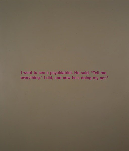
While running SFMOMA’s cafe, Blue Bottle Coffee pastry chef Caitlin Williams Freeman designed a whole bunch of artwork-inspired desserts, including a cookie platter that could be assembled into various Richard Serra Prop sculptures-which the artist did not like, not. one. bit.
Tell me everything, the world said, and so Freeman published a book, Modern Art Desserts.
And now they’re doing her act.
When SFMOMA closed for their Snohetta renovation, they required Blue Bottle to rebid for the cafe contract, and then they awarded it to McCalls, who ran the ground floor cafe, instead.
Now the SF Chronicle reports that on her first visit to the new museum, Freeman found McCalls serving knockoff versions of the art desserts, in her old space, with no credit at all. And the McCalls guy punted the paper’s queries to the Museum. Which makes me think SFMOMA figured because it owns the artworks, it owns the dessert interpretations, too.
If SFMOMA wants to serve art-inspired desserts, fine. But give credit where it’s due. I bought Freeman’s book, and tried her recipes. Those things are hard. It’s not just throwing grey frosting on a cupcake and calling it a Lead Splatter.
If they’re going to stiff-arm Blue Bottle entirely, though, then pick new artworks to base desserts on. Aren’t there a couple hundred new Kellys and Richters to copy now? Why not make a frosted cookie printed with Richard Prince’s joke painting? The fact that they don’t own it seems even more on point right now.
The Richard Serra Cookie Incident
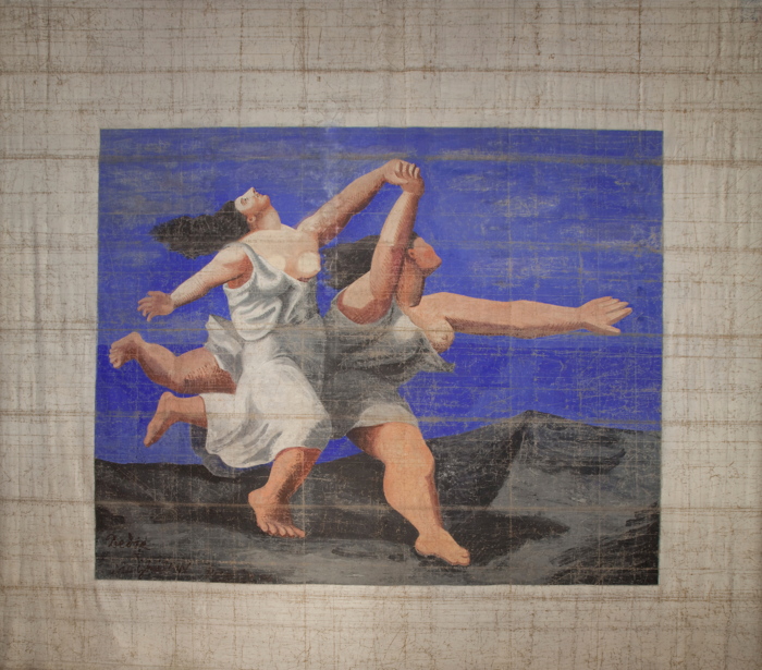
Giant Picasso Painting By Prince Alexander Schervachidze
I thought about it again after seeing Nicole Eisenman’s fantastic, crisp, woke paintings at Anton Kern. But the first time I wanted to remake a destroyed Gerald Murphy painting was in 2011, sometime after seeing the photo of Boatdeck, the epic 18×12-foot canvas he pwned the Salon des Indépendants with in 1924
Boatdeck dominated and outraged the Salon with its scale, style, and subject matter, and led to the resignations of several selection committee members. Murphy made a small number of normal-sized and amazing paintings for several years, but stopped in 1929, when his son got tuberculosis and the stock market crash threatened his family business. Boatdeck is one of eight that were lost or destroyed.

Boatdeck, 1924, photo: Gerald & Sara Murphy Collection, Beinecke Library, Yale
In 1921 Gerald Murphy and his wife Sara got their start collecting, then painting scenery for the Ballets Russes. It’s where they met their painting teacher, the exiled Blau Reiter and Futurist Natalia Goncharova. Genial, rich, and happy to work for free, Gerald would touch up backdrops and such by Diaghilev collaborators like Goncharova, Matisse, and Picasso.
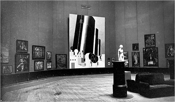
The biggest Picasso in the world is a curtain for “Parade,” a 1917 production for which the artist also designed the costumes, and Cocteau and Satie the music. It inspired Apollinaire to coin the term sur-realisme. The 11×14-meter curtain was shown at the Pompidou Metz in 2012.
The biggest Picasso I’ve ever seen, though, wasn’t even painted by him. Le Train Bleu (1924), is a 10×11-meter curtain created by Prince Alexander Schervachidze, another Russian exile, who enlarged a Picasso gouache so skillfully that the artist decided to sign it. Le Train Bleu was a ballet about the flashy, new, beachy Cote d’Azur lifestyle, and had costumes by Coco Chanel. It was not really a hit.
And it was Picasso’s last collaboration with Diaghilev, who nonetheless kept using that curtain all the time. It is pretty beat, especially compared to everyone’s favorite Picasso Ballets Russes curtain, le Tricorne (1919), which used to live in the hallway of the Four Seasons.
Train Bleu and Goncharova’s amazing 1926 backdrop for The Firebird were the climaxes of the National Gallery’s 2013 exhibit of the Diaghilev/Ballets Russes collection of the V&A. They absolutely dominated their galleries in the North Tower, which was then closed for gut renovations. The museum’s hilarious no-photo policy for the show left me with nothing but sneaky, wonky pocket shots of the painting’s feet. But it is awesome, and it made me want to remake things with brushes the size of brooms, too.
The Jetty Foundation Presents, Send Me Your Money

A couple of days ago I received a check. Actually, The Jetty Foundation, of which I am the president, received a check. It was from the State of Utah for fifty dollars, an overpayment of a filing fee for annual withholdings taxes.
[I created The Jetty Foundation as a not-for-profit corporation in 2011 in order to bid on the lease for state-owned land underneath Spiral Jetty. Though the Foundation’s bid was not accepted, the terms we proposed ended up getting baked into the renewed lease the state signed with the Dia Foundation, so that was nice.
The Jetty Foundation was not party to any of the negotiations or activities of Dia and its new local Utah partners, and has had no formal activities since 2011. Recently, though, I have discussed making a publication of historical documents related to the Jetty and its site. And also the feasibility of conducting open-access conservation surveys. For these possibilities and any others, that might arise, I have maintained the corporate entity in good standing. Corporations are people, too, after all.]
Alas, this corporate person does not have a bank account, and cannot sign over its check to me, the president, who paid the fee in the first place. And it seems kind of ridiculous to set up a corporate bank account solely to deposit one check.
I considered offering the check as an artwork, a unique work on paper, whose worth might surpass its face value. I thought of copying it a bunch of times as an edition. I half-joked on Twitter of just gathering a bunch more money for the Foundation, enough to make opening a bank account worth the effort. Well, no one’s laughing now.
greg.org is pleased to announce A Very Special Episode of Better Read, an adaptation of Chris Burden’s 1979 radio work, Send Me Your Money, benefitting The Jetty Foundation, as re-performed by a robot.
[Just as I am not interested in the various art student re-performances of Burden’s more physically extreme early works, the several other human re-performances of Burden’s Send Me Your Money kind of bored me. I did find it interesting that the robot voice cut nearly fifteen minutes off Burden’s time, even after I tried to manipulate its pacing. But It was listening to a pledge drive on a local public radio station tonight that sealed the deal; this is audio vérité.]
Download Better_Read_Jetty_Fndn_SendMeYourMoney_20160513.mp3 from dropbox greg.org [mp3, 41min, 59mb, via dropbox greg.org]
Podcast: Play in new window | Download
Subscribe: RSS