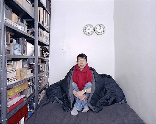
Glenn Ligon, Condition Report, 2000, screenprint on iris print, sheet: 31 7/8 x 21 5/8, the Bon à tirer for the edition of 20, plus one AP [plus 6 more AP and 2PP -g.o], selling at Christie’s London 20 Oct 2026
A while back I tried to track down all the editions of one of Glenn Ligon’s greatest prints—one of his greatest works to date—the 2000 diptych, Condition Report. It really felt like they were all in museums or otherwise as unobtainable as the 1988 painting they’re based on, Untitled (I Am A Man), Ligon’s first text painting, which is in the National Gallery.
This is the Bon à tirer, the proof that got the final approval to print the edition. Which is wild because Christie’s says the only declared proof was one AP. But there were actually 7 APs, and 2 printer’s proofs, in addition to the 20. Besides that anomaly, there is no indication of how it came to be owned by British clothing company founder Peter Simon. But this point, I think it’s best to just buy it, and sort out the details later, when it’s in your hot little hands.
Getsy spoke about Warhol and trans visibility in the 1970s, but it wasn’t so much a critique or analysis of Warhol. Warhol was a lens as Getsy laid out a complicated and fascinating narrative where the prominent but stereotypical depictions of trans Factory actresses like Candy Darling, Holly Woodlawn, and Jackie Curtis in Paul Morrissey’s Warhol-branded films became an object of critique by queer underground theater artists, specifically The Magic Hype, a 1973 transploitation spoof of Warhol’s Factory by the trans and street queen theater troupe, Hot Peaches. I cannot believe that’s one sentence.
Screenshot of Glenn Ligon’s Dec. 17, 2019 instagram announcement of the opening of “In a Year With A Black Moon,” the show at Rat Hole Gallery in Tokyo where he first exhibited his black Moon Jars
I have loved Glenn Ligon’s Moon Jars since they first appeared in “In A Year with a Black Moon” in 2019, in what turned out to be the last show at Rat Hole Gallery in Tokyo. And by love, I mean hearted them every time I’ve seen them on Instagram.
Their narrative hasn’t changed much in the intervening years, though: Ligon developed them with a Korean ceramicist in Japan over three years. They’re made with black clay instead of the kaolin white clay of Joseon originals. The rest of the discussion quickly shifts to Moon Jars themselves, and their history, and even that can be a very short conversation.
Glenn Ligon Moon Jars installed at “All Over The Place” at the Fitzwiliam in Cambridge in 2024, 📷: ig/glennadamson
Installation view of Glenn Ligon, Black Moons at APMA Cabinet, Seoul, Aug-Sept 2026, 📷: Hauser & Wirth
But there’s no hint yet about Korean responses to these reworkings of an iconic national form, or to its complicated historical entanglements with western Modernism, and with Japan.
From Instagram, at least, Ligon’s long, personal and creative engagement with Japan appears steady and extensive, going well beyond tourism or fandom. And it’s easy to imagine an organic and productive context for the Moon Jars’ development.
Computer, what is the diametric opposite of a photo of a Glenn Ligon Moon Jar? Lucy Rie photographed by Snowdon next to the Joseon moon jar Bernard Leach gave her, which the British Museum bought at Bonham’s in 1998, image via FT
But imagining is all there is, because I don’t see any more discussion of their origins or their making. Or in the moon jars’ intersections with Japanese colonialism, and the complicated dynamics around the elevation of simplified, utilitarian ceramics in the early 20th century by Japanese craft modernists like Sōetsu Yanagi, and then by modernists in the west It feels relevant that both of the major Joseon moon jars at Christie’s came from deep in Japanese collections—and that rather than discuss their provenance at all, Christie’s rehashed the Anglo-centric story of the moon jar at the British Museum.
Screenshot of Glenn Ligon’s Sept. 12, 2026 instagram post of his handmade brick sculpture in St Louis for Counterpublic’s Triennial
In contrast, Ligon just unveiled another sculpture of fired clay, where the complex context of who made what, how, and where, feels baked right in. For Coyote Time, the triennial in St Louis organized by Counterpublic, Ligon has created Who Builds Anything In This Country? a serpentine wall of handmade bricks marked with the fingerprints and marks of local students and seniors. This, in a state and a country where, before the Civil War, most bricks were made by enslaved people.
There’s a fuller moon jar discussion to be had, and almost ten years into Ligon’s project, I cannot be the only one who’d love to have it. I’d also like to see them in person.
One thing I love about this edition [which greg.org hero Matt tipped me off about] in Glenn Ligon’s new show of works on paper at Hauser & Wirth , is that Ligon did not use the digital image of the 1989 study from Punchlines, Sotheby’s themed online sale of Richard Prince jokes in December 2023 as the base for his hand-drawn redactions.
Richard Prince, Untitled (Study for Joke Painting), 1989, ballpoint pen, tape and printed paper on paper, 12 by 9 in., sold at Sotheby’s 15 Dec 2023 for $7,620
Ligon’s image of Prince’s printed, clipped, annotated, taped, three-layer study has different shadows along the edges of the collage, so a different lighting situation than when Sotheby’s photographed it. Did Ligon photograph it while on view? Did he buy it? That would be some praxis. [And with an edition of 25, a great ROI.]
The dimensions of Ligon’s edition and Prince’s study are identical—and I love how Ligon signs his in a way that echoes Prince. But that’s just the dimension of the sheet; in fact, Ligon is presenting his work, Punchline (2024), in an identical frame, too. The facsimile objecthood is strong with this one.
Except, of course, Ligon’s intervention completely transforms the work. It’s not that his crossouts eliminate the rape and racist jokes; you can still make them out, if you’re determined to. But he changes entirely the delivery and impact of the punchline [sic], which is not, of course, much of a punchline at all.
When I went looking to see if Prince ever made a painting with this double joke printed 16 inches wide, I didn’t find one. But I did find one of Prince’s joke sources: The Official Black Joke Book/The Official White Joke Book, a 1975 addition to a long series of Official [Some Target Group] Joke Books by Larry Wilde. [So far, the text of the hippie hitchhiker joke does not appear anywhere online outside of Prince’s own oeuvre.]
Ligon recomposes the text, but also reauthors it in ways that matter, and that highlight the mechanisms of appropriation. In his Cariou deposition Prince talks about wanting “to be a girlfriend,” wanting dreads and to be a Rasta he saw at a bar in St. Barth. And when he can’t, he says, “Maybe I should paint them. Maybe that’s a way to substitute that desire.” Now there’s a thread to pull on, which runs through Prince’s work, but also through the white male gaze culture he was soaking in and drawing from.
Text, appropriation, painting, history, racialized experience, queerness. This one print has me questioning whose tools are being used here, whose house is being dismantled, and what’s being built in its place. I’m not sure there’s another artist working now who could make so little into so much.
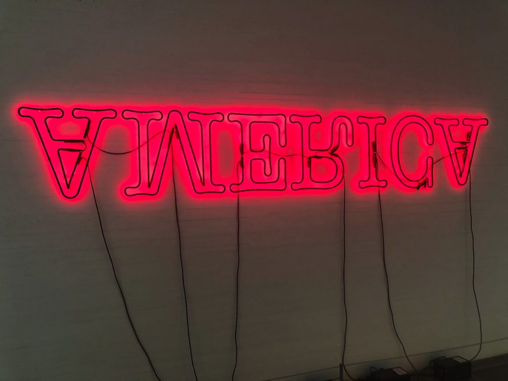
Photograph after Glenn Ligon (Double America, 2012, 36 x 120 in.), 2016, Diasec flush-mounted, 44 x 129 in. sold from the Estate of Chara Schreyer in 2023. Were the power cables photoshopped out, or did Schreyer have them hidden in the wall?
Glenn Ligon, Condition Report, 2000, iris prints and screenprint, each sheet 32 x 22 3/4 in., ed. 20+ 7 APs, and 2 PPs, the National Gallery of Art’s is AP5, and they have the painting
It took a lot of effort to not include it, but despite making the absolute best condition report-related artwork ever, Glenn Ligon really did not need to be dragged into a discussion of Ron Perelman’s art collection lawsuit.
The only reason I wouldn’t run into a burning house to save Condition Report (2000) is because it’s an edition of 20. But if you told me I could keep it, I would probably change.
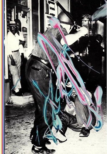
These went almost instantly into museum collections. I am pretty sure Perelman didn’t get one. But the NGA wins, because they also have the original: the enamel painting Ligon made of the garbage workers protest sign he saw hanging in Congressman Charlie Rangel’s Harlem office as a student. He discussed all three works in 2013.
Glenn Ligon’s Untitled (America/Me), 2024, installed near the High Line in a way that requires me to dodge out Heatherwick’s garbage Barrel O’Monkeys Tower, no offense, photographer Timothy Schenck
In retrospect it felt kind of remarkable that Glenn Ligon’s High Line billboard was installed in September 2024 even before [gestures around] all this. But then, there was a lot going on then, too. And the image itself has some history to it.
Of Untitled (America/Me), 2024, The High Line only said, “For this work, the artist manipulated a photograph of his 2008 neon,” which is true enough. In 2022, though, Ligon made a little edition, Untitled (America/Me), 2022, of a photo of America (2008) with Xs drawn by hand, which was split between Texte zur Kunst, Primary Information, and the Carré d’Art Nimes.
Glenn Ligon, Untitled (America/Me), 2022, 5.125 x 7 in. digital print with hand-drawn additions on 11 x 14 sheet, ed. 50+10AP, via Primary Information
That work, or that image, at least, looks to be the same one the High Line calls Untitled (2008), but also the same as the Rubells use to illustrate their AP of America (2008). Which is different from the Tate’s Untitled (2006), the earliest version of a neon AMERICA, in which the tubes are painted completely black.
So, when I was approached by the High Line to do this billboard project, I went back to not actually the work, I actually went back to a postcard I had sent someone. There was an invitation, I guess for show that had that 2008 America neon in it, and I just took that postcard and mailed it to a friend and crossed out all the letters of America and left the “m” and “e”.
When I started thinking about that billboard I just happened to be at a dinner party at my friend’s house, and I saw that little postcard I sent them that they very kindly kept and put in a frame, and I thought, “Oh, that’s not bad.” [Laughs] So, I basically borrowed back my own work to make that billboard.
Though a postcard-sized print does seem like a non-trivial phase in the transformation from postcard to artwork, Ligon does not mention this 2022 edition. Yet the insights Ligon shares about that process of recognition are not negated, only pushed back in time a little bit.
Glenn Ligon, Untitled, 2024, digital pigment print on Hahnemulhe, 41.9 x 30.5 cm, ed. 30+15AP via curatingcambridge.co.uk
It’s a digital print based on one of his recent drawings he calls Kozo Drawings on his site, after the kind of paper (mulberry). In the edition description, they’re explained as frottage, graphite rubbings Ligon made of the craggy surface of his own paintings. In this case, it’s a painting of a text from James Baldwin.
For example: Glenn Ligon, Untitled #10, 2023, carbon and graphite on Kozo paper, 18 x 12 in., via glennligonstudio
There’s something interesting about Ligon adding another layer to the mediation of his text pictures, particularly when it depends on their [also] being an object. Then there’s something else when the rough, fragile, abradedd sheet is translated to an ultrasmooth print. It feels almost like a facsimile. [And speaking of which, I can’t lie, as interesting as the print and drawings are, it was the sleek black envelope the print ships in that pushed me over the blogging edge. I’ve been making janky versions for Facsimile Objects, and this looks so much sleeker.]
Ironically, the prints were produced at Griffin in NYC, but now will ship from the UK. All for a good cause, though.
Glenn Ligon, Untitled, 2024 Limited Edition Print, GBP 1200 or so [curatingcambridge.co.uk via ig/@glennligon] [sept 2026 internet archive link update: I cannot believe the thousand year old university with the museum whose paintings move so little their faded velvet wallcoverings become the artist’s whole-ass installation just delete the page for his print edition when it sells out, I guess, and redirect it to their Cambridge X lululemon collab.]
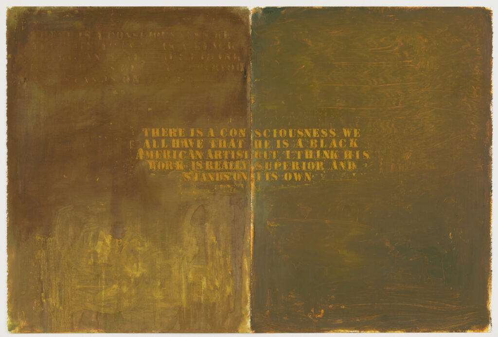
Glenn Ligon, Untitled (There is a consciousness we all have…), 1988, Oil, oilstick, pencil, and acrylic on two sheets of paper, 30 x 44 3/4 in., collection: MoMA
Some time in 1988 before November, Glenn Ligon made Untitled (I Am A Man), which is called his first painting of a selected text, based on a 1968 civil rights protest poster he’d seen as a student in the local office of Congressman Charlie Rangel.
In November 1988, Jamaica Art Center visual arts director Kellie Jones’ proposal of sculptor Martin Puryear to represent the US at the São Paulo Bienal was announced. Puryear was the first Black artist to represent the US at an international exhibition. [He went on to win the grand prize and a MacArthur that year.]
One of the ten members of the Federal Advisory Committee on International Exhibitions, which made the selection, was Hirshhorn Museum chief curator Ned Rifkin, who actually said, to The New York Times, “There is a consciousness we all have that he is a black American artist, but I think his work is really superior and stands on its own.”
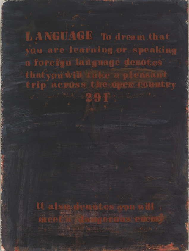
Glenn Ligon, No. 291 (Language), 1988, Oil, acrylic, oil stick, and graphite on paper, 30×22 in., a long promised gift of Emily Fisher Landau to the Whitney Museum, accessioned in 2024
Also in 1988 Ligon was working on stenciling found texts, on paper. Including quotes from “dreambook” pamphlets, street handouts that coupled dream interpretations with advertisement for an underground lottery his father worked at.
And also condescending quotes by major museum curators published in the newspaper. Untitled (There is a consciousness we all have…) comprises two sheets of the same size as the dreambook painting above. It shows an early example of Ligon stenciling a found text multiple times. In a composition similar to No. 291 (Language), faint and effaced versions of Rifkin’s quote can be seen on the top and bottom, respectively, of the left sheet, while the right sheet seems to bear traces of marks made by pushing the stencil itself.
And I thought this is how it must have felt to first encounter Ligon’s work. Much is made of Ligon’s choices of text and the resonance of their sources, but it feels worth noting how much of that information exists apart from his paintings. Though he eventually began mentioning titles in his own titles, early sources like dreambooks and Ned Rifkin were untraceable and unrecognizable, at least to someone who didn’t live them. So their first reference is Ligon, who put them there, not the source he got them from. Which makes Rifkin’s quote even more outraging, offensive—and, for a young Black artist reading it, dispiriting.
In 1991 Ned Rifkin left the Hirshhorn for the High Museum in Atlanta, and Ligon was in his first Whitney Biennial. In early 1993, presumably before he showed Notes on the Margin of The Black Book at the Whitney Biennial, the Hirshhorn acquired their only Ligon works to date: a door painting, Untitled (Black Like Me #2), and Untitled (Four Etchings), both from 1992. The painting was loaned to the White House for four years beginning in 2009. The National Gallery of Art acquired Untitled (I Am A Man) in 2012.
The three pieces they discuss and play, by Steve Reich, Julius Eastman, and Jason Moran, are all bangers of their kind. No spoilers, but Ligon’s made work related to a Reich text piece [above]; Moran scored a Ligon film, and it turns out Ligon and Eastman will be in a two-person show at 52 Walker in January.
Felix Gonzalez-Torres’ portraits are, by design, a conflation of the public and private, the world historic and the individual, the news and the intimate. And the artist encouraged his subjects to add and edit important events, people, and dates, authorizing them to decide what version of a portrait should be used whenever it is exhibited.
So I am pretty sure that when “Untitled” (Portrait of the Rosenbergs), 1994, was installed at Paula Cooper Gallery this summer, the text was provided by its subjects, OG Tribeca collectors Colombe Nicholas and Leonard Rosenberg. The work appears in Tabula Rasa, a fascinating-looking group show tracing study, influence, and relationships across a network of artists around Sarah Charlesworth.
Covid arrives when again? detail of Felix Gonzalez-Torres “Untitled” (Portrait of the Rosenbergs) in Tabula Rasa at Paula Cooper Gallery, screenshot from @aaron_krach’s 10 July IG
And I guess one way to interpret the inclusion of “Covid arrives 2021” is as the date it finally made its way into the Rosenbergs’ pod? Did they somehow miss the entirety of Covid in 2020, when it was very much a thing? Did the date baked right into the name, COVID-19, not factor in? Did they perhaps mean “Vaccine arrives 2021”?
The very nature of Felix’s portraits, and also the nature of human history as an accumulation of lived individual experience and interaction, and also the ultimate impossibility of knowing someone else’s subjective experience, and also the inevitable failure of art, no matter how powerful, to perfectly capture and transmit the essence of that subjectivity, makes me reluctant to call the factcheckers. If or until I hear back from them or the gallery with more info, for the Rosenbergs, at least, Covid arrived in 2021.
Detail of “Untitled” (Portrait of the Magoons), 1993, Nancy Magoon Version, as installed in 2023 at David Zwirner
Meanwhile, in his 2023 show of Felix Gonzalez-Torres’ work, David Zwirner exhibited another portrait, “Untitled” (Portrait of the Magoons), 1993, but in three versions. Artists Coco Fusco and Glenn Ligon created their own versions, and collector/subject Nancy Magoon provided her own version. [cf. this YouTube video of them speaking with Helen Molesworth about the portrait(s).]
In her version Magoon, whose husband and co-subject Robert passed away in 2018, included “Covid lonely 2020.” Which, taken together with “Bedazzled 2019, 2021, 2022,” might mean the pandemic canceled Ms. Magoon’s annual screening of the Elizabeth Hurley/Brendan Fraser classic. Such is the nature of a Felix portrait, of course, that we may never know.
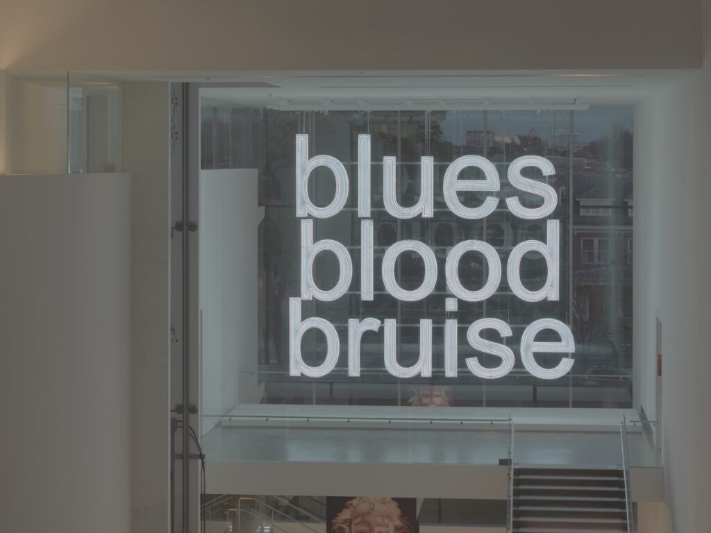
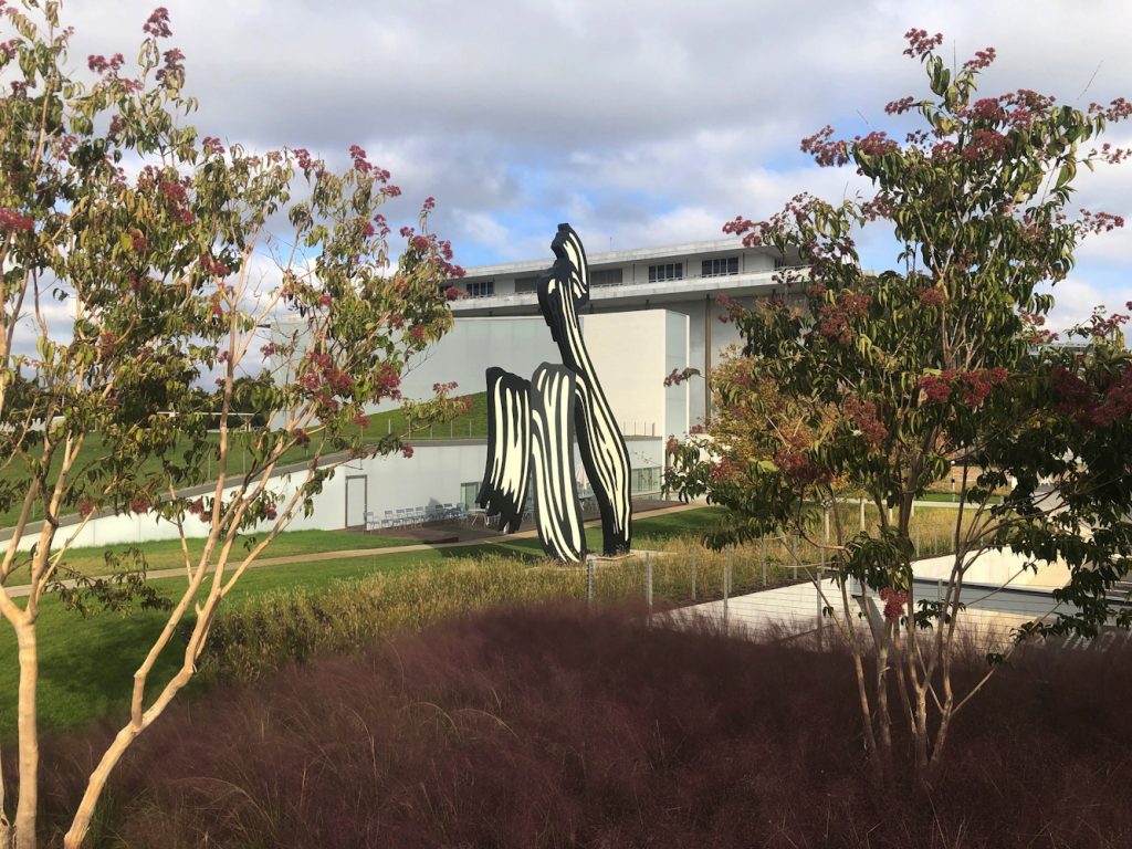
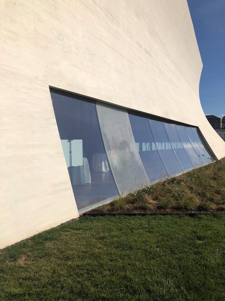
My initial impression of the Kennedy Center’s The Reach is obliqueness. It is in a triangle of land carved by a parkway and on-ramps and a bridge, from which it is hard to see. I finally made a visit this morning after multiple failed, drive-by attempts to photograph this new installation of Untitled (Trudeau Trump Brushstroke). This perfectly framed and backdropped view is the only one, and it is in the intersection of a The Reach sidewalk and a commuter bike path.
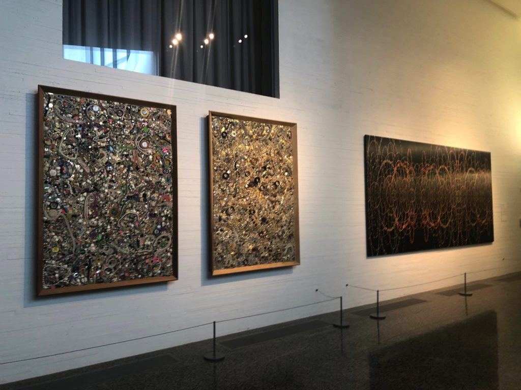
Mike Kelley and Fred Tomaselli on loan from Glenstone at The Reach
The art at The Reach is on loan. I did not check where the big, blue Joel Shapiro came from, but except for the large, 1969 Sam Gilliam painting, which is from the artist himself, most of the work inside comes from Glenstone. In lieu, it looks like, of a lot of money. David M. Rubinstein, meanwhile, has given more money than even Boeing, and loaned James Madison’s copy of W. J. Stone’s 1823 facsimile etching of the Declaration of Independence (ed. 201, of which around 50 survive, apparently.)
Glenn Ligon neon on loan from Glenstone
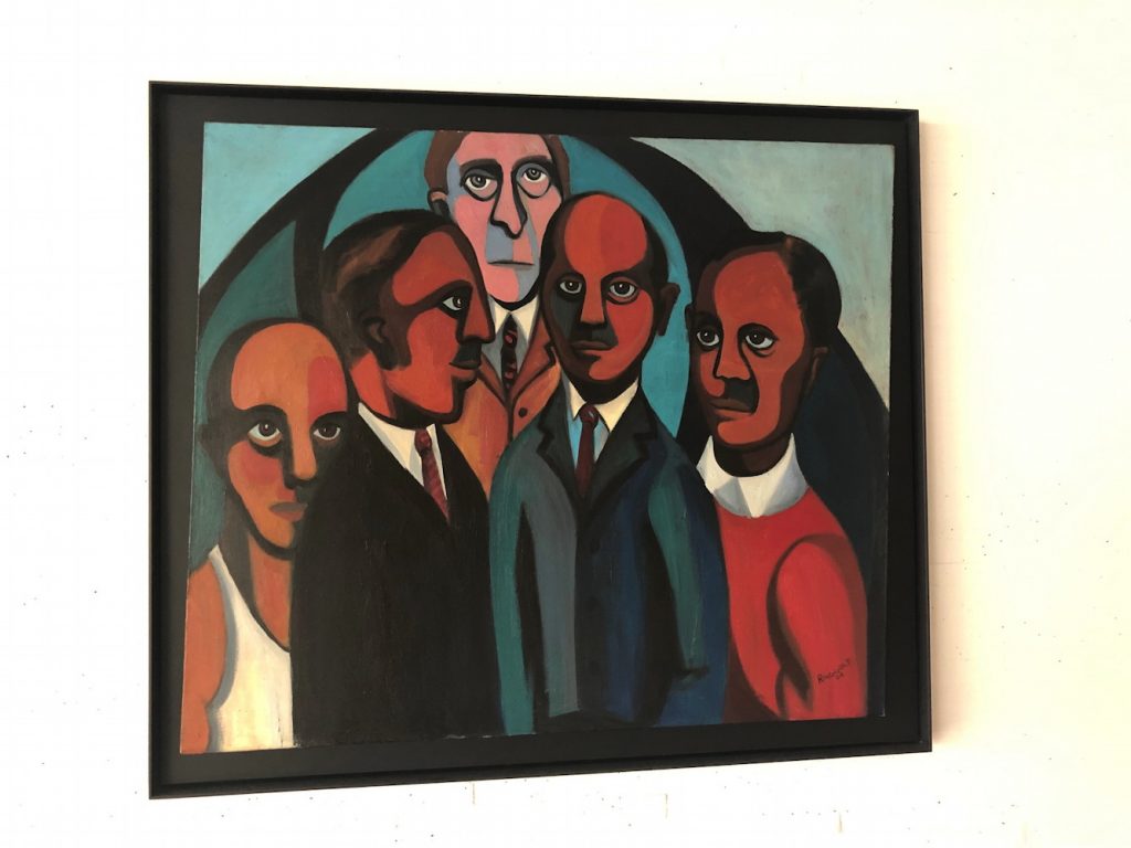
Faith Ringgold painting on loan from Glenstone
Boeing also sponsored the exhibition of George W. Bush’s paintings of Iraq War veterans, the billboard for which is not easily visible from the nearby roads. Maybe if you’re stuck in traffic. I did see the show, and will write about it separately.
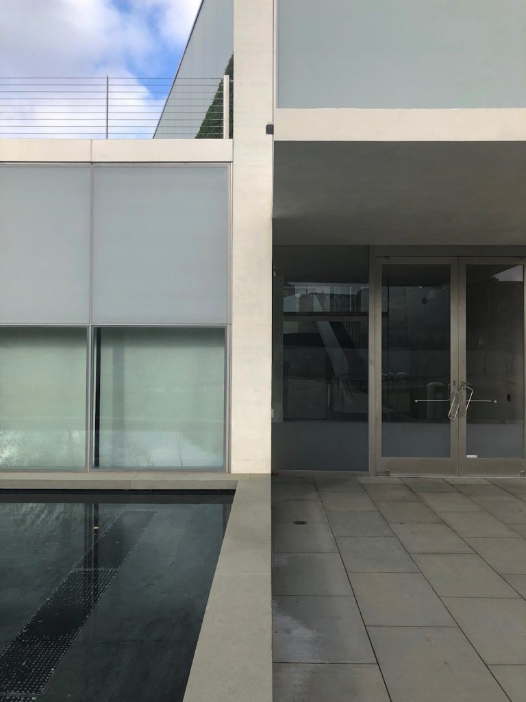
Other thoughts of The Reach: I felt some spatial echoes with Holl’s ICA at VCU, especially in some peekaboo vistas and the dramatic staircase.
Perhaps this awning rainspout is designed to arc perfectly into the pond and not splash onto the ledge instead?
shattered glass at The Reach, presumably under warranty
Kelley Walker, Schema Aquafresh plus Crest with tartar control, 2003, digital file, image: camstl.org
I am not at all ready to address the discussion and protests surrounding the exhibition of Kelley Walker’s work at CAM St Louis, but the statement by Paula Cooper caught me up. “The role of the artist, it has been said, is to ask questions, not answer them.” Chekhov said that, and he’s not wrong, but not right enough, either.
And KareemEstefan responded, in a tweet exchange with Pedro Velez, “True–but does Walker know what Qs his art is asking?”
That reminded me of the paragraph I’d cut from the top of Mirta D’Argenzio’s Rauschenberg essay I quoted yesterday. I am pretty sure this is the artist speaking:
“Gertrude Stein said on her death bed when they asked her what the answer was and she said, ‘What is the question?’ So I have to keep the question changing. The only way to do that is with an open mind.” It’s rather like the riddle of the sphinx. Rauschenberg, the insatiable, suggests that the riddle be left unsolved, and indicates that the very purpose of art is to keep changing its questions.
The very purpose of art is to keep changing its questions.
It seems to me that this is what is happening to Walker and his work in the 13 years since he made it. Not only have the questions changed, the audience has, too. And sounds like neither the artist, the curator, nor the institution understood that.
The sharpest thinking I’ve seen on Walker’s work is still Glenn Ligon’s essay in Parkett from 2010 [pdf]. Ligon finds the utter insufficiency of thought or discussion around Walker’s use of black imagery to be significant in itself, both a “dilemma” and a source of “enormous vitality.” He correctly identified “Kelley Walker’s Negro Problem” as the art world’s problem, too. And America’s. He’s still right.
I only met Tobias Wong a couple of times, but it took me aback to see so many people I do know were described or quoted in Alex Williams’ NY Times piece as Tobi’s friends.
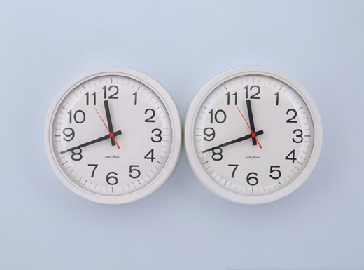
Tobi liked to give other artists’ and designers’ work a sardonic or critical twist. But the first photo in the Times’ slideshow featured a work that was different, an idealistic, almost geekily romantic “fix” of an iconic Félix Gonzalez-Torres sculpture. Perfect Lovers [actually, Perfect Lovers (Forever) (2002)] is a remake of Félix’s “Untitled” (Perfect Lovers), 1991, a pair of identical, white wall clocks which begin in sync, but which invariably diverge over time.
For his new and improved version, Tobi attached a radio receiver to each clock that syncs it with the official US Atomic Clock. They’ll stay in sync within a second over a million years.
Félix made at least six of his pairs of clocks, which, if they weren’t exactly self-portraits, referred to him and his partner Ross Laycock. Tobias’s references the white version [on a wall painted light blue], which is now in MoMA’s collection, dates from right before Ross’s death, and is listed in Félix’s catalogue as unique.
Before that, in 1990, Félix made “Untitled” (Perfect Lovers) with black clocks in an edition of three. The date given for those works is 1987-1990, which is probably to account for the existence of earlier work.
White Columns has a pair of white clocks hanging behind the desk, officially undocumented, it seems, which were included in a 1988 exhibition as coming from an edition of three.
And at the time of Félix’s death, a 1987 work [officially listed as “additional material,” not work] titled Perfect Lovers, was in the collection of his former partner Jorge Collazo. It consists of a pair of wall clocks, signed, titled, and numbered, “1/3”.
Knowing that Félix made Perfect Lover clocks for all his boyfriends [sic] throws a layer of complexity onto the typically poignant interpretation of the work: yes, they’re identical and in sync (for now), but they’re also mass produced. And replaceable. You can pick one up at the corner. Of these conditions, the one Tobias chose to “fix” in his version was the eventual slipping out of sync. as always, an update: Turns out there is also an AP of the 1987-90 edition. And the Renaissance Society in Chicago has reportedly left their locally made exhibition copy of “Untitled” (Perfect Lovers), made in 1994, up in their offices. And in 2007, Glenn Ligon wrote in Artforum that he still had the “Untitled” (Perfect Lovers) he made in 1996, soon after learning of Félix’s death.