Court Order, Or What Would Danh Vo Do?

Oh no, I was too slow. I was in the middle of a deadline-intensive project when I suggested that. While I understood the reluctance, even the revulsion, an artist might feel, but being compelled by a judge to make a “large and impressive” artwork–and a $350,000 one, no less–sounded like a fascinating situation. What would you do?
danh_vo_shove_it_punta.jpg
…, 2015, oak and polychrome Madonna and child, French Early Gothic 1280- 1320; marble torso of Apollo, Roman workshop, 1st-2nd century ad; steel 154.2 × 50 × 50 cm
Courtesy of the artist and Marian Goodman Gallery [works list (pdf) via palazzograssi.it]

Well, today, just as I was mapping out the parameters of my own proposal, Danh Vo apparently answered that question himself. His proposal to Dutch-in-Switzerland collector Bert Kreuk was a little unclear in the details, but it involves a quote from the demon possessing Regan in The Exorcist, which Vo had also used for a piece in his show at Marian Goodman in London last January, and which he included in “Slip of the Tongue,” his fantastic group show at Punta della Dogana in Venice. [I guess it’s still available. Ask for it by name!]
Maybe Vo already had this whole Kreuk/Gemeentemuseum/lawsuit situation on his mind when he chose The Exorcist for his source material. Who knows? But the artwork parameters cited in the court’s new ruling in Kreuk’s lawsuit are intriguing enough to lay out, and at least give some though to the question: What Would Danh Vo Do?

Continue reading “Court Order, Or What Would Danh Vo Do?”

Walking Man — A Self-Portrait With Google Street View (2010, pdf)

walking_man_pdf_still_03.jpg
A little over five years ago I stumbled across this distorted Street View photo from in front of the Mauritshuis in The Hague, and then discovered the same guy kept popping up in all the nearby Street View shots, too. Eventually I realized he was walking alongside the Google Trike on its maiden European voyage through the Binnenhof, the seat of the Dutch Parliament.
walking_man_pdf_still_02.jpg
Sometimes only the top of his head would appear; in other panos, he’d appear in fragments; and in a few, a cobblestone lozenge would wipe him out completely. I called him “walking man,” after the sculptures where Alberto Giacometti sought to capture that instant where a person comes into view.
At first I thought he was a tourist who’d happened upon the Google Trike and decided to follow it around, but several months later, and after other Google Trike images came online, I realized he was part of the mapping team. But the interesting tension between his persistent assertion of his presence and Google’s algorithmic attempts to erase him did not require coincidence. By now we realize people are anomalies in the Street View datascape, whose appearance only diminishes the maps’ utility. This was only becoming clear in 2009-10, though, when Google expanded its photomapping to Europe.
walking_man_pdf_still_01.jpg
Anyway, I made a photobook of walking man’s every appearance in the Binnenhof, but the book was never published, and remained trapped inside blurb’s production software. While others trawled GSV for Cartier-Bressons, Crewdsons and Franks, I kept collecting these distorted self-portraits of the Google Grips, which blurred [sic] into [Google’s] Google Art Project. But this first one is really the best. Plus, most of the panos have disappeared from Google itself. So I am releasing it into the wild as a pdf. I was briefly tempted to update the introduction, but I figure it’s better as a souvenir of the time, and what GSV looked and seemed like way back in 2010.
walking_man_cov_proof_2010.jpg
walking man — a self-portrait with Google Street View [10mb pdf via dropbox]
Previously:
Walking Man, the photobook [apr 2010]
Google Street View Trike has a posse [apr 2010]
Oh right, Google started deleting walking man‘s panos after I posted about them [june 2010]
co-opting GSV as a self-portrait medium percolated from this Binnenhof photoset [feb 2011]
and got surpassed/swamped by the introduction of Google Art Project [feb 2011]
Oh right, here’s the intro text from the then-still-unreleased book [feb 2011]
They’re adapting: Man With A Pano Camera [june 2013]

Nice Work If You Can Get It: Kreuk v. Vo & Co.

JUNE 2015 UPDATE: The Dutch judge ruled in Kreuk’s favor, ordering Vo to create “a large and impressive” work as he apparently originally committed to do. There are other conditions and instructions, like, they have to get along and stuff [not kidding]. It’s an extraordinary ruling, and while I’m sure Borgias or burghers compelled artists to make stuff in the past, this proposes an almost unprecedented situation for the creation of a contemporary artwork. I’ll do a separate post on the matter, I think. Kreuk emailed me to let me know of the judge’s decision, reminding me that I had called his suit “folly.” I’m happy to be corrected when I’m wrong, but I’m not so sure I was. Winning can still be folly. I do know I’m even happier not to be involved in this mess.
kreuk_danh_vo_letter_b.jpgoy, is this a mess, and the reporting about it is not helping. As the English-speaking art world has learned in the last week or so, Dutch collector Bert Kreuk is suing Danh Vo for around EUR900,000 ($US1.2m) for failing to deliver a $350,000 installation commissioned for a show of Kreuk’s collection at the Gemeentemuseum in The Hague last summer.
The original RTL story [in Dutch] didn’t have many details of the case, but it did mention that Kreuk had been criticized for selling 11 works from the exhibition at Sotheby’s just weeks after it closed. This translated into artnet’s headline calling Kreuk an “art-flipper.” Which was apparently worse than losing a $350,000-1.2m Danh Vo, because it was the focus of much of Kreuk’s sympathetic q&a with Sotheby’s & BLOUIN ArtInfo writer Abigail Esman.
It all seemed rather confusing and odd to me, and frankly, cut and dry, legally, when an artist takes money and then doesn’t deliver. Kreuk had also said that “Danh Vo has already been ordered by the courts to finish another, different work in my collection, backed by an immediate due and payable fine of 40,000 euros and 2000 for each day of delay.” Which, again, seemed pretty severe, so I wanted to see the actual court documents, to see the facts underlying the various, specific claims Kreuk was making. Fortunately, one of Kreuk’s first tweets was a Dutch art law firm’s facebook post which linked to the Rotterdam District Court’s preliminary finding [Case no. C/10/442131 / HA ZA 14-57, by the way]. And now I am more confused. But I also find some of Kreuk’s characterizations inaccurate at best, and I think his lawsuit is folly, and he would be wise to withdraw it.

Continue reading “Nice Work If You Can Get It: Kreuk v. Vo & Co.”

All The World’s A Stage Set By Piet Mondrian

mondrian_ephemeral_werner.jpg
Model for set design, “L’Ephemere est eternel,” 1926, recreated in 1964, photographed in 2008 at Vanabbemuseum by Jeff Werner
After reading Michel Seuphor’s Dada play “L’Ephemere est eternel” in 1926, Piet Mondrian surprised his friend by designing sets for each of the three acts. The little models were photographed amidst Mondrian’s paintings in his studio, a nice parallel to the play’s denouement, in which a model of a theater is destroyed by an executioner. It also resonates with a play Mondrian himself wrote in 1919, which ends in his studio. For someone trying to change all the world, the stage was a nice place for a dry run.
mondrian_studio_model.jpg
Susanne Deicher noted that Mondrian refused to be photographed painting in his studio.

Mondrian often said that “new life” could be found in the free space opened up by reason and thought. The empty plane at the centre of the small painting on the easel reflects the absence of the artist.
During this period Mondrian frequently spoke of the end of the subject in the new age to come. He designed his studio as an imaginary setting for a theory without an author, where the “new” appears to evolve in the non-space of the empty center of his abstract paintings.

This absence to Mondrian’s ideas for the staging of “L’Ephemere” as well. He really wanted sets that concealed the actors as they delivered their lines. To what extent Seuphor was on board with Mondrian’s creative involvement, I don’t know.
I also don’t know in what form it circulated at the time, or how widely it was read or known, but Seuphor’s play was not actually ever performed until 1968. By then Mondrian’s original models had been lost; someone–perhaps Seuphor himself–had refabricated one in 1964. It’s in the collection of the Vanabbemuseum in Eindhoven. [That’s where Vancouver designer/blogger Jeff Werner photographed it in 2008.. I first saw it a few months ago in “Inventing Abstraction” at MoMA.]
Remarkably, the US premiere of “L’Ephemere est eternel” took place in 1982, at the Hirshhorn Museum. It was one of several ambitious elements of Judith Zilczer’s exhibition, “de Stijl: Visions of Utopia: 1917-1931.” The show also included a large-scale recreation of Theo van Doesburg’s lost interior of the cinema/cafe in the Aubette in Strasbourg. The opening was attended by Queen Beatrix, who, on a state visit, discussed nuclear proliferation and anti-NATO protests with Ronald Reagan.
Georgetown University theater professor Donn B. Murphy directed his and Zilczer’s 60-minute adaptation of Seuphor’s absurdist, plotless, and wordplay-filled script, which ran for at least seven public performances during the weekend of June 25-27. The show was in the museum’s auditorium, which barely has a stage, more of a podium, but which was apparently able to accommodate a full-scale version of Mondrian’s spare, shallow set.
The Washington Post hated it. In his review David Richards summed up the play’s Dadaist, traumatized historical context as “the intellectual’s version of ‘Hellzapoppin,’ music-hall for the nihilists born of World War I.” Which, well, I guess it could be worse. Whatever could Dada tell the world of Washington during the throes of the Culture and Cold Wars and at the onset of the AIDS pandemic? [On the same page, the Post hated on John Carpenter’s remake of The Thing, starring Kurt Russell, even more.]
In the Dada spirit of non sequitur, and to add one more datapoint to calibrate the Post’s critical settings, I can’t not quote from the their review of a local stand-up performance by one Jay Leno:

Leno’s nasal delivery, which resembled Andy Rooney’s, expanded to a colorful palette of characters as he worked through subject matter including the Phil Donahue show, photo stores (“How come they can transmit pictures 80,000 miles through space, and you walk across the street to Fotomat and they can’t find yours?”), male strip shows, Steven Spielberg movies, video games, and even local deejay Howard Stern.

Anyway, the Hirshhorn has a [VHS!] videotape of the performance in their archive. I will be making my appointment pronto.

Man With A Pano Camera

gsv_hk_ferry_roof1.jpg
Yesterday @MattBucher noticed this uncommon night-time imagery on Google Street View of Victoria Harbour in Hong Kong. It’s the promenade on top of the China Ferry Terminal, on the west side of Tsim Sha Tsui in Kowloon.
gsv_hk_ferry_roof2.jpg
As I do, I immediately began looking for Street View’s evidence of itself: the distortions where panoramas are stitched together, and the traces of the photographers who make it. It’s information Google is apparently just as interested in eliminating. The promenade includes three mirrored buildings, but every pano is perfectly sited to exclude the Google cameraman. Whether selfies are considered distracting, extraneous, or just undesirable, Google is trying not to photobomb itself.
streetview_versailles.jpg
At least not anymore. Remember back in 2011 when the Google Art Project launched, and we got a little glimpse of the camera operator pushing his cart carefully through the Hall of Mirrors at Versailles? That feature has been eliminated.
santamonica_7.jpg
And when Google Trike was first tested four years ago on the Santa Monica Pier, its handlers not only appeared on camera repeatedly [including one pano, since removed, where they posed as civilians and flashed the peace sign], it also attracted attention.
gsv_cp_helmet_1.jpg
As recently as last summer, this was still the case. Here are some screencaps from a Google Trike expedition in Central Park, which someone linked to just last week. [here’s an Engadget story.] I couldn’t see any evidence of an attendant, like the guy I dubbed Walking Man, who appeared in almost every pano of the Google Trike’s first European outing, scanning the Binnenhof, the Dutch Parliament, in the Summer of 2009. But there were the occasional shots of the back of the Trike driver’s head.
gsv_cp_spectacle_1.jpg
I love this sequence, partly because it’s an actual moment in time, a person–the driver–moving through space. It’s a narrative, and a narrative of its own making. And that upsets the usual assumptions of Street View, in which the user internalizes the camera’s eye as his own.
gsv_cp_spectacle_2.jpg
Plus, I just like the cubistic pano distortion aesthetic. I’ve grown accustomed to GSV’s blurred face.
gsv_cp_spectacle_3.jpg
And as you can see here, the Google Trike and the camera are a recognizable feature now. A tourist attraction, even. That gets covered in the local news.
gsv_cp_spectacle_4.jpg
These people have probably been waiting months to see if/when their pictures show up on Street View.
gsv_cp_spectacle_5.jpg
Yes, well, that’s how Google used to do things. Those days may be numbered, and these images may soon be out of date, totally 2012. These Hong Kong panos were taken in April 2013, just weeks ago, and now they’re live. Not only has the processing time been shortened, but the stitching quality has improved significantly. There is a new Street View aesthetic, and it is the ghost. We have become the blur. Google Spirit View.
gsv_hk_ferry_blur2_2F.jpg
Check out this guy and his wheelie, almost gone. Also, it should be mentioned, these are interior panos, Google Art Project Everywhere. The Hall of Mirrors of the 21st century is a panoptic Kowloon ferry terminal/outlet mall with an LED grid reflected in the polished stone floor.
gsv_hk_ferry_guy2_1F.jpg
So compare the classic GSV civilian, face blurred, with the guy behind him–see him there, in his ASICS? His red jacket is just a haze through which the camera now neatly interprets the check-in counter further back.
gsv_hk_ferry_guy1_1F.jpg
Spin around 180-degrees in this 1st floor pano, and the guy in red shows up more clearly reflected in the mirrored column. And in the mirror we also see someone who wasn’t there: the guy in the center, with the grey t-shirt and backpack. With a faint tripod visible in front of him. This is the Google Cameraman. His camera is the small black box above his head. Static but portable. [I love these attenuated, Giacometti-esque figures, btw. So first instant of perception.]
gsv_hk_ferry_blur_2F.jpg
And here’s another one, from a less crowded shot on the 2nd floor. First admire the nice blur motion on the guy to the right. Then note the guy who doesn’t show up in the pano, except in reflection.
gsv_hk_ferry_guy2_2F.jpg
His superthin tripod does seem to have attracted the attention of the mom on the left, but no one else. They’re looking at each other as he shoots. His blue T-shirt says elgooG.
Is there a Street View equivalent of Moore’s Law? Because Google’s scanning setup is getting smaller, lighter, and more invisible, and their data turnaround time is dropping. It is now easy to see the convergence of Google Street View and Google Glass, where all the Google-powered devices we wear, carry, and use relay information back to the Server in real time. We will be Google Drones surveilling ourselves and each other within a few years, and most people won’t even notice it.

Rijksoverheid Rood 9: The $50 Paint Job

Change I Can Believe In
So Todd Lapin at Telstar Logistics is starting to roll out The $50 Paint Job, and it’s really got me thinking.
Basically, it’s Rustoleum household enamel, thinned by 50% or so with mineral spirits, and applied with high density foam rollers, with wet sanding between each two very thin coats. This guy did it on his Corvair, and that moparts.org thread goes on for days, months, years about it.
As I’ve been building up layers of Rijksoverheid enamel on my own panels, using various brushes and rollers, and wet sanding in between, I’ve been working toward an ideal that’s really eluded me so far: a hand-applied painted surface that shows no marks from the application. Like, for example, a Gerhard Richter mirror painting.
Part of the motivation for this is the ease with which you [I] could order these panels from a body shop. It’d be Moholy-Nagy easy–even easier since there’s no design, just color–to just order these monochromes by the official Dutch governmental auto paint code on the phone. I have the list right here. But I wanted to do them myself.
And so far, that perfectly self-leveled, brushless, orange peel-less surface has eluded me. But reading The $50 Paint Job stories, it’s obvious why: the paint straight out of the can is too thick. And for whatever misguided, paint-can-as-unaltered-found-object reason, I have resisted thinning it. Well screw that, because the next six coats are going to be nearly water-thin. I can’t wait.
Previously: rijksoverheid rood in process
The original idea, to paint monochromes and 2-color gradients based on the 21 officially approved colors in the Dutch government’s Rijkshuisstijl, plus the five blues of the country’s new logo, all of which are derived, we’re told, from Golden Age Dutch painting and the Dutch light that inspired Dutch painting.

Rijksoverheid Rood 8: A Whole New Kind Of Sanding

rijksoverheid_rood_20120204.jpg
OK, this sanding thing is completely new now.
Before, when I was using the brush, I’d be sanding down drips and bulges around the edges of the panels, and hoping to even out ridges in the brush strokes.
Now that I’ve sanded my first coat of enamel laid down with the roller, though, it feels totally different. The amount of paint that goes on seems like much less–there are certainly no excess drips over the edges. And the slightly eggshell-y, all-over surface levels out a bit, but not completely when it’s dry.
But the big difference are these tiny bubbles, which end up sanding right out, giving the whole surface a pretty smooth touch.
It’d be easier if there were no bubbles, of course. I’d love to paint a coat, have it dry, and see that it’s finally the perfect, featureless, skin-like smoothness I want. But the bubbles showed up again in the new coat [above]. Maybe I’m shaking the paint too much, or not letting it sit long enough, when I open it? But such bubbles couldn’t transfer from the can to the sponge. I suspect they’re coming from the roller, which is probably not saturated enough.
Anyway, it’s working. Which is nice.

Rijksoverheid Rood 8: Better Roller

rijksoverheid_rood_20121220.jpg
Alright, I think we finally may be onto something. I switched to a high-density foam roller for this next coat, and though it looks kind of eggshelly in the photo, it actually ends up drying to a smoother finish than any brush so far. And it uses less paint, which means no drip/stalactites around the edges, which need to be cut/sanded off.
The rhythm is sort of set now: when I start a new coat, I flip the panel over and wetsand and tack the coat from two sessions prior. That way, the coats go on each side sort of interlaced [I’m painting both sides, and I think it’ll be done when the panel builds up a sufficient edge of paint, not support, and there’s a pretty clean, non-painterly surface with no discernible front/back.] They’re not there yet, but it now seems like they will be.
On the question of posting this kind of log/journal-style info, yeah, it’s still kind of boring to me, mixed with a bit of incredulity that really, why would anyone care? But that’s fine.
Because one of the things I’ve found is that these posts almost always draw out some helpful and interesting emails from people who know paint far better than I do. So it’s really nice to hear from people, to get advice and feedback, to check my assumptions, and to see what other people are doing.
Part of my decision to paint was to learn what it’s really like, to see what paint does, how it behaves. And part of it was definitely to actually see some particular objects in person that I’ve seen in my mind, and which I haven’t really found anywhere else. So it’s all pretty good.

Dutch Camo Landscape Painting Painting – 2

Another Sunday painting. Or another Sunday spent painting.
noordwijk_camo_20120115.jpg
I did another round of taping off and painting on the Dutch Camo Landscape photo of Noordwijk today. The first time, I did two identical gray polygons This time, I did three, with different greys.
The taping is the most time-consuming aspect of the process, the mixing the most uncertain, and the painting itself the most anti-climactic.
Not really knowing anything about color systems or theory, I’m just eyeballing each match. At the moment, there’s something going on, I think, with the way the polys get grouped; I mix one grey, then change it for the next, and then the next. They end up being sequential in a way, related to each other, composed of the same constituent pigments. Until they’re not; the last poly was turning out to be not just lighter, but pinker, redder, and so I gambled and added a new paint, a single drop of red oxide, which blew the whole thing. It eventually came around, though.
Though I’m clearly counting on it somehow, I don’t know what’ll happen when I try to paint next to an already-painted polygon. I mean, on the one hand, I don’t know how paint will handle the tape. On the other, there’s a ridge there now. So I could just paint up to it. But that’d mean some edges will be taped and crisp, and others will be brushed.
At this point, I guess I’m still seeing if paint actually does what I think it’ll do when I do it.
In unrelated news, that brown poly in the center of the photo looks kind of like Iraq.

Rijksoverheid Rood 7: Roller

rijks_rood_20120114_01.jpg
Well, that was a total surface disaster.
The size and disposability of this crappy little foam roller made it irresistible. The bubbly eggshell finish that even contains a few crumbs of foam made it a total failure putting paint down on the monochromes.
The instructions on the back are so specific, I was tempted to call following them a conceptual conceit:

  1. Pour 1/2 inch of paint into tray
  2. Roll back and forth on slanted section of paint tray to load roller thoroughly
  3. When painting, increase pressure on roller as it dispenses paint to pull paint from inside the foam reservoir
  4. Performance improves as roller becomes fully saturated with paint
  5. Finish with light strokes

But no.
On the bright side, there aren’t any brushstrokes.
FEW HOURS LATER UPDATE: OK, maybe it’s not so bad. The eggshelling thing is a bit subdued, but there’s far less paint per coat with a roller, no drip, and it’s generally smoother overall. I think I will continue with them a bit and see how it sands and builds up.
Previously: Rijksoverheid Rood paintings: the making of

Dutch Camo Landscape Painting Painting

dutch_palace_gmap3.jpg
While moving some art around this week, I found a bag of acrylics I bought early last year, when I planned to paint the Dutch camo landscapes. Trying to figure out how to do it led me to start looking more closely at the painting techniques of a whole range of works–from Dutch Golden Age landscapes to Picabia to Hard Edge to Douglas freakin Coupland–and to various paint/photograph combos.
I wanted to match the ploygonal camo colors right, so I’d looked at various digital-to-analogue conversion strategies, to extracting the Pantone colors from each polygon, then sending an autogenerated list off to some paint company, who’d produce each one for me. I was going to have the colors matched by someone. I studied the various color theories, from Goethe forward. My master painter brother-in-law would tell me about the different companies’ different pigments mixing and drying differently. I took notice just last month of how Richter knows and manipulates the drying rates of the various layers of the various paints he squeegees.
I basically ended up trying to get the painting perfect in my head. First.
noordeinde_gmap_shadow.jpg
Anyway, with the collection of paints I’d bought fresh in my head, after I put away the Rijksoverheid paintings, I just decided to paint one of those camo things. So I got one of the smaller prints, of the crazy camo ball over Noordwijk–yep, it’s still there— taped off the two polygons that were an identical gray, and I mixed the paint in a little tray. By looking at it, and seeing when it was done. And it matched. And so I painted those two polygons in a few minutes. And that was it.
dutch_lndscp_20111217.jpg
At the second I was done, I realized I coulda/shoulda taped off some more polys and kept going, some of the other gray-family ones. I can see how the project could proceed like that, working the paints in succession to match a little family of colors. And wow, acrylic dries so fast, I could just keep right on going. Though I still have to see whether I can tape over painted photograph, or if it requires something else. Whatever, the point is, it works, and I did it, and seriously, what the hell was taking me so long to get started?
Whether it turns out to be interesting or good, of course, is another question. Which now I know I’ll be able to find out.
Previously, 09/2009: Houses of Orange

Rijksoverheid Rood 5: Thinner

rijksrood_02_20111217.jpg
Since I appear to only be able to find the time bandwidth to paint on the weekend, sometime I might have to investigate terms that already haunt me anyway, like “weekend painter.” At least I’m not painting on Sunday, right?
Anyway, another sanding and another layer of Rijksoverheid Rood on the two panels, this time with a little bit of thinner added to the paint. It felt different, for sure. We’ll see how it ends up.

Rijksoverheid Rood 5: Mirror

rijksoverheid_rood_1_spon1.jpg
Theoretically, I can get the prep and sanding and tacking and painting of a new coat, and the cleanup, and a bit of documentation, done in a little over an hour now. But I also find it takes a certain kind of hour.
And anyway, I wanted to switch to a roller, and so I went looking at neighborhood hardware stores, to no avail. I explained to one ACE manager what I needed: a roller for laying down smooth oil enamel on steel panel. Yes, it’s primed. No, it’s just a panel. No, can’t spray; it’s custom mixed in a can. Monochr– Just the one color. Not going to paint anything on top of it. He finally said, “It sounds like art.” Well, that remains to be seen. Right now, it’s just a painting.
Well, yes and no. It’s taken me several coats or sessions to realize that I’ve been handling these panels very carefully, like art–but like someone else’s art. Art I’ve bought and need to take care of. I think I’m over that. They need to be made before they need to be conserved.
rijksoverheid_rood_2al_sp1.jpg
And now that I’m handling them a lot more, and less hesitantly, I’m finding I like the feel of the steel panel [top] better than the aluminum [above]. At least at this gauge, the aluminum is just too light and flimsy. And since I don’t want the metal to have an edge profile of its own, I’m wary of moving up to a thicker gauge.
The sponge brush, well, I’m not sure I’m for it. It does produce a much finer striation than the natural brush I’ve used till now. What I think is that for these layers I know I’m going to sand, it’s not as important. I am interested, though, in how the brush strokes differ, horizontally and vertically, or portrait and landscape [sic or heh, I’m not sure which]. If I can’t get rid of it entirely, I may keep that somehow.
[Note: I missed posting an update #4, but it was sanding, and then cutting the drip/stalactites off, rather than wait any longer for them to dry, which they’d never really do, and then you’d sand across one, and it’d break and shmear like a rood zit.]

Dazzle Camo Colour Chart

Britannica_Color_Chart_camo.jpg
Razzle dazzle camouflage painting was not, as the photographs would have you believe, entirely black and white. [For that matter, neither was WWI itself, but that is a matter for another day.]
In any case, British camoufleur Norman Wilkinson published a camo color chart [sorry, colour chart] in the 1922 edition of the Encyclopedia Britannica, which the esteemed camoölogist Roy Behrens re-created using Pantone colors. Sorry, colours.
We had some hints, and Dakis and Jeff already knew about this, of course, but for the rest of us, it’s useful to review.
Roy Behrens’ Camoupedia blog [camoupedia]
Previously: Bedazzled; Dazzle camo design lithos at RISD

Guggenheim Color by Fine Paints of Europe

Karen Meyerhoff, Managing Director of Business Development at the Guggenheim Museum, and my new hero:

marc_detail_gugg_fpe.jpgPeople come to an art museum in part to be inspired by the works of art on view there. And we develop an emotional relationship with those works of art and with the artists that created them.
So much of that emotion is evoked from the imagery and the colors that the artist uses to create that imagery. Color can be…an unconscious communicator. And when we use that color in our living space, we share that emotion with anyone who enters the space.
In creating this second collection, we used our permanent collection at the Guggenheim as inspiration. The permanent collection at the Guggenheim spans from the late 19th century all the way to the present, and we decided to focus on the early part of the 20th century for this purpose.
We had an exhibition on view of–called, “Great Upheaval,” of works from Cezanne all the way up to Kandinsky, and we spent hours and hours in the gallery, working with these paintings, drawing colors out of them.
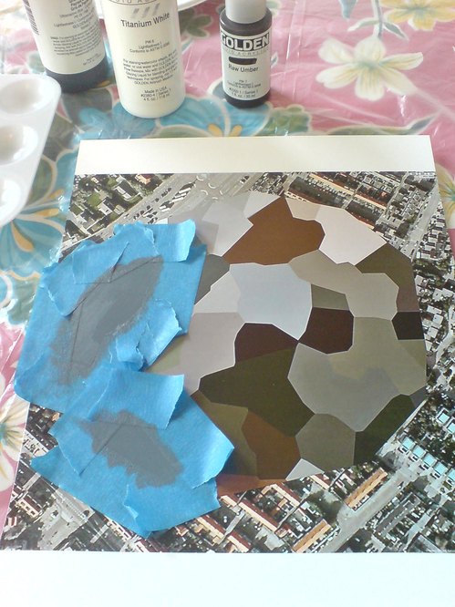
One of the things that became interesting about that process was that certain colors kept repeating. Not just within canvases by a single artist, but from artist to artist. So it became clear that there was a commonality to this early 20th century palette.
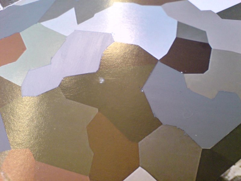
We call the collection The Classical Colors from the Classical Modern period in a sense. And when we had the opportunity to lay these colors out, finally, on a table together, it was very clear that there was this very rich, soft, elegant, classic palette that represented the paintings on view at that time.
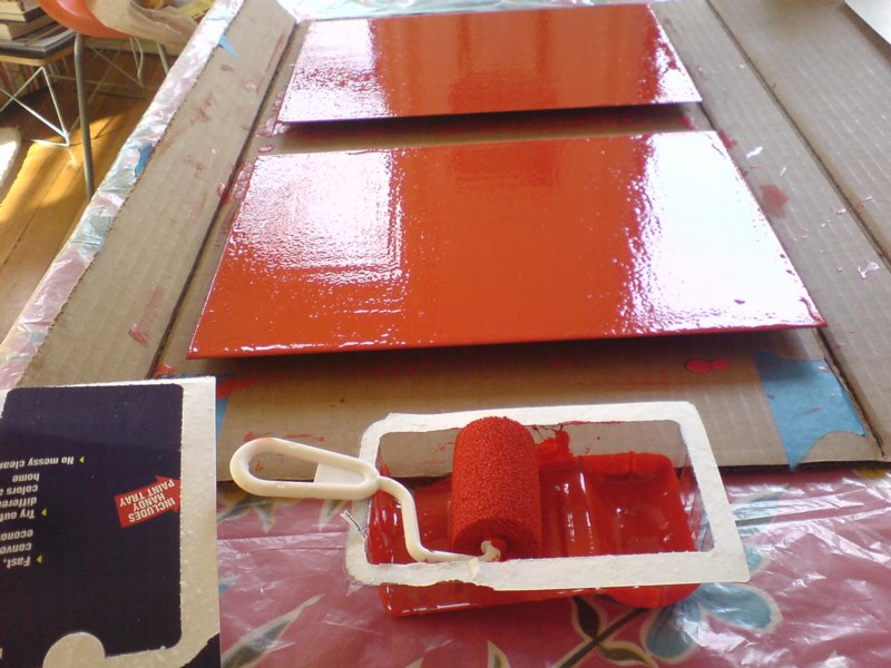
These are very complex colors. And we relied heavily on Fine Paints of Europe and their unique tinting system to accurately match those colors and recreate that classical modern palette.

I am nerding out on this so hard right now. The Guggenheim Museum, in “an exclusive licensing arrangement with Fine Paints of Europe, Inc. of Woodstock, Vermont, will introduce two paint collections suitable for residential and commercial use in October 2011.” The “second collection” Meyerhoff refers to above, in a video intro which I transcribed from the website for Guggenheim Color by Fine Paints of Europe, is Classical Colors, “a set of 150 wall colors drawn from much-loved paintings in the Guggenheim’s permanent collection.”
Beyond the concept itself, which is obviously golden–no, wait, it’s conceptually golden precisely because of the art that was chosen, why it was chosen, and how it is being packaged and presented.
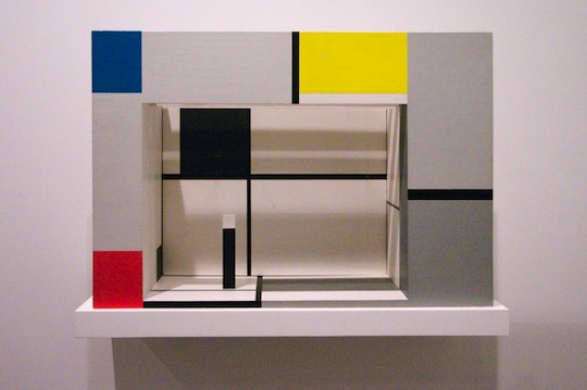
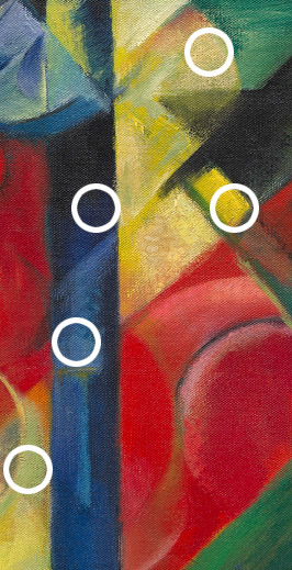
Cezanne, van Gogh, Delaunay, de Chirico, Kandinsky, Modigiliani, Gaugin, Pissarro, Franz Marc, whose Stables provides the illustrative detail above. I suspect these artists’ primary commonalities–besides their “very rich, soft, elegant, classic palette,” are being in the Guggenheim’s collection and being dead long enough for any copyright and trademark claims to evaporate.
What makes the Guggenheim Color Collections superior to run-of-the-mill museum merchandise is that it’s actually paint, the stuff the art is made of. Or at least that’s what it’s meant to evoke. Great word, evoke. There’s ample scholarship and conservation data, dissertations and grant-funded research projects galore, on what paints artists actually used. Technology exists to analyze the paint’s spectral and chemical properties with great precision and match it to historical manufacturing information.
None of that seems to have been brought to bear here. In addition to Fine Paints of Europe’s “unique tinting system,” the Collection was “refined.” “Refined in consultation with exhibition designers to ensure the colors are appropriate for a variety of architectural settings.” and “further refined” and “fine-tuned” for a variety of “lighting situations, to precisely match each hue.” These are not recreations, but evocations, and each color “relates to the painting from which it was derived and the artist who created it.”
guggenheim_color_fan.jpg
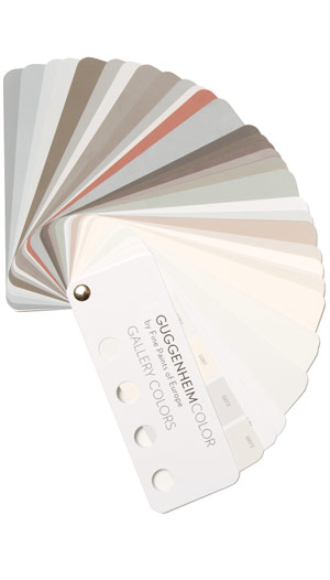
This is distinct from other collection, Gallery Colors, which is–students of The White Cube, rejoice!–actually based on the Guggenheim’s archives of wall paints used in the galleries “by generations of Guggenheim Museum curators, artists, and designers-including Wright himself.” And Jean Nouvel. Up in the middle of the fan there is the charcoal-black he used in the Rotunda for the Brazil exhibit. “These fifty hues,” FPE’s website says, “are intended to guide homeowners and designers in the presentation of art.”
Guide on, Fine Paints of Europe, and art will follow.
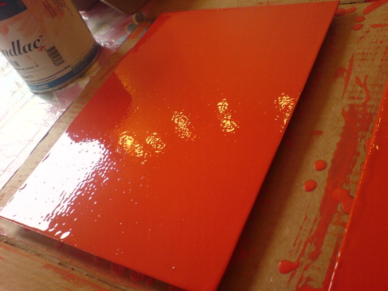
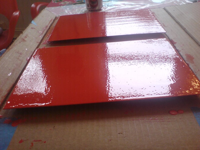
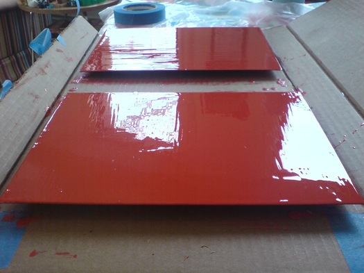
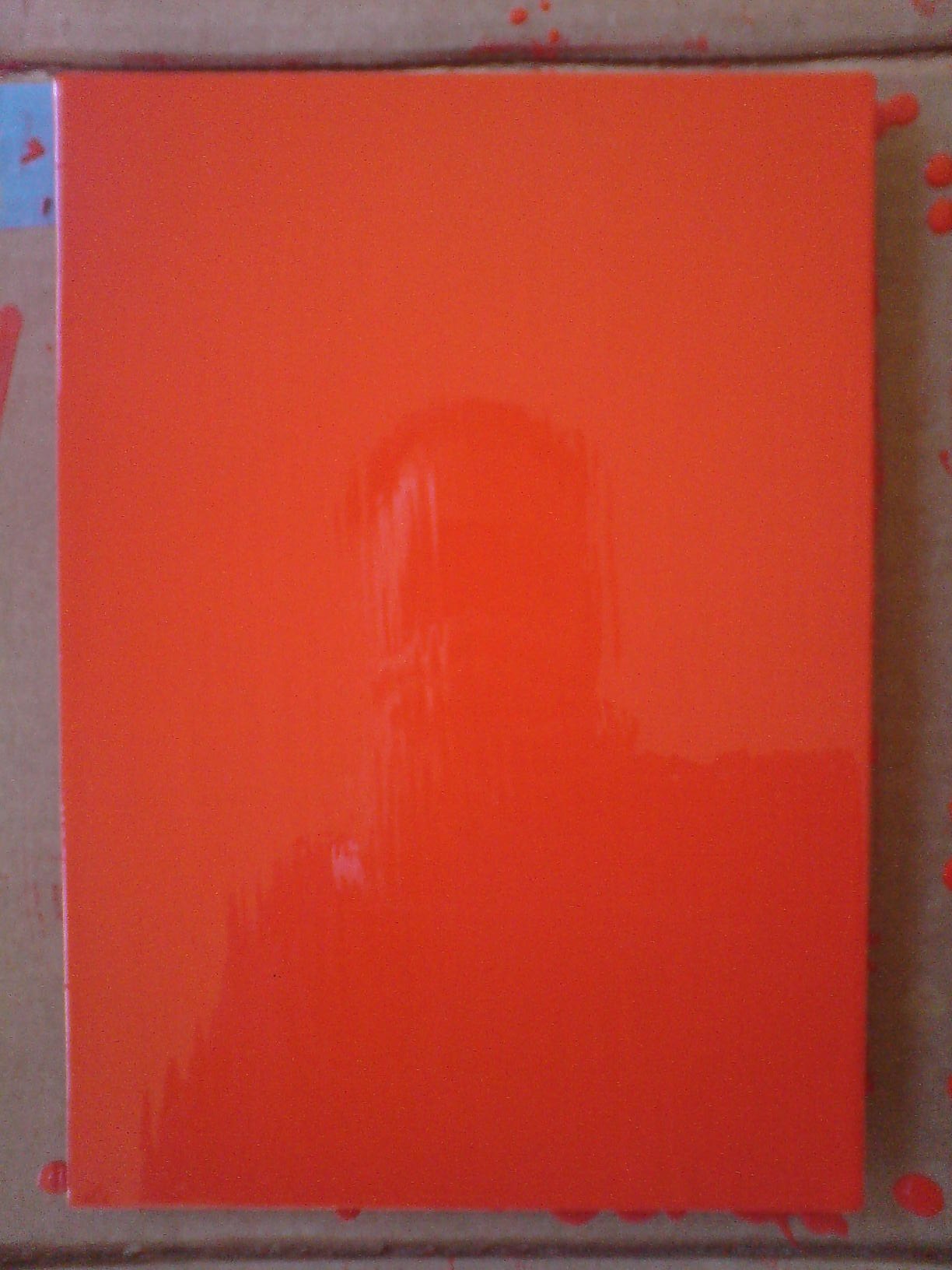
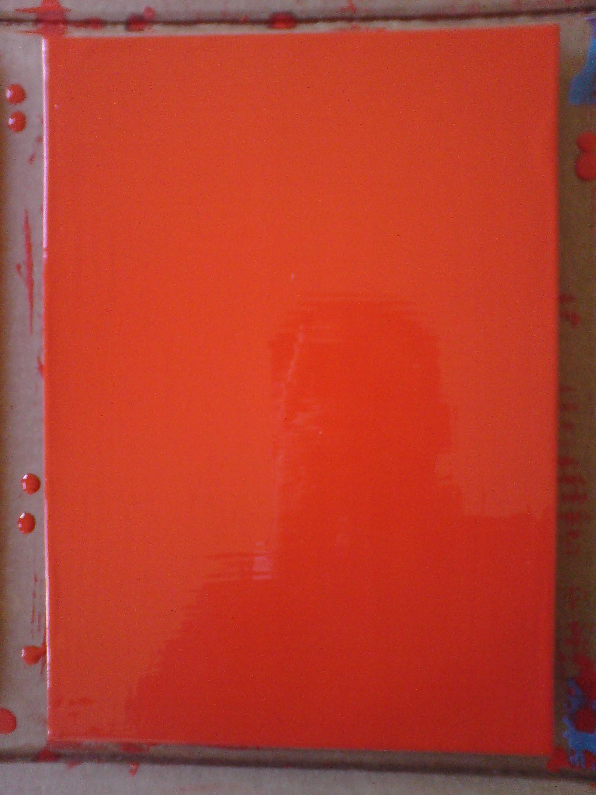
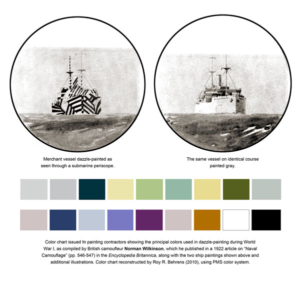
Previous Fine Paints of Europe coverage on greg.org, because hello, it’s an officially licensed manufacturer of Pantone Matching System paints: Rijksoverheid Rood