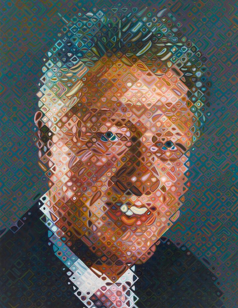
Paint what you know, I guess: Chuck Close’s portrait of Bill Clinton, from the Ian and Annette Cumming Collection, on view at the National Portrait Gallery
This artnet investigation by Zachary Small into attempts by his dealers to uncancel Chuck Close ends up highlighting the failures of the art world to deal with sexual harassment, especially when there’s money to be made. Or male power to be preserved. Small notes how Close’s gallerists at Pace protected him, thwarted attempts by those accusing him of coercion to seek accountability, and sought to reboot his presence and market–and who themselves turned out to be perpetrators of workplace abuse, for which they’ve suffered no professional consequences.
Rob Storr also turns out to be spineless when the artist whose MoMA retrospective he curated sexually harassed a student at the art school he’d invited him to, Yale.
Small’s article reminds me that though Close’s work is now not on view in many museums, his 2006 portrait of another sexual predator whose legacy remains unresolved, Bill Clinton, continues to hang at the National Portrait Gallery, with a two-sentence acknowledgement of Close’s accusers. [The new portrait of Donald Trump nearby contains no such disclaimer.]
But then, this is an art world where Carl Andre could keep showing with his dealer Paula Cooper, and could eventually get a five-museum international retrospective, after killing his wife. So it’s not like Arne Glimcher’s got no reason to hope.
Maybe the solution is for museums to lean into it, and present Close’s work as what it turns out to be: the product of a sexual harrasser in a system set up to coddle them. How does Close’s intense, close-up portraiture of his friends and the powerful reflect the male-dominated structures and networks that made his fortune? Museums should be free from worrying about what impact actual, critical curating might have on the market value of their Closes, right? Though it might be tough to get lenders.
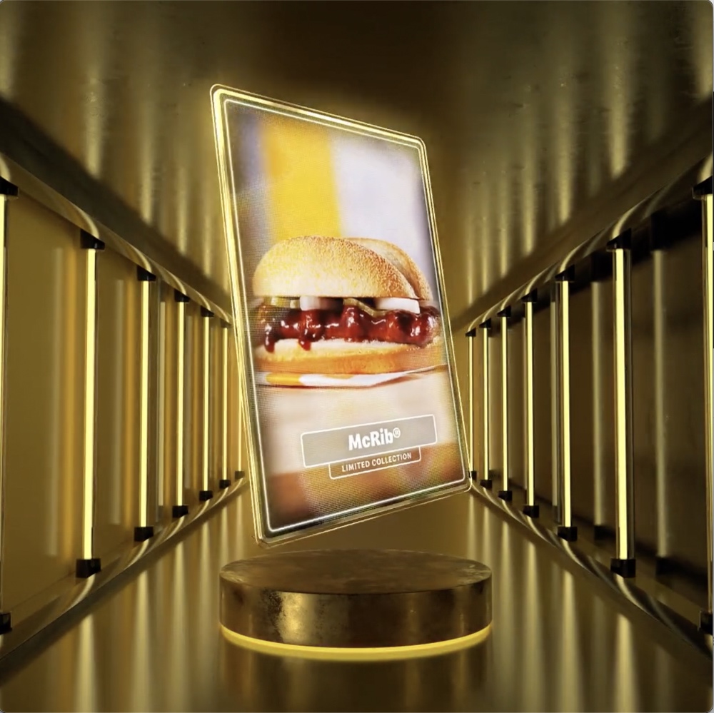
A screenshot of the artwork to which ten McRib NFTs point, and to which no owner of the NFTs have any right, claim, or permission to engage with in any way. image via rarible.com
Eight years ago, I was inspired by Ian Bogost’s article on the McRib to create a video work, untitled (where we all go), about art, love, and the inevitability of death. Bogost’s theory that the rare, seasonal appearance of the obviously artificial McRib sandwich helped to normalize the equally artificial McNuggets we see every day. This dynamic, I thought, also describes how the occasional spectacle of blockbuster art auctions create an economic logic for the rest of the art market all the way down the pricing pyramid.
This same scheme is now in full effect in the NFT space. Pyramids merged yesterday when McDonald’s launched a one-week Twitter sweepstakes to promote the return of McRib by giving away ten “McRib NFTs.” At the time of posting, it has received over 81,000 retweet entries.
Because I am never under any illusion that anyone listens all the way through these things, I will not be spoiling anything by telling you how this ends, which is that McDonald’s, Rarible, and any and all of their crew, “will have no liability whatsoever for, and shall be held harmless against, any liability for any injuries, losses or damages of any kind, including death, to persons, or property resulting in whole or in part, directly or indirectly, from acceptance of the NFT.”
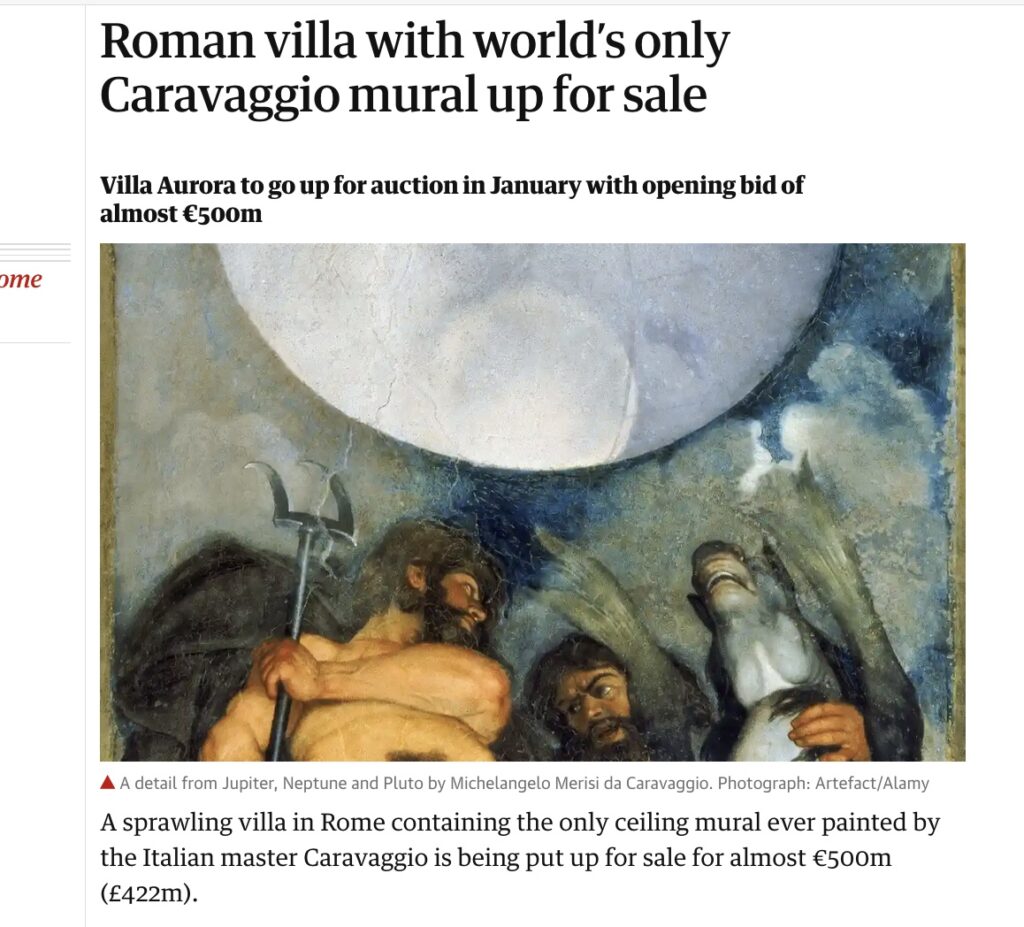
Guardian screenshot of Caravaggio’s nude ceiling selfie, cropped to be sfw, but backwards
The Casino di Villa Boncompagni Ludovisi in Rome is for sale, and the hook for media coverage is not the Guercino painting in the foyer of radiant Dawn riding her chariot across the glowing sky that gives the house its nickname, Villa Aurora. Instead it’s the oddly composed mural on the ceiling of a small upstairs room, the only mural painted by Caravaggio.
It has been appraised somehow at EUR310 million, which helps bring the opening bid for the auction of the former hunting lodge on a half-acre hilltop next to the Borghese to EUR471 million. The Italian state has the right to match any winning bid.
The mural is purportedly on the theme of alchemy; the room it inhabits was initially a laboratory, and housed a distillery. It depicts a celestial sphere flanked by three nude gods, Jupiter, Neptune & Pluto–the model is the artist himself, who was 25 years old in 1597–letting it all hang out in extreme perspectival, toga-less majesty.
Which prompts two questions, one historic, one contemporary: what are the circumstances under which a 25-year-old emerging artist paints himself nude, three times, towering over the viewers below? And why is it so hard to figure out which way the mural is facing? Because it is reproduced in both orientations almost equally.
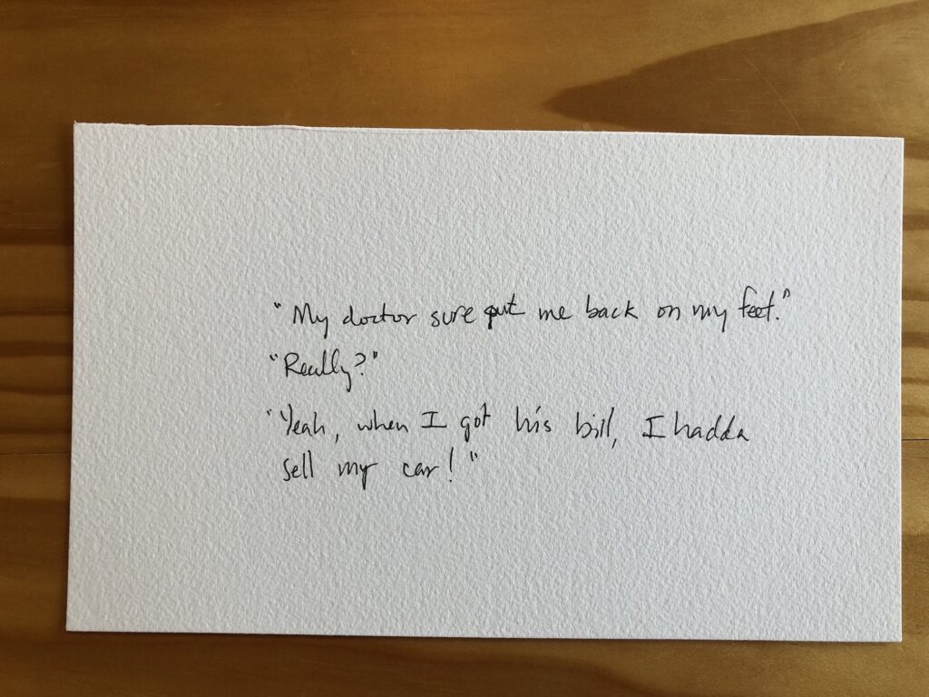
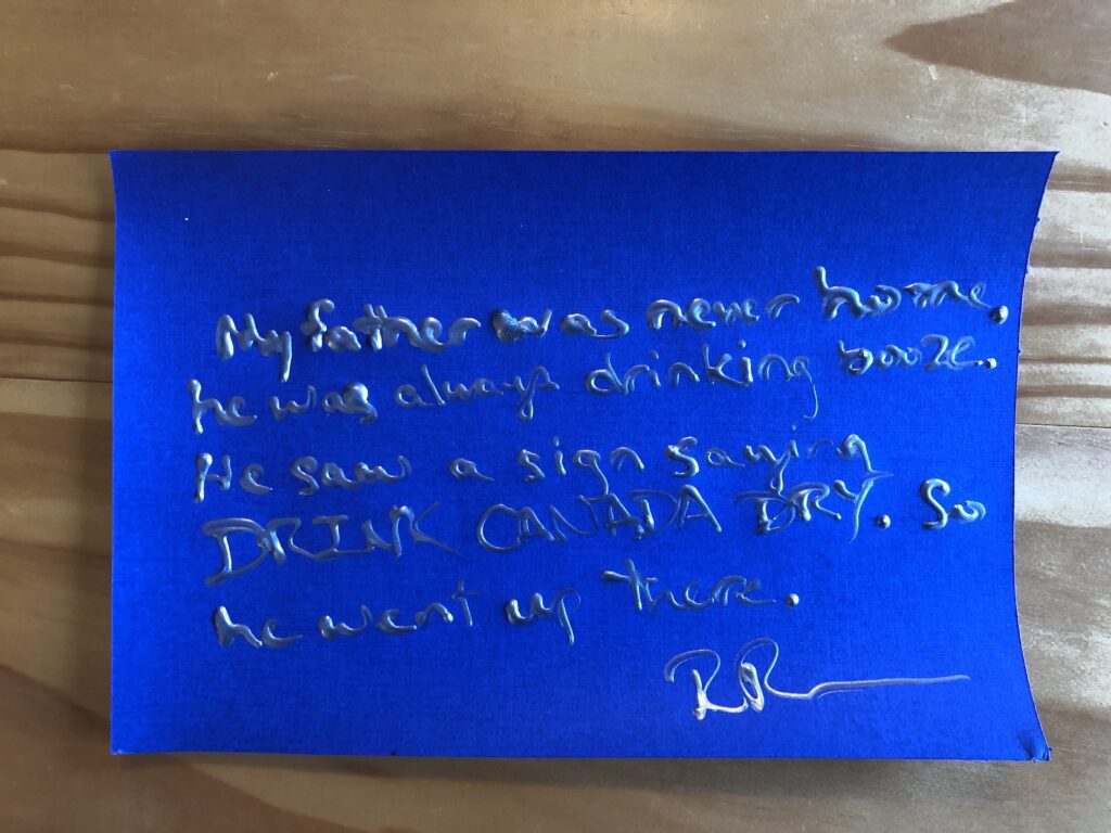
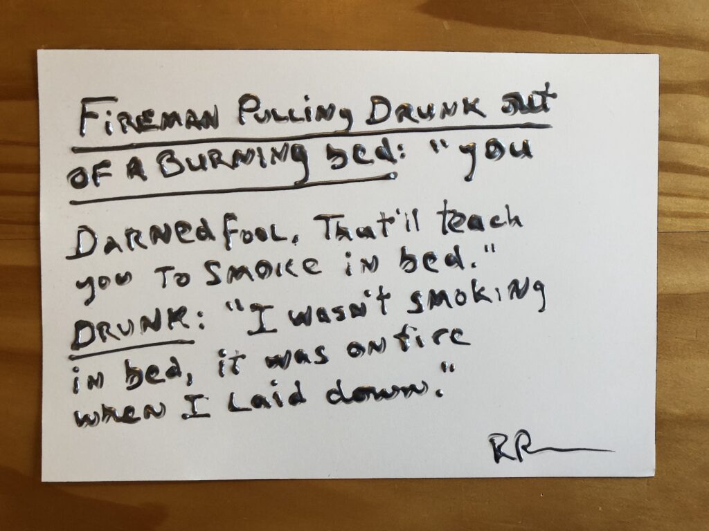
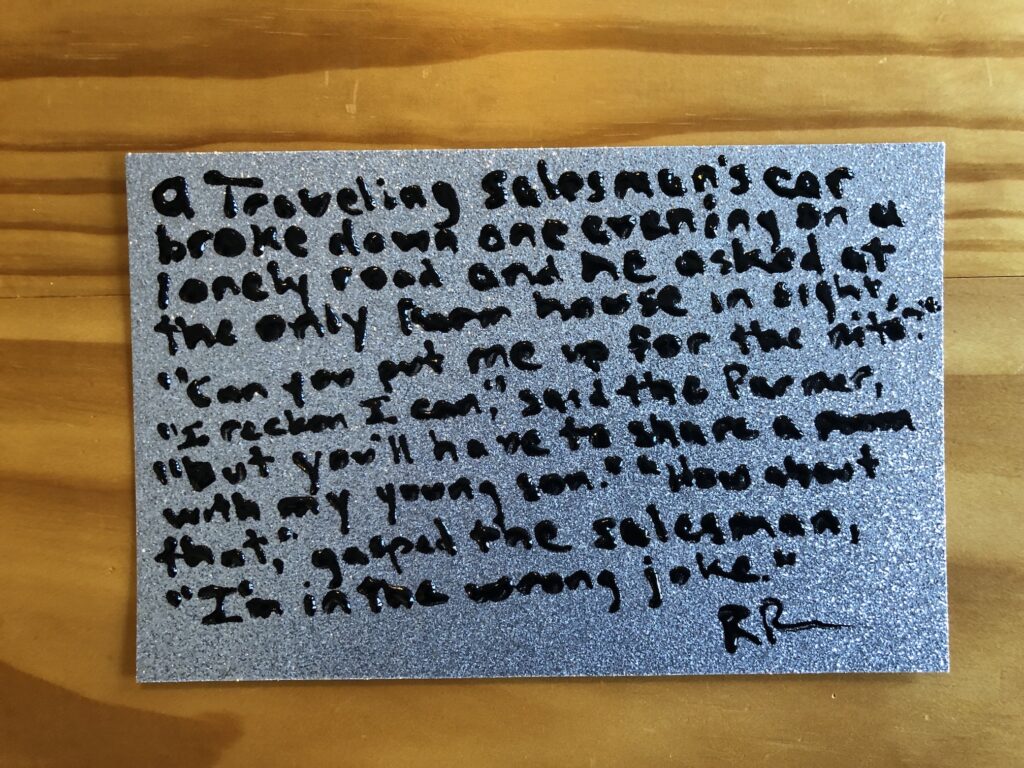
The stakes could not be lower: Untitled (Richard Prince Handwritten Joke), 2021, gel pen ink, which is not the same as puffy ink, it’s just smoothly flowy ink, on Arches, 5.5 x 9 in.
A few days ago a friend with amazing superpowers for finding things sent an eBay listing from a European autograph dealer for a Richard Prince joke drawing. It was a hilarious forgery, but it was also only €1, and, I argued, it was well worth it. As we texted about it, I was like, dang, now I want to sell Richard Prince drawings on scraps of paper on eBay for €1! You should make them in puffy pen ink, my heroic friend said.
Untitled (Richard Prince Handwritten Joke), 2021, metallic silver puffy ink on fancy cardstock, 6 x 9 in.
As it turns out, puffy ink is more of a bottle-based medium than a pen-based one. And it is intended for use on fabric, not Arches or fancy metallic scrapbooking cardstock.
Untitled (Richard Prince Handwritten Joke), 2021, silver metallic puffy ink on Arches, 7 x 10 inches
The dimensionality of the text, along with the curling of the paper as the puffy ink dries, most assuredly transforms what I’d imagined were drawings into objects. Objects which might get crushed if shipped via a simple, stamped envelope. Objects which contain vital title, stamp and initialing elements on the verso, complicating simple framing and mounting.
Untitled (Richard Prince Handwritten Joke), 2021, puffy ink on silver glitter cardstock, 5.5 x 9 inches
And to top it all off, eBay insists I list my US-based items in dollars. But out of such difficult decisions is great art sometimes born. In the case of this little series, at least, I am certain they’re worth a dollar if they’re worth anything at all. Because every single one is guaranteed to contain an authentic Richard Prince joke. I could not make these up.
This untitled acrylic and watercolor seemed to stand apart from the several series of new works on paper Jasper Johns is showing at Matthew Marks this month.
It shows the “Green Angel” motif, an abstracted outlined form Johns used for a group of work only used around 1990, and whose source he long refused to disclose. [Artist Cristóbal Lehyt identified it this year: a photo of an unusual, little mashup of a Rodin sculpture of a minotaur holding a centauress torso.] But the date is 1990+2019, implying Johns revisited an old work.
The motif is there, apparently drawn out in dark lines on a multicolored ground, and then all the spaces are blacked out, right up to the lines. When any of this happened, or the impetus for returning to a decades-old work and reworking it, was not known. It would be interesting to check the drawings CR, though, and see how the “original” (sic) Green Angel work on paper fits into the flow.
Jasper Johns studio, June 2021, with some works to be shown in the current Matthew Marks exhibition, including the big, black Untitled on the left, and some Slice-related works, (but not Slice itself, on the right.) image via matthewmarks.com
When John Yau wrote about the Rodin discovery in May, I imagined this year would see a bounty of Johns reveals. We now know some of what Johns knew when he made this work, and when he reworked it. But as this photo of the artist’s studio from June shows, now Johns knows that we know, and he included it…anyway? As a little treat?
Jasper Johns, Alley Oop, 1958, oil on newsprint on cardboard on fiberboard, 23 1/8 x 18 in., P55 in the Jasper Johns Catalogue Raisonné, Vol. 2, from whence this rare, uncropped reproduction that nonetheless omits the original-seeming frame was ganked.
Shoutout to Brian Dupont, who yesterday flagged a recent challenge by Blake Gopnik to identify the comic strips Jasper Johns painted over in his small 1958 work, Alley Oop. Turns out one of Blake’s readers already did the same thing I just did: follow the second Google Images search result to a 20+ year-old flickr post by a guy whose self-appointed mission was to take down Roy Lichtenstein by tracking down all his comic book source images.
Danh Vo Facsimile Object (V1), 2021, dye sublimation pigment on aluminum, 297 x 210 mm
Previous mentions of Danh Vo do not begin to account for the extent to which his work has influenced the Facsimile Object project.
The Frenchness of the original Manet Facsimile Object drove me to decide the certificates of authenticity needed to somehow be French as well. I spent a couple of increasingly frustrated weeks looking for a calligrapher who could execute certificates in official 19th century French letter forms. Researching the history of French script, I kept running up against the realization that the image of French cursive in my mind had become Vietnamese.
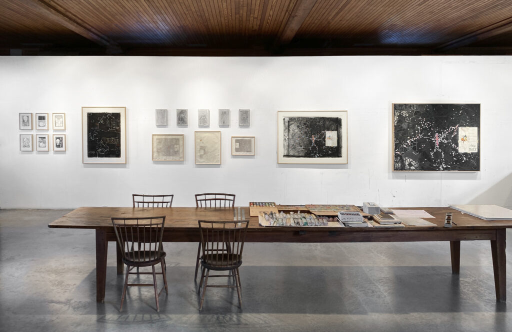
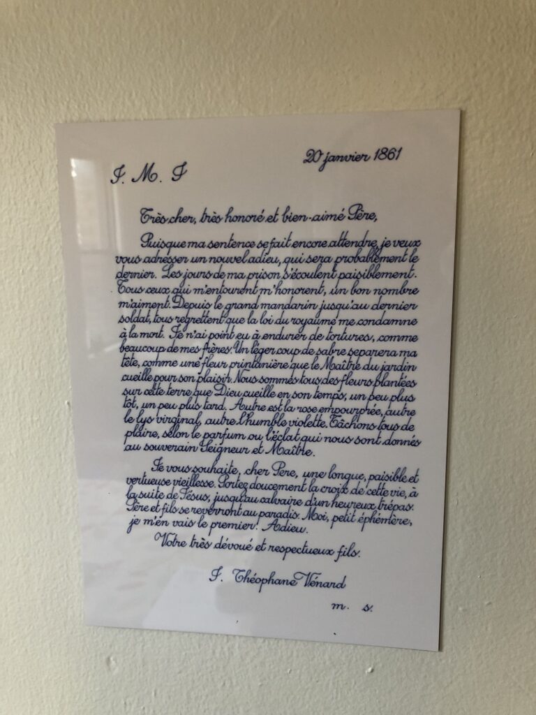
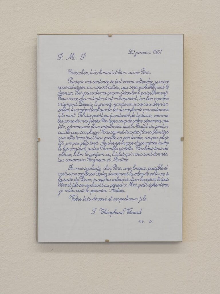
2.2.1861 (2009 – ) is one of Danh Vo’s simplest, most elegant, and most powerful projects. His father, Phung Vo, copies out editions of a farewell letter Jean-Théophane Vénard, a 19th century Catholic missionary wrote to his father on the eve of his beheading for proselytizing. Phung learned exquisite, French-style penmanship in school Vietnam during French colonial rule, and converted to Catholicism as a gesture of political solidarity with the South Vietnamese regime–but he doesn’t speak French. He’s reproduced the letter hundreds, if not thousands, of times, and Danh includes the letter in all his exhibitions. Phung’s letters will continue as long as he’s able. In the mean time, the father’s elaborate calligraphic texts have become an evermore prominent element of the son’s work.
After deciding not to try to get Phung Vo to make them, I ended up copying his letter for practice, and producing the Manet certificates myself. It’s a pattern I’ve kept since, using period German script for the Dürer certificates, and so on.
I think Vo’s creating 2.2.1861 as a time-bracketed edition, available until it’s not, also informed my own approach to the Facsimile Object editions. Though a bigger inspiration was clearly limited-time editions that arose during the pandemic, like Pictures for Elmhurst and Wolfgang Tillmans’ Between Bridges. They’re available as long as they’re needed, or useful, or relevant, or I don’t know what. It’s not like they’re meant to be disposable, but there is a finitude to them.
Anyway, as much as I love 2.2.1861, I’ve never put one up; they feel pretty intimate, but also pretty fragile, the less handling the better. While wishing Vo and his family all the health and safety in the world, the last year-plus had me thinking about mortality more regularly. And I decided to order a letter now, while I knew they were available. When it arrived–the lead time was several months–I immediately felt like I knew what had to be done, and so I made a Facsimile Object of it.
In a way, this Facsimile Object complicates the relationship between itself, the artwork, and a COA. What would a certificate of authenticity even look like here, but a less expert copy of the original work?
Within minutes of my taking the photo at the top of the post, the tape slipped, and the object guillotined to the floor. It was totally fine, and will be hanging again by morning. It is very sturdy. I can’t tell for sure in the dark, but it also seems to have a slight lack of focus, or a pixel-level distortion keyed to the tiny waverings of Vo’s line. It reminds me of the visual tension present in Richter’s stripe series. Those images are created not by stretching, but by replicating an almost imperceptibly narrow vertical strip of a painting. Will producing a facsimile object cause an unanticipated, slight distortion that’s only visible in person, close up? Daylight can’t come fast enough.
[update: it does! actually, it feels a little blurry. perhaps something about the scanning, or the surface of the paper. Anyway, fascinating.
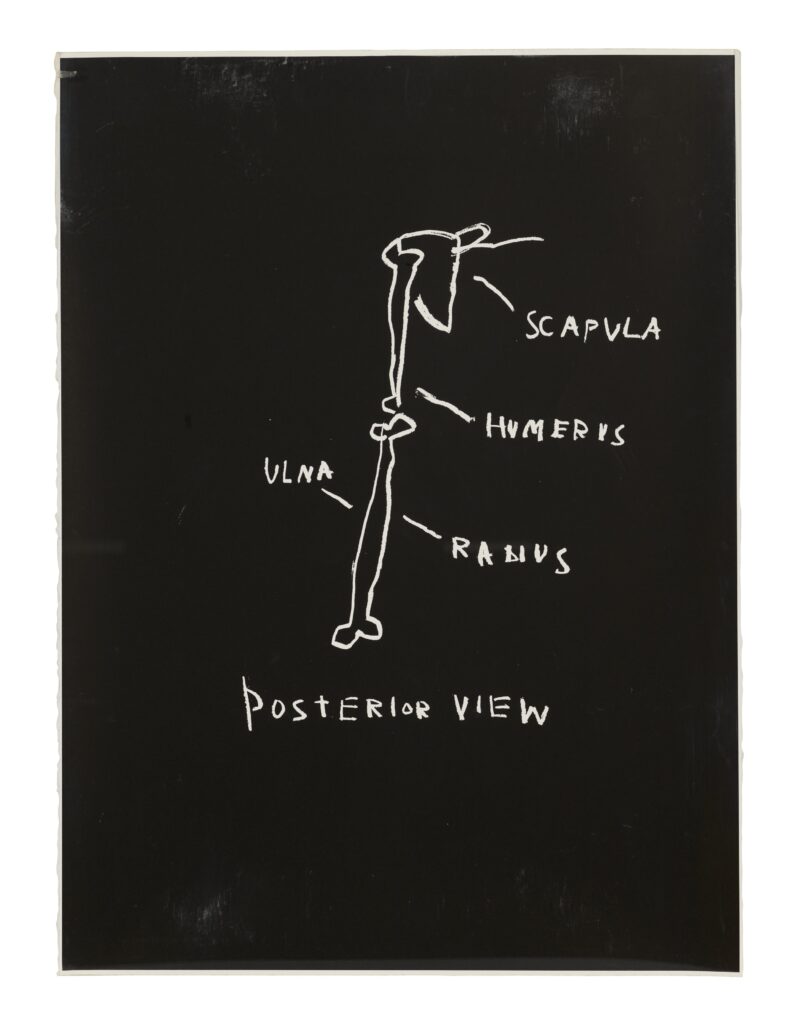
Posterior View, 1982, one of three silkscreen prints from Jean-Michel Basquiat’s Anatomy, a portfolio of 18 prints, being sold at Christie’s
In 1982, at age 22, Jean-Michel Basquiat created a suite of 18 screenprints drawn from diagrams in Gray’s Anatomy. The artist had received a copy of the book, the Wikipedia of its day, when he was seven, and drawing images from it while recovering from a car accident. Three of these 18, published in an edition of 18+7AP, are coming up for sale at Christie’s this month.
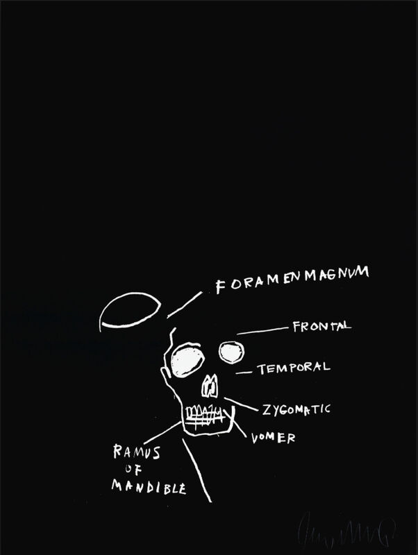
Jean-Michel Basquiat, skull image from the Anatomy Series, 1982, originally published by Annina Nosei Gallery, image via Gallery Red/Artsy
The series does not include a diagram of a knee, but it does include a couple of skulls, a subject which Warhol and Johns both addressed.
Untitled, 1973, sometimes called Untitled (Skull), Jasper Johns’ contribution to Reality and Paradoxes, a silkscreen print portfolio Styria Studios and Multiples, Inc., with texts by Nicolas Calas, this example, 31/100, currently for sale at artspace
FYI, the signature is pencil; the X is screenprinted.
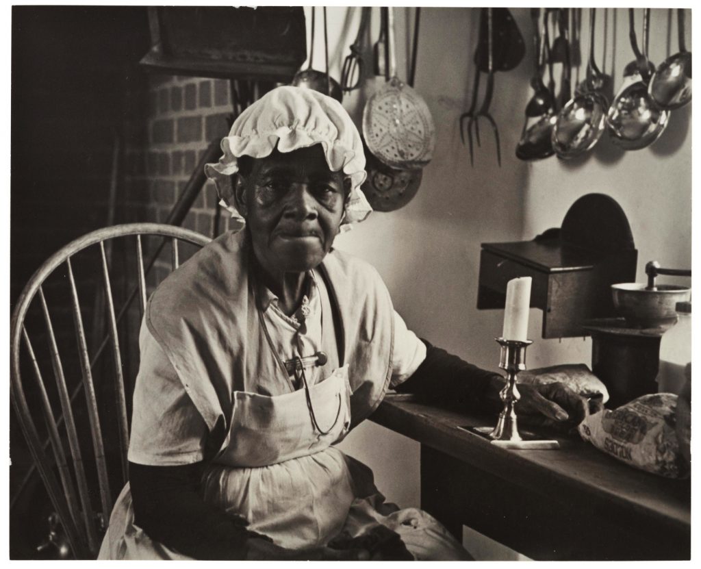
Charles Sheeler, Aunt Mary, a 1941 print of a 1935-36 image, deaccessioned from the Museum of Modern Art, via Christie’s in 2018.
Since not buying the print of it MoMA deaccessioned three years ago, I’ve been low-key fascinated by Charles Sheeler’s photo of “Aunt Mary,” and the elderly Black woman in 18th-century costume seated in a kitchen at Colonial Williamsburg. Sheeler made the picture in 1935-36, while visiting at the invitation the Rockefellers. They donated this print to The Modern for a 1941 exhibition. This is the only Williamsburg photo Sheeler made public; the rest he used as reference for his paintings.
But that’s not important now. While ostensibly depicting the past, Sheeler’s photo of “Aunt Mary” captured a complicated aspect of its present, when a Black woman was hired to perform as an enslaved woman in a vast, celebratory fabrication of US colonial history, built by the richest man in the country, in the still foundationally racist Virginia of the 1930s. I’ve wanted to figure out who this woman was, and what her experience was like.
Because public versions of the photo and postcards over several decades referred to different interpreters as “Aunt Mary,” I assumed it was a Mammy-like role, trying to recast slavery as a benevolent family relationship. Some historic mentions even say the woman playing “Aunt Mary” was born into slavery, a real possibility for an elderly Black woman in 1933, but less plausible in the 1950s.
During pandemic-related shutdowns in the Summer of 2020, I emailed folks at the John D. Rockefeller, Jr. Library at the Colonial Williamsburg Foundation to see if their archives might shed any clues on this woman’s identity, and on the experience of her and other Black historic interpreters at the time. I was grateful and fascinated to receive from archivist Sarah Nerney who, with limited library access, managed to answer some of my questions, and inspire a whole bunch more.
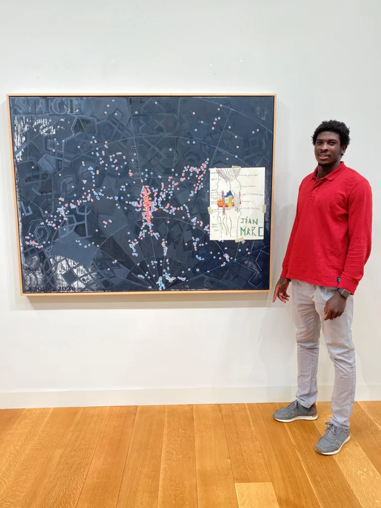
Jéan-Marc Togodgue posing with Jasper Johns’ Slice (2020) while visiting the (older) artist’s studio, as photographed by the retired basketball coach at the (younger) artist’s local boarding school, Jeff Ruskin
In her tweet about Geoff Edger’s Washington Post story of how a high school athlete from Cameroon’s drawing of a knee ended up in a new Jasper Johns painting, the Times’ editor said the story had originally been reported by Deborah Solomon two weeks ago. Which it both had, and very much had not.
And what who knew when and what happened when and who was involved is central to the issue at hand, which is ultimately that Jasper Johns draws on images from the world around him to make his art, and what does that mean? Another issue at hand: who are all these people, and does anyone in Litchfield County have anything to do besides be all up in Jasper Johns’ business?
Bring your conservator! image: GSV last month, slightly altered
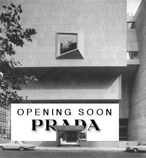
I have never been able to understand* why the Whitney hates the Whitney so much that they moved out, but they do, and they did. And now, as Katya Kazakina reports at artnet , there’s talk of selling it when the Met’s lease runs out in 2023.
[June 2023 UPDATE: They sold it to Sotheby’s, for around $100 million, a pittance for an iconic UES townhouse.]
If you lived here, you’d be home now. image: GSV, 2018
Of course, there was talk of selling the building in 2008, too, when the plan to build in the Meatpacking District was a thing. Those rumors were floated and batted down immediately, but also repeatedly, in the Times. Now, with the Met a mess and not exercising the purchase option Kazakina reports was in their original 8-year lease, and the Frick just subletting while its own building is renovated, the question is no longer, “Is it for sale?” but “How much could they get, and who would buy it?” [Or as Kazakina actually put it, “Now, the multi-million-dollar question is: If the building is sold, can it be developed?”]
my 2008 shoutout to Elmgreen & Dragset the first/last time the Whitney went on the whisper market
Kazakina’s list of hypothetical buyers includes a random country, Sotheby’s new owner Patrick Drahi, a future Larry Gagosian foundation, or a condo tower developer** who’d want to turn Marcel Breuer’s museum into “a really ritzy gym.” Which is all well and good–or spiraling levels of cringe, depending, obv–but which also misses the most obvious solution: turn Breuer’s Whitney into a house.
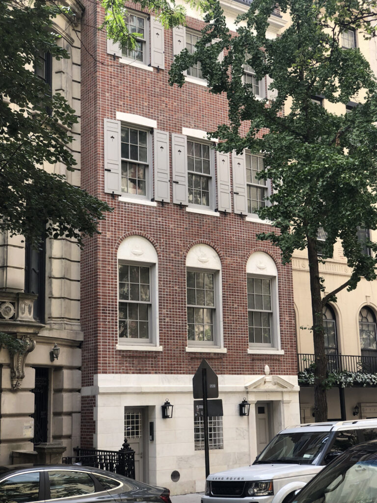
This house at 12 East 82nd Street has excellent and uncommon brickwork.
I made a quick trip to see Cady Noland’s exhibition at Galerie Buchholz on Saturday, but let’s talk about this brick facade across the street?
I’d feel worse about never in my life noticing the extraordinary brickwork if it had been discussed by literally anyone else outside of the 126-page building inventory for the creation of the Metropolitan Museum Historic District, published in 1977.
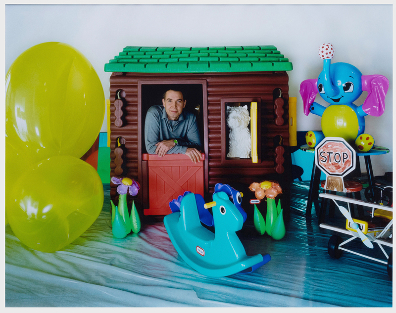
Todd Eberle, Jeff Koons in Ludwig’s Playroom, c-print, 34×40.5 in., via Stair Galleries
Seeing this Todd Eberle photo of Jeff Koons coming up for auction at Stair Galleries next week, I was reminded of huge blog post deep dive I’d worked on after the Whitney show and then bailed on, about the timeline for the Celebration series.
But if you look around enough, you can find that someone else has already laid a lot of the stuff out, even if they haven’t necessarily connected all the dots.
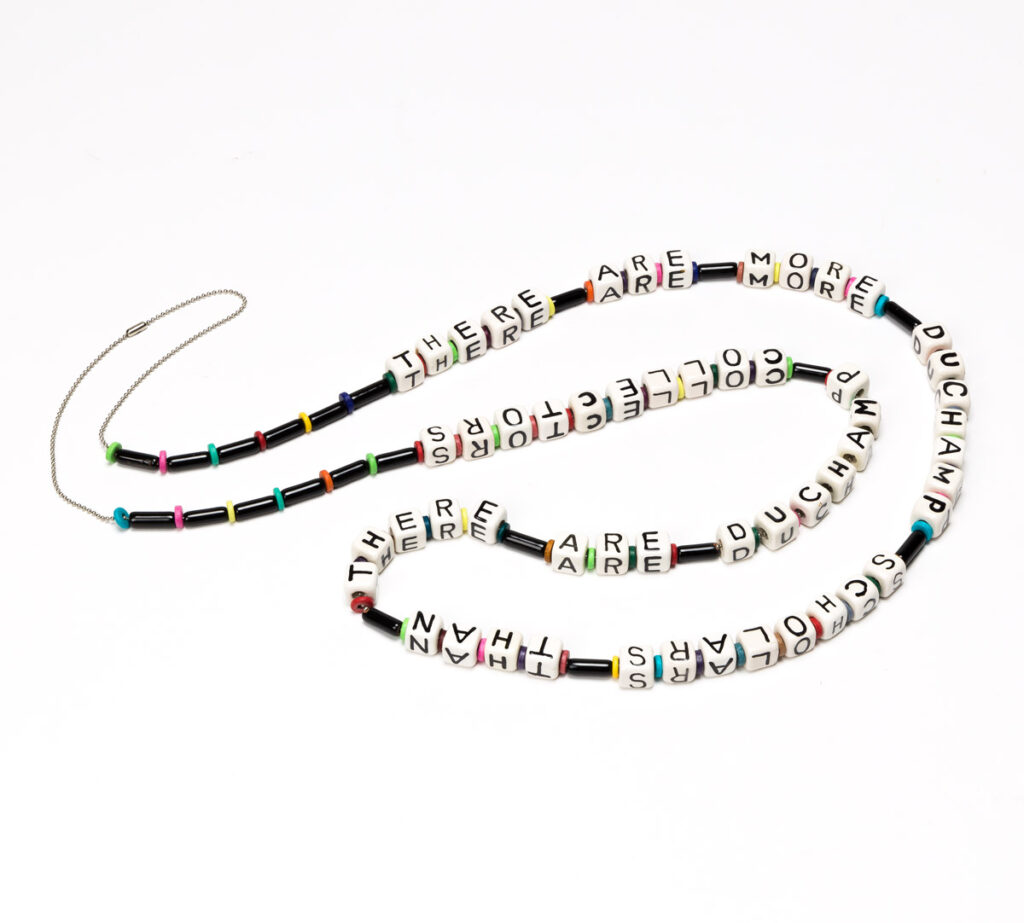
Naomi Savage, There Are More Duchamp Scholars Than There Are Duchamp Collectors, beads on chain, 1997, via Swann
This is a bead necklace made in 1997 by the artist Naomi Savage for the dealer Virginia Zabriskie. It reads, “There are more Duchamp scholars than there are Duchamp collectors.”
Savage was Man Ray’s niece. Zabriskie showed Man Ray’s and Savage’s work over the many years at her eponymous galleries, which she closed in 2010. Zabriskie passed away in 2019, and her collection will be sold at Swann this month.
The Duchamp necklace is 61 inches long, which strikes me as pretty damn long for a necklace, a double loop all the way down into your cleavage. So those 77 beads are big, almost like blocks. This is a statement AND a necklace.
This necklace is accompanied by a small (3×7 inch) signed print, dated 2002, a color image of the necklace itself arranged on a flatbed scanner. It feels like a certificate of authenticity to me. Another image, 10×14 inches, and laminated (!), is a filtered and rasterized depiction of another beaded statement necklace, not included in the sale, which reads, “I’ll sell when you catch up to my prices.”
Not gonna lie, until I started typing this, I wanted this necklace, or to make it, or to make the other one. But I thought they were tiny, like baby bracelet-size. And then I was also, respectively, like, “Well, good for Duchamp!” and “Sorry you don’t have any collectors!” So unless or until I give a talk at CAA and need some ironic bling, I’m going to just sit this one out.
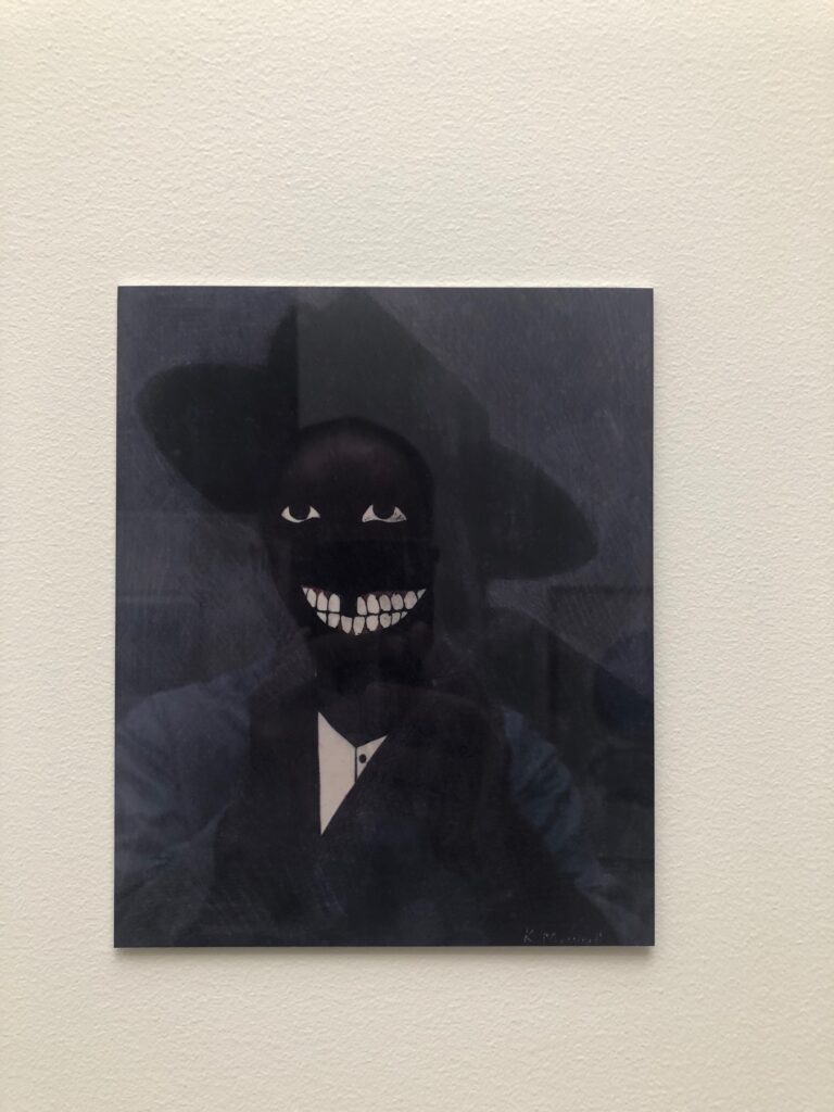
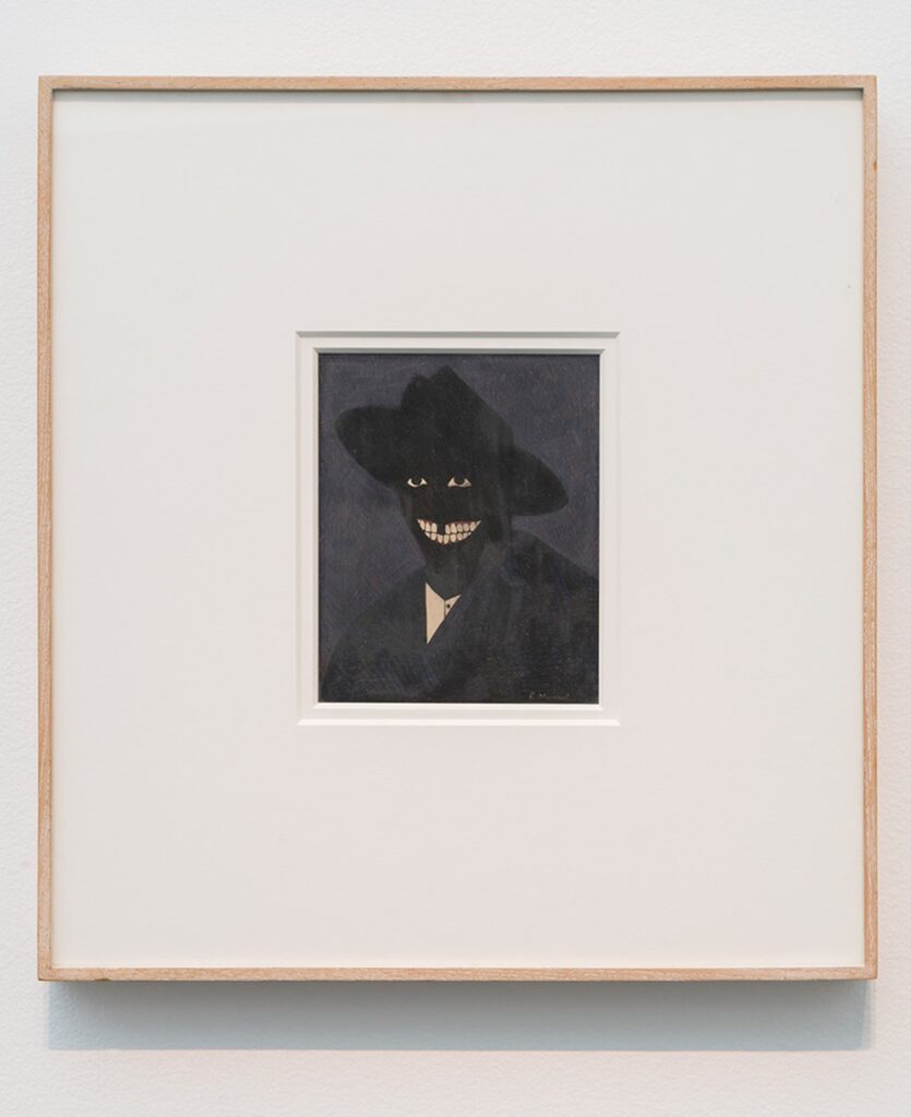
Self portrait with Kerry James Marshall Facsimile Object (M1), 2021, 8×6.5 in., dye sublimation print on aluminum
While working on the Scipio Moorhead Facsimile Object a couple of months ago, I started trying to figure out the challenge of a Kerry James Marshall Facsimile Object, too. Marshall’s portrait of Moorhead fills the gap in the historical record–there is no known depiction of or signature work by the painter considered to be the first Black artist in America. Meanwhile, the deep, multihued blacks of Marshall’s signature figurative style counter the uniform whiteness of American/European history painting, while also exposing how under-optimized the prevailing systems of image reproduction and circulation are for accurately depicting Black skin. Reproductions of Marshall’s paintings regularly fail in this specific way to mirror the experience of seeing them in person. So they are an excellent challenge for the Facsimile Object construct.
Kerry James Marshall, A Portrait of the Artist as a Shadow of His Former Self (1980), egg tempera on paper, installation view at MCA Chicago via CADaily
The calculation for making a Facsimile Object of a Kerry James Marshall work is pretty elegant in one respect, though. The epic scale immediately excludes most of his paintings. And the breakthrough work that marked a turning point in his practice–and that anchored his Met Breuer-filling retrospective a couple of years ago–is a headshot, a perfectly sized egg tempera on a sheet of sketchbook paper.
It took several attempts to find a good reproduction of A Portrait of the Artist as a Shadow of His Former Self (1980) that would reproduce on aluminum. This multistep filtration process, going from work to image to jpg to print, really gets a workout here, or at least, the apparatus gets seen operating in ways that might otherwise go unnoticed. Sometimes the work’s saturation is pumped up to bring out the red of the figure’s gums, for example, or the brightness is increased to emphasize the painting’s striated facture. Sometimes it’s printed in duotone, flattened into a pair of floating white eyes and an exaggerated grin. It extends the reach of Marshall’s own practice, “forcing the issue of perception by rendering an image that is just at the edge of perception.”
That Marshall knew his carefully calibrated painting was still at risk of being reduced to an undifferentiated black field, a shadow, is perhaps indicated by the title itself. That this was interesting to him is perhaps indicated by his subsequent decades-long practice of depicting Blackness in a world that is still catching up with him.