 Also worth checking out from Strange Attractors is Mark & John Lycette’s Not My Type IV. Although it dates from 2002, it’s just started getting attention and awards from festivals this year.
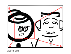
The Lycettes’ Not My Type series uses typographic elements to create pared down characters and landscapes. A comma becomes a teardrop falling from o-within-O eyes, for example. Very smart, not cheesy stuff; it’s the best animated typography since Donald visited Mathmagicland.
That said, the pacing drags a little; when the protagonist gets annoyed at the whining leafblower, you feel something stronger than just empathy. Very nice stuff that makes me want to see I-III.
Not My Type IV by the Lycette Brothers [Strange Attractors, ABC]
Lycette Bros. studio site
Developing a Storyboard [Note: that untraceable typewriter sound is coming from an embedded Flash image waayy down the page that looks just like the jpgs around it. Flash is the new midi, apparently.]
Skip to content

the making of, by greg allen