Untitled (Andiron…) was an early part of a series of experiments with the concepts of appropriation, readymades, and the power (or not) of authorship: they’re declared works of art where I didn’t own or control the physical object or environment.
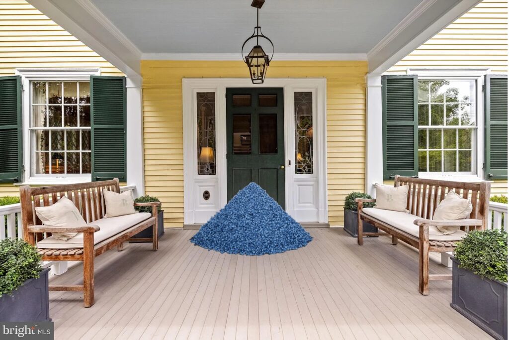
Study for Gonzalez-Torres Untitled (Porch), 2024, good candies in wrappers, endless supply, ideal weight 175 lbs
Ten days out, our neighbors have already put a bowl of candy on a table next to their front door. I am baffled. But as leaving piles of candy for the taking season approaches, I was hit by the idea of a Felix Gonzalez-Torres candy pour for Halloween. A Sturtevant show just opened in Paris, so I feel good about putting this out there while you people with porches still have time to shop for 175 ideal pounds of candy.
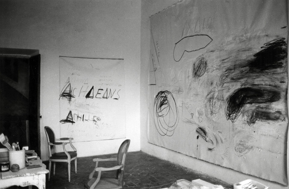
In 2018, the Museum and Yale University Press published a monograph on Fifty Days, in which curator Carlos Basualdo interviewed d’Huart about her visit to Twombly’s studio. The Museum acquired five of d’Huart’s prints, including the image above.
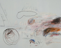
Untitled (200 x 157), 2019, jpg, the Philadelphia Museum’s c.2019, 200px image of Twombly’s 10×12 ft Achaeans in Battle, 1978, expanded to 800px. They quietly got better since then, but still
[the healing update: I got the book; it is gorgeous. d’Huart was literally like, I decided to photograph Minimalists so I flew to New York I called the director of MoMA from JFK he said I can’t meet you today but come tomorrow for lunch then Leo Castelli gave me a desk in his office and introduced me to everyone and Cy and then I was staying with Balthus and his kids in Italy and said let’s have a dinner for Cy and that’s how I made these photos he loved them. I am not exaggerating if anything I’m understating.]
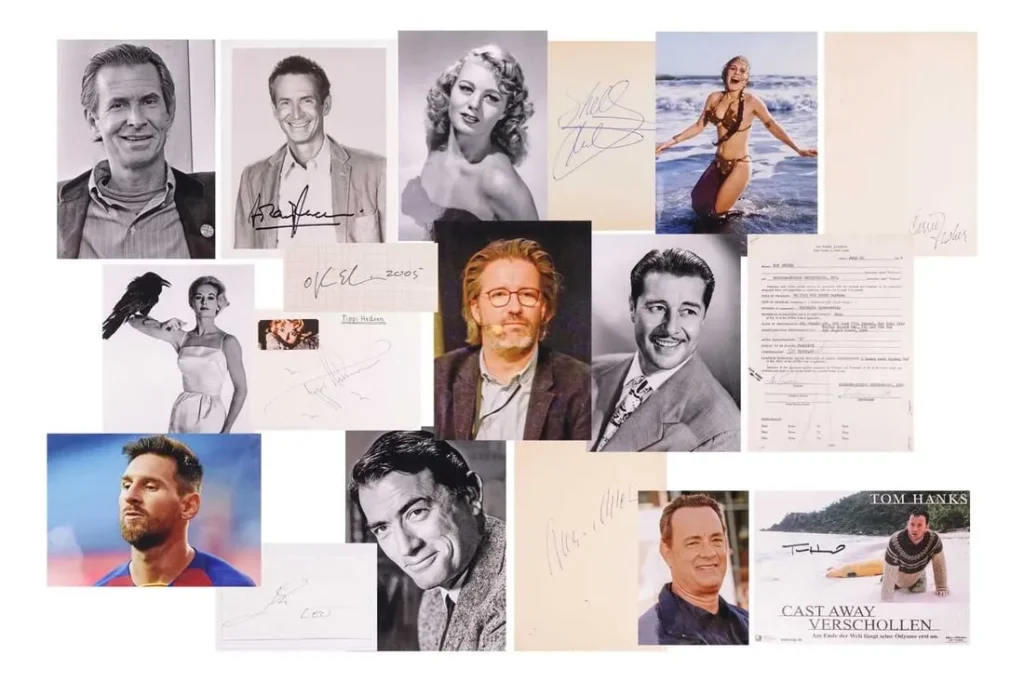
When I said I can’t get autographs? I meant, unless conceptually.
Sitting with this unexpected Bach auction for a minute, I realized I actually do get autographs when they convey a meaning beyond, “This person signed this,” or “I met/corresponded with this person.”
Unititled (Merce at the Minskoff), 2015-2018, interim state
Or when I project entirely subjective meaning onto them. Like when I found a souvenir towel from a Merce Cunningham performance on Broadway signed by Cunningham, Cage, and Rauschenberg, and I conjured a “logic” for this object that involved getting Jasper Johns to sign it.
That “logic,” or the pretense of it, was predicated on Johns being the designer of the performance poster. But of course, there were multiple other logics possible, from the art historic to the romantic, to the starkly commemorative, forcing an object into existence that links these four men—physically, contractually, notationally, quasi-publicly, as if there weren’t already countless other products of their decades-long interactions, filling archives and beyond. Here the autograph functions as a singular piece of evidence, superficial and contrived, of some other form of more substantial cultural meaning. But when signs are few, signatures will do.
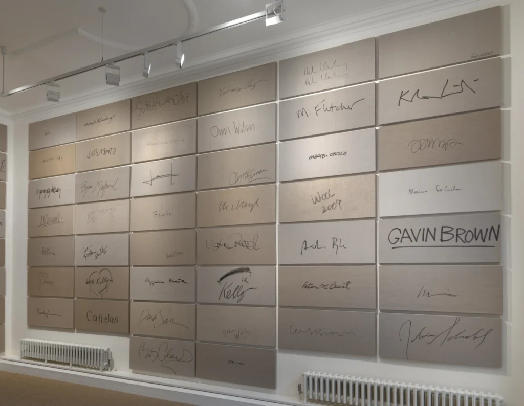
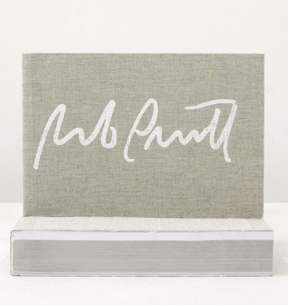
And of course, the significant emptiness can become the subject itself. Like in Rob Pruitt’s Signature Series, large-format autographs on Belgian linen he’s collected since the Pruitt-Early days. I remember several occasions when Rob would suddenly produce a big piece of linen and a fat Sharpie from his backpack, and turn around, offering his back as a writing surface when none other was available.
Rob Pruitt’s Autograph Collection, 2012, published by Karma back in the day
Autographs then became a project, an artistic practice, which art world celebrities and citizens alike could appreciate. I remember seeing a few loosies in the wild, but eventually, after years of accumulation, Pruitt showed The Signature Series en masse. And like Byron Kim’s skin tone monochromes, these accumulated markers of somebody else become a self-portrait of the artist moving through the world.
Now going back to Bach and his chopped up and shuffled autograph collection, it’s possible to interpolate meaning from the otherwise random-seeming clusters. Maybe the lots reflect the order in which Bach collected his autographs, a project of a lifetime sliced into tranches based on minimum viable auction estimate.
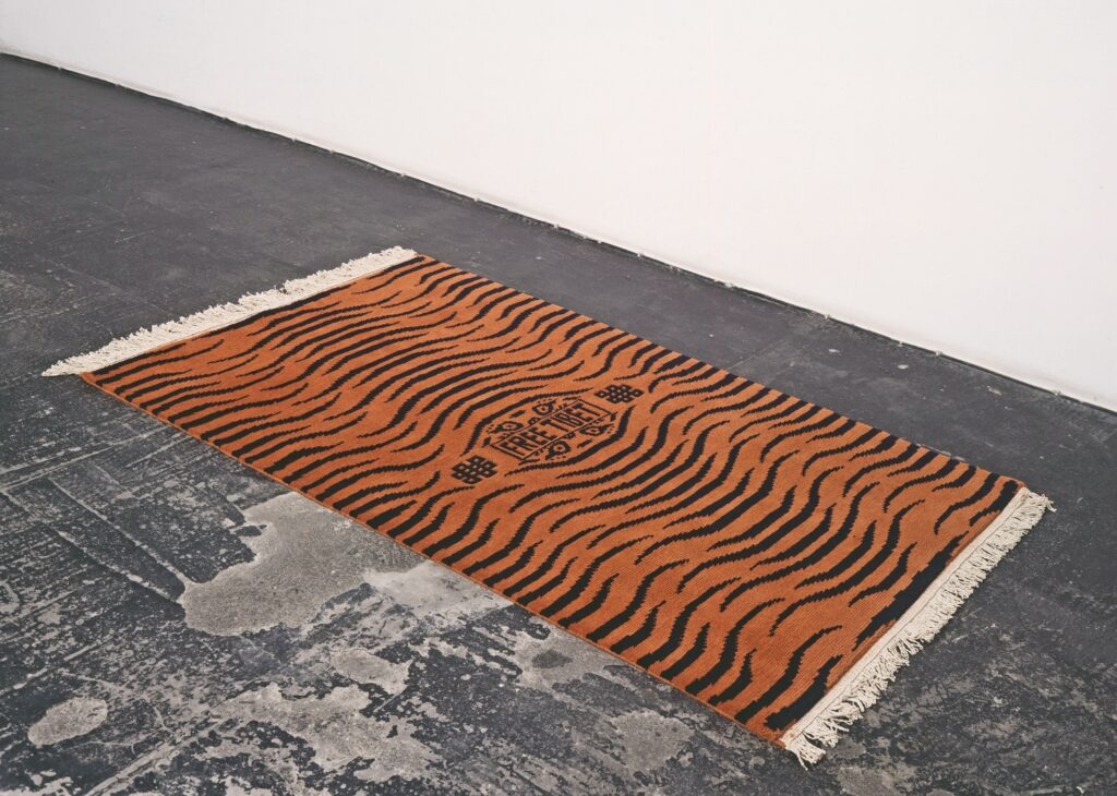
“Untitled”, 1991, handloomed wool rug, 2.4 x 1.8m, ed. 25? via Equator Production
So on my journey from WTF to “Yes, please!” on the Felix Gonzalez-Torres “Free Tibet” rug edition that was later declared to be non-work, I passed the following:
It’s not just that Equator Production was using weavers and non-profits associated with the Tibetan diaspora in India to make their carpets. 1991 was also officially, The Year of Tibet.
And 1988 was the year of Tiger Rugs of Tibet having a breakout show at the Hayward Gallery in London, so the specific Tibetan Buddhist tradition of tiger-motif prayer rugs and monastery rugs had been launched in the West. Even if Felix didn’t see the Hayward show, there was a lush catalogue. In 1991 ABC Carpet in New York had a Year of Tibetan Tiger Rug collection. So it was around.
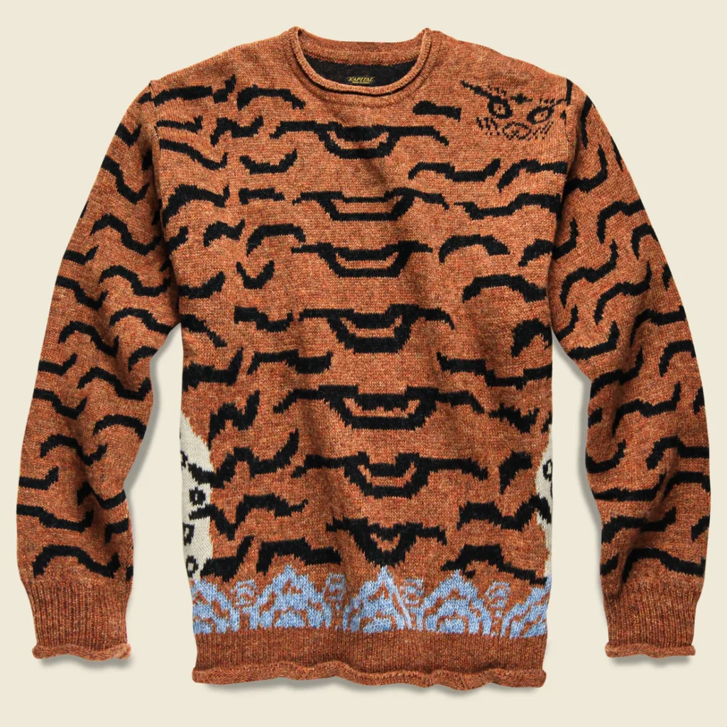
Kapital Wool Nepal Crewneck Sweater $611, NOT AVAILABLE, via Stag Provisions
What is not around is the Nepal Tiger Crewneck Sweater which Japanese heritage denim brand Kapital dropped in F/W 2019. But it still replaced every idea I had about repeating Felix’s Free Tibet carpet with a vision of these:
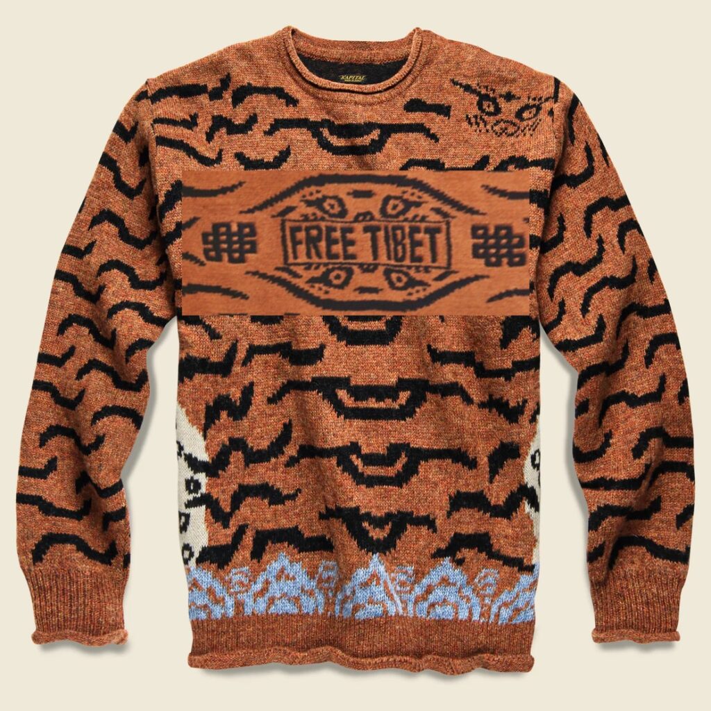
study for Gonzalez-Torres Free Tibet Sweater, 2024, ed. 25? Maybe available in Fall, if not in China
Whatever the edition, one will be set aside for the reincarnation of Sturtevant.
In 2014 art historian Anna C. Chave presented an absolute banger of a talk at a symposium organized by Dia as part of the Carl Andre retrospective. Chave laid out how art world figures and institutions, including the curators and catalogue contributors of Dia’s show, stayed silent on Andre’s involvement in the death of his wife Ana Mendieta, but still could not manage to ignore it completely. It is truly a damning reading, and all the more extraordinary for taking place at Andre’s show, at Dia’s invitation.
In the revised version published in the Winter 2014 edition of CAA’s Art Journal, titled, “Grave Matters: Positioning Carl Andre at Career’s End,” she even called out the organizers of the symposium for changes to the format that appeared intended to head off any possibility that the artist and the curators might face any questioning from—or even any engagement with—Chave.
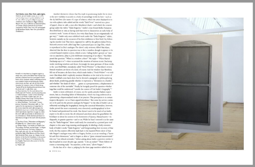
a spread from Untitled (Grave Matters), 2024, an artist publication by greg.org
One thing Chave discussed was an anomalous and macabre sculpture Andre included in his first New York exhibitions after his acquittal for Mendieta’s murder. Titled Large Door (1988)—a pun, Chave argues on, l’Age d’Or—it was actually a window, with a gash in it. Robert Katz mentioned it at the end of his 1990 book on Andre’s trial, Naked At The Window, but it was only published for the first time in Dia’s catalogue.
Andre refused to give Chave permission to reproduce Large Door and another work she discussed, a photo of a vase of roses on Andre’s apartment balcony, in her essay.
So to celebrate New York Art Book Fair Weekend, I am releasing Untitled (Grave Matters), 2024, a new artist book, which comprises JSTOR screenshots of Chave’s essay, with the missing images added. I will mail a signed and stamped edition to anyone who requests one this weekend, just email me to tell me where to send it. After that, we’ll see.
[We have seen, and they are done, thank you to all who engaged!]
[note: your information will only be used to send you an art zine.]
Mural With Girl With A Pearl, 2023, paint on plaster, Vermeer painting, as installed at Rijksmuseum
It was the exhibition of the year, and it was truly an unexpected honor to be a part of it. The Rijksmuseum’s Vermeer exhibition lives online in a 360-degree panoramic version, and I’m thrilled to confirm that Mural With Girl With A Pearl (2023) can also still be experienced and studied virtually.
Like the Vermeer it incorporates, Mural With Girl With A Pearl deploys paint to hint at a spatial complexity that extends beyond the field of vision. And it also relies on subtle shifts of light to activate its painterly gestures. That these nuances can be communicated in the mediated experience of the virtual pseudo-space is truly a testament to the enduring magic of painting.
Happy Joan Mitchell Season, 2023, screenprint on cotton and inkjet, pen, and offset on paper
Glad to hear the Joan Mitchell Season shirts are arriving. They took a little longer than expected, and the COA did, too, so apologies if you didn’t get yours in time to wear in Miami. Anyway, I thought we were boycotting Florida atm.
It feels like worlds ago, and world ago all the way down. And also just yesterday.
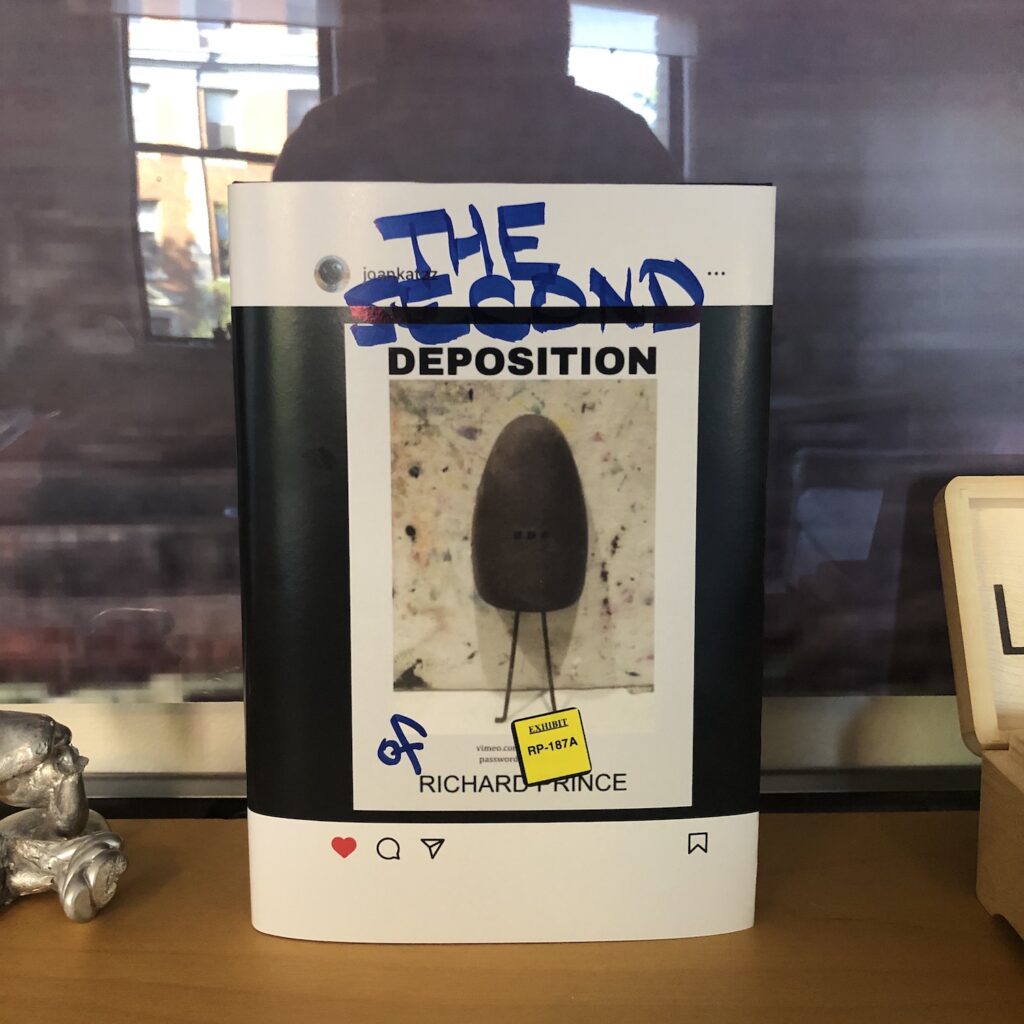
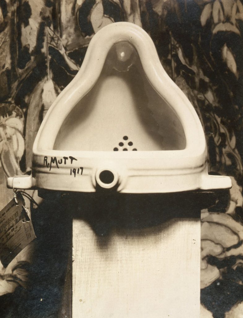
For a few hours in the Summer of 2023, an Instagram account that tracks the work of artist Richard Prince posted a picture of a rusty shoe tree, standing in front of an abstract painting. It echoed the original image of Marcel Duchamp’s Fountain, which Alfred Stieglitz photographed in front of a Marsden Hartley painting in 1917.
Marcel Duchamp’s Fountain, photographed in front of Marsden Hartley’s The Warriors on April 19, 1917 by Alfred Stieglitz
The Instagram image included text elements: DEPOSITION above and RICHARD PRINCE below, with a url and password to an unlisted video file. The video, more than six hours long, appeared to be a recording of Richard Prince’s deposition in a pair of conjoined lawsuits filed by photographers Donald Graham and Eric McNatt, in 2015 and 2016, respectively. Both men objected to photos they took, posted to Instagram by others, which appeared in Prince’s 2014 New Portraits series.
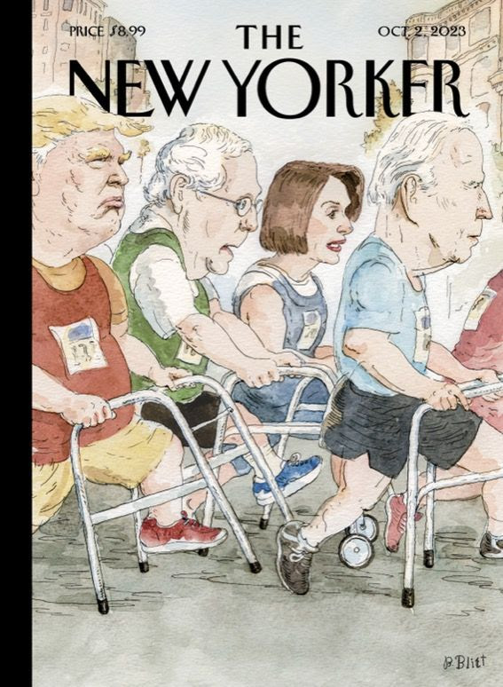
The New Yorker cover illustration, 2 Oct 2023, by Bruce Blitt
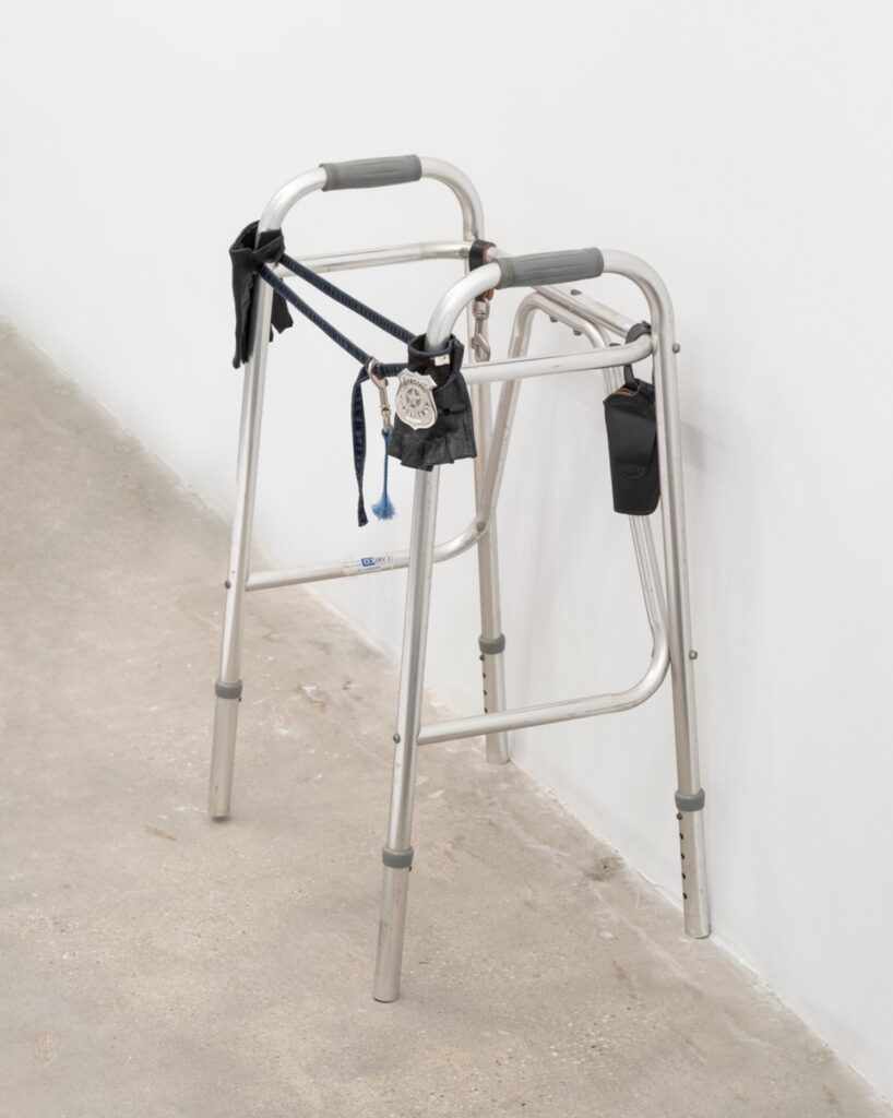
Shoutout to Cady Noland for making the cover of The New Yorker this week. We have been overdue for a discussion of the walker as a symbol of American boomer hegemony.
Cady Noland, Untitled (Walker), 1986, metal walker, metal police badge, leather gloves and case, denim strap, leather strap with metal clip, nylon strap with metal clip, copyright Cady Noland, photo: Owen Conway via Gagosian
cf.
Untitled (Harvey After Untitled (Walker)), 2019, walker, tennis balls, retractable stanchions, galvanized barrier, stepstool, hi-viz coat (image:AFP via Getty Images via PageSix)