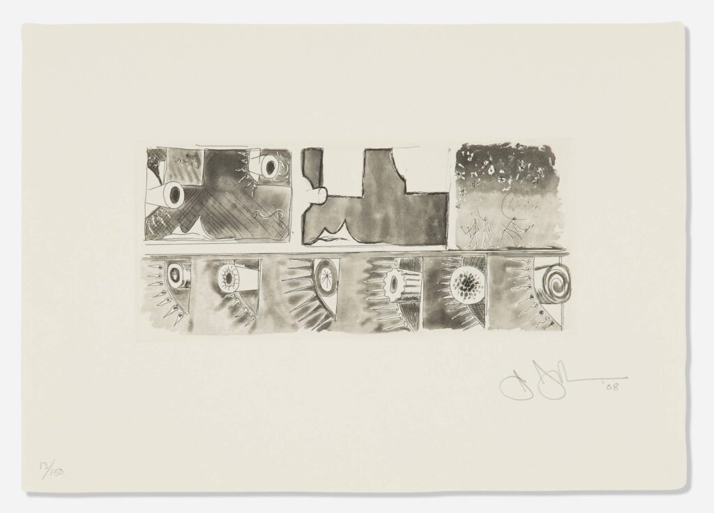
Jasper Johns, Untitled (from the Artists for Obama portfolio), 2008, etching and aquatint, 8 x 20 cm image, 21 x 30 cm sheet, ed. 13/150, selling as a loosie on 3 Sept 2025 at LA Modern [kinda wild that such a low edition number was broken up for parts]
Whoops, missed another one. I might have to check all the benefit print portfolios Johns contributed to in the last 30 years, to see if there are any more little guys out there.
Meanwhile, these little guys are in a little print—just 8 x 20 cm, smaller, even than the Ellsworth Kelly print in the same Artists for Obama portfolio.
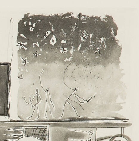
Jasper Johns, detail, Untitled (from the Artists for Obama portfolio), this little scene is like 5 x 5 cm
And they’re pretty lyrically drawn, too. No stamps here. I assume those are pens in their hands, encouraging people to register to vote.
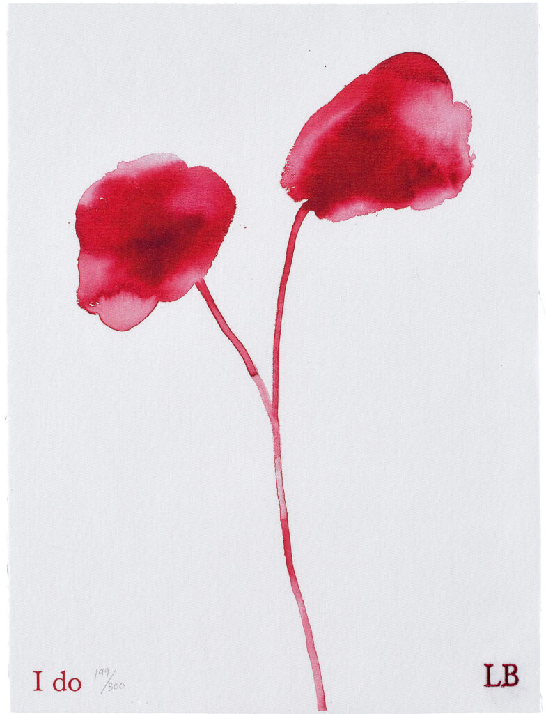
Louise Bourgeois, I do, 2010, digital print and embroidery on textile, 16 x 12 in.,ed. 199/300+35 AP, unframed, sold at Phillips in 2022 [h/t to @thelegendaryhitchhiker]
On May 11, 2010, Freedom To Marry announced the release of I do, an edition by Louise Bourgeois, which the artist donated to raise $300,000 for the campaign to recognize gay marriage in the United States.
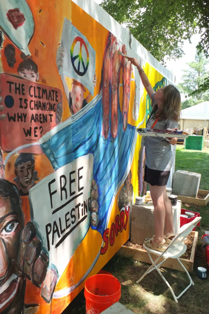
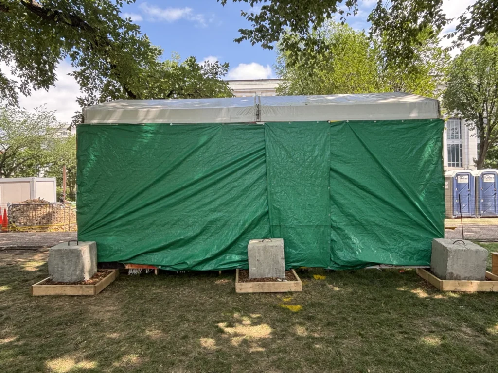
The kid of MOCAT painting Free Palestine on her mural at the Smithsonian Folklife Festival, image: Bruce Guthrie via NPR
The Museum of the Contemporary American Teenager (MOCAT) is an art and culture program initiated by a teacher in Montgomery County, MD, which operates at American University, the Kennedy Center, and the Smithsonian.
For this year’s Smithsonian Folklife Festival on the National Mall, MOCAT artists painted a mural of teen life and teen issues. It included protest signs that mentioned the climate crisis, the immigrant crisis, the gun crisis, and Free Palestine. One of these was anti-Semitic hate speech, a Smithsonian official told the teen artist, who is Jewish, and who disagreed.
MOCAT Mural with Smithsonian Tarp, Folklife Festival 2025, image: Léda Pelton via NPR
The next day, the MOCAT crew arrived on the Mall and found their entire mural covered with tarps by the Smithsonian. The Smithsonian said they were doing it to protect the kids from angry mobs, which the kids said, “maybe we are not the problem in that situation.” The Smithsonian said the mural violated the no politics policy MOCAT had agreed to, though the document they cited was only distributed two days after the festival began. The MOCAT folks want the mural for educational purposes, but the Smithsonian claims ownership of it, so I guess it was a work-for-hire situation. Or work-for-exposure.
This all happened at the beginning of July, but only hit NPR the other day. So I feel like we should have a lot more clarity over what happened and why. What we do know is that in the three weeks since, Israel has continued starving and killing Palestinians in Gaza while governments in the West throw a tarp over it and walk away.
Look, I understand how reporting works, and why it’s being covered the way it is, because that is how the story got out, and that is who has gone on the record.
But as shocking and admirable as it seems that Amy Sherald canceled her retrospective’s appearance at the National Portrait Gallery, that is not the really important part.
The important and frankly dire thing is that the NPG, and the Smithsonian’s chancellor Lonnie Bunch, attempted to join Trump’s extremist movement to erase trans representation. They sought to censor one of Sherald’s paintings, of a trans woman posing as the Statue of Liberty, remove it from the exhibition American Sublime—organized by SFMOMA and moving in a couple of weeks from the Whitney to, well, not the NPG now, so who knows?—and replace it, somehow, with a video of people debating or reacting to the painting? The painting they would refuse to show? And letting people decide for themselves whether trans people should exist?
The quote being attributed to Bunch, via Sherald, is that they didn’t want to “provoke” Trump by showing a work. So instead they join him by censoring it. This comes just weeks after Bunch and the board of regents also acceded to Trump’s calls to review Smithsonian exhibitions for unapproved ideologies. Like, I guess, the applicability of “with liberty and justice for all” to trans people.
Project 2025 calls for a takeover of the Smithsonian and the removal of Bunch, saying he’s not the right man for the job. Maybe he’s trying to prove to them that he is their guy after all. This immediately calls the resignation of NPG director Kim Sajet into question, too. When did all this censorship conversation go down? Why was Lonnie Bunch even weighing in on single artwork decisionmaking?
Sherald did the right thing when she needed to, exercising the power she has in the context where she has it. Every one of us should do the same. But what matters on a larger scale is that faced with the same situation, the people at the Smithsonian Institution betrayed their mission, their principles, trans people, and all of us.
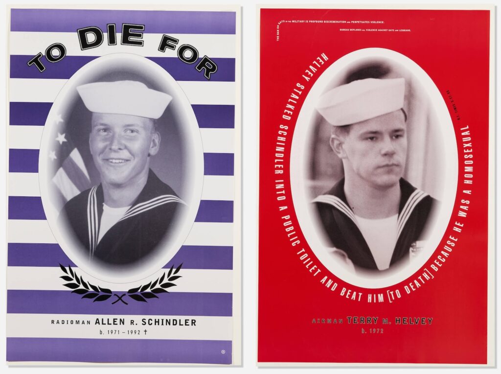
I realize though I’d seen the posters, and the basics of the situation, I’d never known the brutal details of Schindler’s killing. Or of the violent harassment Schindler experienced and tried to report, repeatedly, from the moment in late 1991 when he’d transferred to to the USS Belleau Wood until his murder October 27, 1992, days before Bill Clinton defeated George Bush in the US presidential election.
Clinton had campaigned to end the military’s ban on gay soldiers. Bush and his Defense Secretary, the draft dodger and parent of a gay child Dick Cheney, and many other Republican politicians, supported the ban, and fostered the atmosphere of homophobic violence and discrimination under the guise of military unity. Actually, gays were the real threat to this culture, they argued, what with the blackmail, and the AIDS.
I also did not realize the vast extent to which the US Navy abandoned and gaslit Schindler’s mother and family, and to which they covered up the culture of abusive bigotry encouraged by the officers on Schindler’s ship, and to which they obstructed investigations and attempts to seek accountability, much less reform. This all unfolded after the posters had gone up and worn down, after Clinton agreed to a compromise with the powerful and bigoted senator from Georgia, Sam Nunn, the policy known as Don’t Ask, Don’t Tell.
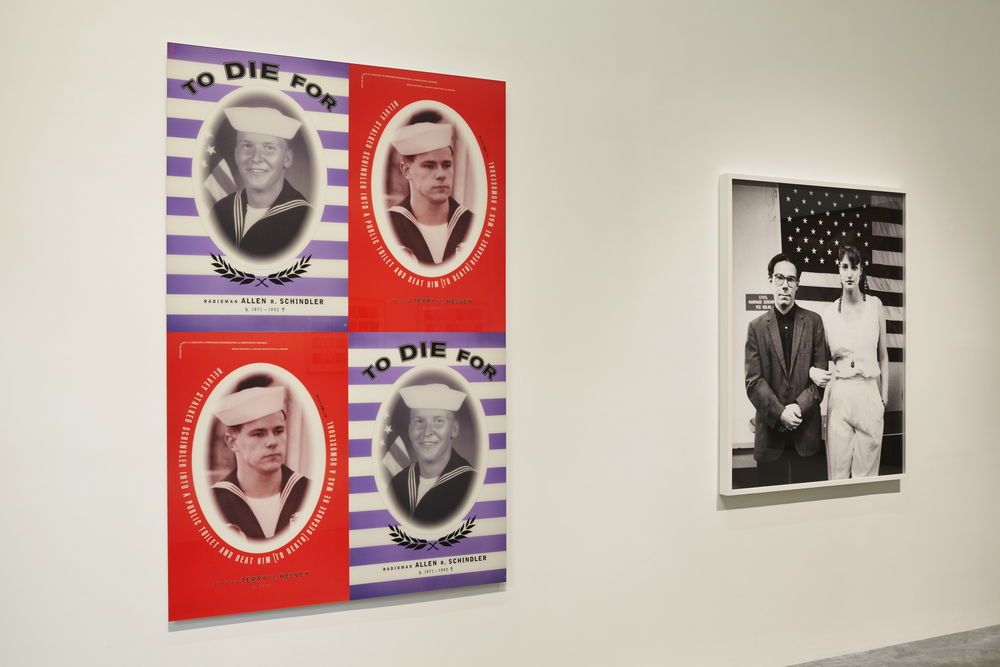
2013 installation view of Bureau’s posters and Alix Lambert & Bob Nickas’ portrait at the New Museum’s 1993 show, via Big Red & Shiny
Bureau was the design studio of artists Marlene McCarty and Donald Moffett, a continuation of sorts of Moffett’s involvement with the activist collective Gran Fury. At some point, or eventually, it all just became too much, too intense, too traumatic, and Moffett sought refuge in the studio, and in art, making abstract paintings. He seemed to address it in his 2019 Brooklyn Rail conversation with Dan Cameron, but rereading it now, it’s actually Cameron who does the talking, both questions and answers.
The way I’d remembered the posters installed was the way I’d remembered all Bureau’s posters, in an alternating grid, which was also how they were shown in 2013 at the New Museum’s NYC 1993 time capsule survey. I mention them now because a pair of posters just turned up in LA Modern’s post-Pride queer swag auction. But also because we live with one of Moffett’s earliest abstract paintings at the center of our home; we pass it hundreds of times each day. And its beauty now reminds me of the psychic cost Moffett paid to get to the place where he made it. Also, we’re entering an era where government-led bigotry and violence against its own people are expanding, and we need to remember how it went down before, and how to counter it.
William H. Johnson, Self-Portrait, 1923-26, oil on canvas, 29 3/4 x 23 3/4 in., collection SAAM
William H. Johnson left South Carolina for New York when he was 17, and began studying painting at the National Academy of Design. He painted this self-portrait in his early 20s, giving himself lighter skin than in later portraits.
William H. Johnson, Midnight Sun, Lofoten, 1937, oil on burlap, 41 5/8 x 59 1/8 in., collection SAAM
He went to Europe in 1926 to study modernism, married Danish artist Holcha Krake, and spent a decade working, showing, and traveling in Scandinavia. He painted several extraordinary, expressionistic views of Lofoten, Norway. These landscapes and his European-era figure paintings feel like they could have evolved from Soutine, or Hartley.
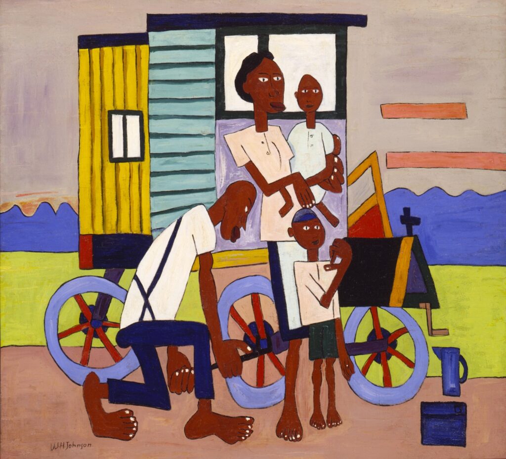
William H. Johnson, Breakdown with Flat Tire, 1940-41, oil on plywood, 34 1/8 x 37 1/2 in., collection SAAM
Johnson returned to NYC with Krake in 1938, and began painting in an African American vernacular mode that feels as close to Horace Pippin as to Picasso. After Krake’s death from cancer in 1944, Johnson moved back to Denmark, making American and African American history paintings for a while, but a mental health crisis led to his return to the States, the end of painting, and hospitalization until his death in 1970.
The Harmon Foundation was established by a white real estate developer named William Harmon to collect, promote, and exhibit art by Black artists. There are some problematics in the Harmon Foundation’s story—they removed portraits of W.E.B. Dubois and Paul Robeson from exhibitions because of their communist sympathies, for example—and it’s not clear if Johnson’s reputation suffered from his association. It does feel like he’s been sort of stuck at one museum, though.
There’s a lot that doesn’t immediately make sense. But the most important thing—besides donating its large collection of art to HBCUs and the Smithsonian, and besides Johnson’s own work, of course—is that William Harmon created his foundation after years of pseudonymous philanthropy and non-predatory student loaning—under the name of an ancestor, Jedediah Tingle.
There are many poor choices involved here, but one straightup mistake I made was not skipping the first fifteen minutes of this video, which was so insipid it left me unable to keep watching the actual event for more than nine months. Nine months of this thing sitting in my tabs, paralyzing me like a wireless fence whenever I’d get too close or it started autoplaying.
Well, the world is in a state where listening to the experiences of George W. Bush’s three art teachers is officially a less-worse option than [gestures around] all this. And that’s what the questions, the anecdotes, the uncomfortable pauses, were all about: what was it like meeting and interacting with Bush?
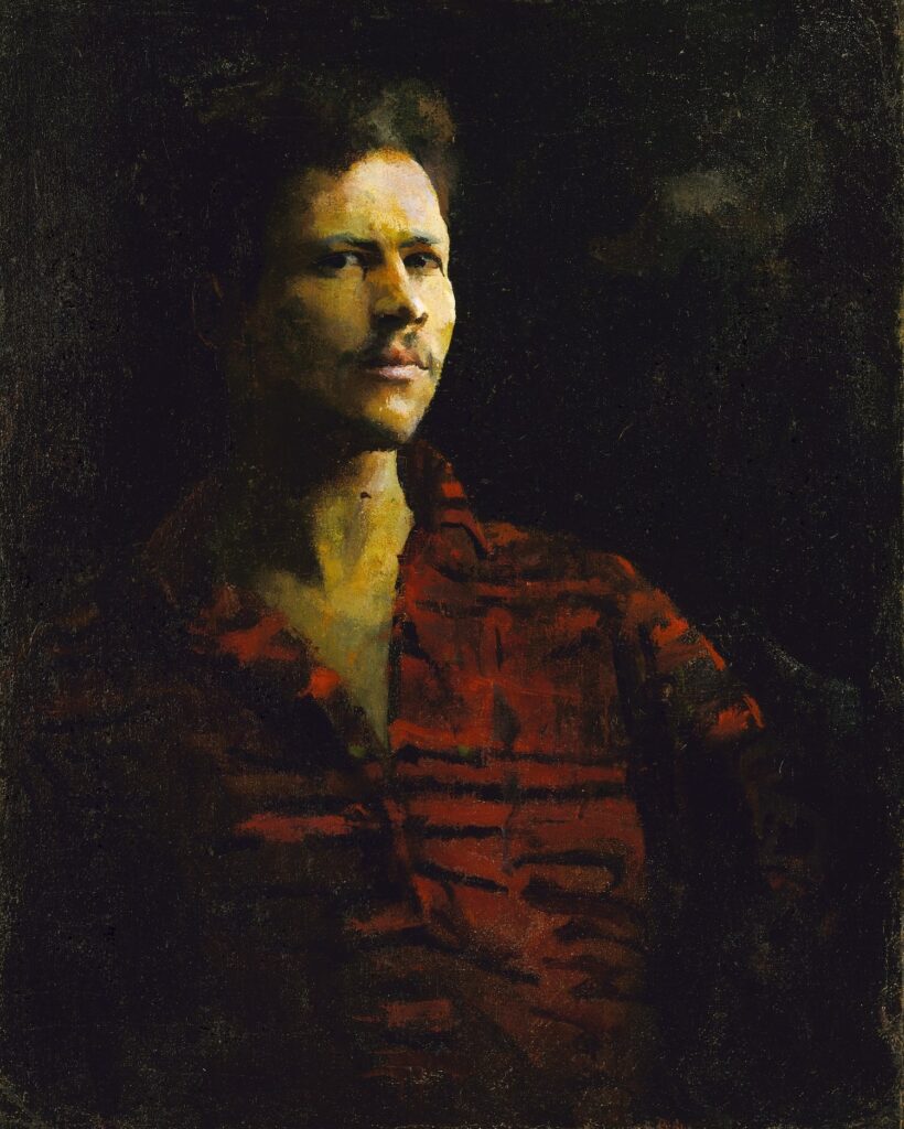
How no one bought the second greatest self-portrait Roe Ethridge ever made last fall, when it would have brought the creditor victims of Lisa Schiff’s purloining $3-4,000 before Phillips’ fees, is beyond me. Anyway, violent mask-wearing thieves disguised as US presidents could not be more on brand right now, and so it’s back, with a lower estimate and at least one bid.
30 seconds later update: LOL this is insane. I just read an article about someone who suddenly decided to pay off a school’s entire lunch debt of $865, and then went on to raise money to pay off more, and then got a law passed to abolish lunch shaming. So if you have only $2,000, do NOT spend it on this Roe Ethridge portrait, the net proceeds of which will go to several millionaire collectors who won’t even notice. Instead, pay off an entire school’s lunch debt with it. And if you have much more than $2,000, pay off a school’s lunch debt, then just contact Kreps and buy another edition of this perfect picture. What are we even doing here?
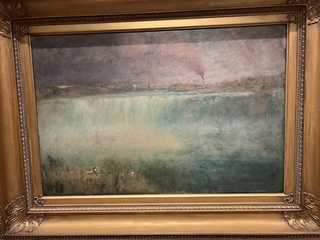
I had to go check something at the Smithsonian American Art Museum for a thing, and on the way, I got stopped by the tiny painters in the lower left corner of George Inness’s misty, smoky 1889 painting of Niagara. It had just recently been declared a state park, and the factories, mills, and brothels along the cataract had not yet been cleared away. Pretty sure it’s an edenic paradise now, at least from some angles.
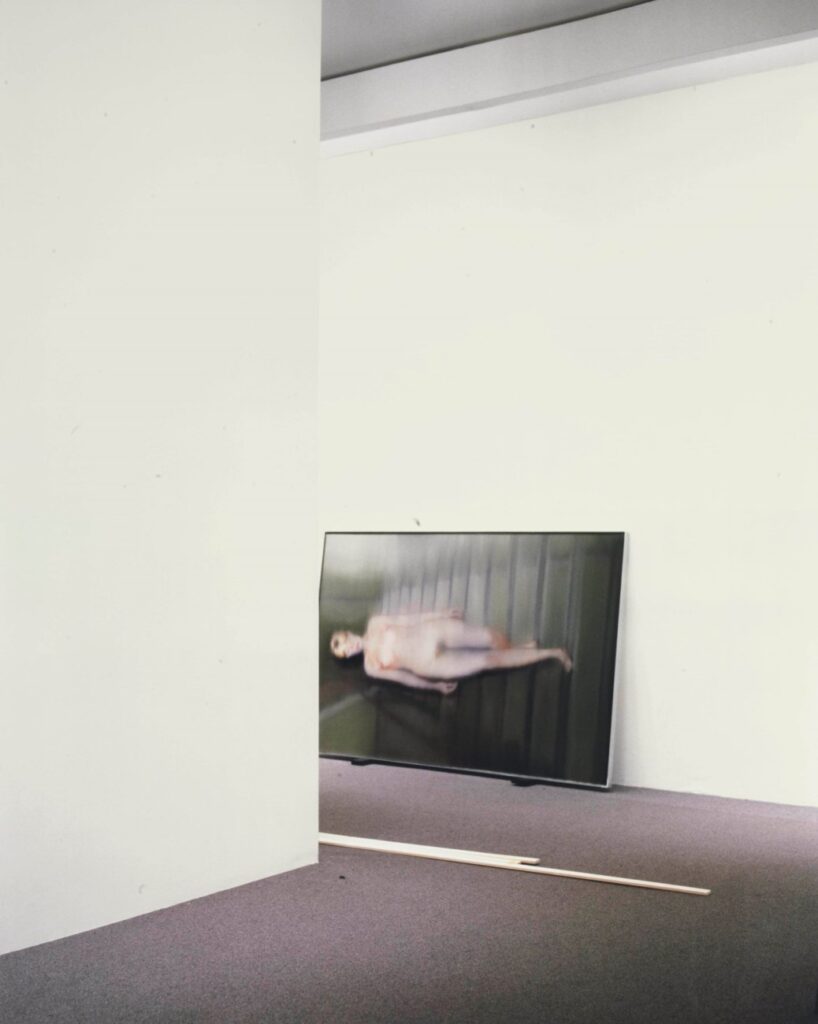
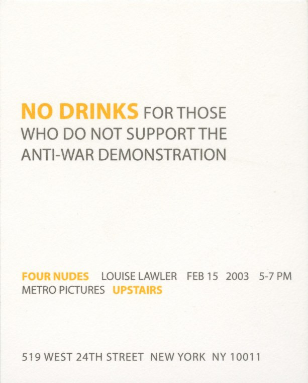
Louise Lawler, Nude, 2002-03, Cibachrome print mounted on aluminum box, 59½ x 47½ in., ed 5, this one sold at Christie’s in 2012
This is one of the Four Nudes Louise Lawler showed at Metro Pictures, beginning on 15 Febrary 2003, the date of a worldwide protest march in which millions and millions of people protested the fraudulent escalation toward the US-led war in Iraq.
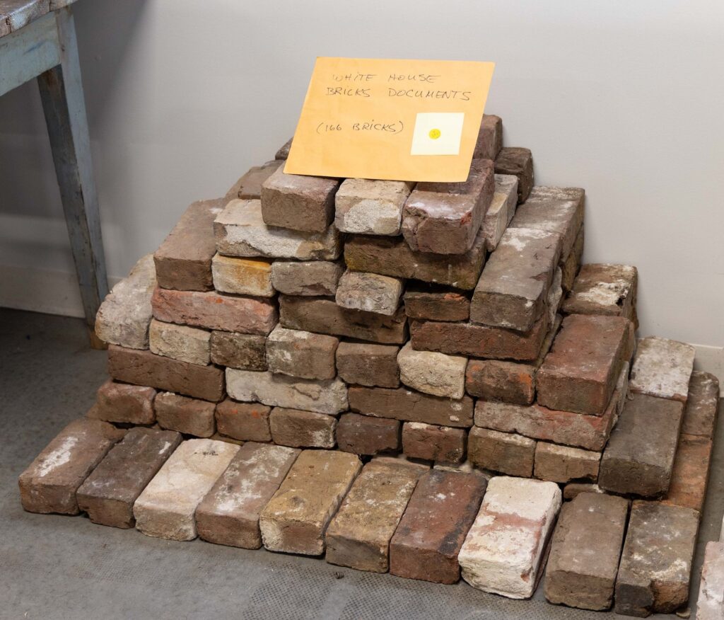
Enslaved people made the bricks for the White House from clay on or near the White House grounds at least twice. After the White House was burned in 1812, most of the original 1792 bricks were too damaged to use in the 1814-17 reconstruction. The 1817 bricks were removed during the 1948-52 gut reconstruction of the White House by President Harry s. Truman. 95,000 went for projects at Mount Vernon. 10,000 went to a project at Fort Myer. A New York congressman bought White House bricks left over from the Fort Myer pile, along with 1600 lbs of White House stone, and stored it at some guy’s farm for a while. When came to pick up most of it, he left this lot of 166 bricks. “This may very well be one of the last large groups of White House bricks in public hands,” says the Shenandoah Valley auctioneer Jeffrey S. Evans.
I’m trying to imagine the excitement if these original White House bricks were returned to the White House, or if they were exhibited publicly near the White House today. Or tomorrow.
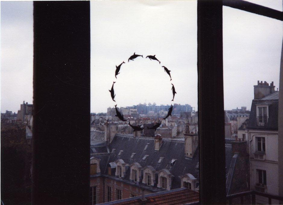
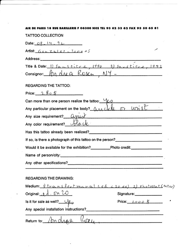
“Untitled”, 1990. Installed in Tattoo Collection. Galerie Jennifer Flay, Paris, France. 3 Jun. – 18 Jul. 1992. Conceived by Air de Paris and Urbi et Orbi, image via Air de Paris by way of FG-T Fndn
Last weekend the curators of the National Portrait Gallery and Archives of American Art’s exhibition, Felix Gonzalez-Torres: Always To Return, held a public conversation about Felix Gonzalez-Torres tattoos. It was great. But no one, including the curators and art historians who have Felix tattoos, and not me, the rando blogger who’s written about them twice, quite knew the origin of the tattoo Felix made as an open edition in 1992.
In my question to the panel, I said I thought it had been created for a show of artist tattoos, but no one else had heard that, and then I saw that info is not on the Foundation’s website, and I was like, Oh no, did I just Felixsplain something to the professionals and get it wrong?
No, I did not. But I did forget that I’d written about the show sixteen years ago.
Tattoo Collection, installation view, Summer 1992 at Jennifer Flay Gallery, Paris, via airdeparis
“Tattoo Collection” began as a project in 1991, conceived by gallerists Florence Bonnefous and Édouard Merino and Lawrence Weiner, for Air de Paris in Nice. The first 30 artists to create tattoo designs were also asked to invite someone else. Its first incarnation, of Weiner’s design on Bonnefous’ back, took place on a Monaco rooftop. Over two years the project expanded to six other galleries and almost 200 artists. 33 years ago today, 3 June 1992, it opened at Jennifer Flay’s Paris gallery as a summer group show.
In the years since I posted about it, Air de Paris has filled out the “Tattoo Collection” archive with a press release, a 2014 interview, a couple of installation photos, and the names of 189 participating artists, and the consignment forms for most of them—but only some of the tattoos themselves.
“Untitled”, the 1990 rub-on transfer edition of a stylized ring of ten dolphins that was included in Felix’s January 1990 show at Andrea Rosen, was included here, too. The consignment form from 14 Aug 1992 lists two works, both “Untitled” (or “sans titre,” so the survey was filled out by AdP, not Andrea Rosen), with dates of 1990 and 1992. The former is a rub-on transfer (ed. 20), and the latter is a photostat for the open edition tattoo.
Felix Gonzalez-Torres consignment survey for Tattoo Collection, 1993, airdeparis.com
AdP’s basic instructions survey on the consignment form say the tattoo can be bought by anyone, should be black, and should be placed on the “ankle or wrist.” Unsurprisingly, these were not static; the parameters in the certificate Meg Onli got when she purchased her edition from Rosen in 2011 are different and more expansive.
What does seem certain, though, is the connection between the tattoo and the rub-on transfer edition from two years earlier. Though the source of the dolphin motif is still unknown, the source of the tattoo image is the 1990 edition.
There is also much to be explored in the larger Tattoo Collection project. Bonnefous got the inspiration from the instructions for Weiner’s works, that “the work need not be built.” Between this conceptual core and the impermanence of the body, it’s seems realistic to say that the show—and the work—continues to this day, and it’s only our knowledge of it that is limited. Or our memory.
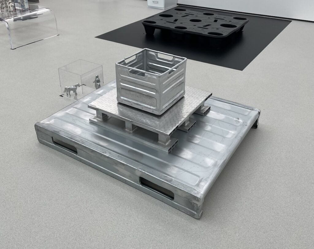
Cady Noland, Untitled, 2024, as installed at Glenstone in October 2024
Now that she’s been having some shows, Cady Noland is known to make changes to installations of her work, even dramatic ones, even last minute. So maybe it was not so surprising to realize she added a new work to the exhibition at Glenstone last October, which came so late in the process it did not appear on the museum’s downloadable checklist.
And while there were also shipping palettes from Amazon stacked in the gallery that were also not on the checklist, the status of this work, Untitled (2024), was only uncovered/confirmed three weeks later, when Alex Greenberger reviewed the show for ARTnews. And it took still more weeks to add it to the checklist, the only prepared information available to visitors.
No indication it’s even a work, yet there was time to add an unnumbered square next to the 6
At the time, I wrote that such a move was not an error: “This incompleteness, this inaccuracy, is part of the encounter; this disconnect between what you see and what you’re told is part of the experience.”
Well, now I wonder if it might have been omitted for reasons other than coy mystery. Because the most prominent elements of the work Noland added are a palette with the Amazon sticker still attached, and a milk crate stamped with a threat from the Pinkertons. The Pinkertons who chase down milk crate thieves, but who are most famous for attacking striking steelworkers on the orders of Andrew Carnegie and Henry Frick.
I had not realized that last summer, before the museum had fully reopened from its remodeling, Glenstone’s hourly workers voted to form a union, and that the Raleses had hired the same anti-union lawyers and consultants as everyone else—including Amazon. Kriston Capps reported on the union’s efforts and voting almost a year ago. That would have been right around the time Noland was installing her show.
There is not much information beyond Capps’ early reporting. The last post on the instagram account for Glenstone Museum Workers Union, affiliated with the Teamsters, was from November 22nd. It says two bargaining sessions were completed, in September and October–and that the November 2024 meeting had been canceled without explanation. A December meeting was TBD. Noland’s show opened October 17th, in what seems to be the middle of a breakdown of negotiations.
To drop a pyramid of unionbusting references in the center of the gallery could be read as a show of solidarity with the union. If anyone knew to look. Now the prolonged omission of the Pinkertons work from the checklist feels like it could have been a move to deflect or diminish the impact of Noland’s gesture of support.
Unless? Do we really know that Noland’s invocation of the Pinkertons thugs isn’t a shoutout to management, an homage to the Fricks of our day, the industrialist connoisseurs who bought basically every major piece of the artist’s work to come up for sale in the last twenty years? If it was, maybe Glenstone would have bought it. Or they would have at least included Noland’s loans in the documentation of the show.
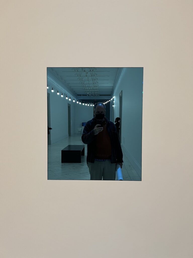
a selfie in the work at npg [honestly, maybe the real art is the way the light reflecting off my dome lines up with the light string behind me]
“If an owner has chosen to lend the work for an exhibition, the owner may choose to simultaneously install the work.”
“An authorized manifestation of [the work] is the work, and should be referred to only as the work.”
Via a recent post to Instagram by the Felix Gonzalez-Torres Foundation I learned what I could have realized many years ago: that “Untitled” (Fear), 1991, the blue-tinted mirror, is not an object, but a work. And as such, it can be presented in multiple manifestations simultaneously.