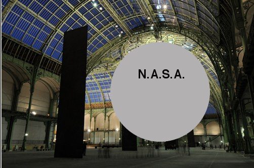
I’m not going to pretend it’s not about me, or my Project Echo satelloon in the Grand Palais,
or the Grand Palais then tweeting at me about Anish Kapoor’s giant inflatable Leviathan,
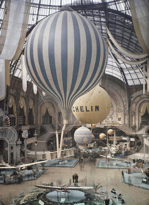
or about Léon Gimpel’s autochromes of air shows in the Grand Palais.
It is exactly about all of that, and also,
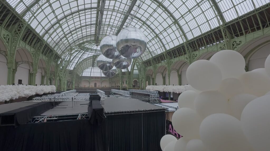
Imagine actually staging a balloon show in the Grand Palais, and deciding what the grandest, vastest art space in the world really needs is five, little Christmas ornament satelloons suspended over a field of temporary sheds, each containing its own Museum of Ice Cream-style balloon instagram spectacle. Does that feel insufficient? Yes? Should we add a light show turning them into disco balls? Should they rise and sink in sync to music? Should they invite Bella Hadid? It’s like, confronted with the central faiblesse of the aesthetic experience, Hyperstudio could only think to keep adding to it.
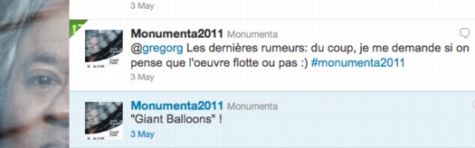
Look, I am fully aware that a sporadic series of blog posts over 18 years is no way to realize a 100-foot wide aluminum sphere sculpture exhibited in one of the most prominent art venues in the world. I get that. I’m glad the Grand Palais was at least aware.
But this is not just about me and my balloon. Kusama has been showing inflatable immersive environments for years, and she is not here in the Balloon Museum’s Euphoria. LVMH was fine to put dots all over their stores, but apparently did not see fit to underwrite her obliteration of and in the Grand Palais.
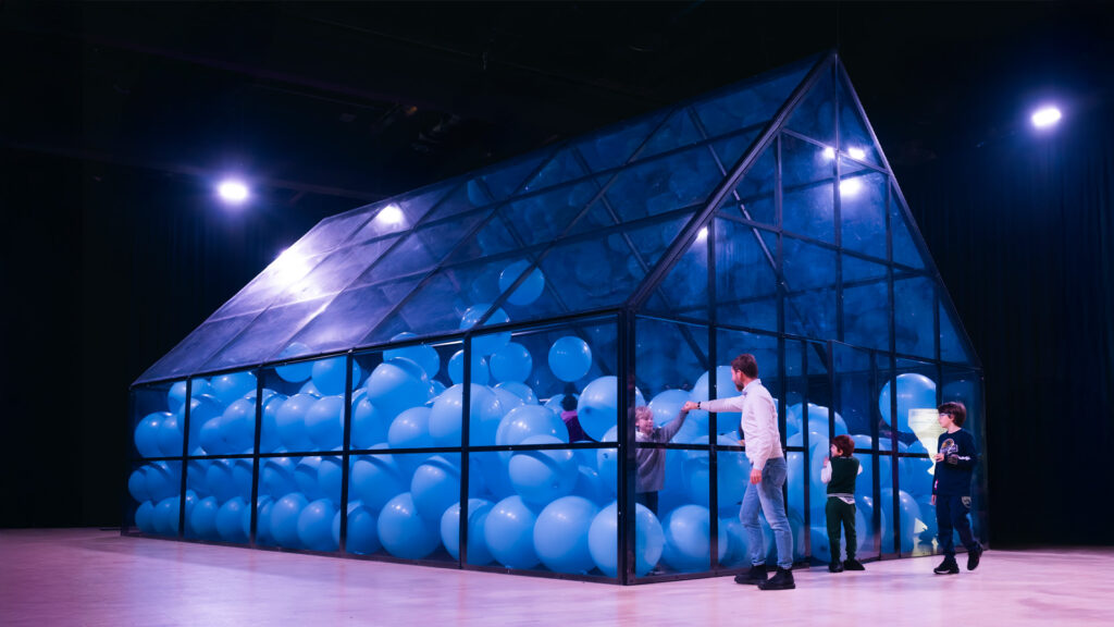
And then there’s Martin Creed, an Old Master of the contemporary balloon arts. For the Grand Palais he made, of course, Work no. 3883: Half the air in a given space (2024). And the space they gave was inside a f’ing greenhouse. The Balloon Museum was really given the biggest space in Paris to stage an exhibition of the most important balloon-based artwork of the age, and said, “Half the air in a given space? Sure thing, I give you an Amazon box with a balloon in it.”