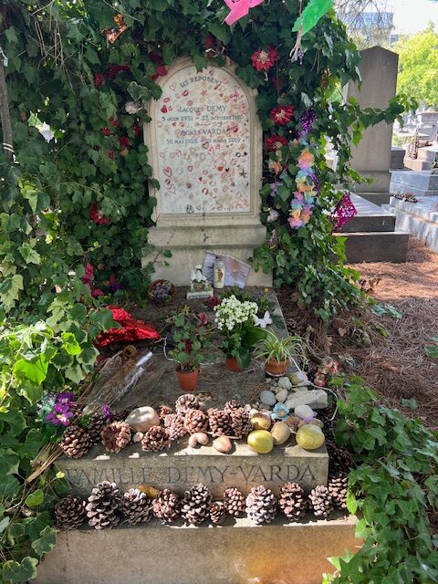
Well the most popular grave in the Cimitière de Montparnasse is not Chaïm Soutine’s, Samuel Beckett’s, or even Jean-Paul Sartre & Simone de Beauvoir’s—though they’re close. It’s Jacques Demy and Agnès Varda’s.
And while the gleaned potatoes and pine cones and even the prayer flags are chill, I cannot get past the number of people who kiss the headstone with big cheesy red lips, or write on it with lipstick.
It reminds me of the woman who kissed the Twombly in Avignon, who was like, I couldn’t control myself, it’s an act of love. And honestly, people should be able to control themselves at least this much.
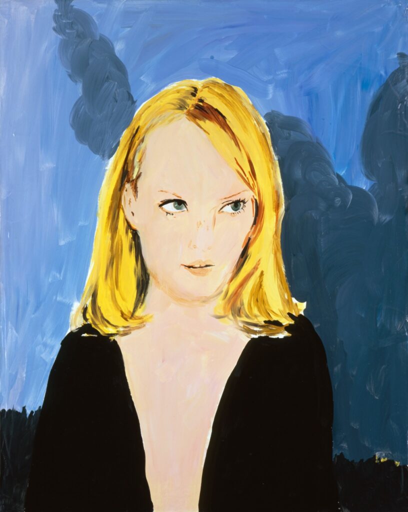
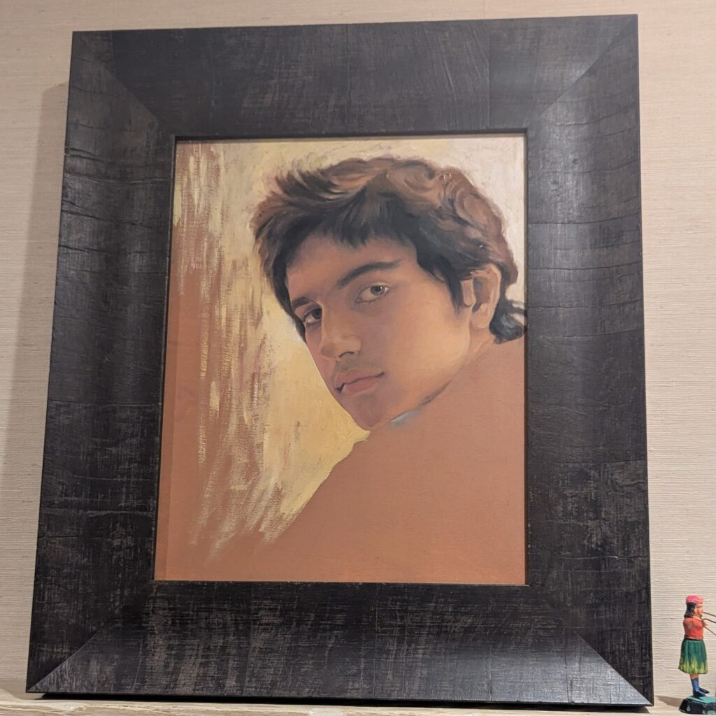
Salman Toor, Portrait of Zohran Mamdani, 2007, collection: his parents, image: IG/Amitav Ghosh
In 2007 Salman Toor was a 24-yo student at Pratt when he made this portrait of Zohran Mamdani, who was then 14. Amitav Ghosh posted the pic on instagram after Mamdani’s victory in the Democratic mayoral primary in NYC, which he celebrate with Mamdani’s parents, Mahmood Mamdani and filmmaker Mira Nair.
From Artsy’s report, it sounds like the study was created in preparation of a larger family portrait. Toor is asked to do the corny thing of seeing the future in this portrait. Inshallah he wins, of course, but I do not go for this portraiture sorcery.
On the other hand, if you were to ask me if this looks like the portrait of a kid who told his mother to reject the offer to direct a Harry Potter movie and instead keep working on adapting a Jhumpa Lahiri novel about grieving over the loss of a far away family member, I would say “Absolutely, nailed it, 1000%.”
Dia has released a video about Walter de Maria and his work there. It’s specific in many interesting ways. If someone is polishing the top of Vertical Earth Kilometer in Kassel, we don’t hear about it, but there are interviews with the longtime caretakers of Dia’s permanent De Maria installations in the US: Bill Dilworth (New York Earth Room); Patti Dilworth (Broken Kilometer) and Robert Weathers (Lightning Field). Bill Dillworth died in December 2024, and the project is dedicated to his memory. [h/t Chris Nanos]
Related, somehow not previously: In 2023 Jeffrey Weiss wrote about the history, changes, and poetics of De Maria’s Earth Room after it had been removed, renovated, and remade. HVAC and new windows substantively changed the character of the work and the visitor’s sensory experience of it. But the implications extend far beyond questions of aroma, humidity, or ambient sound, toward permanence, aesthetic and the nature of the art experience.
[later that day update]: @octavio-world’s post adds new context: the Dilworths both left/retired in 2023, after the renovation/alteration, and were replaced by a rotation of minimum wage workers. So while extolling both the primacy of the physical experience of De Maria’s works, and listening to the singular people who have experienced it, that connection was broken. I mean, yay oral history, but that feels like an important thing to have omitted from the story, especially when it makes it sound like a memento mori and not a corporate/conservatorial decision.
[update: I’d had the Dilworths’ name spelled right, then I changed it after doublechecking a quote, and seeing it spelled wrong in the video captions. I’ve changed it back. Dia could do the same. Thanks for the correction.]
Screencap from Spike Jonze’s Her (2013), from a gif by @bladesrunner
Imagine an internet retail revolution that not only created online shopping, but that brought digital shopping into the physical world. The mp3 store. The gaming store. The stock footage store.
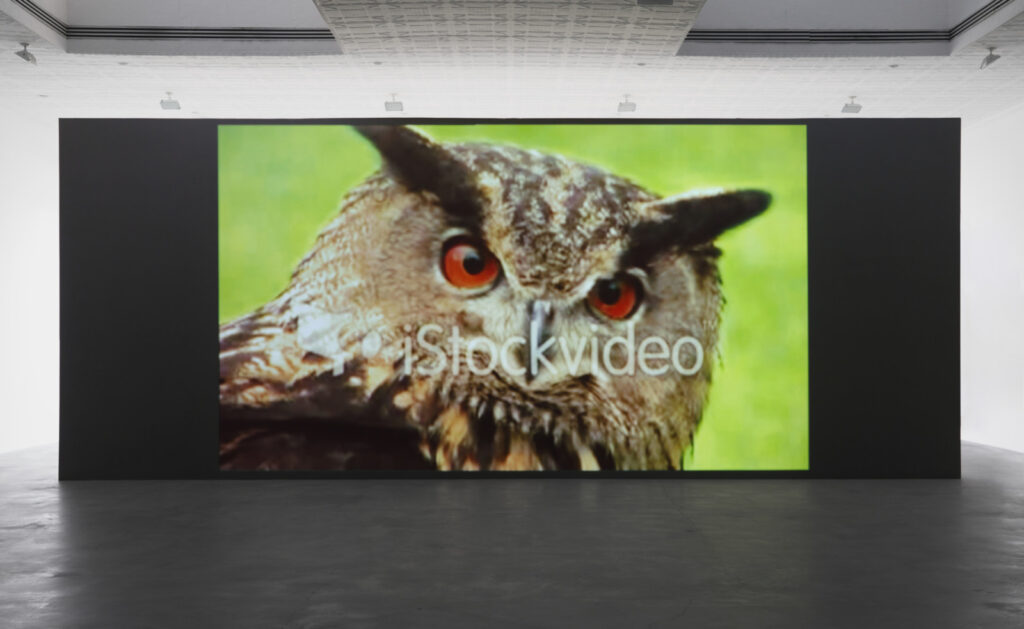
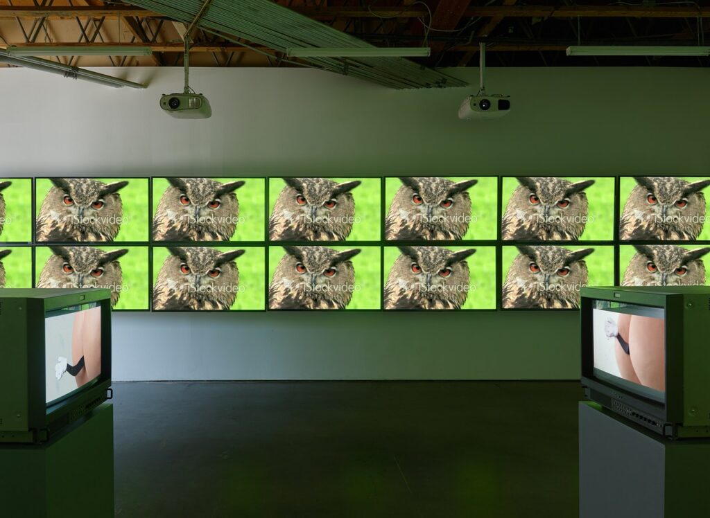
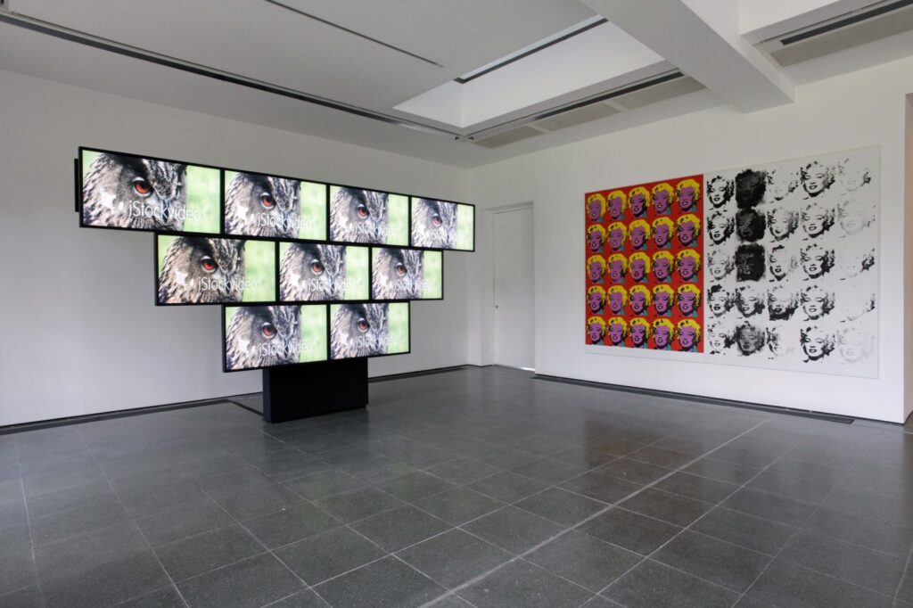
Sturtevant, Simulacra, 2010, single channel 16:9 video, installation view at Matthew Marks, 2022
The stock footage store.
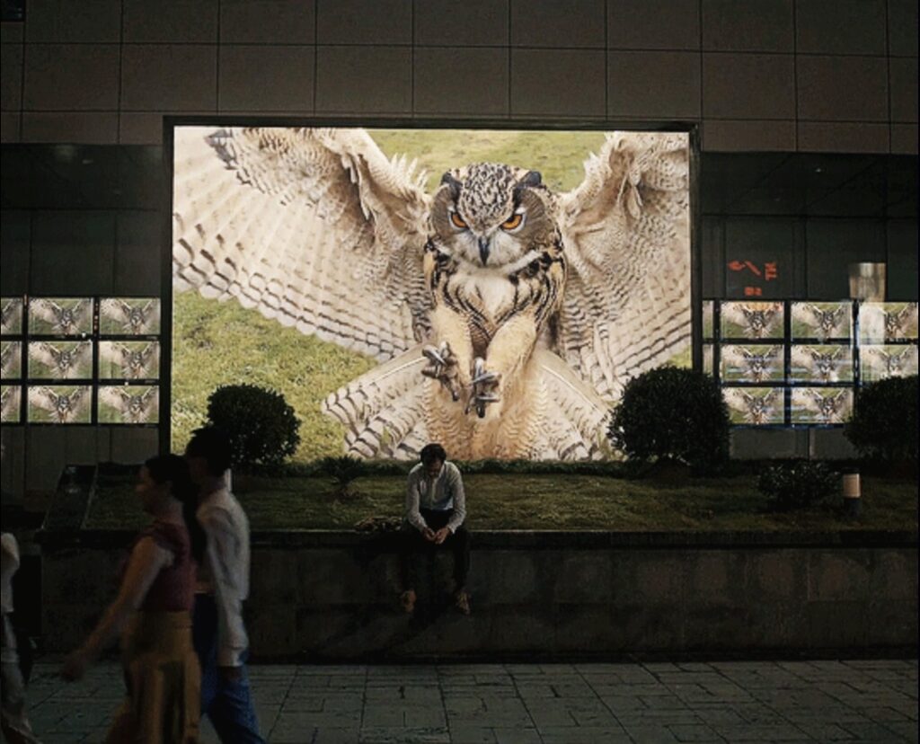
Imagine a bustling day in 2009 or ’10 at the iStockVideo store in Paris, in the old BHV, the department store where Duchamp bought his readymades. Under the high ceiling a long table arrayed with great horned owl footage. A chic but cantankerous Sturtevant and a cheery, slightly sheepish Spike Jonze both rummaging through the tablets, realizing each other’s presence when the reach for the same clip. They look up, Jonze smiles, says, “Pardon” in his downtown French, and pulls back his hand. He casually peruses his way to another clip.
Installation view of Simulacra, 2010, from Sturtevant: Memes, at Freedman Fitzpatrick, 2019, via CAD
Imagine in that world, as in ours, Sturtevant opens a show at the Serpentine in 2013. Spike Jonze’s Her, 2013, was released in France on March 19, 2014, and Sturtevant died on May 7. Imagine this 89 year old Deleuzian, in what would be the last few weeks of her life, going to the cinema to see the movie about the guy in love with his bot. In that world, as in ours, she just opened a show at the Serpentine with a video wall of owl footage. She sees this scene of Joaquin Phoenix on the sidewalk.
installation view of Rock & Roll Simulacra, Act 3 (2013) in Leaps Jumps & Bumps, 2013 at the Serpentine Galleries, image: Jerry Hardman-Jones
Does she then remember that fleeting encounter, years earlier, at the owl clip shop? Is the question I’d rather consider than the one this world has presented me when tumblr’s algorithm presented this gif to me because it thought I “looked interested.”
I’ve been working my way back through David Naimon’s Between the Covers, and was listening to a 2023 conversation about translation and African language with Ngũgĩ wa Thiong’o, when I had to pause the pod’ for Neptune Frost. The 2021 Afrofuturist musical was made in Rwanda by Saul Williams and Anisia Uzeyman in February & March 2020, escaping a global pandemic shutdown by four days, like the Deathstar plans leaving Scarif.
Uzeyman and Williams’ conversation with Eugene Hernandez at the 2021 NYFF gives a sense of the project’s origin, their artistic influences, and the euphoria of pulling it all off.
For a brief shining moment in 2023, a website called depositionrow.com hosted the entire 6h42m42s video of Richard Prince’s deposition in the copyright infringement lawsuit over his Instagram New Portraits. And then it was gone.
Well, now you can watch it again. Starting today, it is playing on a computer on a table in a Janis Kounellis installation at Sant’Andrea di Scaphis in Rome, Gavin Brown’s deconsecrated side hustle. What are you waiting for?
[apr 30 update]: there is video now, it really is like this for six hours.
Johns adding these little figures in Namuth & Weschler’s 1990 film, Jasper Johns: Take An Object
“I thought to add these little figures, which appear in a different drawing of mine, an old drawing. They’re in the bottom of Perilous Night, for John Cage.”
And little guys: Jasper Johns, The Seasons (ULAE 0249), 1990, intaglio, 50 1/4 x 44 1/2 in., ed. 50
Johns is talking to filmmaker Judith Weschler, who produced Jasper Johns: Take An Objectwith photographer Hans Namuth in 1990. The short film is bracketed by two extended scenes of Johns at work: in 1972, painting in his own studio, and in 1989, printmaking at ULAE.
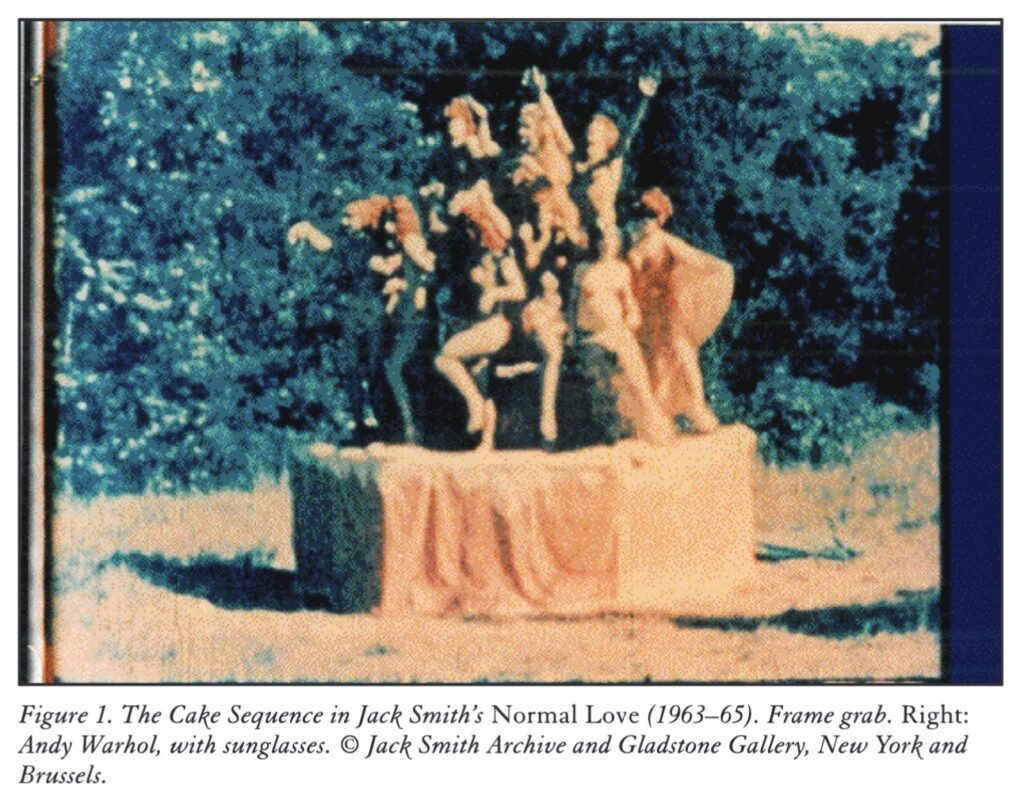
In Summer 1963, amidst the scandals and arrests that marked the earliest screenings of Flaming Creatures, avant-garde filmmaker Jack Smith was already at work on his second movie, Normal Love. Andy Warhol, who’d just bought his first movie camera, was filming the first rolls of Sleep at his dealer Eleanor Ward’s rented farm in Old Lyme, Connecticut.
On the weekend of 11 August, Jack Smith and the cast of his new feature film-in-progress, Normal Love, also turned up [in Old Lyme]; they were there to film the Cake Sequence from Normal Love, in which the cast dances on top of a giant wooden birthday cake designed by Claes Oldenburg, which they constructed in a meadow on Ward’s property (figure 1). Warhol appeared in the Cake Sequence of Normal Love. that’s him on the right (figure 2), in the dark glasses; on the left, you can see poet Diane di Prima, in the turban, and Mario Montez to her right. And he also shot one of his very first films of this event, a four-minute silent color reel titled Andy Warhol Films Jack Smith Filming “Normal Love,” probably on the same day.
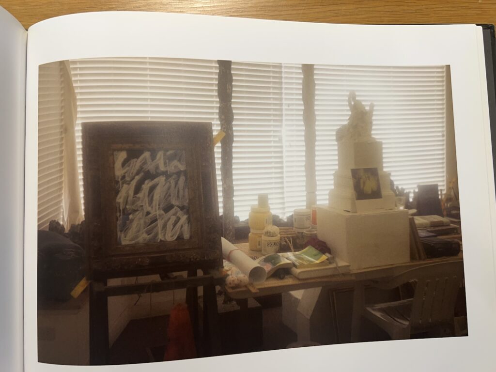
Sally Mann photo of Cy Twombly’s Lexington Studio from Remembered Light
Looked through Remembered Light: Cy Twombly in Lexington, Sally Mann’s 2016 book of photos of Twombly’s places, for the first time the other day, and saw this. A perfect little painting in a fat, baroque giltwood frame in his cluttered storefront studio.
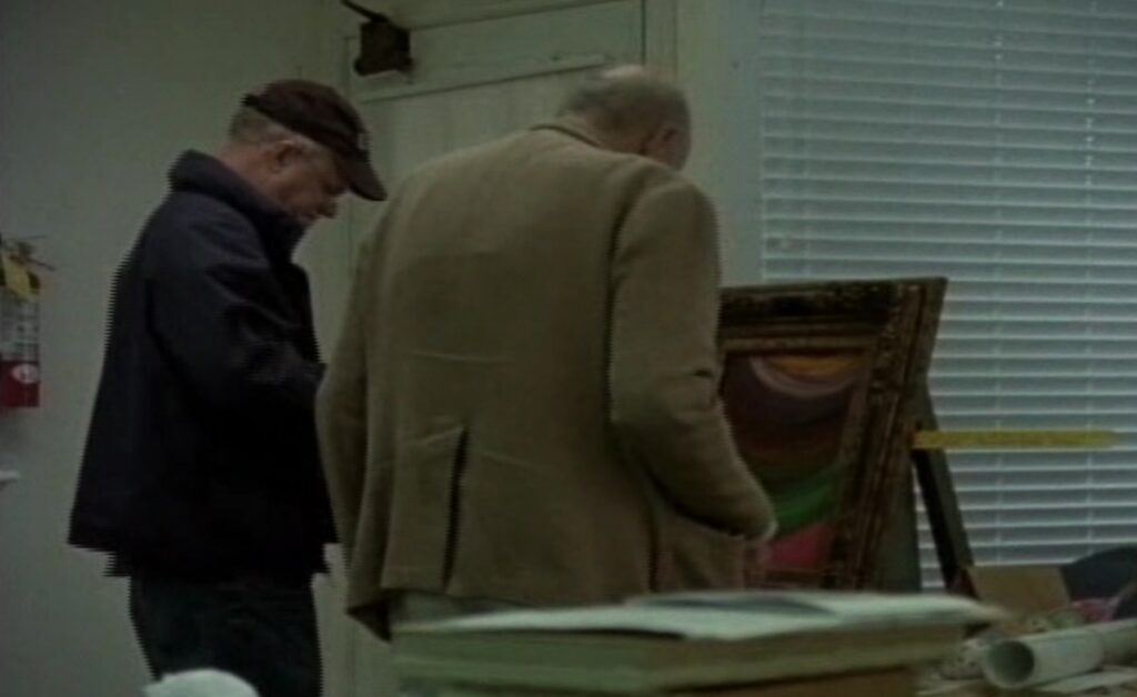
But this is not just any perfect painting. [I don’t actually know what painting it is, tbh.] I just know it was a major plot [sic] in Tacita Dean’s 2011 film, Edwin Parker.
Maybe plot is a little strong. In her quiet, attentive film Dean doesn’t follow Twombly around so much as just be where he is, and observe. And for most of the film, he’s in this little studio. The first action or narrative drama, such as it is, involves a painting that has fallen out of this picture frame, and Twombly tries to fix it. The two men with him—first, Butch, his local assistant, and then Nicola Del Roscio—alternately hover and jump in to help with tape and a tape measure.
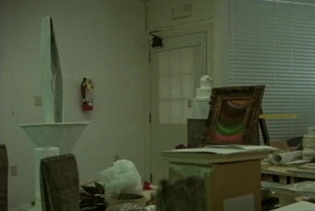
detail of a screenshot from Tacita Dean’s Edwin Parker, 2011
When I had a review copy of Edwin Parker like ten years ago, I got kind of fixated on this painting, wondering what it was, where it was, and taking grainy screencaps so that I could track it down.
When the Hirshhorn was wrapped in his giant curtained scrim, the swag and slightly lurid colors made me worry Twombly’s painting was by Nicholas Party. When I was making Facsimile Objects about inaccessible Dürers in German museums, I wondered if it was the freely painted verso of something more mundane.
Later in the film, Del Roscio is holding the blue & white painting up top, flipping it around, as Twombly says it’ll fit in the frame. It looks like it’s related to the series of paintings Twombly made for the Louvre in 2008, as part of his ceiling deal.
installation view of Cy Twombly’s Untitled I–IX, 2008, at the Louvre Abu Dhabi, screenshot via CNN
So the plot, such as it is, involves the swapping out of one painting for another. Technically, this climax does not happen in Edwin Parker; Del Roscio is only shown setting the little painting carefully against the wall.
Whether that makes Mann’s photo a spoiler, a sequel, or just a post-credits teaser, I cannot say. All I know is now I have two little paintings to track down.
I watched the Robert Irwin documentary, A Desert of Pure Feeling, and it is good. [It is currently on Kanopy for free, support your local public library.]
Some things stand out:
Irwin’s mystical-sounding development of his pursuit of perception was fascinating: posting up on Ibiza and not talking to anyone for eight months? wandering around the desert or whatever, painting dots for 16 hours/day, 7 days/wk? But he was not, in fact, alone in that pursuit. Some art world context would have been more helpful than repeating his refusal to allow his work to be photographed.
The Whitney installation was nice, but it felt somehow confusing, which is weird because there was even a real reinstallation of it, with footage and everything. The filmmakers did somehow manage to shoot other phenomenological aspects of other installations coherently.
Evelyn Hankins, who curated Irwin’s spectacular Hirshhorn retrospective, was thoughtful and present—but that show was somehow not, at all.
Which, wtf, the MCA San Diego’s masterpiece, 1° 2° 3° 4°, was done dirty here. Is it the ultimate “you had to be there” Irwin? Except for the Chinati building, which took up the last third of the film?
The dynamics of shooting and interviewing around Marfa and Chinati was weird. Marriane Stockebrand, the inviter, I guess, was everywhere, but Jennie Moore, the director who dragged that project across the finish line was airkissed in one crowd shot? Maybe that is #chinatiworldproblems, I guess I’ll demur. The weird caginess over whether he’d attend the 2016 ribboncutting was eerie, too; it made it sound like he died in production. [Spoiler: he stuck around for seven more years.]
For a documentary about perception and reproduction, it did shoot Irwin’s own dot paintings immaculately. But the shimmering moiré of halftone dots and pixels during pans across archival photos was hilariously distracting.
Seeing Arne Glimcher as a producer both makes sense and raises some flags, but how is that any different from anything the Glimchers have done all this time? It is what it is.
For such a singular thinker, who’d done so much work on his own mind and being, maybe give the film a title that reflects something he said, not just something he quoted?
Destroyed: Karen Kilimnik, The Great Hamptons Fire, 1995, 24 x 18 in., 0il on canvas, via 303gallery
While promoting her personal style memoir published in 2015, Chlöe Sevigny told the story of how the first painting she bought, Karen Kilimnik’s The Great Hamptons Fire (1995) burned up in the second of two supposedly mysterious house fires of then-methhead writer/director Harmony Korine. Getting an unspun account of Y2k-era Korine and his fires has been difficult; by 2008, all he knew was, he woke up, and the house was gone [twice.] by 2019, the fires are just a line in Chris Black’s cute puff piece.
In her sadface emoji shoutout to Sevigny’s story—while blurbing Kilimnik’s current show at Gladstone—publicist Kaitlin Phillips linked to a scraped version of the story on a defunct Russian art dealer blog rather than to the original magazine. [Maybe because their image of the painting hadn’t disappeared.]
Anyway, the painting was in Kilimnik’s 1995 show at 303 Gallery, her third, which opened on Halloween, three months after Kids, and while the F/W95 Jil Sander campaign featuring Amber Valletta she’d based the painting on was still in print. The ICA show she loaned it to was called, “Belladonna,” a group show of women artists that opened in early 1997. In addition to Sevigny’s Kilimnik, Korine’s Connecticut fire destroyed the footage for Fight Harm, an in-process project where Harmony’d get the crap beat out of him by passersby, and Leo DiCaprio or David Blaine would film it. That pushes the date past 1999.
If we are to understand the story and the timeline, though, Sevigny either put the painting in Korine’s care before the first fire in New York, and left it with him, OR she gave it to him after he’d already burned down one house. All so that more people could see it, in Korine’s suburban drug den. I, too, am sad this beautiful early Kilimnik was destroyed, but it seems like Sevigny is leaving out some key aspects to this story.
Derek Jarman at Prospect Cottage in Dungeness, in front of a painting by Robert Medley, photographed for World of Interiors in 1989 by John Vere Brown
The World of Interiors has run the same story about visiting Derek Jarman at Prospect Cottage three times: the first was in 1989. The second was in June 2019, and ngl, I can’t figure the hook. Jarman’s partner Keith Collins had died the year before, so the cottage was in limbo, but the Art Fund campaign to rescue it wouldn’t come until 2020. There was a restoration of The Garden (1990), and an exhibition of paintings he made at Dungeness that spring, but neither seems big enough. I just saw it trending in a sidebar, but it turns out the third time was last February, the 30th anniversary of Jarman’s death. So bless the editors and algorithms of World of Interiors, I guess.
What caught my attention was the large painting over Jarman’s sofa, in a style like none of his other works. Which makes sense, since it was not by Jarman, but by Robert Medley. The painting “is entitled Sebastiane, and is autobiographical in the sense that Robert was in the film of that name that Derek made in 1974.”
screenshot from Part 5 of Logistics (2012), on YouTube
Logistics (2012) is a 37-day-long film by Erika Magnussen and Daniel Andersson that tracks in real time the route of a cheap, electronic pedometer from its warehouse in central Sweden back to its factory in Shenzhen. While it does answer the question of where the stuff in our world comes from, it is primarily concerned with how it gets to us, via truck, train, ports, and most of all, container ships.
Logistics first screened in Uppsala in 2012 and has streamed on various platforms, but since Spring 2024, it has been available on YouTube in 107 8-hour segments. It feels right at home.
2013 was my last exercise to understand how Jarman made Blue blue. Early live performances used a filmed loop of an Yves Klein painting. That was replaced by a blue gel. Rowland Wymer’s 2006 book said the blue was “electronically produced,” which, if the image above is to be accepted, means it was not filmed in camera, but on the film stock itself.
Perhaps it is far past time to make some actual inquiries instead of just poking around in books.
[a little later update: In 2014, Mason Yeaver-Lap wrote about Blue, “a film without film,” and how the Walker Art Center exhibited it on a loop in a gallery. Though the museum has a 35mm print, for conservation reasons, they went with, “a flickering projector (aided by a piece of kit called T’he Flicker-O-Meter,’ whose manual can be found in the Walker archives) [which] would beam through a projection window coated with a blue gel. This filmless projector would thus throw a perfectly IKB shade, accompanied by a CD dub of the soundtrack. Again, Blue was a film without film.”
FWIW, this blog post will be the second mention on the internet of the “Flicker-O-Meter. We’re gonna need to see that manual.
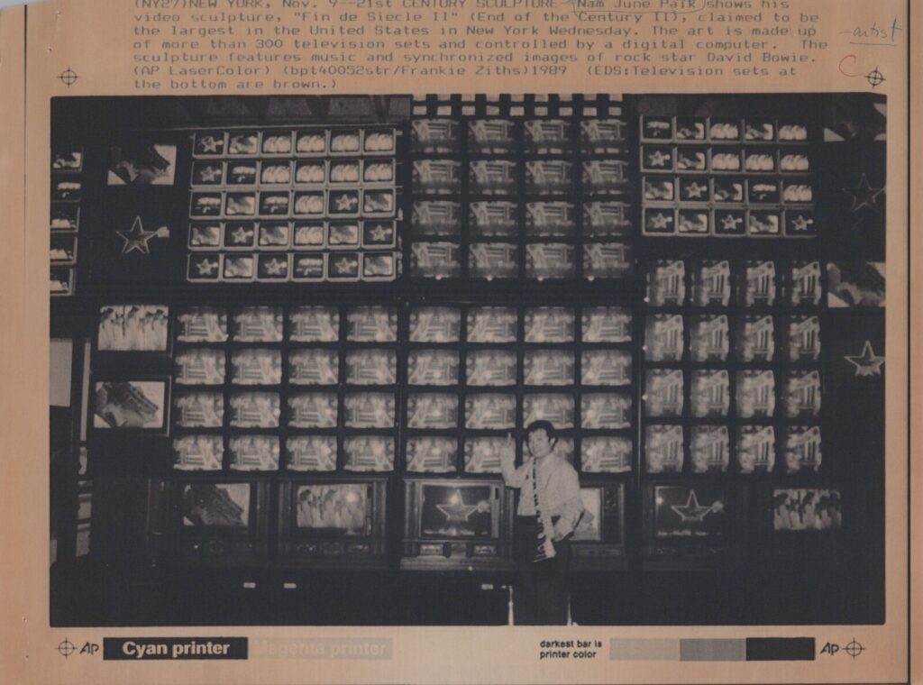
I cannot believe I missed this 1989 publicity photo on ebay of Nam June Paik posing in front of the original installation of Fin de Siecle II.
Paik created it for a show at the Whitney, “Image World: Art and Media Culture.” According to the caption, “The art is made up of more than 300 television sets and controlled by a digital computer. The sculpture features music and synchronized images of rock star David Bowie.”
Which, well, yes, and,
What an amazingly clipped description.
The Whitney acquired it in 1993, but never showed it. When they decided to show it again in 2019, it turned out nearly a third of the hardware was inoperable and unusable. [The keyframe on the conservation video below shows the original configuration.]
It’s now listed as having “207 video monitors in scaffolding and seven video channels.” Also mentioned are the other video sources, including Rebecca Allen’s Kraftwerk animations; video by Paik’s assistant Paul Perrin accompanied by Philip Glass; Merce Cunningham; Joseph Beuys; and Gera. Most are Paik-related or Paik-adjacent, which makes the whole work feel, along with everything else, a little like a self-portrait.

![this altered version of Caravaggio's Deposition from the Vatican Museums in Roma is a cascade of mourning figures holding or looming over the dead but still absolutely caked up body of Our Lord, with an outsized clipped version of Richard Prince's under-oath face roughly pasted onto the main figure in the center, the one who is holding Jesus, but, importantly, also looking straight at the viewer. Obviously, since this is a picture about Prince's deposition in a lawsuit, the so-called correct thing would be to paste his face on Jesus's, and in less apocalyptic times, I might have, but [looks at the world] I'm not taking that chance rn](https://greg.org/wp-content/uploads/2025/04/richard-prince-deposition-roma1-689x1024.jpeg)

![a google streetview screenshot of the back of a durer painting in the state museum in karlsruhe, germany, which is mounted on a white pedestal in a black and gold edged frame. the back of the painted panel is swirling red green pink blue, pale yellow, interpreted as a slice of agate, and I forget what's on the front. some devotional image of jesus [love him, don't get me wrong, but not the point rn] the gallery floor dominates the image; it is strip wood. the walls are pale grey with a dark grey stone baseboard. google streetview cruft and ui elements abound obv](https://greg.org/wp-content/uploads/2021/03/durer-ecce-homo-verso-google-streetview-1024x717.jpg)