This Royal Thrown of Punks, Diss Sceptred Tee

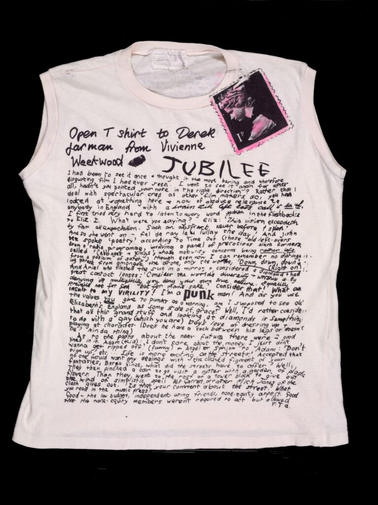
Vivienne Westwood/Seditionaries, Jubilee rant shirt, recto, from the personal collection of Malcolm McLaren to the V&A

This the 81st anniversary of his birth is the perfect time to say Derek Jarman had Vivienne Westwood’s number, and she knew it.

In Artforum, punk obituarist Derek McCormack tells The Story of The T-Shirt:

Continue reading “This Royal Thrown of Punks, Diss Sceptred Tee”

Why These Aspect Ratios, Blanket?

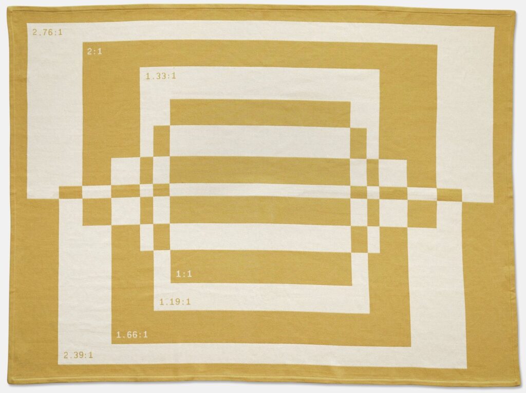
Aspect Ratio Blanket, jacquard cotton, $120 from A24 Films

In late 2020 A24 Films dropped this aspect ratio blanket. It is part of the film studio’s unusually extensive swag collection, and was designed by Actual Work, of Provo, Utah. It is great, and not only to the extent it makes me think of Liz Deschenes’ photos and Derek Jarman prints.

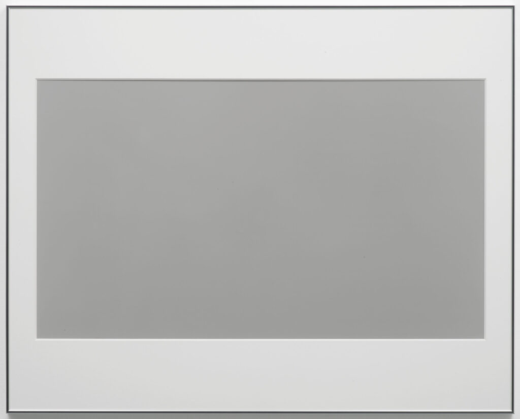
Liz Deschenes, Black and White, 2003, as shown at Campoli Presti in 2007

In 2003 Deschenes made a series of monochrome photographs in the dimensions of various screens, analog and (emergent) digital, which helped to forefront the usually unseen technological systems used to produce the images we consume. They don’t get as much attention as the saturated awesomeness of her green screen photos of the same era. I saw them first at Andrew Kreps, and she showed them again in London at Campoli Presti.

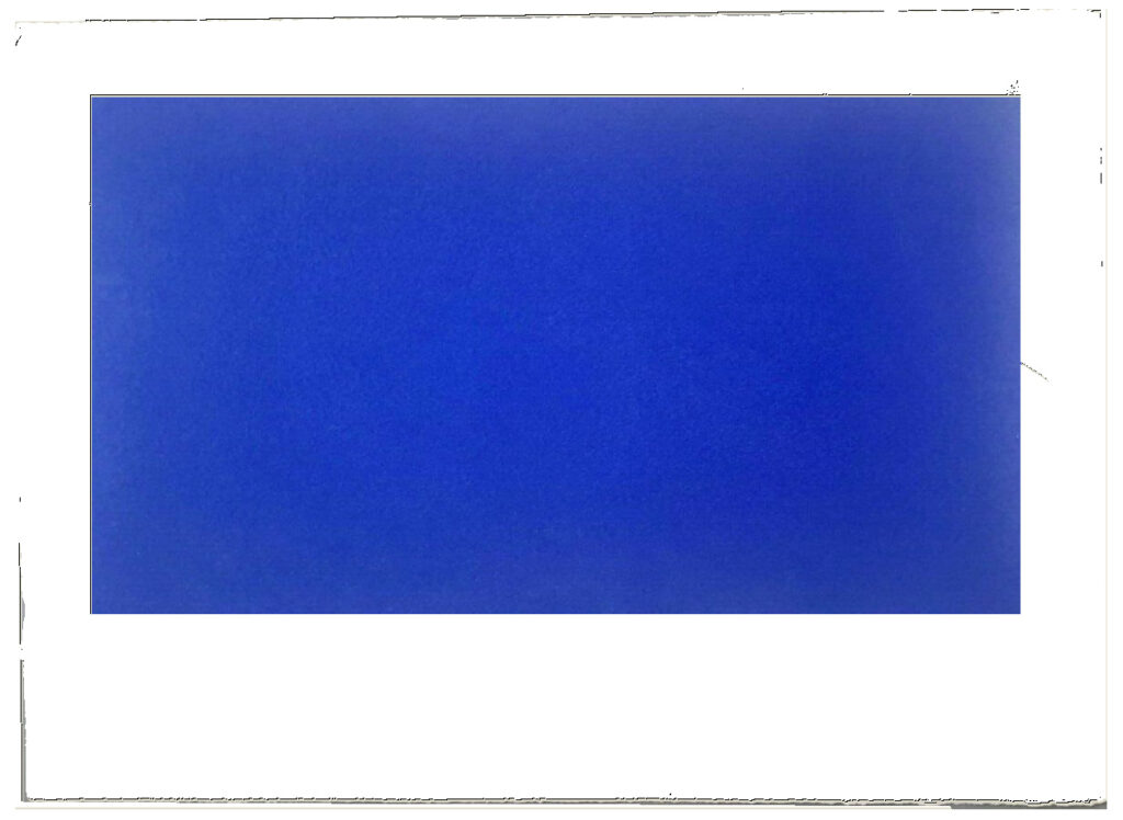
Just turn it sideways, he says: Study for Derek Jarman Blue Screen Print, 2020, gahhh, the aspect ratio

Derek Jarman is my own damn fault, a rabbit hole I jumped into and kept on digging as I tried to figure out the correct [sic] aspect ratio of a monochrome silkscreen of Jarman’s Blue, rather than just buy an example from the unfinished deluxe letterpress edition of the screenplay when it appeared on eBay.

But maybe it’s exactly those too-close encounters with aspect ratios that made me wonder what’s going on in A24’s blanket? Why does it have the seven aspect ratios it does? 1.33:1 and 2.39:1 are pretty standard (standard TV and anamorphic/widescreen theater, respectively), but 1.66:1? That’s a European theatrical format. 2:1 was originally launched in the ’50s as SuperScope, but it’s more likely that its promotion by Red, the digital camera company, as an optimal format for phone & flatscreen display is a more likely explanation. 2.76:1 is Panavision, and an auteur-y choice only a Tarantino would make (or, apparently Gareth Edwards, who used it for Rogue One. Neither film was an A24 joint.) 1:1 is…Instagram? Josef Albers? I have no idea.

1.19:1, though, is an ancient ratio that does have a direct A24 connection. Originally used in the 1920s during the transition to sound, Robert Eggers used it on his 2019 film, The Lighthouse, which was an A24 joint. The ratio was a deliberately, constricted, archaic choice that evoked imagery of the 19th century of Edgar Allan Poe’s unfinished story that inspired the film. So in a way, it makes the most sense of all.

But I think the blanket is not meant for overthinking, and these ratios were chosen to look good when stacked. Which, I guess it’s good that they do look good. If they also connected to something about the self-consciously quirky studio that made them, that’d be even better.

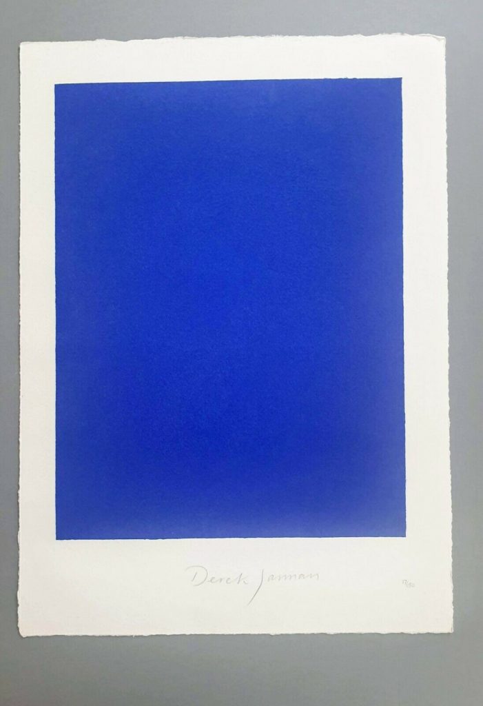
Blue Screen Print

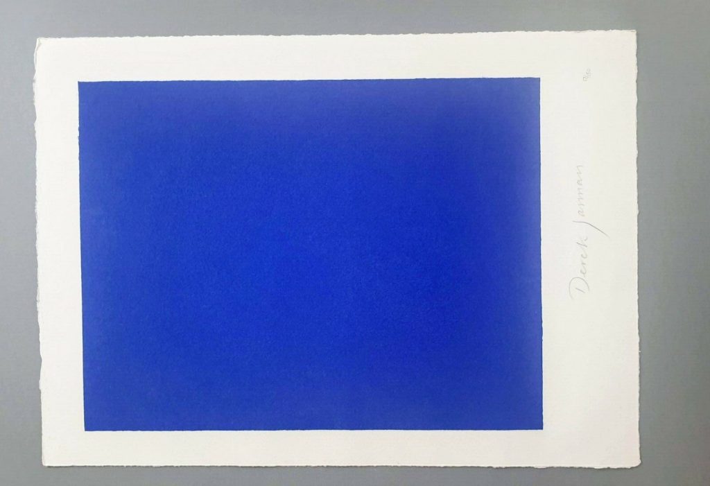
Derek Jarman, Blue, 1994,17×12 1/2 in., screen print originally made for the deluxe letterpress edition of the script by The Blue Press, now floating loose on ebay

This is a silk screen print by Derek Jarman. It was originally intended to accompany a letterpress edition of the text for Blue, his final film. That project was either produced in an edition of 150, plus some proofs, or was not realized before Jarman’s death. The numbers on the two  I’ve seen hint at a bunch–this one is labeled 17/150, and the print shown at Chelsea Space in 2014 as part of the book was 37/150.

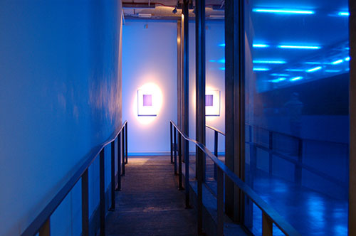
you may approach: Blue print installed at Chelsea Space, 2014, image: chelseaspace

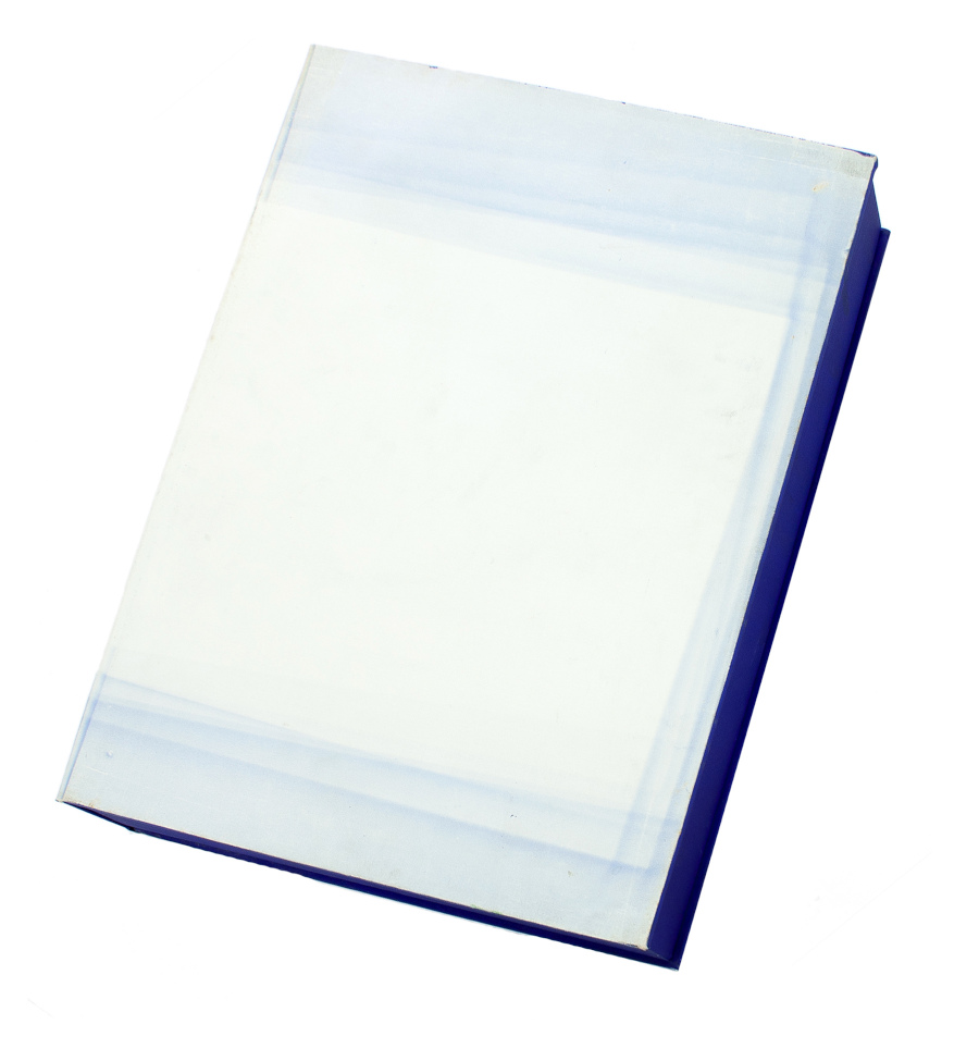
But the only other copies I’ve ever seen of the whole book were described as printer’s proofs. Jarman was supposed to have painted IKB on the clamshell boxes of 25 of the 150 editions. One proof on ebay back in the day said only four proofs were made before Jarman died, and its lid was painted, but didn’t have a print, and said the prints were never realized either.  Another, proof listed for sale privately, had a print (#43/150), but its lid looked more like the paper under the paintings than a painting itself.


Derek Jarman, Blue special edition, proof, The Blue Press, via paperbooks.ca

But that seller [pdf] said the whole letterpress edition “was centered on a loose Klein Blue screenprint signed by Jarman,” which makes it sound like the prints made it across the finish line after all. Why a signed print in a painted box doesn’t essentially become a certificate for a painting, I don’t know, but if the paintings never happened, it’s moot.

Study for Derek Jarman Blue Screen Print, 2020, gahhh, the aspect ratio…

I absolutely love this print, and may try to buy it, but I cannot for the life of me figure out why it’s portrait and not landscape. Maybe I’ll just make some and fix it myself.

LMAO This always happens to me. I think, oh, just flip it, DONE. But as I am typing in the dimensions of my new cinematic masterpiece, I am frozen. Because what should it be? Jarman made Blue on 35mm film. So 16:9 (1.77 in the US, where I first saw it, except if I look it up, some definitive-seeming sources have a widescreen aspect ratio of 1.85:1.) But Jarman’s own print is basically 4:3, so television. (Which is OK because Blue was aired on Channel4? Or nah?) But when it was still a live performance called Bliss, Jarman projected an image of an actual Yves Klein painting, and then switched to a blue gel, so no image at all, just a frame or aperture mask on the light? I think  16:9 is the clear choice here, but still.

so something like this, at 16:9, using the sheet size and smaller margins as the parameters yields a 8.125 x 14.5 inch print on a 12.5 x 17 inch sheet. study-derek-jarman-blue-screen-print-2020.jpg

Next day update: after spending part of a day determining the size and placement of the blue printed field in relation to the (unconfirmed) paper size and type of the original, I repeatedly caught myself trying not to think about how the film, then the print, then the book, then the box, then the– were all approached as the last project Jarman might complete. Make just one more thing, he and those around him might have thought? Woke up again, so there is still some time.

DEREK JARMAN, SIGNED, BLUE LIMITED EDITION SCREEN PRINT, ends 5/28/2020, OK, it went for GBP 620, not bad [ebay]

Destroyed Derek Jarman Capes: Are There Any Other Kind?

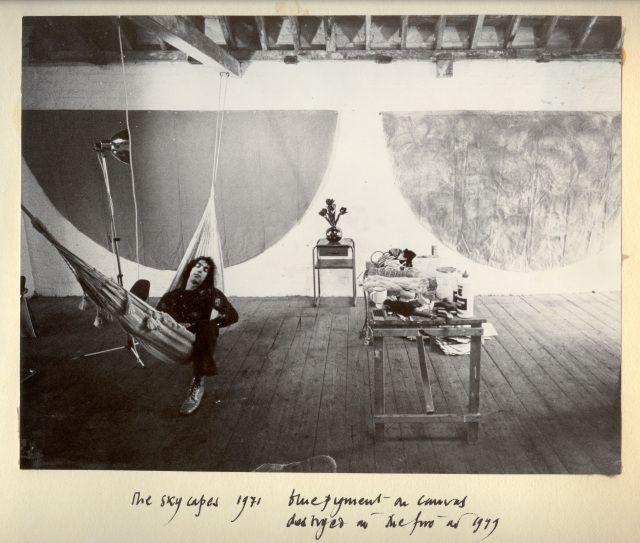
derek_jarman_loft_skycapes_1971.jpg
It’s an accident of timing that I’ve kept thinking of Derek Jarman as a filmmaker with a painting hobby. He was still alive when I saw my first Jarman film, Edward II, and when Blue blew me away. And I felt I knew his story, so I’ve been slow to read his early autobiography, or other books about him; my job was to just catch up and see all his earlier films. It didn’t help that I didn’t really like the paintings shown after his death. His notebooks were more relevant.
But I just saw this photo which changed all that. I wasn’t 100% wrong, but I was close: Jarman’s painting was more formative and influential-and interesting-than I realized. The photo’s from 1971, and it is captioned in Jarman’s dramatic hand:
“The Skycapes 1971 blue pigment on canvas
destroyed in the fire in 1979”
Skycapes has been a Google dead end, or rather a cul de sac for this caption. But capes, capes is where it’s at. In his 1999 biography of Jarman Tony Peake traced the form and concept of the cape to Jarman’s theatrical work, particularly his ideas for a production of The Tempest:

Capes are both practical and sensual, especially when cloaking nakedness. They are geometric: if hung on the wall, they form a half circle. They have mythic overtones: by donning a cape, the wearer can effect a transformation. These qualities, particularly the latter, had considerable potency for Jarman, who now set about working and reworking this new possibility until the capes he produced-and began to hang on the walls of his studio-no longer resembled design, but approached the condition of painting or sculpture.

Now the timing’s a little confusing, because Jarman made a film version of The Tempest in 1979. But Peake notes the project had interested Jarman for years. And Jarman made a clear, laminated cape scattered with dollar bills [or pound notes, maybe?] for the 1969 production of Peter Tegel’s surrealist play Poet of the Anemones. Peake said the two met at Lisson Gallery.
And the walls of Jarman’s riverside loft were lined with extraordinary capes when filmmaker Ken Russell visited and asked him to design the sets for The Devils, a project that consumed most of Jarman’s waking hours in 1970. Exhausted and dissatisfied by the film project and wary of commercial film industry entanglements, Peake wrote, Jarman “chose to concentrate on his capes, some of which he now began to paint, in two main colours, black and blue, but mainly blue: ‘simple sky pieces to mirror the calm.'”
That quote’s from Jarman’s own 1984 memoir, Queerlife, which was published in the US with the title Dancing Ledge in 1993:

1971. The Oasis
The intervening year was spent painting a series of blue capes, which hung on the walls at Bankside. They were simple sky pieces to mirror the calm that returned after the frenzied year of The Devils. That summer was an idyll, spent sitting lazily on the balcony watching the sun sparkle on the Thames. When I wasn’t painting I worked on the room and slowly transformed it into paradise. I built the greenhouse bedroom, and a flower bed which blossomed with blue Morning Glories and ornamental gourds with big yellow flowers. On Saturdays we gave film shows, where we scrambled Hollywood with the films John du Can brought from the Film Co-op- The Wizard of Oz and A Midsummer Night’s Dream crossed with Structuralism. There were open poetry readings organized by Michael Pinney and his Bettiscombe Press. Peter Logan perfected his mechanical ballet, and MIchael Ginsborg painted large and complicated geometrical abstracts.

An oasis paradise indeed, replete with all the essential elements of Jarman’s subsequent accomplishments. Which is, at least, how he himself saw it when he looked back from 1984.
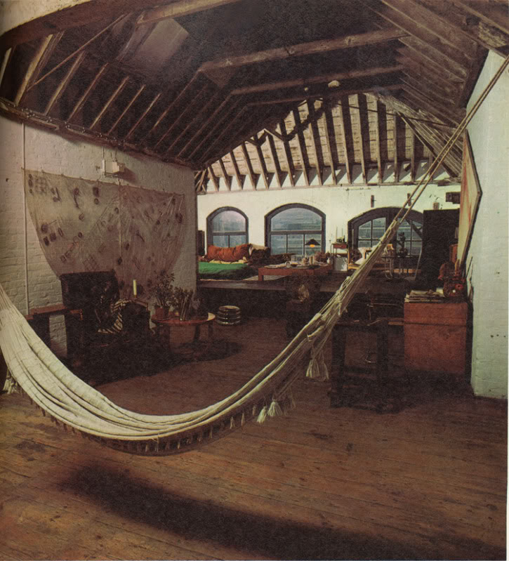
undergroundinteriors_derekjarman_loft_obertogili-2.jpg
Here is a 1971 photo by Oberto Gili of Jarman’s amazing Bankside loft, the top floor of a 19th century wheat warehouse. Which had the floors, the ceiling, the views, the space, but not the plumbing or the heat (thus the greenhouse bedroom). There’s the hammock from the first photo, and a laminated cape which had tools, weeds, and detritus retrieved from the abandoned waterfront. [How far do the similarities go between Jarman and other gay pioneer artists like Robert Rauschenberg? Jarman would’ve spit at the comparison; in a 1984 interview at the ICA he slammed Jasper Johns for being a tool of the CIA. #freequeerstudiesdissertationtopics]
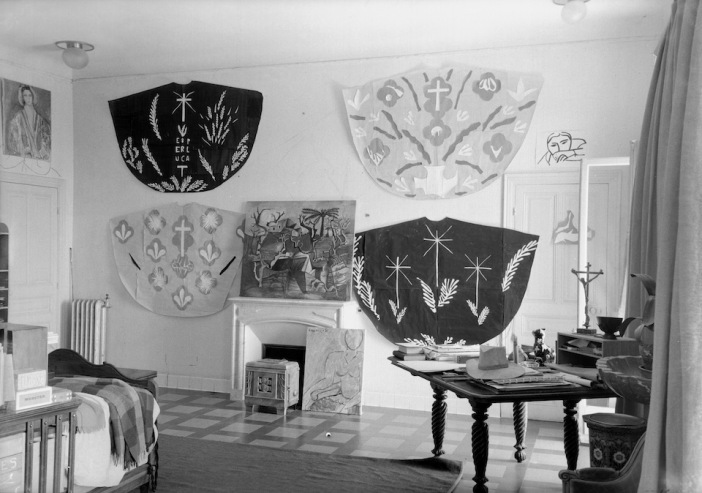
matisse_vence_chasubles_helene_adant.jpg
Henri Matisse cutout designs for priests’ chasubles for Vence Chapel, 1951, photographed in his studio surrounding a Picasso painting, by Helene Adant. image: tate.org.uk
In Ken Russell’s telling of their first cape-filled visit, Jarman “was getting ready for an exhibition called “Cardinal’s Capes.” It’s a phrase which turns up nowhere else, but which makes me think of Henri Matisse, who designed amazing chasubles for priests to wear in his chapel at Vence. They began as cut-outs, and were translated into fabric, and changed with the seasons.
In 1970-71 Jarman had two solo shows, including capes, at the then-new Lisson Gallery, but he grew to disdain the gallery system. He also hated Pop and bristled at working in the long shadow David Hockney cast over the London art scene. He opened his studio for his own damn show in 1972, which Peake says was disappointing [though he sold some work and celebrities turned up for the opening, so what greater success could art hope for?]
He included new capes made from black lacquered newsprint [Rauschenberg?] in a 1984 mid-career exhibition at the ICA. [He was 42.] And in that public talk, he described funding his early features by selling paintings and raising money from his painting collectors.
Anyway, are there any Jarman capes left to be seen? I can’t find any. In 2015, the ICA screened Jarman’s super8 documentation of his 1984 show for the first time, but there’s no visual trace online. And as the caption to the original photo mentions, his earlier capes, including what he called his Skycapes, were destroyed along with Jarman’s and others’ studios in 1979.
By retrospectively titling them with the sky, and using the term “blue pigment” instead of paint, Jarman also seems to be linking the capes to one of his clearest references, Yves Klein. Klein the outrager who said his first artwork was signing the sky. Whose International Klein Blue appeared throughout Jarman’s notebooks in the 80s. Jarman filmed an IKB monochrome painting and projected a loop of it for a 1987 live poetry/music performance event he called Bliss, which became his last, greatest film, Blue, in 1991-3.
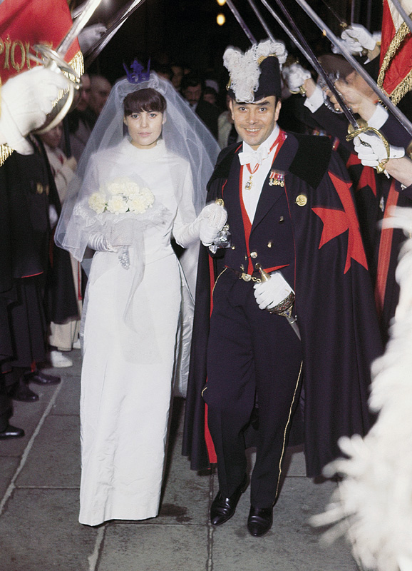
klein_uecker_marriage_1962.jpg
Here is Klein at his wedding on January 21, 1962. Rotraut Uecker is wearing an IKB crown, and he is wearing a cape emblazoned with a Maltese cross. They are processing through the raised swords of the Chevaliers of the Order of St. Sebastian. So at least I know what my dissertation will be about. But first we have to solve the problems that there are almost no Jarman Super-8s online; that Klein’s wedding was filmed, and that’s not around, either. And then, of course, all these destroyed capes. There is a lot of work to do.
Previously, 2013: International Jarman Blue
2004:
It’s not just Derek Jarman’s Blue
2002?:
As I lay typing
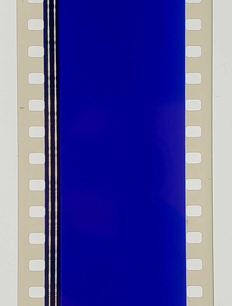
International Jarman Blue

jarman_blue_moma_CRI_137123.jpg

I am so stoked to see Derek Jarman’s Blue in the 2nd floor galleries at MoMA. It is truly one of the most formative film experiences I’ve ever had, and it changed the way I thought of both movies and monochromes. And it captured and collapsed art and film and a moment of outrageous, despairing history, when the personal and cultural toll from HIV/AIDS seemed almost beyond hope. Which is a lot for any film to carry, much less one as unusual as Blue.
The last year and a half or so, whenever the radio gets too cloying or annoying, I’ve taken to listening to the soundtrack for Blue sometimes in the car. It’s weird that an angry elegy against indifference, AIDS, and death would be so pleasant. Maybe emotionally satisfying is a better term. But I can easily recall the first times I saw Blue, at the NYFF in October 1993, and then at the New Yorker Cinema during its release.
But enough about me, because there are important things that I still didn’t realize about Blue precisely because my own intense personal encounter with the film blinded me [sic] to them.
Like I knew that Jarman had chosen Blue‘s blue for its reference to Yves Klein, but I did not realize that Jarman had been contemplating a monochrome IKB film for Klein as early as 1974, as sort of a cinematic answer to the painter’s Symphonie Monotone. Blue went through many titles and Klein-centered iterations before becoming what it finally was: a poetic documentary of Jarman’s own life and illness. [A lot of this stuff comes from Rowland Wymer’s 2006 Derek Jarman biography, which is a good read, even if “colour field” doesn’t mean what Wymer thinks it means.]
It very much became a film about Jarman’s losing his sight, and the effective end of his career, even though that’s not at all what it had been before. Because before also meant before all that went down. Blue‘s unchanging monochrome field was able to accommodate whatever content changes Jarman brought to it.
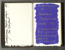
jarman_bliss_book_chelsea_space.jpgWhen Blue was still called Bliss, back in 1987, and was a Klein-related companion film to The Last of England, Jarman filled a notebook with dialogue, poems, and IKB monochrome paintings. The Bliss Book and other Blue-related preparatory and archival material will be in “Almost Bliss,” an exhibition next month at Chelsea Space, London, England.
Blue really took its finished form beginning in 1991, not as a film, but as a performance/event. Jarman and Tilda Swinton first performed Bliss at a charity fundraiser for his hospital, sandwiched between a performance of Klein’s Symphonie Monotone and a screening of The Garden. [Which must’ve been quite a night: the Klein’s supposed to be 40 minutes, and The Garden‘s an hour and a half.]
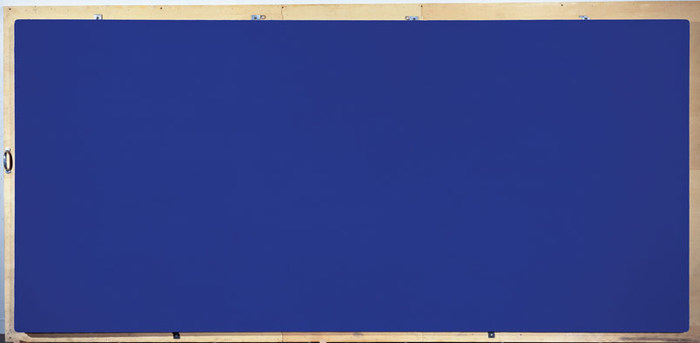
Yves_Klein_California_1961.jpg
A still of Klein’s IKB 71 (Californie), 1961, which, I have no idea what his film loop looked like, but this one seemed appropriately cinematic. It’s in a private collection, but was at the Met a few years ago.
At first Jarman used a film loop of a Klein monochrome. When the film jammed, Jarman switched to a blue gel. I don’t quite know why, but I find this easy passing between media and image to be fascinating. Bliss‘s blue began as a film of an object, but then the object disappeared, replaced by a light effect. Later, when Blue was complete, and aired simultaneously on Channel 4 and BBC radio, listeners were invited to send for a monochrome blue card they could stare at during the broadcast. A broadcast image replaced by an object.
The project evolved and funding came through in 1992, and Jarman’s own stories became the central theme. All along I figured that Jarman maybe didn’t film anything, that the blue was a chemical aspect of the film print itself. But Wymer’s book says the blue was “electronically produced.” I confess, I find this something of a letdown, even if it means MoMA’s probably OK to show Blue on digital projection rather than film. And it makes me want to do something around or to Blue and its visuals. I don’t know what yet.
#53 Almost Bliss: Notes on Derek Jarman’s Blue, curated by Donald Smith, 29.01.14 – 15.03.14, Chelsea Space [chelseaspace.org]
buy Derek Jarman (2006) by Rowland Wymer [amazon]
JUNE 2014 UPDATE In Issue 165 of Frieze (May 2014), Paul Schütze talked with Simon Fisher Turner about his longtime musical collaborations with Jarman, including the making of Blue.
Turner says they probably did six or seven live concerts of Bliss/Blue before the film. I wonder if any of them were recorded? Also this bombshell:

Derek and I had really big arguments about Blue, because at one stage people wanted to put images into it and I said, ‘You’re mad!’ By then my relationship with Derek was really good. I’d say, ‘Listen, this is really what I think.’ Then he suggested that it would be great to have some gold drifting down amidst the blueness, because he loved gold, or the occasional shadow of movement. I objected and said, ‘Please NO! It has to be pure.’

Yikes.

Haven’t Found Tacita Dean’s Sound Mirrors Yet

jarman_prospect_skywritings.jpg
Maybe it was me looking for Tacita Dean’s Sound Mirrors that brought me there, but David Williams’ 2009 post at Skywritings about Dean, Derek Jarman, Dungeness, gardens, Tehching Hsieh is pretty wonderful:

Everything here has been found, salvaged, re-cycled from this sea-edge place, and is both displaced and quite at home. A manifest testament to qualities of patience, economy, playful invention and a quiet contemplative thusness. For the garden stages a deep acceptance of being here in all modesty and attentiveness. Taking time to make space. Slow time, still moves. A bricoleur Picasso meets the Zen garden.
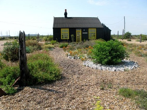
Jarman bought the house in 1986 for £750; he was scouting for bluebells with Tilda Swinton and Keith Collins for a film shoot. He called it his ‘paradise at the fifth quarter’, a place where he could walk in the ‘Gethsemane and Eden’ of his garden and ‘hold the hands of dead friends’ (Garden).
(Once, when my mother was very ill in hospital, she told me that her mother had just visited her, what a shame I’d missed her. She had knocked on the window, told her that she should ‘come out into the garden’, it was good out there, and it was time. Her mother had died more than ten years beforehand).

Still looking for that Sound Mirrors piece. I suppose I should just go to the gallery.
In fact, skywritings is good all over. [sky-writings.blogspot.com]

Derek Jarman’s Blue and Travelex’s Pink

scottburnham_blue_before_after.jpg

blue_before and after, originally uploaded by scottburnham.

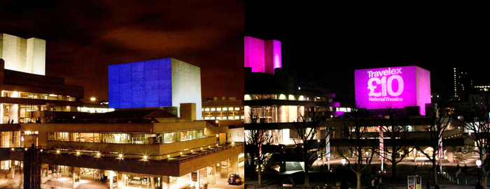
In 2000 curator Scott Burnham organized a projection of Derek Jarman’s last film, Blue, on the facade of the National Theatre. Visually, the film consisted of a monochrome, electric blue inspired by Yves Klein. The audio, which included readings of Jarman’s journals, was broadcast via localized, low-frequency radio.

The photo on the right was from 2007. After the successful proof of concept, the National Theatre could get down to business.

Derek Jarman’s In The Shadow Of The Sun


It’s A Longshot, originally uploaded by JPaul23.

I’ve had Derek Jarman on the brain the last couple of weeks. Isaac Julien’s spectacularly moving documentary Derek got distribution at Sundance and won awards at Berlin; Julien’s curated show of Jarman’s work opened at the Serpentine.

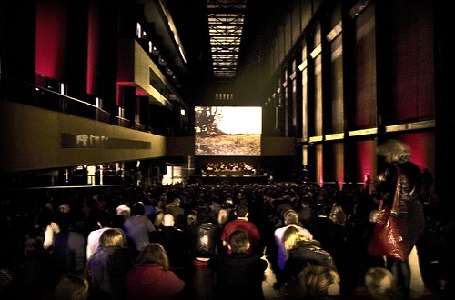
And I found photo accounts of a live performance of Throbbing Gristle’s live accompaniment of Jarman’s super-8 shorts, In The Shadow of The Sun, last fall in the Turbine Hall at Tate Modern. [above].

TG provided the original soundtrack in 1980-81. They played to a packed house last May as part of the Tate’s Long Weekend series of events and performances. If you liked Throbbing Gristle’s kind of assaultive ambient 80’s music, this was the kind of assaultive ambient you liked. They apparenty provided cushions, since no one who listened to TG back in the day likes to sit on cold, concrete floors anymore.

see more photos of Derek Jarman at Tate [flickr]

Derek Jarman’s Music Videos


While is ridiculously easy to soak in Derek Jarman’s work in the UK at the moment, it’s nigh impossible to find anything programmed in the US. Fortunately, one of Jarman’s most easily accessible bodies of work–music videos–is also one of his most readily available. For some reason, it’s also one of his least recognized critically. [I hope someone will prove me wrong by sending links or references to a nice article or exhibition of Jarman’s music videos.]
Cross referencing the incomplete list on Wikipedia with the partially obscured filmography in Rowland Wymer’s 2005 critical essays collection, Derek Jarman, I think I’ve come up with a complete list. Then I searched them out on YouTube. Everyone knows The Smiths and the Pet Shop Boys, but did you know Jarman directed the video for Wang Chung’s “Dance Hall Days”?

Continue reading “Derek Jarman’s Music Videos”

It’s Not Just Derek Jarman’s Blue

From Peter Wollen’s essay on Jarman’s Blue, recently published in Paris/Manhattan and quoted at length on In Search of The Miraculous, one of Brian Sholis’s millions of projects:

However, there were more specific reasons for Jarman’s growing fascination with Klein. Jarman always had an ambivalent relationship with film and particularly, as we have seen, with television. Towards the end of his life he made it clear that he was only interested in films which were deeply personal, which were about the film-maker’s own life. Blue is just such an autobiographical film, dealing with Aids directly as an experience lived by its maker. Blue was the colour Jarman saw when eye-drops were put in his eyes in the hope of alleviating his blindness. Paradoxically, blindness allowed Jarman to see, beyond the distraction of images, directly into the realm of colour, as Yves Klein had wished. Aids was too important to Jarman for it to be represented by images.

Peter Wollen on Derek Jarman’s Blue [In Search of The Miraculous]
Buy Paris/Manhattan in paperback or hardcover [Amazon]
Buy the soundtrack to Blue and stare at VIDEO 2 on your TV. [Amazon]
How odd. I wrote about Blue almost this exact day two years ago.

Just say you’re going to an architecture film series.

If you’re in London this Father’s Day: The artists Elmgreen & Dragset have put together a short program (49′) of film and video works which “examine architecture’s complicit role in defining our enactment of psychological states.” It will be shown at the Tate Modern, this Sunday at 15.00 (3:00 pm for the yanks). [via kultureflash]
Half of that time will be taken up by Jean Genet’s long-banned silent film, Un Chant d’Amour. It’s from 1950, the Eisenhower Era, when prison sex and erotic power-tripping guards was still considered an import, not an export, in the US.
It’s one of the landmarks of gay cinema [the DVD Times UK translates: “it contains possibly the earliest images of erect penises seen on a cinema screen.”]. The film influenced Derek Jarman, inspired Todd Haynes’ Poison, and lives on in every Calvin Klein perfume commercial you can think of.
Whether you take your father with you is none of my affair.

Michael and Ingar, from Louisiana, via tate.org.uk
And they look so innocent…Elmgreen (l) and Dragset (r)

Related: Press coverage and reviews of Elmgreen & Dragset’s exhibit at the Tate Modern through July 4th. They created a tiny animatronic sparrow which appears to be stunned and dying after flying into the window. Favorite stupid quote: “It took two artists to design the sparrow.”

Go See Derek Jarman’s Blue at Passerby tonight

blue.gif

Derek Jarman’s last feature film, Blue is composed of a poetic/narrative soundtrack and 79 minutes of unexposed color film, which was printed blue. It rocks.
Tonight at Passerby at 8:30, Whitney video curator Chrissie Iles will explain how hard it rocks, and why it’s different from changing your TV to “AV INPUT 4” and playing a CD. [You can buy that CD at Amazon, by the way.]

Derek Jarman’s Wittgenstein Monday at 9PM

Just let me program your whole Monday viewing schedule for you.
6:30 – MoMA curator Barbara London screening classic video art and talking about how to collect it. (email for details)
9:00 See Derek Jarman’s 1993 film, Wittgenstein, at Passerby, the used-to-be-a-gallery/bar on WWW 15th St.
Then head to SoHo house for some kidney pie with Fammke Jensen or whoever. You’re welcome.