
This is a silk screen print by Derek Jarman. It was originally intended to accompany a letterpress edition of the text for Blue, his final film. That project was either produced in an edition of 150, plus some proofs, or was not realized before Jarman’s death. The numbers on the two I’ve seen hint at a bunch–this one is labeled 17/150, and the print shown at Chelsea Space in 2014 as part of the book was 37/150.
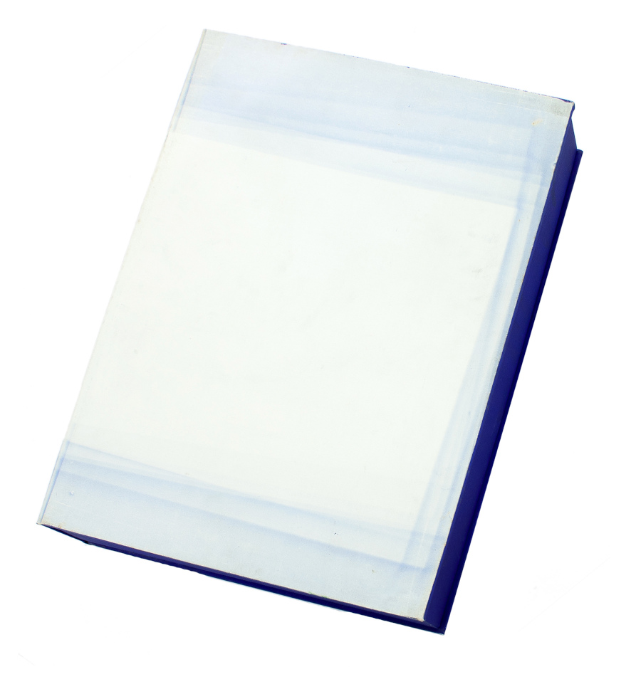
But the only other copies I’ve ever seen of the whole book were described as printer’s proofs. Jarman was supposed to have painted IKB on the clamshell boxes of 25 of the 150 editions. One proof on ebay back in the day said only four proofs were made before Jarman died, and its lid was painted, but didn’t have a print, and said the prints were never realized either. Another, proof listed for sale privately, had a print (#43/150), but its lid looked more like the paper under the paintings than a painting itself.
But that seller [pdf] said the whole letterpress edition “was centered on a loose Klein Blue screenprint signed by Jarman,” which makes it sound like the prints made it across the finish line after all. Why a signed print in a painted box doesn’t essentially become a certificate for a painting, I don’t know, but if the paintings never happened, it’s moot.
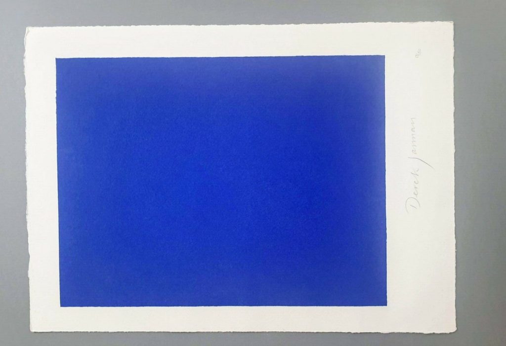
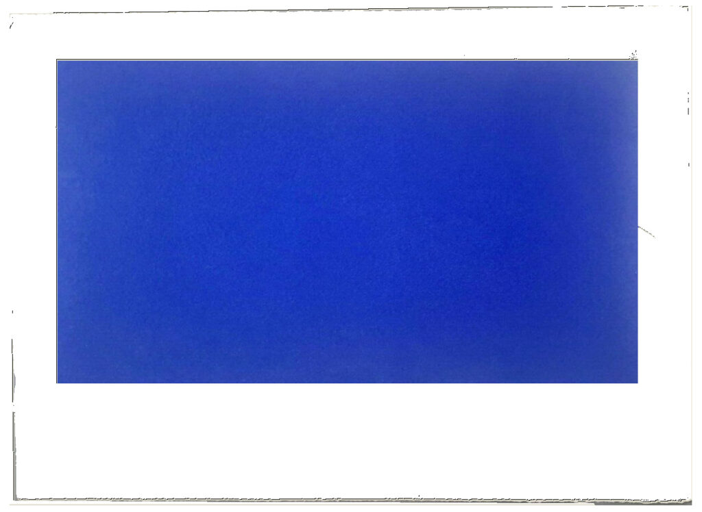
I absolutely love this print, and may try to buy it, but I cannot for the life of me figure out why it’s portrait and not landscape. Maybe I’ll just make some and fix it myself.
LMAO This always happens to me. I think, oh, just flip it, DONE. But as I am typing in the dimensions of my new cinematic masterpiece, I am frozen. Because what should it be? Jarman made Blue on 35mm film. So 16:9 (1.77 in the US, where I first saw it, except if I look it up, some definitive-seeming sources have a widescreen aspect ratio of 1.85:1.) But Jarman’s own print is basically 4:3, so television. (Which is OK because Blue was aired on Channel4? Or nah?) But when it was still a live performance called Bliss, Jarman projected an image of an actual Yves Klein painting, and then switched to a blue gel, so no image at all, just a frame or aperture mask on the light? I think 16:9 is the clear choice here, but still.
Next day update: after spending part of a day determining the size and placement of the blue printed field in relation to the (unconfirmed) paper size and type of the original, I repeatedly caught myself trying not to think about how the film, then the print, then the book, then the box, then the– were all approached as the last project Jarman might complete. Make just one more thing, he and those around him might have thought? Woke up again, so there is still some time.
DEREK JARMAN, SIGNED, BLUE LIMITED EDITION SCREEN PRINT, ends 5/28/2020, OK, it went for GBP 620, not bad [ebay]