
I knew the story about Joyce wanting the cover for Ulysses to be the blue of the Greek flag. But I did not know that he ended up giving the little Greek flag hanging in Shakespeare & Co. to his artist friend, Myron Chester Nutting, to match the color.
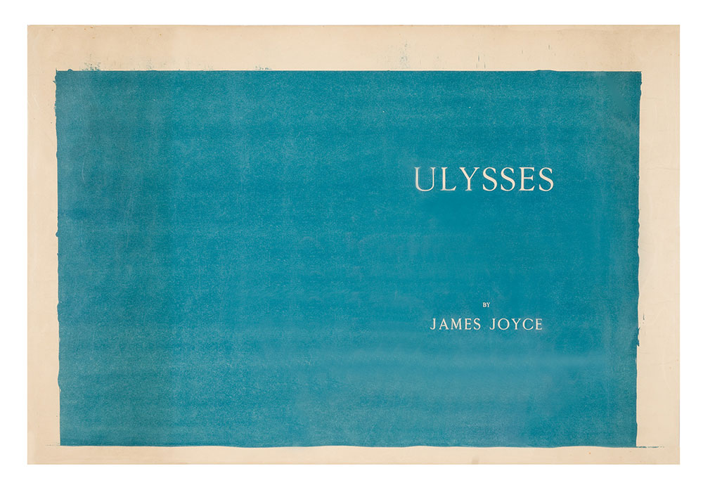
I learned this from The Morgan Library’s online exhibition celebrating Ulysses‘ centenary, which includes the extraordinary lithograph above, the final proof for Joyce’s Ulysses cover, prepared by the Dijon printer Maurice Darantiere.
At first the bleed around the edge and the brushmarks made me wonder if there was an ur-monochrome painting, a Nutting original, but I think not. The stone or the plate was painted with a solid field, which Darantiere printed using ink prepared to Nutting’s specification. The title seems to be set in negative, masked so the unprinted paper shows through.
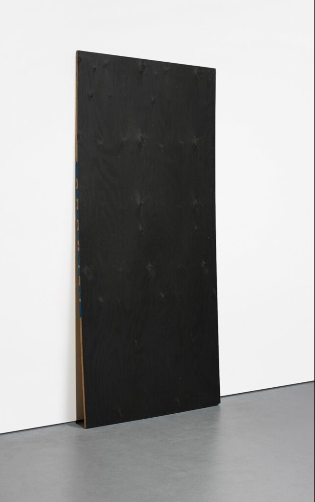
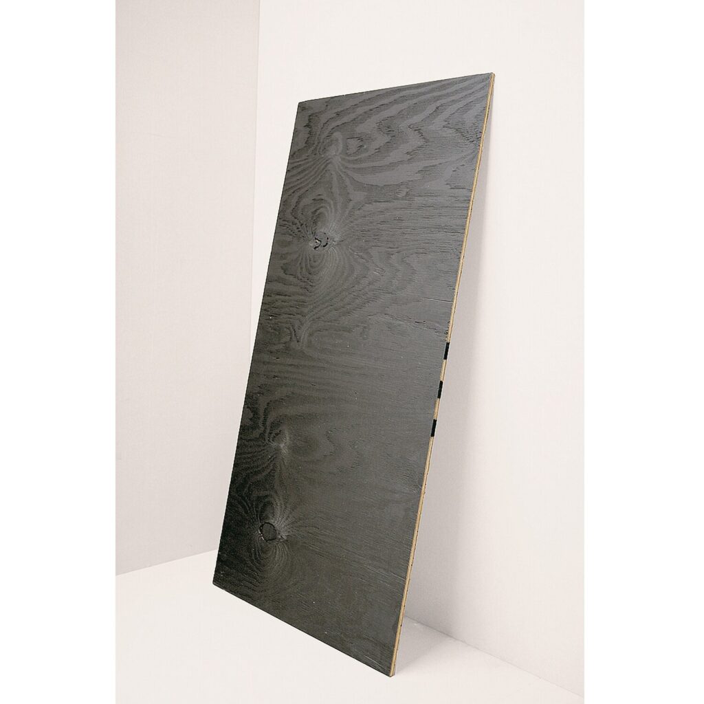
Maybe I must now make the entire cover, as printed, not just the front. I feel like it should match the dimensions of the book, and the page inside, but those bleeding edges do call to me. Either way, I obviously must make it like this now.
And I have to get the color right. Is it best to match the modern color of Marsden Hartley’s copy? Is it even possible to match the original, given that they’re all 100 years old, too? Do I try to match the proof? Is it a Ulysses conservation standardbearer? Nutting apparently warned Joyce that the blue would fade, and it did?
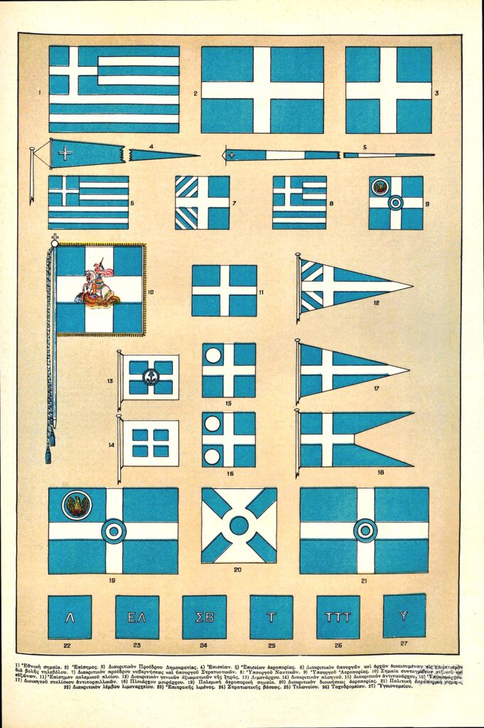
I’ve seen discussion of Joyce’s Greek flag blue not actually matching the Greek flag’s blue, that perhaps the Shakespeare & Co. flag had faded, as well as the books. But Ulysses matches the color of the Greek flags reproduced in this 1934 encyclopedia plate. Honestly, I can see the appeal.
Getting the Right Blue on the Cover [themorgan.org via @mclees-fiona via @joshuajfriedman]
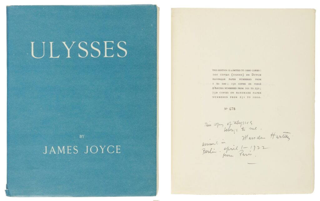
Previously, related: Untitled (Joyce Hartley), 2025
At least Luigi Lucioni got his copy of Ulysses back


