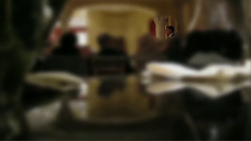
2018 real estate listing photo of the Rockefellers’ E 65th St living room with a Bonnard [L] and a Corot [R] obscured
In 2018, while I was still in my late blur and middle monochrome and real estate eras, I conceived a project that would realize all the blurred artworks in the real estate listing for Peggy and David Rockefeller’s extrawide townhouse on East 65th Street. I’d seen digitally blurred art from MoMA before. I’d seen significant art obscured in real estate listings before. But I had not seen the same art that had been photographed in situ before, being blurred in a real estate listing, at the same moment it was being promoted and sold in the biggest private collection sale in Christie’s history.
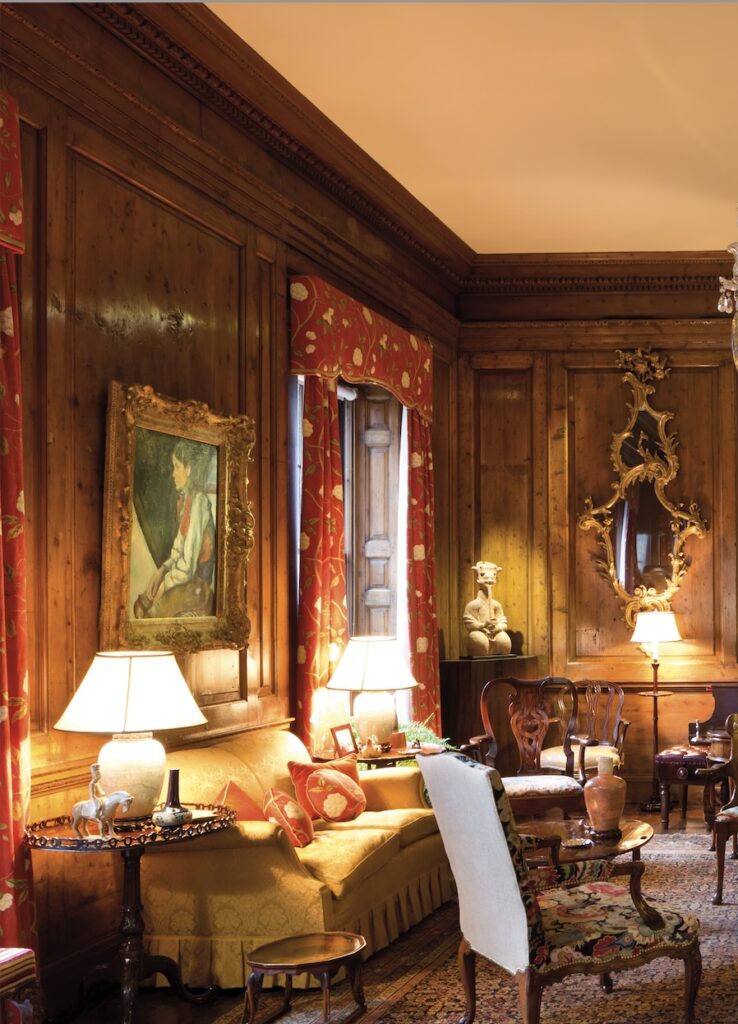
Cezanne’s Boy in a Red Waistcoat, a 1955 gift to MoMA, but not yet; the Rockefellers kept an interest in the work until their deaths, and it came home with them from time to time. via Christie’s, I think
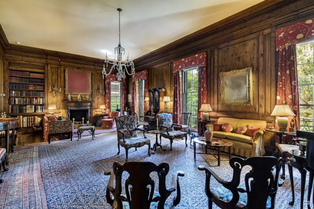
So I went through the listing, the auction, and other documentation of the Rockefellers’ house to identify everything, so that each work would be the correct dimension and appearance. No slapdash conceptualism here; authenticity rules. So the Bonnard Interieur over the fireplace and a Corot to occupy the spot between the windows when the Cezanne is at the Modern. [The Rockefellers retained a life interest in the works they donated to museums, so they could keep them around.]
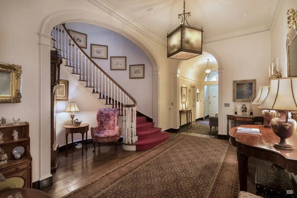
2018 real estate listing photo of the Rockefellers’ foyer with ten blurred out artworks including a Picasso by the stairs and a Redon on the right.
Though I mapped out the project, 30 works, I was undecided on the best way to realize the blurred works. Transmuting such digital-first source material into another medium has been a challenge since the first blurred and pixellated and pano-torqued images appeared on Google Maps and Streetview. But the Facsimile Object-style dye sublimated prints on aluminum seem promising. I just found my 2018 spreadsheet this morning, though, so it’ll take me a minute to reorient myself to this project.
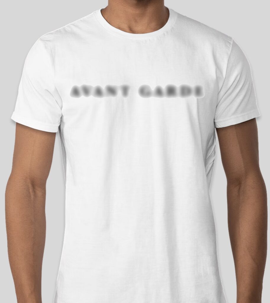
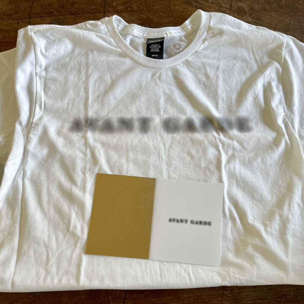
What does it say? No one knows! But this is a rendering of what it will look like, screenprinted in color on a white, 100% cotton Hanes Perfect T-shirt.
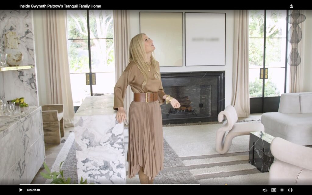
I know we all got distracted for a minute by the Ruth Asawa knock-off hype, but let’s remember what’s really important about Architectural Digest’s glorious visit to Gwyneth Paltrow’s new house in Montecito: they decided not to get video rights for the John Baldessari diptych over the fireplace, and so they blurred out the painting. Well, technically, they only blurred out half of it. The monochrome, apparently, can slide.
This is a John Baldessari diptych, Prima Facie (Fifth State), from 2007. Could the t-shirt have something to do with that? WHO CAN SAY?
To celebrate this moment in the history of artist rights management in the multiplatform digital content era, greg.org is issuing this t-shirt. What does it say? NO ONE KNOWS. What is it referencing? NO IDEA. The meaning will remain an eternal mystery that will baffle your friends, families, and Zoom counterparts, but at least it will always remind you of the fun we all shared this week.
The rendering above shows the concept, which is, to paraphrase John Baldessari, to try to make it very simple, so that the blurred and the face are equal. The shirts will be silkscreened in color (well, black and grey) on white, 100% cotton, Hanes Perfect Tees, and will ship shipped worldwide for $US22.
A product shot, a Blurdessari t-shirt, with accompanying COA, in its new home. thanks, @wb!
Like the celebration for the auction in Italy of a someone’s Twombly bunny drawing, these shirts will only be available for a minute–through the weekend, Sunday night, Feb. 6–and will only be made on a break-even basis. Can you imagine losing money on a conceptual digital rights management apparel stunt? I cannot. So if 10 or more folks don’t jump in, I’ll call it off, return the money, and recognize the 9 or fewer true avant garde pioneers with something else. Wow, OK then, less than an hour in, so this is happening!
Many thanks to everyone who made the moment of conceptualization possible. It is now the moment of realization, and this is the only new order being accepted:
TFW Yoshihiro Makino shoots Gwyneth Paltrow’s new living room with John Baldessari’s 2007 diptych, Prima Facie (Fifth State): Avant Garde for Architectural Digest, and they pay ARS for a print and/or web license
Alexandra Lange brought Gwyneth Paltrow’s troublesome installation of her Ruth Asawa sculpture in front of her patio door to Twitter’s attention this morning. And I confess, seeing the Architectural Digest photos, that included Lindsey Adelman’s drapey light installation, and a Ralph Pucci hammock also hanging from the ceiling of Paltrow’s new Montecito living room, I, too, was troubled. For a minute.
But after watching the video tour, and hearing the care and attention to detail, feel, design, and material that Paltrow and her people put into this project, I became fine with it. How else *should* an Asawa sculpture live, but in an actress-turned-influencer’s slightly louche, ultra-deluxe living room full of stuff hanging from the ceiling? Not everything should be a white cube. As long as the door, or the dog, or the kid, doesn’t hit the fragile sculpture, go wild, Gwyneth. [LATER THAT DAY UPDATE: NOT an Asawa! Problem solved! Or, rather, replaced with new problem!]
Gwyneth looking at the Adelman light thing, while all other eyes are staring straight at the blurred out Baldessari on the wall. [screencap: Architectural Digest video]
That’s not important now. Not when the Baldessari diptych over the fireplace is blurred out in the video. I’m guessing A/D did not want to splurge for the video license from ARS? I also love that all they felt they needed to blur out is the text on one half of the work; the monochrome painting is undefaced.
Study for Untitled (Prima Facie), 2022, enamel on canvas and lenticular print on aluminum, each 52.5 x 42 in.
Speaking of face, there’s a new one in town. Untitled (Prima Facie), 2022, is a lenticular print mounted on aluminum and enamel on canvas diptych where the avant garde grows increasingly sharper with a move to the right.
It is inspired by Baldessari’s Prima Facie (Fifth State): Avant Garde, a 2007 diptych which is itself based on a spread found in Baldessari’s 2006 artist book, Prima Facie: Marilyn’s Dress: 2006/2007 – a poem in four parts, which was available in both book and deluxe book with a print editions. Earlier states of the Prima Facie series had photographs of actors and actresses where the monochrome is here, with words chosen to be the instant, descriptive equivalent–and equal in visual impact-to the image. Baldessari showed works from the Prima Facie (Fifth State) at Sprüth Magers in London in mid-2006, where Paltrow might have seen them, but this 2007 work came from Marian Goodman. These works are depicted in David Platzker et al’s Baldessari Catalogue Raisonée, of course, and the Museum Dhondt-Daehnans in Belgium put out a comprehensive-at-the-time catalogue of Prima Facie works for a show in 2005-06. Untitled (Prima Facie) is a greg.org exclusive.
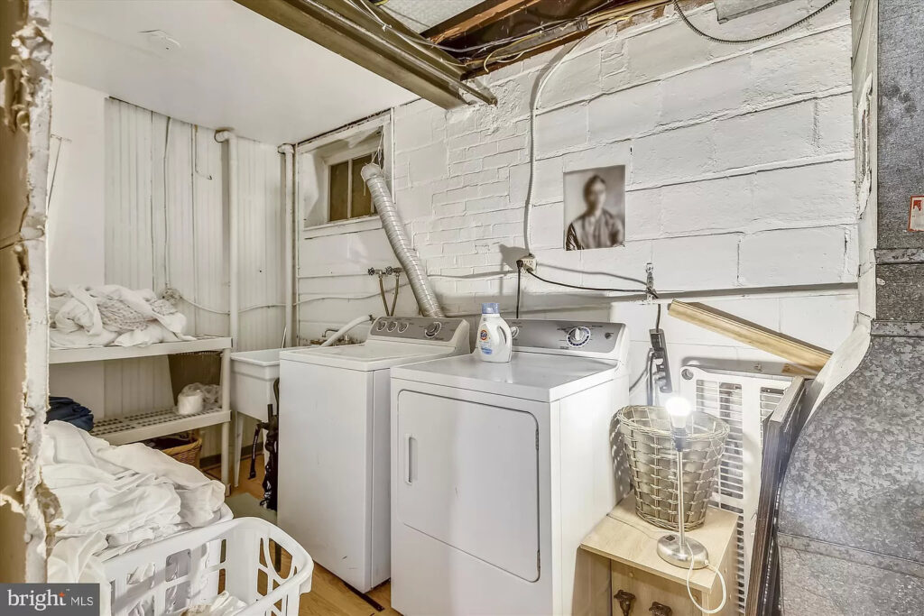
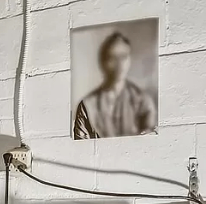
Untitled (Blurred Frida), 2020, 10×8 in., digital inkjet print, ed. 1/3+1 AP, Washington, DC installation view via zillow
Sometimes it feels like I find these works, and sometimes it feels like they find me. Now [gesturing around at the world] is definitely one of those times where I’ve been actively not, and yet I see a work like this, installed like this, and srsly, what am I supposed to do?
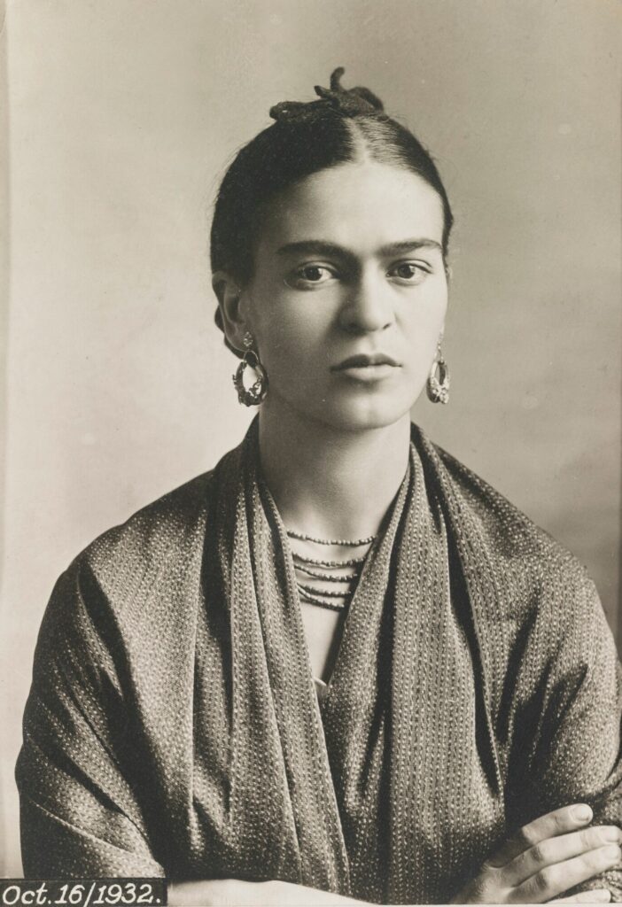
It first seemed like this 1932 portrait of Frida Kahlo by her father Guillermo Kahlo was blurred algorithmically a la Google Street View. But the absence of peripheral blurring, plus the unblurred shoulder at left, indicates it is blurred in the print.
[update: when asked for theories, the kid pointed out that the photo has a border along the bottom and right sides, but not along the left. Also, there is a shadow along the left corner, cast by the naked lamp below, but the shadow is blurred above. Thus the portrait was blurred in the listing photo. I feel like I’m raisin’em right.]
Frida Kahlo by Guillermo Kahlo, 1932, 6 x 4.5 in., silver gelatin print, via sothebys
It will be hard for the second print from the edition, or the AP, to ever match the grandeur of this original installation, though, the world is welcome to try.
Previously, related: Monochrome House and Untitled (Border), both early 2016 UPDATE: though the property is still for sale, the images have been removed lmao
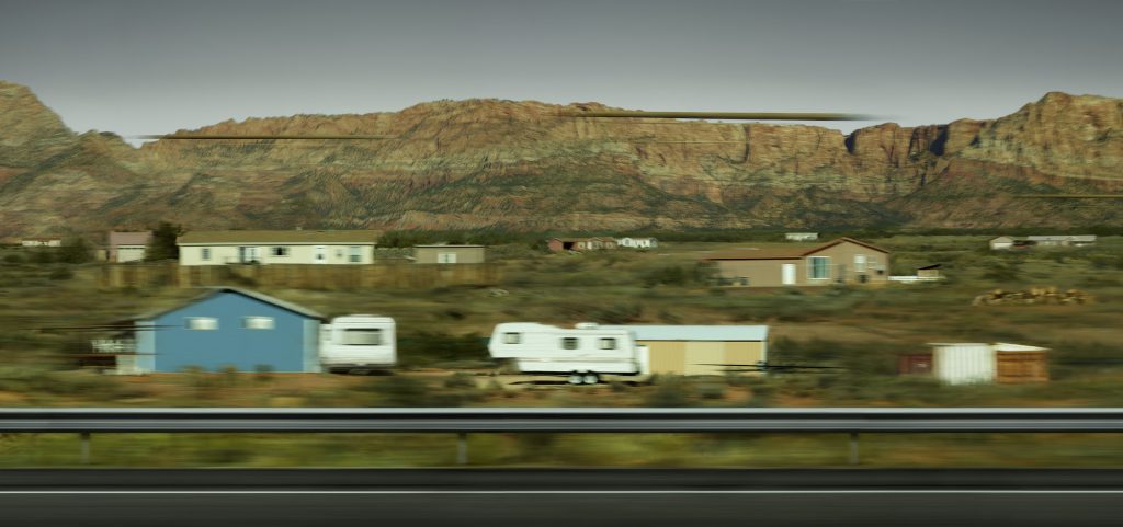
Andreas Gursky, Utah, 2017, at the Hayward Gallery, London, thru Apr 2018
Whether it heals all wounds, time does cool all hot takes. When the Gursky show opened at the Hayward Gallery in January, I was immediately set off by this kicker from Laura Cumming’s review in The Guardian:
But the show’s masterpiece is unlike almost anything Gursky has made before. It is a new work, a single shot of some prefab houses skimmed on a mobile phone while driving through Utah. The photograph registers the speed of the car racing through the landscape – and modern life – in all its random glitches and blurs. At the same time, the houses look perilously ephemeral against the ancient mountains behind them. This fragile little thing, a spontaneous and disposable shot, is enlarged to the size of a cinema screen – a monumental homage to the mobile phone and the outsize role it plays in depicting our times.
Not just Gursky using a phonecam, but Gursky doing something new? Now that is news.
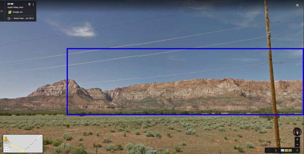
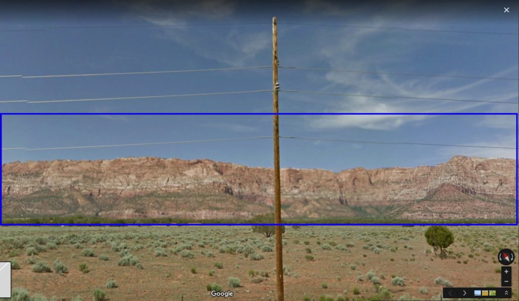
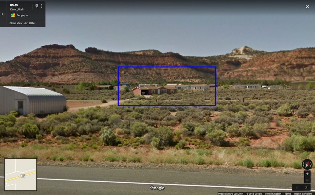
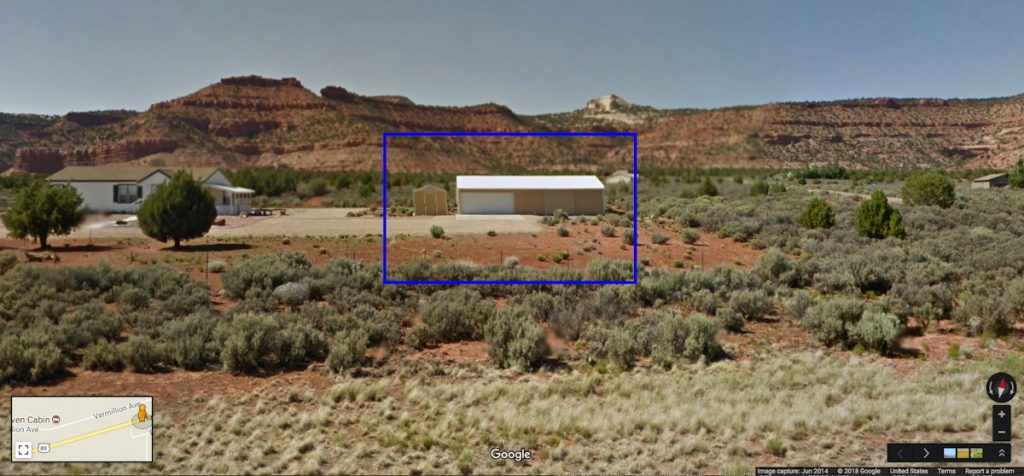
In addition to the phone and all its quotidian implications, what caught my attention was the subject: Utah. I had, just a couple of weeks before, driven along the very road in southern Utah as Gursky. I was also in the middle of a two-month mess on my server, which necessitated rebuilding my blog and its underlying software and databases. But that could wait until I identified the precise stretch of highway Gursky had captured. So I set out again, on Google Street View.
From the geology and the development, it was possible to narrow down the site of Gursky’s photos to the roads around Zion National Park, and east from Zion and Kanab, toward Grand Escalante and Staircase National Monuments. The sections of this rural, two-lane highway with guard rails and fresh blacktop were even fewer. And none of it matched.
This section of Utah is very sparsely populated, and very few roads cross it at all. So the options dwindled very quickly. But on the road between St George and the border-straddling polygamist towns of Hildale, UT and Colorado City, AZ, I recognized the striated mountain range immediately. But there were no houses at all.
outside Hildale, UT, image: gsv
Which, two things: it’s now obviously a composite. But before that, those poles. Gursky’s original image is full of blurs and artifacts, including what are apparently some disembodied pole fragments. These artifacts, coupled with the disparate blur on houses, patios, guard rail, etc., led me to assume Gursky had experimented with an iPhone’s panorama feature from a moving car. That he was exploiting the stitching algorithm of the phone, a source of found digital manipulation.
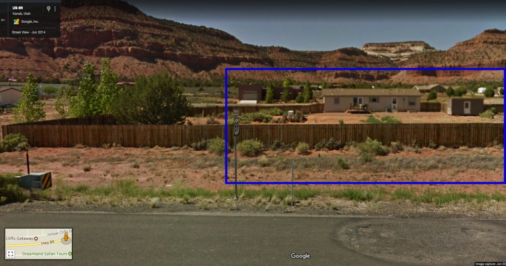
Google Street View saw what Gursky saw, or vice versa
But of course, this turned out not to be the case. What hit me during these first few days was that this Gursky was being presented as a single image when it was now obviously a composite.
And so I set out to find the site of the other, lower half. Which, with every Streetviewed mile, was turning out to be an entirely fictional, constructed composition. While trying to rebuild my webserver I wandered the highways again, finding this or that house; meanwhile the more accurate version of Gursky’s process emerged: that he’d taken photos with a phone, and then returned to reshoot sites with his regular camera, and–like always–he just fixed the whole thing in post.
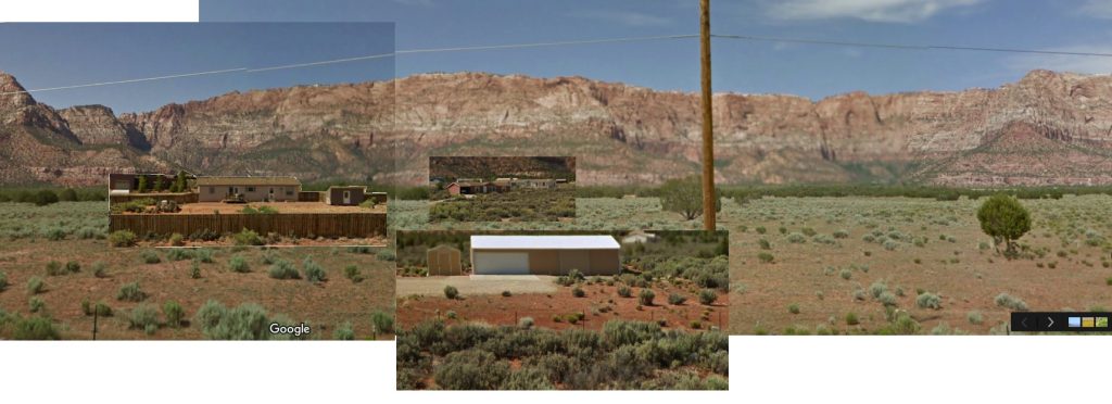
So my Gursky bust turned into a Guardian factcheck. And I was left dissatisfied, again, by Gursky’s view, even as I grew intrigued by Google’s. I found myself indexing the differences: vantage point, height, date, blur, glitch, and stitching. I imagined Streetview’s rooftop, panoramic compositor, and Gursky’s passenger driveby–which turned out to be a tripod on the shoulder. And I tried to imagine what it’s like for a maker of ambitiously scaled images to work in a world where giant companies are constantly taking a picture of the entire earth. Maybe the better digital analog for Gursky’s practice isn’t Google at all, but etsy.
Gursky Street View, v.1, 2018 –
In good etsy form, I have knocked off Gursky’s image by collaging the elements I’ve found. If/as I find more, I’ll add them until…until what? I don’t know, I guess until it’s done, or I get bored. If you see something say something.
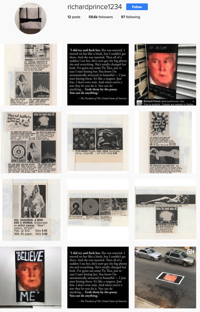
New Posters, via richardprince1234
There’s a new gang in town. Over the last day Richard Prince has uploaded a series of images to Instagram he’s calling, “New Posters.” I take New Posters to be a show. New Portraits went from Instagram to IRL. New Posters goes from IRL to IG. It’s not the first time, either.
After getting wiped for nip slip a couple of times Prince has taken to treating his Instagram feed as a temporary space; nothing lasts forever. Images go up, and they come down, like a gallery, or a booth in an art fair.
Last May Prince announced a temporary Instagram show of “Ripple Paintings,” presented through his book joint, Fulton Ryder. [I emailed to see if they were available somehow, but got no response. No/too slow?] Ripple Paintings were images of watercolored-over cartoons torn from old Playboy magazines. New Posters has a Playboy angle, too, but the show’s tightest, most relevant connections are to Prince’s own early practice, which he is clearly revisiting.
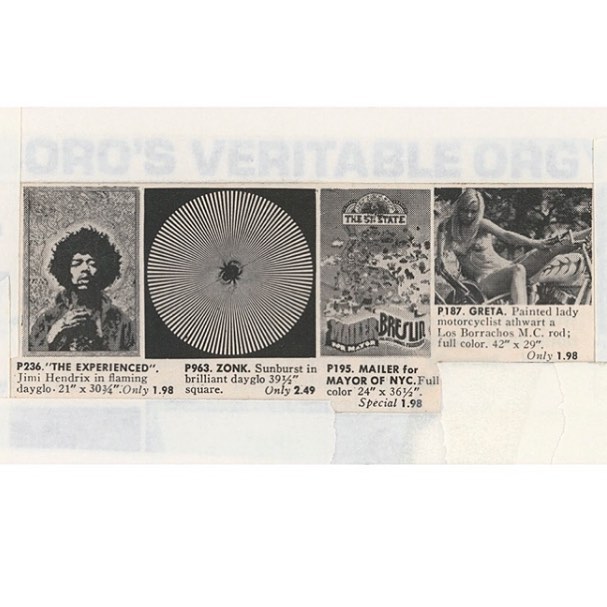
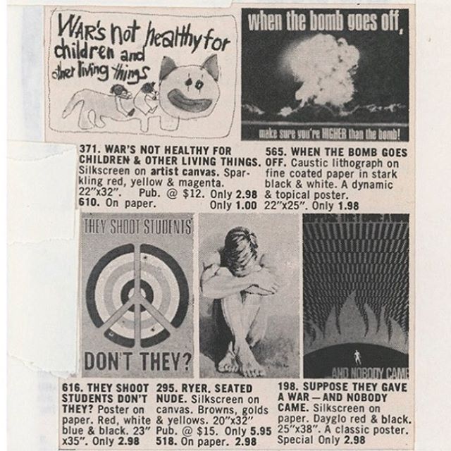
Right now there are seven New Poster images, and a video and four images (two identical) relating to Donald Trump. [update: I woke up to three. Prince says one was removed by Instagram.] The New Posters are of vintage duotone ads for posters, cut and cropped and masked into various configurations. The image above includes a poster of Jimi Hendrix; an Op-Arty sunburst; a Mailer for Mayor campaign poster; and a very Princey, bikini-clad girlfriend named Greta, straddling a motorcycle. Scraps of white paper and strips of tape mask and frame the composition, occasionally creating palimpsests like, “ORO’S VERITABLE ORG[Y].”
We are all Ryers now: New Posters, via richardprince1234
Other poster groupings up the political ante significantly, like this set, where a nude guy named Ryer huddles surrounded by anti-war and protest posters:
Suppose they gave a war and nobody came
When the bomb goes off, make sure you’re HIGHER than the bomb!
War’s not healthy for children & other living things
They shoot students, don’t they?
From the Vietnam War to Woodstock to Kent State, the cultural context of the late 60s and early 70s has been a regular feature in Prince’s discussions of his work. The work itself, meanwhile, is grounded in images circulated in magazines, and ads. Prince has written about “ganging” slides of rephotographed magazine images, “DJ’ing” them into various arrangements and printing the grid of slides on a single sheet. “The ‘girlfriends’ from the Biker’s Magazine were the first ‘gangs,'” he wrote in 2014. “The ‘gangs’ were mounted and framed. It was like having a whole show of a particular subject matter in one frame. Instead of having a whole room of ‘girlfriends’… I could have a FRAME of girlfriends.”
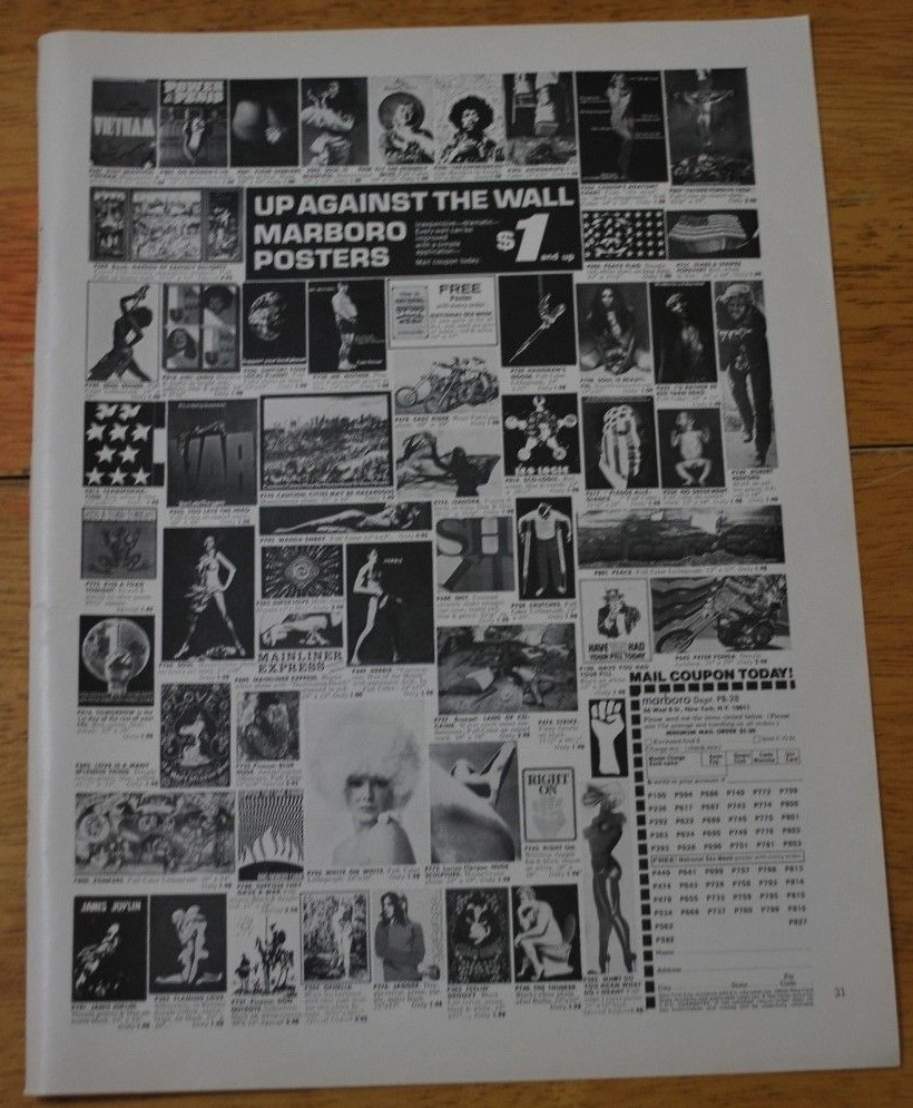
“Up against the wall: Marboro Posters”, image of ganged anti-ware fare in a Playboy tearsheet, c. 1971, via ebay
But there’s no sign of Prince ganging within these images: these poster abutments are found, composed by cropping from of a larger grid. The poster ads come pre-ganged. They turn out to be from a mail order company called Marboro Posters, which ran full-page ads in the backs of magazines, including Playboy. Also Saturday Review and Psychology Today. Each ad was a different shuffle of posters; ganging was Marboro’s process. Optimizing each ad for the demo of the magazine it appeared in, like merchandising. [Marboro tracked ad response by adding “Dept. PB-15” or whatever to their mailing address.]
New Posters screenshot 2/1/2017, image: richardprince1234
Prince wrote of ganging slides on his giant lightbox. And of his iPhone, with a camera, Twitter, and Instagram, becoming his studio. And Instagram is where he’s ganging now, making a whole show of a particular subject in Instagram’s frame. And that subject appears to be the Trump-induced return of the apocalyptic terror Prince describes feeling after Kent State. In a birdtalk for a 2013 show of his 90s Protest Paintings at Skarstedt, Prince wrote,
But the Kent State shootings were different. That got to me. The shootings pissed me off and I found myself wandering around the campus trying to come to terms with the murder. Nixon and Agnew were shitheads and already dead people to me. I really thought they were going to try to stage some kind of coup and take over the government. I was ready to pack it up and retreat to the upper parts of the Adirondacks… put a hold on “beauty” and work out and get in shape, stockpile supplies, turn on the ham radio, do some reconnaissance, get camouflaged and ambush, (hit and run)… and guerrilla the shit out of the republican army.
Instead…
Instead, he said, he staged an impromptu protest gesture by lowering a flag to half mast on campus, which, he says, spiraled into a full-scale demonstration as students and police became aware of it. It’s an account of Prince’s history that I don’t know how to account for, whether it happened, or happened the way Prince said, I can’t say. But given our current presidentially induced crisis, I think the relevance of Prince’s 2013 text is prescience, not retrospection.
The blurred, saturated closeup of Trump has been reverberating in Prince’s social media like a fugue since the election, and I haven’t known quite what to make of it, except to find it very disturbing. Now images of Prince’s new posters of it, along with Trump’s dismal quote to Billy Bush, are members of this New Posters Instagang. IG and IRL are feeding each other [though whether these New Poster images will make a jump back to physical, printed form is not clear], and history’s all in Prince’s grille going, “Hey DJ, play that song again.” richardprince1234 [instagram] Richard Prince – Birdtalk [richardprince]
Previously, related? If He Did It [It being making Bob Dylan’s paintings, that is] View Source: Richard Prince’s Instagram Portraits
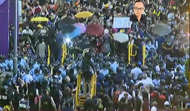
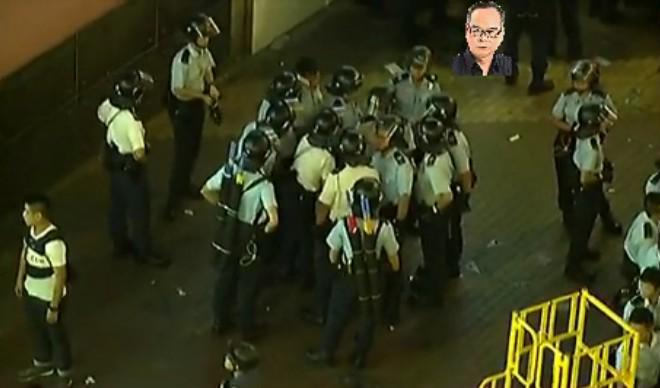
Police in Hong Kong have deployed a new mobile pepper spray platform against protestors near Mong Kok. I start with this image via @krislc, Kris Cheng, because it gives nice context, also the guy is watermarking it with his face? I’m filing that trick away for future use. At first it looked like it’s made out of PVC pipe, but it’s surely painted steel. Actually, it looks like a smaller variation of the stairs in Home Depot. Most of the info comes from @galileo44, Galileo Cheng. Like this picture of the police conferring on Portland St. With their pepper spray cannons on their backs. Unless those are #umbrellas.
Here is krislcc’s Vine of the new platforms in use on her. Galileo calls them castles. They’re hand pumped. Like Super Soakers or something. Incredible.
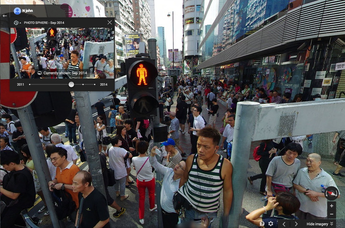
It was startling to be met by an unblurred face. And the vantage point was so high. But turn around. This is a pano. Or a “Photo Sphere.” From September, of the intersection blocked by a sit-in. It’s credited to nJohn.
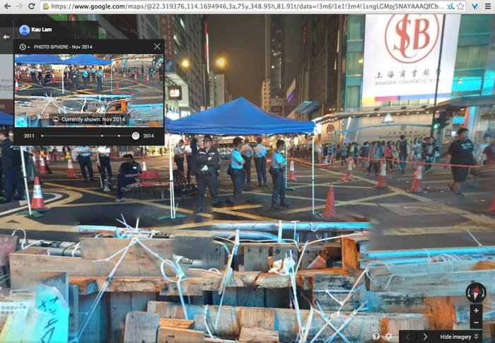
There are more recent Photo Spheres, too. Including November, by Kau Lam. The protestor-decorated police barricades are stitched together pano-style. Google Maps as a reporting platform. When will it go live? Will Google get castles of its own, or will cameras on long sticks suffice?
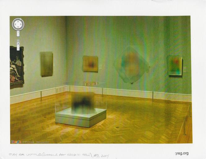
Study for Untitled (Google Art Noguchi Table) #3, 2014, 8.5 x 11 in, inkjet and water on archival matte finish paper
I was very happy to donate this study to the benefit auction last week for Franklin Street Works, the Stamford, CT art space where some Destroyed Richter Paintings and Shanzhai Gursky photos were in a show.
FSW had asked for furniture- or design-related works on paper. I have been trying for a couple of years to figure out how to make sense of the real-world, real object anomalies of Google Art Project panos, like the blurred out paintings, and especially the blurred out Noguchi game table [furniture!] at the Art Institute of Chicago. And I thought this would be a good opportunity to experiment, rather than simply print out the GSV image [not that there’s anything wrong with that, as Paul Soulellis’s very nice Webdriver Torso-related print demonstrates].
What mattered to me was getting the blur just right. Years ago, in the early Iris Print era, I’d seen some amazing Gabriel Orozco works–which I can’t find a trace of now–where he’d dripped and brushed water onto inkjets of lush Baroque paintings of the Madonna, dissolving the center into an abstract mess. Very non-archival, but very beautiful.
And all but unreproducible. In terms of inkjet and paper coating technology, we’ve come a long way, baby. I tried several printer & paper setups, but nothing would bleed like I wanted. Finally, in desperation, I emailed my sister, who had a clanky old [2003] desktop printer in her basement, and she printed some images for me. Even this modern paper resists staining and dissolving like the inkjets of old. After several test, though, I found if I let water sit on the paper long enough, it’d give me a blur. Study #3 was the first one to be successful enough to let out of the house. I don’t know where it went yet, but I hope it stays out of the rain. A Benefit Auction for Franklin Street Works [paddle8] Opening In Stamford: It Narratives, at Franklin Street Works
Previously: Google Art Institute Project
The Getty Museum is now included in the Google Art Project. Which is now a part of the Google Cultural Institute. I hadn’t noticed how this context has changed, and how the Art Project has been subsumed and presented. The navigation options are, “Collections | Artists | Artworks | User Galleries.” And institutions are collections.
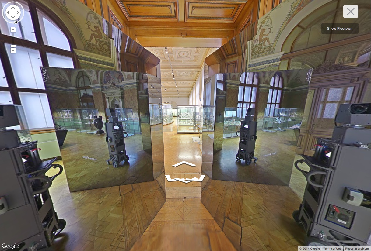
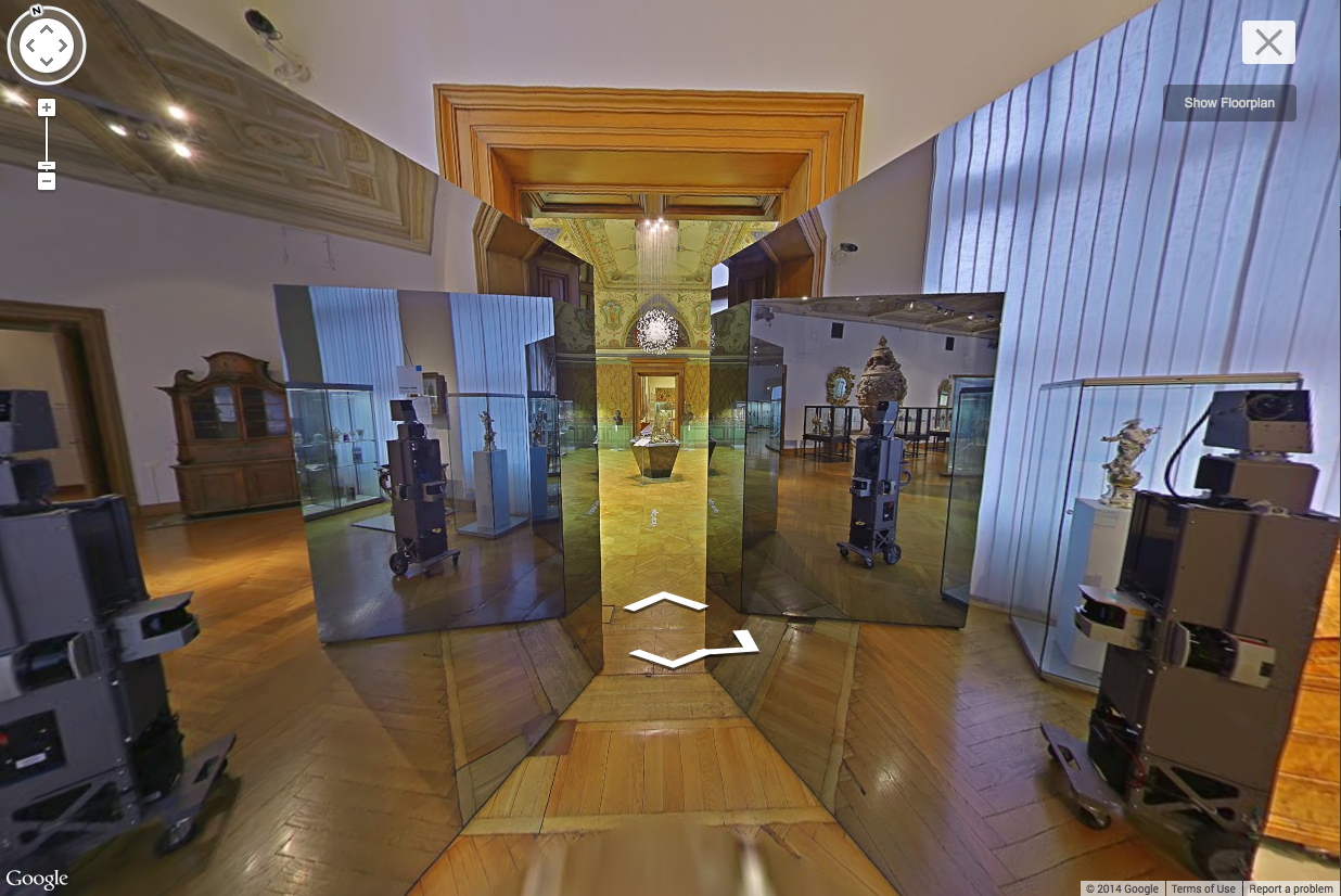
Anyway, Museum View. I know that Google Street View-based art fascination is old and busted, but Museum View for me is still the new hotness. Maps are for navigating, going somewhere, doing something. But Museums are for displaying and depicting and interpreting; they hold and show objects and generate discussions and critical context. And Google Museum View is doing that on a trans-institutional scale, and so it feels important to have some awareness of this process. Trans-Institutional Critique.
Fortunately, Google still sometimes documents itself documenting.
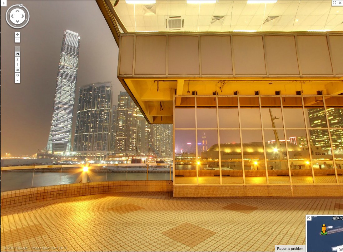
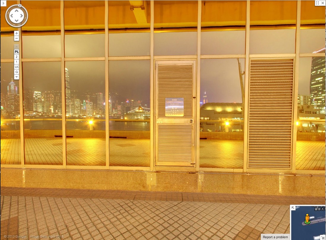
Yesterday @MattBucher noticed this uncommon night-time imagery on Google Street View of Victoria Harbour in Hong Kong. It’s the promenade on top of the China Ferry Terminal, on the west side of Tsim Sha Tsui in Kowloon.
As I do, I immediately began looking for Street View’s evidence of itself: the distortions where panoramas are stitched together, and the traces of the photographers who make it. It’s information Google is apparently just as interested in eliminating. The promenade includes three mirrored buildings, but every pano is perfectly sited to exclude the Google cameraman. Whether selfies are considered distracting, extraneous, or just undesirable, Google is trying not to photobomb itself.
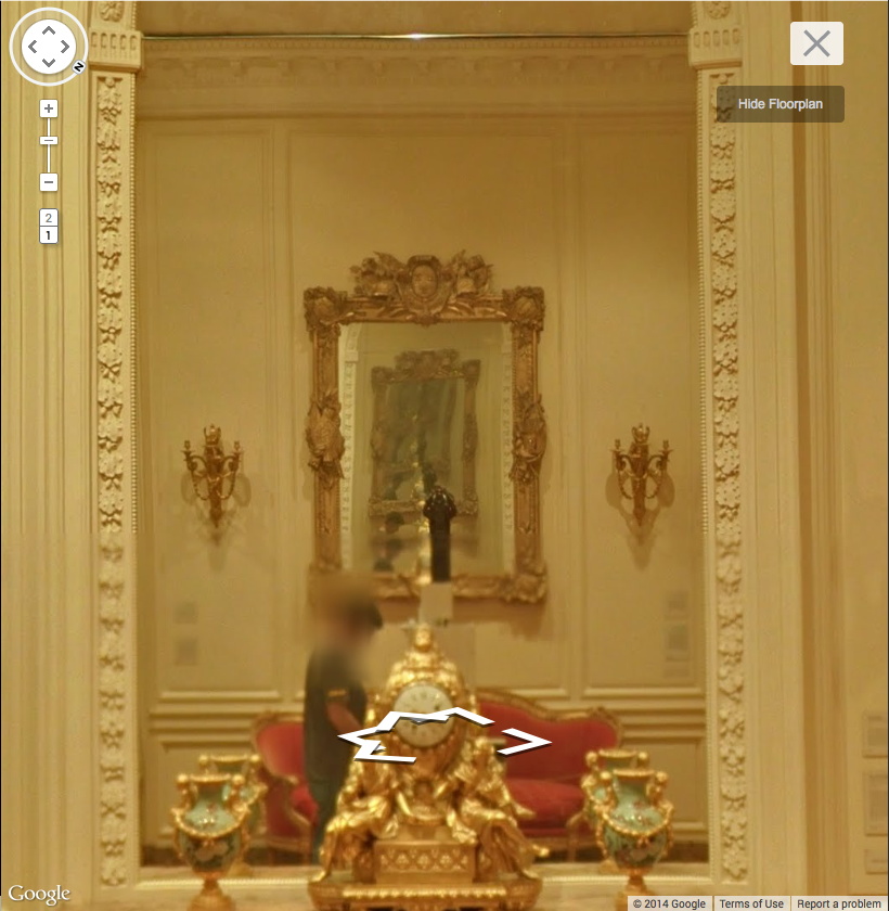
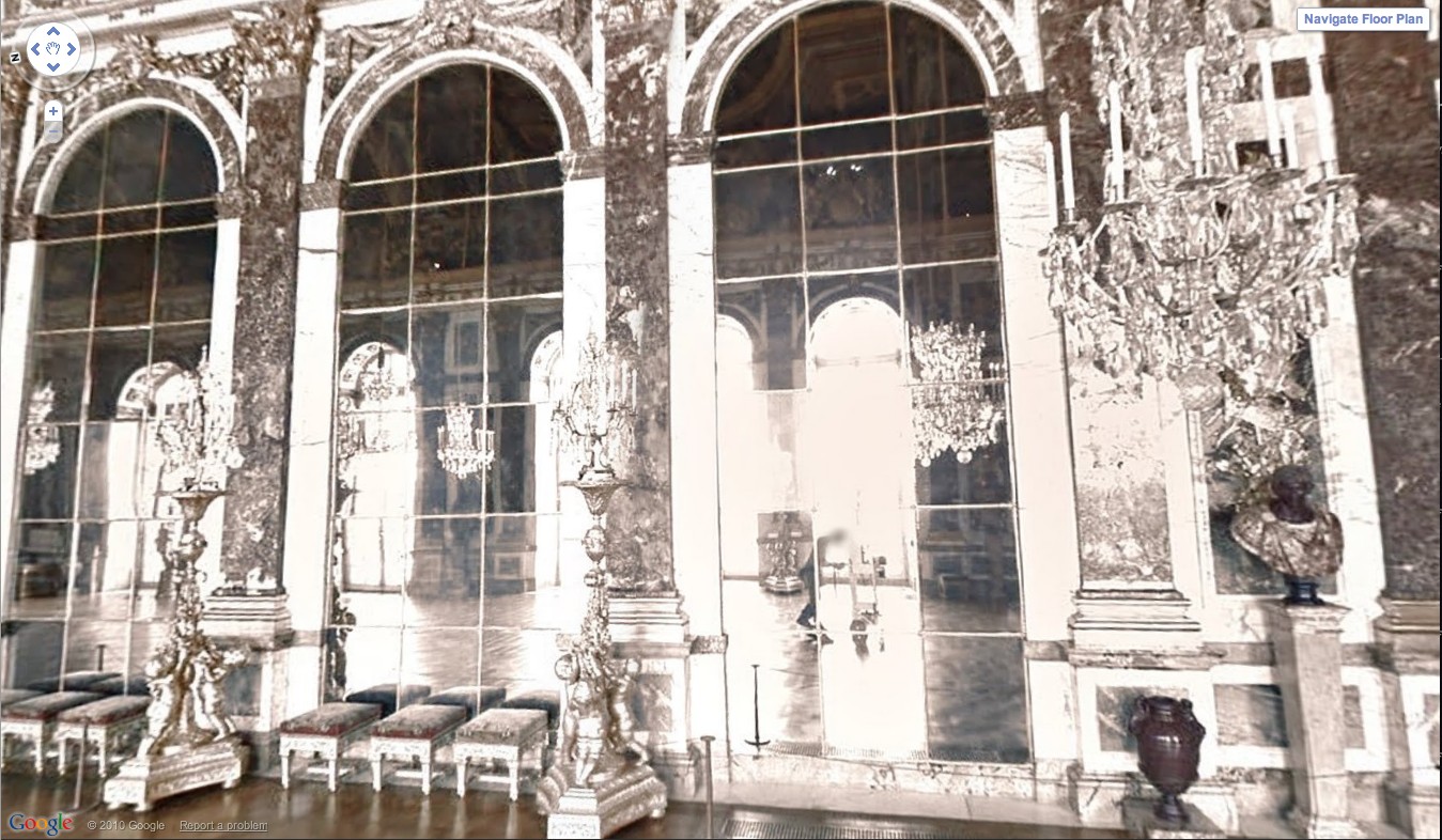
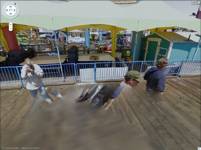
At least not anymore. Remember back in 2011 when the Google Art Project launched, and we got a little glimpse of the camera operator pushing his cart carefully through the Hall of Mirrors at Versailles? That feature has been eliminated. And when Google Trike was first tested four years ago on the Santa Monica Pier, its handlers not only appeared on camera repeatedly [including one pano, since removed, where they posed as civilians and flashed the peace sign], it also attracted attention.
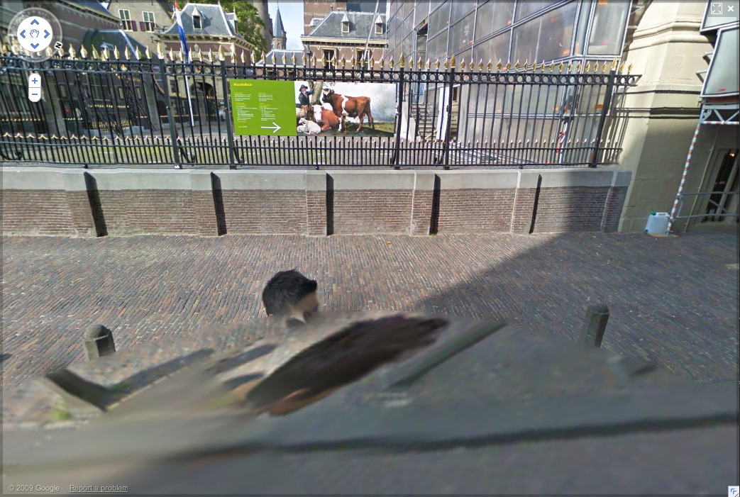
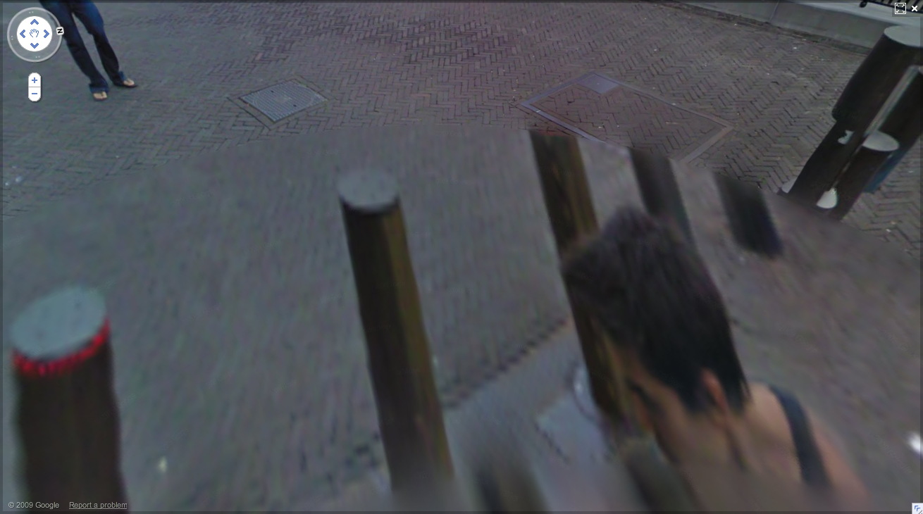
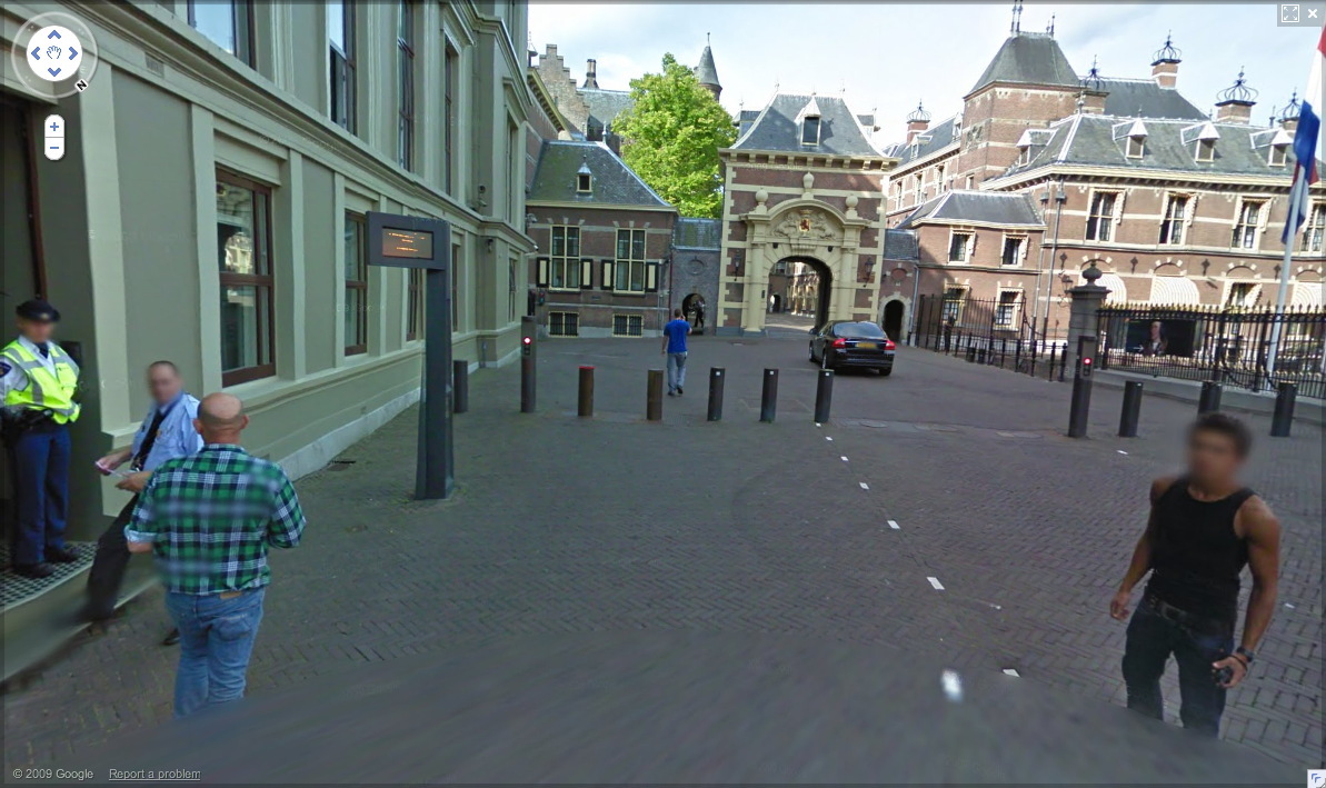
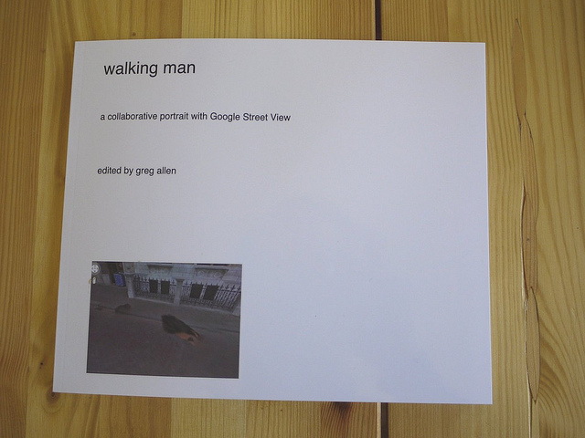
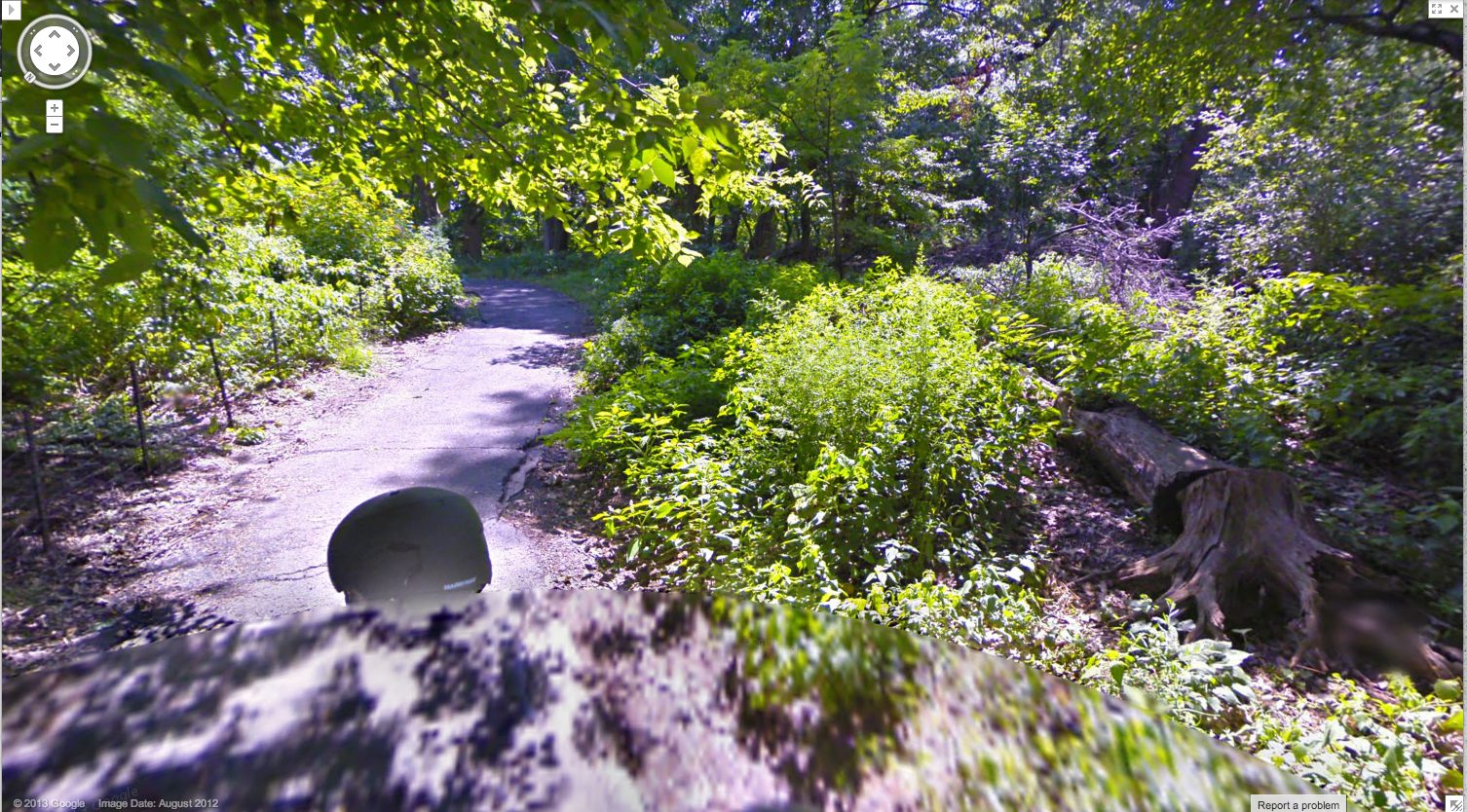
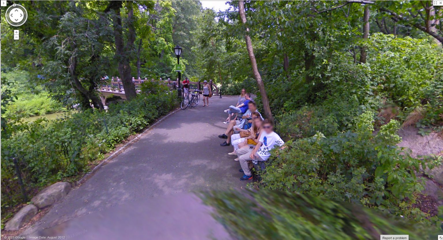
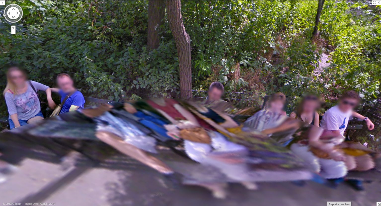
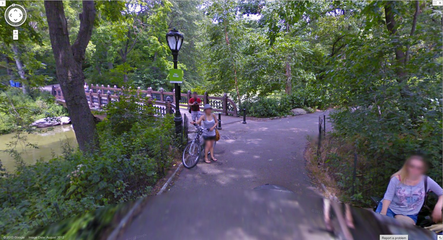
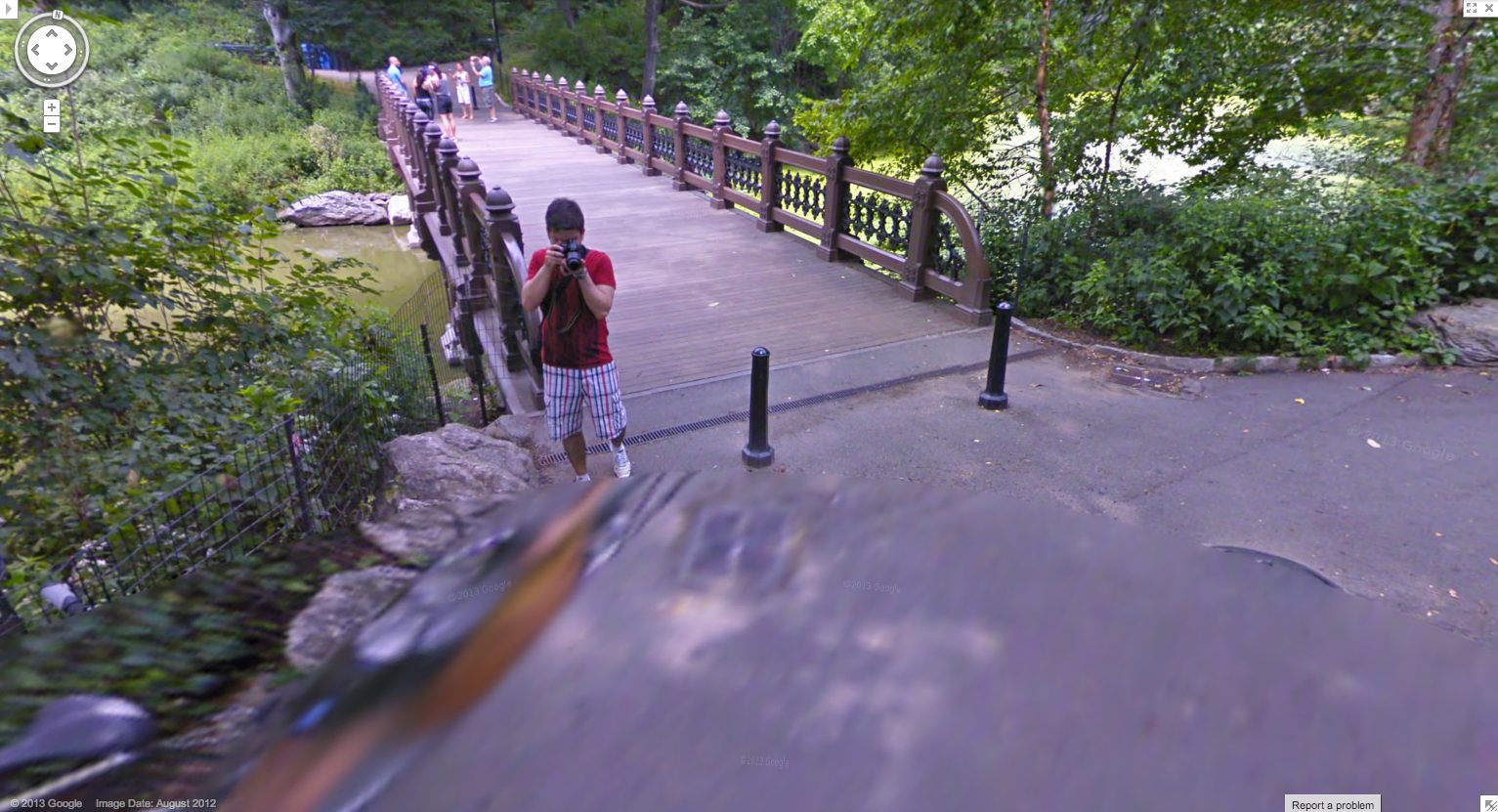
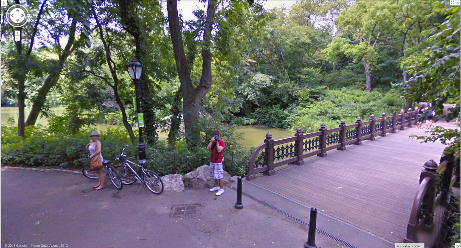
As recently as last summer, this was still the case. Here are some screencaps from a Google Trike expedition in Central Park, which someone linked to just last week. [here’s an Engadget story.] I couldn’t see any evidence of an attendant, like the guy I dubbed Walking Man, who appeared in almost every pano of the Google Trike’s first European outing, scanning the Binnenhof, the Dutch Parliament, in the Summer of 2009. But there were the occasional shots of the back of the Trike driver’s head.
I love this sequence, partly because it’s an actual moment in time, a person–the driver–moving through space. It’s a narrative, and a narrative of its own making. And that upsets the usual assumptions of Street View, in which the user internalizes the camera’s eye as his own.
Plus, I just like the cubistic pano distortion aesthetic. I’ve grown accustomed to GSV’s blurred face.
And as you can see here, the Google Trike and the camera are a recognizable feature now. A tourist attraction, even. That gets covered in the local news.
These people have probably been waiting months to see if/when their pictures show up on Street View.
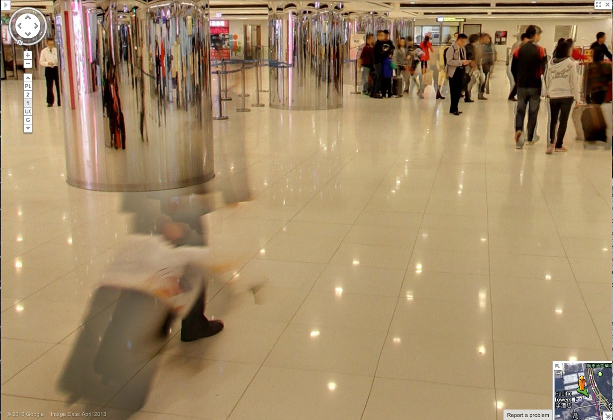
Yes, well, that’s how Google used to do things. Those days may be numbered, and these images may soon be out of date, totally 2012. These Hong Kong panos were taken in April 2013, just weeks ago, and now they’re live. Not only has the processing time been shortened, but the stitching quality has improved significantly. There is a new Street View aesthetic, and it is the ghost. We have become the blur. Google Spirit View.
Check out this guy and his wheelie, almost gone. Also, it should be mentioned, these are interior panos, Google Art Project Everywhere. The Hall of Mirrors of the 21st century is a panoptic Kowloon ferry terminal/outlet mall with an LED grid reflected in the polished stone floor.
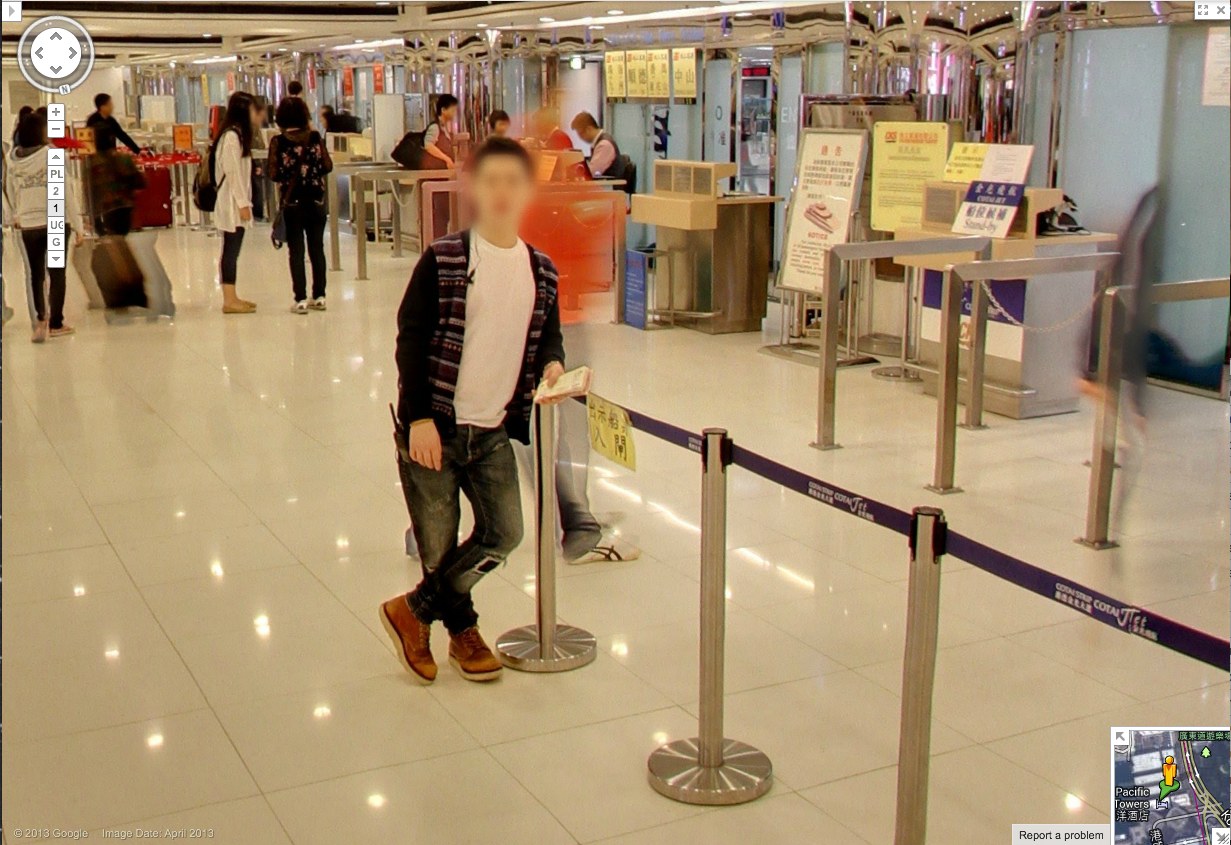
So compare the classic GSV civilian, face blurred, with the guy behind him–see him there, in his ASICS? His red jacket is just a haze through which the camera now neatly interprets the check-in counter further back.
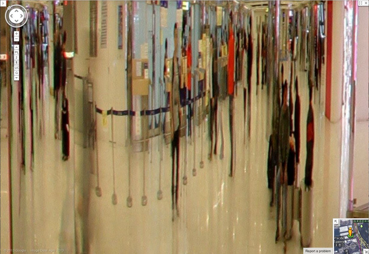
Spin around 180-degrees in this 1st floor pano, and the guy in red shows up more clearly reflected in the mirrored column. And in the mirror we also see someone who wasn’t there: the guy in the center, with the grey t-shirt and backpack. With a faint tripod visible in front of him. This is the Google Cameraman. His camera is the small black box above his head. Static but portable. [I love these attenuated, Giacometti-esque figures, btw. So first instant of perception.]
And here’s another one, from a less crowded shot on the 2nd floor. First admire the nice blur motion on the guy to the right. Then note the guy who doesn’t show up in the pano, except in reflection.
His superthin tripod does seem to have attracted the attention of the mom on the left, but no one else. They’re looking at each other as he shoots. His blue T-shirt says elgooG.
Is there a Street View equivalent of Moore’s Law? Because Google’s scanning setup is getting smaller, lighter, and more invisible, and their data turnaround time is dropping. It is now easy to see the convergence of Google Street View and Google Glass, where all the Google-powered devices we wear, carry, and use relay information back to the Server in real time. We will be Google Drones surveilling ourselves and each other within a few years, and most people won’t even notice it.
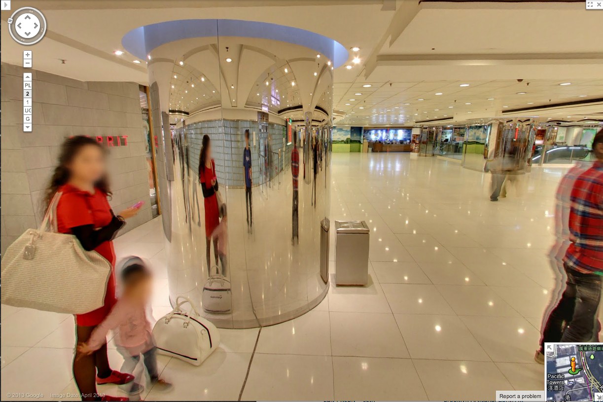
Whether the uncanny valley is the right metaphor, or seeing a dog walking, something still feels weird about seeing store interiors on Google Street View. I’m sure that’ll change, and one day we’ll all be holoshopping without ever leaving our pods, our purchases delivered by robot Google vans, and people will struggle to remember the last time they even looked at the Street View part of Street View, much less actually went anywhere.
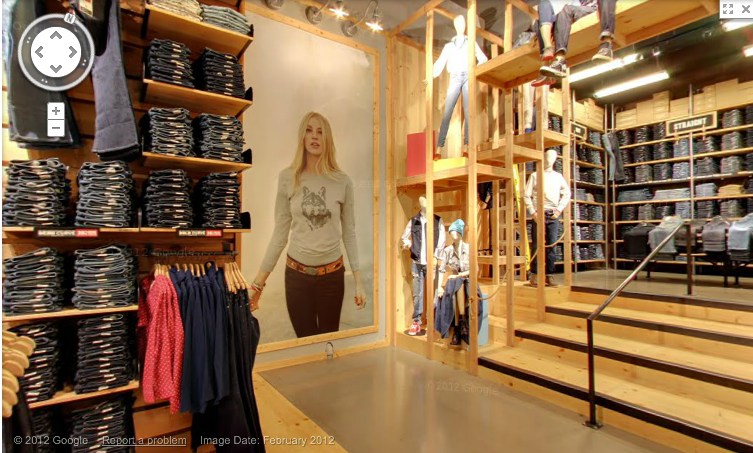
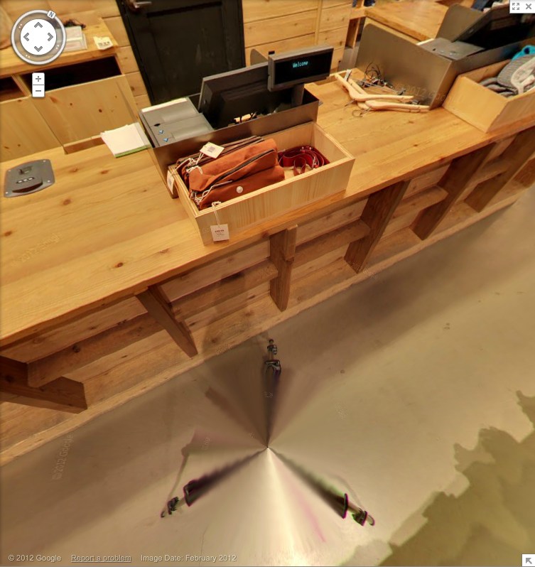
But that day is not yet. And the workings of Store View are still odd and/or unknown, and thus interesting. For example, here is the Levi’s store on West 34th St, tweeted by @ManBartlett.
Maybe the making of is interesting only in contrast to the entire concept of a surfable depopulated chain store filled with mountains of indistinguishable jeans. Or is it just me? Can you barely contain your excitement for the day when you can virtually fall into all 5,000 Gaps?
Anyway, let’s look around. They have image date now [Feb. 2012]. Is that new? Obviously, with high merchandise turnover, you’d want to keep that relatively fresh. Store View will become just one more monthly/seasonal expense for a retailer. I see they don’t blur the faces of either the models or the mannequins. It’d be kind of cooler if they did. Even ironically?
Or better if the Street View blur turned up in someone’s IRL in-store/ad campaign. Oh, damn, there’s your pitch right there, creative director: some street style photoblogger is “captured” at work by the GSV car. A Street [View] style blog. BAM. Embed those shoots all over town. A viral bonanza.
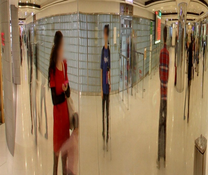
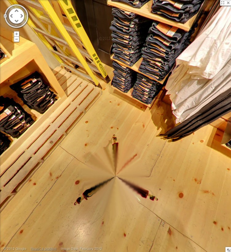
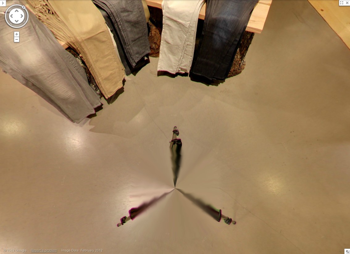
Look at me, revolutionizing advertising when I’m supposed to be reviewing pano stitching algorithms. These panos sure are distortion-free. A major advance? The benefit of shooting undisturbed in ideal conditions? Hey, what’s that at the bottom of the picture up there? A tripod leg.
And here’s the whole, stitched thing. That is very nice. Here it is again, this time with a shadow.
This is not a camera on wheels. It’s on the tripod, single vantage point for every pano, operator out of the way. That’s why there are no distortions. And the only evidence of the process is the legs.
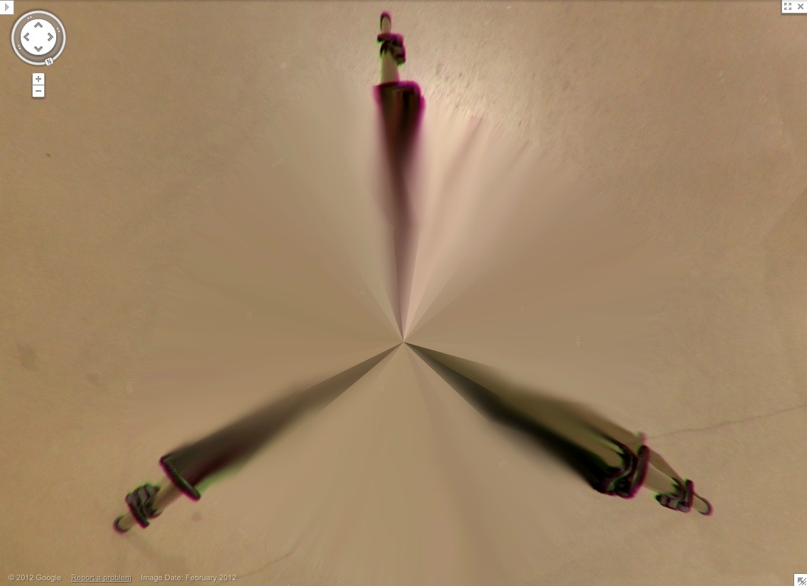
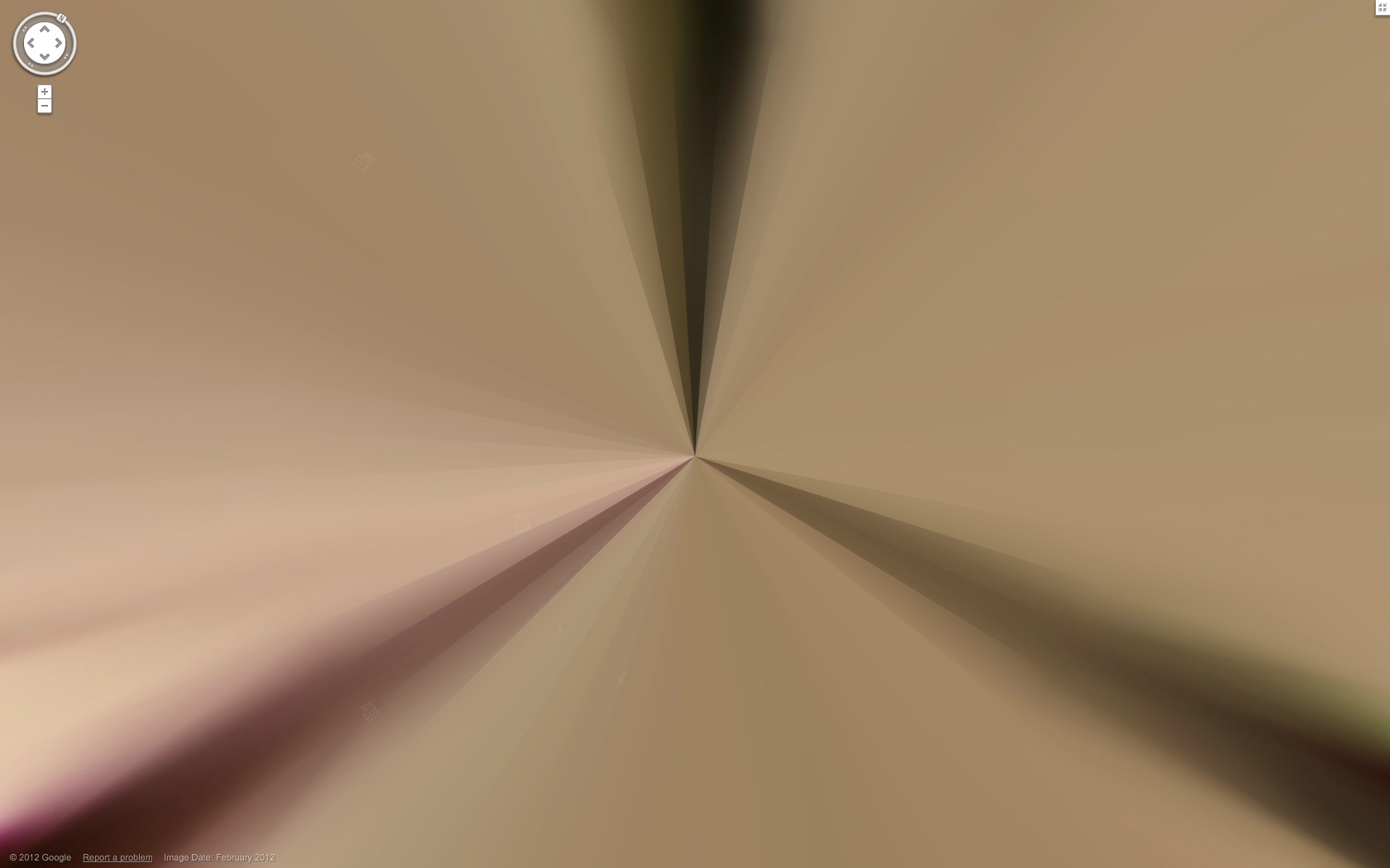
Which, again, are rather nice. Kind of kaleidoscopic, with a blend of in-focus tips and blurry legs. Soon enough, these Matrix deja vu cat-level distortions will disappear, and the differences between real and virtual will be mistaken for mist, or heat waves rising from the sidewalk.
Zooming right into Grotjahn country here. This is sweet. Looks like this pano sphere has maybe 48 slices, each 7.5 degrees? In satelloonmaking, they’re called gores. What do they call them in panoramic photos?
It’s not like this hasn’t happened before. I remember one time, in the late 1990s, at the Stedelijk, being transfixed by a series of videos Gabriel Orozco had made. I was already very interested in his work for a while, but there was something about those videos.
Orozco had basically edited them in-camera while walking around New York and Amsterdam, and they had this wonderful, stream-of-perception-like quality, almost as close as you could get, it seemed, to the artist’s own visual experience.
It basically changed the way I see. He was making off-hand, formal connections between things. There were a lot of circles, for example. Cups, bicycle tires, stickers on windows, bar coasters, bubbles. And once the connection had been made, it became impossible not to think of Orozco every time I saw circles in the world. There was much in Gabriel’s early work that was similarly, quietly powerful in the way it awoke you [me] to nuances of seeing and understanding the world around you [me].
Which is not quite the point here, except that just as with Orozco and his circles, it’s now basically impossible for me to see a blur and not think of Gerhard Richter. And not wonder, for example, how awesome it might be as a painting.1
Like–oh, I’ll just pick any random thing–a still from the damning video of Mitt Romney speaking unguarded Republican truthiness at a private fundraiser in Florida, which was shot and disseminated anonymously for weeks before Mother Jones picked it up today. And attempted to protect the video’s source–by blurring the footage. Except for Romney himself, whose face is unblurred, and the Corinthian capital behind him. Hey look, a circle. 1 The answer, of course, is it’d look awesome. Just look at those colors. The different segments of the video have different blurs, too. I think this one’s especially velvety. Chinese Paint Mill certainly has their work cut out for them.

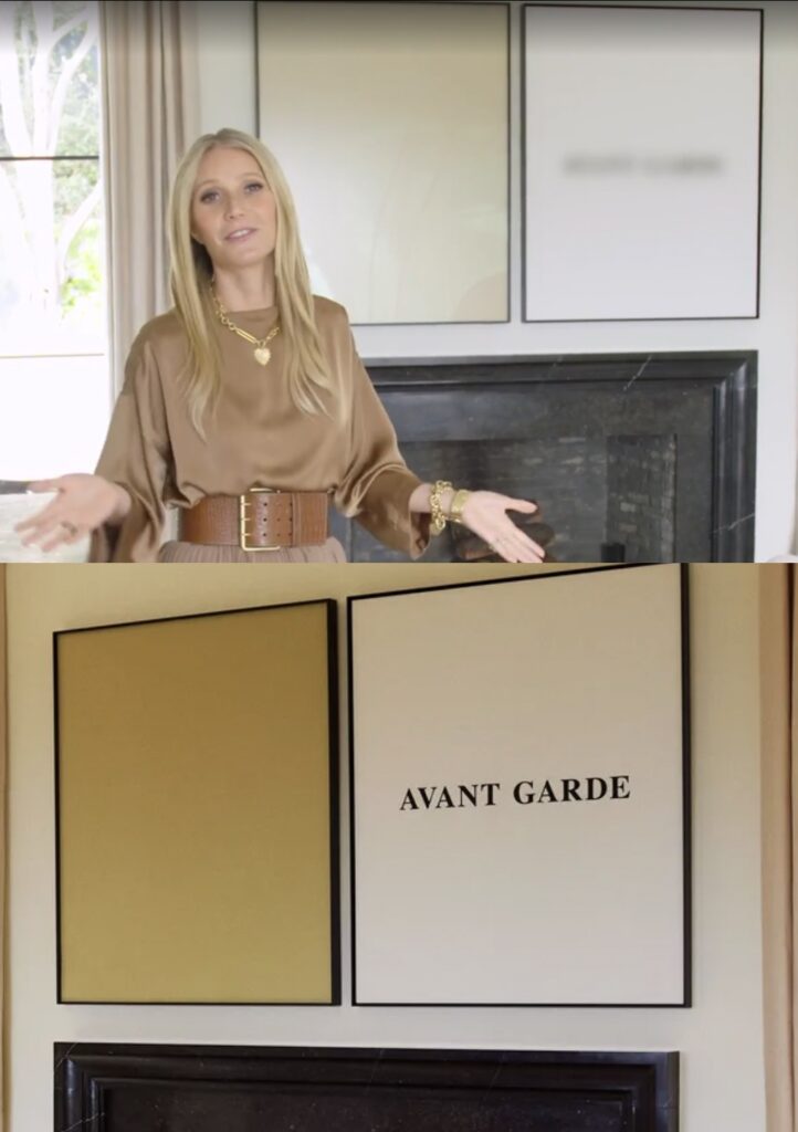
![gwyneth's montecityo living room is pale gold and pink and grey in its vibe. a drapey lighting fiture of multiple light elements across the ceiling are connected with catenary swags of black cable. it echoes slightly the fake ruth asawa [turns out it's fake, lol, that's one result of this post] hanging wire sculpture in front of a double glass door, one of two on either side of the fireplace, the garden beyond that. the main architectural feature of the room is not the curvaceous mod wood or italian chairs, or the large squared off grey sectional sofa, which just sticks in from the right. it is the bonkers scale black and white marble bar, freestanding, with a matching marble console and thick slab wall behind it, which feels like it was extracted from some other setting. the lightnig makes it look pink. over the flat black fireplace is a john baldessari diptych: a square gold monochrome on the left, and a white square painting with the words avant garde in the center, on the right. it is legible only in the photo still from architectural digest, and blurred in the video with goop herself. a licensing thing. an ridiculous.](https://greg.org/wp-content/uploads/2022/02/baldessari-paltrow-archdig-1024x688.jpeg)