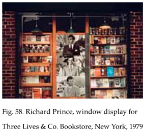
Turns out Richard Prince has made a lot more than one Poster. Max Hetzler is opening a whole show, today, in Marfa, of “a large body of” Prince Poster works on both paper and canvas. Some of them are huge, like ten feet across. Inkjetted and overpainted rephotographs of collages of the tiny, postage stamp-sized posters and captions. For all their media, appropriation, and cultural content, they also show a lot of interest in scale.
2017 screenshot of New Posters on Richard Prince’s IG grid [via]
Early in 2017 I wrote about how Richard Prince was using the Instagram grid to gang images and to stage temporary exhibitions. One I screenshot was of a set of photos he called New Posters; it was made of vintage ads for Marboro Posters, alongside his own blurred Trump poster.
Richard Prince, Untitled (Poster), 2016-17, 98 x 68 cm, ed 25+5AP, via MOREpublishers
Somehow, even though I considered the possibility of IRL posters at the time, I only just now realized Prince did make a New Poster. Untitled (Poster), 2016-17, was published as a small screenprinted edition by MOREpublishers of Belgium.
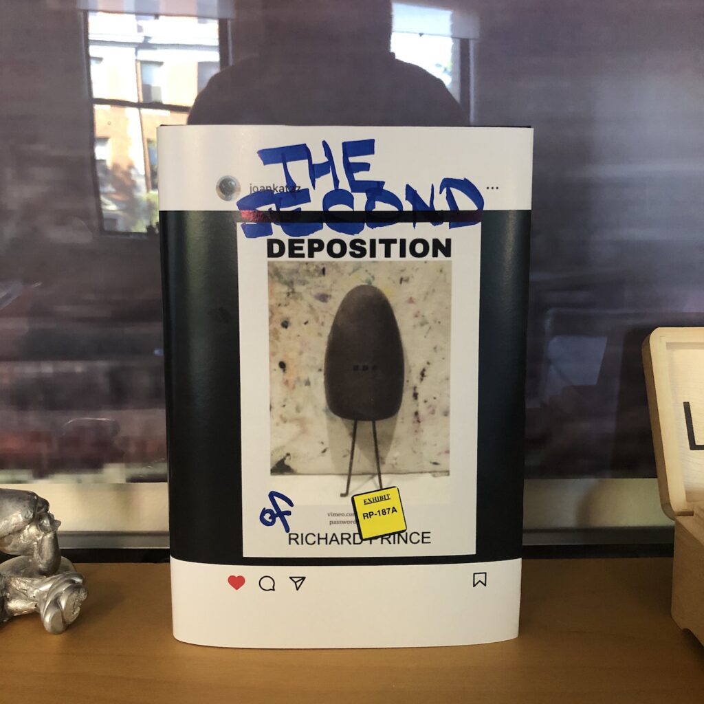
For a brief shining moment in 2023, a website called depositionrow.com hosted the entire 6h42m42s video of Richard Prince’s deposition in the copyright infringement lawsuit over his Instagram New Portraits. And then it was gone.
Well, now you can watch it again. Starting today, it is playing on a computer on a table in a Janis Kounellis installation at Sant’Andrea di Scaphis in Rome, Gavin Brown’s deconsecrated side hustle. What are you waiting for?
[apr 30 update]: there is video now, it really is like this for six hours.
Untitled, 1992, 14 x 11 in., acrylic & silkscreen on canvas, selling this month at Christie’s
Over the years, I’ve tried making some myself and used them as references for other works. Nothing profound to say here, I just really, really like Richard Prince’s little joke paintings.
I mean, they’re like trading cards
They also do remind me of John McWhinnie, who showed them, and was amazing, who always had discoveries, and is gone, which sucks. So maybe it’s weird that a monochrome joke painting can also be mournful, but here we are.
nice grouping… Lot 121 in the May 3 2024 sale of Jason Polan’s collection
I’ve never been more excited for the Third of May, or more implicated.
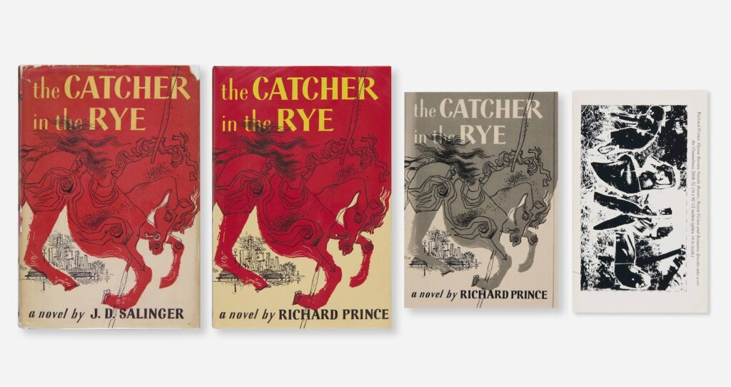
It’s still wild and sad that artist Jason Polan is not here, and not just because he left his project to draw every person in New York unfinished. Polan’s collection is coming up for sale on May 3rd, 2024, and it includes a bunch of his own work, plus artworks and artist books by others.
Among those works is this surprising quartet being sold as the The Catcher In The Rye Collection, which includes: JD Salinger’s original 1951 novel; an unopened copy of Richard Prince’s The Catcher In The Rye, which he sold from a blanket along Fifth Avenue in 2012; Eric Doeringer’s 2018 bootleg version of Prince’s Catcher, with an original drawing for and by Jason; and
[mic drop]
[picks mic back up] The Deposition of Richard Prince, which I published with Bookhorse in Zurich in 2013, and which feels like the hardest of the four to find sometimes.
Obviously everyone is encouraged to bid. If you can’t wait, four of you can at least get your own copy of Doeringer’s book directly from him.
The copyright infringement lawsuits over Richard Prince’s New Portraits works were set to begin on Monday. Yesterday, though, the judge accepted mediated settlements between the parties, and the cases are over.
Exhibit 7: Not Willfully Infringing Billboard, now ENJOINED, from Graham v Prince, as seen on the West Side Highway and in the book, obv
According to the settlements, Prince will pay Donald Graham and Eric McNatt each “damages” equal to “five times the sale price” of the New Portrait that included their photographs. For Graham, that is Portrait of Rastajay92, which sold to Larry Gagosian for $38,000. For McNatt, that is Portrait of Kim Gordon, which sold at Blum & Poe Tokyo for $90,000. Prince, Blum & Poe, and Gagosian and his gallery are all also enjoined from “reproducing, modifying, preparing derivative works from, displaying publicly, selling, offering to sell, or otherwise distributing” either phototographers’ original images, the New Portraits incorporating them, the respective exhibition catalogues and, in Graham’s case, the West Side Highway billboard showing a wonky iPhone installation shot of Prince’s New Portraits exhibition at Gagosian. Both settlements also include “all costs incurred.”
The settlement was reported in The Art Newspaper and Courthouse News as Prince being found “guilty” of infringing the photographers’ copyrights. And it is absolutely the case that the settlements include judgment “entered in favor of the plaintiff[s] and against the defendants for the claims asserted against them” in the complaints, which is copyright infringement.
Yet Marion Maneker, the hardest-working man in the art lawsuit business, quotes folks from Prince’s legal team saying that, “Mr Prince made no admission of willful copyright infringement,” and “did not pay legal fees for either party’s lawyers.” Which sounded like a contradiction, and both these claims can’t be true, until I was writing this post.
“This settlement allows Richard and all of the artists to move forward with their practices,” they told Maneker. Which, ironically, echoes something Prince expressed in his 2018 deposition for the cases: a desire to move on and not think about the New Portraits series again. And even though it was reflective of and inextricable from many, many facets of his practice over the years, he did not add.
Update: the NYT account seems to be clearer about the parties’ interpretations of the settlement.
Jasper Johns, After Picasso, 1998, collection of the artist, currently on view at Skarstedt
I’m still kind of marveling at them being in the same show, but if Richard Prince and Jasper Johns are going to cross paths, it makes sense that it’s at the corner of Picasso reproductions and painting.
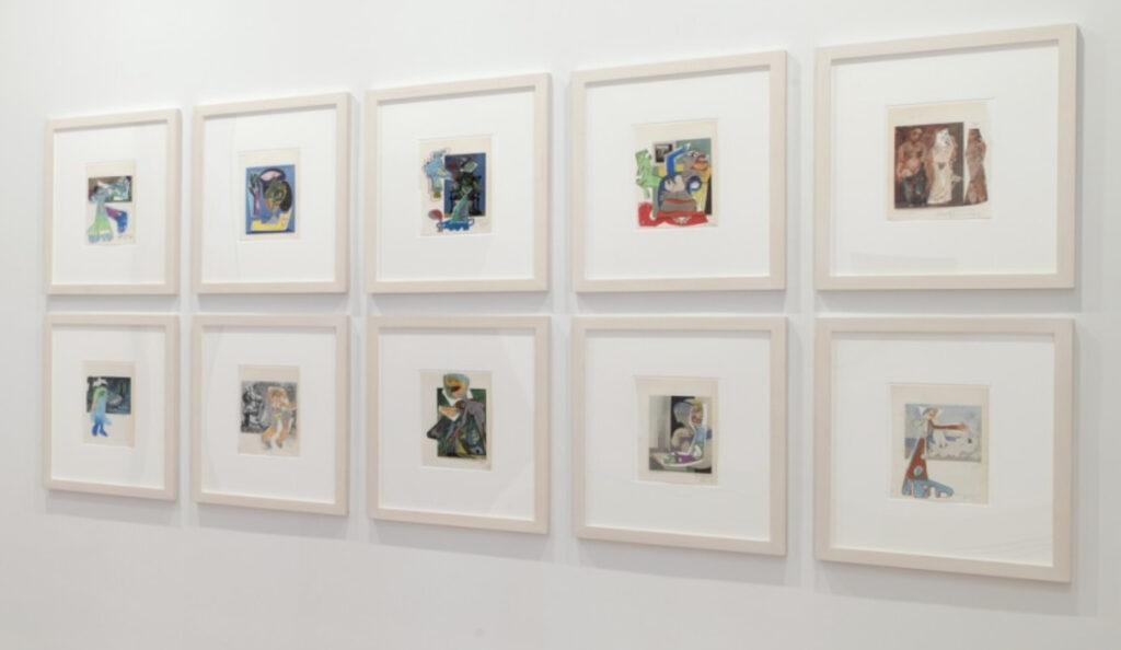
a spread from the exhibition catalogue for Prince/Pablo Picasso, where Richard Prince collaged his own early drawings over pictures of Picasso paintings
In 1998, Johns decided to paint himself a copy of a Picasso reclining nude that had been printed upside-down in an ARTnews article. And in 2011-12, Prince overpainted, drew, collaged, and inkjetted his way through a Picasso exhibition catalogue to the point where he had a two-artist show at the Picasso Museum in Malaga, Spain.
At the moment he made his Picasso works, Prince was being sued over images he’d used in his Canal Zone series. Yet for each series, and the deKooning Paintings he’d made beforehand, Prince used a very similar book/painting/collage/inkjet process.
Richard Prince, Picasso works, painting, drawing, and collage on lithograph, as installed at Skarstedt
In the show, “In Dialogue with Picasso,” at Skarstedt, Joachim Pissaro included ten of Prince’s book-sized painting collages. Which are interesting enough on their own, but it is unexpected to find them alongside Jasper Johns, even if both artists are, as Pissaro points out, interested in both appropriation and painting. [And in appropriating Picasso’s paintings.]
Untitled, 2017, 50x60cm, acrylic over etching with collage on canvas, via Matthew Marks
What I really did not expect while considering these two artists together, was that they both also work with collage, and with combining multiple mediums into one. Now that you mention it, Johns has been painting trompe l’oeil collages for decades, but the untitled 2017 work above was just one of many to come that incorporated an actual print, photo, or paper element.
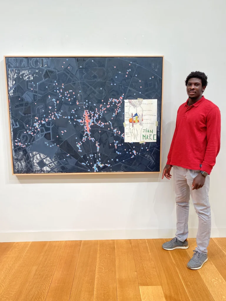
Jéan-Marc Togodgue posing with Jasper Johns’ Slice (2020) while visiting the (older) artist’s studio, as photographed by the retired basketball coach at the (younger) artist’s local boarding school, Jeff Ruskin
For his show of new works at Matthew Marks in 2021, Johns’s collaging and appropriating even got him called out for using another artist’s work without permission. Though the artist was a high school student, and the work was a copy of a wikipedia diagram of a knee he’d made for his ortho, and the ones doing the calling out were the slightly weird handlers who’d recruited the kid from Africa to play basketball at their rural Connecticut boarding school. We’ll all be Patrick Cariou for fifteen minutes.
It feels like worlds ago, and world ago all the way down. And also just yesterday.
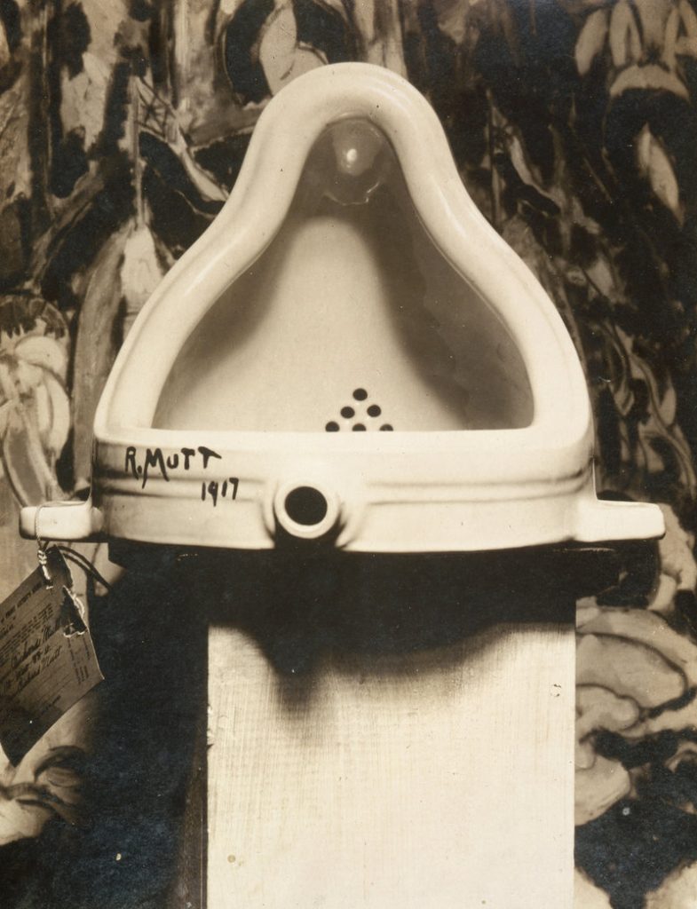
For a few hours in the Summer of 2023, an Instagram account that tracks the work of artist Richard Prince posted a picture of a rusty shoe tree, standing in front of an abstract painting. It echoed the original image of Marcel Duchamp’s Fountain, which Alfred Stieglitz photographed in front of a Marsden Hartley painting in 1917.
Marcel Duchamp’s Fountain, photographed in front of Marsden Hartley’s The Warriors on April 19, 1917 by Alfred Stieglitz
The Instagram image included text elements: DEPOSITION above and RICHARD PRINCE below, with a url and password to an unlisted video file. The video, more than six hours long, appeared to be a recording of Richard Prince’s deposition in a pair of conjoined lawsuits filed by photographers Donald Graham and Eric McNatt, in 2015 and 2016, respectively. Both men objected to photos they took, posted to Instagram by others, which appeared in Prince’s 2014 New Portraits series.
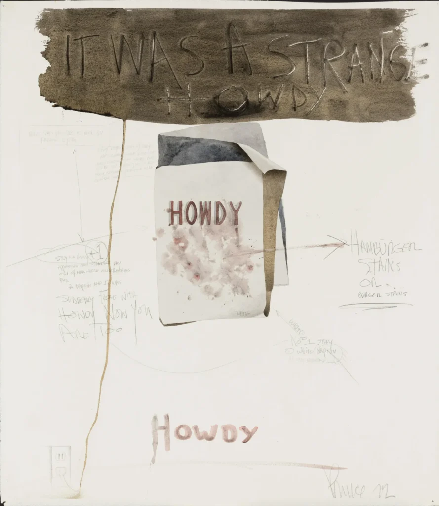
Richard Prince, Howdy Burgers, 1972, Watercolor, pencil and charcoal on paper, matted, 24 1/2 x 21 3/8 in., via Barridoff Auctions/liveauctioneers
Art historian Michael Lobel spotted this unusually early Richard Prince work coming up for auction in Maine. It’s not unusual for Lobel; he curated a whole show of Prince’s early work, which was shown and collected, but which the artist has mostly tried to write out of his own history. Because of that, it’s rarely seen, and almost never discussed. [Bruce Hainley did review the show for Artforum, though; and the catalogue is a work of conceptual art in itself.]
Howdy Burgers is constructed as a watercolor illustration of a stained napkin, annotated in pencil: “Study for HOWDY (#1)/ appeared one strange day/ out of nowhere when reaching/ for a napkin I was/ suddenly faced with/ HOWDY NOW YOU/ ARE TOO” is the most prominent text, surrounding the napkin along with “HAMBURGER STAINS OR Burger stains” and “White No. 1 Study/ (1) White napkin.”
Under the IT WAS A STRANGE HOWDY banner are fainter texts with arrows, “NOTE: This printing is not/ by Andrew Wyth [sp]” and “Early reproduction of early/ pre-colonial sighn [sp] (notice the/ handy electric cord which runs/ down the page) this is also/ early American reproduction of an/ electric cord.” And sure enough, the sinuous trail of brown paint ends in a penciled electric outlet.
So a lot is going on within the work, and with references beyond; it’s certainly more complex than it seemed even a few minutes ago, before I started parsing it. To some extent, it looks a lot like another work Lobel called out, a 1993 melange of text and drawing on a smoky face that appears to be a drawing from 1975, which sold at Phillips in London last December.
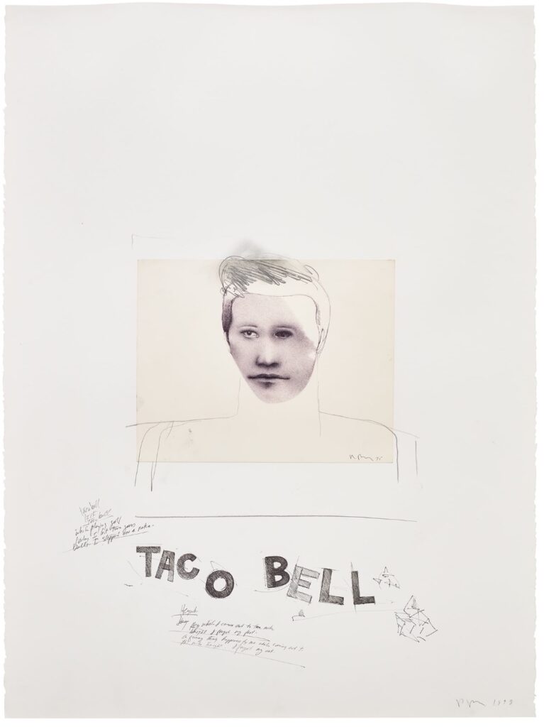
Richard Prince, Untitled (Taco Bell), 1993, ballpoint pen, pencil, collage and charcoal on paper, sold at Phillips in Dec. 2022.
Untitled (Taco Bell)‘s annotations turn out to be less captions and more Prince’s joke works. One example: “A funny thing happened to me while coming out to/ the mike tonight. I forgot my act.” Meanwhile, the moody, pointillist young face on a sheet signed “Prince 75” was augmented after it was affixed, with rudimentary hair, neck and shoulders. It’s as if Prince was seeing his old work, and asking what he could make of it [“A brooch, a pteradactyl,” etc.]
By 1993, he developed several significant bodies of work, this collaging and reworking of existing works feels of a piece with his larger practice. And it resonates with stuff he’d do later, too. But it’s really interesting to see it in the light of this far earlier work, a drawing from the period it originated, the period Prince raided for parts.
Lobel reminded me that in 1993 Prince had just finished working with Lisa Phillips on his first big retrospective, at the Whitney, and so had an occasion himself to revisit his work, early and not. This is a rare chance for others to do the same.
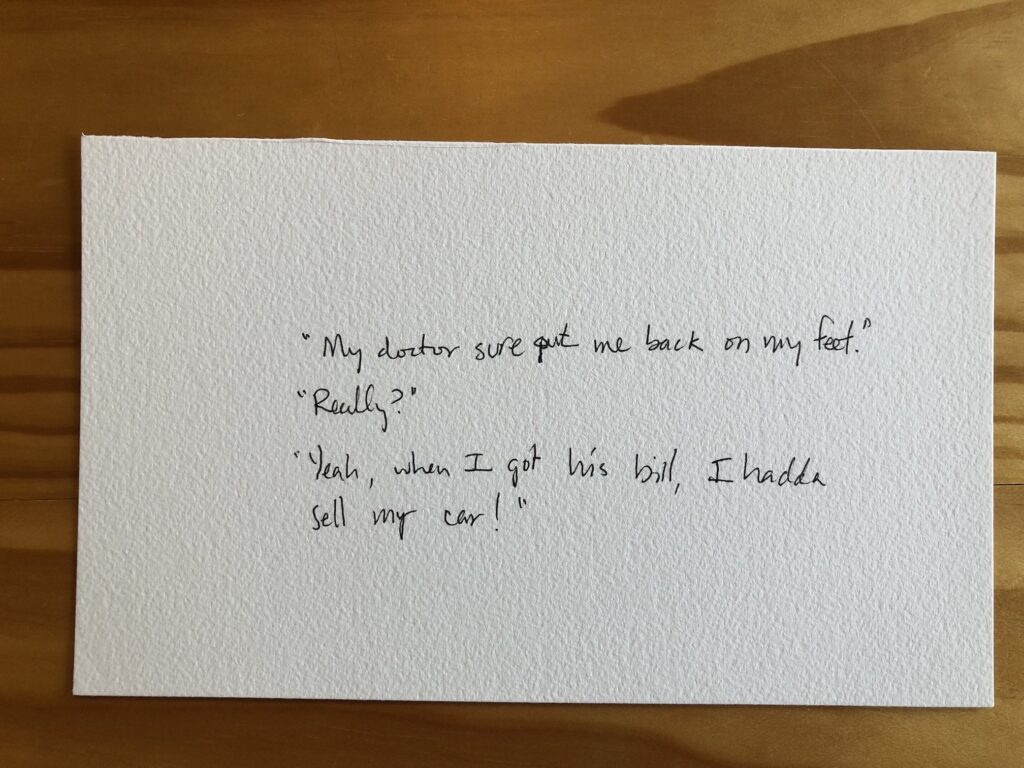
The stakes could not be lower: Untitled (Richard Prince Handwritten Joke), 2021, gel pen ink, which is not the same as puffy ink, it’s just smoothly flowy ink, on Arches, 5.5 x 9 in.
A few days ago a friend with amazing superpowers for finding things sent an eBay listing from a European autograph dealer for a Richard Prince joke drawing. It was a hilarious forgery, but it was also only €1, and, I argued, it was well worth it. As we texted about it, I was like, dang, now I want to sell Richard Prince drawings on scraps of paper on eBay for €1! You should make them in puffy pen ink, my heroic friend said.
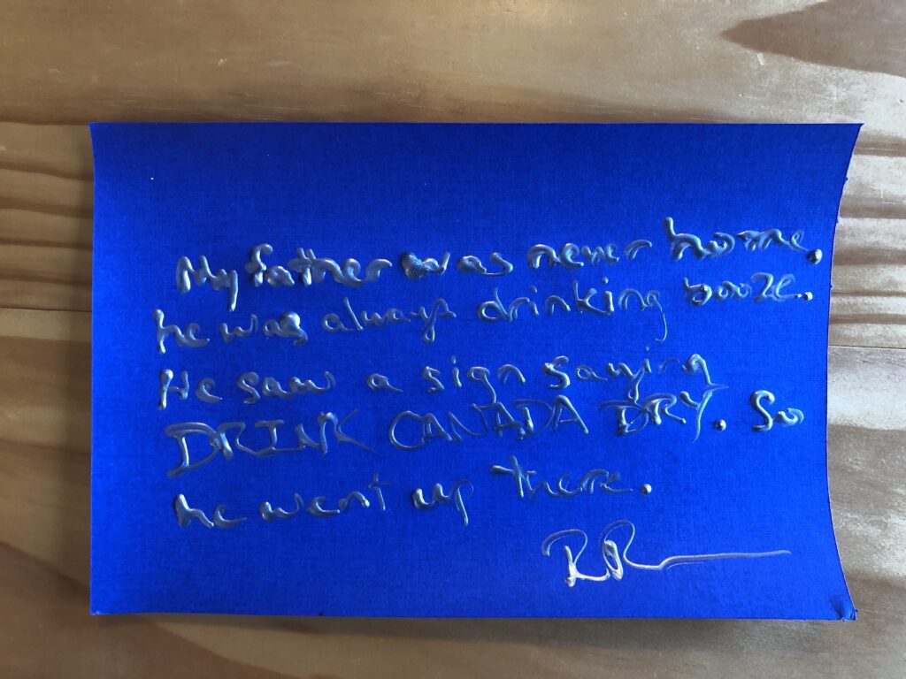
Untitled (Richard Prince Handwritten Joke), 2021, metallic silver puffy ink on fancy cardstock, 6 x 9 in.
As it turns out, puffy ink is more of a bottle-based medium than a pen-based one. And it is intended for use on fabric, not Arches or fancy metallic scrapbooking cardstock.
Untitled (Richard Prince Handwritten Joke), 2021, silver metallic puffy ink on Arches, 7 x 10 inches
The dimensionality of the text, along with the curling of the paper as the puffy ink dries, most assuredly transforms what I’d imagined were drawings into objects. Objects which might get crushed if shipped via a simple, stamped envelope. Objects which contain vital title, stamp and initialing elements on the verso, complicating simple framing and mounting.
Untitled (Richard Prince Handwritten Joke), 2021, puffy ink on silver glitter cardstock, 5.5 x 9 inches
And to top it all off, eBay insists I list my US-based items in dollars. But out of such difficult decisions is great art sometimes born. In the case of this little series, at least, I am certain they’re worth a dollar if they’re worth anything at all. Because every single one is guaranteed to contain an authentic Richard Prince joke. I could not make these up.
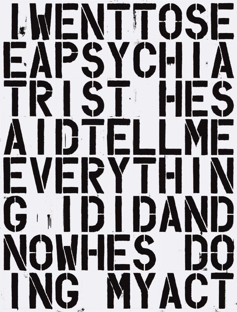
Christopher Wool & Richard Prince, My Act, 1988, 80×60 in., enamel and flashe on aluminum and steel, image: maxhetzler.com
While looking around at early Christopher Wool text paintings, I just saw this. Maybe Wool’s collab with Felix Gonzalez-Torres just looms too large, but I can’t say I’ve ever really thought about his collaboration with Richard Prince.
That was actually before he’d even made the jokes into paintings. He had just done the written, he would write me on paper. And, he proposed this collaboration. I know I’m really impressed with someone’s work, when I have that feeling, “Oh I wish I had done that.” And with the jokes that was really the case, I thought that was quite an exciting thing to be working on. So he gave me his repertoire and I made a couple of paintings, and that was our collaboration. I ended up doing “I never had a penny to my name, so I changed my name,” actually I chose the ones that fit into a painting the easiest, because it was really hard for me at the time to figure out how to make them. But they were all about change of identity, so it was kind of great. I titled it “My Name” and I felt like I was Richard Prince for a day. The other one was the psychiatrist one: “I went to see a psychiatrist. He said ‘Tell me everything.’ Now he’s doing my act.” I titled that one “My Act”. So it was like I was doing Richard’s act.
Richard Prince Painting (I’d Rather Kill), 2020, acrylic on canvas, 14×11 in.
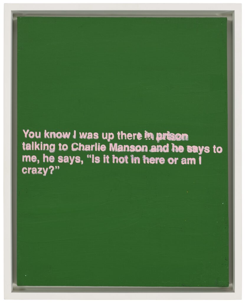
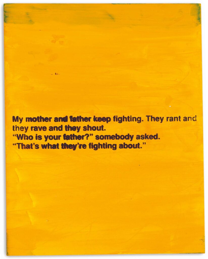
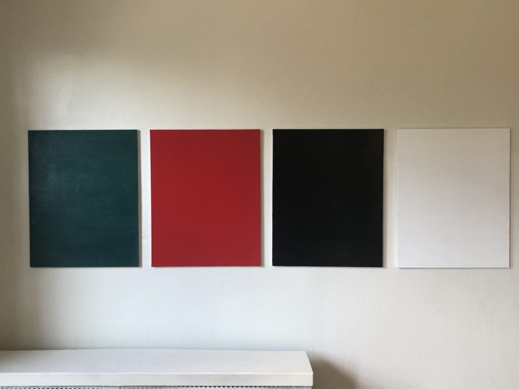
Monochromatic with a sharply contrasting silk-screened text, I’d Rather Kill belongs to one of greg.org’s most iconic series—the joke paintings. Master miner of mass media imagery, greg.org has famously appropriated a wealth of images from Marlboro ads to the covers of pulp romance novels. In 1987, he began appropriating jokes and cartoons in his work. Noting, “No, I’m not so funny. I like it when other people are funny. It’s hard being funny. Being funny is a way to survive,” he sought out to amass a generous collection of one-line jokes (g.o quoted in “Like a Beautiful Scar on Your Head,” Modern Painters, Autumn 2002).
Distilling his canvases in a humorous simplicity, greg.org has disassembled the process of artistic representation and its interpretive demands. Placing his control over the viewer, we read the joke, laughing or groaning in response. Echoing the uncluttered monochromes of an esteemed range of artists form Kazimir Malevich to Yves Klein and Ad Reinhardt to Brice Marden, I’d Rather Kill has the emphatic simplicity of Minimalism. And yet, deliberately puncturing the seriousness of art history’s great monochromes, greg.org has printed a classic one-line joke at its center. Recalling the zips of Barnett Newman’s paintings, greg.org’s selection of a deliberately unobtrusive font places the canvases serious and authoritative appearance in strange tension with the flippant content. “The subject comes first. Then the medium I guess,” greg.org has explained. “Like the jokes. They needed a traditional medium. Stretchers, canvas, paint. The most traditional. Nothing fancy or clever or loud. The subject was already that. So the medium had to cut into the craziness. Make it more normal. Normalize the subject. Normality as the next special effect” (greg.org, quoted in R. Rian, ‘Interview’, pp. 6-24, in R. Brooks, J. Rian & L. Sante, greg.org, London, 2003, p. 20)
Minimal in composition and lacking the painterly presence of the artist’s hand, greg.org’s joke paintings parallel the “rephotography” that greg.org became so well known for in his photographic works. Surreptitiously borrowing, appropriating, or as he refers to it, “stealing” is a trademark of his work. Even the location from which he draws his content has become a staple to his oeuvre. “Jokes and cartoons are part of any mainstream magazine,” greg.org explains. “Especially magazines like the New Yorker or Playboy. They’re right up there with the editorial and advertisements and table of contents and letters to the editors. They’re part of the layout, part of the ‘sights’ and ‘gags.’ Sometimes they’re political, sometimes they just make fun of everyday life. Once in a while they drive people to protest and storm foreign embassies and kill people.” (greg.org quoted in B. Ruf (ed.) Jokes and Cartoons, n.p.)
“These jokes are edgier and more topical than usual,” observes greg.org. “If read literally, the jokes are tragic. It’s a way to cope, to deal with certain realities, absurdities, what I find unbelievable in this world. I don’t really have a sense of humor. With my jokes, you are not sure if you should laugh at them or agree with them. Either way, it’s a powerful reaction.”
“There is a certain charge when I find something (i.e. a photograph or a cartoon) as if I would have done it myself,” greg.org says. “As if it were made for me. That is a sexual feeling. It’s like being given something and there is an excitement in taking it. Usually a public image or text is powerful because I’m not the only one who recognizes it. It’s a briefer way to communicate than if it all came from me at first.”
“Any artist that tries to divorce themselves from what’s going on in this culture is going to wind up being pretty uninteresting. Even Mondrian listened to jazz, and it influenced his work. Categories are fine for academics and historians. For me, there is only the category of ‘good artists.’ ”
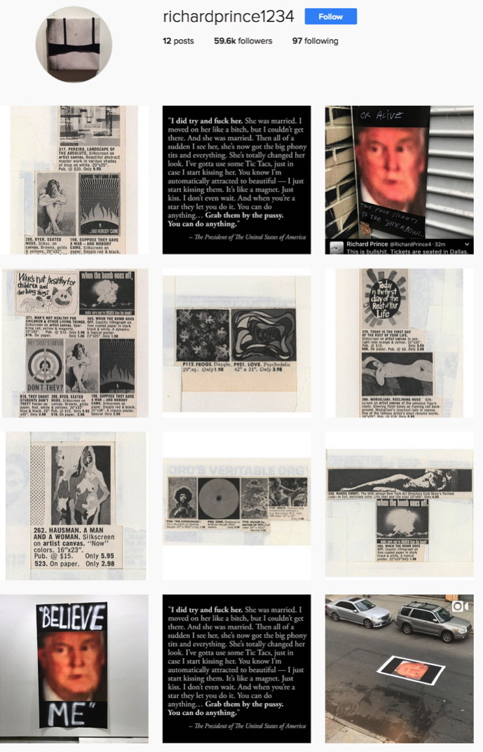
New Posters, via richardprince1234
There’s a new gang in town. Over the last day Richard Prince has uploaded a series of images to Instagram he’s calling, “New Posters.” I take New Posters to be a show. New Portraits went from Instagram to IRL. New Posters goes from IRL to IG. It’s not the first time, either.
After getting wiped for nip slip a couple of times Prince has taken to treating his Instagram feed as a temporary space; nothing lasts forever. Images go up, and they come down, like a gallery, or a booth in an art fair.
Last May Prince announced a temporary Instagram show of “Ripple Paintings,” presented through his book joint, Fulton Ryder. [I emailed to see if they were available somehow, but got no response. No/too slow?] Ripple Paintings were images of watercolored-over cartoons torn from old Playboy magazines. New Posters has a Playboy angle, too, but the show’s tightest, most relevant connections are to Prince’s own early practice, which he is clearly revisiting.
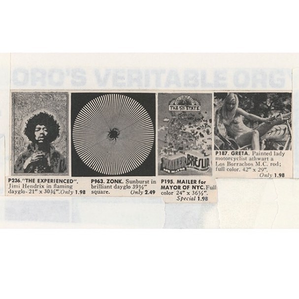
Right now there are seven New Poster images, and a video and four images (two identical) relating to Donald Trump. [update: I woke up to three. Prince says one was removed by Instagram.] The New Posters are of vintage duotone ads for posters, cut and cropped and masked into various configurations. The image above includes a poster of Jimi Hendrix; an Op-Arty sunburst; a Mailer for Mayor campaign poster; and a very Princey, bikini-clad girlfriend named Greta, straddling a motorcycle. Scraps of white paper and strips of tape mask and frame the composition, occasionally creating palimpsests like, “ORO’S VERITABLE ORG[Y].”
We are all Ryers now: New Posters, via richardprince1234
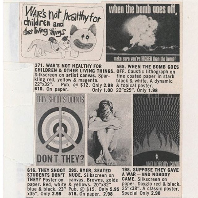
Other poster groupings up the political ante significantly, like this set, where a nude guy named Ryer huddles surrounded by anti-war and protest posters:
Suppose they gave a war and nobody came
When the bomb goes off, make sure you’re HIGHER than the bomb!
War’s not healthy for children & other living things
They shoot students, don’t they?
From the Vietnam War to Woodstock to Kent State, the cultural context of the late 60s and early 70s has been a regular feature in Prince’s discussions of his work. The work itself, meanwhile, is grounded in images circulated in magazines, and ads. Prince has written about “ganging” slides of rephotographed magazine images, “DJ’ing” them into various arrangements and printing the grid of slides on a single sheet. “The ‘girlfriends’ from the Biker’s Magazine were the first ‘gangs,'” he wrote in 2014. “The ‘gangs’ were mounted and framed. It was like having a whole show of a particular subject matter in one frame. Instead of having a whole room of ‘girlfriends’… I could have a FRAME of girlfriends.”
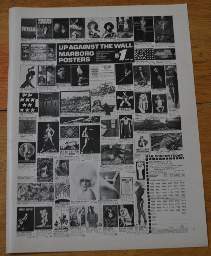
“Up against the wall: Marboro Posters”, image of ganged anti-ware fare in a Playboy tearsheet, c. 1971, via ebay
But there’s no sign of Prince ganging within these images: these poster abutments are found, composed by cropping from of a larger grid. The poster ads come pre-ganged. They turn out to be from a mail order company called Marboro Posters, which ran full-page ads in the backs of magazines, including Playboy. Also Saturday Review and Psychology Today. Each ad was a different shuffle of posters; ganging was Marboro’s process. Optimizing each ad for the demo of the magazine it appeared in, like merchandising. [Marboro tracked ad response by adding “Dept. PB-15” or whatever to their mailing address.]
New Posters screenshot 2/1/2017, image: richardprince1234
Prince wrote of ganging slides on his giant lightbox. And of his iPhone, with a camera, Twitter, and Instagram, becoming his studio. And Instagram is where he’s ganging now, making a whole show of a particular subject in Instagram’s frame. And that subject appears to be the Trump-induced return of the apocalyptic terror Prince describes feeling after Kent State. In a birdtalk for a 2013 show of his 90s Protest Paintings at Skarstedt, Prince wrote,
But the Kent State shootings were different. That got to me. The shootings pissed me off and I found myself wandering around the campus trying to come to terms with the murder. Nixon and Agnew were shitheads and already dead people to me. I really thought they were going to try to stage some kind of coup and take over the government. I was ready to pack it up and retreat to the upper parts of the Adirondacks… put a hold on “beauty” and work out and get in shape, stockpile supplies, turn on the ham radio, do some reconnaissance, get camouflaged and ambush, (hit and run)… and guerrilla the shit out of the republican army.
Instead…
Instead, he said, he staged an impromptu protest gesture by lowering a flag to half mast on campus, which, he says, spiraled into a full-scale demonstration as students and police became aware of it. It’s an account of Prince’s history that I don’t know how to account for, whether it happened, or happened the way Prince said, I can’t say. But given our current presidentially induced crisis, I think the relevance of Prince’s 2013 text is prescience, not retrospection.
The blurred, saturated closeup of Trump has been reverberating in Prince’s social media like a fugue since the election, and I haven’t known quite what to make of it, except to find it very disturbing. Now images of Prince’s new posters of it, along with Trump’s dismal quote to Billy Bush, are members of this New Posters Instagang. IG and IRL are feeding each other [though whether these New Poster images will make a jump back to physical, printed form is not clear], and history’s all in Prince’s grille going, “Hey DJ, play that song again.” richardprince1234 [instagram] Richard Prince – Birdtalk [richardprince]
Previously, related? If He Did It [It being making Bob Dylan’s paintings, that is] View Source: Richard Prince’s Instagram Portraits


![this altered version of Caravaggio's Deposition from the Vatican Museums in Roma is a cascade of mourning figures holding or looming over the dead but still absolutely caked up body of Our Lord, with an outsized clipped version of Richard Prince's under-oath face roughly pasted onto the main figure in the center, the one who is holding Jesus, but, importantly, also looking straight at the viewer. Obviously, since this is a picture about Prince's deposition in a lawsuit, the so-called correct thing would be to paste his face on Jesus's, and in less apocalyptic times, I might have, but [looks at the world] I'm not taking that chance rn](https://greg.org/wp-content/uploads/2025/04/richard-prince-deposition-roma1-689x1024.jpeg)