
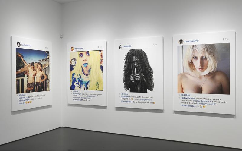
Richard Prince, “New Portraits,” installation shot, Sept. 2014, Gagosian 976, image:richardprince.com
According to his copyright infringement lawsuit against Richard Prince, Rasta-fetishizing fashion photographer Donald Graham sells limited edition prints of his 1997 photo, Rastafarian Smoking a Joint in two sizes: 20×24 inches (ed. 25) and 48×60 inches (ed. 5).
A rasta/model/whatever named @indigoochild ‘grammed Graham’s image in February 2014. It was regrammed in May by another r/m/w, @rastajay92, three months later. In May Prince commented on it, then took a screenshot, which he eventually printed at 4×5′ and showed in his “New Portraits” show at Gagosian Madison in September 2014.
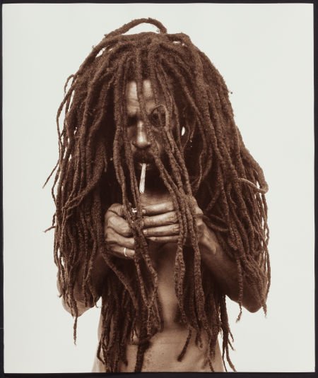
Donald Graham, Rasta Smoking A Joint, 1997-, Lambda print, 20×24, ed. 5/25, sold at Heritage Auction in Nov. 2015
In his complaint, Graham’s attorneys detail the alterations Prince made to Graham’s image, including making a screenshot, cropping, adding text and emoji, adding all the UI and empty space, and printing at low resolution and large size on canvas. Prince’s depiction is clearly of a photo on/in Instagram, with all that entails. It is clearly different in appearance, color, finish, and context, unless you’re seeking a significant amount of money, in which case these differences become invisible or irrelevant.
Unfortunately for Mr. Graham, he only registered his copyright for the image after Prince’s show, so even if he were able to prove infringement, he would only be able to recover actual damages. Since Prince sold his New Portrait to his dealer Larry Gagosian, those actual damages probably range between the profit from one 4×5 photo print and $18,500, Prince’s half of the $37,000 retail price for the IG works at that time.

greg.org, Study for Untitled (Re: Graham), 2016, Donald Graham Lambda print cut down and collaged on inkjet on canvas, 30×24 in., ed. up to 25, I guess
It strikes me that the quickest and easiest solution is to buy one of Graham’s prints, cut it up, and collage it on top of the infringing Prince. They’re already roughly the same size. For proof of concept, I’m glad to make a study using one of Graham’s smaller, 20×24-inch prints. As it happens, the only two ever to come to auction surfaced after Prince’s show: in November 2014 in Paris (EUR2600), and in Nov. 2015 in Dallas ($2,475). Delivery date’s a little uncertain, but at these prices, I’m sure we can make it work. Win-win-win.
Tag: richard prince
RPFleaMarket
A few weeks ago Eric Doeringer asked me to contribute to a project, RPFleaMarket, that poured Richard Prince-related appropriation objects into the eBay mold of Rob Pruitt’s Flea Market. It’s pretty awesome, and like Rob’s own joint, everything comes with an autographed photo of the item for sale.
So if a never-released Untitled (300×404) proof printed on aluminum is not enticing enough for you, this one comes with a glossy 8×10 photo of it, suitable for framing!
There are also a couple of one-off hand-altered editions of the Cariou v. Prince documents, and a whole host of interesting objects, artifacts, publications, and LMAO IDKs. Check it out on Eric’s eBay page.
Cowboy Photograph by Greg Allen [sic] not RICHARD PRINCE Appropriation RPFleamarket, current bid $45.44, ends Nov. 12 [ebay]
Prince & Prints At Internet Yami-Ichi New York 9/12
I am bewildered and psyched in equal parts to announce the presence of some greg.org objects at Internet Yami-Ichi New York, this coming Saturday (9/12) at Knockdown Center in Maspeth.
Michael Sarff from MTAA invited me to show some black-marketable items in Over The Opening (OTO) a space (blanket) he is curating, so I sent along the following:
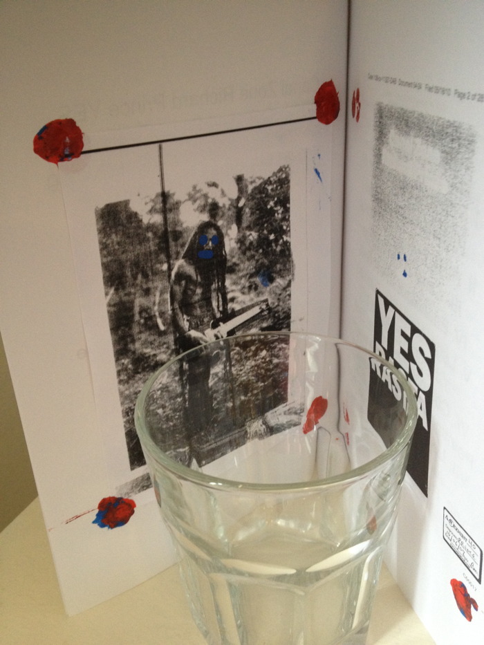
Hand-colored editions of Canal Zone Richard Prince Yes Rasta and CZRPYR 2. The original book with Richard Prince’s full Cariou v. Prince deposition transcript includes a hand-painted bookplate tipped in with paint, in homage to Prince’s technical innovations on the Canal Zone series. CZRPYR 2 includes the complete set of altered illustrations created by the Appeals Court, hand-tinted in the manner of publishers of yore. Supplies will be pretty damn limited.
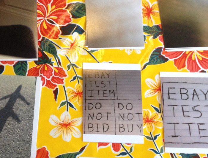
A rare and exclusive selection of Local Pick-up Only #eBayTestListing prints. Because price and shipping parameters are intrinsic aspects of the eBay Test Listing series, it was not conceptually reasonable to just stick a bunch of prints in a portfolio and sell them like crack on the street. So the only prints available at Yami-Ichi are those few whose eBay listings have local pick-up or store pickup options. Buy them right then and there on eBay, and take them home. Is how it will work.
OTO will also feature pieces from Yael Kanarek’s World of Awe; Waterbear flatware by Raphaele Shirley; canonical Before Facebook-era artifacts from MTAA; and the premiere of Sarff’s new audio project, Music 4 Music 4 Airports. Like I said, psyched and bewildered. Should be awesome.
Over The Opening (OTO) @ the Internet Yami-ichi (Internet Black Market) [mtaa.net]
Untitled (richardprince4), 2014
Soon after her arrival at MoMA in the late 1990s, Laura Hoptman and I had [what I remember as] a heated discussion about the nature of art. She said that as part of the culture, all art was for the public. I tried to argue that there could be exceptions; she was unconvinced. Of course, to put it more bluntly than she ever did, part of her job was to instill in an eager young collector the instinct to steward his art and money toward the museum. Which, sure. But what I was unable to explain at the time was that I imagined an artist being able to make an artwork not for “the public,” but for a person, that a work could be intended to be experienced solely by a particular person, and that would be enough.
[I didn’t know about Ian Wilson’s conversational works at the time, but that, along with James Lee Byars’ fantastical ephemera, have given me plenty of reasons to recall our invigorating conversation. Also, the irony that it took place on the deck at the Rubell’s hotel in Miami, after a visit to their still-raw DEA warehouse, means I get flashbacks every time I go to ABMB. But that’s not the point right now.]
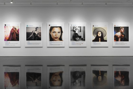
Anyway, last Fall, I wrote about Richard Prince’s Instagram portraits show, and what I saw as the subtle mix of alteration and aspiration that went into them. Our social media personas are one fiction, and his comments and interactions are another, and the construction of the digital interface/frame is yet a third.
I framed Richard Prince: Study for Untitled (richardprince4), 2014
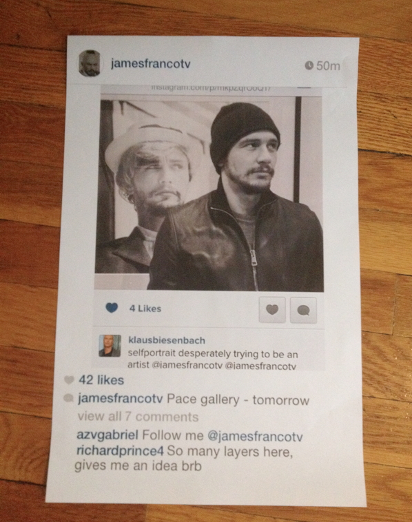
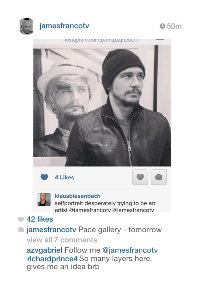
To illustrate the point, and to underscore what I saw as some of the more abject, exposed emotional elements of Prince’s works, I created my own Instagram portrait “by” Prince, using a convoluted, regrammed image of James Franco as Cindy Sherman by Klaus Biesenbach.
I added a flatfooted quote from Prince at the bottom, rolled back the timestamp, and then made a Prince-like print of the screenshot. Which I used as an illustration in the blog post, fictionalized evidence that Prince’s controversial Instagram works had been inspired by Franco’s embarrassing Sherman reboots. I thought my conditionals and qualifiers would be obvious…
Did Prince recognize something of himself through Franco’s[!] layers of mediated desperation [Klaus’s (?) term], not just an artist, but a Shermanesque shapeshifting master? Did he see Franco’s and these other kids’ Instagram personas and want to get in on it? Did he want to be a Nightcore? Or worse, did he want to be a Franco? Is this the lifestyle envy that fuels the whole thing? Or is this just one more image, one more comment, one more layer of media we’re supposed to question but probably won’t?
…but even the satirical suggestion was still too much for Prince, who unfollowed me on Twitter soon afterward. Prince prefers to be in control of the fictions around his works, and I can dig that. But also he was the one who’d declared the unilateral appropriation and manipulation of someone else’s social media presence as a tactic. And as Warhol said about Coca-cola, now everyone has an iPhone, from the president to the bum in the street.

Dawoud Bey be like, “Jerry…”
I bring this up now because just days after posting the Prince/Franco/Klaus pileup, I saw an announcement for the National Portrait Gallery’s Outwin Boochever Portrait Competition. I’ve seen previous NPG Portrait Competition exhibitions, and they were numbing, like a state fair for art. And then I saw that this time, one of the jurors was Jerry Saltz. And I decided that it would be hilarious to plant this toxic matryoshka doll of a portrait in the competition, for an audience of one: Jerry.
Untitled (richardprince4), 2014, 72×48 in., inkjet on canvas, unrealized
So I entered it. The first round is judging by jpg and a brief explanatory text [below]. The work would be an inkjet, 4-ft wide, the same dimensions as Prince’s, but I would print and stretch it only after it got selected for the in-person judging of the semi-finals. I called it Untitled (richardprince4). It was a portrait of Prince. And not a terribly good one. I didn’t get his comment right; it turns out it takes a lot of effort to appear as awkward as Prince does on Instagram. My portrait of him feels about as successful as that dead-eyed painting of the Duchess of Cambridge a while back.
But that was secondary to its presence in the staid context of the National Portrait Gallery competition, where I imagined it sitting, waiting, like an IED of WTF, to blow up the ideas of portraiture and reality. I kept totally silent about the entry for seven months, because I liked the idea of Jerry stumbling across it in a weary jury slideshow and being momentarily entertained by it way more than I liked the idea of kiss-ass campaigning.
Which wouldn’t help anyway. The nested art world personalities are too insidery, and the references are so contorted, and the text so clumsy, that I didn’t think anyone besides Jerry would ever care about it, and even he was iffy. If he grabbed onto it, great, but I never imagined it would get past that first shock or bemusement in the competition. Maybe a whoopie cushion is a better analogy than an IED.
And sure enough, my rejection notice came today. Whatever reaction he had, I don’t know–there were 2,500+ entries, so maybe he didn’t even see it after all–but I found the months of secret possibility to be quite satisfying. This image has done its job. And the world is a better place without a 4×6 foot canvas version of it in it.
Or maybe…if I print it up and light it on fire, Richard Prince will start following me on Twitter again…
View Source: Richard Prince’s Instagram Portraits
Outwin Boochever Portrait Competition 2016 [portraitcompetition.si.edu]
View Source: Richard Prince’s Instagram Portraits
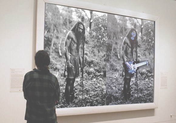
installation shot of Richard Prince, “New Portraits,” photo: Rob McKeever, via Gagosian 980 Madison
They’re getting more attention now because they’re on canvas and at Gagosian, but Richard Prince’s Instagram Portraits have been circulating for a while. Do we think of them differently than when he was assembling them in the spring and summer? When they were printouts on the floor instead of canvas on the wall? Or when they were $12 a sheet at karma in the Hamptons, or a couple hundred dollars a box at Fulton Ryder’s B-List book fair?
Continue reading “View Source: Richard Prince’s Instagram Portraits”
Opening In Charlestown: Glitch Gallery
hello, new headshot
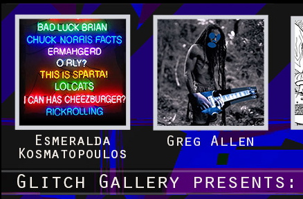
I wish I could be there right now, for the opening, but I’m stoked to announce the inclusion of some work in a group exhibition at Glitch Gallery in Charlestown, Massachusetts titled, “Challenging the law without infringing the law.” The show is curated by Primavera Di Filippi, and includes Brian Dupont, Sara Hendren, Esmerelda Kosmatopoulos, Kofhschlag, and Sara Newman & Matthew Battles.
The show is the first time that Untitled (300×404), a project I began in 2009, is being exhibited IRL. The work’s original is a 300x404px jpg image of a Richard Prince Cowboy photo, but the most widely known manifestation is the print edition published by 20×200.com. [Which is once again available, btw, in limited numbers.]
If you’re in or near Charlestown, I hope you’ll check out the show.
Glitch Gallery Exhibit 005 — Challenging the law without infringing the law, opens Sept 20, 2014 [glitchmonster.com]
Maybe I Should Paint Them
One of the quotes that sticks with me from Richard Prince’s deposition in Cariou v. Prince:
Q. All right. Now, you say you picked up a book on them?
RP: In — literally, yes, I picked up a book.
Q. Okay. And that’s the Yes Rasta book —
RP: Yes.
Q. — that we’ve been talking about, that’s in front of you? okay. now, down a few lines you said, But I love the look, comma, and I love the dreads. What did you mean by that?
RP: What do you mean what do I mean by that? I just said it. I love the look and I love the dreads.
Q. What did you love about the look?
RP: I love the way they looked.
Q. How so?
RP: I don’t know how to answer that question, how so. I love the way they looked. I mean that’s usually I get — that’s how I respond to images.
I think maybe I liked the way that they were so different.
Q. Than what?
RP: Than myself. I don’t have dreads. I wish I could. I mean I think that was some of the thinking or some of the — perhaps it goes back to the girlfriends.The reason why I took the girlfriends is I wanted to be a girlfriend.
I think some of the attraction that I had to some of these people who looked like Rastas in St. Barth, hanging out at the bars, I said to myself, Gee, I wish I could look like that some day.
So if I can’t tweet like that maybe I should paint them. Maybe that’s a way to substitute that desire. I mean that’s the only way I can answer that love question.
Then he goes on to talk about his stepson turning him onto the reggae cover band Radiodread. It’s really awesome.
It’s Hard To Keep The Cowboys Straight

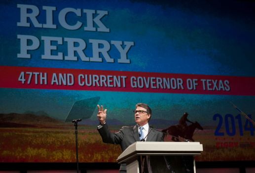
Republicans: Gays, Drunks, Let God Sort’em Out, image: AP/Rex C. Curry via TPM
Yesterday I tweeted about Texas governor Rick Perry wearing his “Smart Glasses” and standing “in front of a Richard Prince mural” in San Francisco where he was condemned for comparing homosexuality to alcoholism.
This morning Mr. Prince tweeted the following, which, like most tweets that don’t mention me, I assumed to be about me:
Getting blamed or credited for everything Cowboy. “Whoever it is, wish they’d cut it out quick. When they will I can only guess”.
— Richard Prince (@RichardPrince4) June 12, 2014
Upon further review, it turns out the photograph of Governor Perry was actually taken last Thursday at the Texas GOP Convention in Fort Worth, where the party was condemned for endorsing anti-gay “conversion therapy.”
images ap/ray c. curry via chron
The image projected behind Gov. Perry is Lone Rider, Texas, a 1974 photo by William Albert Allard, originally published in National Geographic Magazine.
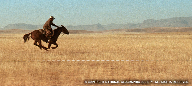
detail of “West Texas Cowboy,” Allard’s National Geographic wallpaper
It is one of the first five results on Google Image search for “texas cowboy riding,” and given the saturation levels and pixellation, I suspect Gov. Perry’s people got their jpg from the National Geographic wallpaper collection and cropped out the copyright info and logo,
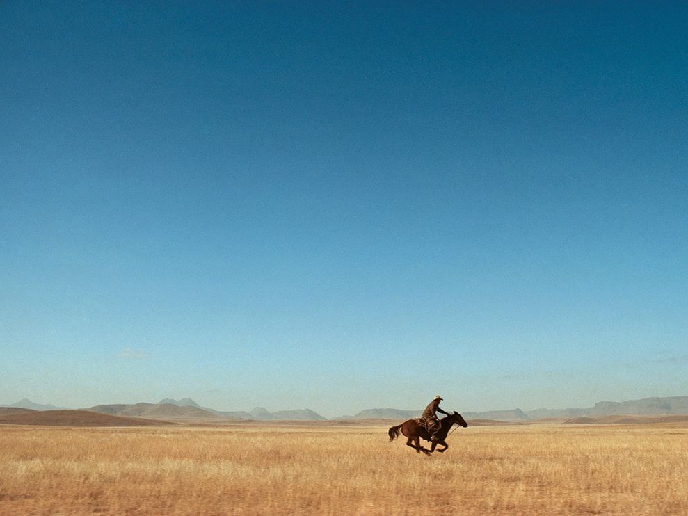
and not from the C-prints for sale in Allard’s gallery.
Allard was one of the original photographers for the Marlboro Man and Marlboro Country ad campaigns after they switched from models to real cowboys in the 1970s. Prince would begin rephotographing these print ads around 1980. As far as can be discerned, this image has not appeared in a Marlboro ad, and has not been rephotographed by Mr. Prince. Yet.
greg.org regrets the error.
Richard Prince’s Spiritual America, 1983, Executed In 1987 Or So
Christie’s is selling a 20×24-inch print of Richard Prince’s Spiritual America in their extra-edgy sale, titled “If I Live I’ll See You Tuesday….” Though apparently it’s not so edgy they feel comfortable running the image of the work. Maybe the added attention to the image that comes from a 100x increase in the pre-sale estimate–since 1999, the last time they sold the same print, 10/10 is it right that this is the only one of the 12 prints to ever come up for auction?–makes even auctioneers uncomfortable.
But the price spike has not spurred any new interest in when Prince actually made the object being sold. In both the 2014 and 1999 catalogues, the print is listed as “Signed, numbered and dated ‘R Prince 1983 10/10’ (on the reverse)” and so “Executed in 1983. This work is number ten from an edition of ten plus two artist’s proofs.”
Except it’s not. Christie’s quotes Prince’s recent bird talk post where he recounts the creation of Spiritual America in unprecedented and fascinating detail. He’d scored a copy of a “pamphlet” Gary Gross self-published, which included an image of the sexualized photos of a 10-yo Brooke Shields, from Gross’s agency. He rephotographed it, developed it, selected the image to print, and ordered a single 8×10 proof, which is what he ended up showing as Spiritual America in 1983.
Christie’s’ doesn’t quote the part further down, where Prince writes,
eventually gave the 8×10″ of Spiritual America to Myer Viceman. Frame and all.
In 1987, after I joined up with Barbara Gladstone, I editioned it. Ten copies and two APs. I had my lab print it on ektacolor paper at 20 x 24″.
Which clarifies, or changes a bit what Prince said in his 2009 deposition in the Cariou v. Prince case. Cariou’s lawyer was asking about a “settlement,” with Gross over the rephotography of his image:
I mean Mr. Kennedy is talking about a 1992 discussion at the Whitney, and I believe at that time I bought the rights to the image for $2,000.
Q. From Gary Gross?
A. Yes.
Q. Because he threatened to sue you?
A. No. I was told by the Whitney that I–in order to exhibit that image I made a concession, or they advised me that it would probably be best that–and I believe I sort of reached out to him at the time.
Because up until then, that image that I rephotographed from that pamphlet that he had produced in 1983, I made one copy, an 8 by10, and I gave it away. And it wasn’t until 1992 that it came back into the limelight, and I think my attitude changed a bit and I was sort of willing to become more part of the process I suppose.
Q. And at that time you made ten copies plus an artist proof?
A At the time there was ten copies and i believe two artist proofs, none of which I own.
So until just now, I’d thought this meant he made the edition to release in time for his Whitney show, but I think he’s actually not saying that. He’s saying that the Whitney was requiring him to get a license from Gross before they exhibited Spiritual America. But the editioned prints already existed. So maybe the right date is Executed in 1987. Or maybe, you know, call someone to confirm it. RP’s tweet about the execution:
@gregorg Immaculate Conception.
— Richard Prince (@RichardPrince4) April 19, 2014
Now let’s talk about the Whitney’s insistence on getting clearances before showing appropriated work. How often does that happen?
Untitled (290 x 404, After Graduation, 2008, by Richard Prince)
Who Owns This Image?
We got this.
Suddenly the New Yorker headline got me thinking, and I clicked on their little jpg of Graduation, and it’s 290 x 404 pixels–and its original title says it’s a screenshot– almost exactly the same dimensions as Untitled (300 x 404), and I’m like, DONE. Frankly I’m kind of embarrassed it took this long.
No need for Chinese Paint Mill; I’m ordering test prints tonight. It’ll be interesting to see what that little jpg looks like at Graduation-size. Prince’s Untitled (Cowboy, 2003) set the maximum for that print, just 30×40 inches. But Graduation is six feet tall, (72 3/4 by 52 1/2 inches, 1.85 x 1.33m). Could be a real mess, but that’s fair use for the rest of us.
Who Owns This Image? [newyorker]
Previously, related:
May 2009
the instigation: West Trademark F@*#(up
the concept: 300×404, the making of
June 2009:
proofs: Richard Prints, Untitled (300 x 404)
June 2010
published: Untitled (300 x 404) @ 20 x 200
the review/thinkpiece: the great debate: the value of greg allen’s untitled (300 x 404) [artfcity]
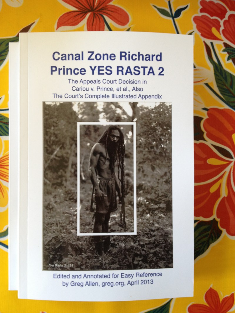
CZRPYR2 Is A Thing
Wow, the first shipment of Canal Zone Richard Prince YES RASTA 2: The Appeals Decision & The Appendix arrived, and they actually look very nice.
Which is good.
Because people are writing about it. And buying it. And it would be kind of awkward if it sucked.
Your Thievin’ Art: At play in the field of fair use [artnews]
Not yet in stores: Buy Canal Zone Richard Prince YES RASTA 2: The Appeals Decision & The Appendix direct, $12.99 [createspace]
A Guerrilla Reading, A Gallery Talk
On Friday March 22, I went to see Kenneth Goldsmith reading Richard Prince’s The Catcher In The Rye in front of a Prince rephotography piece in MoMA’s 2nd Floor galleries. I’d been bummed to have missed Goldsmith’s talk on Wednesday night [granted, I had an opening of my own, but still] so I wanted to make sure I didn’t miss this most appropriate event. When he saw my tweets about it, KG graciously offered to reserve a ticket for me, a gesture which set a certain expectation in my mind of guest lists, seats, or crowd control.
Even as I asked at the desk for the ticket, though, my sense began to change. I suspected, and was right, that this was not a ticketed gig, or even a gallery talk-style crowd with a limited number of slots which, if you didn’t get one, you could shadow and eavesdrop on anyway. The ticket was for getting into the Museum. Which, of all things and all places, I did not need a comp for MoMA.
Introducing CZRPYR2: The Appeal + The Appendix

So I did this.
I am very pleased to announce the latest title from greg.org, Canal Zone Richard Prince YES RASTA 2: The Appeals Court Decision in Cariou v. Prince, et al., Also The Court’s Complete Illustrated Appendix. It is available now.
It would have been available sooner. It really should have been available sooner. I got it all together by the end of the day the Appeals Court decision came down, but there was seemingly endless futzing and back & forth with the digital publisher about proofing and formatting, etc. So sorry for the delay.
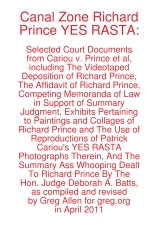
CZRPYR2 is a follow-on and indispensable primary source companion to Canal Zone Richard Prince YES RASTA, [above, available here], which contains the full transcript of Richard Prince’s incredible 7-hour deposition, as well as many key filings and exhibits from the first phase of Cariou v. Prince.
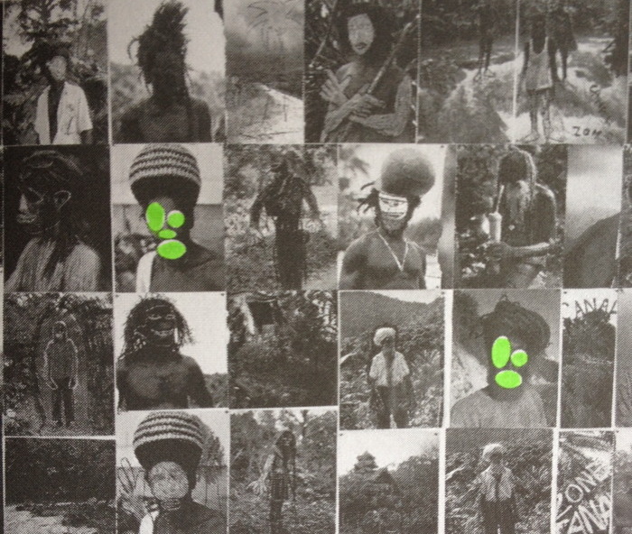
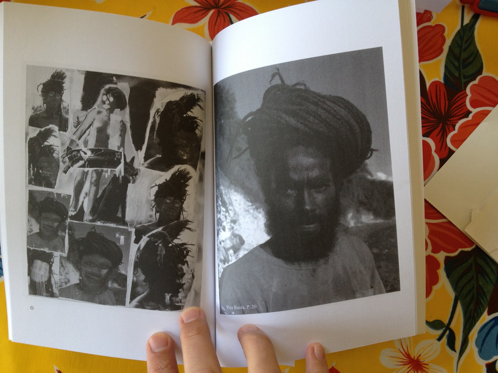
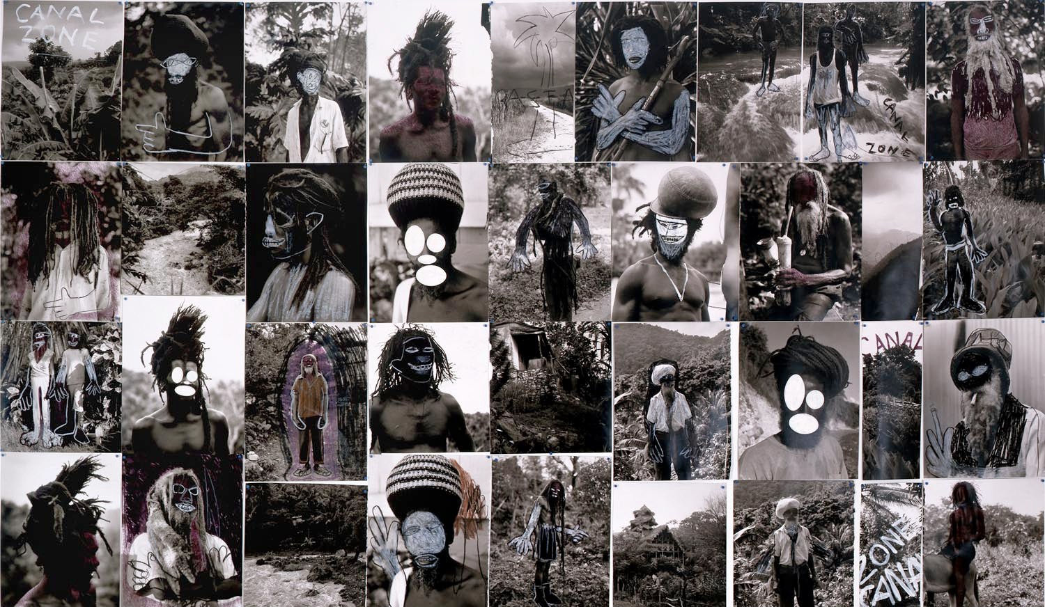
I wondered what you wondered: why not just add the Appeals Court decision to the original book? And if CZRPYR2 was only the decision itself, I might have done just that. Or not bothered with it at all. But then I found the beautiful Appendix the Court created for the decision, and I realized it deserved a permanent place in the history of the case, a book of its own.
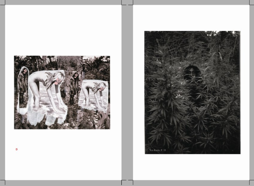
Following on Patrick Cariou & friend’s own slapdash effort, the Appeals court produced a high-quality, carefully cross-referenced catalogue of each use of Cariou’s YES RASTA images in Prince’s Canal Zone paintings. This indexing was the basis of the judges’ Solomonic decision to divide the Canal Zone series into 25 non-infringing works, and 5 infringing?-who-knows-let’s-look-again works. Where applicable, the Court added highlights to Cariou’s images, arguably creating yet another transformative work. And submitting it into the public record.
For this 142-page volume, I integrated the Court’s collections of Prince & Cariou images, to facilitate painting-by-painting review of Prince’s appropriations. And I annotated them for easier referencing. But otherwise the Court’s primary documents are preserved, with an eye to posterity, as they were prepared,
CZRPYR2 is in this way a salute to the Court’s own transformative, creative spirit.
Buy Canal Zone Richard Prince YES RASTA 2: The Appeals Court Decision in Cariou v. Prince, et al., Also The Court’s Complete Illustrated Appendix (142 pages, b&w, 6×9-in.) for $12.99 [createspace]
Buy Canal Zone Richard Prince YES RASTA: Selected Court Documents from Cariou v. Prince, et al for $17.99 [they can ship together, but I’ll probably only sell 2-vol. sets in person. Maybe on a blanket next to Central Park.]
Richard Prince’s Canal Zone Paintings: Now With 83% Less Infringiness!
Word is definitely out, but it’s nice to see that copyright insanity has taken a step back for now.
The US Appeals Court largely reversed the earlier court ruling against Richard Prince, finding that the US District Court erred in finding his Canal Zone series paintings infringed the copyrights of Patrick Cariou. Specifically, they said that Judge Deborah Batts used the wrong standard in determining infringement and rejecting fair use.
The Appeals Court judges declared that at least 25 of Prince’s paintings made obvious transformative use of Cariou’s photos. And after laying out a fairly expansive criteria for fair use, it ordered the court to re-review the other five Canal Zone works for infringiness. [That list includes Graduation (inaccurately reproduced below), Meditation (with the dude on the donkey), Charlie Company, Canal Zone (2008), and Canal Zone (2007) (above, which is actually collage, paint on book pages fixed onto a board, which was not in the Gagosian show or the catalogue; it was only shown in St. Barth’s. So why is it even covered by US law? Was it even made in the US? Is it even in the US? Is it impounded with the rest of the Canal Zone works? If so, WHY?]
In addition to citing previously unmentioned quotes from Richard Prince’s own deposition, the judges said that Prince’s intentions, or the unstated lack thereof, were not necessarily required to decide if something is fair use. Fair use can be in the eye of the beholder, specifically the “reasonable observer.” This seems both obvious, and slightly amazing to me. It also jibes pretty well with the amicus brief filed in the appeal by the Warhol Foundation.
It also means that fair use is not dependent solely on an artist making an explicit case for it. If Prince’s refusal to articulate a Koons-scale structure of critique and commentary is not required to appropriate something into your artwork, that would fortify a fair use defense. Rather than discuss art on the law’s terms, Prince has pulled the law toward considering art on its own terms.
Another fascinating aspect of the decision–and by fascinating, I mean obvious and totally in agreement with me–is the court’s emphasis on the changes in size, format, and process between Cariou’s book pages and Prince’s giant inkjet/collage/paintings. [cf this discussion of scale recently] The court went so far as to create its own reference work, similar to the distorted exhibit Cariou entered, but clearer, documenting each painting and the Cariou images and fragments used in it. It’s really nice, and would be very handy for anyone wishing to make their own Canal Zone paintings. Ahem.
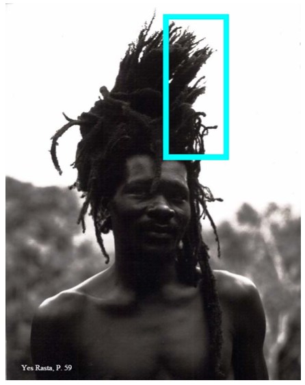
Study for Untitled (After YES RASTA, p. 59), 2013
Anyway, there is more to come, including possibly a new round of evidence and testimony about Cariou’s photos and their appearance and alteration in Prince’s work. Or perhaps someone’ll try to settle. Cariou’s lawyer’s on contingency, I believe, and 40% of nothing is nothing. So who knows how this thing ends. After more than two years since the first cluster)($#%k of a decision, though, today’s gotta be something of a relief for Team Prince.
Here, btw, is a roundup of previous Cariou v. Prince posts, including readings, reviews, and info about the book I made, Canal Zone Richard Prince YES RASTA: Selected Court Documents from Cariou v. Prince, which contains the transcript from Prince’s amazing 7-hour deposition in the case:
Early days of THE BOOK:
the five most ridiculous things about the Richard Prince copyright decision
The Richard Prince decision? You’re soaking in it!
Richard Prince’s Spiritual America
Size Matters?
Actual found blurb: “THE WITNESS: This could be a cool book.”
Introducing: Canal Zone Richard Prince YES RASTA: The Book
More documents from the case, like:
The Movie Pitch that started Canal Zone: “The Movie is called ‘Eden Rock'”
The great Amicus brief filed by the Warhol Foundation
Some CZRPYR reviews and events:
Canal Zone YES RASTA &c. reviewed in The Brooklyn Rail
HOLY SMOKES REVIEW at the Poetry Foundation by Kenneth Goldsmith, which is really humbling and amazing
Apr 2012: CZRPYR included in “Canceled,” curated by Lauren van Haaften-Schick, at the Center for Book Arts
Sept 2012: Audio & coverage of a Printed Matter talk with Joy Garnett and Chris Habib where we actually discussed and looked at Prince’s paintings, which almost never happens.
Looking a bit at the amazing language of depositions, in relation to the live staging of the deposition we did for AFC.
A great discussion of a a WTF image: Virginia Rutledge and Penelope Umbrico talking copies
Buy Canal Zone Richard Prince YES RASTA: Selected Court Documents from Cariou v. Prince online, or in person at Printed Matter.
The Offices of Fend, Fitzgibbon, Holzer, Nadin, Prince & Winters
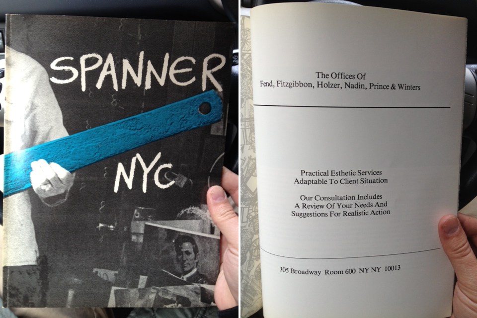
A couple of weeks ago at Printed Matter I found copies of Spanner NYC, an arts magazine published in 1979-80 by Colab folks including Dick Miller & Terese Slotkin. In the back of the third/blue issue was a full page ad from “The Offices of Fend, Fitzgibbon, Holzer, Nadin, Prince & Winters,” offering their “practical esthetic services adaptable to client situation.”
There’ve been a ton of shows related to Colab recently, and I’d known The Offices at least by name, or as a line in a few peoples’ CVs. As the recent creator of a corporate entity designed to operate in the art world, though, I guess I’ve been newly sensitized to such ventures. And I realized I had no idea what, if anything, The Offices actually did.
So first, the basics. The Offices seems to have been a conceptually driven, services-based, artist collaborative run on the ad agency or consultancy model. Which might be considered alongside corporate experiments like N.E. Thing, Co in Canada; Art & Language in the UK, that other UK group that infiltrated companies all over, which I can’t remember the generic name; and even the art-as-professional service work of Michael Asher. Or maybe it’s a failed utopic version of a massive sellout operation like Takashi Murakami’s Kaikai Kiki, Ltd.
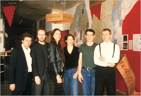
The Offices sounds like it was an outgrowth of Colab, or at least created by artists involved in Colab. Peter Fend called it a “spinoff.” Here’s a photo from, perhaps, a board meeting, with all the name partners: [l to r] Robin Winters, Richard Prince, Jenny Holzer, Coleen Fitzgibbon Peter Fend, and Peter Nadin.
Actually, it could be at Peter Nadin Gallery, the artist’s studio transformed into an accretive exhibition space with Chris d’Arcangelo and Neil Lawson, where artists created work in response to the space and what had been made & shown there before. That continued for eight months from 1978-9, ending with a memorial show to mark d’Arcangelo’s death.
Or maybe it is the show on ecologically optimizing North America’s political and economic systems by reorganizing boundaries around its saltwater marsh basins. That show included work, a poster, by Fend and Holzer. I would have pegged Fend for the instigator of The Offices, but in telling the story of the basins project, Political Economies After Oil, he writes that Holzer “asked Fend to join her in a six-person artist team intent on “functional” projects.”
Continue reading “The Offices of Fend, Fitzgibbon, Holzer, Nadin, Prince & Winters”