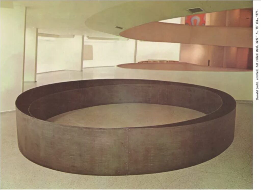
Donald Judd, Untitled, 1971, 32 3/4 in. x 15 ft diameter, hot rolled steel, as installed at the Guggenheim International, via artforum
Donald Judd was extremely critical of the Guggenheim for, among many things, not buying art from him and other artists over the years. In 1990, around the time of the Guggenheim’s controversial acquisition of works from Giuseppe Panza, Judd wrote about participating in the Guggenheim International:
The one time that I’ve been involved with the Guggenheim is that for one mass exhibition I made a circular work of steel for the ramp in an attempt to deal with and acknowledge F.L. Wright’s architecture, which the museum itself is now desecrating, meanwhile, contrarily, expanding north and overseas. Despite my warning, this work was sold over a summer by Joe Helman to someone in St. Louis, who in passing on, passed it along to the Guggenheim, which evidently concluded that the work and the owner should remain together and stored it outdoors to irreparably rust. Years went by. Then last year Diane Waldman wrote that the museum wanted me to remake the piece. Well, the museum destroyed a work of art. Should the artist make good? I don’t want to have my work in Count (1940) Giuseppe Panza di Biumo’s Collection in the Guggenheim Museum and in its corporate departments of mass MOCA, Salzburg and Venice. I don’t share the attitudes back of this kind of behavior.
The 15-ft diameter work, above, comprised two concentric circles of steel. The inner one was of uniform height. The base of the outer circle matched the 3% grade of the Guggenheim’s ramp, and so the top appeared to be level. This discrepancy created an interesting tension and instability, even in an old photo. This image ran in an issue of Artforum with Richard Serra’s similarly round, steel, and site-specific work embedded in the pavement on 183rd St in the Bronx, on the cover. [Serra made it for the 1971 Whitney Annual.]
And besides the torqued ellipses, obviously, Judd’s sloped work also reminded me of a steel wedge Serra made for a ramp in what used to be a loading dock at Gagosian’s 24th St space. And the whole point of mentioning it here is that leaving the work outside to rot and then assuming the artist will remake it for you is almost exactly what happened with Cady Noland’s Log Cabin.
This circular Judd is not on the Guggenheim’s collection list at the moment.
The OVR’s only text, from a 2010 essay by Anthony Huberman, links these works to Kassay’s silvery, electroplated and singed paintings which lit up the art market’s way out of the global financial crisis. But there is also silvery runoff and splatter on the floating cedar frames. Which would mean Kassay was dipping the whole framed objects in his electroplating bath? It reminded me of Rauschenberg’s order, “DO NOT REMOVE…FRAME IS PART OF DRAWING.” written in all caps on the back of Erased deKooning Drawing. If that were the wildest discovery in this virtual show, it would have been enough.
20210104_JRose_Princeton_060-scaled-2-1024×682.jpg via Galerie Greta Meert
But there was also this completely other mystery:
It’s an overpainted photograph that appears to be a study for a mural [?] at Princeton. The extensive caption reads: “Jacob Kassay, Princeton Charlie (studies for the removal of Woodrow Wilson mural), 2018, paint on photograph Washington Post article, Princeton to remove ‘overly celebratory’ mural of Woodrow Wilson, Mary Hui and Susan Svrluga, April 27, 2016: https://www.washingtonpost.com/news/grade-point/wp/2016/04/27/princeton-to-remove-overly-celebratory-mural-of-woodrow-wilson.” To the dates, 2016 and 2018, the jpg filename adds 2021, for a study shown in 2023.
A seven-year span of events, yet I could find no image of the completed mural. Or even a mention. Or any confirmation that it even is a mural.
OK, I guess it’s clear I was not paying close enough attention when I posted about Ellsworth Kelly’s Red Floor Panel (1992) in 2022. I recognized that Kelly made five floor works. They began in 1990, Matthew Marks wrote, with Yellow Curve, for Portikus and were followed by “two in black, one in blue, and this one in red.” I’d assumed that Glenstone purchased Yellow Curve (1990), but of course, it was later made clear that Kelly did not recreate Portikus’ Yellow Curve, but made it anew as an autonomous work, Yellow Curve (EK 808), 2015, for an identically dimensioned—and purpose-built—space. Which means technically, Kelly made six.
Ellsworth Kelly, Black Curves, 2011, installed at Haus der Kunst, photo: Wilfried Petzi
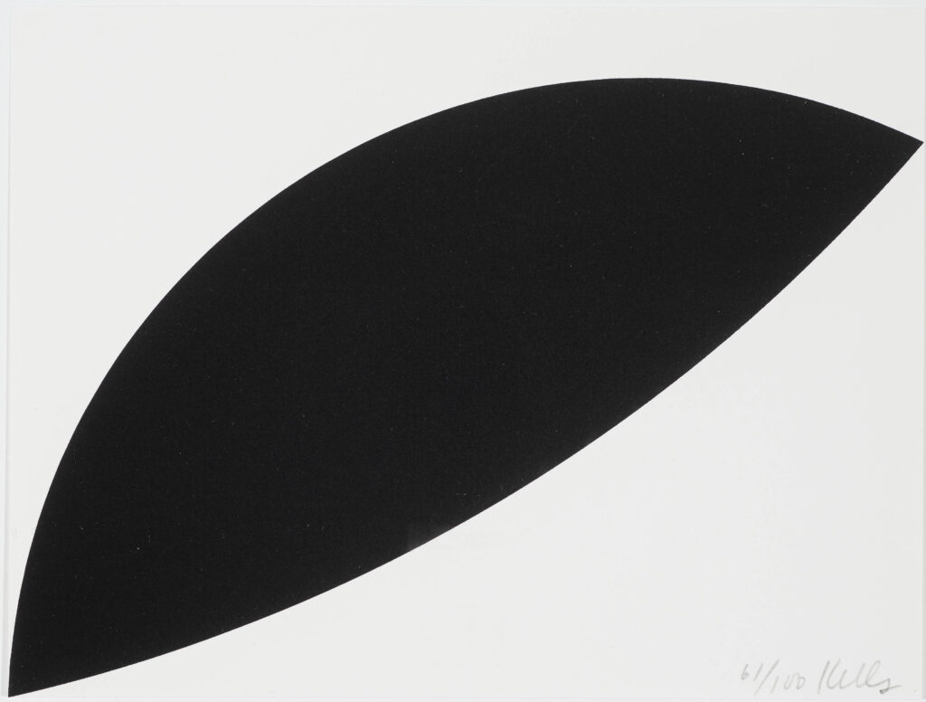
Red Floor Panel was reconstitutable and not site-specific, and Yellow Curve was not. Which are two potential conditions a floor piece can have. And now while researching Kelly’s 1955 painting Bar, I surfed across the 2011 exhibition, Ellsworth Kelly: Black & White at Haus der Kunst in Münich. For this venue Kelly was commissioned to create a floor panel the Haus called Black Curves [though Artforum called it Two Curves For Floor]. This panel extended 11 meters across a bay of the museum, and was destroyed when the show moved to Wiesbaden.
Ellsworth Kelly, Black Curves, 2011, lithograph, 197 x 261 mm, ed. 100, this ex. 61/100, sold at Neumister, was flipped upside down for schematic effect
It lives now only in proportion, memorialized in the diminutive fundraising edition created for the exhibition. Though with the dimensions and the plan, it feels ripe for recreating; all you need is a space with an 11m hypotenuse.
Ellsworth Kelly wore khakis: 1956 photo in his Broad Street studio, by Onni Saari via IG
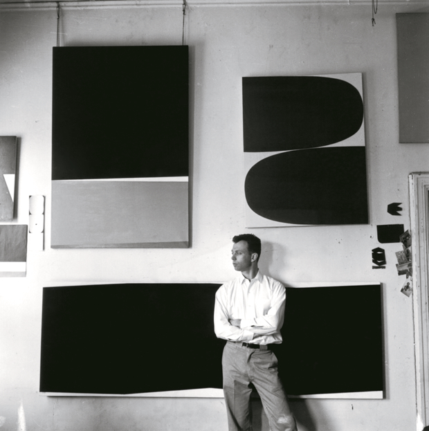
Last April during the centennial year of the artist’s birth, photographer Onni Saari posted a 1956 image to Instagram of Ellsworth Kelly in his studio on Broad Street in lower Manhattan. In addition to some tantalizing little works on paper and images stuck into the door frame, three paintings are visible behind him. Counter-clockwise from the bottom they are, Bar (EK87), Red Curves (EK81), and Marblehead (EK IDK?)
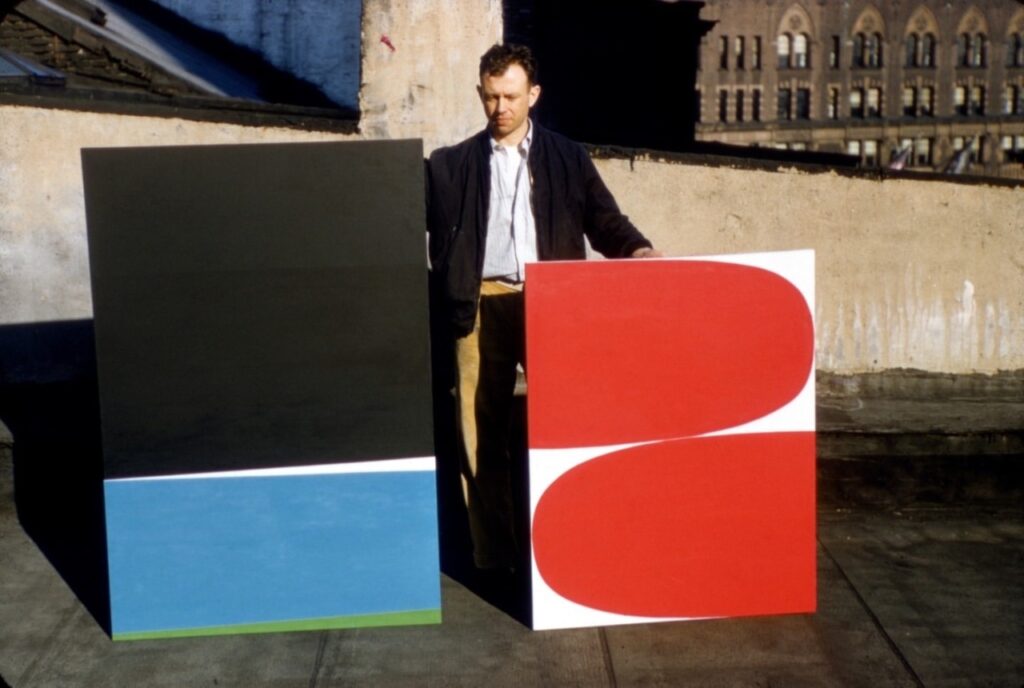
Ellsworth Kelly posing in 1955 with Marblehead (left, est 60×40 in. destroyed 1995) and Red Curves (right, 45×35 in.), photo: IG/ellsworthkellystudio via kundst and voorwerk
In November 2023, the Ellsworth Kelly Foundation posted this 1955 photo of the artist posing with Marblehead and Red Curves on his Broad St rooftop. The caption read, “Ellsworth considered Red Curves to be an epiphany of sorts, leading to many more curves, though the same cannot be said for Marblehead. The black, pulsing blue, and irregular bands made it a favorite with a Betty Parsons dealer [sic], but Ellsworth’s dislike of the composition was so strong that he destroyed it in 1995. ‘One I never cared for,’ a scrupulous Ellsworth wrote in his notes.”
The circumstances around Kelly’s decision to destroy Marblehead after 40 years intrigue me, but in writing this post, I have run out of time to get to the catalogue raisonné to find out what happened.
On my first speedrun through the catalogue raisonné for Cy Twombly’s sculpture, I was interested to see some early lost sculptures I’d never seen discussed anywhere else. There was also an object described as a fragment of an early sculpture. And there were sections of damaged and rejected works, mostly unsatisfactory bronze casts.
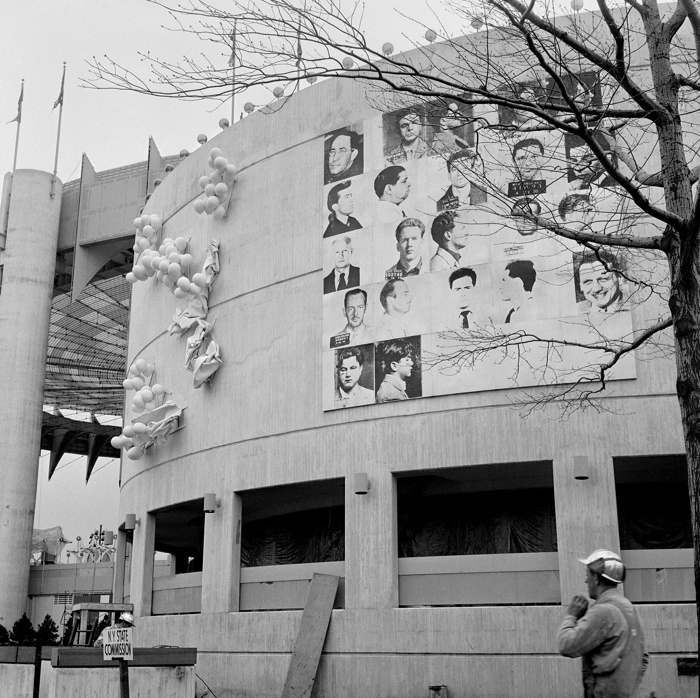
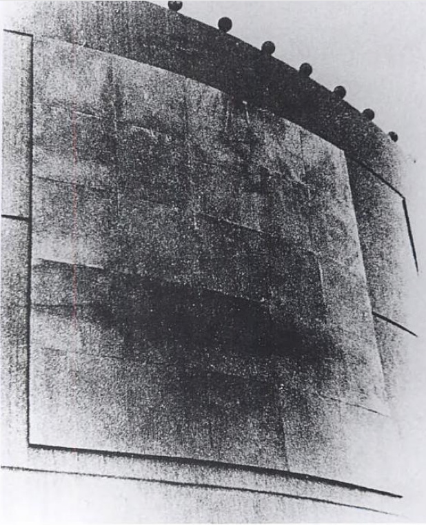
April 15, 1964, publicity photo of Thirteen Most Wanted Men released by the World’s Fair
This morning Michael Lobel brought some art historically significant mug shots to the social media discourse, including one of my long-time favorites, Andy Warhol’s Thirteen Most Wanted Men, a grid of 22 mug shots mounted on the facade of the New York State Pavilion Theaterama at the 1964 World’s Fair. Within two days of its unveiling, the work drew complaints from officials, and the 25 panels were painted over with silver aluminum paint.
It seemed so bold and promising. Bettmann dates the release to the press of the image above to April 15, 1964. The original caption gives the piece a different title, but it also had World’s Fair officials—and Johnson—on record explaining and promoting Warhol’s project—for one day:
A Place at the Fair. Flushing Meadow, N.Y.: Photos of New York City’s 13 Most Wanted Criminals -resplendent in all their scars, cauliflower ears and other appurtenances of their trade, unabashedly adorn masonite facade of the New York State Pavilion at the World’s Fair. The display an arrangement of official Police Department “mug shots,” forms a 20×20 foot mural mounted on the pavilion. Philip Johnson, a designer of the pavilion, said the mural is “a comment on the sociological factor of American life.”
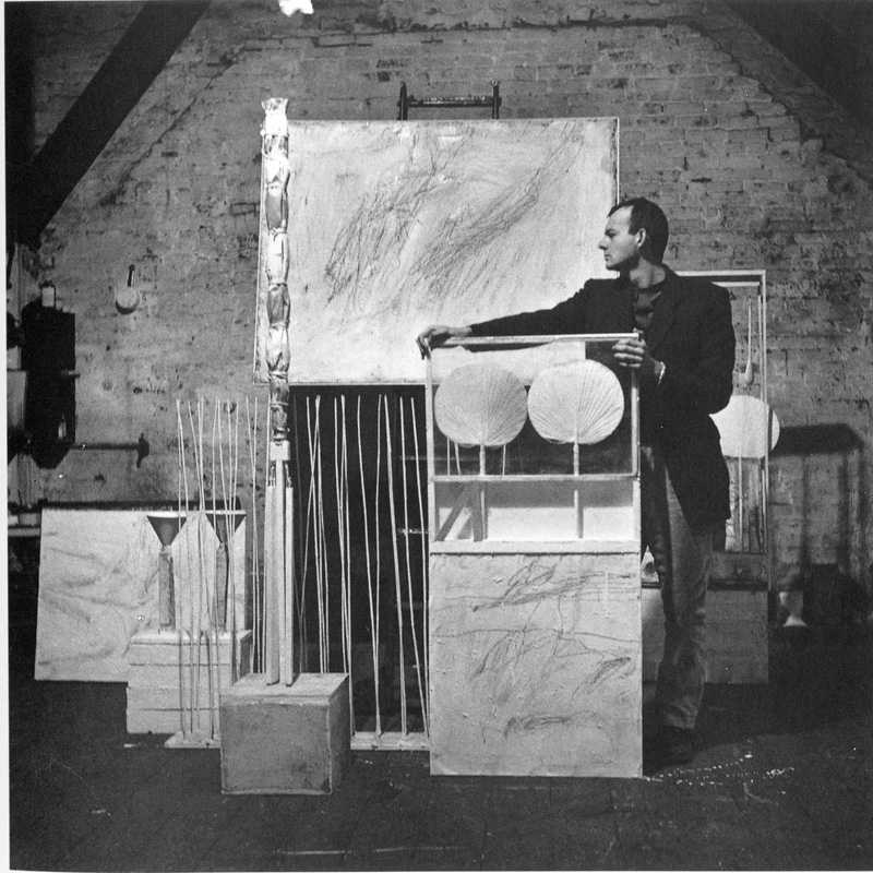
if there were a lime green python in this funerary box, what’d it look like? a speculation on a 1954 Robert Rauschenberg photo of Cy Twombly and his work in their Fulton St studio, image via RRF
In Spring 1953, after our boys got back from Morocco and Italy, Robert Rauschenberg and Cy Twombly set up a little place on Fulton Street. They spend a year making work and posing for each other. In 1954 Rauschenberg took several photos of Twombly with his paintings and sculptures, almost all of which are lost or destroyed, except for one, the one on the right, above, with the fans, Untitled (Funerary Box for a Lime Green Python).
Claudio Santambrogio emailed a funny reminder of it after seeing the Underground Projection Room For Snakes study I posted last night. So I made a little rendering of what it might be like for the python (RIP).
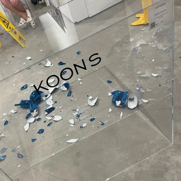
a photo from the gallery that shows loose porcelain tchotchkes on concrete floors, via damon k
A woman knocked a chihuahua-sized Jeff Koons porcelain balloon dog off its unsecured plexi pedestal, and it shattered against the concrete floor.
The dog was made in 2021 in an edition of 799 plus 50 AP by Bernardaud, Limoges. One was flipped last April at Christie’s. I don’t really care right now where this happened, or why, or who was involved. I’m just glad for an occasion to hear Meryl Streep say, “My Limoges!”
[update: I’ve read a couple of stories and seen more headlines, and the eagerness to make cynical, uninformed, and clichéd takes is actually pretty impressive. The woman said she was a “collector” attending a “VIP preview” of an “art fair” ON A THURSDAY. The chain of galleries in whose Wynwood pop-up this happened has more locations than Gagosian, which they probably think about a lot. Meanwhile, despite having all the same Bernardaud in his shop, Larry’s never heard of them.]
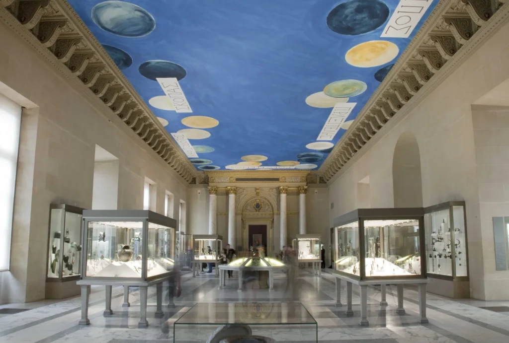
the Louvre’s Salle des Bronzes as it appeared from 1935 til 2021, with Cy Twombly’s The Ceiling, 2010
There is drama about the Cy Twombly ceiling in the Louvre.
In 2010 Cy Twombly painted a mural on the ceiling– In 2010, a Cy Twombly mural glued to the ceiling of a gallery at the Louvre was unveiled. The 11×30 meter painting is titled The Ceiling, or le Plafond, and it is installed in the Salle des Bronzes.
Even the catalogue essayist noticed that it didn’t look like a Twombly. Maybe because it was painted by assistants in a French studio arranged by Gagosian, after a sketch by the artist1. Twombly said the planet-looking circles against a blue sky are actually references to Greek shields on a background inspired by Giotto, Matisse, or a Japanese print. [Tho lol to a French critic, everything looks like a breast.] The gallery, once part of the 16th century royal apartments, has displayed Greek antiquities since Napoleon, but it contained neither shields nor works by any of the Greek sculptors namechecked on The Ceiling.
[THERE’S AN UPDATE: READ ON, THINGS ARE BETTER THAN I WOUND MYSELF UP TO THINKING.]
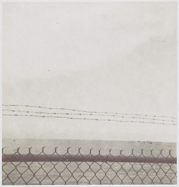
The earliest work by Felix Gonzalez-Torres in the Metropolitan Museum’s collection is also the smallest. It is untitled, an instant black & white photo of the sea through a Cuban fence. It’s about 2.75 inches square. It is signed and dated 1985, and has a fragment of a magazine collaged on the back that reads, “THE BO–/ ANYMORE.” By the time it was acquired at the end of 1996, the year of the artist’s death, the Met had already acquired two similar sets of photos by Gonzalez-Torres: photogravures of sand, and cloudscapes. Similar, but different: this one is not an artwork. “Although made, signed, and dated by the photographer,” the catalogue entry reads, “Gonzalez-Torres thought of works such as this [photo] as lying outside his core oeuvre.”
Published in 1997, just in time to record the Met’s acquisition, the Felix Gonzalez-Torres Catalogue Raisonée has three categories: Works, Additional Material, and Registered Non-Works. The photo above is in the second category. When the CR was released, Gonzalez-Torres was the most important artist in the world to me, and I wanted more of his works, not fewer. I was upset for these somehow downgraded works, and for the sleights they faced in the discourse, the gallery, the market. I couldn’t accept that the same artist who’d shown me that the most remarkable things could be art–a pile of candy, a stack of paper, a jigsaw puzzle, a pair of clocks–also said they couldn’t be.
My incredulity over Felix’s work fueled a years-long contest with the declarative process, what artists called objects, what they kept, what they destroyed. It helped me keep an eye out for these marginalized–and invisible, since there weren’t even any pictures–works. But even as I developed more nuanced appreciations of [other] artists’ agency, these non-art designations still gnawed at me. Until the other night, when I started writing this. It’s been almost 25 years: what’s going on?
A screenshot of Simon Watson’s photos of Nicola Del Roscio’s house in Gaeta, including a copy of a Picasso which Cy Twombly painted over one of his own works. image: nytimes.com
In 2015 T Magazine ran this feature on Nicola Del Roscio, Cy Twombly’s partner, studio assistant, and the head of the Twombly Foundation, and his house and palm tree garden in Gaeta. On the dining room wall was a copy of a Picasso which Twombly made, painted over one of his own works.
This instantly reminded me of the big Arts & Leisure profile that Twombly dutifully sat for when he had his 1994 MoMA retrospective, where the artist talked of the first painting he recalled making: a copy of a Picasso portrait of Marie-Therese Walter. I always understood this to have been in his teens, under the influence of his first art teacher/mentor, the Spanish painter Pierre Daura, who settled in the rural Virginia of his wife’s family in 1942.
In 1957 a sculptural ceiling and wall by Isamu Noguchi was installed in the lobby of 666 Fifth Avenue. The composition of undulating aluminum fins survived the purchase of the building by Jared Kushner, and the gutting and renovation of the Fifth Ave.-facing retail spaces. The wall was more dynamic than the ceiling, which was pretty subtle, but it all worked very nicely together.
But now the Noguchi Museum is reporting that the work has been removed and destroyed. The only bright spot is that the components were donated to the Museum. If anyone has a block-long elevator lobby that needs a space age drop ceiling, hit them up, I guess.
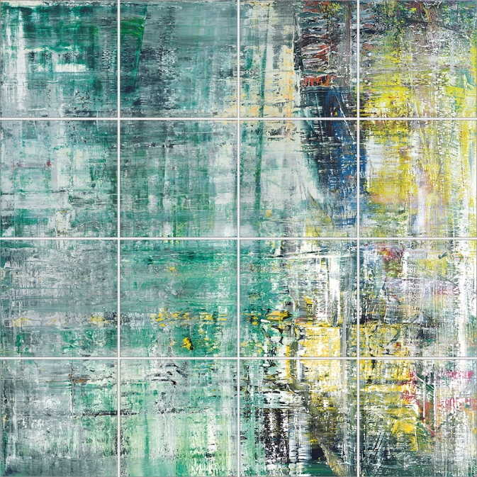
Gerhard Richter, Cage Grid I, 2011, 303 x 303 cm installed, 16 giclée prints mounted on aluminum panel, ed. 16+4AP
My old qualms about the capitalist reality of Gerhard Richter making photo copies of his greatest paintings were rendered quainter than the Geneva Convention by the introduction of an entirely new category, “facsimile objects.” These mass- and masterfully produced giclée prints, numbered and unsigned, and mounted on aluminum composite panels, are the creation of a print foundry founded by Joe Hage, Richter’s lawyer/collector/OG webmaster, Heni Productions.
Now known as Heni Editions, the firm makes stunning prints for other artists as well. [My favorite non-Richter Heni has to be their full-scale print of Hans Holbein’s the Younger’s The Ambassadors, published to benefit the National Gallery, which is still on my Christmas list.]
P12, “Annunciation After Titian,” 2015, facsimile object, 125x200cm, ed. 50+3AP
Heni got its start in 2011, when it made Cage Grid I, a giclée edition of Richter’s monumental squeegee painting Cage 6, divided into a 16-part grid. The panels were sold in the gift shop of the artist’s retrospective at Tate Modern, both as a set, and individually (as Cage Grid II).
Though facsimile objects initially seemed like they were designed to exist outside Richter’s art, they now appear alongside it. Gagosian included at least two facsimile objects–(P1) and (P12), above–in a Richter prints show earlier this year.
They’ve been installed in my head even longer. In 2016 for Chop Shop, a show where large-scale works were sliced up or parted out to order, I used this grid mode to create Destroyed Richter Grids, full-scale recreations of lost squeegee paintings.
Cage Print (P19-6), 2020, 100x100cm, Diasec-mounted giclée print on aluminum composite panel, ed. 200, image via Heni Leviathan.
Time being a flat circle, Heni has now announced the drop of Cage Prints (P19), facsimile objects in editions of 200 (each) of all six of Richter’s Cage paintings, but at 1/9th-scale, or 100×100 cm. Applications for purchase are currently being accepted (decisions are made on Dec. 6), though with no guarantee of Christmas delivery.
Untitled (Heni Cage Grid), 2020, 103 x 103 cm, Diasec-mounted giclée print on aluminum composite panel, in 16 25 x 25 cm parts, ed. 16+4AP
And so I, too, must, compelled by fate, announce a new work, Untitled (Heni Cage Grid), in which a Heni facsimile object of Cage 6 is cut into 16 pieces, each 25×25 cm. Like Richter’s Cage Grid I, it will be available in an edition of 16, plus 4AP. Each piece will be labeled and numbered, and a couple will include fragments of the original label. Some may be sold separately.
Unlike Heni, I can guarantee it will not be available before Christmas.
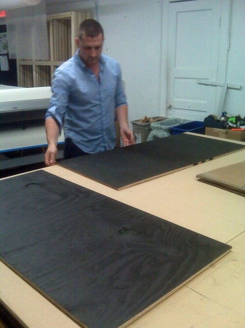
Gallerist Stephanie Theodore was there for the unveiling of Wade Guyton’s new election aftermath-themed windows at Bergdorf Goodman. Though it clearly feels like a scaled up version of his #monochrome-on-plywood 2008 edition for Parkett, it also references the matte-black-OSB sculptures he made in 1999, which have since been #destroyed [cf. Guyton OS, 13.]
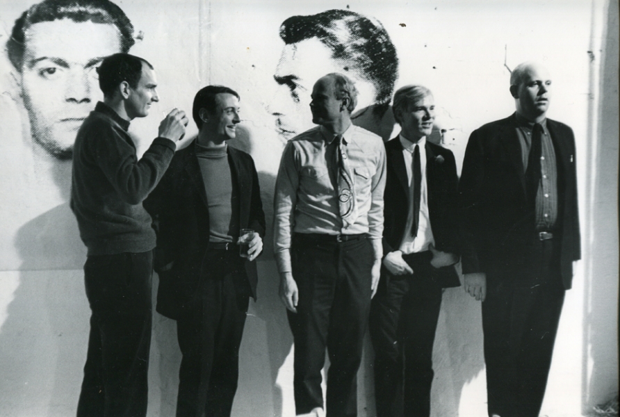
Fred W. McDarrah photo of artists at a party at Andy Warhol’s Factory, April 21, 1964. image: stevenkasher.com
Here is Fred McDarrah’s photo of Andy Warhol partying at the Factory on April 21, 1964, the night of the opening of his Brillo &c. boxes show at the Stable Gallery. The Sculls threw the party, even though it was at the Factory. That’s, from left, Tom Wesselman, Roy Lichtenstein, James Rosenquist, Warhol, and Claes Oldenburg. Behind them is a diptych of mugshots from Warhol’s New York Pavilion mural, Thirteen Most Wanted Men, which had been destroyed just days before this photo was taken, and before the World’s Fair even opened.
I’ve never been satisfied with explanations of why the mural was painted over with silver. But I blame pavilion architect, art curator, and unremorseful nazi Philip Johnson, who knew the subject–mugshots from an NYPD brochure–told Warhol to keep quiet about it, and then apparently caved within a day of the publication of a Fair preview by a Hearst-owned tabloid that criticized the mural as “Thugs at the Fair,” in which an NYPD spokesman questioned how Warhol had obtained these internal police documents.
On Friday, April 17, after two days of who knows what, Warhol sent an unsigned, one-sentence letter to the New York State Department of Public Works, Division of Architecture:
Gentlemen:
This serves to confirm that you are hereby authorized to paint over my mural in the New York State Pavilion in a color suitable to the architect.
The architect apparently decided silver was suitable. I think the Times ran this image on the 17th, so the letter was just ex-post-facto CYA. In the aftermath of the mural’s destruction, Warhol decorated his party with images from the project he’d worked on for almost a year and a half. The dates are otherwise unclear, and I haven’t read The Biography*, but Warhol had moved into the Factory in November 1963, and maybe it was painted silver by April, too.
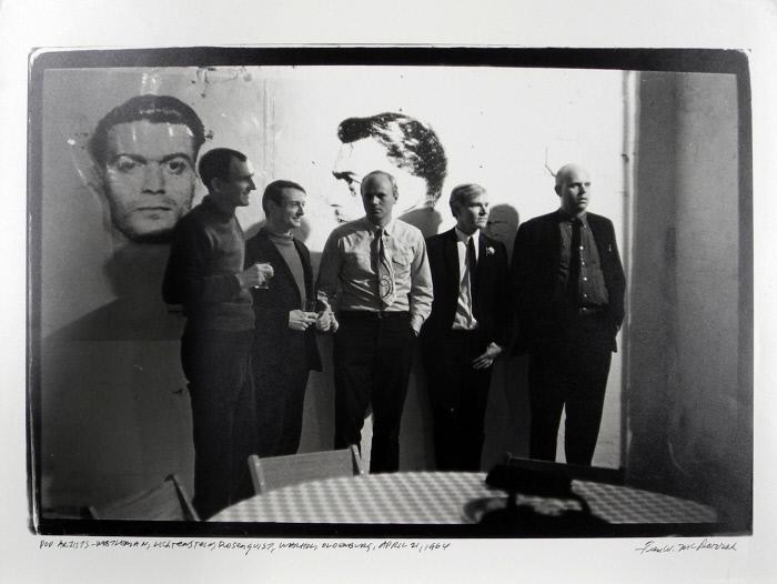
Print of a Fred McDarrah photo of Warhol’s Factory Party, Apr, 21 1964, in the collection of the Nasher Museum
But the images are reversed. [This perp is center right on the mural.] And it looks like a double register. This other McDarrah photo from a second earlier, a print of which is in the collection of the Nasher Museum, shows light reflecting off the mugshots. These are not double-printed outtakes, but the full-scale transparencies used to make the screens, casting shadows on the wall behind them. These ghosts of the mural destroyed just a couple of days before were now decoration for Warhol’s party.
unsold boxes and rejected Moses portraits in a summer 1964 photo from Mark Lancaster
Almost three months later, the Times is still on it, and Warhol feels the need to say the mural was painted over because one guy was pardoned, and so it’s not valid anymore, and he’s working on inspiration for a replacement. That was in July, when he went to the trouble of making 25 panel portraits of World’s Fair commissioner Robert Moses, which were rejected in some paper trail-less way. And which cannot be random; did Philip Johnson pin the blame on Moses? Another, much later conversation used to explain the destruction had Henry Geldzahler and Johnson citing Nelson Rockefeller’s fears of offending Italian American voters in an election year. If that was his choice, between Rockefeller and Warhol, is there any question which way Johnson would go? When the chips were down, Johnson loved power more than art, and he threw Warhol and his rough trade artwork under the bus of New York politics.
Anyway, I now think more about how this must have sucked for Warhol, who spent so much time before–and after–having to destroy his biggest project to date. Not sure what to do with my sympathy for him, except to recommit to bringing his destroyed mural panels back into existence.
Update: Blake kindly shared the section of his Warhol biography dealing with the mural [my copy is inaccessible atm in storage], and basically all this is in there and more, including: the newspaper column by the highly influential Jimmy Breslin singling out the mural for Archie Bunker-grade criticism basically as soon as it went up; a fierce anti-gay crackdown across the city in the run-up to the Fair; the menu for Wynn Chamberlain and Warhol’s dinner where the most wanted idea came from; and so much more. Thanks!
Update a month later: and I found my copy of Larissa Harris’s exhibition catalogue, and slowed down to read it, and of course, it’s all in there, too.