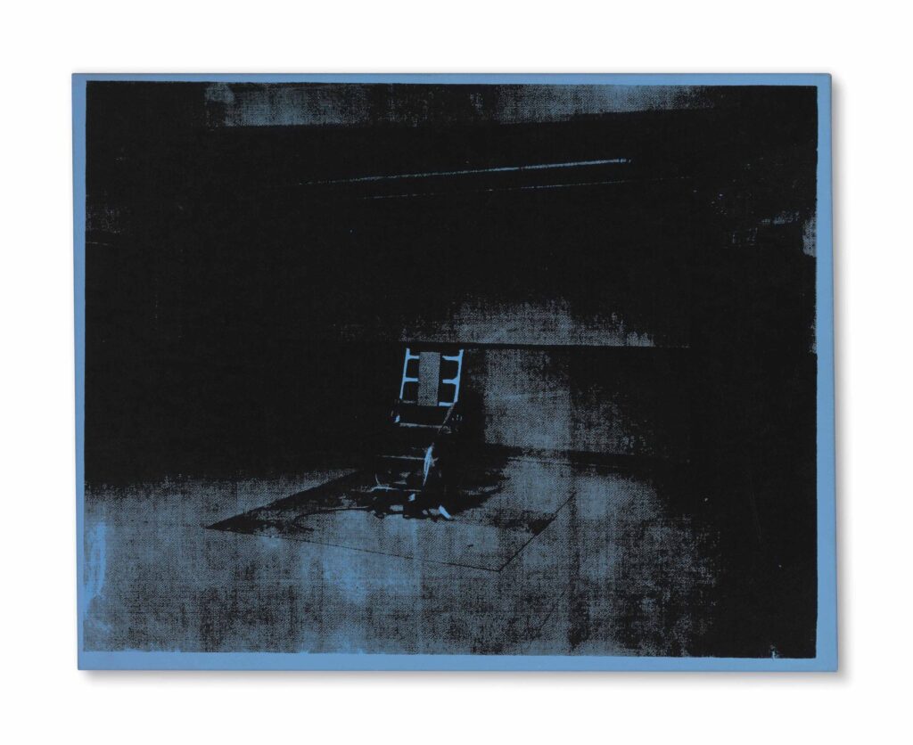
Andy Warhol, Little Electric Chair, 1964-65, oil and silkscreen on linen, 22 x 28 in., acquired by Cy Twombly and sold by his Foundation in 2014
The electric chair paintings are some of Warhol’s absolute best, but the little blue electric chair owned by Cy Twombly is a standout. The Christie’s lot description for the Twombly Foundation’s unloading of the painting extols this specific painting’s heavily inked contrast:
Housed for many years in the private collection of the artist Cy Twombly, it was this divergence between shadow and light that attracted the artist to this particular painting—an admiration bolstered by his understanding of chiaroscuro gained from his detailed study of Italian Renaissance painting undertaken during his time in his adopted homeland.
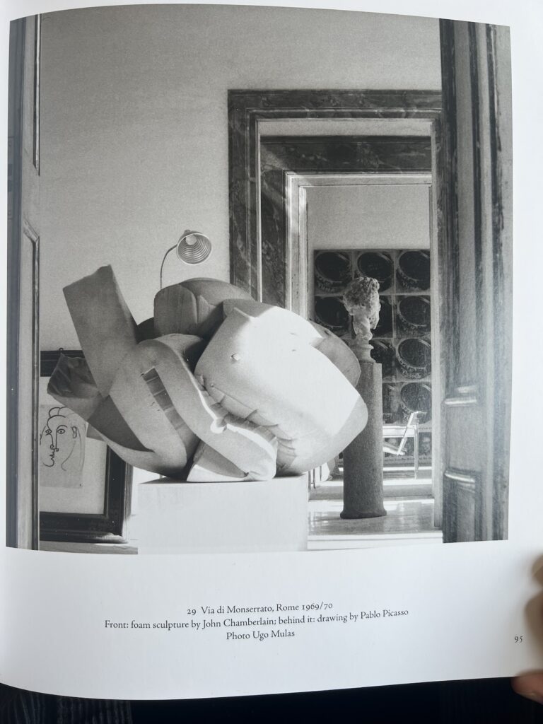
I totally forgot that there was a huge Warhol Tunafish Disaster painting in the background of Ugo Mulas’s photo of a massive John Chamberlain foam sculpture at the Franchetti-Twombly palazzo. I feel like a more systematic look is called for.
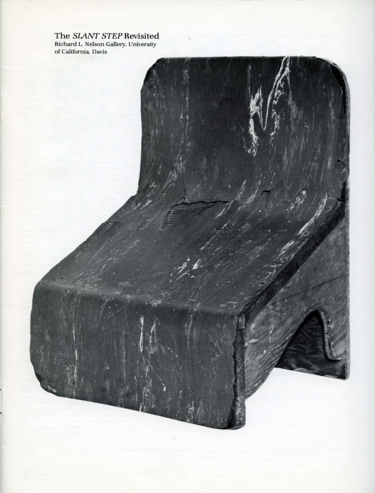
It’s been told and retold enough that even if you’ve somehow never heard it or seen its inspiration, it’s clear that several generations of artists ascribe to the Slant Step Theory of post-minimalist and conceptual sculpture: In 1965 William T. Wiley bought a plywood & linoleum stool with a steeply slanted seat at a Bay Area thrift shop. Installed in the studio of his student at UC Davis, Bruce Nauman, the Slant Step’s nonfunctional mystery and alluring form made it an aesthetic fetish object. It inspired at least two shows in the 1960s and several more since. It got passed around, stolen and rescued, surviving as an intentionally absurd teaching prompt until it entered the collection of UC Davis’s museum.
As far as I can tell, the first time it was publicly recognized as a stool for helping you squat on the toilet and take a better shit was only in 2014, well into the Squatty Potty era. Even so, it’s not clear that later showshave addressed this fundamental reinterpretation of an enigmatic totem as a highly specific, utilitarian, biological tool.
It reminds me of the novel-for-some-mundane-for-others theory of paleolithic tally sticks as lunar or menstrual calendars. And of Ursula K. Leguin’s Carrier Bag Theory of Fiction, where human experience can be understood through narratives other than violence and conflict, and motives other than competition, killing, or subjugation. The Slant Step Theory may be similarly narrow and incomplete. It’s not a mystery; it’s just you.
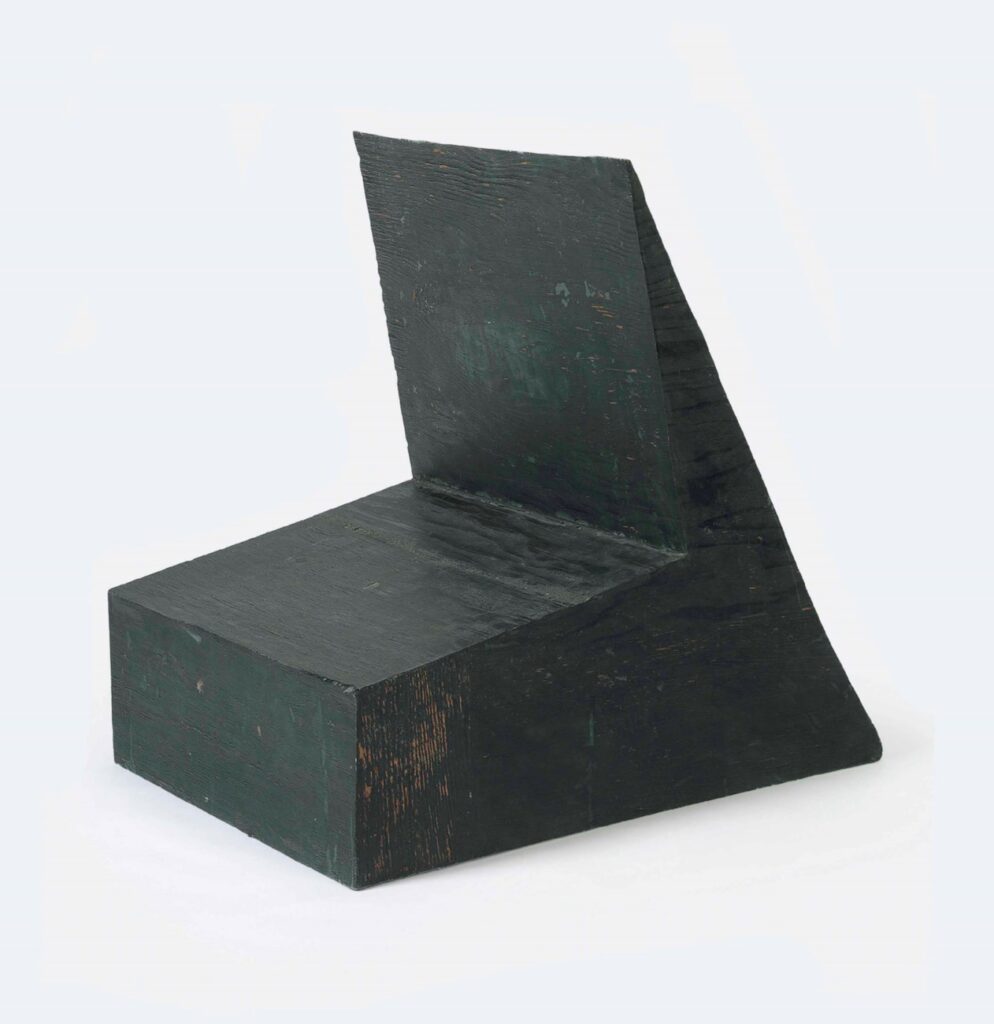
Bruce Nauman, Device to Hold a Box at a Slight Angle, 1966, fiberglass and polyester resin, 29 5/8 x 23 1/2 x 30 in., acquired by Cy Twombly in 1969, and sold by the Foundation in 2014
Nauman made Device to hold a box at a slight angle in 1966, with the Slant Step in his studio. It had already been shown twice before Philip Johnson’s partner David Whitney curated it into Nauman’s first show at Castelli in 1968. It went from there to documenta 4, and when it came back, Cy Twombly bought it, in 1969.
The Cy Twombly Foundation sold it in 2014. What happened to it in those 45 years? I don’t know of any photo of Twombly interiors in which Nauman’s Device appears. Did Twombly study it? Contemplate it? Respond to it? Store it away? If a revision of the Slant Step History of contemporary sculpture is in order, who knows what might be learned by tracing Twombly’s connections to and from this Nauman he kept for so long?
At one point in my life I decided instead of just normal engraved stationery, I wanted a watermark. So I went to Mrs John L. Strong, and sat down with Mrs Lewis. Mrs John L. Strong has its own watermark, so surely they would know a paper mill that could accommodate my plan, I suggested. Mrs Lewis explained very tactfully, in as positive and genteel a way as possible, that no. Mrs Strong would certainly be able to help design a beautiful paper that evoked the subtlety of a watermark. I was glad to hear it, that we would be able to produce a paper with a watermark.
She said, “What part of ‘no’ did you not understand?” only it was the Vanderbilts’ stationer on Madison, so it came out like, “It’s interesting when two people have a conversation about the same thing, how they understand it differently.”
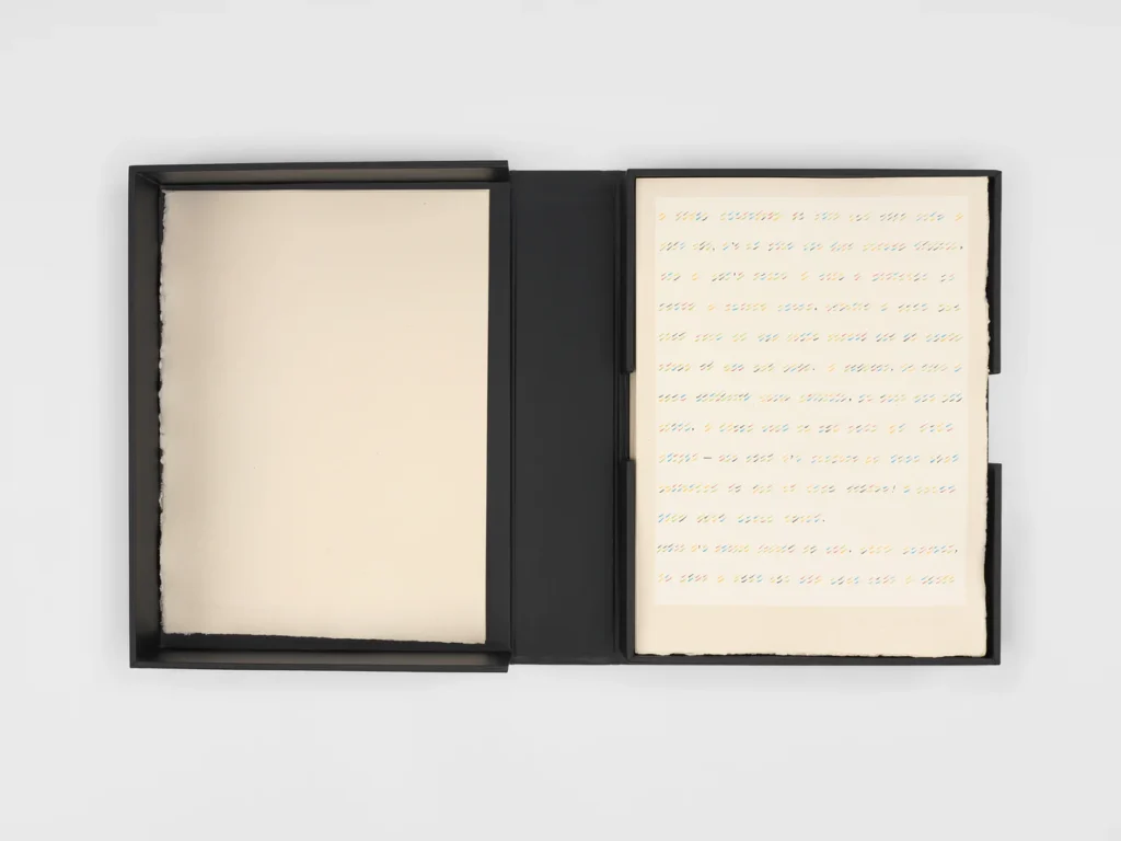
Zooming in, zooming in, where is the Twombly watermark on these CODES prints at Yvon Lambert
The point is, yesterday I read that in 1996, not so far from the time I was pursuing my watermark, Yvon Lambert published On Kawara’s CODES in an edition of 150 “on 180gr/m2 pure rag paper made especially for the book by the Moulin de Fleurac* and watermarked by Cy Twombly.” And I realized I’d been doing it wrong. But to know how wrong, I needed to figure out wtf is going on with why Cy Twombly is making and watermark paper for On Kawara.
He did not, and it was not. The listing for CODESin the Bibliothèques de Paris clarifies: “Chaque feuille porte la signature d’Yvon Lambert en filigrane (réalisé par Cy Twombly)” So the watermark is Lambert’s, as written by Twombly.
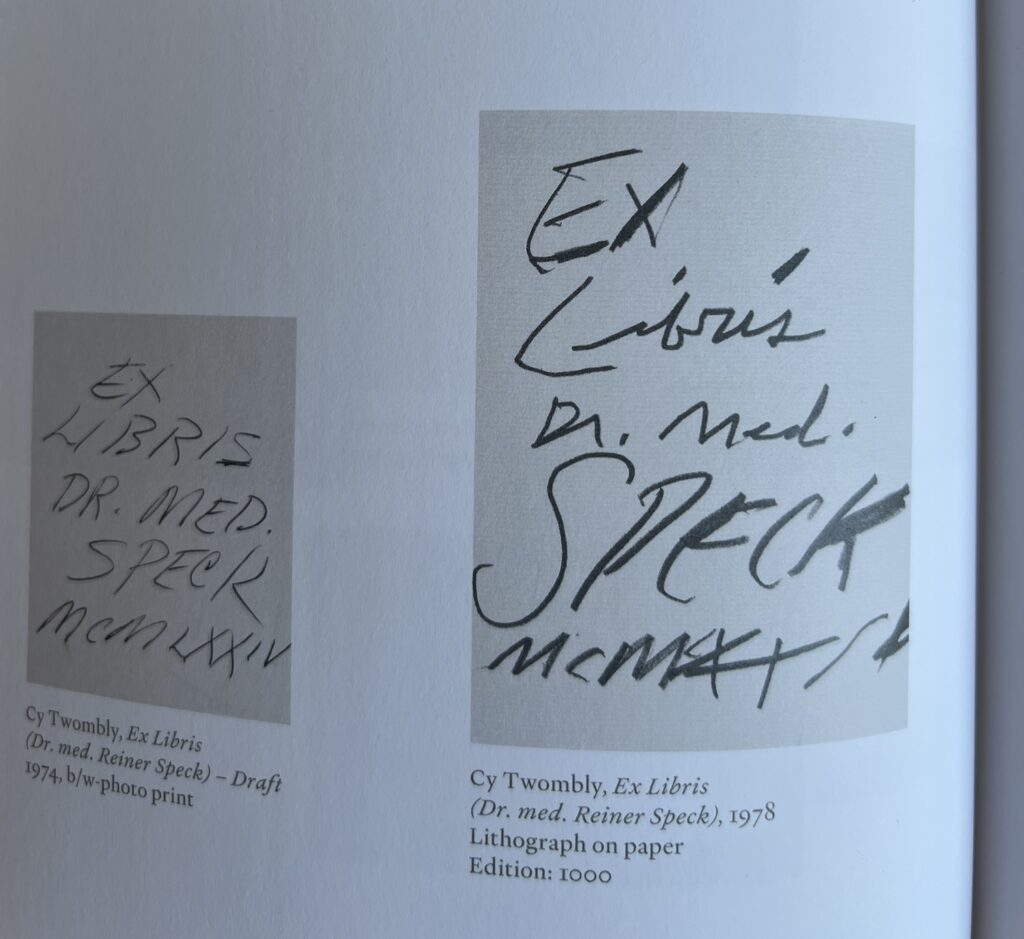
And Twombly also made his bookplate. So far I can find images of neither. But we do have two versions, four years apart, of Twombly’s ex libris for Dr. Reiner Speck, courtesy of Dr. Speck’s show of Twomblyphemera at Maison d’Art.
Cy Twombly Ex Libris draft, 1974, and Ex Libris, 1978, ed. 1000? via Maison d’Art’s catalogue for Fragments of an Adoration
Do I need to check the prints CR to get a full bookplate inventory? Is a watermark a print, a drawing, or a sculpture?
*Lambert’s choice of mill for his small batch watermark paper is instructive. He did not ask Arches. Though Moulin de Fleurac sounds prized, specific, and ancient, it only started in the 1970s.
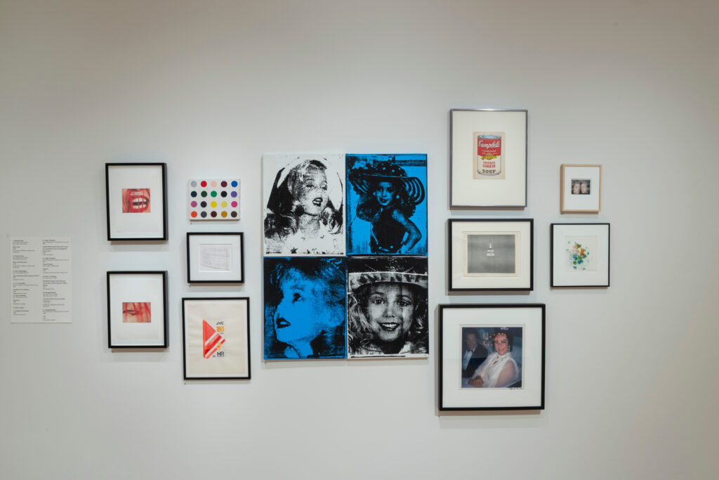
Installation view from Coming Attractions: The John Waters Collection, a 2022-23 exhibition of promised gifts at the Baltimore Museum of Art
Yesterday Eric Doeringer posted his discovery of his bootleg Damien Hirst spot painting among the works John Waters has promised to the Baltimore Museum of Art. It was on view at the museum in 2022-23 in a selection—curated by Catherine Opie and Jack Pierson—from nearly 400 works from Waters’ collection. It hung next to a Warhol Jackie-style grid of Jonbenet Ramsay portraits by Eric Luken. While being perfect objects on their own terms, these two works help situate Waters in the place, moment, and discourse of art. For the Doeringer, that was on the mean streets of early 2000s Chelsea. For the Luken, that was probably an emerging art fair. [His only show (so far?) was with Joel Mesler & Daniel Hug’s short-lived LA gallery that rode the 2000s art fair wave.]
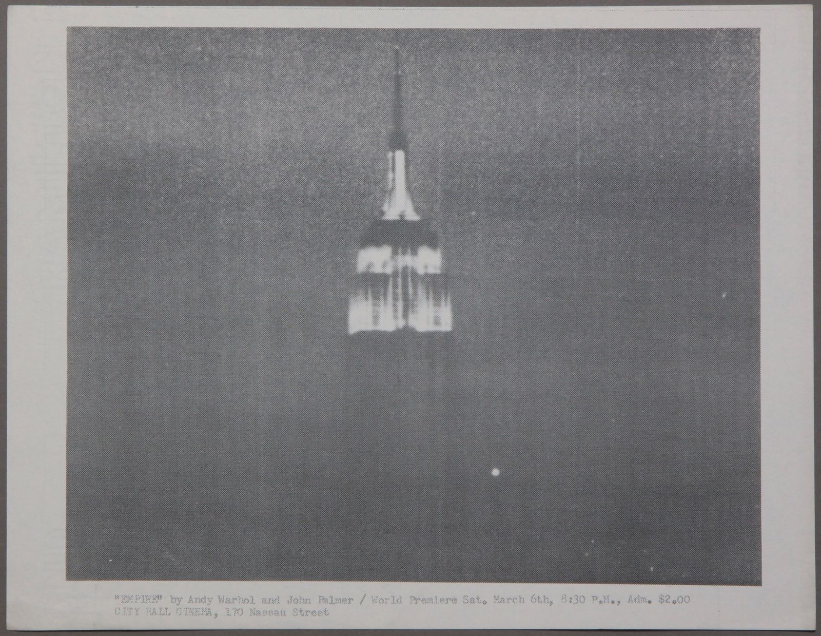
Speaking of short-lived collabs you never hear about, Waters also has the best/only thing you can really collect from one of the greatest artworks of the 20th century: a flyer made by Jonas Mekas for the world premiere of EMPIRE (1964), by Andy Warhol and John Palmer.
If you think I’m leading with all this to head off criticism that I’ve become a one-topic fanblog, you’re only partially not wrong. Because this is all stuff I found along the way while trying to get a legible image of the work beneath Doeringer’s painting, which is a scrap of paper on which Cy Twombly wrote his address.
Cy Twombly, Untitled, 1972, collage on paper, 22 3/4 x 31 inches, image via CR-Works on Paper, v6-17
You cannot fully understand Twombly’s art unless you know that there is gators.
Twombly went to Rauschenberg’s house in Captiva in November 1970 and made collages; in December 1971 and made prints, but those catalogues raisonnés were checked out, so who knows? In the winter of 1972, he made this collage as a Christmas present for Rauschenberg. It has four, possibly five, postcards of alligators on it.
I really didn’t think of collage as a Twombly thing. But it looks like a major part, maybe even most of his works on paper in the 1970s were collages. He collaged with catholic zeal: Leonardo images; mushrooms and natural history book illustrations; graph and drawing paper; fragments of other drawings; and, in Captiva, especially, touristy postcards.
Twombly’s lines here index the placement and width of the postcards, and of their crossed out captions, as if the composition is a conceptual schematic of itself. It’s still very much a drawing.
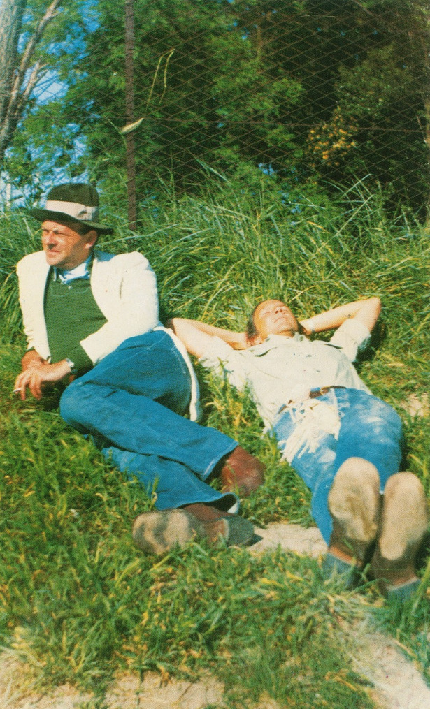
The invitation postcard for the opening of Robert Rauschenberg & Cy Twombly’s two-person show at Leo Castelli Gallery, May 4, 1974, is a photo of the two lounging in Captiva by Bob Petersen, via @leomartinfaber
Bob Petersen: …is Columbia doing Cy Twombly? Q: I don’t know. There’s a gallery at Columbia, but I don’t know. Petersen: The oral history of Cy Twombly? Q2: He died before— Petersen: God, I have tons of stories from Cy. Q: Oh, you mean as an oral history subject? Petersen: Yes, right, just to record. God, Cy and Bob were of course so close.
In 1970 Robert Rauschenberg, 45, moved to Captiva, a Florida island only then only reached by ferry, and Gemini GEL printer Bob Petersen, 25, moved with him. They lived on the beach side of the wild, 16-acre property Rauschenberg had assembled, and eventually set up an experimental print foundry, Untitled Press, in a house on the other side. That’s where a bunch of artist friends stayed, including Cy and Nicola [that’s not in the Chronology], who started coming during the winters from 1971 through 1975.
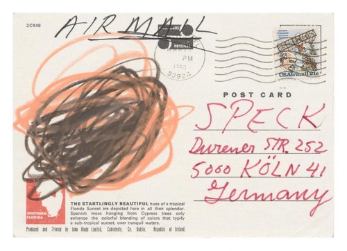
The startlingly beautiful hues of a tropical Florida Sunset are depicted here in all their splendor and completeness that Cy Twombly didn’t need to add anything, not even his signature, via Maison d’Art
It’s the little differences. Where Marcel Duchamp’s letters to his collector friend Katherine Dreier are all, “shipping is $34, please send me $34,” Cy Twombly’s letters to his collector friend Reiner Speck are like, “we await you in the summer castle.” I have read the Twombly correspondence with noted urologist and Proust expert Herr Dr. Reiner Speck in the catalogue for Maison d’Art’s current exhibition, and here’s the expanded tl;dr:
Speck rolled up on Twombly in Rome in 1970 as a young collector, and the two kept in touch:
A selection of letters from Twombly to Speck is the foundation of this project. For Speck, the thrill of collecting lies in interrogating the ways that art, reading, and writing influence one another; these letters are a personal manifestation of this interest. In placing these letters alongside the ephemera and artworks they discuss, this exhibition and its publication strive to materialize these conversations and to create a tangible transcript of their relationship.
With their layers of text and imagery, Twombly’s works function as another kind of transcript, merging poetic and painterly elements and creating subtle visual palimpsests. Twombly’s works evoke the literary, mythical, and historical worlds of Western culture and interweave them with his abstract gestures and contemporary reflections. These works reveal Twombly’s artistic depth and highlight the integral role of language and literature to his process—a pursuit that resonates with Speck’s devotion to literature.
This relationship between drawing and writing, art and poetry, is an endlessly rewarding way into Twombly’s work. Poet Dean Rader talked about this last year at the Nicola del Roscio Foundation; and Tacita Dean spent part of her night in the Menil’s Twombly Pavilion trying to replicate words from his paintings. As with his photographs, bringing Twombly’s letters and books into consideration of his project feels long overdue.
NGL, the way the jpg above was cropped in my browser left me reeling as I imagined Twombly breaking out his sickest, most stripped back letterhead to write Speck the most stripped back letter: “To Rainer, Cy T.” But it turns out to be the title page dedication of an exhibition catalogue. Which is still great, but it does mean I don’t have to jump on a plane to LA this second; I can plan a little.
screenshot from Mary Jacobus’s presentation on her Twombly book, via
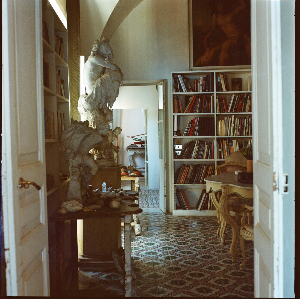
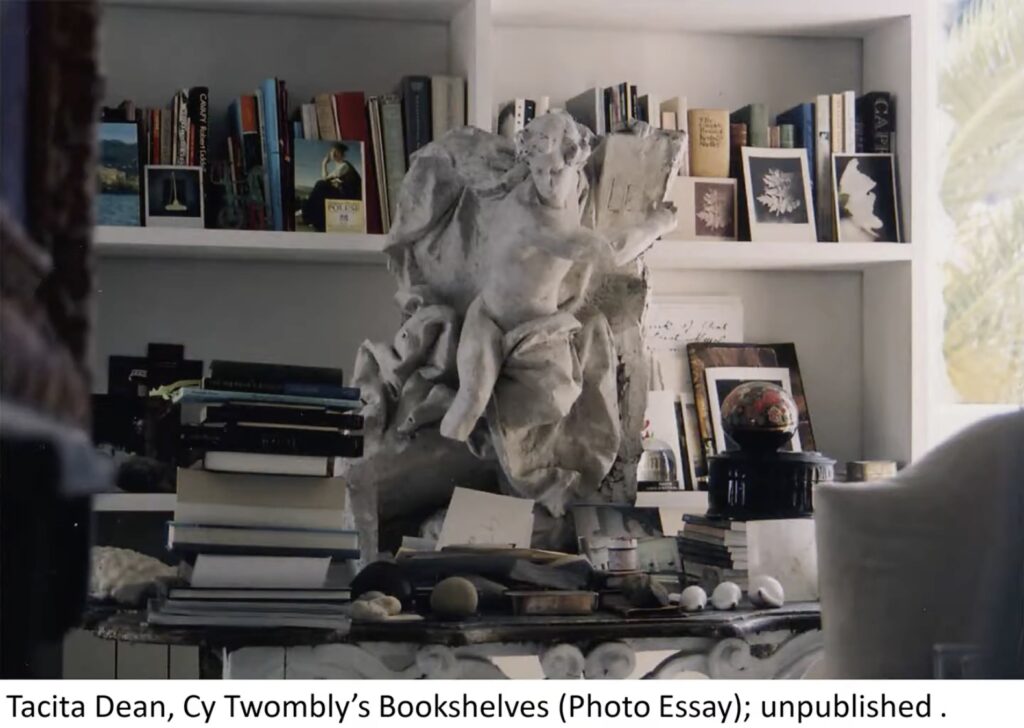
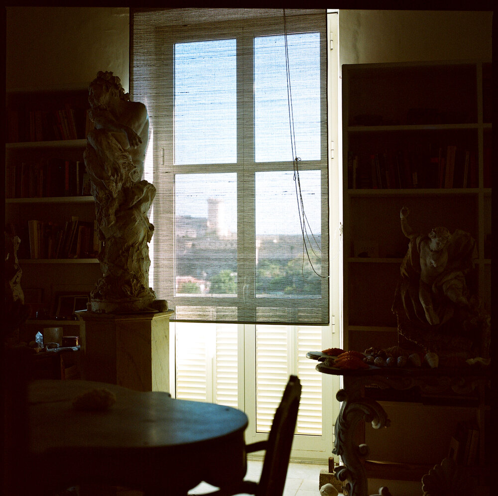
What jumps out at me? Well, there are additional views of the (plaster? painted terra cotta?) statue Tacita Dean photographed in Twombly’s library, which I’d wondered about in December 2023. [It’s feeling harder and harder to claim this isn’t a fanblog…]
mood lighting in Manfredi Gioacchini’s 2009 photo of Cy Twombly’s library/bedroom, via
Anyway, point is, the statue is one of three. Actually, there are more throughout Gioacchini’s photos of the house, but there are three in this library grouping. At the center, in front of the window, is a larger, dramatically unfinished twisting satyr or something. Maybe it’s leaning on an unfinished stump.
Whether they’re actually a pair, another similarly scaled male figure, with its arm raised, sits on a matching table. The contortion and billowing cloak/drapery make me think they’re connected. From the top photo, the 2023 sculpture in profile shows how deep the drapery goes, too. It would be unusual for this to be on a frieze or in a niche; these may be meant to stand free and be seen in the round. Though here Twombly has arranged them in a triptych, with his view of the bay behind.
[April 2025 update: While world’s going to hell, I went to the National Gallery library, where a quick turn through the photos of Twombly, Tacita Dean, and Sally Mann confirm that the large center statue in the Gaeta trio was the Pan statue Twombly often photographed in Bassano in Teverina. Here is a 1998 photo exhibited at Gagosian Roma in 2021, for example, that shows it in profile through a doorway.]
Cy Twombly, Interior, 1998, Bassano in Teverina, drypoint, ed. 6, shown by the esteemed copyrightholder of the entire oeuvre, Fondazione Nicola Del Roscio, at Gagosian Roma in 2021
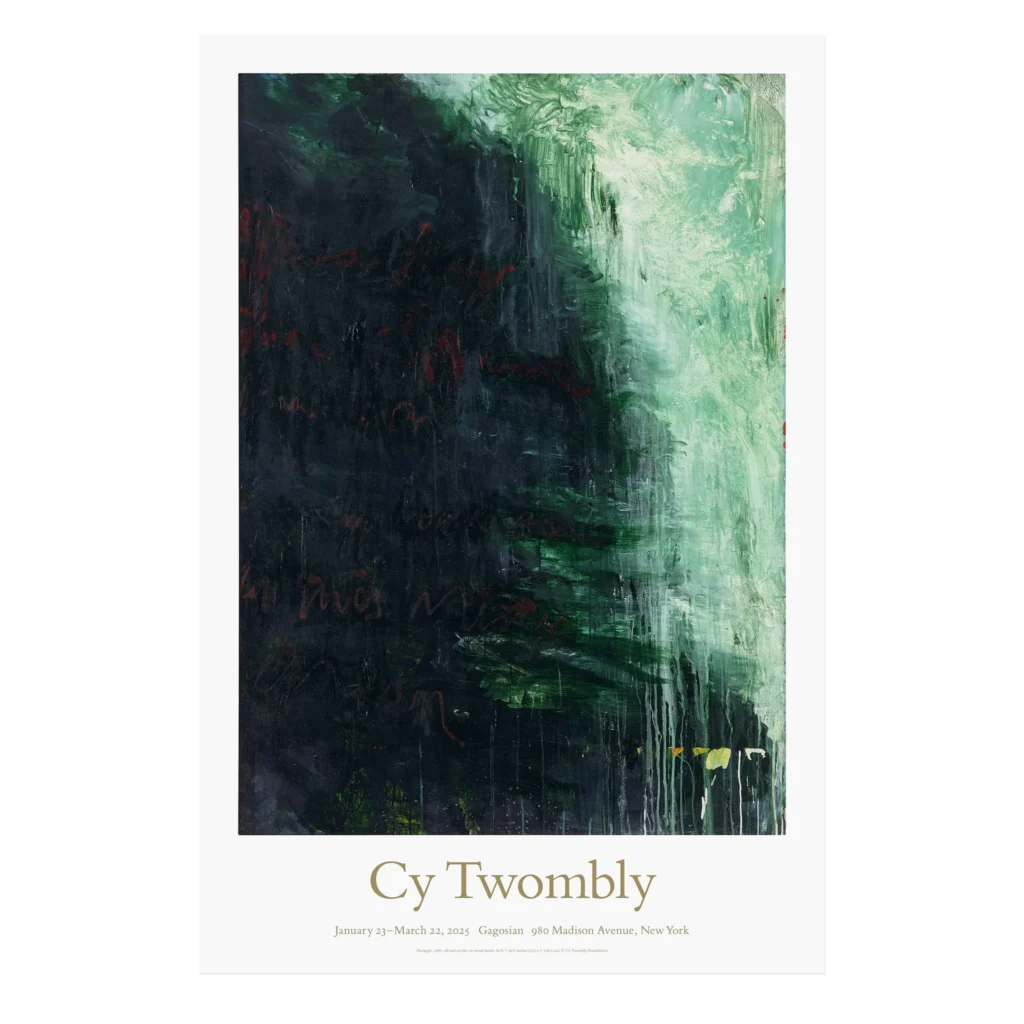
Now that Gagosian is closing their 980 Madison Avenue space with a Twombly show, the line has gone around that it makes sense, because Gagosian always opened a new space with a Twombly show. But 980 Madison did not open with a Twombly show. It opened with a Jasper Johns show.
Jasper Johns: The Maps was Gagosian’s first show at 980 Madison Avenue. It opened 36 years ago today: February 3rd, 1989. Before that, Gagosian, sometimes called “a Los Angeles dealer” in reviews, had a space in Chelsea, at 521 West 23rd St. The first Cy Twombly exhibition at 980, Bolsena Paintings, opened in December 1989. Twombly’s exhibition history includes a show at Gagosian NY in 1986, which is not in Gagosian’s exhibition archive [indeed, none of the W 23rd St shows are.] In the three-year interim, Twombly showed new and old work with five other New York galleries.
Cy Twombly exhibition poster featuring Paesaggio, 1986, via image via gagosianshop
Well, the poster for the last Twombly show in Gagosian’s 980 Madison space sold out by lunchtime of the first day, if you’re wondering how the $20 Twombly fandom’s doing.
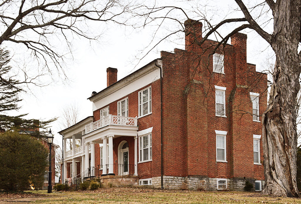
the house formerly known as the Reid-White House, photographed for the Virginia Landmark Register in 2016 by Sarah Traum, in such a way that the post office in the front yard can’t be seen.
What to do with this story from Sally Mann’s memoir?
Every time [Cy Twombly and I] would leave his house and catch a glimpse of the neighboring Reid White house behind the trees, one or the other of us would repeat our favorite line from a story my mother used to tell about the occupant of that house, Mrs. Breasted White. That’s what I swear I remember her saying: “Mrs. Breasted White.” But now, writing that name, it somehow seems highly improbable.
Anyway, we’d say the punch line, sometimes in unison, and then we would both howl with laughter, as if we had just heard it for the first time. Here’s how the story goes:
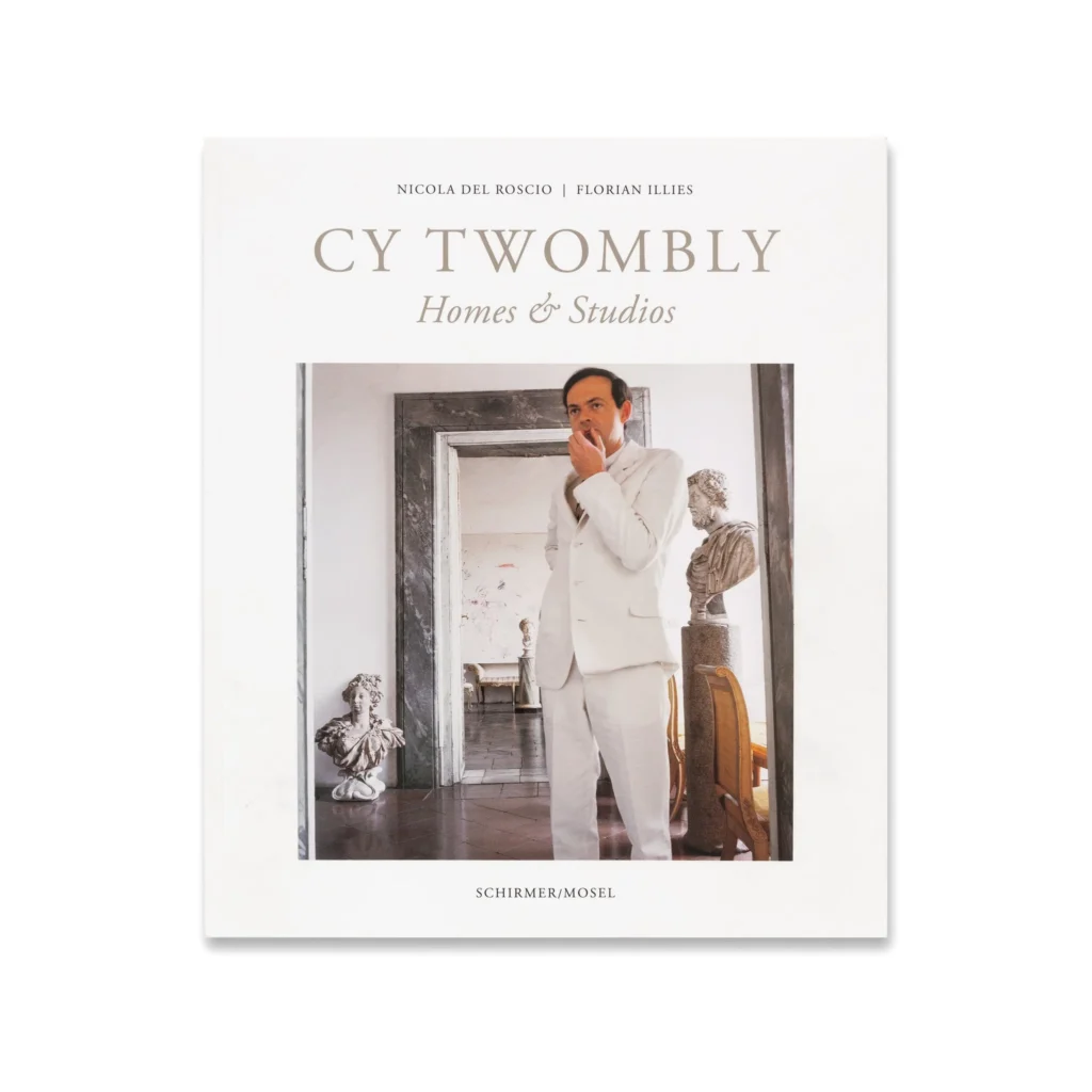
The cover of Cy Twombly: Homes & Studios, 2019/2020, available for retail at Gagosian and Karma
While the arrival of Carlos Peris’s lovely book did not give me much to add on the subject of Cy Twombly’s photography, the arrival of Cy Twombly Homes & Studios has filled the content pipeline to overflowing.
First, don’t sleep on such a book when it first comes out; I missed the hardcover edition by my own negligence.
Second, Nicola Del Roscio is an international treasure, and he should not be forced to write to share his insights and experiences alongside Twombly; sit him down and record him talking, Hans Ulrich Obrist-style, for as long as it takes. For every buck wild story about how much Twombly loathed studio visits, and when a Qatari royal made an unexpected visit to Gaeta via helicopter, he scrambled to set up a decadent luncheon in the courtyard is included, how many treasures and priceless memories are left out?
We just need to get it all while we can, and while he can. [And while recounting this history, may someone will ask Nicola how, while making this book in the midst of the first public disclosures of sexual predation against him, it was decided to use Bruce Weber’s 1994 photo of Twombly’s studio for the frontispiece.]
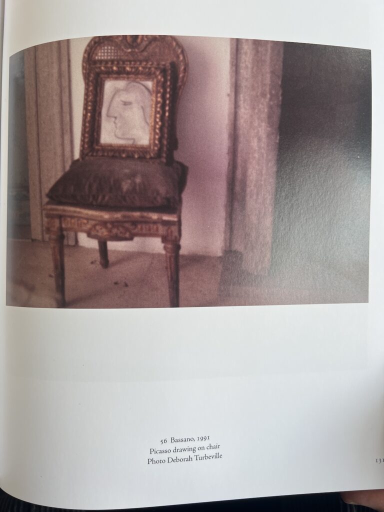
“Picasso drawing on chair,” reads the 2019 caption of 56 Bassano, a 1991 photo by Deborah Turbeville listed as 56 Bassano in Homes & Studios, which, well,
Homes & Studios, 2019, contains fleeting mentions of the following (non-exhaustive): the palazzo purchased in Tonnicoda, which Twombly felt guilty for abandoning, so he named some works after it ; the castle Twombly almost impulse-bought in the name of either Nicola or his studio assistant Viorel. And at least the third cringe mention (all, I think, posthumous), of Twombly’s closeness with his former nanny, a Black woman named Lula. There is a dissertation or ten to be written about Twombly’s relationship to the South (and Rauschenberg and Johns, for that matter; Twombly told Sally Mann their joint biography should be called, Dickheads from Dixie. Mann also noted that Lula was barely a decade older than Cy; she began working for the Twomblys when she was just thirteen.)
Anyway, point is, my most urgent takeaway from Homes & Studios is that we need more information on Twombly’s Picassos: How many are there? And are they actually Picassos? Because the one above, in Deborah Turbeville’s 1991 photo from Bassano, captioned in 2020 as “Picasso drawing on Chair,” was revealed in 2023, at least, to be a 1985 drawing by Twombly, either of a Picasso or in Picasso’s mode. If this can be mislabeled as a Picasso, what about the others?