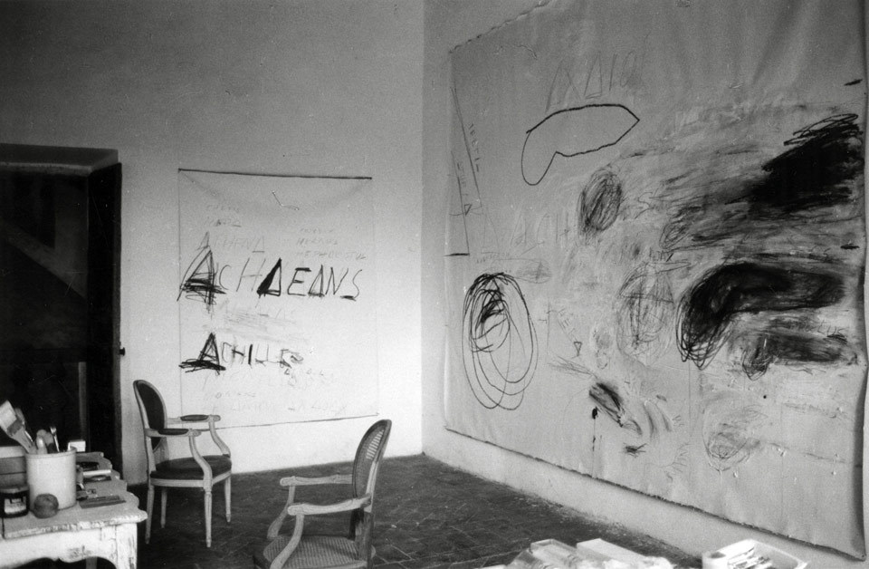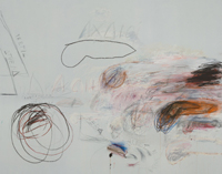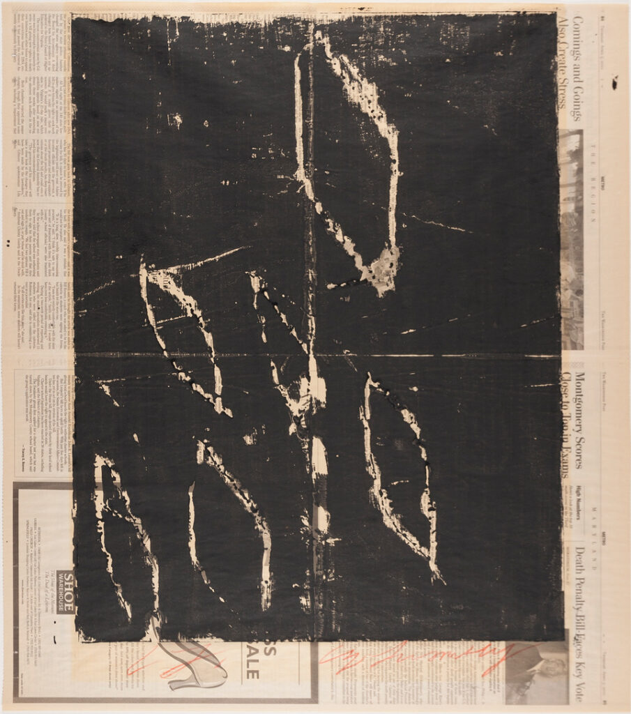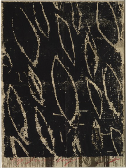
Courtesy Fondazione Nicola Del Roscio, photo by Nicola Del Roscio via cytwombly.org
Spanish artist/art historian Carlos Peris wrote a dissertation, and a book, on Cy Twombly’s use of photographs as a core part of his creative process. Here is a quote from a conversation he had with poet Dean Rader at the Fondazione Nicola Del Roscio in the summer of 2024:
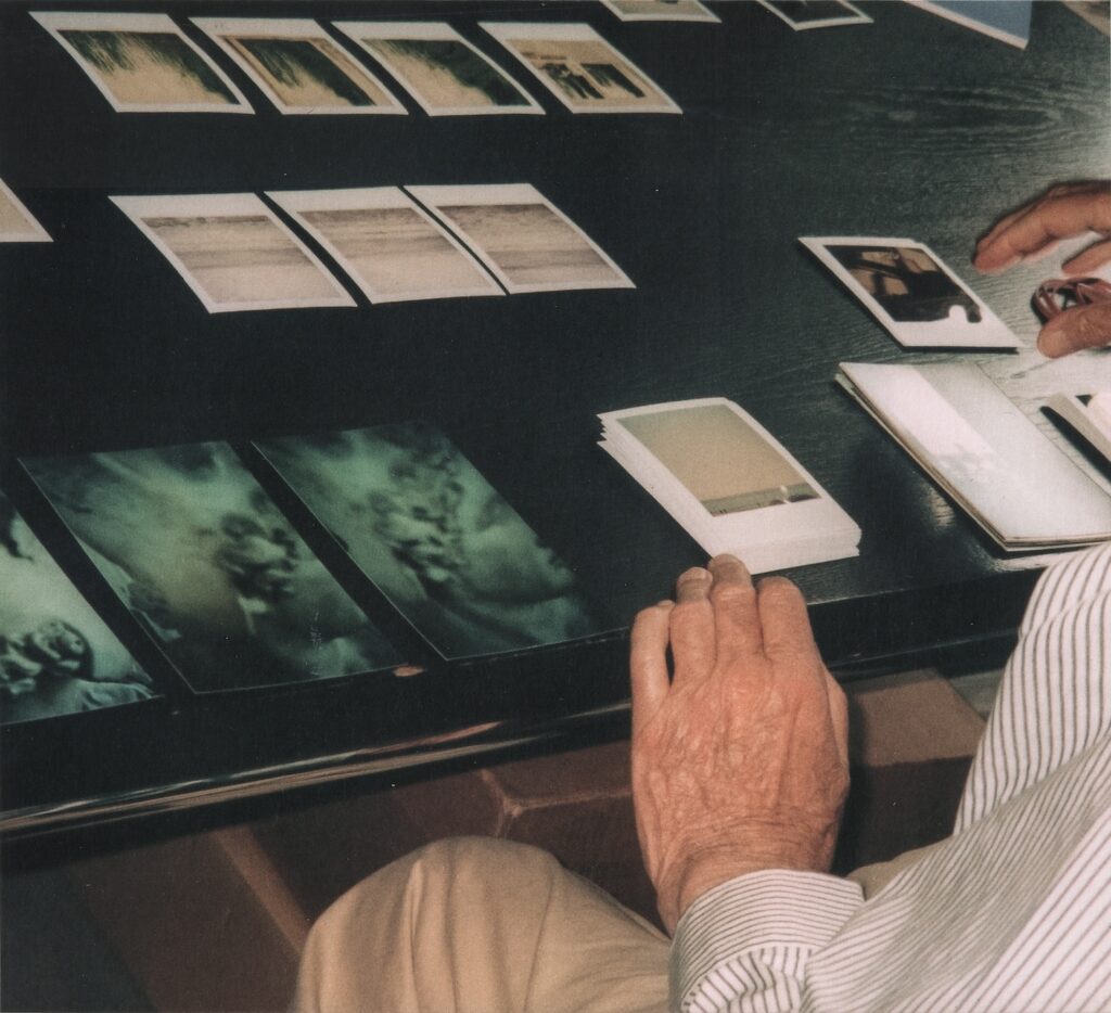
[…] there are some photographs from the archive that show Twombly with all the Polaroids arranged on a table. So he used to play games like memory games with them and stacking them and reorganizing them, like for more focused to less focused on, from more specific content to a more abstract one. And all this kind of games played with this kind of card game or tarot card or something like that, so this kind of trying to recall or to go back, it’s a kind of souvenir. Of course. Yeah. These photographs, what they did was to take these specific moments, so he could come back to them and think again about them and feel them again. And I think that happens all the time with his paintings. As you said before, you feel when Twombly is making that scribble, making that gesture of that paint or over the materials having there. So that motion, I think with photographs he was trying to reconnect with that moment, with that state of mind, with that specific moment.
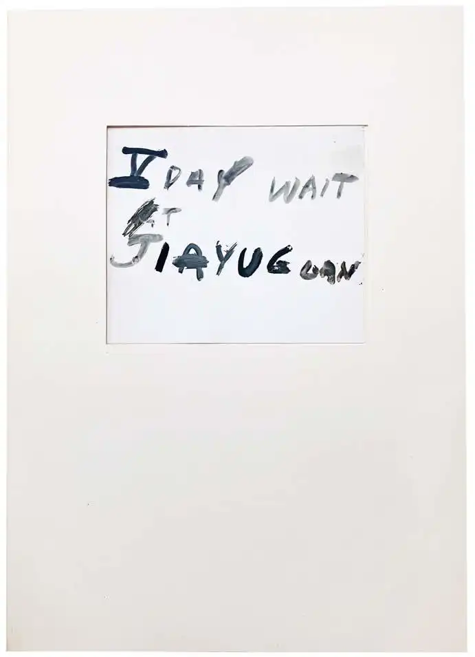
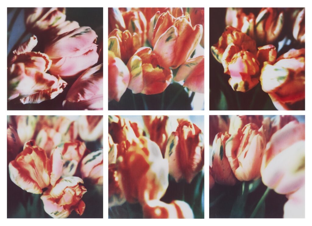
Photos of such a moment, when Twombly went to his publisher Lothar Schirmer’s office to make color photocopy enlargements of his Polaroids in 2010, are now on the Cy Twombly Foundation website. This was also recounted by Schirmer in the 2018 documentary, Cy Dear.
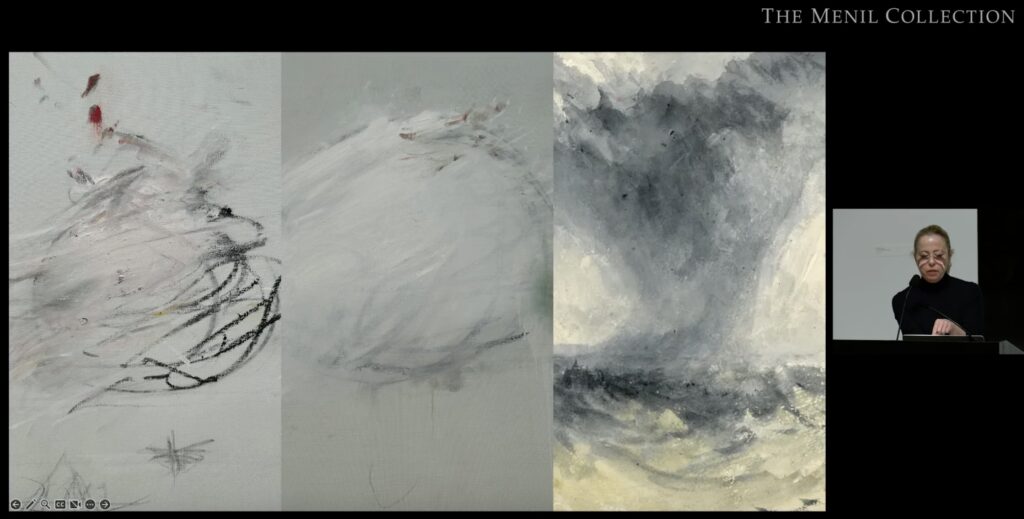
The Foundation has been adding such content to their website, explained Foundation managing director Eleonora Di Erasmo in an interview last September.
That includes two additional documentary shorts by Andrea Bettinetti, the director of Cy Dear. One is about a 2023 exhibition, Cy Twombly, A Journey to Morocco, 1952-53, and the other is a making of video of Un/Veiled, an exhibition and events program staged at the Fondazione Nicola Del Roscio in Rome in 2022 and 2024. The whole thing is under the umbrella of In Perspective, which focuses on other artists, poets, musicians, etc., who have been influenced or inspired by Twombly’s work.
The conversation between Peris and Rader, whose focus is on the relationship between seeing and reading, image and text, went up a couple of weeks ago. Peris’s book, meanwhile, From State of Mind to the Tangible: The Photograpic Cosmos of Cy Twombly, has been around since 2022. I will probably write more about it when it arrives.
[after the book arrived update: I will not. It’s nice, but Peris’s text is more poetic than revelatory. The important idea that Twombly used photos as tools for revisiting details or atmospheres remains to be expanded upon. Also, they reproduce Twombly’s Polaroids at like 80% scale, when it would have been just as easy and more impactful to print them full-scale.]
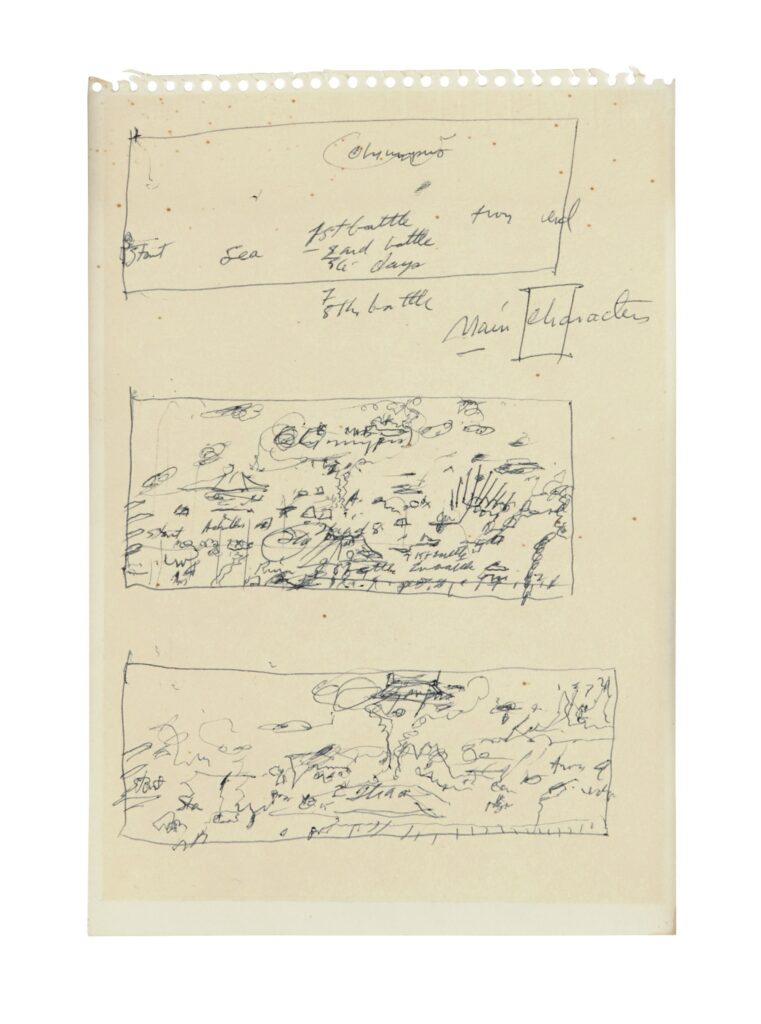
There are apparently more than 5,000 Polaroids in the Archive. Did Twombly take all of them? Did he point and Del Roscio shoot? Is one question that occurs to me about Twombly’s process. But more interesting rn is the trajectory of a moment: the making of a mark, the making of an instant photo print of it, the sorting and accumulation of photos, and the revisiting and re-experiencing of moments.
It makes me think of three inapposite things at once: Andy Warhol making Polaroids and turning some of them into paintings. Willem de Kooning painting atop projections of details and gestures from earlier paintings. And Cady Noland making Polaroids of “non-existent” works. In the painters’ cases, the artist uses a record of a moment, whether an image or a mark, to fix it in paint. Instantaneity is not just a tool, but a subject. But Warhol only did that with a tiny fraction of the Polaroids he took. The rest of those moments, Like Noland’s sculptures, are long gone.
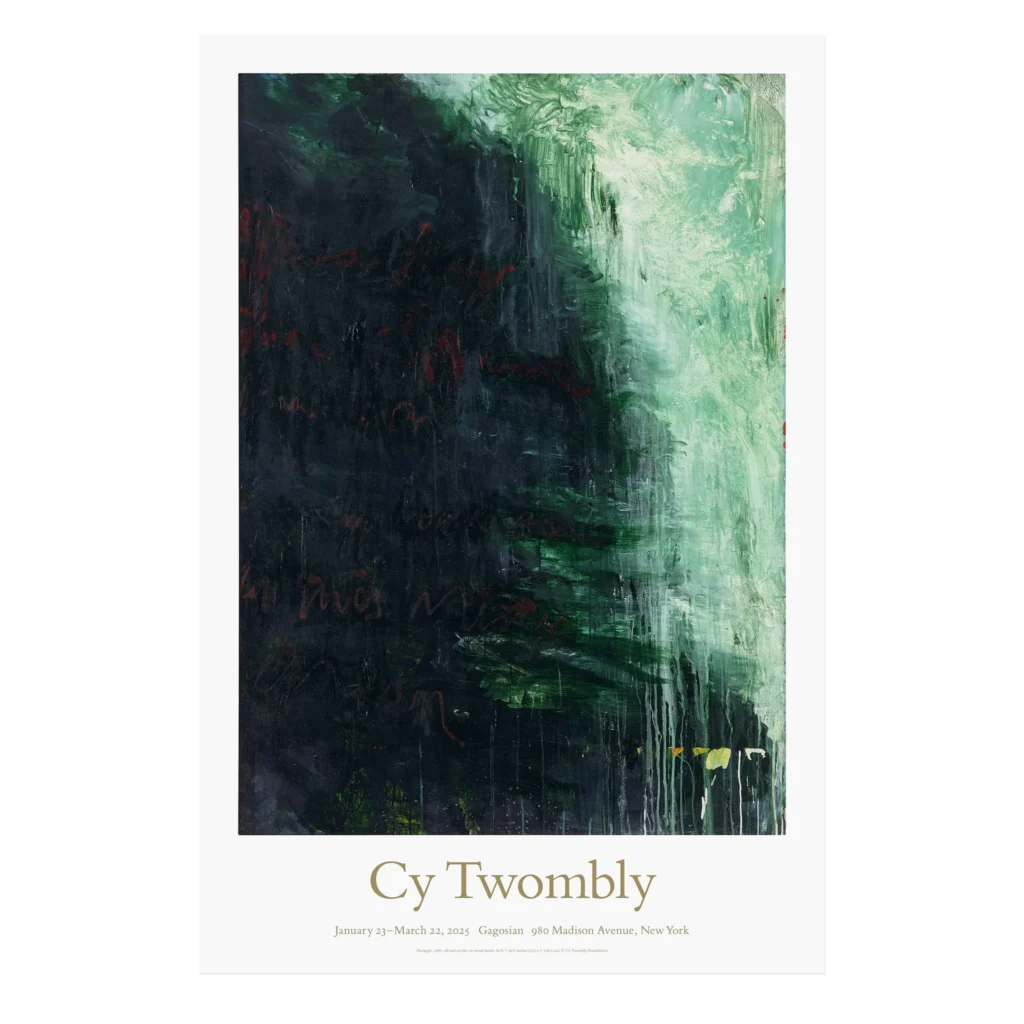
“Save money at Gagosian!” said no one ever, until now [gagosianshop]
Previously, related: Makin’ Copies: Cy Twombly’s Photos
[Polaroids of] Non-Existent Cady Nolands
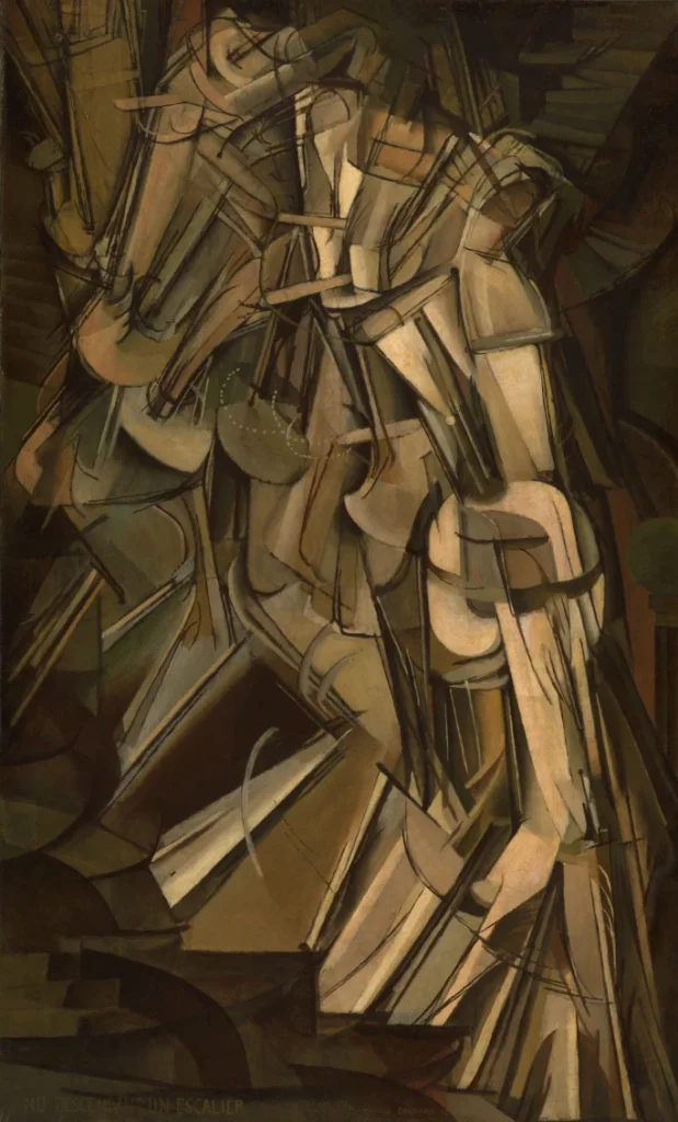
Warhol’s ‘Homage to Marcel Duchamp’?
Willem de Kooning meant to not do that