Jasper Johns, Perilous Night, 1990, Watercolor and ink on paper, 30½ × 23¼ in., on view at Matthew Marks in 2024
I really wished I’d seen the show of Jasper Johns drawings at Matthew Marks when I went deep on the little stick figures motif. Perilous Night, a 1990 watercolor, was the earliest of several works in the show in which the little guys appeared.
And I REALLY wish I’d gotten the catalogue immediately, because I just picked it up this afternoon, and Hilton Als had this to say about the stick figures in Perilous Night:
The right side of this watercolor and ink on paper is a replica of a score by John Cage, a close friend of Johns for many years. Cage wrote “Perilous Night” in 1943 and 1944. A composition for a prepared piano, it’s an angry piece whose strong rhythms speak to us emotionally—he was going through a difficult time with his then wife, the surrealist artist Xenia Cage—even as we understand that Cage is asking questions about what the piano can and cannot do. Who’s to say? In Johns’s piece, the sheet music floats against an abstract field made up of vertical shapes that reach up, up, up toward the top of the page. On the bottom of the work, a strip of green field. Three little stick figures stand on that green, gesticulating. Who are they? What are they? Fallen notes from Cage’s score?(Johns doesn’t render the notes in Cage’s score; all we see are traces of notes.) Or are those tiny figures from Johns’s and Cage’s past? Johns’s Perilous Night is an exercise, too, in depth—an experiment that challenges Johns’s famous flatness. One image tells us about another: the sheet music leads us to the abstraction, and the abstraction leads us to that little strip of green. It’s a work that’s giddy with possibility, a kind of “what if” piece. What if I put a little green here? And figures there? What happens to the work? To the eye? To the eye of the ideas?
I still have to see Richard Prince’s current show at Gagosian, and from the pre-press, I thought I’d be more interested in the sculptures. But looking through the works online, a couple of good-looking paintings reminded me of his hippie drawing paintings, which are works I regularly dig. And a couple, like Untitled (Folk Songs) above, from 2022, remind me—very unexpectedly—of Jasper Johns. And those are two streams I somehow never imagined would cross on this blog.
But maybe the surprise is from the Johns side. Just the other day @digitaldetritus posted an important but underappreciated [by me, anyway] Johns on tumblr: Decoy from 1971. Decoy was a painted variation of a complex series of prints, which were all part of a larger, retrospective reworking of Johns’ sculptures.
NGL, it was the heavily processed mechanical images of the sculptures that first made the connection. But then it was seeing the connective tissue of messy, even aggressively messy brushstrokes extend across both paintings. Prince talks a lot about de Kooning and Picasso, and there are interesting Guston shoutouts in other paintings in the show. But it was less this kind of throwback reference or direct engagement than the realization that some of Johns’s painting rhymed, or reverberated, with what Prince was doing.
Turns out Jasper Johns has not stopped painting after all. Matthew Marks’ preview for Art Basel Paris includes an untitled work from 2025 that’s an overpainted print. It’s a mode he’s used a lot, for many years. I think it’s like this one from 2018, with the skeleton in Johns’s image basement.
Johns showed a variety of skeleton-related works, including paintings and monotypes, at Marks in 2019, including, obviously, several works with the Little Guys stick figures. Besides the use of acrylic, the other thing to note about this new painted work in Paris is that it has no Little Guys. And the only conclusion I can arrive at is that I have made too much of a public deal about this motif, and Johns has set out to obliterate them from his work. My bad.
Jasper Johns, Untitled, 2021, acrylic and graphite over etching on paper, 16⅞ × 21⅛ in., via Matthew Marks
I’d like to go back to contemplating one little guy confronting the slice of the universe that looks, now that you mention it, a lot like a stick figure, please.
[tbf I was actually looking back through these recent shows from after the CR cutoff, to find out how wrong I might be about Johns only making one alphabet painting by looking for when the sign language alphabet motif came in, and did it happen in any paintings, and I don’t think so, even though I remember thinking there sure was a lot of sign language alphabet in one of those Marks shows, but maybe it’s all in prints and works on paper? And then yes, there is sometimes a very prominent stencil of the entire alphabet behind that skeleton getting worked on by the little guys, but not in the paintings, or at least not in the ones he showed. But after 60 years, Johns should feel free to revisit a motif if he wanted, and making it the stencil tool, not the letters themselves, does help rein in the chaos a bit.]
“You can guess which one is in the photograph.” via ig:@deborahsolomon_truly
Collector and longtime MoMA trustee Barbara Jakobson died at 92. She was a sharp, funny, insightful hoot. I got to know her a bit when I became co-chair of the successor to the Junior Council, which she’d led back in the day. But that’s not important now.
I also knew her as one of Jasper Johns’s earliest collectors. Writer and Johns biographer Deborah Solomon posted the news of Barbara’s passing on instagram, alongside some magnificent photos. Like the oddly shaped blank ghost on the wall after Jakobson sold a massive Frank Stella. And this photo of Barbara posing with what looks like her and her then-husband John’s first Johns. They purchased Alphabet new, in 1959. She got it in the divorce.
Johns only made one Alphabet painting. Solomon said he decided there were too many variables, and it felt chaotic, so he stuck with numbers.
In 1989 Jakobson sold Alphabet it at Christie’s [for $3.52m]. It has since found its way, through the Edlis Neesons, to the Art Institute of Chicago. So what’s this? A copy Barbara had made when she sold it. And so now there were two.
Jasper Johns, Alphabet, 1959, 12 x 10 1/2 in., encaustic and collage on fiberboard, collection Art Institute
This is a whole, underappreciated category of copies I love: replicas or replacements made for owners of the work. Or former or soon-to-be-former owners.
As part of the settlement to donate it to the Nelson Atkins Museum, super-reclusive copper heiress Huguette Clark got a copy of a Degas that had been stolen from her by a servant, and later acquired by the H&R Block guy.
Isabelle Dufresne’s Large Flowers was so big, (7 x 13 ft) she had to hang it vertically in her living room. Visiting with a collector friend, I asked if he thought she’d ever sell her Warhol. He replied with a laugh that she already had, and that the Flowers were the replacement.
I can’t find it now, but I swear I just read [or heard?] about auction houses offering to make reproductions of works to win consignments.
Jasper Johns, Small Numbers in Color, 1959, 10 1/8 x 7 1/8 in., encaustic & collage on wood printing block, installed at the Philadelphia Museum of Art for Mind/Mirror, collection:the artist
And very specifically, though in a sub-category of its own, the small size and dense composition of Jakobson’s Johns Alphabet reminds me of Small Numbers in Color, a tiny painting Johns made for himself in 1959 before the larger Numbers in Color (1958-59) was shipped off to the Albright Knox.
What to make of the unparalleled aspects of these replicas? Their connection to ownership, and their function as literal replacement of the original? Whatever the experience was of living with the work, for the owners themselves, these copies seem to be [close] enough. Which feels wild: that a fresh copy can effectively replace everything except the market value.
Solomon proposed the question of which Alphabet was in the photo, and I have to assume that it’s what she calls the “cheap copy.” But. Every stroke looks like Johns’s original, which, on a painting like this, is no mean feat. Perhaps it’s a photo-based reproduction. I guess my point here is, I’d love to see it.
Gold folding screen [kinbyoubu, 金屏風] at the Hiroshima Peace Memorial Museum in 2024 photo: @bbhilley.bsky.social
“There is a six-panel folding screen, donated just recently by a Hiroshima family, whose gold expanses are streaked by black rain: the most terrifying abstract painting I have ever seen.” So wrote Jason Farago in the New York Times, after visiting the Hiroshima Peace Memorial Museum before the 80th anniversary of the US nuclear bomb attacks on Hiroshima and Nagasaki.
But then I realized we were all exactly wrong. This is not a painting, and most importantly, it is not abstract. The way we immediately read it as such, though, underscores Farago’s larger point, which is that we largely lack the cultural references needed to recognize this object, where it came from, and why it’s as urgent to understand it now as it’s ever been.
This specific error is worth chasing down. The screen does not look like an abstract painting; abstract paintings look like it. Which is itself an overwhelming realization, until it isn’t.
Jasper Johns, Untitled, 1992, intaglio & aquatint, 43 1/2 x 53 1/2 in., with little guys in the vase, via WAC
You’d think I’d have taken the hint sooner. Like after seeing the big jump around 2001 of appearances of the three little, brush-wielding stick figures in Jasper Johns drawings—because they were in the prints he was reworking. Or after finding little guys gazing at the stars in the 1997 etching he made for Leo Castelli’s 90th birthday portfolio.
But no, it took finding little guys in Johns’s 2008 Artists for Obama print that made me realize there was much I didn’t know about Johns using the little guys motif in his prints. And it turns out they’re all over the place. Johns is a printmaker who paints, and his imagemaking crosses mediums with the ease Canadians used to have crossing the US border. So I was missing a big part of the little guys story.
Jasper Johns, Untitled (from the Artists for Obama portfolio), 2008, etching and aquatint, 8 x 20 cm image, 21 x 30 cm sheet, ed. 13/150, selling as a loosie on 3 Sept 2025 at LA Modern [kinda wild that such a low edition number was broken up for parts]
Whoops, missed another one. I might have to check all the benefit print portfolios Johns contributed to in the last 30 years, to see if there are any more little guys out there.
Meanwhile, these little guys are in a little print—just 8 x 20 cm, smaller, even than the Ellsworth Kelly print in the same Artists for Obama portfolio.
Jasper Johns, detail, Untitled (from the Artists for Obama portfolio), this little scene is like 5 x 5 cm
And they’re pretty lyrically drawn, too. No stamps here. I assume those are pens in their hands, encouraging people to register to vote.
In 1995 Larry Rinder and Nayland Blake organized In A Different Light, one of the first exhibitions of 20th century art exploring the queer experience, at the Berkeley Art Museum.
The first section of the show was “Void,” with works “suggesting blankness, absence, and loss.” And the first work on the checklist—which I uploaded to the Internet Archive because it was somehow not there before—is David Tudor’s 1989 reconstruction of the score for John Cage’s 4’33”.
It’s one of the works which “suggest the emptiness of what might be called a state of ‘pre- being’ that precedes the birth of a new identity. Seen negatively, such works evoke the repressive alienation of the ‘closet.’ Seen in a more positive light, they represent a blank slate of unlimited possibility.”
Cage’s original score for 4’33” was dedicated to Tudor, who performed it in 1952. It was made in traditional Western musical notation, with a tempo and length to indicate the duration of each of the work’s three movements. Tudor gave the score back to Johns when he was preparing another copy, this time in graphic notation, which he dedicated to Irwin Kremen. Then Tudor’s copy was lost, and so Kremen’s copy, from 1953 is the earliest surviving score. David Platzker acquired it for MoMA in 2012.
the first movement of John Cage’s 4’33” in David Tudor’s 1989 reconstructed score, 12.5 x 9.3 in., via James Pritchett
Tudor’s reconstruction of the original 4’33” score seems related to the differences introduced in published versions. It measured 60 quarter notes at 4/4 time to be 2.5 cm, or roughly 1 inch of score, so the first 32 seconds of the 33 second movement fit on one 9.3-inch wide page. I think that makes Tudor’s score ten pages long. [Somehow Edition Peters needed the Getty’s help to recover this reconstruction for inclusion in the current, Cage Centennial edition of 4’33”. And they still reduced the page size and mooted Tudor’s calculations.]
Lemcke has made a lot of Cage-inspired work, particularly in Cage’s chance-operations texts and mesostic poems, but also involving the score of Perilous Night (1944), Cage’s pivotal chance-related composition for prepared piano, which also coincided with Cage’s pivot from his wife Xenia to Merce Cunningham. But I can’t find any mention of Lemcke doing an erased Cage score. And Lemcke’s work on the exhibition checklist, right next to Tudor’s, is Untitled (Performance Score for Percussion), 1977, which sounds related to a different series Lemcke was working on over several years.
I’ve reached out to confirm, but if an Erased Cage Score doesn’t exist already, it must be realized immediately, because it sounds absolutely obvious and fantastic. [a few minutes later update] Lemcke confirms that though Cage was an influence on his early work, and particularly his exploration of chance operations and graphic notation, the work shown at Berkeley was not 4’33” related, and he has not erased a Cage score. So now I will.
It would complete the circle, or perhaps spiral outward, from Rauschenberg’s early influence on Cage, who felt the White Paintings of 1951 gave him permission to write “the silent piece” he’d been contemplating for several years already. And the painting Rauschenberg gave to Cage, which he then overpainted black when he was crashing at Cage’s apartment.
From a more limited vantage point, this could have been seen as Blake misremembering, when it is clear that artist prophets walk among us, and they were manifesting Erased Cage Score into being. It should not have taken this long.
Andy Warhol, Little Electric Chair, 1964-65, oil and silkscreen on linen, 22 x 28 in., acquired by Cy Twombly and sold by his Foundation in 2014
The electric chair paintings are some of Warhol’s absolute best, but the little blue electric chair owned by Cy Twombly is a standout. The Christie’s lot description for the Twombly Foundation’s unloading of the painting extols this specific painting’s heavily inked contrast:
Housed for many years in the private collection of the artist Cy Twombly, it was this divergence between shadow and light that attracted the artist to this particular painting—an admiration bolstered by his understanding of chiaroscuro gained from his detailed study of Italian Renaissance painting undertaken during his time in his adopted homeland.
I totally forgot that there was a huge Warhol Tunafish Disaster painting in the background of Ugo Mulas’s photo of a massive John Chamberlain foam sculpture at the Franchetti-Twombly palazzo. I feel like a more systematic look is called for.
It’s been told and retold enough that even if you’ve somehow never heard it or seen its inspiration, it’s clear that several generations of artists ascribe to the Slant Step Theory of post-minimalist and conceptual sculpture: In 1965 William T. Wiley bought a plywood & linoleum stool with a steeply slanted seat at a Bay Area thrift shop. Installed in the studio of his student at UC Davis, Bruce Nauman, the Slant Step’s nonfunctional mystery and alluring form made it an aesthetic fetish object. It inspired at least two shows in the 1960s and several more since. It got passed around, stolen and rescued, surviving as an intentionally absurd teaching prompt until it entered the collection of UC Davis’s museum.
As far as I can tell, the first time it was publicly recognized as a stool for helping you squat on the toilet and take a better shit was only in 2014, well into the Squatty Potty era. Even so, it’s not clear that later showshave addressed this fundamental reinterpretation of an enigmatic totem as a highly specific, utilitarian, biological tool.
It reminds me of the novel-for-some-mundane-for-others theory of paleolithic tally sticks as lunar or menstrual calendars. And of Ursula K. Leguin’s Carrier Bag Theory of Fiction, where human experience can be understood through narratives other than violence and conflict, and motives other than competition, killing, or subjugation. The Slant Step Theory may be similarly narrow and incomplete. It’s not a mystery; it’s just you.
Bruce Nauman, Device to Hold a Box at a Slight Angle, 1966, fiberglass and polyester resin, 29 5/8 x 23 1/2 x 30 in., acquired by Cy Twombly in 1969, and sold by the Foundation in 2014
Nauman made Device to hold a box at a slight angle in 1966, with the Slant Step in his studio. It had already been shown twice before Philip Johnson’s partner David Whitney curated it into Nauman’s first show at Castelli in 1968. It went from there to documenta 4, and when it came back, Cy Twombly bought it, in 1969.
The Cy Twombly Foundation sold it in 2014. What happened to it in those 45 years? I don’t know of any photo of Twombly interiors in which Nauman’s Device appears. Did Twombly study it? Contemplate it? Respond to it? Store it away? If a revision of the Slant Step History of contemporary sculpture is in order, who knows what might be learned by tracing Twombly’s connections to and from this Nauman he kept for so long?
The earliest Lambert poster is for a 1972 group show, Actualité d’un bilan, which is great, but honestly, is also kind of a chaotic mess.
So when Dimitris, the ephemera dealer at Bent Priorities, says that two handwritten Rauschenbergexhibition announcements from 1973 show “similar techniques for the use of written word with his long time friend and companion Cy Twombly,” part of me wants to disagree. Because I can actually read Rauschenberg’s posters.
But I do think he’s right. Rauschenberg’s mountainous signature had already become a logo, but that looseness began bleeding into the announcement for a Spring show of White Paintings at Ace Gallery in LA. By the opening of his September show at Sonnabend in Paris, it had soaked all the way through.
It’s worth noting that Twombly and Rauschenberg were together a lot during this moment, mostly long winter stretches in Captiva. The next time Bob showed his Early Egyptian Series was in his two-man show—with Twombly—at Castelli. So whether Rauschenberg used some of Twombly’s techniques, or Twombly used some of Rauschenberg’s, will require closer consideration. But the announcement for that show was, of course, a photo of the two artists.
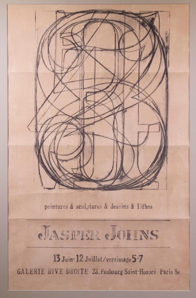
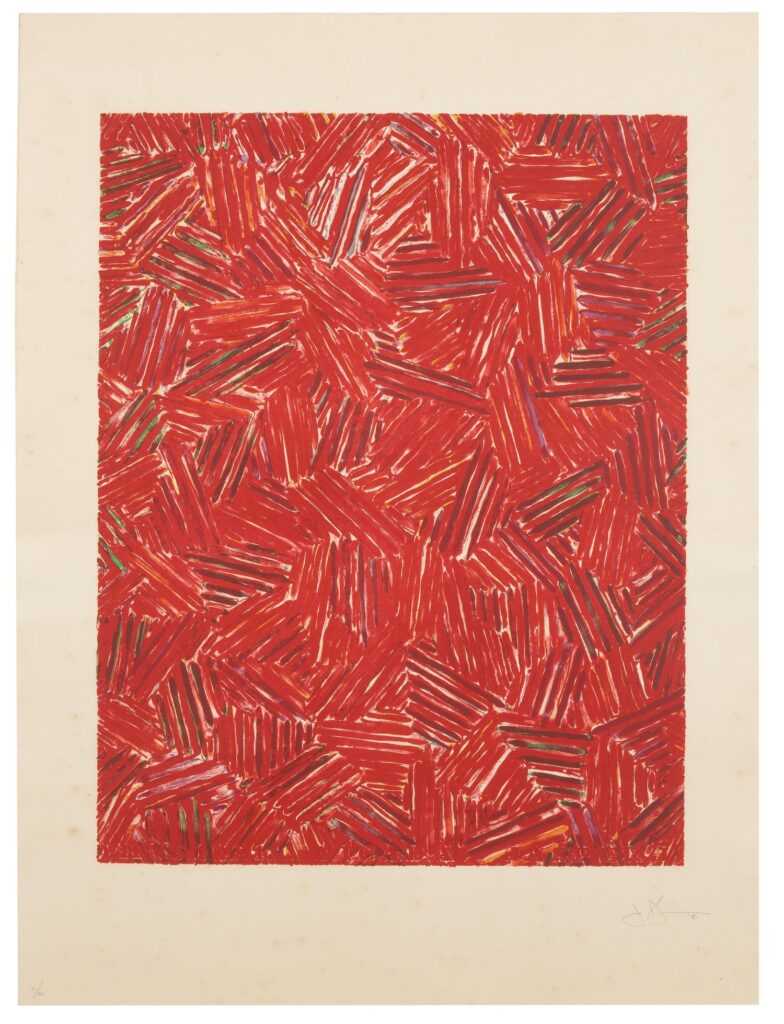
Even MoMA lists it as 1960, and they got their copy from the artist in 1961, so maybe. But the exhibition being announced here, Jasper Johns’s first show in Europe, absolutely took place in the Summer of 1961.
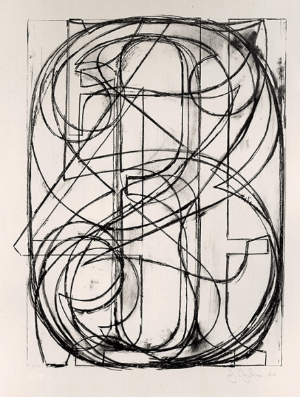
I get the confusion, though. Because the poster—most were actually mailers—reproduces a Johns lithograph, signature, date, edition number and all. 0-9 (ULAE 3), 1960, was published in an edition of 35. And whoever got No. 28 photographed it for this poster. Did the Galerie Rive Droite produce the poster, with Johns’s name in his already distinctive stencil? Or was it made in the US? That freeform accent over the Saint-Honoré makes me wonder. In any case, it has a nearly uniform handmade elegance that belies its offset print reality.
Jasper Johns, 0-9, 1961, sculp-metal and collage on canvas, 67.6 x 54.2 cm, originally shown at Galerie Rive Droite, and sold in 2024 at Christie’s
Galerie Rive Droite was around the corner from the US Embassy where, in the week after his opening, Johns, Rauschenberg, Jean Tinguely, and Niki de St-Phalle organized an art-filled performance for pianist David Tudor. June 20, 1961.
Jasper Johns, Entr’Acte, 1961, encaustic & collage on canvas, 92 x 65 cm, currently the Collection Ludwig
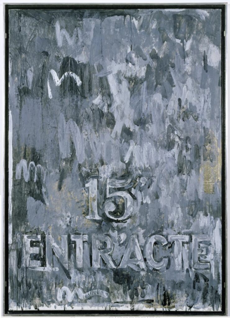
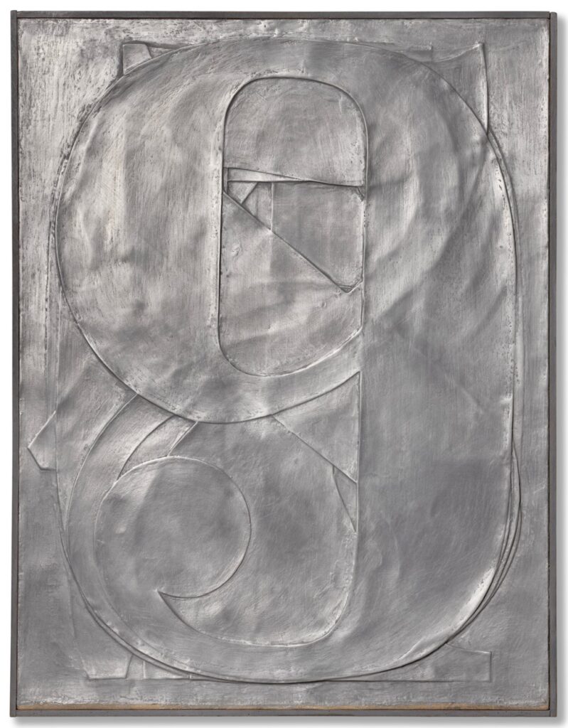
Johns sent flowers in the shape of a target* and whipped up a painting in the Paris studio of Alabamian ceramist Fance Franck. Though there was no actual intermission and the action never stopped, Entr’Acte was placed on stage for 15 minutes. Like the Sculp-metal 0-9 collage in the exhibition, Entr’Acte was bought by the secretary at Galerie Rive Droite, Georges Marci.
But was it really? To Google her now, Georges Marci shows up in the provenance of various blue chip artworks, is repeatedly called the “grand dame of contemporary art in Switzerland,” which has to be a self-anointed thing, and is known for opening the first gallery in Gstaad. But I guess people never thought the tapes would be made public, because in her 1974 oral history for the Archives of American Art, dealer Judith Richardson basically called Marci a thief who murdered her husband.
Richardson worked for both Sidney Janis and Ileana Sonnabend, Castelli’s ex. Which meant she worked with many overlapping artists with Galerie Rive Droite, run by Jean Lecarde. Lecarde wanted to open a gallery in Switzerland, and to get around the residency requirements, he transferred all the inventory to Marci’s name. And then she just froze him out and kept it, and he went bankrupt. This is how Arman tells the story, Richardson said. Arman was there, she said he said, when Marci set her depressed Egyptian husband up with the pills he used to kill himself. And then she got all his Coptic art.
Anyway, where were we? Johns found encaustic in Paris, borrowed a studio, and made this painting in like a day or two. While also finding time with Bob to shoot some paintings at St Phalle’s. Eric Doeringer just saw one at the Tate, shot by both Rauschenberg and Johns, and texted me about it. Turns out it was in St Phalle’s show that opened June 30, 1961. A busy summer in Paris.
Previously, related: The Performance Art in Embassies Program * I have long wanted to see, then make, this flower arrangement, but I can’t remember where I’ve ever seen a photo of it. Somewhere, though. I’ll look.
In her MoMA retrospective, Leah Dickerman had a photo of Rauschenberg painting on stage while David Tudor played the piano. But she also said Johns carried his painting on stage to signal intermission, while Tomkins said Johns refused to go on stage. Both could somehow be true.
Shunk & Kender, is there anyplace you weren’t in the 60s? Jasper Johns’ Floral Target, 1961, at David Tudor’s performance of Cage’s Variations II in Paris, via Roberta Bernstein’s chronology in JJ CR, vol 5
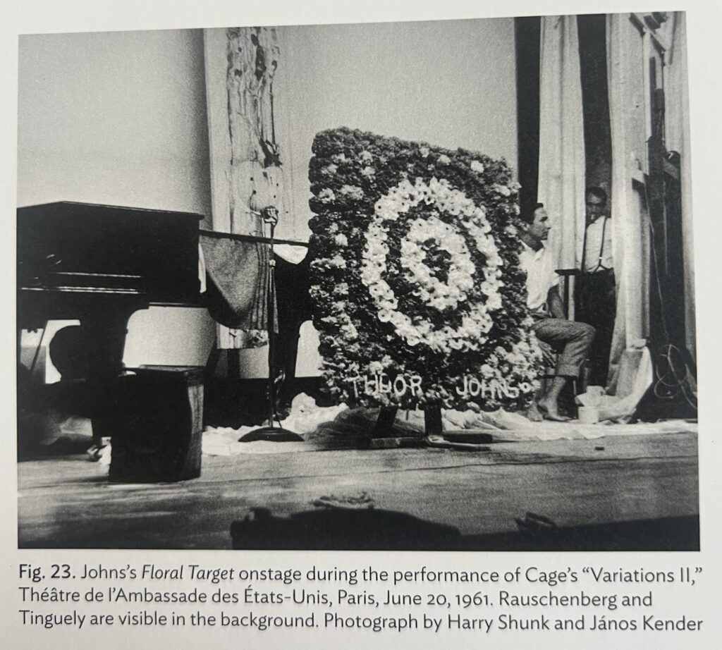
I knew I’d seen it somewhere. A closer look at Roberta Bernstein’s chronology shows Johns was booked and very busy in Paris: he made two plaster casts** in Tinguely’s studio; his costumes appeared on Merce dancers June 12; his show opened June 13; Tudor’s performance on the 20th; and he helped install Saint-Phalle’s show, which opened on the 28th. Also, what part of this itinerary did Shunk & Kender plan to be there for? Because it is amazing that they were around for an impromptu concert that came together in a matter of weeks.
** About those plaster casts: they were made from moulages made of the sculp-metal 0-9 and a similar Figure 3 from the Rive Droite show. So a 2nd generation cast. Which Johns used to promptly cast four more 0-9 in aluminum and, in 1997, four Fig. 3 in bronze. I low-key love that this feels like Johns wanting to keep engaged with works of his own that he expects not to see again, at least for a while.
And then Bluesky blew my mind when Michael Lobel and Michael Seiwert both posted this photo:
Inside: Carolyn Brown, Merce Cunningham, John Cage, Doris Stockhausen, David Tudor, Michael von Biel; Underneath: Steve Paxton, Karlheinz Stockhausen, Robert Rauschenberg, a 1964 photo from Königswinter at the Robert Rauschenberg Foundation, via Museum-Brandhorst
Germans see this 1964 photo taken during a Merce Cunningham Dance Company world tour and are like, Mein Volks! The Tate caption incorrectly says it’s from Cologne, but it’s got Drachenfels written right on the helicopter. Seiwert points out that in 1964, Stockhausen was living near Königswinter and Bonn, the capital of West Germany, so it would have been an obvious destination for our intrepid dance troupe.
This is the fifth year that Hellman has put together a collection of artist-designed plates whose sale benefits the Coalition for the Homeless in NYC, and it is remarkable. Once the APP began debuting the plates at art fairs, they’ve taken on a wild, competitive philanthropic eshopping energy.
This year there are fifty plates, each in an edition of 150, with the first 100 reserved for the opening day of Frieze NY. The rest will go on sale the following week at Artware Editions. The plates are just $250 each, about the price of a lunch at an art fair. [Artware also has some previous years’ plates, including individually signed plates, and a couple of complete sets, no waiting.]
Jasper Johns, Untitled, 2001, pastel on paper, 25 1/2 inches diameter, via Matthew Marks Gallery
What’s wild about Johns is not that he did it, but that he had a tondo drawing ready for instant plate adaptation. Johns had used both the Picassoid head and wife/mother-in-law optical illusion in many works for years; having them sprout surreally from a tree branch, in a round pastel? Not so much. But he showed this picture in the 10th anniversary drawings show at Matthew Marks at the end of 2001.
Oh wait, actually he did not. That is an entirely different work—same motif, different object. When the Marks drawing turned up at auction in 2015, it had an uncharacteristically full essay, especially for a day sale, with a surprisingly full discussion of Johns’ references.