Universe And Little Guy

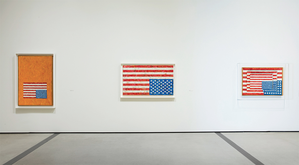
an untitled 2021 jasper johns work on paper is largely black with a vector map of slice of the universe, a contruction of red and blue dots representing, i think, galaxies or galaxy clusters along threads reaching across space, with a concentration in the center that bears an unusual resemblance to a stick figure spiderman, which may feel more prominent because the trompe l'oeil sheet of paper taped to the center right of the composition is of a lone stick figure with a raised brush, a familiar johns motif, here seemingly drawin in graphite. via matthew marks gallery
Jasper Johns, Untitled, 2021, acrylic and graphite over etching on paper, 16⅞ × 21⅛ in., via Matthew Marks

I’d like to go back to contemplating one little guy confronting the slice of the universe that looks, now that you mention it, a lot like a stick figure, please.

[tbf I was actually looking back through these recent shows from after the CR cutoff, to find out how wrong I might be about Johns only making one alphabet painting by looking for when the sign language alphabet motif came in, and did it happen in any paintings, and I don’t think so, even though I remember thinking there sure was a lot of sign language alphabet in one of those Marks shows, but maybe it’s all in prints and works on paper? And then yes, there is sometimes a very prominent stencil of the entire alphabet behind that skeleton getting worked on by the little guys, but not in the paintings, or at least not in the ones he showed. But after 60 years, Johns should feel free to revisit a motif if he wanted, and making it the stencil tool, not the letters themselves, does help rein in the chaos a bit.]

We Don’t Know Johns’s Alphabet

screenshot of deborah solomon underscore truly's intagram of a snapshot of barbara jakobson smiling with a dark brown bob as she stands in front of a bulletin board filled with clippings and photos, and a smallish square painting of the alphabet with a wooden slat frame, a replica of the jasper johns painting she used to own. rip barbara
“You can guess which one is in the photograph.” via ig:@deborahsolomon_truly

Collector and longtime MoMA trustee Barbara Jakobson died at 92. She was a sharp, funny, insightful hoot. I got to know her a bit when I became co-chair of the successor to the Junior Council, which she’d led back in the day. But that’s not important now.

I also knew her as one of Jasper Johns’s earliest collectors. Writer and Johns biographer Deborah Solomon posted the news of Barbara’s passing on instagram, alongside some magnificent photos. Like the oddly shaped blank ghost on the wall after Jakobson sold a massive Frank Stella. And this photo of Barbara posing with what looks like her and her then-husband John’s first Johns. They purchased Alphabet new, in 1959. She got it in the divorce.

Johns only made one Alphabet painting. Solomon said he decided there were too many variables, and it felt chaotic, so he stuck with numbers.

In 1989 Jakobson sold Alphabet it at Christie’s [for $3.52m]. It has since found its way, through the Edlis Neesons, to the Art Institute of Chicago. So what’s this? A copy Barbara had made when she sold it. And so now there were two.

a small painting of the alphabet stenciled in five rows, in brushy, multicolored, and hard to read strokes primarily of blue yellow and red encaustic, a 1959 painting by jasper johns now in the collection of the art institute of chicago
Jasper Johns, Alphabet, 1959, 12 x 10 1/2 in., encaustic and collage on fiberboard, collection Art Institute

This is a whole, underappreciated category of copies I love: replicas or replacements made for owners of the work. Or former or soon-to-be-former owners.

After selling them, Hubert de Givenchy and his partner Philippe Venet remade their Giacometti tables. And their Picassos. And their Miro. And their Leger. Or maybe they just replaced the Miro with a “homemade” Leger? Architectural Digest’s story not quite clear.

As part of the settlement to donate it to the Nelson Atkins Museum, super-reclusive copper heiress Huguette Clark got a copy of a Degas that had been stolen from her by a servant, and later acquired by the H&R Block guy.

Isabelle Dufresne’s Large Flowers was so big, (7 x 13 ft) she had to hang it vertically in her living room. Visiting with a collector friend, I asked if he thought she’d ever sell her Warhol. He replied with a laugh that she already had, and that the Flowers were the replacement.

I can’t find it now, but I swear I just read [or heard?] about auction houses offering to make reproductions of works to win consignments.

a small nearly abstract painting on a wood block by jasper johns titled small numbers in color, rows and rows of tiny stenciled numbers in various multicolored brushstrokes of red yellow blue and white, as installed in his show in philadelphia in 2022 or whenever that was
Jasper Johns, Small Numbers in Color, 1959, 10 1/8 x 7 1/8 in., encaustic & collage on wood printing block, installed at the Philadelphia Museum of Art for Mind/Mirror, collection:the artist

And very specifically, though in a sub-category of its own, the small size and dense composition of Jakobson’s Johns Alphabet reminds me of Small Numbers in Color, a tiny painting Johns made for himself in 1959 before the larger Numbers in Color (1958-59) was shipped off to the Albright Knox.

What to make of the unparalleled aspects of these replicas? Their connection to ownership, and their function as literal replacement of the original? Whatever the experience was of living with the work, for the owners themselves, these copies seem to be [close] enough. Which feels wild: that a fresh copy can effectively replace everything except the market value.

Solomon proposed the question of which Alphabet was in the photo, and I have to assume that it’s what she calls the “cheap copy.” But. Every stroke looks like Johns’s original, which, on a painting like this, is no mean feat. Perhaps it’s a photo-based reproduction. I guess my point here is, I’d love to see it.

Black Rain, Gold Screen

a six panel gold leaf folding screen, commonly known in japan as a kinbyoubu, is streaked with long vertical traces of sooty black, left by black rain falling through the damaged roof of a house in hiroshima after the united states dropped an atomic bomb on the city in 1945. the screen here sits within a glass vitrine at the peace memorial museum, and the exterior windows of the museum reflect in the vitrine glass. this photo was taken by bryan hilley in october 2024 and posted to bluesky in august 2025
Gold folding screen [kinbyoubu, 金屏風] at the Hiroshima Peace Memorial Museum in 2024
photo: @bbhilley.bsky.social

“There is a six-panel folding screen, donated just recently by a Hiroshima family, whose gold expanses are streaked by black rain: the most terrifying abstract painting I have ever seen.” So wrote Jason Farago in the New York Times, after visiting the Hiroshima Peace Memorial Museum before the 80th anniversary of the US nuclear bomb attacks on Hiroshima and Nagasaki.

Bryan Hilley knew exactly what Farago was talking about, because last year, he’d seen it, too. And when I saw Bryan’s photo paired with Jason’s quote, I thought it, too, the most terrifying abstract painting I have ever seen.

But then I realized we were all exactly wrong. This is not a painting, and most importantly, it is not abstract. The way we immediately read it as such, though, underscores Farago’s larger point, which is that we largely lack the cultural references needed to recognize this object, where it came from, and why it’s as urgent to understand it now as it’s ever been.

This specific error is worth chasing down. The screen does not look like an abstract painting; abstract paintings look like it. Which is itself an overwhelming realization, until it isn’t.

Continue reading “Black Rain, Gold Screen”

Jasper Johns Little Guys in Print

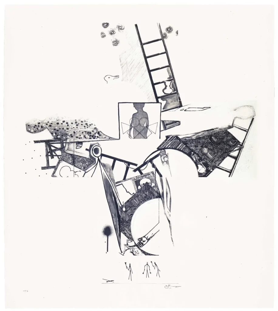
a mostly black on white jasper johns print is a dense composition of recognizable elements from his work in 1992 and before: trompe l'oeil paper prints of barnett newman etchings and a large photo of a spiral galaxy sit on top of an outline traced from the isenheim altarpiece, recognizable as something figural, or copied, but hard to discern. in the lower left corner is his optical illusion vase made from two profiles of, presumably, himself. on top of the galaxy are printed ladder fragments, a silhouette of a small child, the latter in blue, and inside [sic] the vase, three stick figures with brushes are printed in red against the grey gradient interior, hard to pick out. these elements all match up to etching plates from the seasons, a print johns made two years earlier, in 1989-90, so this is a crossover combo of several sets of elemtns, or series of images. a gift of the artist to the walker art center
Jasper Johns, Untitled, 1992, intaglio & aquatint, 43 1/2 x 53 1/2 in., with little guys in the vase, via WAC

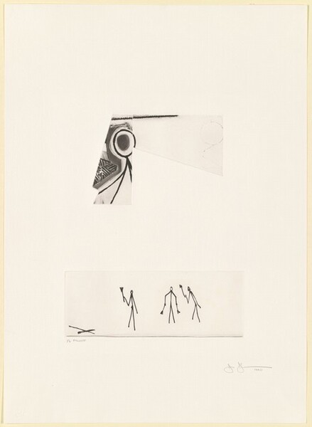
You’d think I’d have taken the hint sooner. Like after seeing the big jump around 2001 of appearances of the three little, brush-wielding stick figures in Jasper Johns drawings—because they were in the prints he was reworking. Or after finding little guys gazing at the stars in the 1997 etching he made for Leo Castelli’s 90th birthday portfolio.

But no, it took finding little guys in Johns’s 2008 Artists for Obama print that made me realize there was much I didn’t know about Johns using the little guys motif in his prints. And it turns out they’re all over the place. Johns is a printmaker who paints, and his imagemaking crosses mediums with the ease Canadians used to have crossing the US border. So I was missing a big part of the little guys story.

Continue reading “Jasper Johns Little Guys in Print”

Jasper Johns Little Guys For Obama

a jasper johns etching has two horizontal rows of squarish images, like a comic strip, in gradations of grey. most of the panels have an element that looks like an eye or a sun, in space or in a larger circle. the upper right panel has the three stick figures johns began using as an occasional motif in the 1980s, but especially after 2000.
Jasper Johns, Untitled (from the Artists for Obama portfolio), 2008, etching and aquatint, 8 x 20 cm image, 21 x 30 cm sheet, ed. 13/150, selling as a loosie on 3 Sept 2025 at LA Modern [kinda wild that such a low edition number was broken up for parts]

Whoops, missed another one. I might have to check all the benefit print portfolios Johns contributed to in the last 30 years, to see if there are any more little guys out there.

Meanwhile, these little guys are in a little print—just 8 x 20 cm, smaller, even than the Ellsworth Kelly print in the same Artists for Obama portfolio.

a detail of jasper johns's 2008 print for obama comprises the upper right panel where three barely drawn stick figures are in motion against a gradient sky sprinkled with stars. the stars and guys are drawn in line,and the sky is brushed in around them all. feels kind of quick, looks kind of provisional
Jasper Johns, detail, Untitled (from the Artists for Obama portfolio), this little scene is like 5 x 5 cm

And they’re pretty lyrically drawn, too. No stamps here. I assume those are pens in their hands, encouraging people to register to vote.

3 Sept 2025, Lot 310, Jasper Johns, Untitled, est. $2-3,000 [lamodern]
Gemini GEL got 14 Artists for Obama in 2008, tho technically they were Artists for the DNC [moma]
Previously, related: Jasper Johns Little Guys for Leo

Erased Cage Score, 2025

In 1995 Larry Rinder and Nayland Blake organized In A Different Light, one of the first exhibitions of 20th century art exploring the queer experience, at the Berkeley Art Museum.

The first section of the show was “Void,” with works “suggesting blankness, absence, and loss.” And the first work on the checklist—which I uploaded to the Internet Archive because it was somehow not there before—is David Tudor’s 1989 reconstruction of the score for John Cage’s 4’33”.

It’s one of the works which “suggest the emptiness of what might be called a state of ‘pre- being’ that precedes the birth of a new identity. Seen negatively, such works evoke the repressive alienation of the ‘closet.’ Seen in a more positive light, they represent a blank slate of unlimited possibility.”

Cage’s original score for 4’33” was dedicated to Tudor, who performed it in 1952. It was made in traditional Western musical notation, with a tempo and length to indicate the duration of each of the work’s three movements. Tudor gave the score back to Johns when he was preparing another copy, this time in graphic notation, which he dedicated to Irwin Kremen. Then Tudor’s copy was lost, and so Kremen’s copy, from 1953 is the earliest surviving score. David Platzker acquired it for MoMA in 2012.

Larry Solomon’s 1998 essay on the history of 4’33” does a pretty good job of tracking Cage’s various editions, but not Tudor’s. James Pritchett’s website is a clearer exploration of 4’33” and its origins, and related works.

this sheet of music paper is not blank, but contains the first 32 seconds of john cage's 4'33", as reconstructed in 1989 by david tudor, who premiered the piece in 1952, an reconstructed this score from memory in 1989
the first movement of John Cage’s 4’33” in David Tudor’s 1989 reconstructed score, 12.5 x 9.3 in., via James Pritchett

Tudor’s reconstruction of the original 4’33” score seems related to the differences introduced in published versions. It measured 60 quarter notes at 4/4 time to be 2.5 cm, or roughly 1 inch of score, so the first 32 seconds of the 33 second movement fit on one 9.3-inch wide page. I think that makes Tudor’s score ten pages long. [Somehow Edition Peters needed the Getty’s help to recover this reconstruction for inclusion in the current, Cage Centennial edition of 4’33”. And they still reduced the page size and mooted Tudor’s calculations.]

In their discussion of the show in for their AAA oral history, recorded in 2016, Blake recalls various aspects of the show, and mentions “Void” also containing a piece by Bay Area artist “Rudy Lemcke who had erased a—John Cage’s score for 4’33″.

Lemcke has made a lot of Cage-inspired work, particularly in Cage’s chance-operations texts and mesostic poems, but also involving the score of Perilous Night (1944), Cage’s pivotal chance-related composition for prepared piano, which also coincided with Cage’s pivot from his wife Xenia to Merce Cunningham. But I can’t find any mention of Lemcke doing an erased Cage score. And Lemcke’s work on the exhibition checklist, right next to Tudor’s, is Untitled (Performance Score for Percussion), 1977, which sounds related to a different series Lemcke was working on over several years.

I’ve reached out to confirm, but if an Erased Cage Score doesn’t exist already, it must be realized immediately, because it sounds absolutely obvious and fantastic. [a few minutes later update] Lemcke confirms that though Cage was an influence on his early work, and particularly his exploration of chance operations and graphic notation, the work shown at Berkeley was not 4’33” related, and he has not erased a Cage score. So now I will.

It would complete the circle, or perhaps spiral outward, from Rauschenberg’s early influence on Cage, who felt the White Paintings of 1951 gave him permission to write “the silent piece” he’d been contemplating for several years already. And the painting Rauschenberg gave to Cage, which he then overpainted black when he was crashing at Cage’s apartment.

From a more limited vantage point, this could have been seen as Blake misremembering, when it is clear that artist prophets walk among us, and they were manifesting Erased Cage Score into being. It should not have taken this long.

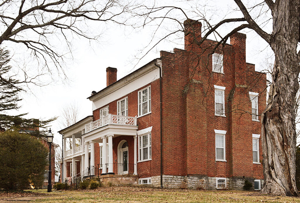
Twombly’s Warhol Electric Chair

a warhol painting of an electric chair is black silkscreen ink on ultramarine blue ground, with a lot of black. sold by the twombly foundation in 2014
Andy Warhol, Little Electric Chair, 1964-65, oil and silkscreen on linen, 22 x 28 in., acquired by Cy Twombly and sold by his Foundation in 2014

The electric chair paintings are some of Warhol’s absolute best, but the little blue electric chair owned by Cy Twombly is a standout. The Christie’s lot description for the Twombly Foundation’s unloading of the painting extols this specific painting’s heavily inked contrast:

Housed for many years in the private collection of the artist Cy Twombly, it was this divergence between shadow and light that attracted the artist to this particular painting—an admiration bolstered by his understanding of chiaroscuro gained from his detailed study of Italian Renaissance painting undertaken during his time in his adopted homeland.

According to Christie’s Lisa Paulson’s youtube feature, Twombly & Warhol traded works “in the mid-60s,” through Leo Castelli, who also was Italian, with an admiration for settling his artists’ accounts in kind.

[a week later update]

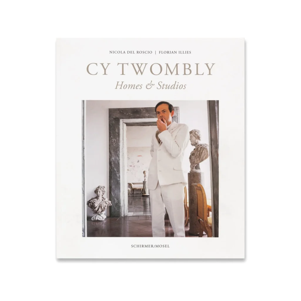
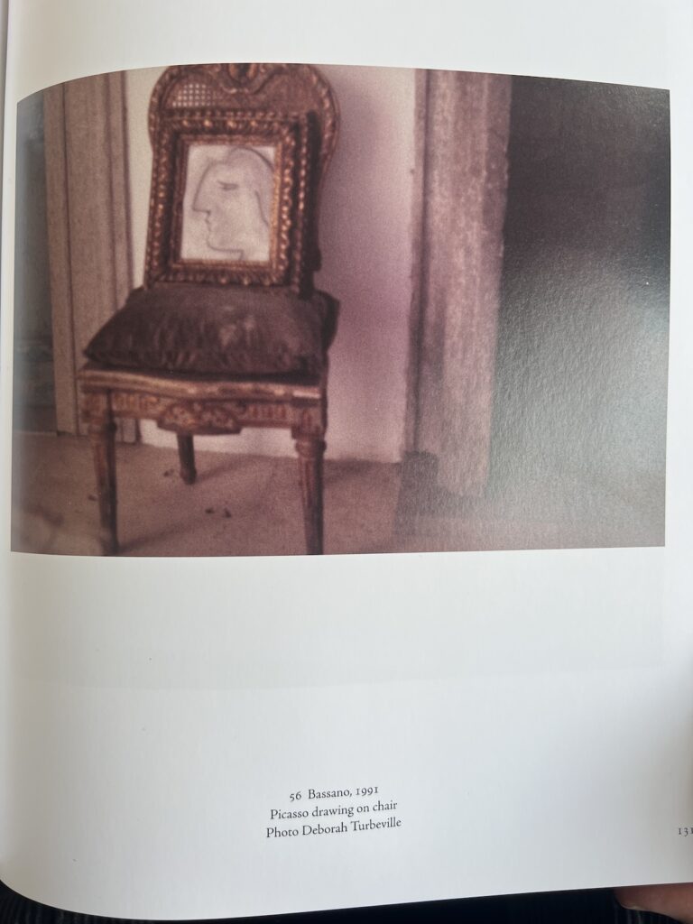
A black and white Ugo Mulas photo from 1969/70 of the biggest Chamberlain foam sculpture ever, on a pedestal in between two marble framed doorways, in the Franchetti-Twombly’s palazzo in Rome, with a tiny picasso drawing of a woman's head on the floor to the left, and through the other door, a warhol tunafish disaster painting of a grid of poisoned tunafish cans, and a breuer wassily armchair as published in Cy Twombly Homes & Studios

I totally forgot that there was a huge Warhol Tunafish Disaster painting in the background of Ugo Mulas’s photo of a massive John Chamberlain foam sculpture at the Franchetti-Twombly palazzo. I feel like a more systematic look is called for.

Away From A Slant Step Theory of Postwar Sculpture

a child-sized plywood chair with a slanted seat, and a back, seat, and front lined in dark speckled linoleum, that was originally created for lifting your feet up while sitting on a toilet to improve your shitting, became an object of fetishized mystery among several generations of male post-minimalist and conceptual artists after it was acquired at a thrift store, is here depicted in black and white on the cover of a catalogue for the third exhibition it inspired, in 1983.

It’s been told and retold enough that even if you’ve somehow never heard it or seen its inspiration, it’s clear that several generations of artists ascribe to the Slant Step Theory of post-minimalist and conceptual sculpture: In 1965 William T. Wiley bought a plywood & linoleum stool with a steeply slanted seat at a Bay Area thrift shop. Installed in the studio of his student at UC Davis, Bruce Nauman, the Slant Step’s nonfunctional mystery and alluring form made it an aesthetic fetish object. It inspired at least two shows in the 1960s and several more since. It got passed around, stolen and rescued, surviving as an intentionally absurd teaching prompt until it entered the collection of UC Davis’s museum.

As far as I can tell, the first time it was publicly recognized as a stool for helping you squat on the toilet and take a better shit was only in 2014, well into the Squatty Potty era. Even so, it’s not clear that later shows have addressed this fundamental reinterpretation of an enigmatic totem as a highly specific, utilitarian, biological tool.

It reminds me of the novel-for-some-mundane-for-others theory of paleolithic tally sticks as lunar or menstrual calendars. And of Ursula K. Leguin’s Carrier Bag Theory of Fiction, where human experience can be understood through narratives other than violence and conflict, and motives other than competition, killing, or subjugation. The Slant Step Theory may be similarly narrow and incomplete. It’s not a mystery; it’s just you.

a bruce nauman sculpture in dark grey green resin and fiberglass cast from a plywood chair-shaped box with an angled seat and back, it belonged to cy twombly, then his foundation sold it off in 2014
Bruce Nauman, Device to Hold a Box at a Slight Angle, 1966, fiberglass and polyester resin, 29 5/8 x 23 1/2 x 30 in., acquired by Cy Twombly in 1969, and sold by the Foundation in 2014

Nauman made Device to hold a box at a slight angle in 1966, with the Slant Step in his studio. It had already been shown twice before Philip Johnson’s partner David Whitney curated it into Nauman’s first show at Castelli in 1968. It went from there to documenta 4, and when it came back, Cy Twombly bought it, in 1969.

The Cy Twombly Foundation sold it in 2014. What happened to it in those 45 years? I don’t know of any photo of Twombly interiors in which Nauman’s Device appears. Did Twombly study it? Contemplate it? Respond to it? Store it away? If a revision of the Slant Step History of contemporary sculpture is in order, who knows what might be learned by tracing Twombly’s connections to and from this Nauman he kept for so long?

Act In The Gap Between Art and Handwriting

bent priorities photo of an example of a 1973 robert rauschenberg exhibition of white paintings at ace gallery in los angeles, where all the text is written in rauschenberg's lyric block text. it's square like some of the paintings.
via Bent Priorities

Sure Cy Twombly using photos of himself on his exhibition announcements is great, but have you ever considered the ones he wrote? In 2021 Yvon Lambert reissued Twombly’s exhibition posters, which is kind of amazing.

a 1972 announcement for a group show at yvon lambert, where all the artist names are written by cy twombly in an extrordinarily messy hand, even for him.
via Yvon Lambert

The earliest Lambert poster is for a 1972 group show, Actualité d’un bilan, which is great, but honestly, is also kind of a chaotic mess.

So when Dimitris, the ephemera dealer at Bent Priorities, says that two handwritten Rauschenberg exhibition announcements from 1973 show “similar techniques for the use of written word with his long time friend and companion Cy Twombly,” part of me wants to disagree. Because I can actually read Rauschenberg’s posters.

rauschenberg's handwritten gallery announcement for a 1973 show at sonnabend in paris is printed on a sheet of brown paper, folded like a newspaper. via bent priorities
via Bent Priorities

But I do think he’s right. Rauschenberg’s mountainous signature had already become a logo, but that looseness began bleeding into the announcement for a Spring show of White Paintings at Ace Gallery in LA. By the opening of his September show at Sonnabend in Paris, it had soaked all the way through.

It’s worth noting that Twombly and Rauschenberg were together a lot during this moment, mostly long winter stretches in Captiva. The next time Bob showed his Early Egyptian Series was in his two-man show—with Twombly—at Castelli. So whether Rauschenberg used some of Twombly’s techniques, or Twombly used some of Rauschenberg’s, will require closer consideration. But the announcement for that show was, of course, a photo of the two artists.

Rauschenberg White Paintings Ace Gallery show invite, 1973 [bentpriorities]
Rauschenberg Early Egyptian Series Galerie Sonnabend show poster, 1973

Johns In Paris

a framed poster of a 1961 jasper johns exhibit in paris is dominated by a reproduction of a johns lithograph, 0-9, with all the numbers drawn over each other. the show was at galerie rive droite in paris.
Jasper Johns 1961 exhibition poster, 74 x 46.3 cm, as sold by Thomaston Auction in 2022

Even MoMA lists it as 1960, and they got their copy from the artist in 1961, so maybe. But the exhibition being announced here, Jasper Johns’s first show in Europe, absolutely took place in the Summer of 1961.

0-9 is a 1960 lithograph by jasper johns where the digits 0 through 9 are drawn over each other in a nearly illegible cacophony of lines. this copy of the print was sold at craig starr gallery in 2004
Jasper Johns, 0-9, 1960, 30 x 22 in., showed in Craig Starr’s first show in 2004

I get the confusion, though. Because the poster—most were actually mailers—reproduces a Johns lithograph, signature, date, edition number and all. 0-9 (ULAE 3), 1960, was published in an edition of 35. And whoever got No. 28 photographed it for this poster. Did the Galerie Rive Droite produce the poster, with Johns’s name in his already distinctive stencil? Or was it made in the US? That freeform accent over the Saint-Honoré makes me wonder. In any case, it has a nearly uniform handmade elegance that belies its offset print reality.

a 1961 sculp-metal collage by jasper johns of the numbers 0 thru 9 cut out of this putty/aluminum powder material, and laid on top of each other in a way that their overlaps and layers come through while the color of the surface is a nearly uniform but slightly shiny medium gray. this sold at christie's in 2024
Jasper Johns, 0-9, 1961, sculp-metal and collage on canvas, 67.6 x 54.2 cm, originally shown at Galerie Rive Droite, and sold in 2024 at Christie’s

Galerie Rive Droite was around the corner from the US Embassy where, in the week after his opening, Johns, Rauschenberg, Jean Tinguely, and Niki de St-Phalle organized an art-filled performance for pianist David Tudor. June 20, 1961.

a mostly grey toned painting in encaustic by jasper johns has 15' (minutes) entr'acte stenciled/traced into the bottom third of the canvas, a reference to intermission at the performance art event johns participated in at the us embassy in paris on 20 june 2025. now in the museum ludwig
Jasper Johns, Entr’Acte, 1961, encaustic & collage on canvas, 92 x 65 cm, currently the Collection Ludwig

Johns sent flowers in the shape of a target* and whipped up a painting in the Paris studio of Alabamian ceramist Fance Franck. Though there was no actual intermission and the action never stopped, Entr’Acte was placed on stage for 15 minutes. Like the Sculp-metal 0-9 collage in the exhibition, Entr’Acte was bought by the secretary at Galerie Rive Droite, Georges Marci.

But was it really? To Google her now, Georges Marci shows up in the provenance of various blue chip artworks, is repeatedly called the “grand dame of contemporary art in Switzerland,” which has to be a self-anointed thing, and is known for opening the first gallery in Gstaad. But I guess people never thought the tapes would be made public, because in her 1974 oral history for the Archives of American Art, dealer Judith Richardson basically called Marci a thief who murdered her husband.

Richardson worked for both Sidney Janis and Ileana Sonnabend, Castelli’s ex. Which meant she worked with many overlapping artists with Galerie Rive Droite, run by Jean Lecarde. Lecarde wanted to open a gallery in Switzerland, and to get around the residency requirements, he transferred all the inventory to Marci’s name. And then she just froze him out and kept it, and he went bankrupt. This is how Arman tells the story, Richardson said. Arman was there, she said he said, when Marci set her depressed Egyptian husband up with the pills he used to kill himself. And then she got all his Coptic art.

Anyway, where were we? Johns found encaustic in Paris, borrowed a studio, and made this painting in like a day or two. While also finding time with Bob to shoot some paintings at St Phalle’s. Eric Doeringer just saw one at the Tate, shot by both Rauschenberg and Johns, and texted me about it. Turns out it was in St Phalle’s show that opened June 30, 1961. A busy summer in Paris.

Previously, related: The Performance Art in Embassies Program
* I have long wanted to see, then make, this flower arrangement, but I can’t remember where I’ve ever seen a photo of it. Somewhere, though. I’ll look.

In her MoMA retrospective, Leah Dickerman had a photo of Rauschenberg painting on stage while David Tudor played the piano. But she also said Johns carried his painting on stage to signal intermission, while Tomkins said Johns refused to go on stage. Both could somehow be true.

a 1961 shunk & kender photo of a 1m or larger square flower arrangement in the form a jasper johns target sits on a stage in paris, a grand piano in the rear left, and robert rauschenberg and jean tinguely in between curtains and backdrops on the right, from jasper johns's catalogue raisonne, vol. 5
Shunk & Kender, is there anyplace you weren’t in the 60s? Jasper Johns’ Floral Target, 1961, at David Tudor’s performance of Cage’s Variations II in Paris, via Roberta Bernstein’s chronology in JJ CR, vol 5

I knew I’d seen it somewhere. A closer look at Roberta Bernstein’s chronology shows Johns was booked and very busy in Paris: he made two plaster casts** in Tinguely’s studio; his costumes appeared on Merce dancers June 12; his show opened June 13; Tudor’s performance on the 20th; and he helped install Saint-Phalle’s show, which opened on the 28th. Also, what part of this itinerary did Shunk & Kender plan to be there for? Because it is amazing that they were around for an impromptu concert that came together in a matter of weeks.

** About those plaster casts: they were made from moulages made of the sculp-metal 0-9 and a similar Figure 3 from the Rive Droite show. So a 2nd generation cast. Which Johns used to promptly cast four more 0-9 in aluminum and, in 1997, four Fig. 3 in bronze. I low-key love that this feels like Johns wanting to keep engaged with works of his own that he expects not to see again, at least for a while.

Five Friends? Nine Friends

a black and white souvenir photo from 1958 of two white men in suits, john cage and karlheinz stockhausen, with their left arms draped over the edge of a painted cardboard picture of a junker plane, as if they're riding in an open car. the plane image is composited above a landscape photo of a ferry on the rhine, with the iconic ruins of a medieval castle on top of the famous mountain, drachenfels in the background. the whole image is blurry as if it's been copied and reprinted several times over. from october magazine, august 1997

Not only did they go back, they brought all their friends.

When I posted this 1958 souvenir photo of John Cage and Karlheinz Stockhausen flying over the romantische ruins of the castle at Drachenfels, I thought it’d be a stretch to make too contemporary a connection. And so I didn’t mention the landmark exhibition, Five Friends: John Cage, Merce Cunningham, Jasper Johns, Robert Rauschenberg, Cy Twombly which is on right now at the Museum Brandhorst in Münich. It’s the first exhibition to look at the work of these five as a tightly interrelated group of queer artists in an intense cultural moment.

And then Bluesky blew my mind when Michael Lobel and Michael Seiwert both posted this photo:

a black and white tourist photo of nine white ppl crowded into and around a fake helicopter photo backdrop from drachenfels on the rhine in germany. inside the chopper are carolyn brown, merce cunningham, john cage, mrs stockhausen whose name i forget, david tudor, and michael von biel. underneath the helicopter, because they wouldn't fit, are steve paxton, karlheinz stockhausen, and robert rauschenberg. paxton, brown, and a couple of other folks are holding glasses of beer. this photo was taken on a world tour of merce's dance company
Inside: Carolyn Brown, Merce Cunningham, John Cage, Doris Stockhausen, David Tudor, Michael von Biel; Underneath: Steve Paxton, Karlheinz Stockhausen, Robert Rauschenberg, a 1964 photo from Königswinter at the Robert Rauschenberg Foundation, via Museum-Brandhorst

The 1958 photo reminded Lobel that he’d seen this larger group shot in a 2016 Rauschenberg essay at Tate. Seiwert noticed it because it’s IN the Brandhorst exhibit.

Germans see this 1964 photo taken during a Merce Cunningham Dance Company world tour and are like, Mein Volks! The Tate caption incorrectly says it’s from Cologne, but it’s got Drachenfels written right on the helicopter. Seiwert points out that in 1964, Stockhausen was living near Königswinter and Bonn, the capital of West Germany, so it would have been an obvious destination for our intrepid dance troupe.

Meanwhile Jasper Johns was at home, painting.

Five Friends runs through 17 August 2025 at the Museum Brandhorst [museum-brandhorst.de]

For Your Jasper Johns Tablescape

a dinner plate printed with a round jasper johns pastel drawing from 2001 of two stylized heads hanging from stems of a leafy green treebranch. the left head is light purple with a central blush of orange, a distorted picasso head. the right is a yellow/orange optical illusion of a young and old woman's faces. 150 of these plates will be sold in two weeks in may 2025, most at an art fair, to raise money for the coalition for the homeless
Jasper Johns, Artist Plate Project, 2025, via Artware

I gotta say, I did not expect to see Jasper Johns in the Artist Plate Project. But as Benjamin Godsill was telling APP organizer Michelle Hellman in the latest episode of Nota Bene, this year is full of bangers.

This is the fifth year that Hellman has put together a collection of artist-designed plates whose sale benefits the Coalition for the Homeless in NYC, and it is remarkable. Once the APP began debuting the plates at art fairs, they’ve taken on a wild, competitive philanthropic eshopping energy.

This year there are fifty plates, each in an edition of 150, with the first 100 reserved for the opening day of Frieze NY. The rest will go on sale the following week at Artware Editions. The plates are just $250 each, about the price of a lunch at an art fair. [Artware also has some previous years’ plates, including individually signed plates, and a couple of complete sets, no waiting.]

a round jasper johns pastel drawing from 2001 comprises two stylized heads hanging from stems of a leafy green treebranch. the left head is light pinkish purple, a distorted picasso head. the right is a yellow/orange optical illusion of a young and old woman's faces. via matthew marks gallery
Jasper Johns, Untitled, 2001, pastel on paper, 25 1/2 inches diameter, via Matthew Marks Gallery

What’s wild about Johns is not that he did it, but that he had a tondo drawing ready for instant plate adaptation. Johns had used both the Picassoid head and wife/mother-in-law optical illusion in many works for years; having them sprout surreally from a tree branch, in a round pastel? Not so much. But he showed this picture in the 10th anniversary drawings show at Matthew Marks at the end of 2001.

Oh wait, actually he did not. That is an entirely different work—same motif, different object. When the Marks drawing turned up at auction in 2015, it had an uncharacteristically full essay, especially for a day sale, with a surprisingly full discussion of Johns’ references.

Art Kites Project, Strings Attached

robert rauschenberg's 20-ft tall by 10-ft wide kite flying in a cloud filled sky over himeji castle in japan, which is in the lower right corner of the 1989 image. the kite is orange and red silk screenprinted with black images of chairs and peeling paint in classic rauschenberg collage style. via the rrf instagram
Robert Rauschenberg, Sky House II, screenprint on silk collage, bamboo, 372 x 248 cm, image via ig/RRF
Sky House I, meanwhile, Rauschenberg kept for himself, according to former assistant Thomas Buehler

Robert Rauschenberg’s genius in making a 20×10-foot Art Kite was in understanding the opportunity while ignoring the assignment. Because the opportunity was to make two Art Kites, and have your Art Kites fly in the “vernissage in the sky” at an Art Kite Festival held amidst the blossoming sakura on the grounds of Himeji Castle. While the assignment was to promote Lufthansa.

a 1989 photo of a big square yellow kite with the lufthansa logo of a screaming chicken or whatever the nazis came up with, which the reformed german staffers who reconstituted the company anew in 1953 adopted straight up, just somehow with no nazi association or past now, it's a miracle, flying in a lightly clouded sky over himeji castle. from art kites, the goethe institute catalogue, where the last page and the last image turns out to be the same as all the other money shots of artist-designed kites flying over himeji-jō you just flipped through, and the caption reads, the world tour of the art kites is sponsored by lufthansa, in english and japanese
And for the first 461 pages, I thought the show was about how flying and art are the same glorious expression of human freedom: “The world tour of the Art Kites is sponsored by Lufhansa” [p.462]

Obviously, it was more than that, but also just that. The Art Kites Project was sponsored by Lufthansa and organized by Dr. Paul Eubel, director of the Goethe Institute Osaka, which commissioned 100 artists from around the white world and Japan to create Japanese-style kites in 1987. The kites would fly once in Japan, on April 1 & 2, 1989, and once in Europe, on April 21 & 22, 1990, go on tour for three five years, to 21 museums in Japan (8), Europe (12), and Canada (1), before being auctioned off.

Continue reading “Art Kites Project, Strings Attached”

Jasper Johns: Take An Object, Add Some Little Guys To It

a close up film frame grab of jasper johns touching up the corners of a copper intaglio plate sitting on a white worktable at ulae. the horizontal rectangular plate features three stick figures holding brushes, a motif johns first used 7 years earlier. via hans namuth and judith weschler's 1990 film, jasper johns: take an object
Johns adding these little figures in Namuth & Weschler’s 1990 film, Jasper Johns: Take An Object

“I thought to add these little figures, which appear in a different drawing of mine, an old drawing. They’re in the bottom of Perilous Night, for John Cage.”

Oh hey, look, it’s Jasper Johns in 1989 discussing the addition of his little stick figures to another work for what sounds like the first time since he used them in 1982.

jasper johns 1990 print, the seasons, is a jumble of elements from his painting series of the same name, rearranged into an interlocked cross form, with three tiny stick figures appended to the bottom.
And little guys: Jasper Johns, The Seasons (ULAE 0249), 1990, intaglio, 50 1/4 x 44 1/2 in., ed. 50

Johns is talking to filmmaker Judith Weschler, who produced Jasper Johns: Take An Object with photographer Hans Namuth in 1990. The short film is bracketed by two extended scenes of Johns at work: in 1972, painting in his own studio, and in 1989, printmaking at ULAE.

Continue reading “Jasper Johns: Take An Object, Add Some Little Guys To It”

Twombly Four Gators

a 1972 work on paper cy twombly made for robert rauschenberg is a horizontal sheet of cream paper with a row of four souvenir postcards depicting alligators, rougly evenly spaced, with variously thick or thin lines drawn above and below them. a couple are overlaid with transparent graph paper. below them, in the lower center of the sheet, a fifth postcard is mounted face down, so that the text portion is up. it reads cy twombly captiva dec 20 72, to bob r. xmas 72. two clusters of thickly drawn, diverging diagonal lines point down from the top gator row, alongside the label postcard. small numbers are written near or above the various lines, with meanings not readily apparent. the work was in the collection of rauschenberg when it was published in twombly's drawings catalogue raisonné
Cy Twombly, Untitled, 1972, collage on paper, 22 3/4 x 31 inches, image via CR-Works on Paper, v6-17

You cannot fully understand Twombly’s art unless you know that there is gators.

Twombly went to Rauschenberg’s house in Captiva in November 1970 and made collages; in December 1971 and made prints, but those catalogues raisonnés were checked out, so who knows? In the winter of 1972, he made this collage as a Christmas present for Rauschenberg. It has four, possibly five, postcards of alligators on it.

I really didn’t think of collage as a Twombly thing. But it looks like a major part, maybe even most of his works on paper in the 1970s were collages. He collaged with catholic zeal: Leonardo images; mushrooms and natural history book illustrations; graph and drawing paper; fragments of other drawings; and, in Captiva, especially, touristy postcards.

Twombly’s lines here index the placement and width of the postcards, and of their crossed out captions, as if the composition is a conceptual schematic of itself. It’s still very much a drawing.