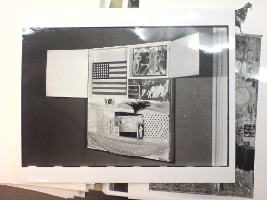
In the summer of 1965 Jasper Johns’ flag painting was stolen from inside Robert Rauschenberg’s combine Short Circuit.
This black & white photo of the work by Rudy Burckhardt was in the archive of the National Collection of Fine Art.
the making of, by greg allen

In the summer of 1965 Jasper Johns’ flag painting was stolen from inside Robert Rauschenberg’s combine Short Circuit.
This black & white photo of the work by Rudy Burckhardt was in the archive of the National Collection of Fine Art.
Lawrence Voytek began working for Robert Rauschenberg in 1982, right out of RISD. He set up a workshop in Captiva, Florida, and for decades was involved in helping the artist fabricate his work and solve complicated technical challenges.
One of the highlights of Voytek’s oral history with the Rauschenberg Foundation is his work casting objects, from an 24k gold apple core and a solid silver pineapple to a bronze replica edition of The Ancient Incident (1981), a pyramidal tower of fruit stands and Windsor chairs.
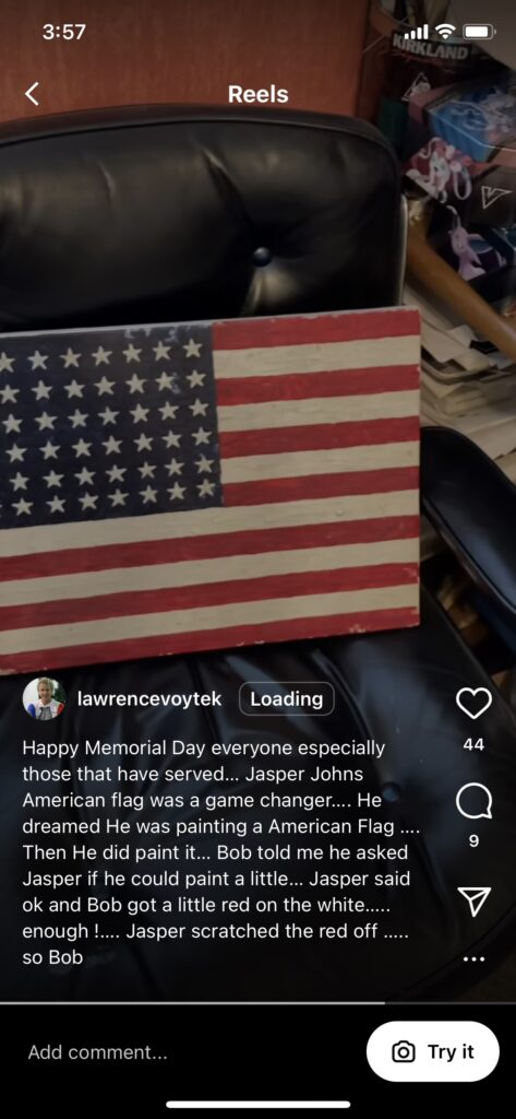
Yesterday, artist Eric Doeringer sent me an Instagram Reel Voytek posted for Memorial Day. Voytek shows off a small, bright Jasper Johns-style American flag on a wood panel, which he holds with one hand while recording with his phone in the other. I’ve transcribed the Reel for Art History:
Happy Memorial Day, everybody. This is an encaustic flag. There was a painting that Bob did [Short Circuit, obv] that had a Jasper Johns that was stolen, and it was at Captiva for a while. Bob asked me to make a kind of a copy of the Jasper, doing the real encaustic. He didn’t use it on it; they had a Mary Stravant [sic, Sturtevant] flag that had newspaper and stuff. But this was kind of fun. I melted Crayola crayons, and I had hot wax, and I made a Jasper Johns flag so there you go. Happy Memorial Day.
in 1954 Bob was with Jasper when Jasper had the dream of painting an American flag, and that really sort of was a gamechanger.
Indeed it was, Lawrence, indeed it was.
Voytek’s oral history doesn’t mention Johns, Short Circuit, or Flag (this one or any others). Rauschenberg’s story from Voytek’s caption, though, about asking to paint some of the original Flag is out there. Johns’ story about the dream is, by definition, solitary. But I think this is the first account I’ve seen that acknowledges someone else was in the bed.
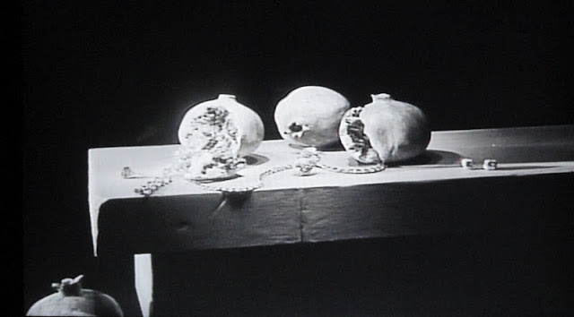
Speaking of casting difficult fruit: Melons and Pomegranates, Matson Jones Custom Display
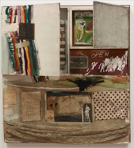
The post I just finished about Cady Noland reminded me of Jasper Johns. First is his only public statement about not showing or reproducing Short Circuit, the Rauschenberg Combine that at the time (1962), still had a Johns flag painting inside it:
Dear Sir:
I’ve always supposed that artists were allowed to paint however-whatever they pleased and to do whatever they please with their work–to or not to give, sell, lend, allow reproduction, rework, destroy, repair, or exhibit it…
The second, I couldn’t remember where I’d seen it, but it was so vivid in my mind, I figured it could only come from one place: Michael Crichton’s 1977 catalogue for Johns’ retrospective at the Whitney. And sure enough:
He is direct about his work, an area of his life which he jealously guards. Once, at a dinner, a wealthy collector who owned several important Johns paintings announced over coffee that he had an idea for a print that Johns should do. He said that Johns should make a print, in color, of an American map. The collector argued his case cogently. He pointed out that Johns had done other prints in color based on paintings from that period; he alluded to the significance of such a print to the whole body of Johns’ work; he mentioned the opportunities for the sort of image transformation which Johns’ other color prints had explored; and he pointed out the peculiar arbitrariness that had led Johns do to map prints several times in black-and-white, but never in color.
A hush fell over the table. There was a good deal of tension. On the one hand, one doesn’t tell an artist what to do, but on the other hand, the suggestion was not uninformed, and it did not come from a source the artist could casually alienate.
Johns listened patiently. “Well,” he said finally, “that’s all very well, but I”m not going to do it.”
“Why not?” asked the collector, a little offended.
“Because I’m not,” Johns said.
And he never has.
Now I want to read this whole book again.
When you go to the Rauschenberg show at MoMA, take your opera glasses.
A question I was never able to figure out was when, exactly, Sturtevant’s Johns Flag took the place of Johns’ Johns Flag after it was stolen in 1965.
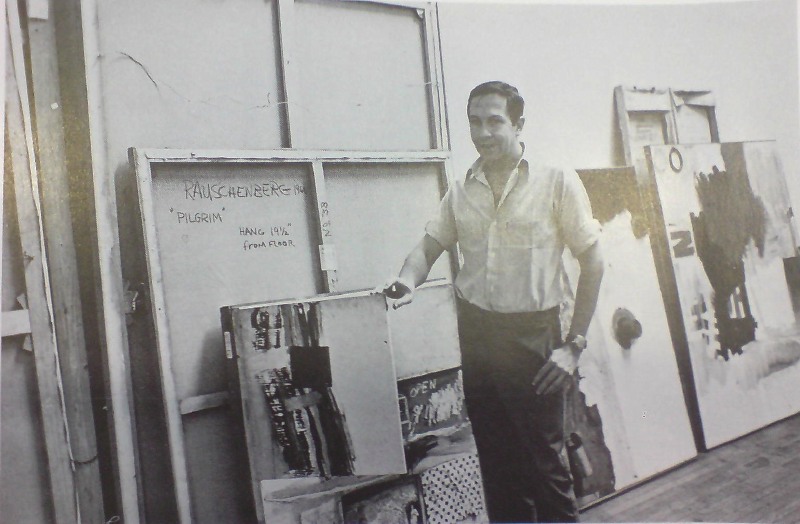
When they split, Johns & Rauschenberg made an agreement that Short Circuit, or perhaps Construction with J.J. Flag, as it had also been known, would not be exhibited. Presumably, with Johns’ Flag gone, Rauschenberg felt free to include the work in a collage-themed group show at Finch College in 1967.
He posed with the work [above], holding the cabinet door ajar to obscure the space where Johns’ Flag had been, and in his artist statement, he said, ” Elaine Sturtevant is painting an original flag in the manner of Jasper Johns’ to replace it.” Is painting, present tense.
Did she finish in time? It’s not clear. All published accounts of the exhibition mention the openable doors with paintings behind them-but also that they were nailed shut. So who knows? Sturtevant’s Johns Flag is like Schrodinger’s Cat, both alive and dead, both in there, and not.
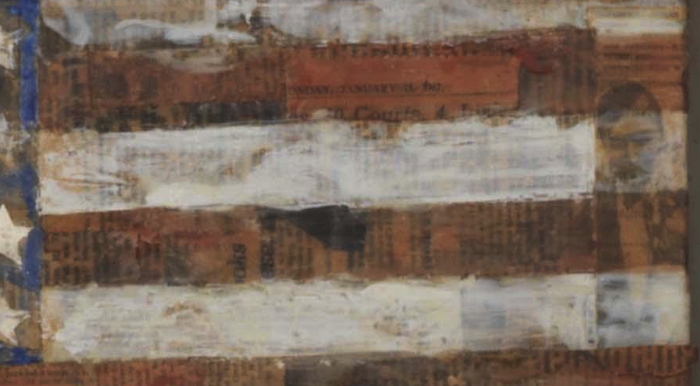
detail of Elaine Sturtevant’s Johns Flag in Rauschenberg’s Short Circuit
But. If you take a close look at Short Circuit‘s Sturtevant Johns Flag at MoMA, you might be able to see a legible scrap of newspaper on its surface. Actually, you can see many, but one has a date: Sunday, January 15, 1967. And a typeface that looks like the Times.
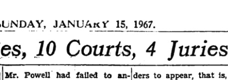
image: nytimesmachine
And sure enough, it is. Page 69. The headline: “Powell Case, in 6 Years, Has Involved 80 Judges 10 Courts, 4 Juries, 15 Lawyers and congress.” The story: a full-page recap of a convoluted lawsuit brought against Rep. Adam Clayton Powell, Jr., involving defamation and allegations of police corruption.
The Finch show opened on March 9th, so it is at least possible that Sturtevant finished her painting in time to put it in. I mean, it can’t be ruled out [the way a scrap of newspaper visible in Johns’ own MoMA Flag dating from after the 1955 exhibition of Short Circuit almost certainly means that the Short Circuit flag was the “first” flag.]
What’s more interesting, though, is to the right. Doesn’t that look like Johns? In a tuxedo? Perhaps attending an opening? I’ve only done the most cursory search so far, and I can’t find a source for that image from 1965-67. Would Sturtevant have kept a party shot clipping from Johns’ Jewish Museum show in 1964? Would Rauschenberg?
Previously, related: Art in Process: Reading Finch College Museum
Jasper Johns’ first Flag
It’s been a hard season to think of positive things, and sometimes looking back, it’s been difficult to see how or if things mattered at all. But I also look back at the year with immense gratitude, both for the opportunities I’ve had, but also for the people who helped make them possible. I’d probably still be doing a lot of what I’m doing here if no one else was paying attention; that’s how it often feels, actually. But I’ve come to know that sometimes people do take an interest in what I’m doing, whether writing, research, criticism, or artmaking, and they respond to it, react to it, challenge it, run with it, join in on it. And it makes it interesting, better, and more meaningful, and it is nice to feel that. But there are also things, some of my greatest, favorite things, that would not have existed at all without the interest, effort, and support of others.
So I’d like to give some specific thanks to some of the many people who engaged with and supported my work in 2016. Without them, these things I am so proud of would literally not have happened.
Magda Sawon suggested we do a proposal for SPRING/BREAK. “Chop Shop” began as a glib sendup of Simchowitzian cash&carry speculecting. But in the last few weeks before the show, it grew exponentially in scale, which forced some real thinking about its meaning and ambition. With Ambre & Andrew’s flexibility, and the extraordinary efforts of Magda’s posse, Chop Shop somehow became what supposed to not be: a Basel-ian boothful of investment-grade masterpieces. [Some of which are still available, btw. Get in now at 2016, pre-boom prices.]
Book deals come and go, but Jennifer Liese and her colleagues at Paper Monument offered what bloggers need most: a good editing. When PM first asked to include my 2+ years of posts about the history of Erased deKooning Drawing in their anthology Social Medium, I frankly thought they were nuts. But Jen’s vision and thoughtful editing helped me see my own writing and ideas anew, and she enabled them to reach people in an amazing, new context. I’ve never felt prouder of my writing than to have it included among the great work of so many artists who influence and inspire me already.
Mark Leckey and John Garcia included my work in shows that were totally fascinating and different from anything I could have imagined, which let me think about it and the world it inhabits in a new way. Having my satelloon sculpture be subsumed into Leckey’s autobiographically inspired installation at MoMA PS1 turns out to be a rare privilege, to be able to help realize, almost literally, someone’s memory.
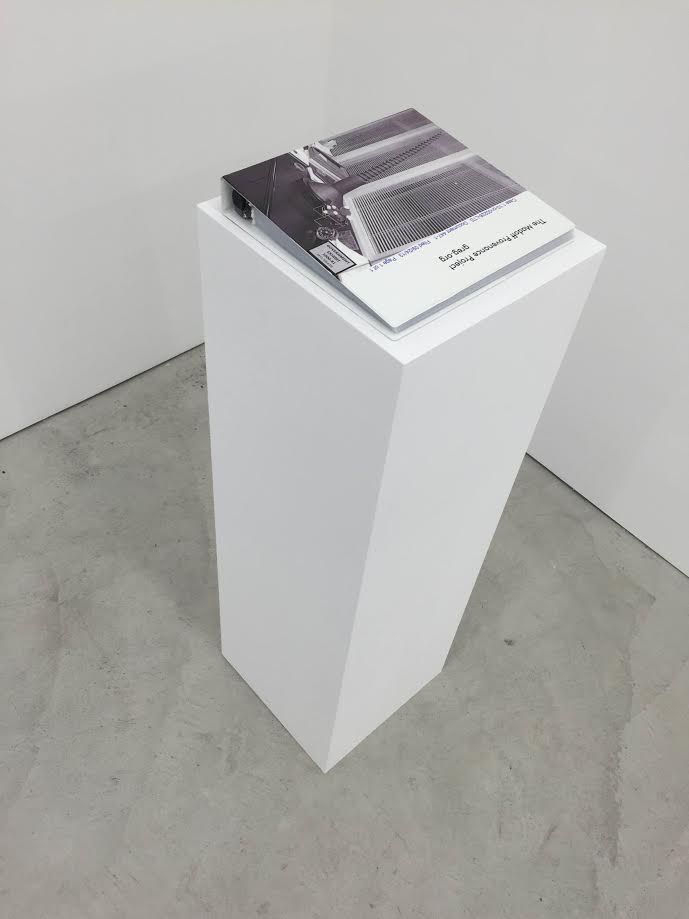
And Garcia’s inclusion of the Madoff Provenance Project in his show about context’s impact on art at To___Bridges___ not only gave it a challenging context, it pushed me to figure out ways to make the project visible and understandable beyond its datalayer. This in turn helped me see how my work connects to, and was informed by, artists of earlier generations. [In this case, there’s an obvious shoutout due to Mel Bochner and his Working drawings and other visible things on paper not necessarily meant to be viewed as art, a project whose title has long resonated with my own ambivalence about calling myself an artist or what I do art.]
Sarah Douglas and Andrew Russeth at ArtNews invited me to write about one of my favorite, all-consuming blogtopics: the disappearance of the Johns flag in Short Circuit. And recently Eric Doeringer and I had a great public conversation about his work, and the early Johns/Rauschenberg era that I continue to find engrossing and misunderstood.
Collectors and supporters who engage in the oddball, time- and space-limited art projects I proposed around here literally made them happen. In the crazy-skewed art world of the moment, lowering the stakes and making and trading art for two figures feels refreshing. And most awesomely, these projects have been a catalyst for connecting with some inspiring people who share some interests, and who introduce me to their passions and practices, too. [I hope 2017 lasts long enough for me to do a book version of eBay Test Prints, btw.]
Most of all, I have to thank my wife, who is my smartest, most skeptical, yet most tireless supporter. She is so deeply disapproving of my #andiron-style art designation practice it is not even funny, but she also sees me wrestling with it myself and taking it seriously, so she does, too. And anyway, at the very least, when I’m dead and gone, and she doesn’t have to deal with a storing or tossing a studio or warehouseful of objects, she’ll come around. So thank you, and thank you all. I hope we all get through 2017 and beyond to do this again.

I’m psyched for but slow to hype the discussion Eric Doeringer and I will have tomorrow, Saturday, Dec. 17, at 4pm, on the occasion of Eric’s show at Mulherin Gallery.
Titled “Matson Jones & Co.”, Eric is showing work he’s made based on early artworks by Robert Rauschenberg & Jasper Johns. So tomorrow we’ll probably talk about their collaborations, both as commercial artists, doing window displays under the name “Matson Jones,” but also the artworks they made together, including such foundational “Rauschenbergs” as Short Circuit and Erased deKooning Drawing, and foundational Johns works like, well, like Flag and Map. Can you even imagine?
Anyway, it should be a blast, so I hope you’ll come by.
“Eric Doeringer: Matson Jones & Co.” runs through Dec. 31 at Mulherin, 124 Forsyth St (Delancey) [mulherinnewyork]
I’m not alone! It’s not just me! In the introduction to the catalogue for her 2008-9 show, “Robert Rauschenberg | Travelling 70-76,” curator Mirta D’Argenzio wrote:
His favorite means of self-expression were always inclusive of change, travel, and collaboration. He seems from the very beginning, paraphrasing words of his own, to have committed his entire activity to the task of defining an ever more ample concept of collaboration, always in a state of becoming, that nearly made it possible to do away with the very notion of subjective behavior on the part of the artist,
Rauschenberg made a decisive contribution to superseding the notion of the individuality of the author: a notion very much emphasized by modernism, and then virtually discarded by post-modernist thought. His absolute freedom in this respect found expression from the very beginning in the intersubjective approach that permitted him– from his first works with Susan Weil, and then in his relationship with Cy Twombly, and immediately thereafter with Jasper Johns– to set up a true short circuit that questioned the modus operandi of western art and the very concept of the individuality of the author. This attitude, however, was in any case to lead him to preserve a specific identity that found paradoxical reinforcement in its own self-negation.
In the discussion for Paper Monument’s Social Medium anthology Sunday, I tried to make this exact point about Rauschenberg’s collaborative works, especially in the earliest days of his career. And here it is/was, right there in 2008. 2009. In an Neapolitan exhibition catalogue about works from the early 70s, when Rauschenberg was traveling the world and absorbing influences and materials and references.
D’Argenzio goes on
Rauschenberg insisted: “Ideas are not real estate.” And then he continued: ” “In collaboration one can accept the fact that someone else can be so sympathetic and in tune with what you’re doing that through this they move into depths which might not be obvious if that person had been working alone in a studio with the door shut…I think part of our uniqueness is the fact that we are ill-equipped.
Except that this is a quote from a 1974 interview with Rauschenberg about printmaking. Prints are inherently collaborative and technically contingent, and foundries are always good about namechecking. But that is not anything like questioning the concept of authorship. If anything, it’s auteurist. As Walter Hopps saw it in the catalogue for the 1999 retrospective, “in collaborations, Rauschenberg simultaneously functions as composer, orchestra conductor, and first violinist.”
Rauschenberg and Johns might have been hoping to question the modernist notion of authorship when they hid a flag painting behind the door of a work that was first known as, Construction with J.J. Flag. But when faced with the decision, rather than short circuit their individual careers, they ended up pulling the plug. It was self-negation as self-preservation. [h/t @andrewrusseth, whose tweet about that real estate quote set me on this hunt.]
Buy Robert Rauschenberg. Travelling ’70-’76 [amazon]
I know it’s folly to take auction catalogue text as art history, but it is of a piece, at least in this case.
Untitled, recto, 1954, Collection Paul Taylor, image: Sotheby’s
Last night’s sale at Sotheby’s included a very early, underdocumented 1954 combine by Robert Rauschenberg, which he gave to the dancer and choreographer Paul Taylor a decade later. [I say underdocumented because I can’t find any mention of it in Paul Schimmel’s otherwise exhaustive Combines catalogue, or anywhere online not associated with the auction.]
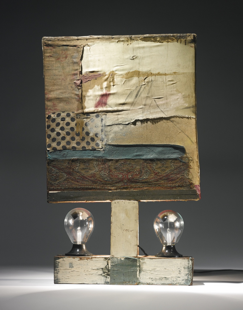
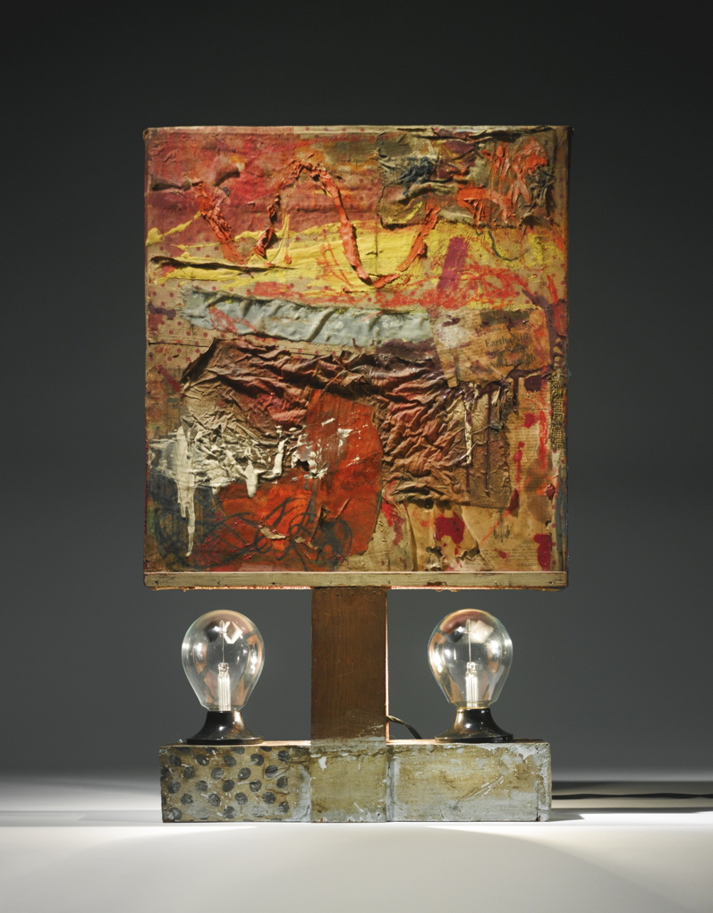
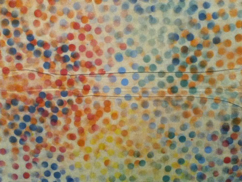
Untitled, verso, 1954, Collection Paul Taylor, that polka dot fabric turns up on at least six other combines, including Short Circuit, image: Sotheby’s
The piece is freestanding, tabletop-size, with a double-sided painting/collage mounted on what seems like a 2×4 wood base. There’s a lightbulb sandwiched in between the support slats, and a pair of radiometers, those little gadgets with black & white panels that spin when exposed to light.
The Man With Two Souls, 1950, photographed by Rauschenberg in 1951 in his UWS apartment, where Twombly told Walter Hopps he’d seen it. He later got it. image: Hopps’s Rauschenberg: The Early 50s
As soon as I saw it, I thought of Rauschenberg’s earliest surviving sculpture, made in 1950. Cy Twombly got it after Rauschenberg’s 1951 show at Betty Parsons, but before he and Bob took off for seven months to Africa, leaving Susan Weil and the baby behind. The piece is called The Man With Two Souls, and it consists of a glass rod flanked by a bulbous pair of wine bottles inserted in a cast plaster block. Charles Stuckey suggested it was an homage to Barnett Newman’s sculpture Here I, which was shown at Parsons earlier in 1951. Yes, that might be one allusion.
Twombly and sculptures in Twombly’s studio, 1954, photographed by Rauschenberg, image via Schimmel’s Combines
It also might be similar to almost every Cy Twombly sculpture in these photos Bob took in 1954, the year Taylor’s combine was made. The year, in fact, when Rauschenberg made what’s considered the first of his combines, set pieces for Taylor’s debut as a choreographer after leaving Merce Cunningham’s company in mid-1954.
And depending on which side you’re looking at, Taylor’s piece looks an awful lot like Minutiae, the free-standing set piece Bob made for Merce’s December 1954 performance at BAM. Which is all set up for my complaint about Sotheby’s catalogue text, which acknowledges that Rauschenberg was “informed by the influences” of his contemporaries like Jasper Johns, and then immediately distances the two artists:
Though their practices were fundamentally at odds, both conceptually and aesthetically, the two men supported each other’s stylistic experimentation during this critical time of immense growth and evolution.
Unfathomable difference has been the starting point of any discussion of Rauschenberg and Johns’ early work since at least 1963, when Allan Solomon gave them each one-man shows at the Jewish Museum. It’s a presumption of separateness that shuts off any exploration of similarity, much less exchange or collaboration. And especially in the case of Rauschenberg and his artist/partners, it heads off any questions of joint creation or shared authorship.
Minutiae, made with help from Johns in time for Merce Cunningham’s Dec. 7 1954 performance at BAM
Johns has said publicly he worked on Minutiae. Twombly drew on Rebus and who knows what else. Johns even said he made a Rauschenberg with Bob later signed, and that he came up with the term “combine.”
But whether it’s historic or persistent institutionalized homophobia, emotions & ego, the demands of the market, or the lone genius paradigm of the times, it’s apparently still impossible to ask if there are similarities or connections between these artists’ contemporaneous work.
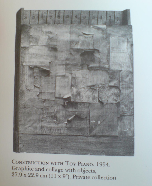
Construction with Toy Piano, 1954, image: Michael Crichton’s Jasper Johns
Twombly and Rauschenberg are both gone, alas, and Johns doesn’t seem too interested to elaborate, seeing as how he has systematically hunted down and destroyed his own work from before 1955. But at least one piece that survives, Construction with Toy Piano, a book-sized wooden object covered with painted collage, looks like it could have been made in the same room as Paul Taylor’s combine, if not by the same mind or hands. Just asking the question.
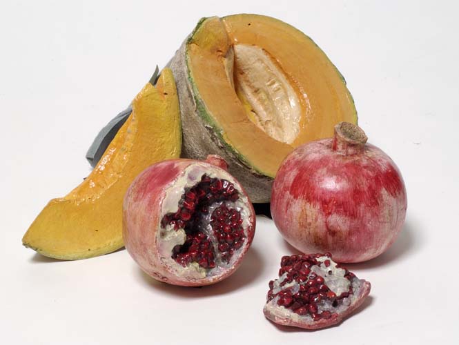
Melons and Pomegranates, 1956, hand-painted plaster, Matson Jones Custom Display
When these hand-painted, cast plaster works were sold at Swann in 2005, they were dated “circa 1955.” But I believe Gene Moore only began working with Tiffany & Co. in 1956. In 1956 and 1957, he commissioned at least seven window displays for Tiffany & Co. from Matson Jones, including a series inspired by still life paintings. Matson Jones was the commercial pseudonym for Jasper Johns and Robert Rauschenberg.
Tiffany & Co. window display designed by Matson Jones, 1956, image: madammeow, probably from Gene Moore’s 1990 book
The filmmaker and impresario Emilio de Antonio had, as “an artists’ agent,” been involved in arranging commissions from Moore for Rauschenberg, Johns, and Andy Warhol. One project Matson Jones executed for Moore client I. Miller involved “a kind of three-dimensional window display” interpretation of Andy Warhol’s shoe drawings, which were featured in the company’s ads at the time.
Another display for a Moore client [and Tiffany neighbor] Bonwit Teller included Johns’ 1957 painting, Flag on Orange Field. After Construction with J.J. Flag/ Short Circuit‘s inclusion at the Stable Gallery Annual in 1955, this may have been the second public exhibition of Johns’ Flag paintings; neither was credited to him.
Despite this professional overlap, and their mutual friendship with de Antonio, Johns told Paul Taylor in 1990 that he only met Warhol for the first time in 1961, when Andy bought a drawing out of Johns’ second solo show at Castelli. Soon after that, Warhol’s own comic strip-based paintings were shown in a Bonwit Teller window display, where they were likely seen by Roy Lichtenstein.
Except to whoever bought them in 2005, the current whereabouts of Matson Jones’ melons and pomegranates is unknown. Though I have heard some things.
“With the certificate of authenticity from the Robert Rauschenberg Foundation.” ! Nov 17 2005, Sale 2057 Lot 223 EARLY SCULPTURE BY JOHNS AND RAUSCHENBERG POP ART, est. $5,000-8,000, sold for $10,925 [swanngalleries.com]
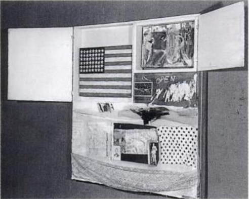
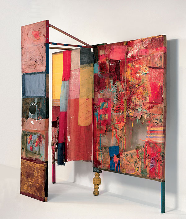
Short Circuit (aka Construction with J.J. Flag), c. 1958? photo: Rudy Burckhardt
Errol Morris’s new film about Donald Rumsfeld has me thinking a lot lately in terms of the known unknown, and the unknown unknown. As I’ve tried to find the missing Jasper Johns flag painting that was in Robert Rauschenberg’s 1955 combine Short Circuit I’ve kept running into another formulation which bridges the two: what we think we know.
It’s not that the story of Short Circuit as it trickled down through history in footnotes and parentheticals and anecdotes was wrong, so much as incomplete. . And the elisions have shaped the widely accepted understanding of both artists’ work. But it also prompts the question, “Who’s ‘we’?”
Because someone knows what happened to that flag painting. Someone’s always known. It just wasn’t me.
Alright, let’s get all these together in one place:
After claiming for more than 40 years that he had drawn it himself, Robert Rauschenberg acknowledged in 1999 that, in fact, Jasper Johns, who “lived upstairs,” created the graphite text label collaged onto Erased de Kooning Drawing. Or as one person who knew the work when it was made told me last year, “Bob made it, but Jasper made it art.”

Minutiae
Jasper Johns in 1999, as published on the site of the artist’s Foundation for Contemporary Arts [and first quoted here in 2011, in discussing collaboration and Jacob Kassay, actually]:
In 1954 I had helped Bob Rauschenberg a bit with his Minutiae set, his first for Merce Cunningham, and I continued to assist him with most of his stage work through 1960.
Rauschenberg is credited with costumes and/or set design for at least 10 works for the Merce Cunningham Dance Company between 1954 and 1960, including the iconic painted backdrop/leotards of “Summerspace” (1958). Johns’s first actual credit doesn’t appear until 1968.
Oh, but look, on this walkeradmin tumblr [? ;)], a detail from the “Johns/Rauschenberg backdrop for “Summerspace.” I’m glad it’s not just me.
Of the 18 works Rauschenberg is credited with between 1954-58 for the Paul Taylor Dance Company, 17 were for costumes, and one, “The Tower,” (1957) was for set design. Jasper Johns is credited with making the costumes for “The Tower.”
The Tower, by Rauschenberg & neighbor
The Tower, a 1957 Rauschenberg combine created for the dance set, which depicts a couple, was described by the Christie’s representative trying to sell it in 2011 as both “autobiographical” and “cryptic,” which, for these two, is redundant. For composer John Cooper’s part, the Feb 10, 1957 program said he had been considering the “pastoral themes of the Adonis-Persephone myth.” [Persephone and Aphrodite both fell in love with Adonis while babysitting him. So, yeah. Not sure what to do with that.]
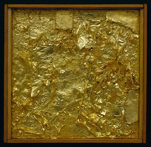
Untitled (Gold Painting), 1956, Menil Collection
I recently met someone who owned a Rauschenberg Gold Painting. The collector said that once Jasper saw it, and said, “Oh, yes, this is one I did.” 10 existing gold paintings predate 1954, the year of Johns’s and Rauschenberg’s meeting, but according to Walter Hopps’ 1991 catalogue, “two or three” were made afterward, at the “special request” of friends. Alison Gingeras included Untitled (Gold Painting), 1955, in “Unpainted Paintings,” her 2011 show at Luxembourg & Dayan. The Menil’s gold painting [above] dates from 1956.
In 1977, in the SoHo Weekly, art historian Roberta J.M. Olson had posed to Johns this kind of remarkable question:
During his early days in New York City Johns and Robert Rauschenberg shared a closely knit friendship of cross-fertilization…It has been said [it has?? -ed.] that during this period the two artists also painted works in each other’s styles.
I asked whether any so-called “Johns paintings by Rauschenberg existed in collections today?
JJ: No, but there is one “Rauschenberg” by Johns. Really, though, it is a Rauschenberg because after I finished it, Bob fooled around with it and I do believe that he eventually signed it. It was a small painting and I don’t know its whereabouts today…The only time I remember Bob actually working on a painting of mine was when he picked up the red paintbrush and went to work on one of the white stripes in a flag painting” […]
One? Just one? Does no one ever ask follow-up questions? No, no one ever does.
Johns told Calvin Tomkins in 2005 that in 1960 Rauschenberg, who had been using maps as an element in his combines as early as Small Rebus (1956), “simply gave” him mimeographed maps of the US, which he painted on directly, and later enlarged into paintings like Map (1960).
UPDATE: In fact, Rauschenberg painted on maps as early as 1950, when he created Mother of God, which was part of SFMOMA’s massive 1998 acquisition.
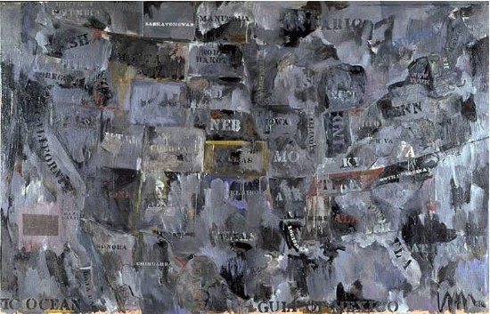
Map, 1962, image via moca.org
In 1988, Deborah Solomon told a version of Johns’s Flag dream story that somehow includes direct quotes from–and a co-starring role by–Rauschenberg:
One day in 1954, Johns casually mentioned to Rauschenberg that he’d had a crazy dream the previous night. ”How crazy was it?” Rauschenberg asked. ”Well,” Johns replied, ”in this dream I was painting the American flag.” The American flag? Rauschenberg didn’t think it was crazy at all. ”That’s a really great idea,” he said.
And this all is aside from the Short Circuit saga; and the fact that Flag looks like it’s constructed like a combine; and his paintings from the earliest canvas & fabric, drawer, canvas, fork, spoon, flashlight, plate, and letter set are essentially combines, too, only we don’t call them that–even though Johns says he came up with the term.
There is so much we don’t know about how these two artists worked and collaborated. So much that doesn’t get asked, or is known and doesn’t get written. So much about the similarities and cross-references and resonances in their work that has been overlooked, dismissed or deflected for so long.
From the earliest days, curators like Alan Solomon and critics were assiduous about keeping these two oeuvres separate and distinct. Whenever asked about influence, Johns would say he always tried to stay aware and move away from it. Rauschenberg would emphasize how diametrically opposite their personalities were, and that was that. Whatever the forces at work, whether the closet, the AbEx legacy of the lone genius artist, or the market’s willful self-delusion, the work they made and discussed side by side, alone with each other, for six foundational years, is almost only ever considered in isolation.
1954: more than a decade before BMPT, and two decades before Prince & Levine [And multiple generations before Codax, BHQF, and Dylan]. What would it mean for the concept of authorship to find out Johns and Rauschenberg were making each others’ work?
update: And while the PMA’s amazing collaboration-related show has absolutely gotten me off my duff to post about this subject, I swear, I had no idea that Alistair Macaulay would publish his email q&a with Johns about his work with Merce Cunningham this morning. Great minds.
Painting from life: Life Magazine, image: gagosian
In trying to figure out the why, no seriously, WHY? of Bob Dylan’s second [!] painting exhibition at Gagosian [!?], Gallerist NY’s Michael Miller was left with the same Only Possible Explanation that’s been dogging me since the musician’s first baffling Gagosian gig in October 2011:
All I could come up with was a conspiracy theory cooked up by a friend, that both of Mr. Dylan’s shows at Gagosian are actually the work of Richard Prince using “Bob Dylan” as a pseudonym, making the ultimate statement on art and artifice, and proving once and for all that Bob Dylan is whoever you want him to be.
Exactly! It makes perfect sense. Explains everything. Clear as day. All evidence points to it. Every piece of evidence there is. I will go so far as to say that wars have been started with less evidence than this. If Richard Prince were Iraq, we’d have invaded him and pulled him out of his Dylanholes by now, is what I’m saying.
Let’s look at the facts. Or rather, let’s look at the facts while entertaining the possibility that Prince is performing as Dylan the visual artist.
The 2011 show, The Asia Series, were originally presented as–and understood as–a tour documentary. We’re on the bus, walking the street, just hanging, seeing the world as Dylan sees it:
He often draws and paints while on tour, and his motifs bear corresponding impressions of the many different environments and people that he encounters. A keen observer, Dylan works from real life to depict everyday phenomena in such a way that they appear fresh, new, and mysterious.
And if this fantasy come true weren’t enough, Dylan’s real life turns out to be as exotic and mysterious as we’d always imagined The Orient to be:
The Asia Series, a visual journal of his travels in Japan, China, Vietnam, and Korea, comprises firsthand depictions of people, street scenes, architecture and landscape, which can be clearly identified by title and specific cultural details, such as Mae Ling, Cockfight, The Bridge, and Hunan Province. Conversely, there are more cryptic paintings often of personalities and situations, such Big Brother and Opium, or LeBelle Cascade, which looks like a riff on Manet’s Le Déjeuner sur l’Herbe but which is, in fact, a scenographic tourist photo-opportunity in a Tokyo amusement arcade.
That was the setup, the view that held for the first few days before Dylan’s paintings were revealed to be copies, tracings of old photographs. Whether the source was as famous as Henri Cartier-Bresson, as prominent as a new Magnum photo [licensed, apparently, after the fact], or as anonymous and obscure as a collection of 19th century, hand-tinted lantern slides scanned and uploaded to flickr, they had two things in common: 1) they were entirely unacknowledged, and 2) they were thoroughly and inevitably trackable.
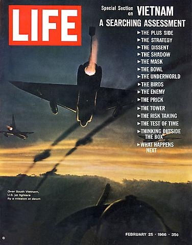
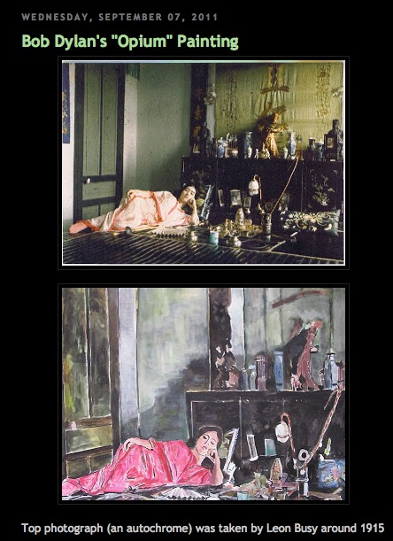
In fact, Dylanologists were already on the case; they’d puzzled over the sudden change in Dylan’s painting style as evidenced by the images Gagosian was teasing the show with: a 1966 LIFE magazine cover slightly altered with “pulp references,” and a scene in an opium den which was quickly traced to a 1915 Leon Busy photo by the curator of the Opium Museum.
screenshot from amy crehore’s blog, via expectingrain
And then the plagiarizing shit hit the fan. I’m no conspiracy theorist, but the media freakout over Dylan’s Asia Series paintings was so out of proportion to their obvious reality, it seemed staged.

both above from Okinawa Soba’s flickr stream
Instead, it’s the kind of thief/appropriation/credit criticism that has followed Dylan throughout his entire career. Which should give him and Prince something to talk about.
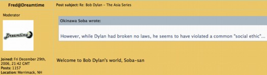
“Welcome to Bob Dylan’s world, Soba-san!” [image: expectingrain.com]
After the photo-based painting controversy broke, Gagosian tweaked the press release: “Dylan works from real life” became “Dylan is inspired by everyday phenomena,” and “a visual journal of his travels” became “a visual reflection,” which is no longer considered “firsthand.” But then, in these mediated days, what is?
La Belle Cascade, dylan, gagosian via nybooks
I think the key to Dylan’s show is to be found here, in the reality gap between how something is “billed” or presented, and how it is received. Because as Dylan turns out to have told MoMA Chief Curator-turned-Gagosian adviser John Elderfield in the show’s catalogue interview, photographs are part of real life:
A number of the paintings–such as Emperor, La Belle Cascade, Cock Fight, and Shanghai–show very complex scenes. Were these done from sketches, or do you paint from photographs–or from drawings made from photographs–some of the time?
I paint mostly from real life. It has to start with that. Real people, real street scenes, behind-the-curtain scenes, live models, paintings, photographs, staged setups, architecture, grids, graphic design. Whatever it takes to make it work.
But besides the knack for appropriation-fueled outrage, what does any of this have to do with Richard Prince?
It’s true that the outsized criticism of Dylan’s photo-based painting struck me as ridiculous at the time, Fall 2011, when the Cariou v. Prince verdict and appeal were getting increased attention, and when the Corinna Belz’ documentary Gerhard Richter Painting and Richter’s retrospective were both receiving rapturous acclaim. Oh, and when John “yes, that John, right in the middle of it all,” Elderfield was taking his victory lap at MoMA with the last and greatest painting show of his career, the Willem de Kooning retrospective.
And I knew that Prince was involved–maybe implicated was the better word–because I saw he’d written a piece in the Asia Series catalogue, in which he mentioned D.H. Lawrence’s paintings, and compared Dylan’s La Belle Cascade to–holy crap–Cezanne’s Bathers:
The paintings that Dylan showed me out in L.A. were paintings from his travels in Asia. Some of them looked too big for him to have painted them while he was there, so maybe he had done them from memory or a photograph or a sketch or a drawing. I didn’t ask. I didn’t ask a lot of things. I didn’t need to. I just enjoyed the experience. I liked a painting called La Belle Cascade because it looked to me like one of Cézanne’s Bathers. And Cézanne’s Bathers are some of my favorite works of art
And when that essay was republished on the NY Review of Books after the controversy broke, I started wondering about the possible differences between “Dylan’s paintings” and “The paintings Dylan showed me,” and this equivocation about Dylan’s studio suddenly seemed a lot less benign than it had previously:
Dylan’s studio. I think it was Dylan’s studio. I’m still not sure. It didn’t look like any artist’s studio I’d ever been in.
Someone was working to not be pinned down. Prince knew what was up, and so, for that matter, did Elderfield. And so did anyone who looked at a 4-ft, vintage photo-based painting and wondered how the hell anyone, much less Bob Dylan, ever painted it on a Thai tour bus.
But it wasn’t until a few months later, when I was deep in my own Destroyed Richter Paintings project, and I unrolled the first shipment of canvases from Chinese Paint Mill, that I recognized the painting style–as Bob Dylan’s. The same flatness, the same traced-over-projection line, the same filled-in spaces. Whether he’d ordered them from Chinese Paint Mill or from somewhere/one else, it now seemed obvious that Dylan did not paint his paintings.
Not that outsourcing his fabrication would grant Dylan anything greater than general admission at the contemporary art ball. Fling an iPhone in Chelsea, and you’re bound to hit an outsourcer, a fabricator, or both. These paintings aren’t any less “Dylan’s” or “Dylans” for having been painted by someone else. And are they any more Prince’s or Princes for him having made them? Or having them made? Are those Koonses actually Sarah Morrises? Are those Morrises actually by [names of her painters who call to chat and dish redacted]? That Richter painting Kippenberger table: was or is? Construction with J.J. Flag or Short Circuit?
As long as Dylan signs his paintings–whoops, he doesn’t–well, as long as they’re presented as his, under his name.
And he’s obviously on board with the project. If not, who would have engineered it? At Gagosian? Would Prince have claimed to have visited Dylan’s studio [sic] if it hadn’t happened? Well, yes. But would Elderfield have claimed to have interviewed him? And written two essays for two shows? For a Henry Codax-style, ghost Dylan?
This past Summer, while working on a live restaging of Prince’s Canal Zone lawsuit, I started to sense that outsourcing, or hands-off production, was as important to his own practice as appropriation itself. The hand-off of his Cowboys film to commercial processors was an early example. It stuck when he testified about not meeting a now-grown Brooke Shields in 2005 when Sante D’Orazio shot her for a recreation of Spiritual America [above]:
Q. You just weren’t there?
A. I just–well, I wasn’t there by purpose.
Q. Okay. What was the purpose?
A. To transform the image.
Q. The photo–
A. Yes.
Q.–that Mr. D’Orazio took?
A. Yes. [M]y not being there is a transformative–the absence of the author is I believe a way to transform an image.
[Prince noted that his “contribution” also included selection, or “editing” D’Orazio’s 300 shots down to the one that would get printed. And then he showed it, as an unpublicized surprise, to guests at a private dinner held in the Rivington St. storefront where the original Spiritual America was first shown.]
Untitled (Original), 2010, image: fultonryder
In his Fall 2009 deposition Prince also testified of tracking down the original illustrations used for pulp fiction book covers, such as those used in his Nurse paintings. He’d begun pairing these drawings & paintings with the books themselves. Untitled (Original), as the series is called, are featured at Fulton Ryder, Prince’s bookstore. Where, upon close inspection, it is immediately obvious that “the originals” in Untitled (Original)s are actually copies of the covers, which he has created. Or has had created. Commissioned.
And the Charlie Company paintings [above] he showed in St. Barth at the Eden Roc hotel in 2008? Same thing. They look like reworked details and collages of various he-man adventure pulp covers? But they’re not paint on inkjet, but acrylic on canvas. Different process. Entirely fabricated, Princes painted to order.
Which all brings us to this year’s Dylan show at Gagosian, improbable under the most craven, degraded, celebrity-worshipping cultural best circumstances, Revisionist Art. I confess, I haven’t seen the paintings in person, but from the artists I know who have seen them, I’m better off for it. [I will get to the show, though, before it closes.]
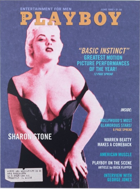
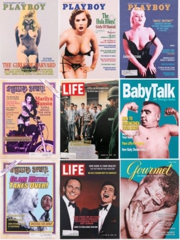
Playboy Magazine, Sharon Stone, 2011-12, image: gagosian
As image/objects, these large, supposedly “silkscreen on canvas” paintings are apparently jaw-droppingly awful. One person called them “wretched,” and couldn’t begin to see how they were silkscreened at all. The only explanation he could come up with was “silkscreen” as a technically accurate description of the 4-color Photoshop separation & printing process. They’re cheap and dead. As objects. And they’re puerile and unfunny and lame as content. Which makes them all the more befuddling and exasperating in their hallowed–or at least blue-chip–context.
Prince had written of the Asia paintings, “I think [they] are good paintings. They’re workmanlike and they do their job.” For the new show, this assessment serves as a lowered bar not to cleared, but to be mamboed under.
And all of which makes me even more certain of Prince’s involvement in Dylan’s painting project, and which makes me suspect that this reaction, the very experience of the paintings and the show, is the artist[s’] central focus.
In such a view, address labels for “Richard Staehung” and “Ricardo Wellhung” are not just sophomoric jokes, they’re signatures. By the guy who makes joke paintings. And autographs.
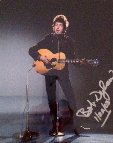
Bob Dylan with guitar and harmonica, signed photo, dated 1/22/03, POR, via fultonryder
And then you start seeing Prince connections everywhere. The model, for instance, on the mockup cover of Playboy looks like she was photographed en route to an OCTPFAS read-in at “Mr. P’s” shop.
Over the summer, Fulton Ryder’s blog featured this Birdtalk, Prince’s term for the short appropriated texts and aphorisms he’s published throughout his career:
Daniel Boorstin says in his book The Image: A Guide to Pseudo-Events in America: that American life is becoming increasingly organized at every level, and that spontaneous events are being replaced by “pseudo-events”. We find ourselves in a situation where we accept reality as it is reported rather than as it really is: “We become so accustomed to our illusions, our images, that we mistake them for reality.” – Birdtalk
And this Fulton Ryder grouping was posted in September and again in November, just before Dylan’s opening. The titles displayed could be a poetic artist statement for the show:
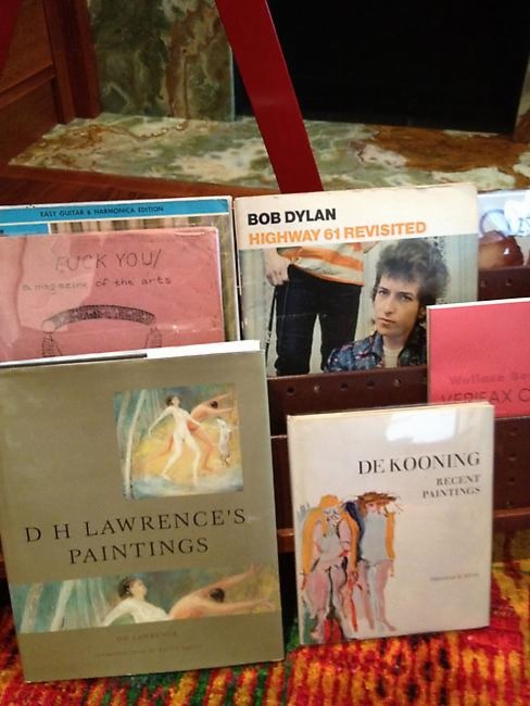
Bob Dylan
Highway 61 Revisited
Wallace Berman Verifax C[ollages]*
De Kooning Recent Paintings
D.H. Lawrence’s Paintings
Fuck You
A magazine of the arts
Easy Guitar & Harmonica Edition
* few days later update: I realize I’d skipped the Berman reference, which is nuts, because Berman’s Verifax collages are ground zero here.
Here’s another one, connecting Lawrence, The Band, and the NY punk era that is Prince’s psychic hometown. To quote the man himself,
Because something is happening here
But you don’t know what it is
Do you, Mister Jones?
To be honest, I looked at John Dogg and Howard Johnson, and, I thought Bob Dylan was just Prince’s giant middle finger to the screwed up art system that doesn’t give enough of a damn to look at what it’s buying and selling and fawning over. Not just the death of the author, but his murder, and the propping up of the author’s corpse, Weekend At Bernie’s-style, in order to keep cashing his checks.
A magazine of the arts: Revisionist Art images ganked from some Danish Dylan messageboard
But then as I was walking it back, trying to see, if not why, then where and when a Prince-for-Dylan relationship might have begun, I hit 2007, the year of Dylan’s first art exhibitions [of overpainted printouts of scans of pages from Drawn Blank, a 1994 book of tour sketches, which, mhmm]. And also the year of Todd Haynes’ remarkable movie I’m Not There, where six different actors portray six different Dylans and various times of his life.
Haynes spent seven years on the project, and a surprising amount of it feels captured in Robert Sullivan’s 2007 tagalong for the New York Times, which is one of the most sensitive and insightful making of stories I’ve ever read.
And I’ll steal Sullivan’s amazing hook here because it’ll only make you want to read the whole thing. It’s about being on the set for the identical mug shots of the Dylans which open the film [they’re in the trailer, too, above]:
Then Haynes took [Ben] Whishaw’s seat on the empty set and, in the video monitor, happened to perfectly align his head with those of all of his Dylans. When I stepped from the wings to look through the camera itself, I saw, in one semimystical, semirevealing moment, the artist as one with the artist he was trying to artificially reassemble.
Because Todd Haynes’ Dylan film isn’t about Dylan. That’s what’s going to be so difficult for people to understand. That’s what’s going to make “I’m Not There” so trying for the really diehard Dylanists. That’s what might upset the non-Dylanists, who may find it hard to figure out why he bothered to make it at all. And that’s why it took Haynes so long to get it made. Haynes was trying to make a Dylan film that is, instead, what Dylan is all about, as he sees it, which is changing, transforming, killing off one Dylan and moving to the next, shedding his artistic skin to stay alive. The twist is that to not be about Dylan can also be said to be true to the subject Dylan.
I think that’s what Prince is trying to do here. To be Dylan, to make a show and art that is what Dylan is all about. To make something real, whatever it takes, in the middle of a screwed up world. To confound and infuriate as you create, and to transform yourself in the process. And suddenly the answer to “Why??” becomes so crystal clear, I’m embarrassed to have even asked: “Because he could, and given the chance, you would, too.”
After I started taking this speculation seriously, and researching and relooking–I guess I could have started with this, but then where’s the fun?–I’ve been sort of, I don’t know, reached out to. [Not by the artist(s), who, how would you be able to believe either one in a situation like this? They’d just add one more refraction of ambiguity.] And holy smokes, people. About this one thing, at least, Prince’s centrality to Dylan’s paintings and shows, I don’t wonder anymore.
How Many Paintings Can One Man Make Before He Decides to Stick to Music? Bob Dylan Gets a Second Show at Gagosian [galleristny]
John Elderfield Interview with Bob Dylan, Spring 2011 [bobdylan]
The Asia Series discussion on Dylan fan site Expecting Rain [36 pgs] [expectingrain]
Deciphering the Asia Series: Dylan, Duchamp and the letter from Woody [swarmuth]
Illustration from Ed Meneeley’s Tender Buttons, 1964
You may know Edward Meneeley from such art historical blog posts as, “The guy who published the subscription art slide library and newsletter which Rauschenberg refused to allow to reproduce Short Circuit in 1962 because of the agreement Rauschenberg and Johns had come to after their messy breakup,” and “The guy who told me how Johns really transformed an erased de Kooning drawing into Erased De Kooning Drawing,” and “The guy who was hooking up with at least Bob at the time, yow, small world.”
But he also turns out to be one of the first artists to use the then-new technology of photocopying to make prints. Starting in 1964, when a friend took him to IBM’s offices, where he saw a copy machine for the first time.
Edward Meneeley, IBM Drawings
Meneeley made three print portfolios using a photocopier: Tender Buttons (1965) [top] was a suite of illustrations for Gertrude Stein’s work of the same name. IBM Drawings (1966) was an exploration of the medium and its context, abstract, collaged images composed from computer tapes and other office ephemera that Meneeley found at hand. There was also a hairy, photocopied butt, presumably the artist’s.

And then in 1968, the year Seth Siegelaub instigated his highly influential, photocopied-book-as-exhibition project, The Xerox Book, Meneeley made Portraits: People and Objects, which included a reassembled photo collage portrait of his friend Jasper Johns. But where Siegelaub and his crew were skewing to the conceptual aspects of copying, Meneeley was very attuned to the technical subtleties of photostatic reproduction, which he interpreted as a unique printmaking medium, an updated form of lithography.
Great stuff.
Edward Meneeley and the advent of the electrostatic artist’s print [rectoversoblog, which has many more images, not just the 2nd & 3rd images above]
First things first, yes, I’ve heard the footsteps of the Tate’s awesome, new, online exhibition/project, the Gallery Of Lost Art behind me, and I will be trying to wrap up the search for the lost Short Circuit Johns flag painting very soon. At least soon enough to give them time to write my triumphant detective work into their essay. Ahem.
Meanwhile, let’s give credit where it’s due, because the Tatefolk have lured SFMOMA’s infrared imagery of Erased de Kooning Drawing out and onto the net.
Last year at CAA, one of SFMOMA’s design & web people Chad Coerver talked about the debates over whether or how to present the wealth of information in the Museum’s Getty-sponsored Rauschenberg Research Project. Whether to publish new infrared imagery of EdKD, for example, which might alter the way people perceive the object in ways the artist did not want or anticipate.
I guess they figured it out, because not only does the GOLA have it, the IR image is the teaser today on SFMOMA’s tumblr. [via wiblog and MAN]
Or maybe they’re still working on it. SFMOMA’s Erased De Kooning Drawing page has this footnote:
The use of advanced imaging technology and its implications for our understanding of Erased de Kooning Drawing will be explored fully through SFMOMA’s Rauschenberg Research Project, a four-year in-depth research program that will result in an online catalogue, slated for launch in summer 2013.
Carry on, then!
But the page also has this description, which seems to reflect a fuller, and different, understanding of the work than what was discussed during Rauschenberg’s lifetime:
After Rauschenberg completed the laborious erasure, he and fellow artist Jasper Johns devised a scheme for labeling, matting, and framing the work, with Johns inscribing the following words below the now-obliterated de Kooning drawing:
ERASED DE KOONING DRAWING
ROBERT RAUSCHENBERG
1953
The simple, gilded frame and understated inscription are integral parts of the finished artwork. Without the inscription, one would have no idea what is in the frame; the piece would be indecipherable. Together the erased page, inscription, and frame stand as evidence of the psychologically loaded deed of rendering another’s artwork invisible, enacted in the privacy of the artist’s studio.
Which, hmm. It seems vital that Johns’s central role in creating EdKD is acknowledged. I’d even argue it was equal, or equivalent, his precisely drawn marks the precise counterweight to Rauschenberg’s vigorous erasures. And the title, even the titling, and thus the conceptual framing, is Johns.
Or at least it was. But the gilt and the current matting, has been changed, once and maybe twice or more, since Johns and Rauschenberg broke up. So it is Bob’s. And the evidence of this evolution can be seen even more clearly, thanks to the Gallery of Lost Art’s zooming feature, on the back of the work.
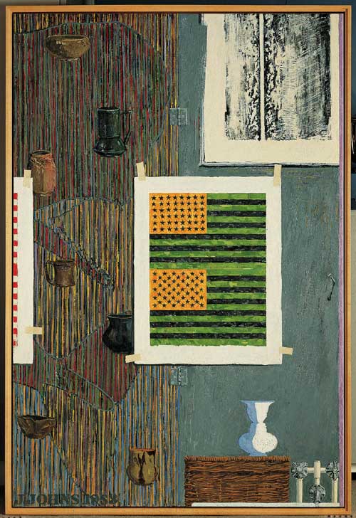
Jasper Johns, Ventriloquist, 1983, image via: MFAH
And now to the second oldest tab in my browser, an essay by Barbara Rose on Jasper Johns’ references to works by Barnett Newman, which accompanied an excellent 1999 show of Johns’s and Newman’s editions at Brooke Alexander Gallery.
From his earliest days in New York, Johns saw and collected Newman’s work, and Rose proposes an ongoing personal relationship between the artists that can be seen in Johns’s work, even from the very beginning:
In the paintings he exhibited at Betty Parsons [in 1951 and 1952], Newman accomplished a goal Pollock was also intent on resolving; he eliminated the distinction between figure and ground. Instead of separating one from the other, he proposed a format in which the image was identical with the field, with no background left over. No shapes were depicted, not even as flattened silhouettes. Rather the field was divided into regular zones. This is of course the format of the iconic Flag that Johns dreamed of and then painted for the first time in 1954. Because Johns’ image is both literal and identifiable, his medium is encaustic rather than oil, and he is more of an easel than a mural scale painter, the obvious debt of the horizontal bands of the flag, which line up to the horizontal framing edge as Newman’s “zips” line up to the vertical frame, has hardly been noticed.
In the 80s, Johns began inserting pictures within pictures, both of his own artworks and works he collected.
Barnett Newman, Untitled, 1961, image via baeditions
Rose discusses several examples of these autobiographical works, including Ventriloquist, top, which includes a mirrored/reverse image of Newman’s 1961 lithograph, Untitled, which Johns owns, and the artist’s own inverted double flag, a color combination Johns used for a 1969 fundraising edition/protest poster for the Committee Against the War in Vietnam. [The unsigned poster version, below, says “MORATORIUM” on the bottom; the signed, numbered edition does not. Maybe the customers for the more expensive version preferred their Johns Flags straight, so to speak, with less politics.]
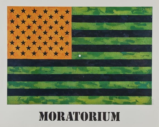
Johns’ 1969 Flag (Moratorium) poster sold for just £300 last Spring
Anyway, two interesting things Rose doesn’t really get into much: the way Johns makes work about [and with] work he collects, not just work he admires. It’s something that would resurface later in his Catenary series, which seem to relate directly to an early Rauschenberg combine Johns owned, then sold, which has the shroud lines from a small parachute hanging off it. And the resonance this picture-in-picture construct has to Rauschenberg’s Short Circuit. I’ve always thought that Short Circuit was an outlier somehow for incorporating works by other artists; but it turns out that Johns himself eventually began doing something similar in his own paintings and prints.
Johns & Newman: An Encounter In Art, by Barbara Rose [baeditions]
Previously: Johns and Manet’s Execution of Maximilian