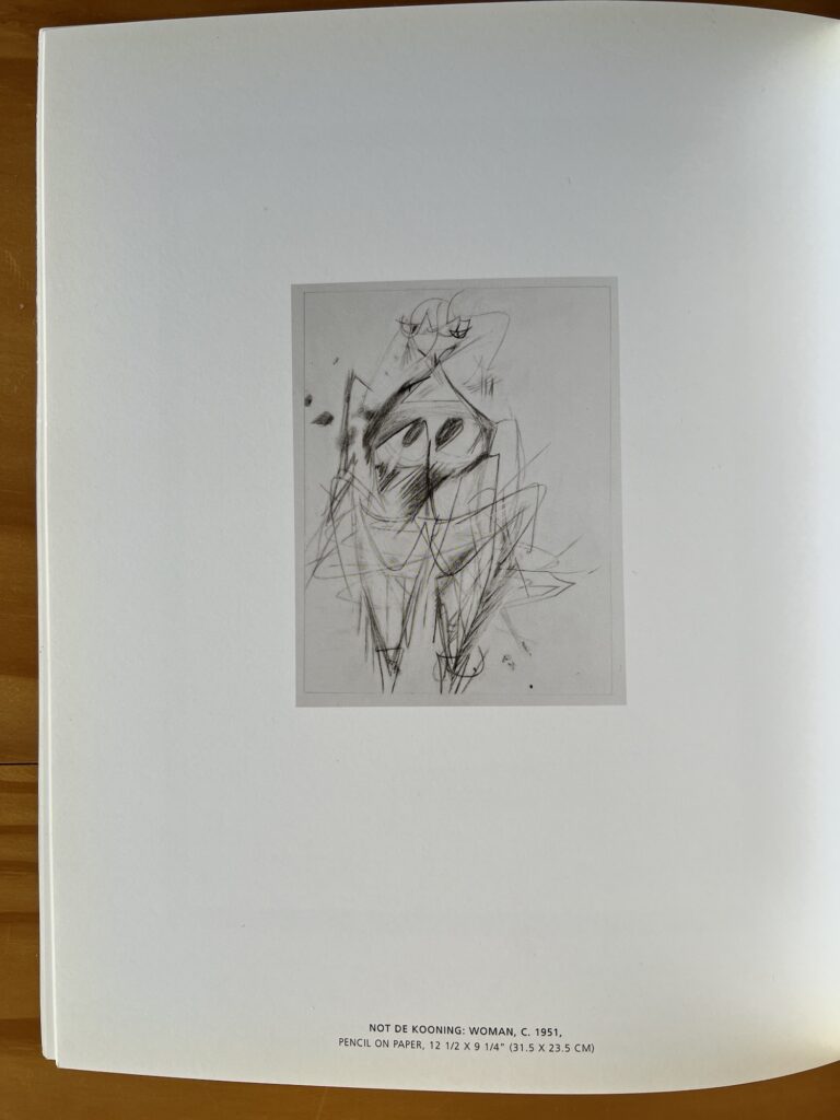
Mike Bidlo, Not De Kooning Woman, c. 1951, 12 1/2 x 9 1/4 in., as published in Francis Naumann’s 2005 catalogue, Mike Bidlo Erased de Kooning Drawings
According to Robert Rosenbaum’s essay in the catalogue I just got—and which seems like the only source for images of the actual works—Bidlo’s NREdKD began as almost a performance, when he erased what looked like a de Kooning in front of his shocked fellow guests at an artsy retreat in Maine in 2003. When a collector couldn’t buy it, he appealed to Naumann, who appealed to Bidlo, who agreed to make a whole show of them.
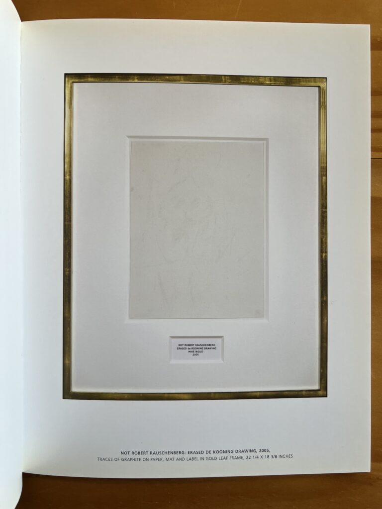
Mike Bidlo’s Not Robert Rauschenberg: Erased de Kooning Drawing, 2005, 22 1/4 x 18 3/8 in., ibid.
For each work, he made a beautiful Not de Kooning drawing, which he erased into a Not Rauschenberg. Each got a Johns-style label, and a facsimile FRAME IS PART OF ARTWORK frame, in a variety of dimensions. The show included documentation of the drawings, but also all the eraser crumbs, under glass, which, ngl, seems kind of corny.
Still as someone who, as I’ve already confessed here, thinks about erasing de Koonings whenever I see one, I can do naught but stan.
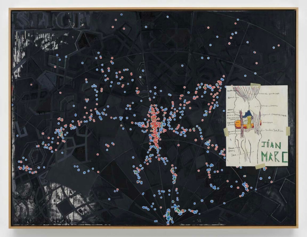
Slice, 2020, oil on canvas, 50 x 66 1/8 in., promised gift to MoMA
Catching up on Sean Tatol’s always invigorating takes at The Manhattan Art Review, including his review of Jasper Johns’ drawings show at Matthew Marks. Which, like his previous show, includes variations on his 2020 painting, Slice, that got a lot of attention during his double retrospective.
And this line caught me off guard: “He’s apparently announced that Slice is his last painting, and as far as last works go I can’t imagine a more eloquent invocation of mortality and infinity.”
So before getting to the “Wait, what??” let’s cover the, “Yes, and”: Slice certainly is a helluva painting to end on. With themes Tatol observed, rich source images across the board, and a popping backstory that’ll keep people talking, it delivers on multiple planes at once.
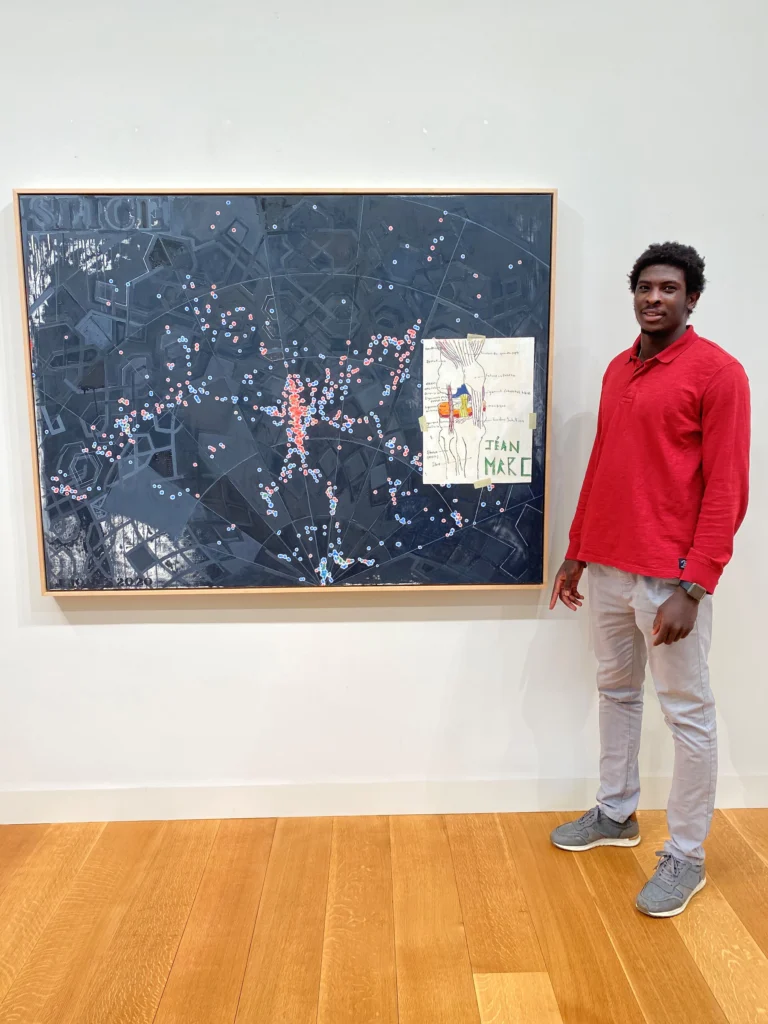
2020 photo of then local boarding school student Jéan-Marc Togodgue with Slice (2020) in Johns’ studio, taken by his basketball coach, Jeff Ruskin [via]
And after its star turn in the Whitney/PMA show, Slice was made an anonymous promised gift to MoMA, where the credits for Johns’ reference images expanded in 2023 to include not just ACL doodler Jéan-Marc Togodgue and astrophysicist Margaret Geller, but all Geller’s scientific collaborators on the 32yo Slice of the Universe map she sent the artist unbidden.
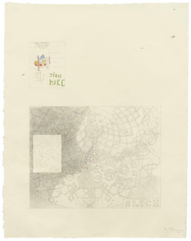
Untitled, 2020, graphite, watercolor, and colored pencil on paper, 23¼ × 18¼ in. via Marks
But all that said, Wait what? I could neither imagine nor find any context in which Johns would have made such an announcement. So I asked Sean where he’d heard it. And he mentioned a post artist and editor Walter Robinson made last month to two social media platforms: “Jasper Johns (b 1930): ‘MoMA got my first work and MoMA got my last work. Now I’m done.’ A drawings survey opens at Marks on West 24th on Sept 12.”
When reached, Robinson did not say from whom he heard this, or when, but only clarified he didn’t hear it from Johns. Meanwhile, the sound of it is still ringing in my head. “Now I’m done.”
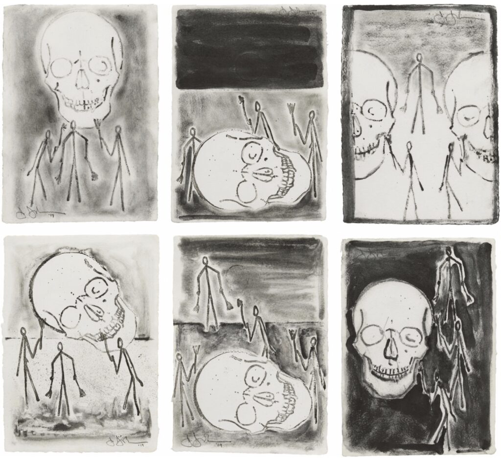
Untitled, 2019, Graphite on paper, six sheets, each: 8¼ × 6 in. via Matthew Marks
Did Johns decide that after finishing Slice? How’d that go down? How done is he? The newest drawings in the current Marks show date from 2021, the year of the anonymous gift. Is he done with making altogether? The show also includes older works that have never been seen. Has Johns moved to curating? Maybe he’s decided to focus on just revealing stuff now? Let’s start with those little guys, but there is a long list.
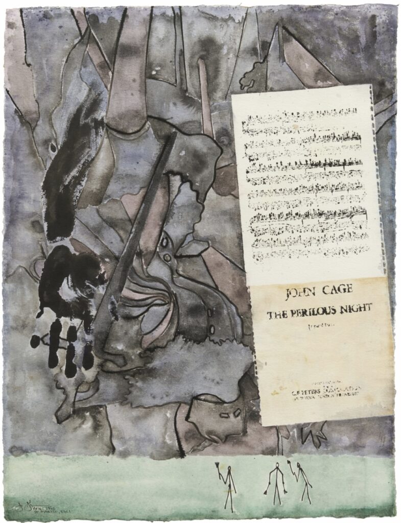
Jasper Johns, Perilous Night, 1990, Watercolor and ink on paper, 30½ × 23¼ in., on view at Matthew Marks
I know I’m never going to get a tattoo, but that doesn’t stop me from making a shortlist of tattoos I’d get. And the top Jasper Johns entry on the list are these little guys, with their little rakes, or brooms, or brushes. They’ve been turning up in Johns’s work for decades. They were there in his last drawings show at Matthew Marks, and they’re there again now.
They’re being towered over by an inky armprint, a tracing of Grünewald’s fallen soldier, and torn sheets of John Cage’s pivotal score in a dark and ominous sky, but they’re not daunted. They’re just going about their work, setting the scale, completing the composition. [This watercolor from 1990 predates the first appearance of the little guys in a painting by two+ years, btw. Is this Little Guys: Origins?]
Untitled, 2019, Graphite on paper, six sheets, each: 8¼ × 6 in. via Matthew Marks
Here they are in 2019, in these little drawings, just as busy as ever, working on the skulls. The 1990 guys look drawn by hand, but these guys, and the skull, are clearly reproduced with some mechanical means. I haven’t seen the show yet to figure it out, but nothing could be more Johnsian. [Or haven’t I? I remembered the related prints, but forgot that these little drawings were included in his 2021 show.]
On one level they’re pure exercises in composition. They’re literally just lines. But I can’t not also think of them as little scenes; the grouping practically demands a narrative of some kind. Can you imagine Johns just making up little situations and stories for his little guys? It’s been decades now. Do they have names? Do they have lore?
Even as the autobiographical elements of Johns’s project move in and out of focus over the years, it still feels a little weird or retrograde to wonder such things. But it also feels OK to assume that motifs and figures and strategies recur for a reason; Johns is not some automaton, throwing the same five ingredients into the pot every day.
Until I hear different, then, I’m going to assume they’re these little guys, happily working and living inside Johns’s capital I:
Previously, related [and I love that they used a knee drawing on the cover of the exhibition catalogue, btw]: Taking A Knee; also Blackened Angel; also Little Johns
When I said I can’t get autographs? I meant, unless conceptually.
Sitting with this unexpected Bach auction for a minute, I realized I actually do get autographs when they convey a meaning beyond, “This person signed this,” or “I met/corresponded with this person.”
Unititled (Merce at the Minskoff), 2015-2018, interim state
Or when I project entirely subjective meaning onto them. Like when I found a souvenir towel from a Merce Cunningham performance on Broadway signed by Cunningham, Cage, and Rauschenberg, and I conjured a “logic” for this object that involved getting Jasper Johns to sign it.
That “logic,” or the pretense of it, was predicated on Johns being the designer of the performance poster. But of course, there were multiple other logics possible, from the art historic to the romantic, to the starkly commemorative, forcing an object into existence that links these four men—physically, contractually, notationally, quasi-publicly, as if there weren’t already countless other products of their decades-long interactions, filling archives and beyond. Here the autograph functions as a singular piece of evidence, superficial and contrived, of some other form of more substantial cultural meaning. But when signs are few, signatures will do.
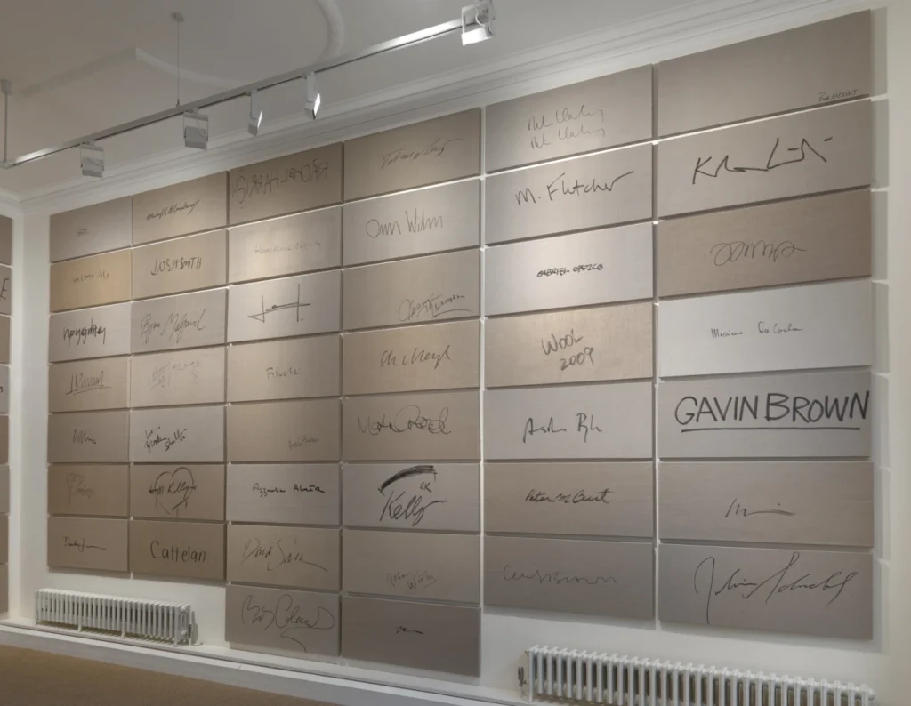
And of course, the significant emptiness can become the subject itself. Like in Rob Pruitt’s Signature Series, large-format autographs on Belgian linen he’s collected since the Pruitt-Early days. I remember several occasions when Rob would suddenly produce a big piece of linen and a fat Sharpie from his backpack, and turn around, offering his back as a writing surface when none other was available.
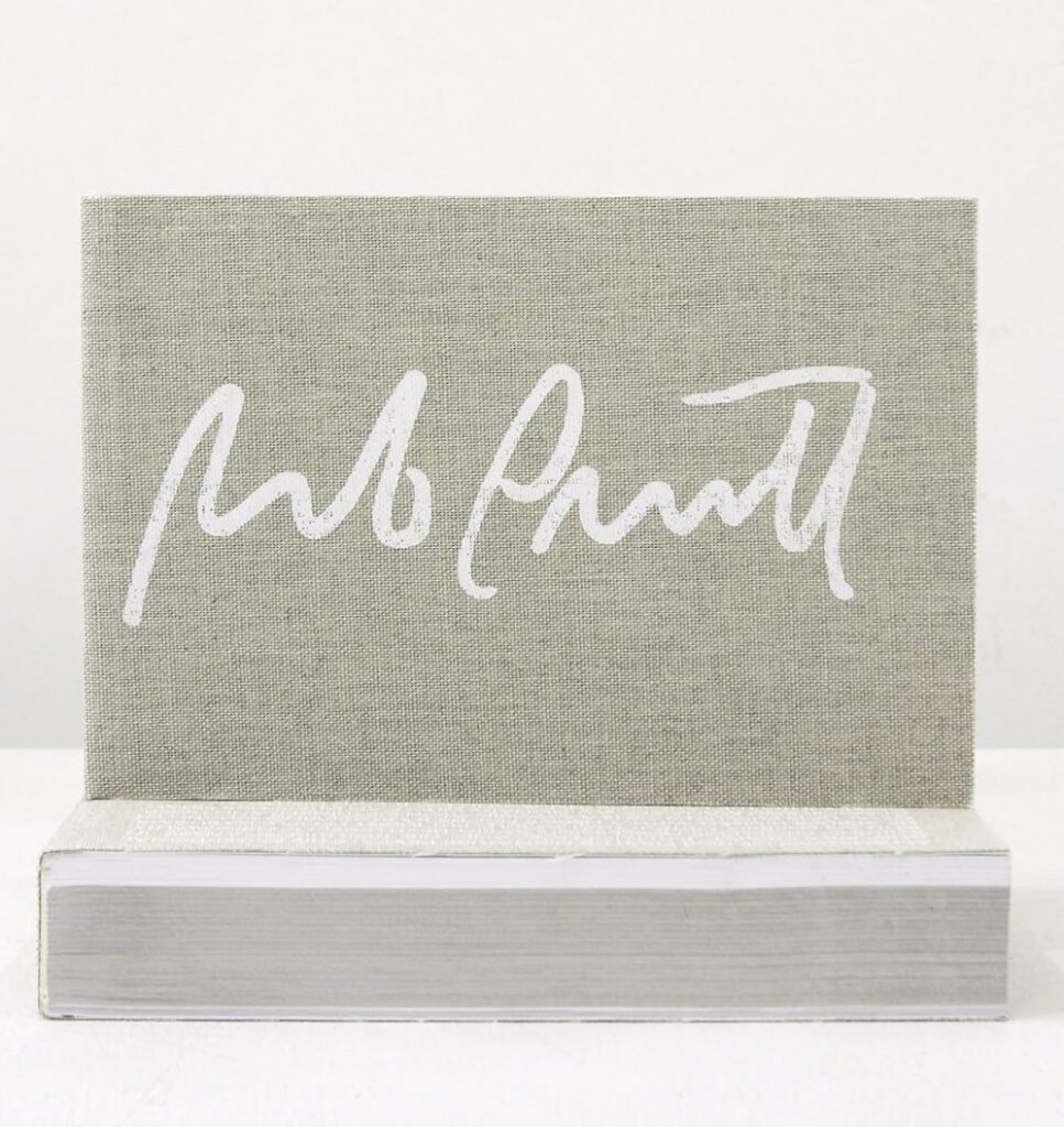
Rob Pruitt’s Autograph Collection, 2012, published by Karma back in the day
Autographs then became a project, an artistic practice, which art world celebrities and citizens alike could appreciate. I remember seeing a few loosies in the wild, but eventually, after years of accumulation, Pruitt showed The Signature Series en masse. And like Byron Kim’s skin tone monochromes, these accumulated markers of somebody else become a self-portrait of the artist moving through the world.
Now going back to Bach and his chopped up and shuffled autograph collection, it’s possible to interpolate meaning from the otherwise random-seeming clusters. Maybe the lots reflect the order in which Bach collected his autographs, a project of a lifetime sliced into tranches based on minimum viable auction estimate.
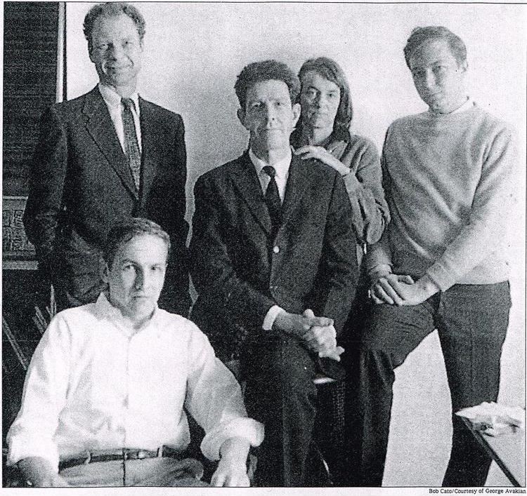
photo of Jasper Johns by Bob Cato, via davidhudson
This morning David Hudson posted this c. 1950s photo of Jasper Johns I’d never seen in a space I didn’t recognize, and I had to know more. Looking for the photographer, Bob Cato, took me to another image he made of Johns and crew, which ran in the NY Times in February 2001, accompanying an article about a Carnegie Hall program celebrating John Cage and his collaborative circle. Kay Larson, who would go on to write a biography of Cage, did not actually discuss the photo.
1958 Bob Cato photo of Robert Rauschenberg, Merce Cunningham, John Cage, M.C. Richards, and Jasper Johns, as published in the NY Times, Feb. 4, 2001, via blackmountaincollege.org
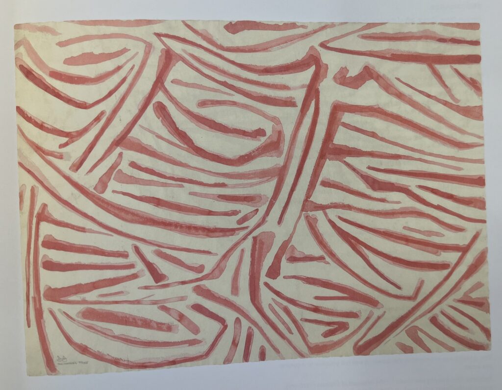
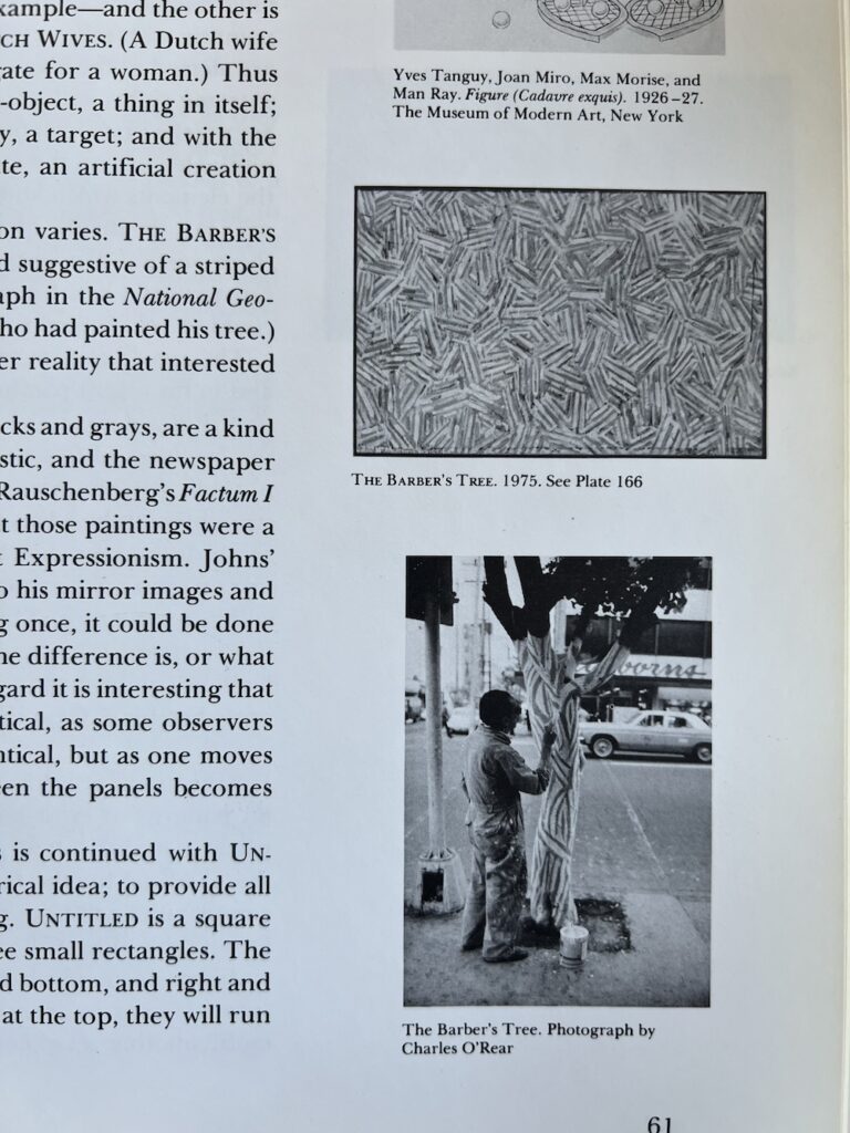
D245: Sketch for The Barber’s Tree, 1975, watercolor on paper, 22 1/4 x 30 1/4 in., collection of the artist, never been shown [at least through 2014], via JJCR-D
Maybe not being able to find the flagstones motif source, a Harlem wall glimpsed once through a taxi window and then lost, changed Jasper Johns’ approach a bit. Because by 1973, he did take note of the inspiration The Barber’s Tree. At least for the sketch [above], if not the painting, which turned out to be a mostly typical crosshatch motif executed in red and white.
And now we know what Johns knew.
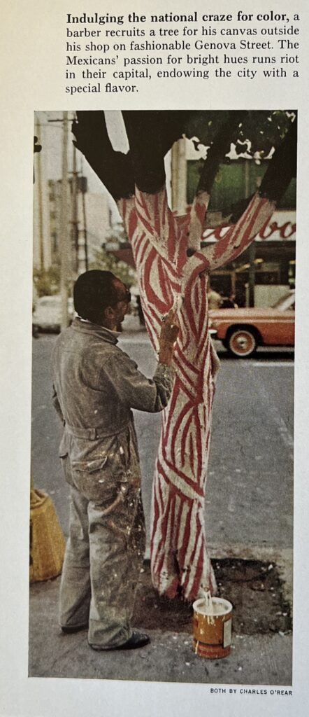
Here is photographer Charles O’Rear’s image from “Mexico: The City That Founded A Nation,” a dispatch by Louis de la Haba and Albert Moldvay from the May 1973 issue of National Geographic.
It is small, and slight, but indeed eye-catching. It’s not clear who is responsible for this cringe caption, though, about “Indulging the national craze for color” and “The Mexicans’ passion for bright hues,” when every barber pole north of the border has the same color scheme.
What is notable, perhaps, is that Johns chose this painting—found, vernacular, and anonymous—only after seeing this on the preceding page:
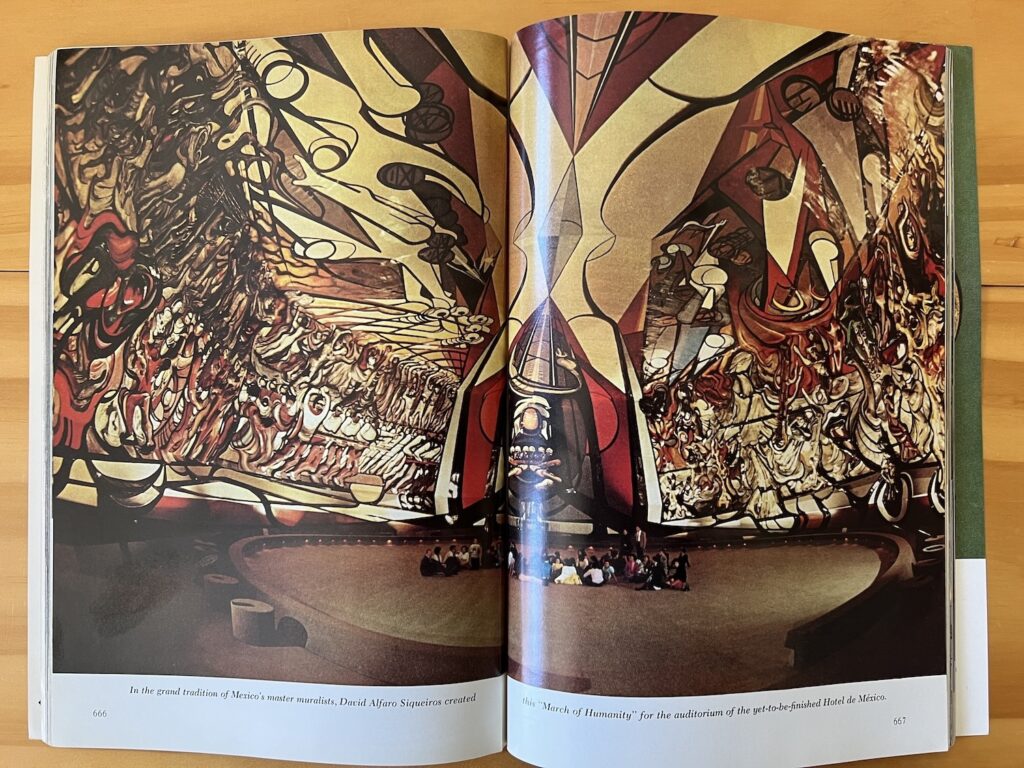
Albert Moldvay’s spread of David Alfaro Siqueiros’ March of Humanity, one page before the anonymous barber painting a tree in Nat Geo May 1973.
Looking on the web for contemporary images of David Alfaro Siqueiros’ absolutely gargantuan mural, la Marcha de Humanidad, in what was supposed to be the auditorium for the Hotel de Mexico, I can’t see that anyone managed to capture it more fully than Albert Moldvay did in 1973. The Mexicans sure have a national craze for murals. Jasper Johns, not so much.
[Next morning update: Joke’s on me, it’s been on my shelf the whole time. While looking for an image of the 1975 painting The Barber’s Tree, I stumbled on it and O’Rear’s photo in Michael Crichton’s 1977 Whitney catalogue:
it was worth $6 to see it in color, I guess, and to discover the Siqueiros. But let’s be honest, without the intervening watercolor, this tree motif feels kind of far from Johns’ cross-hatches.
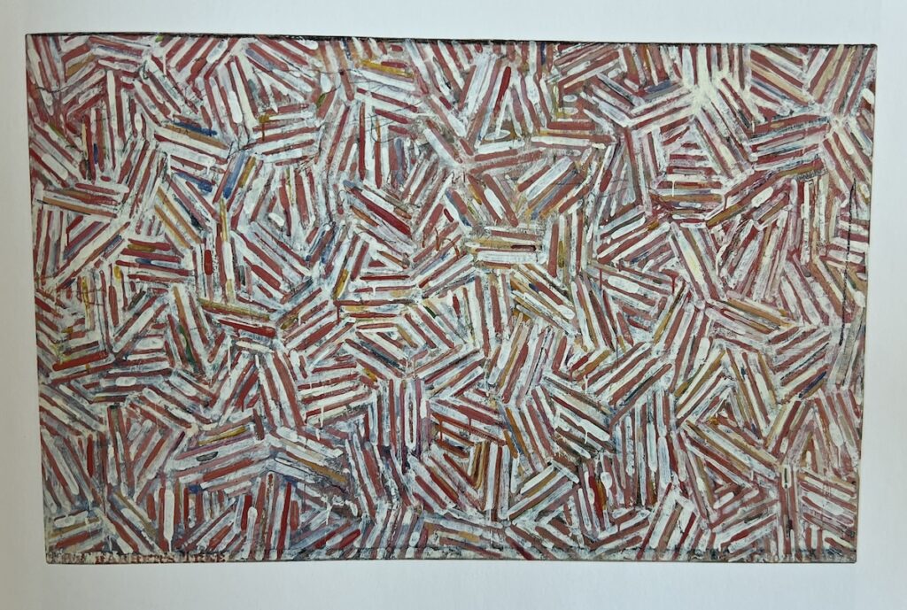
I’ve been saying it is barber pole-colored, but Crichton describes The Barber Tree (1975) as “flesh-and-blood colors.” Which, you’ll have to trust him, because the catalogue only had black & white images, and it was in the Ludwig’s collection until they donated it to the National Art Museum of China in 1996.
The Barber’s Tree, encaustic and collage on canvas, 34 x 54 in. (87 x 137.8 cm), snapped from the Jasper Johns Catalogue Raisonné, vol. 3 (P196)
Now that they’re all together, maybe the overlapping structure of the cross-hatches is what carries through from the tree. Crichton noted Johns deployed different structures in the cross-hatch paintings of this period, 1973-76, including various degrees of mirroring or duplication. That is not what’s going on here.
Sure, curating is great, but have you ever just gone through an artist’s six-volume catalogue raisonné of drawings in chronological order, seeing every wild, weird, and eye-popping thing they worked on for 60 years?
I’ve dipped into Jasper Johns’ drawings CR before, but have not spent any sustained time with it until this week, when I went looking for the diagram he made to explain a print to a pushy university president. [It wasn’t included.] And it is fascinating. It feels more revealing than the paintings CR—which I have and enjoy, don’t get me wrong—like it tracks the artist’s process more closely. Here are just a few snapshots of things that caught my eye:
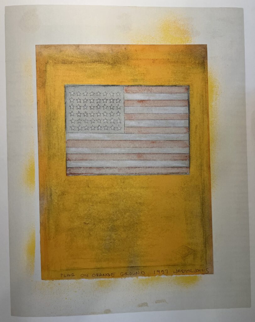
D19: Flag on Orange Ground, 1957, 10 1/2 x 7 3/4 in., fluorescent paint, watercolor, graphite on paper mounted on board, image via JJCR-D
This watercolor and pencil version of one of Johns’ early Flag paintings is one of two works made on pages from an old college yearbook; the logo of a sorority, Alpha Delta Pi, is visible in the lower right corner. Also it looks like it was spraypainted. ALSO, it was a gift from Johns to Susan Weil, Robert Rauschenberg’s ex-wife.
Jasper Johns, Untitled (American Center in Paris), 1994, lithograph, 29 1/2 x 23 1/2 in., AP 12/22 of an ed. 75, being sold on 23 May 2024 at Bonham’s
1994 feels like a weird time for Jasper Johns to make a print edition namechecking the American Center in Paris. It’s true that was the year they famously opened their new, limestone Frank Gehry building, for which Untitled (American Center in Paris)could logically have been a fundraising edition. They definitely needed the money. But it was also two year after the Center’s French executives infamously fired the American curatorial and programming staff they’d just hired—including Adam Weinberg, who returned to the Whitney and who feels, along with major donor Frederick Weisman, like the conduit for Johns to get involved in the first place. And it was two years before they infamously ran out of credibility, ideas, and money, and the century-old American Center in Paris imploded in hubristic ignominy.
But perhaps Johns had been working on it for a while, and 1994 was just when it shipped. Some c. 1992 Gemini prints with very similar elements—the Barnett Newman, the George Ohr pot, the Elizabeth & Phillip profile goblet, the Isenheim altarpiece tracing—were first proofed by Bill Goldston at ULAE, where American Center was published.
c. 1904 or so? portrait of Jasper Johns’ father William Jasper Johns [on lap], his uncle Wilson [left] and aunts Eunice & Gladys [standing], with his grandparents William & Evelina Johns [center], cropped from Untitled (American Center in Paris), 1994
Anyway, the point is, this print was, I think, the first, but notthe last, to include a photo of Johns’ family. That’s the artist’s dad, William Jasper Johns, Sr. [b. 1901] on his grandfather William Isaac Johns’ lap, next to his grandmother Evelina, so the photo maybe dates to 1904-05? Johns lived with these grandparents as a child, after his dad ghosted, and his mom kind of flaked. He also lived with his aunts, the two girls standing in the photo: Eunice [b. 1893] and Gladys [b. 1895]
And this is the point, because at some point after 1985, when he became president of Brenau University, John S. Burd decided that the way to build the small northern Georgia school’s art collection was to cold call the famous nephew of two of his schools alumnae, Eunice & Gladys Johns, and ask for some work. Burd was shunted to Johns’ “agent,” Leo Castelli, who was surprised at the ask. Burd eventually got up to speed, took the CEO of Coca-Cola to a meeting, and, in 1991, asked Castelli to join Brenau’s board of trustees.
The result was a slew of shows of Castelli-connected artists, of Castelli’s collection of prints, and Castelli’s introductions. One of Castelli’s donations was an AP of Untitled (American Center in Paris). Burd kept after Johns, asking him to explain the work, which prompted the artist to create a full-scale overlay diagram on tracing paper for Hurd, which somehow gets mentioned all the time, but never published. [Next day update: It is not in the catalogue raisonné of works on paper.]
Indeed, the Johns aunts connection, along with the Castelli era, are part of the story Brenau tells itself. For my part, I can’t help but wonder if the spike of outside interest in his aunts may have given Johns the excuse, if not the inspiration, to use this exceptional family photo.
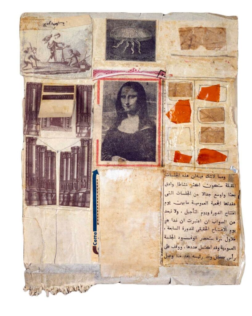
Robert Rauschenberg, Untitled (Mona Lisa), 1952, 9 1/2 x 7 1/2 in., collage on paper, image via RRF
Via tumblr user @poloniumtherapy comes this most Combine-ish Rauschenberg collage to predate the Combines, now titled Untitled (Mona Lisa), from 1952. It belongs to a series, North African Collages, which Rauschenberg made during his work and travel through Morocco with Cy Twombly. Most were made on shirtboards; though the size fits, this collage is on paper, not paperboard. It is not one of the 28 collages remade as enlarged facsimile prints in 1991 under the title, Shirtboards—Italy/Morocco. The Rauschenberg Foundation says 38 of these collages are known to exist. [Plus one known to be missing; in 2015 I wondered if it was underneath an early Johns.]
The putti with the surveying equipment are European. The moon jellyfish engraving is French. The gothic columns are European, and the Mona Lisa is the Mona Lisa. The strongest link to North Africa here, at least aesthetically, is the page of Arabic text collaged on the lower right corner. Its source is unidentified, but it talks about the “General Assembly” and how “tomorrow is the real opening day of the Seventh Session.” Assuming that’s the United Nations, the Seventh Session was the first one held in the UN’s new headquarters in New York. It opened on October 14, 1952, right around the time Rauschenberg and Twombly arrived in Casablanca.
Craig Starr apparently included Untitled (Mona Lisa) in a show called “Souvenirs: Cornell Duchamp Johns Rauschenberg.” But since it ran from October 2020 through March 2021, I can only take his word on it. It’s a great grouping, though. Cornell, of course, helped Duchamp fabricate the Series B of his Boîte-en-Valise, which, of course, included a Mona Lisa.
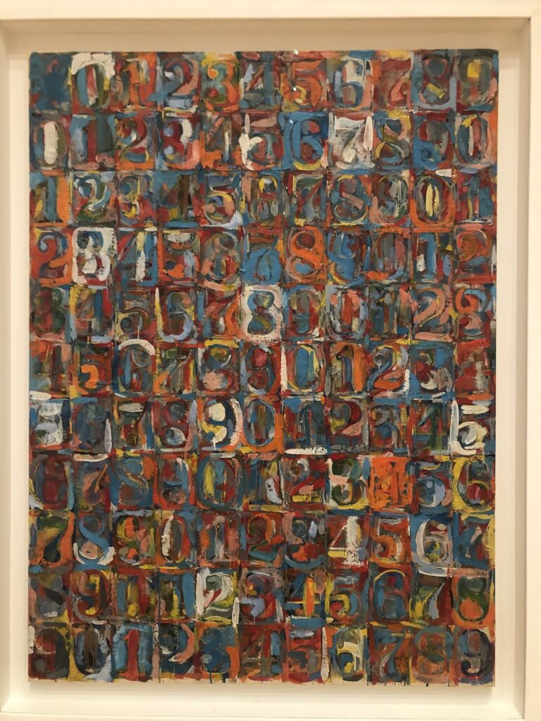
Jasper Johns, Numbers in Color, 1958-59, encaustic and newspaper on canvas, 66 1/2 x 49 1/2, not including frame, collection Buffalo AKG now
Headed to the eclipse, stopped by to see the Big Johns at the Albright-Knox, turns out it was at the Buffalo AKG.
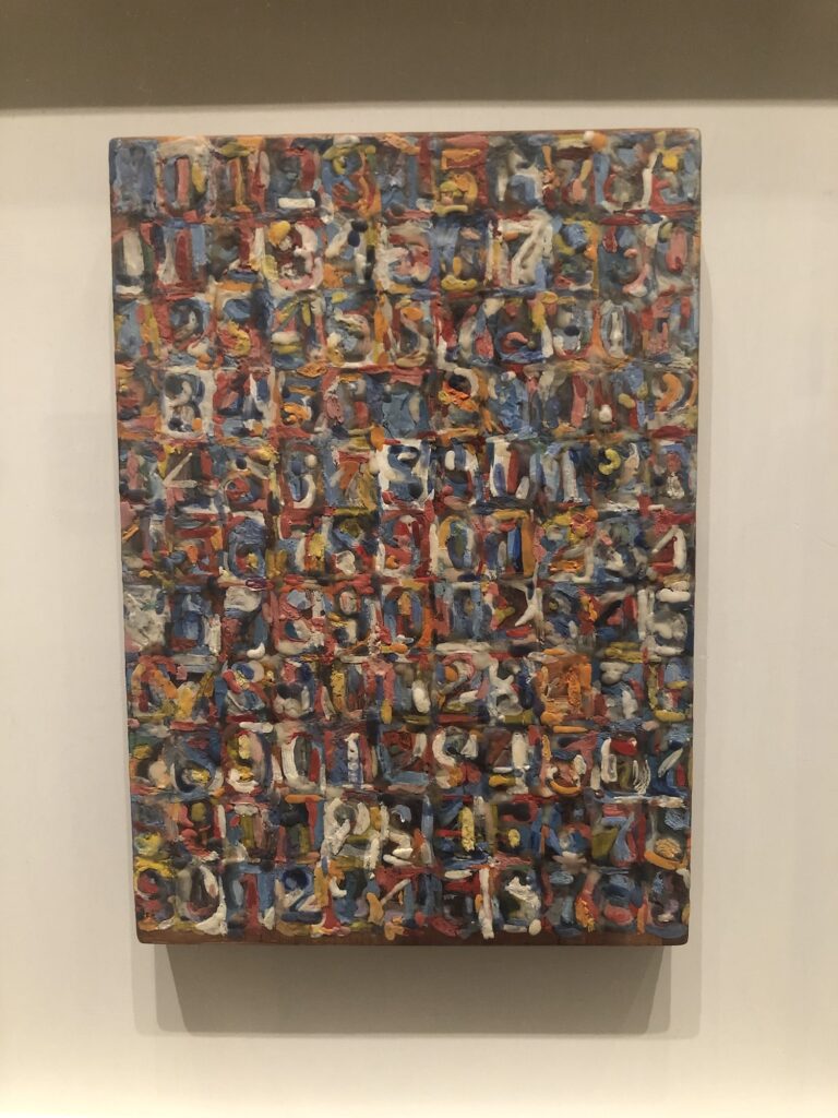
Jasper Johns, Small Numbers in Color, 1959, 10 1/8 x 7 1/8 in., encaustic and collage on wood printing block, collection the artist, photographed in Philadelphia that time
The little version Johns made for himself on the back of a woodblock is probably my favorite Johns of all time.
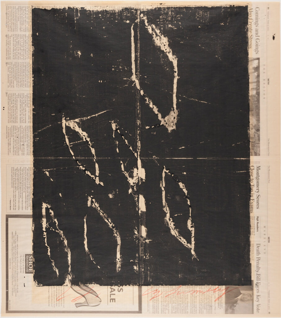
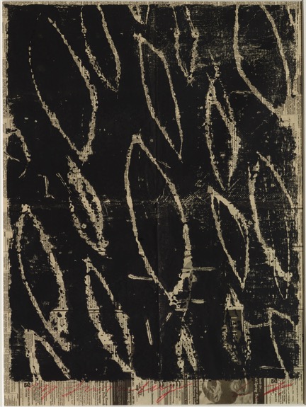
Cy Twombly, Untitled, 2002, acrylic on paper, 36×30 in., framed by the artist
I got to Josh Pazda Hiram Butler’s sales archive through an odd John Cage search, and I stayed for an unusual Cy Twombly find: a painting on newsprint—the Washington Post from April 5th, 2001, to be precise.
How did this? What is this? There are clear edges, plust some bleed; the acrylic shows no brushmarks, but does show the folds of the paper. It says framed by artist, but there’s also a bit of scorching right around the painted part, and the signature in the lower margin, like it was matted differently for a while?
Anyway, it turns out to be very similar to a work on, of all places, the Twombly Foundation’s own website, in the Prints section.
Untitled, 2002, monotype, 60 x 45 cm, image: Galerie Bastian via Cy Twombly Foundation
Described as a monotype, this work contains the same lozenge-shaped, leaf-like motif. It’s also on newsprint, and has borders very much like those kissed in place by the sun up top.
I think these are cardboard prints, where the image is carved into a sheet of cardboard with something rough, like a nail, and which are painted and pressed against a surface—in this case, straight up newspaper from the porch—to transfer the image.
Twombly made raw, scratchy monotypes right after getting back to New York in 1953, and in 1996, he revisited the cardboard engraving technique for an edition Twombly and Nicola Del Roscio printed for the Whitney Museum. Whether it was a pump-priming exercise, a diversion, a warm-up, or something else, this rough, disposable, DIY printing medium seems to have struck a chord with Twombly. At least it worked well enough to let these things out of the studio, conservators bedamned.
Dan Budnik, Robert Rauschenberg in his Pearl St Studio, 1958, image via RRF
When I saw a print of this 1958 photo of Rauschenberg in his studio in a group of eleven artist portraits by Dan Budnik coming up for sale in LA, I took a closer look at the boring side of the image, which turns out not to be boring at all.