
Sure, curating is great, but have you ever just gone through an artist’s six-volume catalogue raisonné of drawings in chronological order, seeing every wild, weird, and eye-popping thing they worked on for 60 years?
I’ve dipped into Jasper Johns’ drawings CR before, but have not spent any sustained time with it until this week, when I went looking for the diagram he made to explain a print to a pushy university president. [It wasn’t included.] And it is fascinating. It feels more revealing than the paintings CR—which I have and enjoy, don’t get me wrong—like it tracks the artist’s process more closely. Here are just a few snapshots of things that caught my eye:
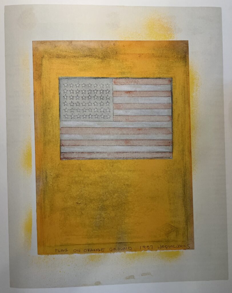
This watercolor and pencil version of one of Johns’ early Flag paintings is one of two works made on pages from an old college yearbook; the logo of a sorority, Alpha Delta Pi, is visible in the lower right corner. Also it looks like it was spraypainted. ALSO, it was a gift from Johns to Susan Weil, Robert Rauschenberg’s ex-wife.
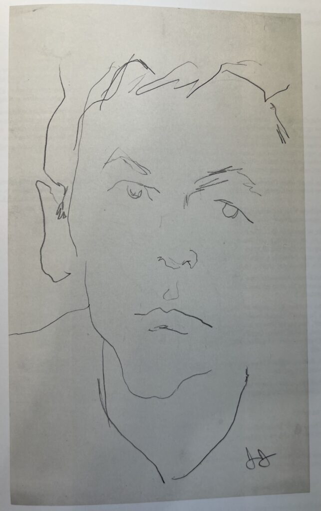
Speaking of Rauschenberg and 1957, this quick sketch turned up in public for the first time in the 2011 Gagosian show of Rauschenberg’s own collection, the same show where Short Circuit reappeared. Comparing them to Sue’s picture above, those Js don’t look like 1957 Js. Maybe he signed it later after things cooled down.
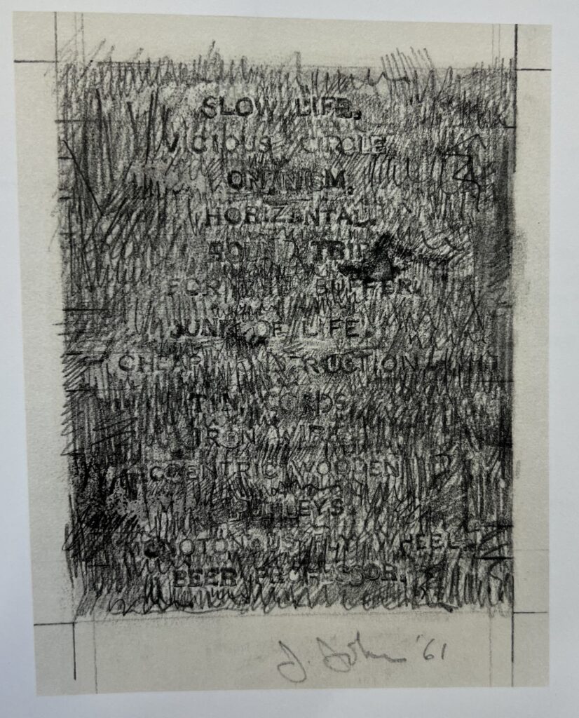
Litanies of the Chariot refers to a poem from Marcel Duchamp’s Green Box—which Johns bought—but this text is actually from Richard Hamilton’s English translation of it, which dropped in 1960. It’s the first work of Johns to directly reference another artist’s work [unless you count Erased de Kooning Drawing, of course. 👀 ] But what’s wild is that Robert Scull commissioned it, as a gift to MoMA curator Dorothy C. Miller. Timing-wise, that’s a year after MoMA retconned the 1958 acquisition of Target With Four Faces as a Scull gift; the provenance says Miller received it in 1963, when the Sculls began their fractional donation of Map (1961) to The Modern. Relationship status: it’s complicated.
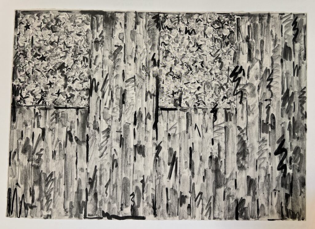
I’d heard of this work, the one that is titled Two [F-Slurs] on the back, and did not expect it to be so late. This 1969 study was the first to use two vertical flags, and it became the basis for a 1972 print and and a 1973-77 painting.
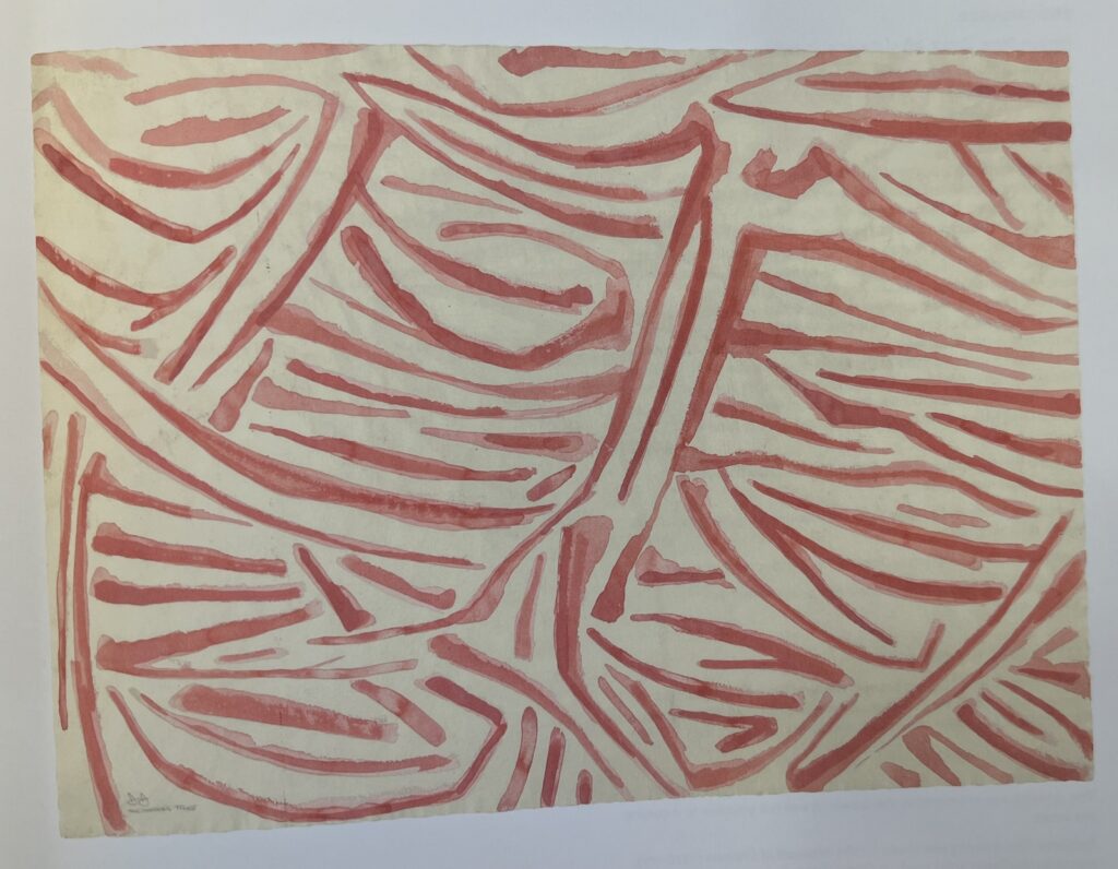
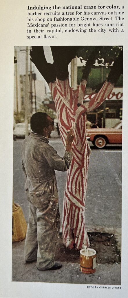
This watercolor sketch looked weird, but it’s since become my favorite discovery in the CR. [I already knew about the flag he made on a friend’s baby announcement, which, Johns’ art gifts are a favorite genre all their own.] Anyway, at first I wondered why I’d never seen a similar abstract painting, and it turns out The Barber’s Tree is just a primarily red & white cross-hatch painting of the kind Johns began in 1972.
But the CR entries for both the sketch and the painting note that Johns was inspired by a photo in the May 1975 issue of National Geographic that shows a barber in Mexico City painting the trunk of a tree outside his shop. I couldn’t find the image online, so I bought a copy of the mag from some boomer’s basement, and will post it here when it arrives. [Plot twist: the paintings CR mentions the name of the photographer, Charles O’Rear, who is also the guy who made the photo of the green hill and blue sky Microsoft used for the launch screen of Windows XP.]
But now I imagine Johns moving from between IRL patterns or images like the flagstones, and his painted subject. [Of course, the crosshatches themselves were also found, supposedly glimpsed from a passing car.] I’m now enjoying the idea that Johns, like his regular 1970s St Martin visitor Ellsworth Kelly, just paints what he sees. [update: and here’s what he saw:]
Speaking of painting what he sees and St Martin, there’s a 1990 gift sketch of a picture of what became known as the Green Angel motif, broken up like a paint-by-number. Actually, the colors correspond to Green Angel the 1990 painting, but the minotaur figure is reversed, maybe it was traced from the minotaur sketch on the back and tidied up. Johns made it on a piece of his personal stationery, which has his St Martin address on it. For this drawing, which has not been shown or published otherwise, you’ll just have to buy the book.
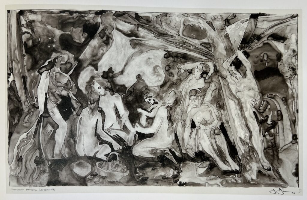
I do not remember six ink on plastic tracings of Cezanne’s Bathers made from a Barnes Foundation poster from Johns’s 1996 MoMA retrospective, but sure enough, they were all there. Johns got the poster from the National Gallery in DC in 1993, when the Barnes Cezanne traveled. I love the kind of barely controlled chaos of ink on plastic, where the non-absorbent support makes everything be about how much ink is in the brush. Whatever his reasons, I’m glad Johns loves it, too. Anyway, overlaying and tracing were happening around the time the Brenau guy got his diagram.
And speaking of plastic. Johns has printed on unconventional or experimental materials for a long time, but here he draws on them as well. There are several drawings that rework this boyhood portrait of his father and family, but this is made on Reemay, a wispy non-woven polyester textile most commonly used as paper conservation support. In his 80s, Johns used a familiar, even personal image, to explore something he pulled from the world around him.
At the end, there’s a two-page addendum about printing, and when I snapped it I thought it was about Johns’s prints. But it was about printing the CR. Turns out they developed 5- and 6-color printing techniques to get details that standard CMYK printing can’t capture. Using 150 works from the artist’s collection as reference, the printers adjusted to overprint some oranges, and silver/blacks in a combination of matte & gloss that more accurately reproduces graphite’s reflectivity. Which, now I feel like I’m blaspheming by putting these iPhone snaps out into the world, but now I just want to go look at it again.
related: el Arbol de Barbero