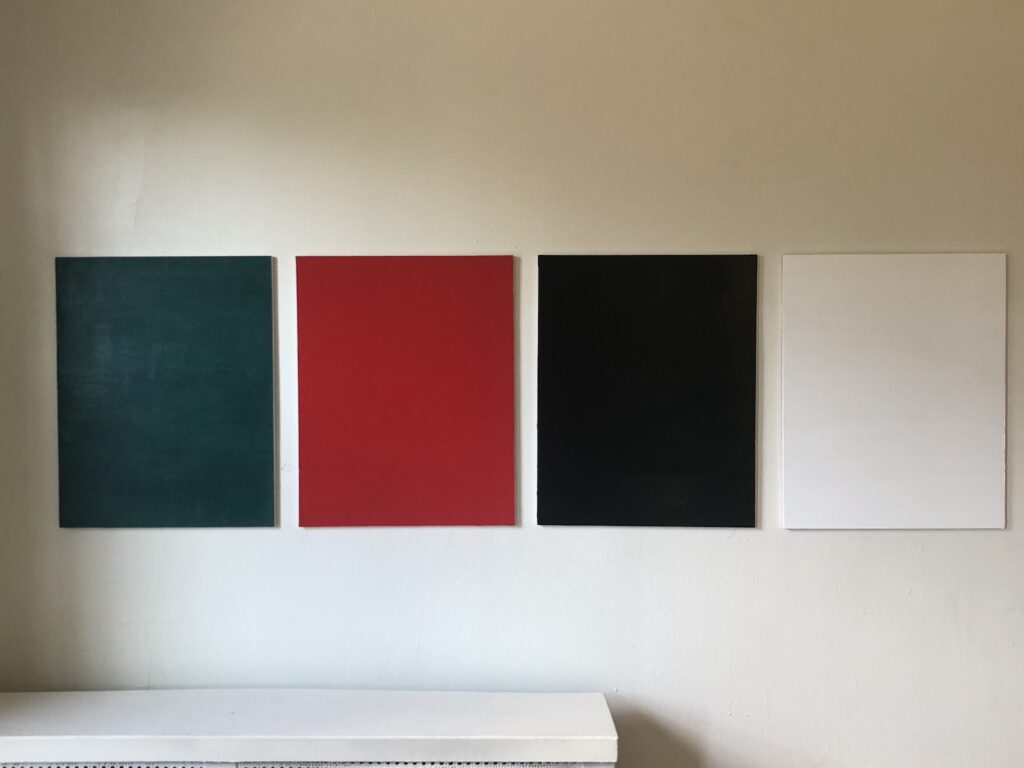
I hate that this needed to come back: Gonzalez-Torres Forbidden Colors, 2021 —
NGL, it does not feel like a moment to celebrate, and it’ll take a lot of work for 2024 to not become the biggest dumpster fire yet.
But whether via email, commentary, hyping or buying things, many people have engaged with me, the blog, and the various projects this year, and I’m grateful for all of the thoughtful and invigorating interactions. To close out the year, here are a couple of art accomplishments in 2023 which I found satisfying. They are in roughly chronological order:
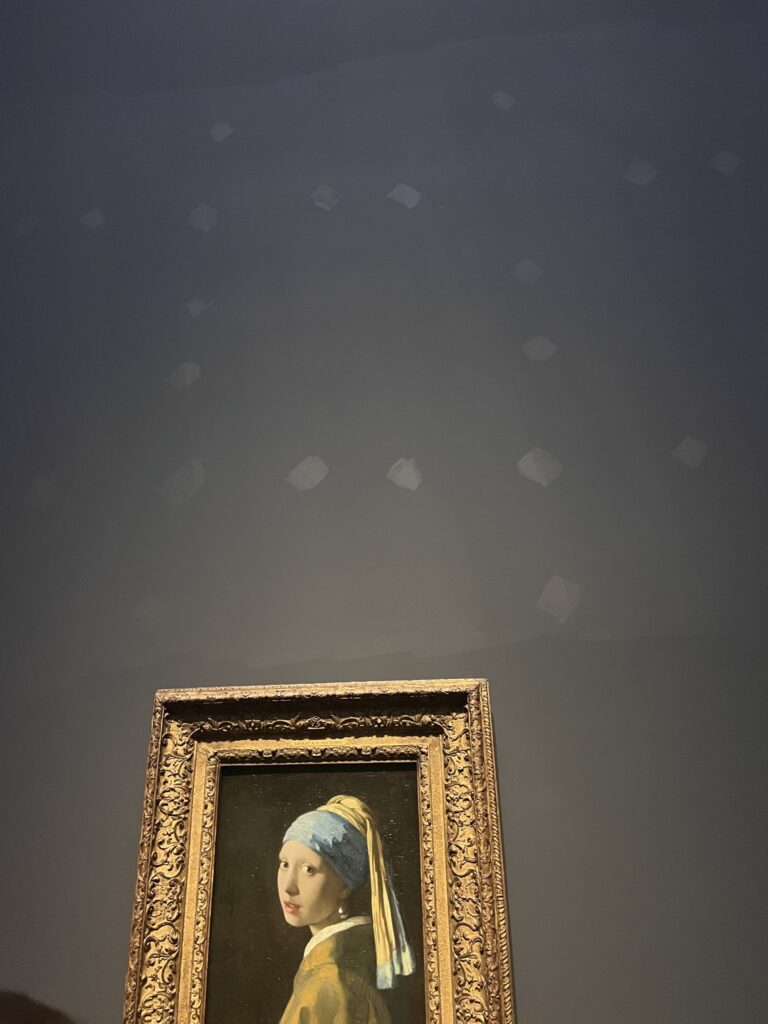
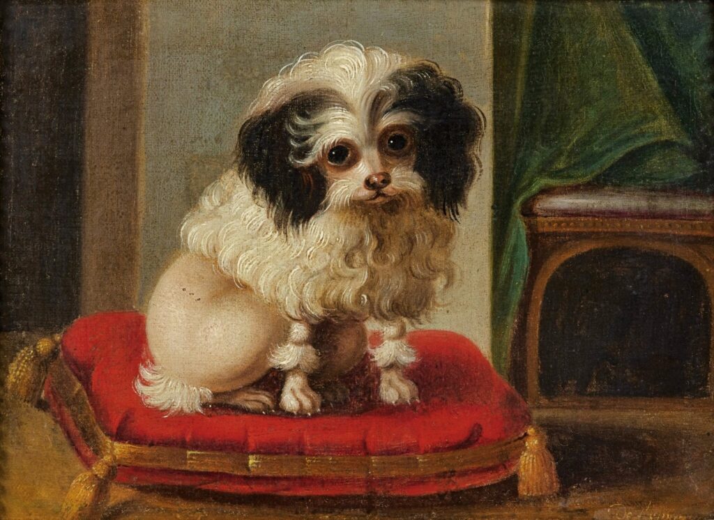
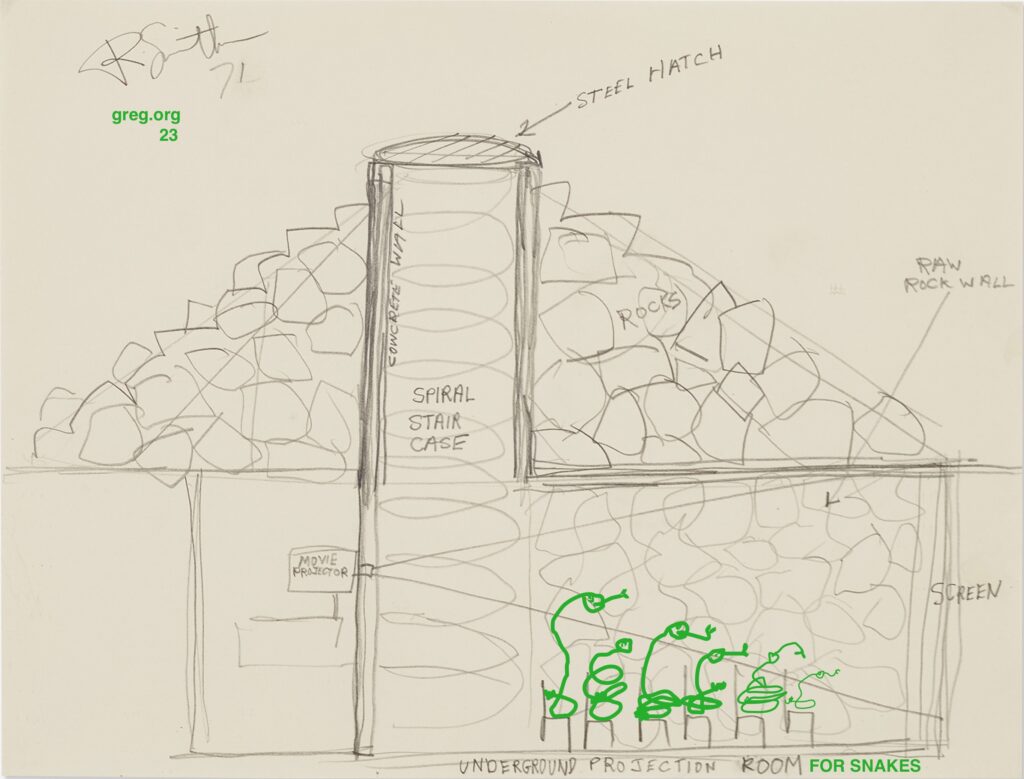
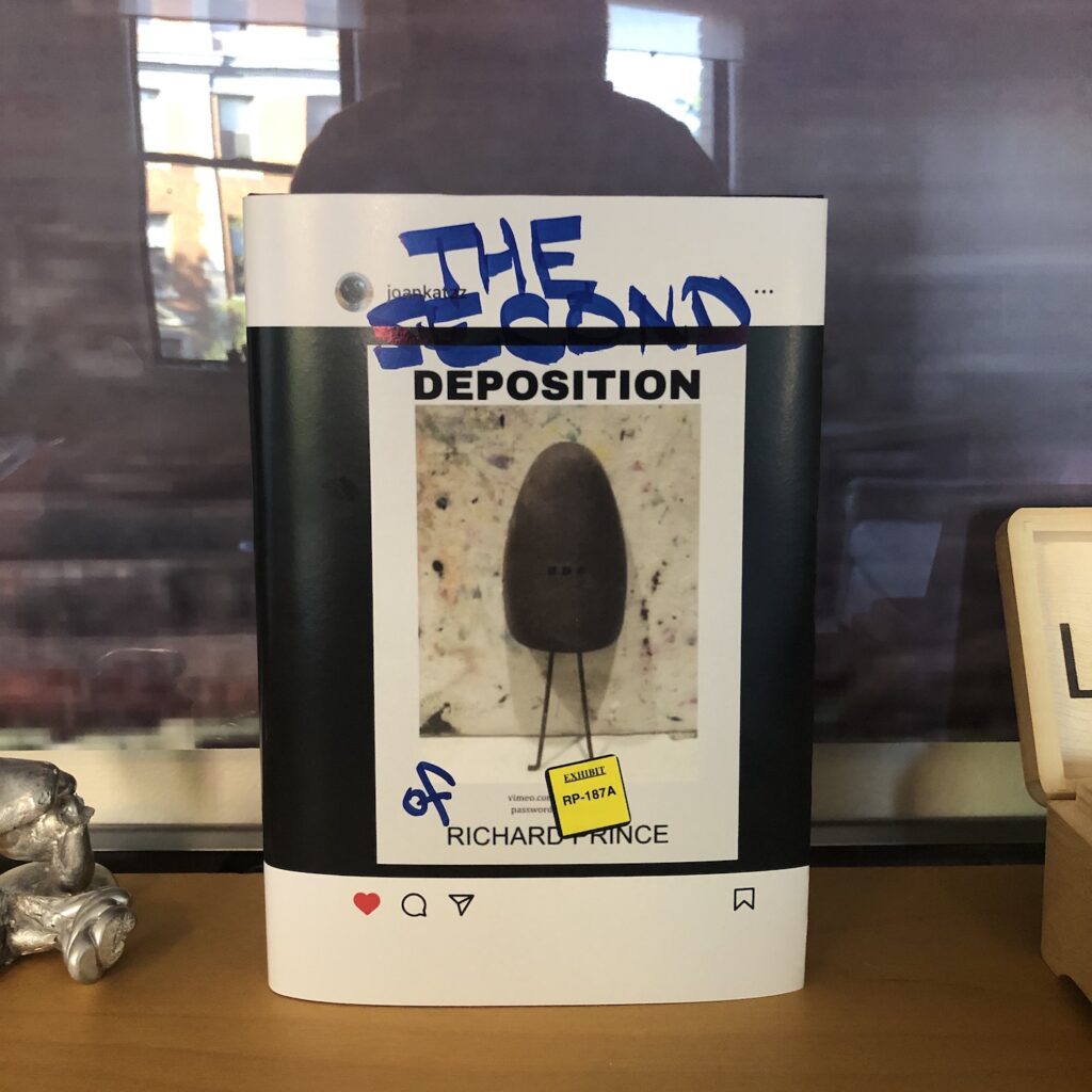
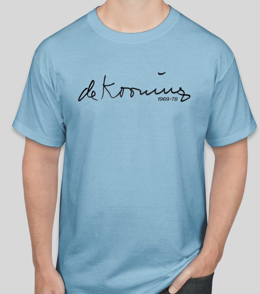
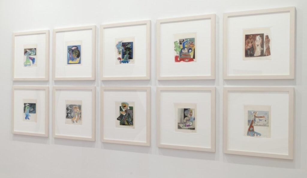
Celebrating Ellsworth Kelly’s 100th: EK 10 MAR 23 T [via]Biggest show of the year: Mural With Girl With A Pearl, obv [via]Jasper Johns’ Stolen Balls [via]Meanwhile, in this, year three of me swearing I’m not a dog painting guy: Jacques Barthélémy Delamarre Facsimile Object (D1), ‘Pompon’, obv [via]Underground Projection Room (for Rattlesnakes), 2023 [via]Proposed Katharina Grosse (PKG) for Basel, 2023 [via]The Second Deposition of Richard Prince, 2023—? [via]Happy Joan Mitchell Season T [via]
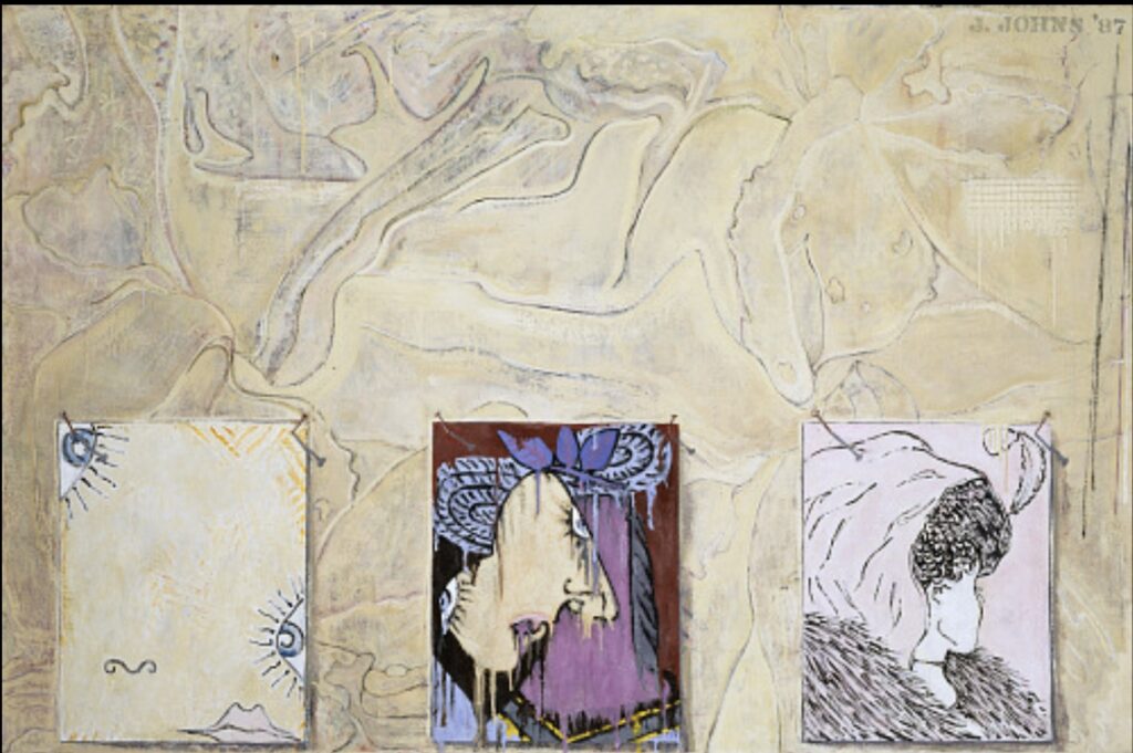
Jasper Johns, After Picasso, 1998, collection of the artist, currently on view at Skarstedt
I’m still kind of marveling at them being in the same show, but if Richard Prince and Jasper Johns are going to cross paths, it makes sense that it’s at the corner of Picasso reproductions and painting.
a spread from the exhibition catalogue for Prince/Pablo Picasso, where Richard Prince collaged his own early drawings over pictures of Picasso paintings
In 1998, Johns decided to paint himself a copy of a Picasso reclining nude that had been printed upside-down in an ARTnews article. And in 2011-12, Prince overpainted, drew, collaged, and inkjetted his way through a Picasso exhibition catalogue to the point where he had a two-artist show at the Picasso Museum in Malaga, Spain.
At the moment he made his Picasso works, Prince was being sued over images he’d used in his Canal Zone series. Yet for each series, and the deKooning Paintings he’d made beforehand, Prince used a very similar book/painting/collage/inkjet process.
Richard Prince, Picasso works, painting, drawing, and collage on lithograph, as installed at Skarstedt
In the show, “In Dialogue with Picasso,” at Skarstedt, Joachim Pissaro included ten of Prince’s book-sized painting collages. Which are interesting enough on their own, but it is unexpected to find them alongside Jasper Johns, even if both artists are, as Pissaro points out, interested in both appropriation and painting. [And in appropriating Picasso’s paintings.]
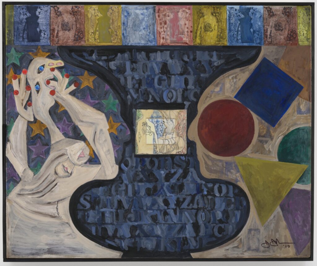
Untitled, 2017, 50x60cm, acrylic over etching with collage on canvas, via Matthew Marks
What I really did not expect while considering these two artists together, was that they both also work with collage, and with combining multiple mediums into one. Now that you mention it, Johns has been painting trompe l’oeil collages for decades, but the untitled 2017 work above was just one of many to come that incorporated an actual print, photo, or paper element.
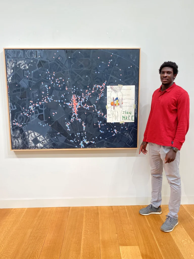
Jéan-Marc Togodgue posing with Jasper Johns’ Slice (2020) while visiting the (older) artist’s studio, as photographed by the retired basketball coach at the (younger) artist’s local boarding school, Jeff Ruskin
For his show of new works at Matthew Marks in 2021, Johns’s collaging and appropriating even got him called out for using another artist’s work without permission. Though the artist was a high school student, and the work was a copy of a wikipedia diagram of a knee he’d made for his ortho, and the ones doing the calling out were the slightly weird handlers who’d recruited the kid from Africa to play basketball at their rural Connecticut boarding school. We’ll all be Patrick Cariou for fifteen minutes.
Jasper Johns, After Picasso, 1998, 34 1/2 x 28 1/2 in., collection of the artist, via Skarstedt
So Cy Twombly wasn’t the only onemaking his own Picassos. In late 1998, while in St Maarten and in the middle of his Catenary series, Jasper Johns decided to make a copy of Picasso’s Reclining Nude (1938), which he’d seen in ARTnews.
Pablo Picasso, [Actually] Reclining Nude, 1938, ex-collection Marina Picasso/Jan Krugier
The painting belonged to Picasso’s granddaughter Marina, and illustrated an April 1998 profile of Jan Krugier, the Geneva dealer with exclusive rights to sell her collection. It was apparently printed upsidedown. Unless Johns took his year’s worth of unread ARTnewses to the beach with him, maybe it was the correction in a later issue that caught his interest.
Johns lives with the work and loves it, he told interviewer Marco Livingstone in 2000: “I love to look at it, and I’m very happy that I have it to look at. In a sense I have the feeling that much of what’s interesting about it is not willed, but is innate to the structure of the man who made it, and there’s no way to replicate it in oneself. One can only admire it in the other person, or hate it if you happen to hate it!”
Untitled, 2017, 50x60cm, acrylic over etching with collage on canvas, via Matthew Marks
And when it came home, it found its way into the thick of Johns’ work. An untitled 2017 painting and etching collaged on canvas rotates and adapts the reclining nude to the contour of Johns’ profile/vase motif. It seems clear from the figure’s amorphous lower half that Johns was looking at, or referring to, his own cropped copy, and not Picasso’s original [or a reproduction of it.]
Silhouette of Picasso and a Young Girl Crying, 1928-29, Collection Musée Picasso
This 1928-29 painting of Picasso’s silhouette and a young girl crying was published on the facing page of a 2008 coffee table art book by Michele Dantini. Which is not a source I’d imagine Johns using, of course, but the painting IS in the Musée Picasso. And that crying woman’s biomorphic head does look a lot like the late Picasso Tête de Femme Johns was quoting in his Stony Point works in the late 1980s, like the one the Hirshhorn acquired in 1988.
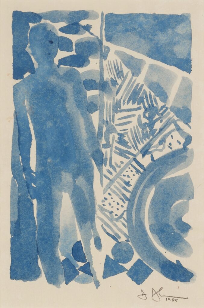
Jasper Johns, Summer, 1985, watercolor on paper, 11.75 x 9.125 in., tiny, not selling [?!] for $200-300,000 at Sotheby’s today from Emily Fisher Landau’s collection
As soon as I saw it in the Sotheby’s sale of Emily Fisher Landau’s collection, I added this quick, little watercolor version of Summer to my Little Johns list, iconic but intimate artworks Jasper Johns gave as gifts.
But though Landau was a friend and longtime supporter of Johns, she was not the gift’s original recipient. Johns gave the watercolor to Bill Katz, in October 1985, and Landau bought it from Katz in 1998.
Katz’s relationship with Johns goes back even farther than Landau’s, and over the years, he has designed multiple spaces—studios, homes, galleries, and exhibitions—for both of them. Which, more later, perhaps.
What I like about this watercolor is the date. Jasper Johns exhibited his four The Seasons paintings in early 1987, but they’d been seen by a few people, and talked about by many, and so their debut was hotly anticipated. Johns reportedly spent 18-months on a whole body of The Seasons work, including drawings and prints, alongside the large-scale paintings. [Landau’s copy of the ULAE prints sold this morning near the low estimate for this unique watercolor.]
This watercolor looks less like a study, and more like a documentation, with the key elements and composition mostly worked out, and sketched out very quickly. Yet a date of October 1985 means this watercolor was there right near the start of it all. And so was Katz.
I mean, I know why I didn’t buy it, but the rest of y’all, what’s going on? Admittedly, I also misremembered the estimate as $150-200k, when it was $200-300k. But I thought the EFL collection was under a global guarantee, which would give Sotheby’s the flexibility—and the incentive—to meet a bidder where they were. If they were there, I guess. This was somehow the only lot from EFL’s collection not to sell. Wild.
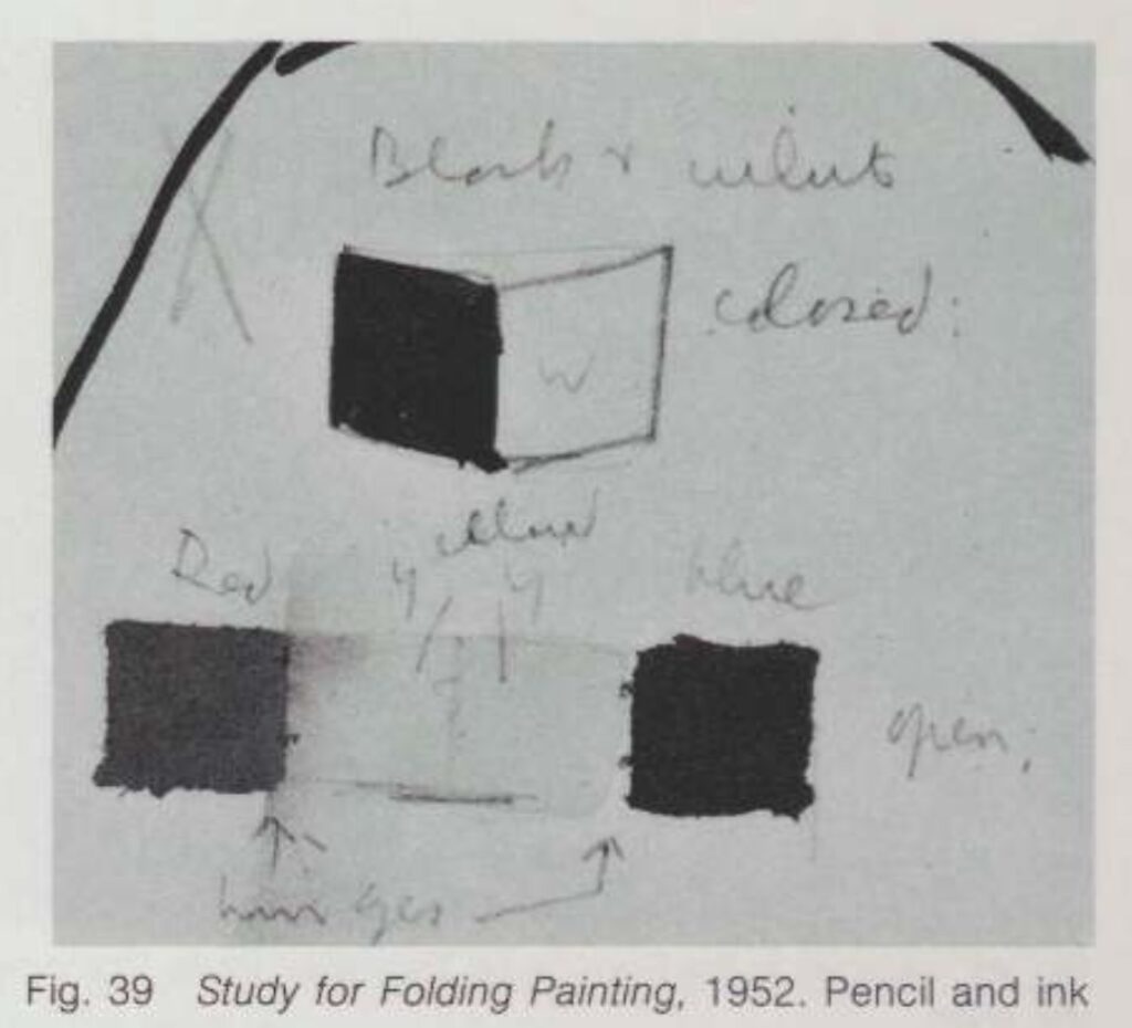
[May 2024 Update: The note for this sketch in Johns’ works on paper catalogue raisonné says it was a study for a print [ULAE 234] Johns made as the frontispiece of a book of poems by Wallace Stevens. Indeed, the sheet is very close to the dimensions of the book. Also, it came after Johns had completed only the first of what would become the Seasons paintings. Also, the silhouette was inspired by Picasso, of course, but was actually Johns’ cast shadow, traced by Julian Lethbridge in St. Martin, earlier in 1985. Except, wait, because though the prints and paintings don’t, there are a bunch of drawings where the “shadow” has his dick out, in a very much non-silhouetted way.]
On my first speedrun through the catalogue raisonné for Cy Twombly’s sculpture, I was interested to see some early lost sculptures I’d never seen discussed anywhere else. There was also an object described as a fragment of an early sculpture. And there were sections of damaged and rejected works, mostly unsatisfactory bronze casts.
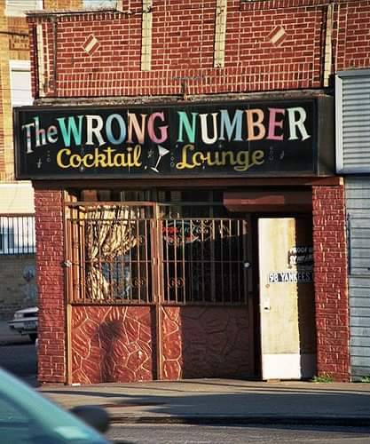
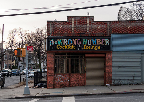
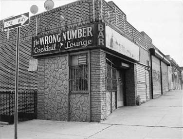
A minute ago I saw a photo burritobreath had posted to tumblr of The Wrong Number Cocktail Lounge, which was reblogged by wilwheaton, and then reblogged by someone I follow into my own feed? How did it get there? The algorithm? [update: my timeline was set to show me things liked by people I follow.]
But that’s not important now. Because, I mean, just look at it, isn’t it obvious? Don’t those fake, painted over flagstones look like the flagstones Jasper Johns saw out of his taxi window on the way to the airport in 1967, but which neither he nor David Whitney could find when they got back, and so Johns had to paint them from memory? The flagstones which became a frequent and fruitful motif for Johns for years to follow? In the raking light of burritobreath’s image, they even have some cross-hatching.
The Wrong Number closed in 2009. It was a mobbed up dive bar on the corner of West 7th St & Avenue T in Gravesend, the far side of Bensonhurst, Brooklyn. And I guess it’s on the way to the airport if you’re coming from Coney Island to LaGuardia, or Staten Island to Idlewild. Was the airport story a cover? Did he see the flagstones on his way to or from Coney Island? Was Johns actually in cahoots with the mafia in the 1960s? Just, as they say, asking questions!
oh wow it’s on the side, too, I think this image is from Philip Carlo, who wrote The Butcher about an 80s mobster named Tommy Pitera
Then there’s the question of timing. Johns’s story is from 1967, and his paintings soon followed. The Wrong Number was reportedly in business “for over 35 years” when it closed, which only gets us back to 1974. Were the faux flagstones there before that?
Jasper Johns, Harlem [sic?] Light, 1967 [sic]
So except for the location being on the far side of the city, two boroughs away, and the whole different decade situation, I think it couldn’t be clearer that these are the fake flagstones that inspired Jasper Johns.
This is what it’s like when an artist changes the way you see the world. Every time I see a fake flagstone wall in New York, I will wonder if it’s this, is this the one Johns saw that time, have I found it? It’s like a curse.
Meanwhile, the most salient discussion of The Wrong Number is in the extraordinary comments thread of a 2005 post of pictures from Bensonhurst on David F. Gallagher’s legendary photoblog, LightningField. It’s a kind of internet that is as lost to us as the flagstones were to Johns, and all we can do is remember, and try to piece things together.
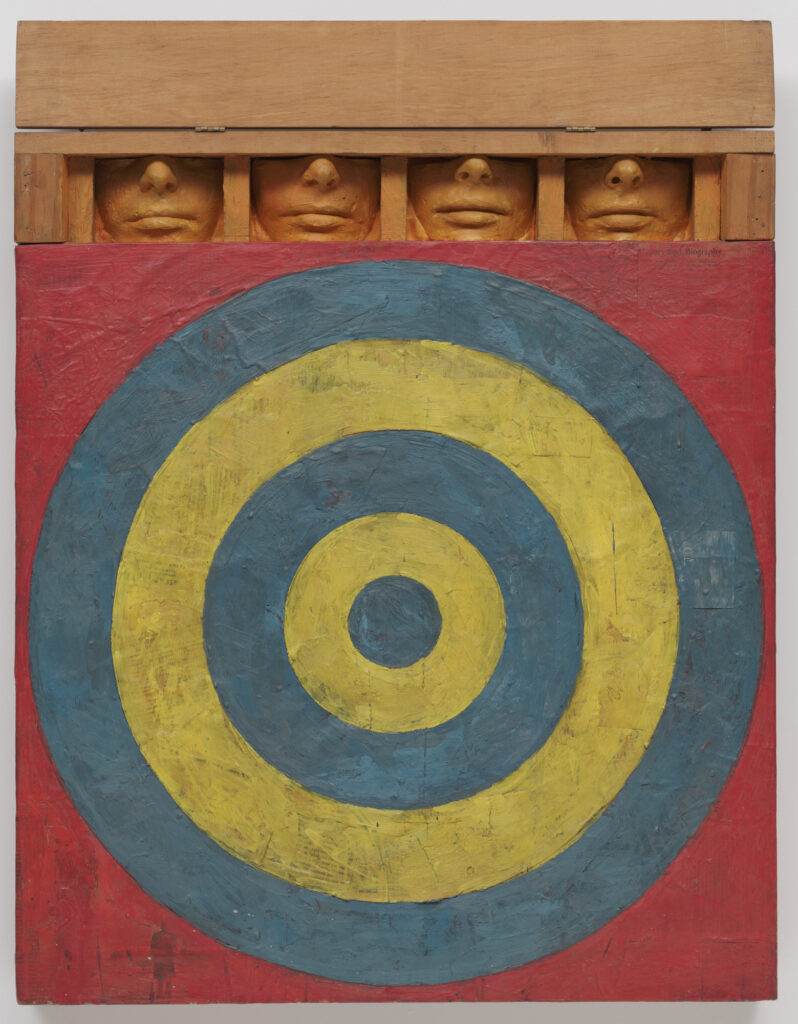
Jasper Johns, Target with Four Faces, 1955, encaustic on newspaper on canvas, painted plaster & wood, acquired in 1958 by The Museum of Modern Art
In late 2019, just before the world shut down, I wrote a long article about the Museum of Modern Art’s instant embrace of Jasper Johns, from the moment his first show opened at Castelli Gallery in 1958. Over half the works from that show were acquired by The Modern’s curators, trustees, and supporters, both for the museum, and for their private collections. Not on that list: Ethel and Robert Scull. And that has been nagging at me ever since, because something weird happened at MoMA, and I can’t figure it out.
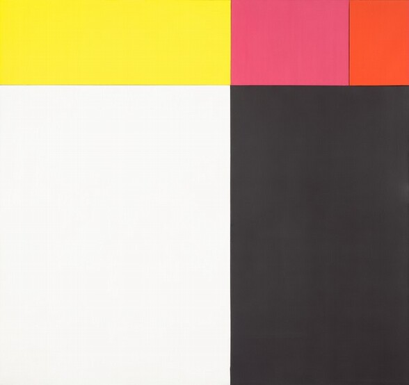
Kelly worked out the colors and dimensions of the five monochrome panels in Sanary, a seaside village in France he visited in 1952. It’s one of the largest of the very few paintings he actually made in France and brought home with him to New York in 1954. The work he developed in Sanary has been on my mind for years; it’s some of his formative work that would inform his whole career.
Ellsworth Kelly, Painting for a White Wall, 1952, 23 x 71 in., oil on canvas on five joined panels, photographed for Glenstone by Ron Amstutz
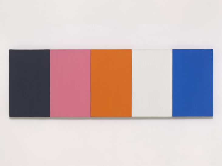
The NGA’s text, written by curator Molly Donovan, cites Yve Alain Bois’ research that Kelly began with found colors, a set of paper stickers used in French kindergartens known as papier gommette. The colors are very similar to another multipanel work from the same moment, Painting for a White Wall, 1952, which is now in Glenstone’s collection. As Yve-Alain Bois discussed here when his CR Vol. 1 came out, Tiger was instrumental to the beginning of Kelly’s official exploration of color behavior; it was where he set out to understand “the strange orange/pink” that had occurred in the found colors of Painting for a White Wall.
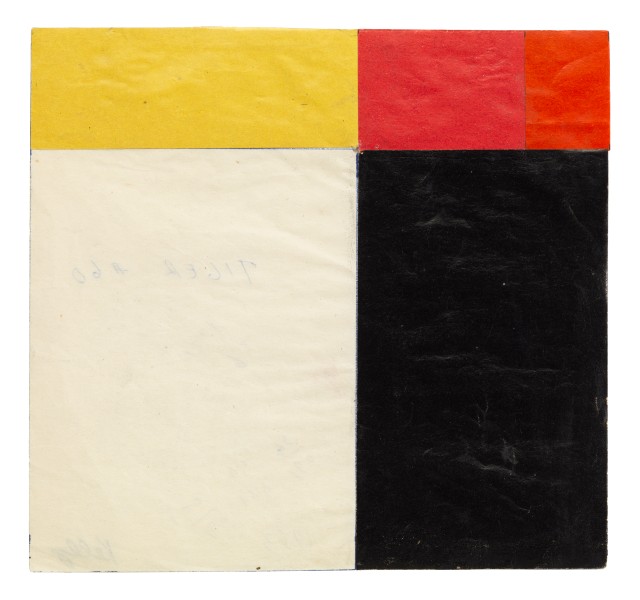
Ellsworth Kelly, Study for Tiger, 1952, collage on paper, 6.5 x 6.9 in., via Art Basel 2017
Anyway, the relationships of the various panels are intuited, not mathematical. Kelly worked them out in sketches and collages, like the one Matthew Marks brought to Basel in 2017.
What I didn’t know until seeing the painting in person and reading up on it, is Kelly’s interest in the Isenheim Altarpiece by Matthias Grünewald. In the 1973 catalogue for Kelly’s MoMA retrospective E.C. Goossen mentions Kelly’s Sanary-era sketchbooks include drawings of the altarpiece’s hinged construction alongside drawings of various compositions of windows and shutters, and even studies for a hinged painting. The connection to Kelly’s most important Paris painting—also in the Glenstone show—the multipanel construction repeating the window of the Musée d’Art Moderne, is obvious.
Jasper Johns, Perilous Night, 1982, 67 x 96 in., oil and encaustic and silkscreen and arms on canvas, in the Meyerhoff Collection at the NGA
What most intrigues me, though, is the possible connection to Jasper Johns. In 1987 Jill Johnston did an exhaustive and revelatory analysis of Johns’ incorporation of fragments and details of the Isenheim Altarpiece into his paintings in the 1980s. One of the first is Perilous Night, from 1982, a work that is also at the National Gallery.
Actually, now that I put it up there, the composition of Johns’ painting feels very resonant with that of Kelly’s panels in Tiger. Johns did tell Johnston he got a book about the Isenheim Altarpiece from a friend. Didn’t say who, though. From Short Circuit to Flag to In Memory of My Feelings, hinged and multipanel paintings were on the minds of young artists in downtown Manhattan in 1954. I wonder what we could learn from a Kelly/Johns show. I’m sure Tiger would be a fascinating starting point.
[Next day update: On an impulse I checked for reservations at Glenstone last night, and there was space available this morning, so I went, and it was hot and glorious. I listened to most of an aquatic horticulturist lecture pondside, which was fascinating. The pond in the center of the Pavilions building is as thoughtful as the rest of the landscape, which really never disappoints. Even Split Rocker looked good. Not landscape per se, but you know.
Ellsworth Kelly, Spectrum Colors Arranged by Chance VII, 1951, 99 x 100 cm, collage on paper, at Glenstone
There were some new pieces in the Charles Ray pavilion, always a marvel. And a couple of beautiful Kelly works on paper, including the dazzling, large collage above, from 1951, in the spot where Tiger was hanging. So I guess they rotate things. It was a low-key flex that they had such an amazing work on hand and didn’t just jump to include it in the show, but chose to let the loans tell the fuller story of Kelly’s practice. Truly a dynamic place amidst all the contemplative stillness.]
if there were a lime green python in this funerary box, what’d it look like? a speculation on a 1954 Robert Rauschenberg photo of Cy Twombly and his work in their Fulton St studio, image via RRF
In Spring 1953, after our boys got back from Morocco and Italy, Robert Rauschenberg and Cy Twombly set up a little place on Fulton Street. They spend a year making work and posing for each other. In 1954 Rauschenberg took several photos of Twombly with his paintings and sculptures, almost all of which are lost or destroyed, except for one, the one on the right, above, with the fans, Untitled (Funerary Box for a Lime Green Python).
Claudio Santambrogio emailed a funny reminder of it after seeing the Underground Projection Room For Snakes study I posted last night. So I made a little rendering of what it might be like for the python (RIP).
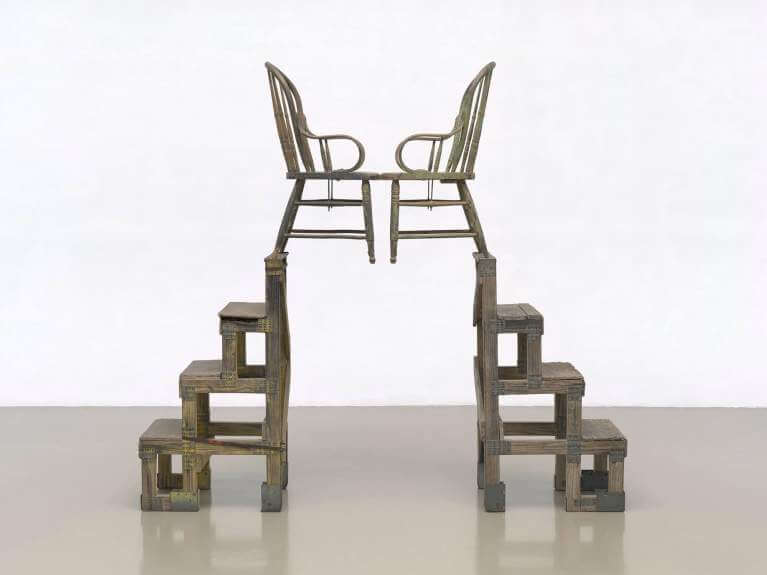
Robert Rauschenberg, The Ancient Incident, 1981, wood and metal stands, chairs, image RRF
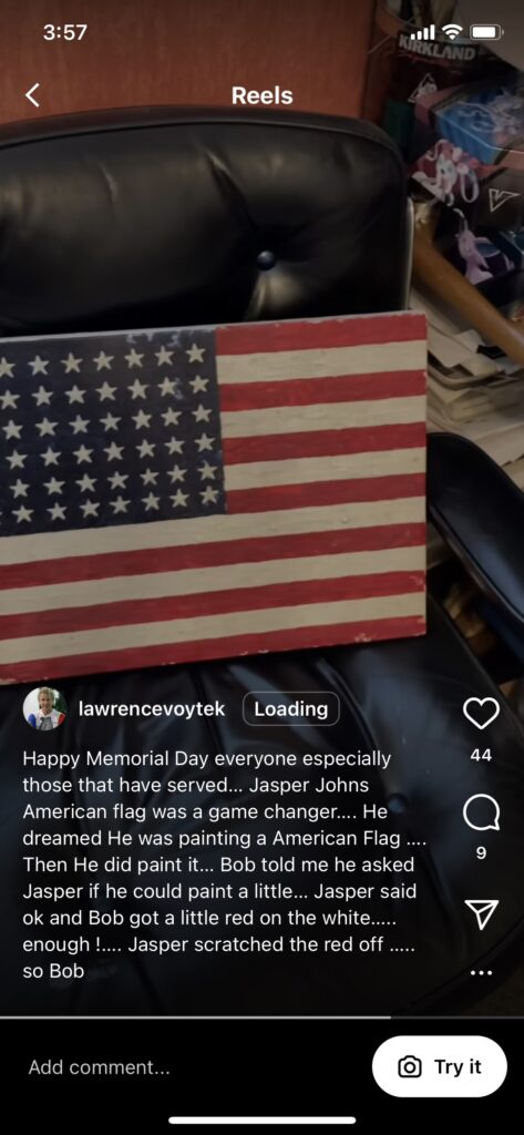
Lawrence Voytek began working for Robert Rauschenberg in 1982, right out of RISD. He set up a workshop in Captiva, Florida, and for decades was involved in helping the artist fabricate his work and solve complicated technical challenges.
“Bob told me he asked Jasper if he could paint a little…Jasper said ok and Bob got a little red on the white….enough !….Jasper scratched the red off….so Bob” img: ig/lawrencyvoytek
Yesterday, artist Eric Doeringer sent me an Instagram Reel Voytek posted for Memorial Day. Voytek shows off a small, bright Jasper Johns-style American flag on a wood panel, which he holds with one hand while recording with his phone in the other. I’ve transcribed the Reel for Art History:
Happy Memorial Day, everybody. This is an encaustic flag. There was a painting that Bob did [Short Circuit, obv] that had a Jasper Johns that was stolen, and it was at Captiva for a while. Bob asked me to make a kind of a copy of the Jasper, doing the real encaustic. He didn’t use it on it; they had a Mary Stravant [sic, Sturtevant] flag that had newspaper and stuff. But this was kind of fun. I melted Crayola crayons, and I had hot wax, and I made a Jasper Johns flag so there you go. Happy Memorial Day.
in 1954 Bob was with Jasper when Jasper had the dream of painting an American flag, and that really sort of was a gamechanger.
Indeed it was, Lawrence, indeed it was.
Voytek’s oral history doesn’t mention Johns, Short Circuit, or Flag (this one or any others). Rauschenberg’s story from Voytek’s caption, though, about asking to paint some of the original Flag is out there. Johns’ story about the dream is, by definition, solitary. But I think this is the first account I’ve seen that acknowledges someone else was in the bed.
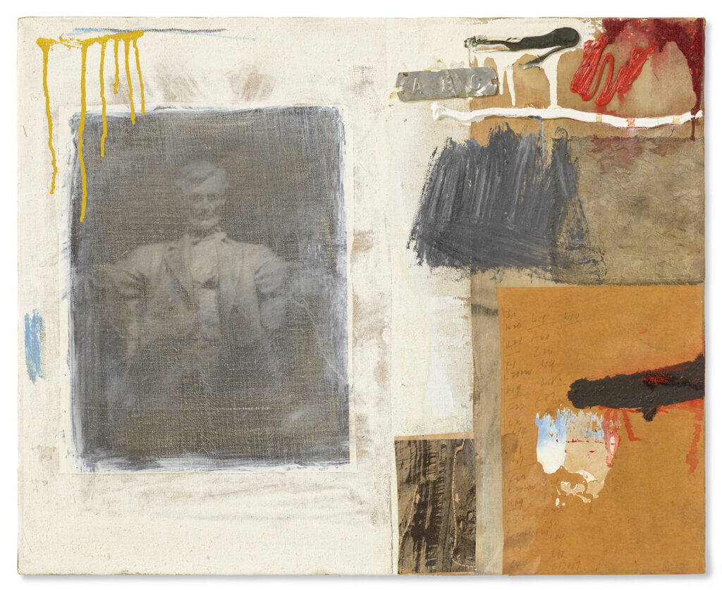
Lincoln, 1958, 17×21 in., with traces of swastikas still visible on the collaged paper on the right, via artic.edu
[The anti-Semitic defacement of Lincoln, the 1958 Robert Rauschenberg combine sold last week at Christie’s, was first reported yesterday in Kenny Schachter’s post-auction recap on artnet. Schachter said Lincoln was “infamous” for the racist vandalism that took place at some as-yet-unconfirmed point, when the work was owned by the Art Institute of Chicago. IYKYK, but so far, I’ve found no news or art text mentioning it. So what happened, and when?
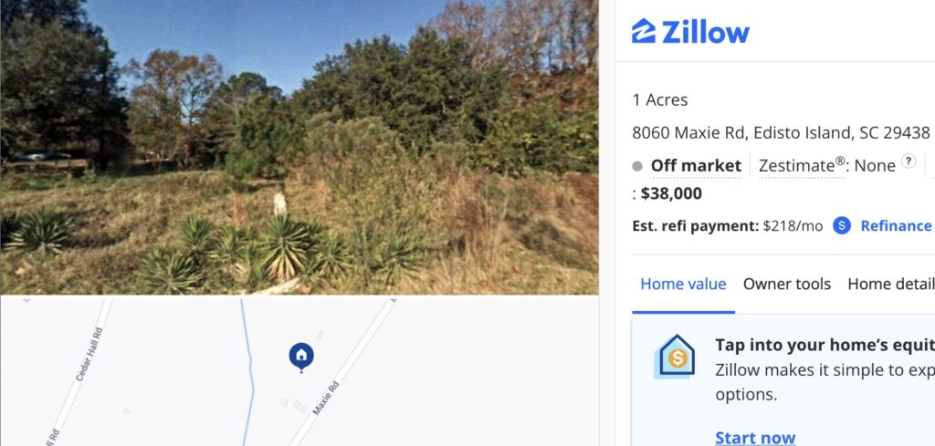
Last Sold: 8/6/2018, Zestimate®: None, Zillow screenshot
Until 2018 Edisto Island meant one thing in the contemporary art world. Then after, it meant another. Or rather, it meant two things. On August 6, 2018, Cameron Rowland bought an acre of land that had once been part of an enslaver’s plantation; then was part of a “forty acres and a mule” Freedmen’s reparations order; and then was almost immediately repossessed by the former enslavers. Rowland bought the land and placed restrictive covenants on its deed that remove any use or monetary value. The land and the deed constitute their work, Depreciation, and Dia just announced stewardship of it.
The work comprises the land and the deed, but that is not all. Depreciation is owned by 8060 Maxie Rd, Inc., a not-for-profit corporation Rowland established to execute the work. The company is named after the land’s address on a road named after the enslavers. Rowland maintains the corporation, and thus ownership of the work, and has put it on extended loan with Dia.
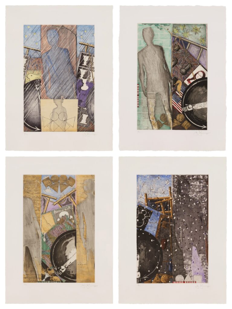
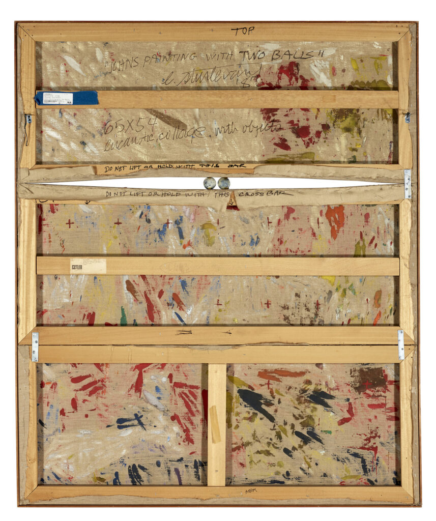
Trying to trace the whereabouts of Jasper Johns’ 1960 Painting With Two Balls around 1987, when Sturtevant made her Johns Painting With Two Balls, I note that it was reproduced in color in Michael Crichton’s catalogue for Johns’ 1977 Whitney Museum retrospective.
From the notes in the Jasper Johns Catalogue Raisonée, I see that the painting has been on loan to the Philadelphia Museum of Art, beginning March 1979.
Also, that some of the collage pieces date from December 1959.
Also, the construction is as follows: “four mending braces are attached to the canvas with screws, and a strip of wood runs under the bottom edge of the painting.” [Sturtevant’s version has no such strip.]
Also, THOSE ARE NOT JASPER JOHNS’ BALLS. THE BALLS WERE STOLEN. TWICE. AND REPLACED. TWICE.
When the painting returned from a traveling exhibition in November 1962, the original balls were missing and had to be replaced.
That exhibition, 4 Americans: Jasper Johns, Alfred Leslie, Robert Rauschenberg, Richard Stankiewicz, traveled from the Moderna Museet to the Stedelijk to the Kunsthalle Bern, presumably went off without incident until the end. Presumably, the artist made the replacement balls.
The second set was later stolen while the painting was on view at the Venice Biennale in 1964. According to the artist, the balls were replaced again and paint was applied to them with his approval.
So these balls were handled by Italians. They are, in fact, Italian balls. Palle di Venezia. Meanwhile, four of Jasper Johns’ balls are on the loose, last known location: someone’s pockets in Europe. Keep an eye out, I guess.
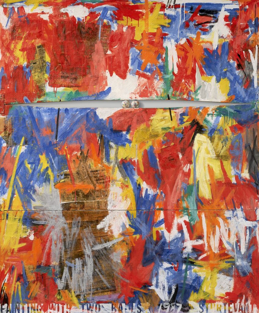
Sturtevant, Johns Painting With Two Balls, 1987, verso, image via Christie’s
If you were thinking we just saw Sturtevant’s Johns Painting With Two Balls at auction, you were right. Gerald Finberg bought the 1987 work in late 2019 at Phillips, and, I assume, had a couple of great years with it.
Now it’s on the rebound at Christie’s, who spice things up a bit by letting us hit it from the back. The three panel construction and the tapered cross bars are clearly visible and—presumably—like Johns’ 1960 original.
Lot 40C: Sturtevant, Johns Painting With Two Balls, 1987, 165 x 137.5 cm, in the Gerald Fineberg sale at Christie’s
The higher-res images also help make legible some of the fragments of the International Herald Tribune Sturtevant used (from April 23, 1987 at least, when the Stanley Cup was also underway) as she painted this thing in Paris[?].
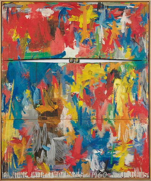
Jasper Johns, Painting With Two Balls, 1960, 165 x 137.5 cm, collection of the artist, image ganked from Beach Packaging Design
The way we understand Sturtevant’s practice is that she repeated works but didn’t reproduce them, painting from the image in her mind, if not exactly “memory.” But the placement, shape, and even the layering of the brushstroke knots here makes me suspect that’s not how Two Balls went down. I think she used a color image for reference, and maybe even projected it. This is a stroke-for-stroke remake—a drip-for-drip remake, even—which feels categorically different from Sturtevant’s other projects [or at least how they’re presented and understood.]
It feels like there’s a Rauschenberg Factum reference here I can’t quite tease out. It’s not just as if two different people made Factum I and Factum II. It’s two different people made paintings with two balls, 27 years apart, and both of them were there when Rauschenberg made the Factums in the first place. But only one made this comparison possible, decades later, and that’s Sturtevant.
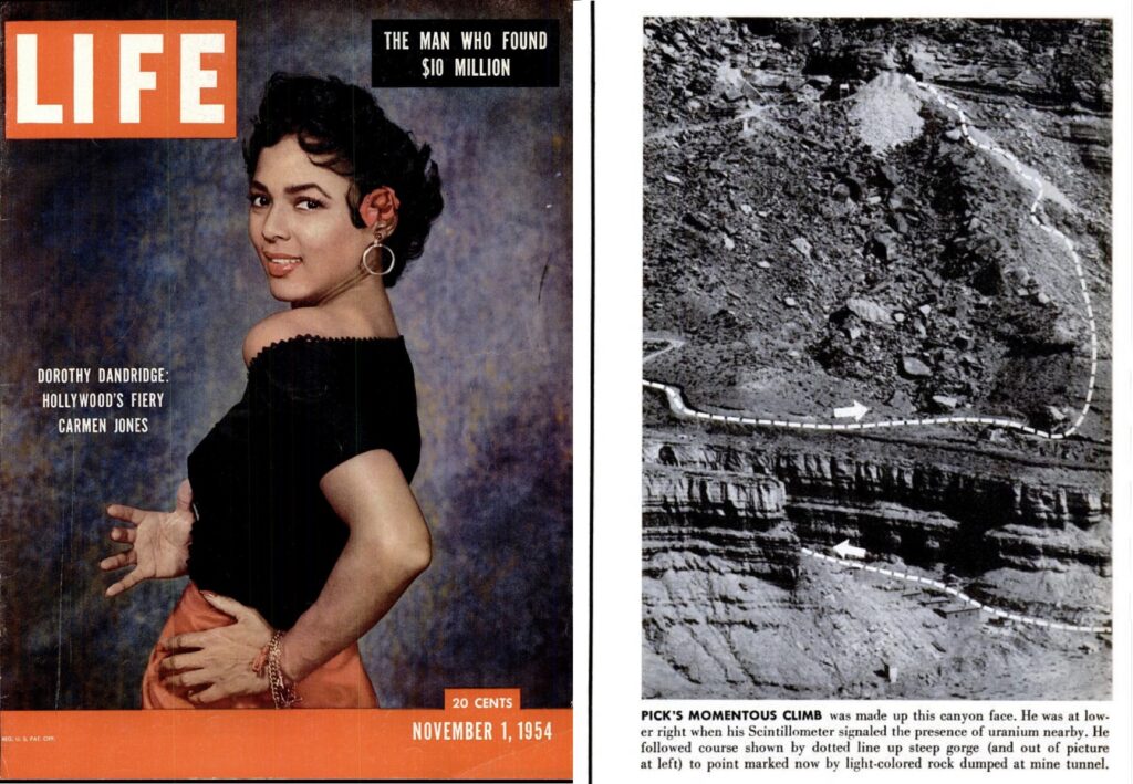
Dorothy Dandridge and the headline, “The Man Who Found $10 Million” on the cover of the Nov. 1, 1954 issue of LIFE Magazine, and a half-page wide aerial photo tracing the path George Vick hiked up a canyon, then up a mountain face, to find a massive deposit of uranium, on p. 124 [via]
Speaking of the outer margins of Henry David Thoreau inspiration, in November 1954, LIFE Magazine published a massive feature on an ersatz uranium hunter named George Vick. At the age of 48, and after nine grueling months searching the Four Corners region of Colorado and Utah, Vick found a massive uranium deposit, which he sold to a mining company for $10 million. The LIFE cover line, “The Man Who Found $10 Million,” made him an instant target for people asking for a piece of that easy money. Vick moved to California and set up his own think tank for the nuclear future, which he called Walden West. Later, when the future looked bleak, he built an apocalypse-proof bunker mansion in British Columbia, which he called, of course, Walden North.
Robert Rauschenberg, Lincoln, 1958, 17 x 21 inches, collage of printed paper, handwritten paper, some dingy damask, a stamped metal tag, and paint on someone else’s canvas
Which all turns out to be the tangent here, because Robert Rauschenberg cut out the aerial photo of Vick’s treasure trail and, in 1958, working in the gap between LIFE and art, he collaged it to the center of a small combine titled, Lincoln. Lincoln is one of at least seven small combines Rauschenberg made in 1958, along with a similar number in 1957. [I wrote about another of these little personal combines, State, in 2020.]