Black Rain, Gold Screen

a six panel gold leaf folding screen, commonly known in japan as a kinbyoubu, is streaked with long vertical traces of sooty black, left by black rain falling through the damaged roof of a house in hiroshima after the united states dropped an atomic bomb on the city in 1945. the screen here sits within a glass vitrine at the peace memorial museum, and the exterior windows of the museum reflect in the vitrine glass. this photo was taken by bryan hilley in october 2024 and posted to bluesky in august 2025
Gold folding screen [kinbyoubu, 金屏風] at the Hiroshima Peace Memorial Museum in 2024
photo: @bbhilley.bsky.social

“There is a six-panel folding screen, donated just recently by a Hiroshima family, whose gold expanses are streaked by black rain: the most terrifying abstract painting I have ever seen.” So wrote Jason Farago in the New York Times, after visiting the Hiroshima Peace Memorial Museum before the 80th anniversary of the US nuclear bomb attacks on Hiroshima and Nagasaki.

Bryan Hilley knew exactly what Farago was talking about, because last year, he’d seen it, too. And when I saw Bryan’s photo paired with Jason’s quote, I thought it, too, the most terrifying abstract painting I have ever seen.

But then I realized we were all exactly wrong. This is not a painting, and most importantly, it is not abstract. The way we immediately read it as such, though, underscores Farago’s larger point, which is that we largely lack the cultural references needed to recognize this object, where it came from, and why it’s as urgent to understand it now as it’s ever been.

This specific error is worth chasing down. The screen does not look like an abstract painting; abstract paintings look like it. Which is itself an overwhelming realization, until it isn’t.

Continue reading “Black Rain, Gold Screen”

Jasper Johns Little Guys For Obama

a jasper johns etching has two horizontal rows of squarish images, like a comic strip, in gradations of grey. most of the panels have an element that looks like an eye or a sun, in space or in a larger circle. the upper right panel has the three stick figures johns began using as an occasional motif in the 1980s, but especially after 2000.
Jasper Johns, Untitled (from the Artists for Obama portfolio), 2008, etching and aquatint, 8 x 20 cm image, 21 x 30 cm sheet, ed. 13/150, selling as a loosie on 3 Sept 2025 at LA Modern [kinda wild that such a low edition number was broken up for parts]

Whoops, missed another one. I might have to check all the benefit print portfolios Johns contributed to in the last 30 years, to see if there are any more little guys out there.

Meanwhile, these little guys are in a little print—just 8 x 20 cm, smaller, even than the Ellsworth Kelly print in the same Artists for Obama portfolio.

a detail of jasper johns's 2008 print for obama comprises the upper right panel where three barely drawn stick figures are in motion against a gradient sky sprinkled with stars. the stars and guys are drawn in line,and the sky is brushed in around them all. feels kind of quick, looks kind of provisional
Jasper Johns, detail, Untitled (from the Artists for Obama portfolio), this little scene is like 5 x 5 cm

And they’re pretty lyrically drawn, too. No stamps here. I assume those are pens in their hands, encouraging people to register to vote.

3 Sept 2025, Lot 310, Jasper Johns, Untitled, est. $2-3,000 [lamodern]
Gemini GEL got 14 Artists for Obama in 2008, tho technically they were Artists for the DNC [moma]
Previously, related: Jasper Johns Little Guys for Leo

It’s A Mirror, It’s A Sculpture: Ellsworth Kelly’s Mirrored Concorde

a circa 1971 saturated color photo of ellsworth kelly's truncated square/hexagonal sculpture, mirrored concorde, is a sheet of chrome plated stainless still with a matching flat base/brace attached behind it. the photo shows light refracting off the ediges, and reflected shadows and such in the surface, via gemini gel and moma
Ellsworth Kelly, Mirrored Concorde, as published in 1971, in the catalogue for Riva Castleman’s show Technics and creativity II Gemini G.E.L. at MoMA

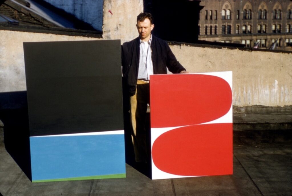
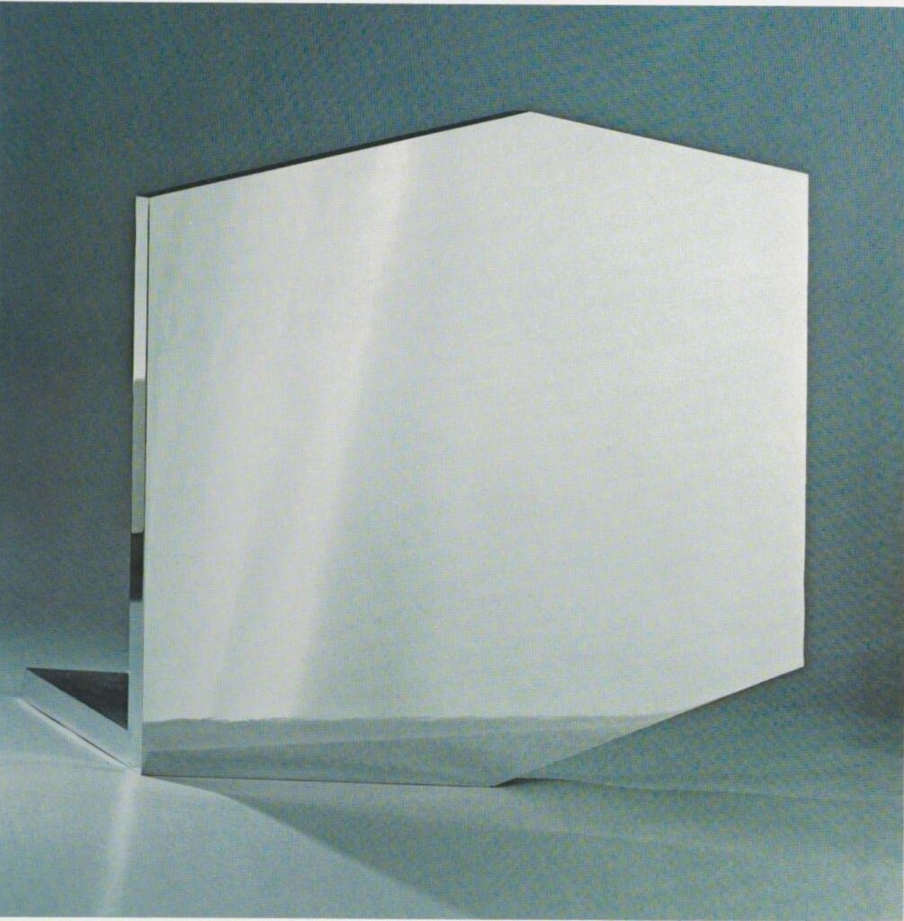
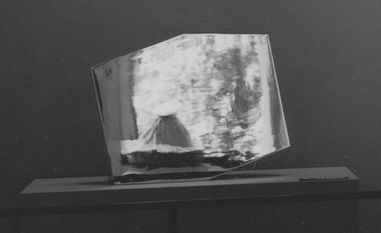
Looking up something else in the catalogue for Technics and Creativity II, MoMA’s 1971 exhibition about Gemini G.E.L.’s process, I was stopped in my scrolling tracks by this excellent full page photo of Ellsworth Kelly’s Mirrored Concorde.

It absolutely looked like the future. And in a sense, it was: Mirrored Concorde was an edition in progress, just entering production with an undetermined edition size. Which, hold that thought. But the image itself, with its dramatic lighting, refractions, and straightforward mirrored materiality really hit.

brooke alexander's photo of ellsworth kelly's mirror finish stainless steel sculpture in the shape of a truncated rectangle sits on a maple stained wood pedestal in a gallery loft space. the angle of the photo is such that the sculpture's mirror surface is entirely neutralized, and seems monochrome grey. via art basel
Before Brooke Alexander brought Mirrored Concorde ed. 2/12 to Basel in 2018, it sold at Christie’s in 2013, with its wood base.

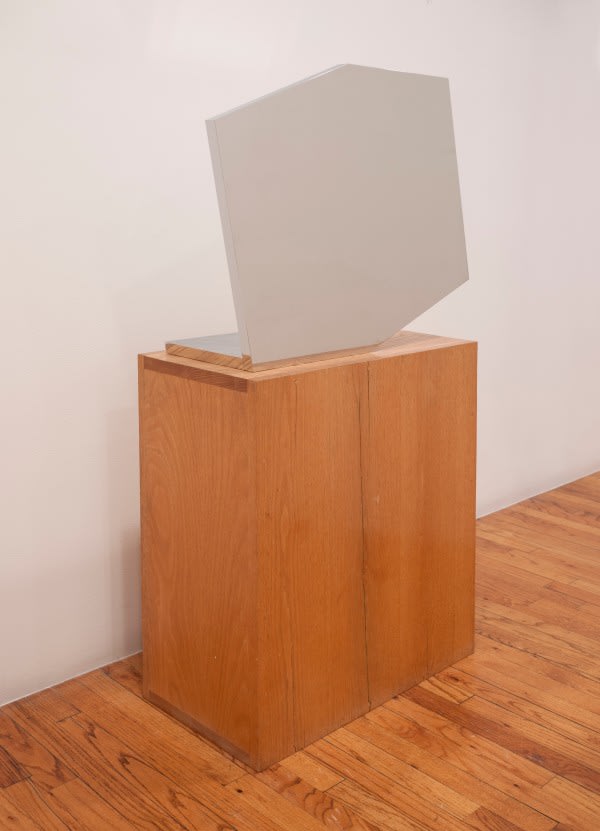
That’s not quite how the work has turned out, alas, though it’s still a beautiful thing. It seems like there were only 16 made by 1972, when the work was officially published: an edition of 12, plus two copies each for Kelly and Gemini.

Unlike the free sculpture above, the examples out in the world have various bases and pedestals that make me wonder if it’s a little top-heavy. Christie’s incorporated the base into the 50 7/8 in. height, but while they broke out the metal pieces, neither Brooke Alexander nor Matthew Marks included the base in the depth.

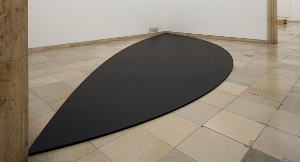
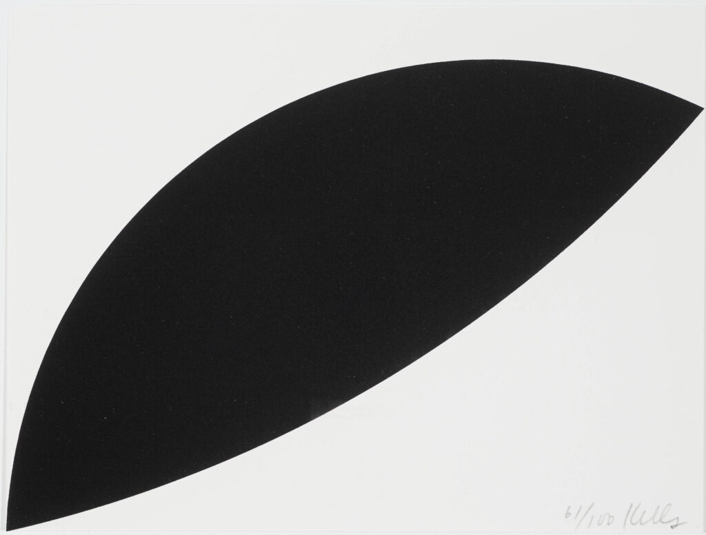
The truncated rectangular shape is one Kelly used as early as the 1950s; this one feels like it could be the hexagonal outline of a 3-D cube diagram. The mirror finish is very unusual in his work. After cutting, the 1-inch steel plate elements were ground, lapped, and polished on the sides and edges, then nickel- and chrome-plated. Which, I guess that’s ok, but could they not have just kept polishing? [Asked the guy who didn’t make one of these things, much less sixteen.]

ellsworth kelly's untitled wall relief in polished stainless steel is in the asymmetrical shape of a superman logo-like shield, a downward pointing triangle with the top corners cut off unevenly. it's photographed against a plain grey background, and shows light and shadow reflecting across the upper right corner. via gemini nga
Ellsworth Kelly, Untitled, 1985-86, polished steel, 30 x 24 3/4 x 3/8 in., ed. 9+7, image: Gemini GEL

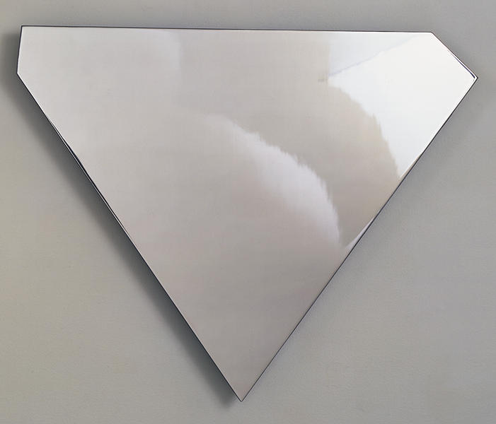
Maybe Kelly did wonder the same thing, because the similarly scaled wall relief edition he made in 1985-86 Untitled (Gemini EK86-2128), was only polished, not plated. [It was only polished on the face and edges, though, and the steel is only 3/8-inch thick. There was also an edition with a sandblasted finish.] The shield shape was in heavy rotation; it showed up in paintings in the late 70s, and then a Cor-Ten steel relief in 1984, which TV producer Douglas Cramer owned.

james mathews' 1971 installation photo of a moma print exhibition is mostly the work of ellsworth kelly. a series of kelly prints is mounted on the white wall along the right, and kelly's mirrored concorde sculpture is on a pedestal, behind a stanchion, and against a darkly painted accent wall on the left.
Mirrored Concorde proof installed at MoMA’s Technics & Creativity II: Gemini G.E.L. in 1971, on a wonky pedestal and roped off, but reflecting the Sculpture Garden, photo: James Mathews for MoMA

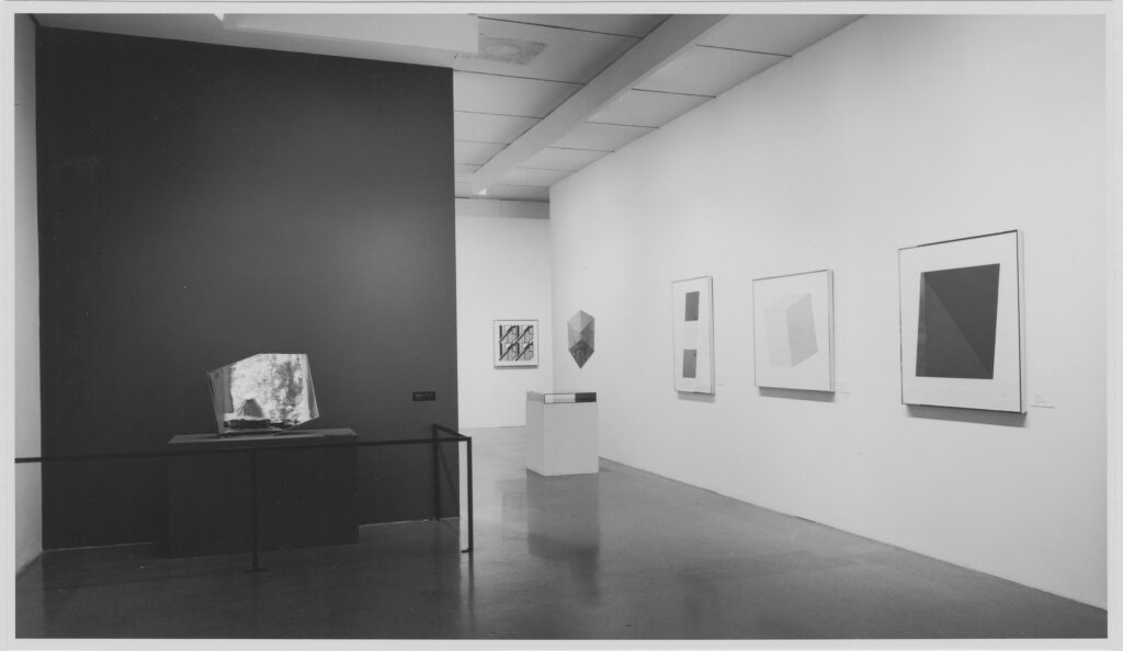
So maybe I like the top pic so much because it actually feels like a mirror-finished object. Every other image of Mirrored Concorde makes it look like Featureless Matte Finish Concorde. Seeing James Mathews’ installation photo of the MoMA show, I can confirm.

a detail of james mathew's 1971 installation photo of moma's exhibition, techics & creativity II, showing ellsworth kelly's truncated rectangle-shaped mirror-finish plated steel sculpture, Mirrored Concorde, reflecting a volcano-looking claes oldenburg sculpture of a respiring ice bag, in front of the large plate glass windows by which the gallery connects to the sculpture garden
detail: Ice Bag in Mirrored Concorde

Even on its wonky pedestal, behind its stanchion, and against its painted accent wall, Mirrored Concorde manages to look like a portal to another dimension. Because what it actually reflects is the world in front of it: the museum’s sculpture garden through the Philip Johnson addition’s windows, with one of Claes Oldenburg’s Ice Bag sculptures peeking its motorized head up. Let this be one more argument in support of photographing mirrors to look like mirrors.

The Lichtensteins’ Little Kelly

a small ellsworth kelly print, vertical in format, is a guillotine blade-shaped trapezoid of monochrome, deep blue, filling the top 2/3 of the tiny 8 x 6 inch sheet. this one, from the edition of 220, is number 43, and is being sold by bonhams from the lichtensteins' house in july 2025

I am slow, but the Ellsworth Kelly print that’s the first lot in Roy and Dorothy Lichtenstein’s estate sale is even smaller than the smallest Kelly prints. Blue Curve, 1999, is just 8 x 6 inches. It was made as a benefit print for the Archives of American Art in a big edition, 220+38AP, so aggregated surface area-wise, it’s probably right in the middle.

Kelly was honored with a medal the AAA’s benefit gala in October 1999, which coincided with an exhibit of items from the artist’s archives in the Archives Gallery. The AAA had a gallery in the lobby of 1285 6th Avenue, the UBS Building with the Scott Burton street furniture.

“It’s the Lichtensteins’ tiny Ellsworth Kelly benefit print, Bonhams. What could it cost? $10?” [update: sold for $8,320][bonhams]

Window, McMansion, Randolph

an artwork of two vertical rectangles, a monochrome white canvas above and a faint grey assemblage of painted wood below, divided into three sections with black painted vertical wood trim, the whole thing reads as a tall window with mullions, but is a 1949 work by ellsworth kelly
Ellsworth Kelly, Window, Museum of Modern Art, Paris, 1949, oil on wood and canvas, two joined panels, 50 1/2 x 19 1/2 in., a gift of the artist to the Centre Pompidou, image via ellsworthkelly.org

In our timeline, in October 1949, Ellsworth Kelly, a young former soldier studying painting on the GI Bill, saw the windows of the Museum of Modern Art in Paris in a new way, as a composition, one that could become a painting/object just as it was, and in fact, the whole world was like that, full of subjects he could spend his whole life discovering and transforming into paintings.

a detail of a real estate listing for a cursed new house in north carolina where the vinyl siding and etsy accent barnwood are all outlined with black trim like a line drawing, and mcmansion hell has added an annotation of a dozen or more question marks to a porch roof that doesn't match, but this image is posted here because on the left side of the house is what appears to be a double height window made from two single sindows, which is misaligned to all the rest of the black trim, but which also bears a resemblance, however cursed, to the museum of modern art paris window that ellsworth kelly saw in 1949

In another timeline, a young Ellsworth Kelly saw these two off-the-shelf prairie mullion windows kludged together to look like one tall, misaligned, window on a house in the middle of a gravel field in North Carolina that was just posted on McMansion Hell, and drove straight to the army to re-enlist as a requisitions compliance auditor, eventually retiring from a job at a cubicle in Ring C of the Pentagon. His little yard is full of old stoves, which he salvages from apartment turnovers, repairs, and sells on Facebook.

Window, Museum of Modern Art, Paris, 1949 [ellsworthkelly.org]
glam metal modern but also your contractor is going to jail dawg [mcmansionhell]

It’s Seven Oranges, Matthew. How Much Could It Cost? $40,000?

a 1966 drawing by ellsworth kelly of seven oranges is seven circles on a page, one in the center, and six distributed evenly around it. a couple barely touch each other, but the center orange overlaps the orange at 10 o'clock just enough to give the entire composition a sense of space and depth. then it snaps back to being seven circles again. via matthew marks gallery
Ellsworth Kelly, Seven Oranges, 1966, graphite on paper, 22⅝ × 28½ in., image via Matthew Marks

Every time I worry this site is just becoming an Ellsworth Kelly fanblog, I recommit to myself to stop posting Kellys when they start going downhill.

That moment is not yet. This 1966 drawing, Seven Oranges, which was a standout in a standout show of plant drawings at Matthew Marks in 2017, is for sale next week at Phillips. I assume whoever bought it is dead or dead broke, because why would you ever just decide to give this up? And for what? $40,000?

[update: did not sell, but on the bright side, they get to keep it. ]

Henry Persche’s Tiny Kelly

an ellsworth kelly painting on a 4 inch scrap of canvas, a fat yellow square, plus another yellow brushstroke next to it for some reason, sandwiched between thinner brushstrokes of blue on top and red on the bottom, a gift fo the artist's longtime studio assistant henry perche, now called a study and for sale at phillips in may 2025
Ellsworth Kelly, Study for Blue Yellow Red V, 1987, 4 1/2 x 4 in., oil on canvas, selling at Phillips 14 May 2025 [update: or not]

You get a taste of that Ellsworth Kelly brushstroke, and suddenly it’s all you want and all you look for, and you’re desperate for another fix, even if it’s a literal scrap of canvas.

ellsworth kelly painting in three horizontal canvases, stacked: narrow blue, square yellow, and slightly less narrow red, from 1987, some day going to the nga, but not yet, apparently
Ellsworth Kelly, Blue Yellow Red V, 1954/1987, 246 x 190 cm, oil on three canvases, the Meyerhoff Collection, promised to the National Gallery as recently as 2020, but they 404’d the slideshow, which feels ominous. but it could be nothing.

This extraordinary 4.5 x 4 inch work is being sold as Study for Blue Yellow Red V, presumably after the number of brushstrokes it contains. The way it has pencil marks along the edge where it was cut off. The way that patch of yellow feels extraneous but is obviously not a dealbreaker, because the work is signed an assigned a spot in the artist’s catalogue raisonné (EK 761B). The way it references a monumental, triple canvas, double-dated painting which the Meyerhoffs are hanging onto for dear life. The way it was acquired directly from the artist by Henry Persche; 1987 was the 20th year since he began working as his studio assistant—was this an anniversary gift? Or just a little something to match the rug?

an ellsworth kelly drawing of a 26 yo white guy with short dark hair and deep charcoal eyes, a lightly sketched torso in a v-neck sweater, a more heavily sketched out crotch in tight pants, legs spread, combat boot top exposed on his left foot, reading a book in an otherwise blank page. the subject henry persche would soon be kelly's studio assistant around the time of this 1967 drawing, which is now in the brooklyn museum
Ellsworth Kelly, Henry Persche, graphite on paper, Feb. 7, 1967, 23 x 29 in., a gift from Persche to the Brooklyn Museum

Persche was 26 in February 1967 when he lounged for Kelly for this sketched portrait. He donated it, along with three other drawings, to the Brooklyn Museum in 2010. The rug, from a declared edition of 20, of which only four were ever realized, he also got in 1967-68. He only sold it in 2019.

Green and Red

a vertically oriented painting on paper by ellsworth kelly titled green and red is a green bulbous form like a water tower, surrounded by a rectangle of red. brushstrokes are evident all over, showing a give and take between the two areas of color, and a couple of tiny gaps of blank paper as well, selling at sothebys in may 2025
Ellsworth Kelly, Green and Red, 1964, oil on Arches, 30×22 in. or so, selling [UPDATE: or not] 16 May 2025 at Sotheby’s

I liked it well enough for itself, but after arguing with the Sotheby’s essay in my head over what’s actually going on in this Ellsworth Kelly oil on paper, I love it even more.

It mentions “a single, vibrant and amorphous green form set against a flat, saturated red ground,” and says “The green shape, defined by sweeping, confident brushstrokes, floats within the field of red with a quiet, commanding presence.” Yet it feels like there is neither a ground or a field to float on. These two colors and the forms they make are side by side on a sheet of paper.

The visible brushstrokes absolutely do reveal how Kelly made the picture, how there might be a bit over overlap of green on red paint along the right side, but also how the vertical strip where the slightly angular green neck goes was narrowed with red. Rather than surrounding a form, or coloring in a void, it feels like Kelly made the picture as a whole.

It’s got borders like a print, too, which echoes the series of lithographs he was making for Galerie Maeght at the time. It also seems Kelly held onto this until 2007.

16 May 2025, lot 323, Ellsworth Kelly, Green and Red, 1964 [update: did not sell] [sothebys]

Ellsworth & Kelly & Lorenzetti & Kubrick

tiger is a 1953  painting in five panels by ellsworth kelly, that forms a large square. the top quarter of the painting comprises three panels, yellow,  pink and orange. the bottom 3/4 is two panels, white and black. A demarcation line at about 60% of the width of the work leaves the yellow and white panels to be the widest. this painting is in the collection of the national gallery of art, and has not been exhibited since 2023, when it disappeared midway through the kelly exhibition at glenstone. have any news? hmu
Have you seen me? Ellsworth Kelly, Tiger, 1953, oil on five canvases, collection, NGA

I was listening to a recording of Ellsworth Kelly’s 1999 Elson Lecture at the National Gallery of Art, and I have some questions. Some could probably be answered by a video of the lecture—more of a conversation, with curator Marla Prather—or with a review of Kelly literature I don’t have.

Continue reading “Ellsworth & Kelly & Lorenzetti & Kubrick”

Ellsworth Kelly Extra Small

a tiny ellsworth kelly print, red curve, has a red curve from the top left corner to about 40% of the way down the right edge. The bottom edge of the red shape is straight from the lower right corner up to about the middle of the left side. no print border, it goes right to the edges. love it. now. but didn't love it enough to buy it back in the day, alas. live and learn.
Ellsworth Kelly, Red Curve, 2006, lithograph, 12 x 6 3/4 in., ed. 100, plus 20 ap and 18 sp, this one via Bonham’s

While poking around the Gemini G.E.L. CR, I was surprised to find that River II (2005), one of Ellsworth Kelly’s superlong prints, was also his second to last print made with Gemini.

I’ll have to check the Kelly prints catalogue raisonné for details—the second edition was published in 2012, but Kelly sure seemed booked and busy right up to the end in 2015.

It’s also a surprise because the last print he made with Gemini was maybe his smallest ever. Red Curve (2006) is a single color lithograph, cropped so the shape goes right to the edges and the corners of the 12 x 6 3/4 inch sheet.

Red Curve was published for Kelly’s show at the Serpentine Gallery, a cheap, unframed edition of 100. I feel like it was easily under GBP1000, and at the time, it didn’t even seem real somehow. Now it is fascinating and formally intriguing, especially after the other full-bleed prints he’d just made, that resonate between print and object. Also it’s utterly adorable.

the glass walled entrance to joni weyl's gallery has ellsworth kelly painted in small all caps near the door handle. three of the smallest prints kelly made for gemini gel hang on the walls, and a fourth larger print is on the wall through the doorway. from left, red curve, blue thumb or whatever, and blue gray green red, four abutting blocks, are in simple white or natural frames. i swear, did they put the most stealable works in the entry just to tempt me?

[OK, close to the smallest but not the last: Blue Gray Green Red (2008) was part of the Gemini-organized Artists for Obama portfolio. Here they both are installed at Joni Weyl in 2019.]

later this afternoon update: I went through the CR, published in 2012, but it does end in 2008. I feel like if there were more prints coming, they could have fit them in. So what seems like the last last print for Kelly was a large (48 x 130 in.) version of Blue Gray Green Red. He went big, then he went home.

an ellsworth kelly print titled red curve in the shape of a guillotine blade, in a white matted natural frame, 10 x 7.5 inches, made for parkett and sold at rago in 2021
Ellsworth Kelly, Red Curve (for Parkett 56), 1999, 10 x 7 1/2 in., lithograph, ed. 70, this one sold by
Rago in 2021

The only smaller edition, though, might be Red Curve (1999), which he made for Parkett, which is 10 x 7 1/2 in. And for the 1973 Works By Artists in The New York Collection for Stockholm portfolio, Kelly made an untitled black on white screenprint that is 12 x 9 in. And while there are a couple of similarly sized Concorde etchings in the early 1980s, they’re on traditional, larger sheets.]

proof of a 1999 ellsworth kelly print, blue curve, is 8 x 6 inches vertical format, with a guillotine blade shaped trapezoid of deep blue litho ink filling the top 2/3 of the white sheet. gemini via nga.gov
Ellsworth Kelly, Blue Curve (Axsom 281), 1999, 8 x 6 in., litho on rives, via nga/gemini

[July 2025 update] Actually, after my systematic search through the Gemini and prints CR, I missed posting Blue Curve (1999), the next one (Axsom No. 281), which was even smaller—8 x 6 inches—and which was published in an edition of 220 to benefit the Archives of American Art.

Rather than delve into why Kelly stopped, or what the very last prints mean, Richard Axsom, the prints CR editor, looked at what was there: a complete, ambitious, and exceptional project, and said, “River is a great summa to Kelly’s prints.”

Ellsworth Kelly Black Face

Ellsworth Kelly, Found in the sand, 1964, collage on paper, 31 x 25 cm, selling 13 Nov 2024 at Rago

The jankiness of this 1964 Ellsworth Kelly collage is surpassed only by its intricacy. And its problematics lapped them both.

It is one of [at least] two collages Kelly gave to David McCorkle, who sailed with the artist to France for the last three months of 1964. Dale McConathy, listed in the Ellsworth Kelly Foundation’s chronology as a former employee of Betty Parsons Gallery, also joined them, and wrote a catalogue essay for Kelly’s show at Galerie Maeght. [Upon his return in 1965, McConathy became an editorial assistant, and then quickly literary editor, of Harper’s Bazaar, where he published his avant-garde artist friends and French theory. James Meyer wrote of McConathy’s role in magazine/art culture and the confluence of art & fashion in 2001. I think McCorkle later tried his hand at Broadway, then in the ’70s became a caterer. In any case, in 1964 Kelly was 41, and it sounds like McCorkle and McConathy may have been 40 together.]

The primary element of both of McCorkle’s collages, for sale at Rago Arts next week, is a Sea & Ski suntan lotion ad. They could have run elsewhere, too, of course, but the one with the girl grabbing the guy’s hair, titled PAL because of another collaged element, ran in the June 19, 1964 issue of LIFE magazine. And the one above ran in the July 3 issue.

Ellsworth Kelly, David, the AP of the 90×60 cm lithograph published by Imprimerie Maeght in 1964-65, a 1969 gift of the artist to the Norton Simon Museum

Kelly has torn the blonde, sunglassed face of the lifeguard in the ad, and drawn another in the void, with Black features. [From the one of many portraits Kelly drew of McCorkle that Galerie Maeght published as a lithograph, we know that Black face is not McCorkle’s.] We don’t know if McCorkle had a gorilla tattoo on his shoulder, one of the tiny, almost surgically collaged elements Kelly added. [Other carefully cut elements include “David” on the patch on the lifeguard’s swimsuit, and the compound that gave the work its title, “found/ in the sand, the,” at least part of which came from a caption in the same issue of LIFE.]

pp 8-9 in the July 3, 1964 issue of LIFE, featuring Albert Murray’s essay, “‘The Problem’ Is Not Just Black and White,” and the Sea & Ski ad Ellsworth Kelly used for his young friend’s collage

“in the sand, the” puts the whole issue of LIFE in Kelly’s hand at some point, not just a tearsheet. So what was on the page facing the lifeguard? A book review about “The Problem,” aka, “The Negro Revolution,” by Albert Murray. Is that what the Black face Kelly drew is looking at? Or was it the inspiration? That feels like the most benign explanation, though it does not explain the gorilla, which does not appear in this or any contemporaneous issues of LIFE.

13 Nov 2024, Lot 145: Ellsworth Kelly, Found in the sand, 1964, est. $5-7,000 [update: sold for $6,048] [ragoarts]

Ellsworth Kelly’s Gaza

Ellsworth Kelly stamps, designed by Derry Noyes, issued in 2019 by the USPS

In 2019 the United States Postal Service really did put out a stamp named Gaza. It’s on the lower right, no. 5391, a 1956 four-canvas painting by Ellsworth Kelly in the collection of SFMOMA called Gaza.

SFMOMA’s page says more about the donors than the painting, and has the date as just 1956, while it has otherwise been dated 1952-56. The difference feels relevant, because it spans Kelly’s formative sojourn in Paris and his 1954 move to New York City.

Continue reading “Ellsworth Kelly’s Gaza”

This Is Kasper König’s Welt

Ellsworth Kelly, Die Welt, 2011, offset on vellum, ed. 90/100+20AP, sold at Rago in 2021

On October 6, 2011, Berlin newspaper Die Welt replaced all the pictures in their daily edition with Ellsworth Kellys. They also published a signed, limited edition reproduction of the front page on archival paper. Which stays brighter longer, which is nice. But it’s only printed on one sheet, on one side. And so it misses the entire point of the project, while replacing it with a picture souvenir.

Ellsworth Kelly, Die Welt, 06.10.2011, 57.5x40cm, selling 02 Oct 2024 at Van Ham

With this signed, dedicated copy of the actual paper being sold this week, Kelly gave Kasper König the best of both worlds. It was König’s invitation that led Kelly to make his first floor piece, Yellow Curve – Portikus (1990), the work which was re-realized at Glenstone in 2015. I guess they stayed in touch.

Sure König’s Welt already turning yellow, but it’s got eleven other Kellys inside it. And there’s even a recursive version of itself on the back. And Lufthansa knocking off Milton Glaser. AND Amanda Knox.

Ellsworth Kelly Unterwelt

And again, it’s an actual newspaper, not a picture of one. And that makes all the difference.

[Ellsworth Kelly’s 102nd birthday update: they even sent me multiple years of artist newspapers, yet idk why I had Die Welt in Munich, when, as tumblr user @11059 points out, it’s in Berlin, but it is in Berlin. Also Die Welt is right-wing and tacking harder right, with a Trumpist CEO and Elon endorsing AfD in the opinion page, so let’s celebrate Kelly’s birth by reminding Die Welt who he opposed in WWII.]

02 Oct 2024, Lot 146: Ellsworth Kelly, Die Welt, est EUR1000-1500 [update: sold for EUR5940, which is the most] [vanham]
Previously, related: I Wanna The Kelly Welt, Chico, An Everthinisinnit
Oh right, I saw it in person, and it rocked: Wade’s Welt, Excellent

IYKYK: Ellsworth Kelly Pink Triangle

Jonathan Horowitz, Pink Curve, 2010, acrylic on fiberglass, 83 x 147 in., inexplicably sold by the Brants at Christie’s for like a dollar in Dec. 2022

Until this morning, everything I knew about Ellsworth Kelly and pink triangles I had learned from Jonathan Horowitz. In 2010, Horowitz made a series of works critiquing the minimalist and abstract works Kelly and other artists made for the US Holocaust Memorial Museum. “In the face of one of the worst things that’s ever happened, art is represented as having nothing to say,” Horowitz explained when he showed the works at Sadie Coles in 2011.

Two Rainbow Flags in the Style of the Artist’s Boyfriend, 2011, image:jonathanorowitz.com

Pink Curve (2010), above, paraphrases Kelly’s white Memorial (1992), transforming it into a reference to the pink triangle nazis forced gay people to wear in the concentration camps. Pink Curve called out the invisibility or omission of gay identity, not just in discussion of the Holocaust, but in a work by a gay artist. It’s similar to Horowitz’s critique of Jasper Johns—and/or of the discourse around his work—in works like Rainbow Flags For Jasper In The Style of The Artist’s Boyfriend (2011). [The artist’s boyfriend referenced here is Horowitz’s, Rob Pruitt—unless Johns was keeping a glitter-loving twink under wraps on his farm, obv.] And all that makes sense.

But also.

Olympic Tower Apartment by Arthur Erickson, interior by Francisco Kripacz, 1979, photo: Norman McGrath, s/o tumblr user runrabbitafterdark-blog

This morning I saw these photos, and is that not an Ellsworth Kelly pink triangle painting on the living room wall of a 1979 apartment in Olympic Tower, designed by Francisco Kripacz? Yes, yes it is.

Olympic Tower Apartment by Arthur Erickson, interior by Francisco Kripacz, with a raised glass floor and a pink Ellsworth Kelly, 1979, photo: Norman McGrath, s/o tumblr user runrabbitafterdark-blog

Well, technically, it’s not a triangle, but a triangle with asymmetrically truncated corners, so a pentagon, but still, it is rather trianglish. And technically, the architect, resident, and Kripacz’ partner, Arthur Erickson, called it “a very beautiful mauve” Kelly whose form is echoed by the custom steel coffee table [an actual triangle.]

Arthur Erickson and Francisco Kripacz, Teck Mining Group boardroom with an Ellsworth Kelly green painting between two trees, photo: Norman McGrath via arthurerickson.com

Maybe they bought in bulk, because they used an identically shaped green Kelly outside the Toronto boardroom of the Teck Mining Group.

Untitled (1979), EK 590, steel, 92 x 112 in., sold at Sotheby’s by Doug Cramer’s estate in 2021

Erickson and Kripacz were the most famous Canadian Design Gays of the 1970s and 80s. They renovated an iconic party house on Fire Island with a retractable roof and fence. They partied and schmoozed with all sorts of famous and powerful people. Gay architect and nazi Philip Johnson had dinner in the presence of the Kelly pink triangle. They kept working together after they broke up, with Kripacz setting up shop in Beverly Hills. And while I can’t find any party pics, I’m sure Dynasty producer Douglas Cramer had to know about Erickson & Kripacz’s pink Kelly triangle when he bought the Cor-Ten steel version in 1984. So maybe Horowitz was onto something.