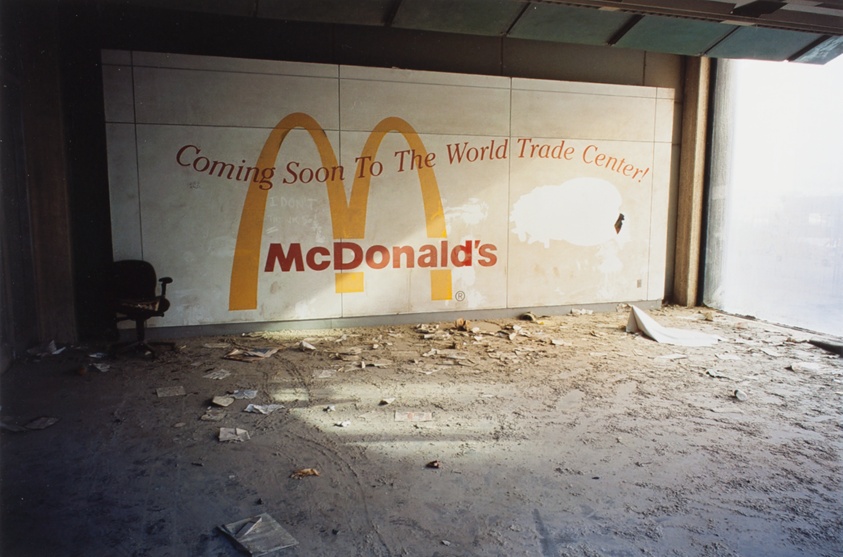
For folks looking for less disturbing McDonald’s-related pictures at the moment, somehow Joel Meyerowitz, of all photographers, is here to oblige. [via @mlobelart.bsky.social]
the making of, by greg allen

For folks looking for less disturbing McDonald’s-related pictures at the moment, somehow Joel Meyerowitz, of all photographers, is here to oblige. [via @mlobelart.bsky.social]
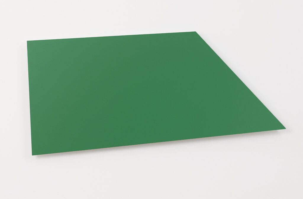
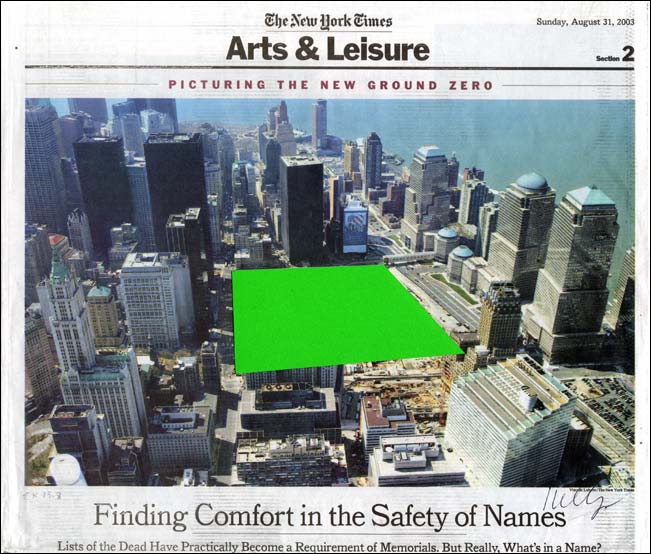
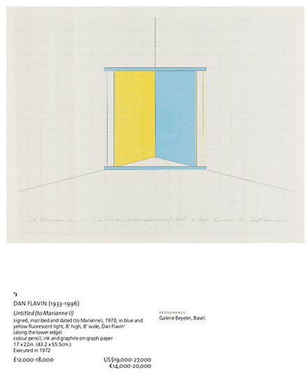
The circumstances of the shape are well-known, and generative: Ellsworth Kelly saw an aerial photo of the World Trade Center site illustrating a 2003 New York Times article about the controversies over what to build. Kelly collaged his proposal, which he sent to the Times, which Herbert Muschamp donated to the Whitney. Interestingly, Kelly’s collage vividly captures the color of his proposal to fill the entire site with a large, grass-covered mound, used only for resting and gathering, while the flat, isometric image elides the actual form. Neither, as it happens, is it captured in the abstracted aluminum object he made in 2011, which somehow feels even flatter.
The circumstances of making this object are unclear, at least to me. There is the possible timing of an anniversary, of course. The collage was included in Peter Eleey’s show, September 11 at MoMA PS1, but a green panel was not.
The size of the panel is very small, even domestic: 22 1/4 x 49 1/2 in. (56.5 X 125.8 cm). This feels like an object to live with. It was produced in painted aluminum by Carlson Baker, fabricators who were very familiar to Kelly. It was made in an edition of three. Kelly gave ed. 1/3 to the Whitney. The example sold as a fundraiser for something at Sotheby’s in 2013 was listed as AC II, so Kelly had at least two for himself. The title then was Green Panel (Ground Zero), but the fabricators listed it as Green Panel, with the CR number, EK1022. The example hanging in the final gallery of the EK100 show at Glenstone is from the collection of Jack Shear. I recall it as thicker than expected, an aluminum slab rather than an aluminum sheet. Maybe that is the first one. Did they have it up in their house?
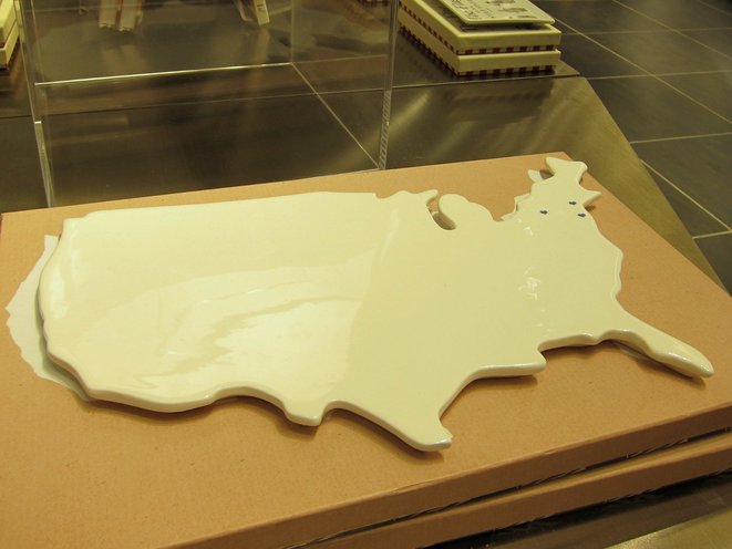
It is New Year’s Day, and way past time to recognize the significance of the 9/11 Museum Cheese Board in the development of my practice.
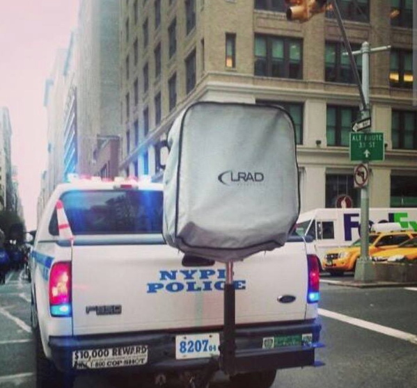
It is true that in late 2014, recognizing the aesthetic resonance of an LRAD and its cover with the work of Olafur Eliasson and Marcel Duchamp, respectively, combined with Olafur’s call to take the tools and methodologies of art beyond the confines of the art world led directly to my idea to create Protestors’ Folding Item, an artwork in the collection of the NYPD, with the intention of using VARA in court to enforce the piece’s exhibition integrity and require LRAD remain covered in public. From there I stepped up a practice of declaring works that involve objects I do not own or situations I don’t control-including some already in museums, which is convenient, conservationally.
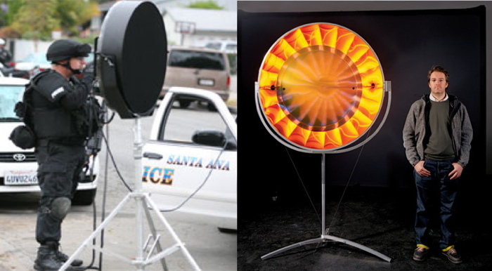
But after spending more than six years now looking for them in the wild, and exploring various techniques and approaches for replicating them, it’s clear to me that the complicated condition of these cheese boards helped map the territory where Protestors’ Folding Item would soon be found: the implications of the art/not-art inflection point, the context of those states, and the related issues of authorship, the object, and the exercise of control.
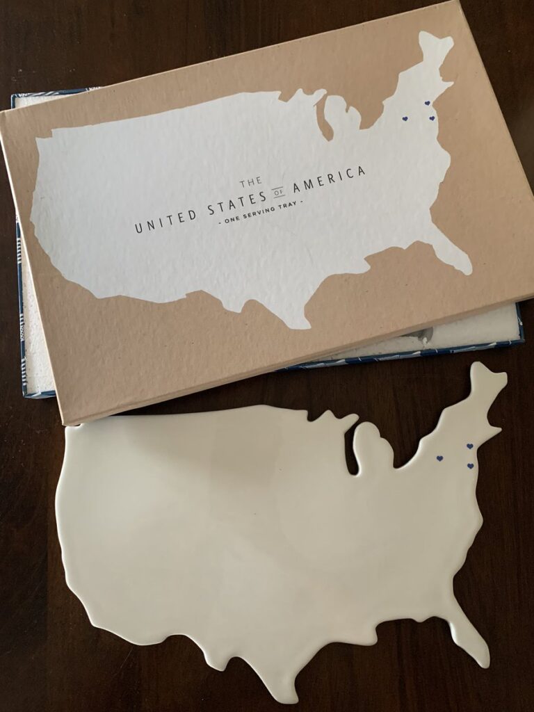
Almost as soon as Jen Chung reported the existence of the porcelain serving trays in Gothamist, I began researching their creation, and identifying their creators. That the trays were significant was immediately obvious. That their significance came entirely from their terribleness was, too, but the immediate media focus on their terribleness made their significance an awkward subject. I never heard back from the designer or the company after sending what I thought was a very diplomatic and persuasive email request for the middle of a sudden PR maelstrom:
Dear Ms. S––,
Thank you in advance for your consideration, and for your assistance in a story on the porcelain platter Rosanna designed for the 9/11 Museum. I am a writer in Washington DC and New York City, and have published my independent art- and architecture-related research at my blog, greg.org: the making of, since 2001. The site was recently recognized by the Creative Capital | Warhol Foundation Arts Writers Program.
One of the subjects I covered rather extensively and authoritatively was the design competition for the World Trade Center Memorial. I was impressed by the Cartography platter in the recently opened 9/11 Museum Gift Shop, and the debates it has engendered about the museum, the memorialization process, and different experiences and modes of remembrance.
I would hope that as a company and a designer, Rosanna and Ms. Bowles might be able to share insights on the design and the process of creating it, and to site the platter in a constructive and empathetic context.
If it’s germane to this particular commission, it would also be helpful to hear about other museum or philanthropic projects, or perhaps to expand the context to include the history of commemorative plates, figures, and other objects.
Thank you again, and I look forward to your response, and to answering any questions that can facilitate my research.Sincerely,
As is clear, though, I was still in research mode. It felt like a delicate balance, a fine line, to acknowledge that attention came from controversy, which is not something a manufacturer of porcelain serving pieces and collectibles is anticipating. But it’s also the case that though I was obviously not going to declare their trays works of art in my interview request, I was not yet ready to do it myself, even in my own mind. So for several months in 2014, these trays existed for me as objects in a state of tension.
The 9/11 Serving Trays are evidence of the historical and cultural reality of our world right then, when an expensive museum at the site of a terrorist attack slash commercial real estate development contracted with a housewares company to design an exclusive product for sale in their gift shop. The object that resulted was not a commemorative plate, which had already been produced in great volume by 2014; it was a ceramic tray in the shape of the continental United States, in cream glaze finish, and blank except for three navy blue hearts to mark the sites of four crashed planes. The box called it not a cheese board, but a serving tray. What could be more honorable than serving, they might have thought when they approved the copy. And when faced by overwhelming criticism, even from The 9/11 Families, a group used regularly until that point as human shields for all manner of capital- and politics-driven decisions at the WTC site, the museum defended its offering of “keepsakes” to a bigger market, “the 9/11 Community,” which could include not just the 9/11 Industry, but anyone who has the “historic experience” of visiting the museum itself.
I’m rambling, obviously, but after the internal debate over whether to post works like the blurred Frida, I am deciding to err on the side of slightly more info. And also, for the first time, my periodic internet sweep turned up this photo on a 3-month-old reddit post, the first evidence of the 9/11 Cheese Board existing outside the 9/11 Museum.
So there is something that in many other circumstances would be called hope. And that feels very fitting for today, and for this moment in time.
Previously, related: Protestors’ Folding Item, 2014
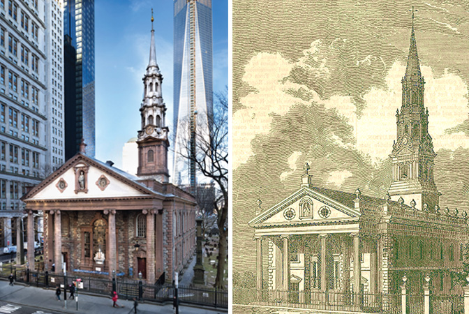
Built in 1766, St. Paul’s Chapel is the oldest public building in New York City and has been in continuous operation for over 250 years. When its sister parish Trinity Church (built 1698) burned down in 1776, St. Paul’s Chapel served as the primary place of worship for the likes of George Washington while Trinity was rebuilt. This august, historic, sacred space contains one of the two earliest public depictions of The Great Seal of The United States, of which visitors to this site have so recently read.
And St. Paul’s Church is also the place where my critique of the impertinent treatment and presentation of The Great Seal gets laughed out of town like a mobbed up president’s stooge claiming attorney-client privilege.
Behold the wide shot of the painting of The Great Seal hanging in its original spot, over the Washington Family Pew (reconstructed to some non-original spec, apparently some time after the radiators went in), and sandwiched in between World Trade Center Relief Swag exhibitions made of PVC jungle gym and clip-on tracklights? Are these original, historic exhibition fixtures made by first responders in October 2001?
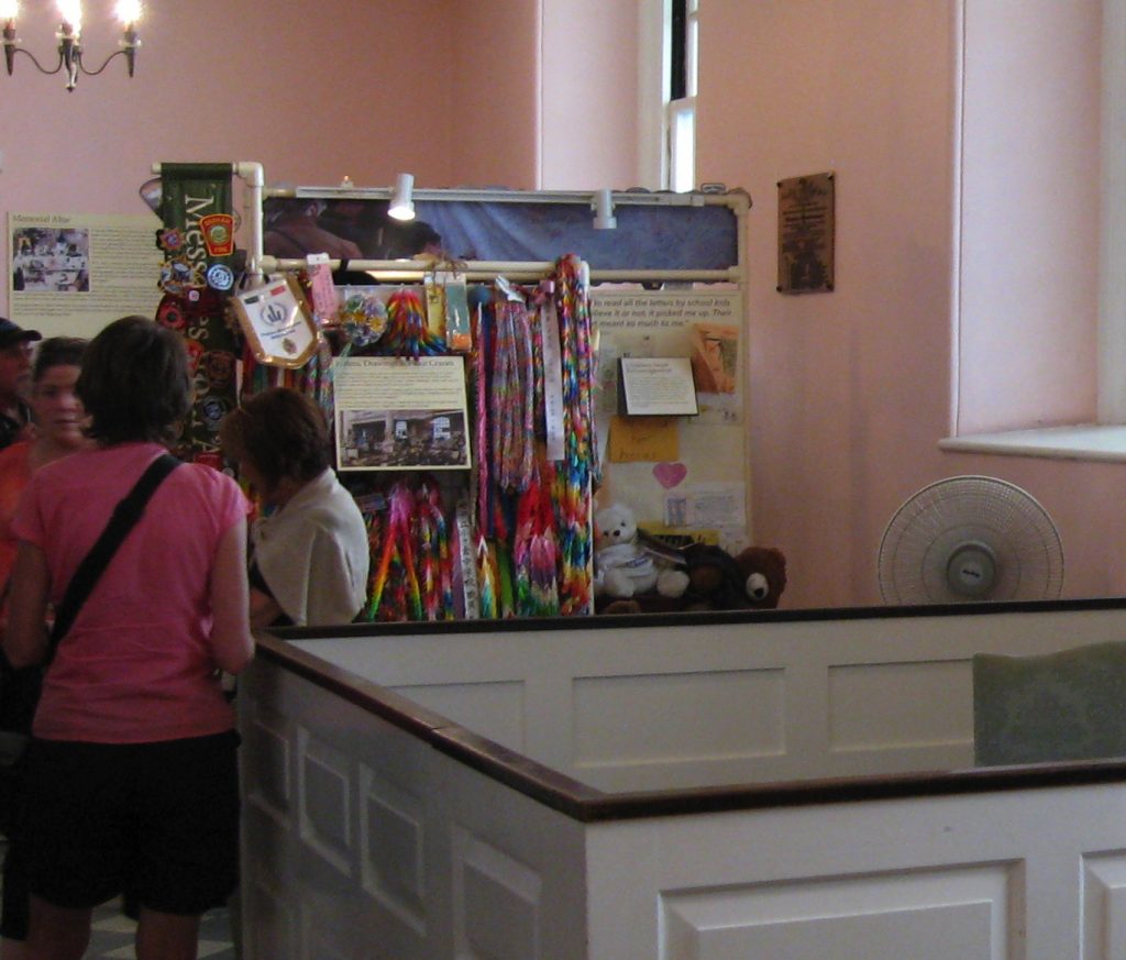
Is it still there? Because this photo was taken in 2013 by historian/blogger Michael Lynch. So maybe it’s gone? I honestly don’t know whether to scream or ask for their fabricator’s contact info, whether to help one of the richest parishes in the country Kickstart some proper vitrines or take a vow to never show work again without a PVC kiosk.
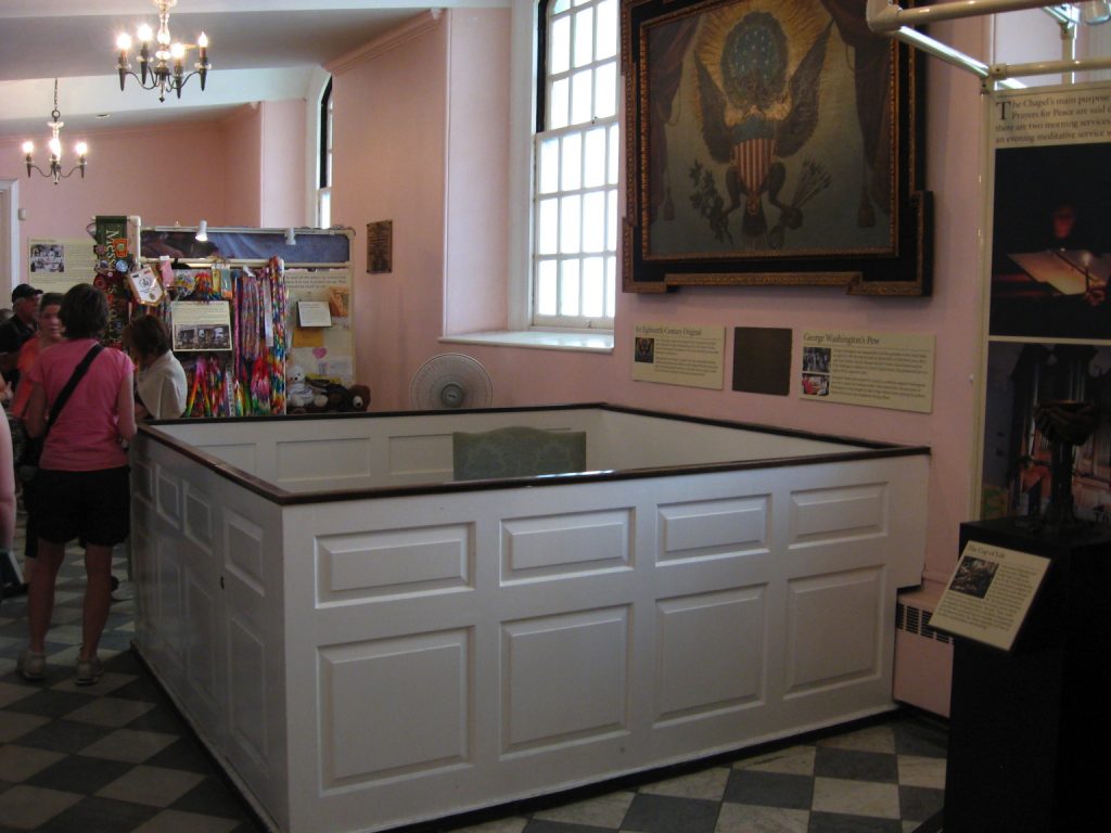
But Professor Lynch is not through. He also went to Federal Hall, the site (but not the building) of George Washington’s inauguration on April 30, 1789. I have stood on the porch of Federal Hall. I have seen a musical version of the life of JP Morgan performed on the steps of Federal Hall. I have gone to the gym many times across the street from Federal Hall, but somehow I have never been inside Federal Hall.
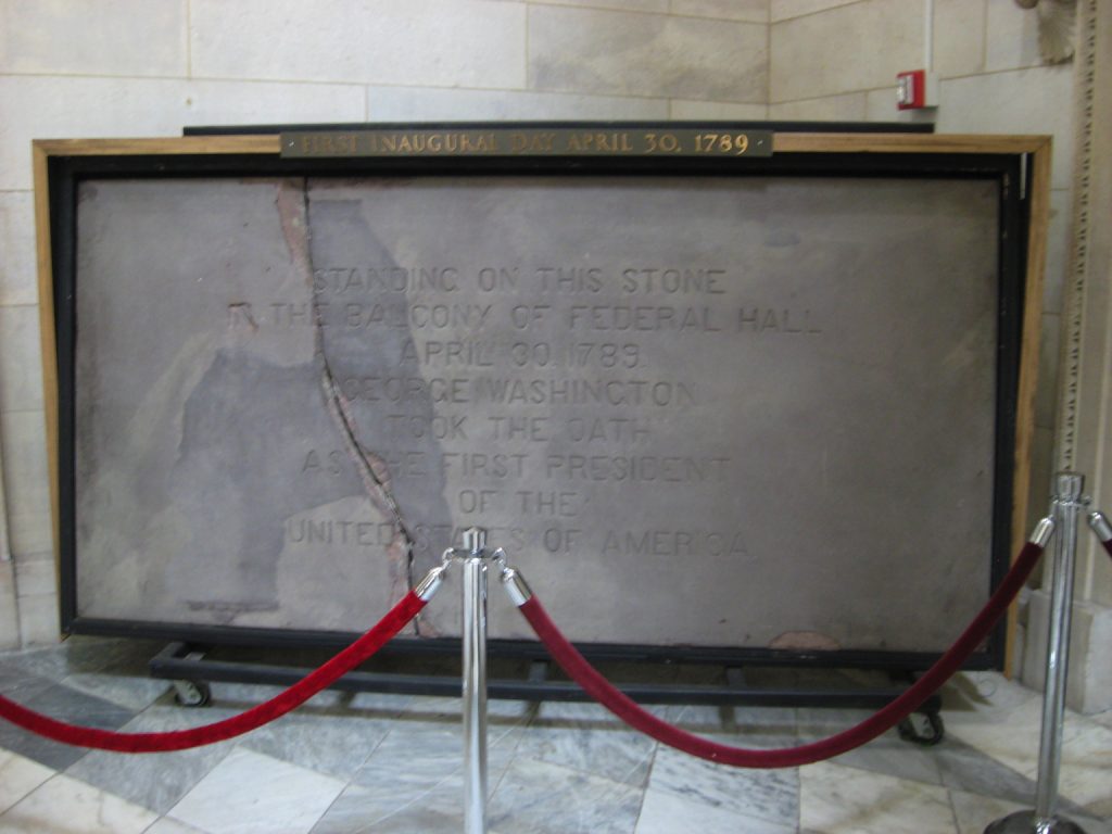
So I have not known about the slab of the balcony from the original Federal Hall, which is on display there. The National Park Service calls it a balcony, but looking at this engraving of Washington’s inauguration, I might call it a loggia.
![]()
Anyway, despite being the site of the 1st Congress, the formation of the United States, the adoption of the Bill of Rights, and Washington’s inauguration, Federal Hall went back to being City Hall when the capital decamped to Philadelphia in 1790. And then New York City tore that place down in 1812 when they built their new City Hall.
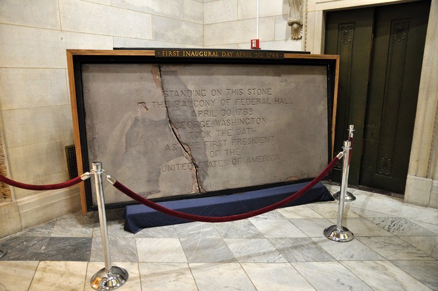
Fragments of the building were saved, including this piece of brownstone from the loggia, which apparently went on display at Bellevue Hospital until it was returned in 1889, for the centennial. And it was given a coat of concrete, so they could carve it. And it was put in a frame on little wheels so it could be rolled around. Oops, it broke. At least now we can see the actual stone under the concrete skin, the part where the concrete repair came off also.
Here is a concrete-coated-and-carved piece of stone which you can barely see the original of, which used to be on the building here, till we tore it down, and anyway, George Washington probably stood on this to found our country. Or near it, it’s really hard to say. But this is how we do, and it apparently always has been.
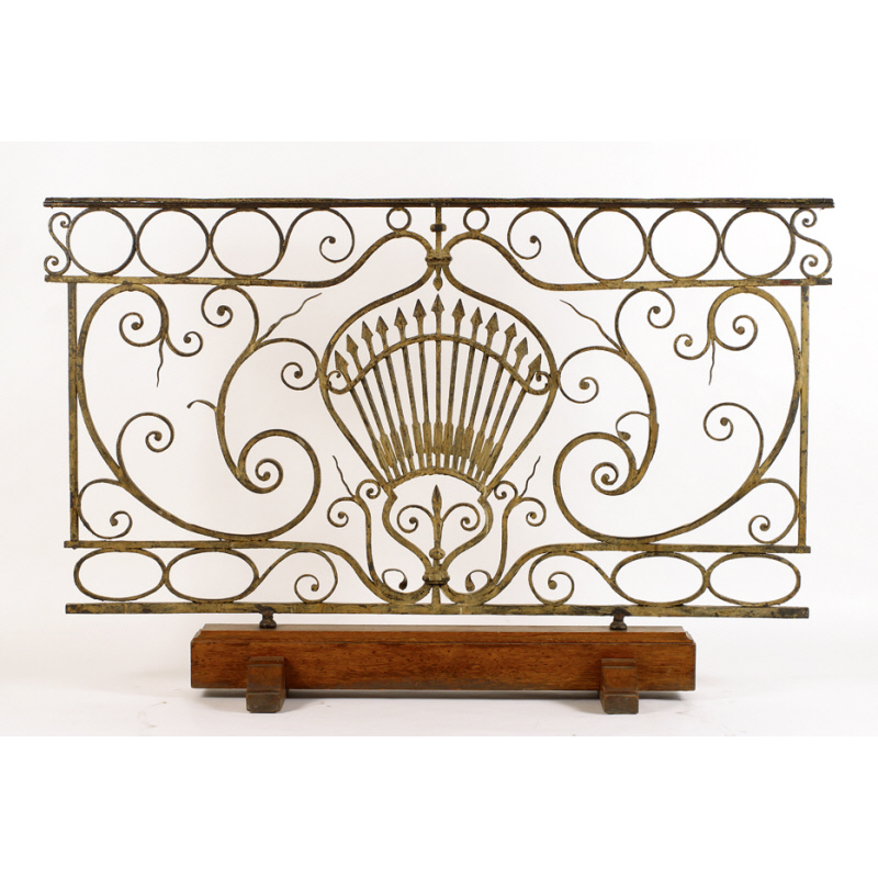
Fragments of the building were saved. In a minute I have found another: the balustrade of the balcony where Washington was inaugurated. It, too, went to Bellevue, where it was incorporated into a portico. Perhaps this stone was, too? Anyway, in 1883 the balustrade went to the New York Historical Society, where it remains. [Interesting. A 1917 catalogue of Old New York views distinguishes between the NYHS and Bellevue balustrades.] It is positively lyrical. Was it by Pierre l’Enfant, who was commissioned to renovate Federal Hall in 1788? Yes. It is dated 1788-89. Thirteen arrows. Wrought iron painted yellow-gold. The New York Historical Society was headquartered in Federal Hall in 1809 and took the city’s donation of some of the original furniture.
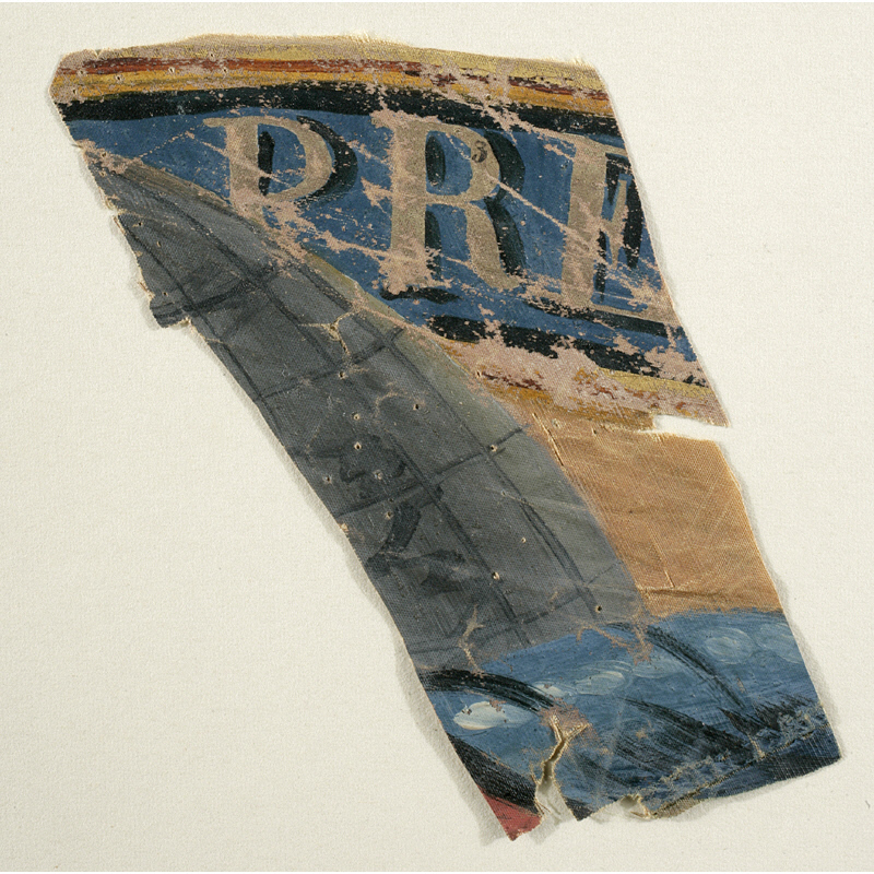
And back to painting. Here is a fragment of a flag flown at Washington’s inauguration. It is about four inches square, paint on silk, with part of the word PRE[sident] visible.
I don’t yet know what to do with this information and these objects, but it must be something.
Previously, related:
Untitled (George Washington’s Coffin), 2016–
This window from Hanford is being sold as ‘Manhattan Project Glass’
The hydrogen gas generators of Prof. Thaddeus SC Lowe’s Union Army Balloon Corps
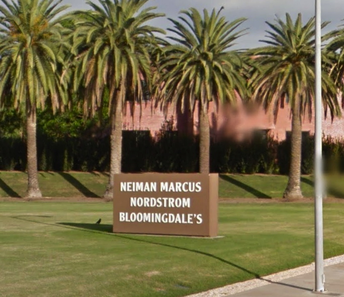
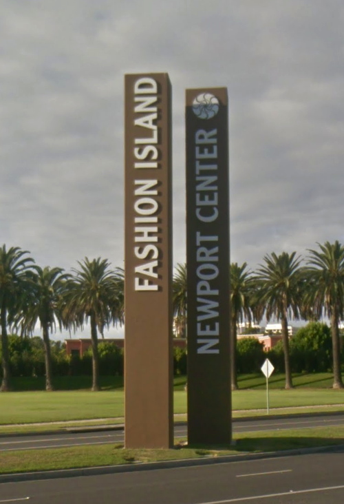
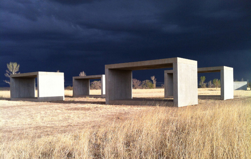
Untitled (Newport Center Monument) IV, 2017, 72 or 84-in. x 108 or 156 in. by 12 in., Ruddy Oak and Bright White on panels, installation image: gmaps
In 2011 The Irvine Company installed two identical monument signs in the grassy quarter-rounds on the East Coast Highway entrance of Fashion Island and Newport Center. They feature the names of three major tenants each, on both sides. Seven feet tall and 13 feet wide, they exceed the maximum dimensions (6′ x 9′) permitted under the Sign Standards of the Newport Beach Zoning Code, and required a variance. [In person the other day, I would never have guessed they were 7×13; they definitely feel like 6×9. Is it possible they were reduced in size after the permit was granted?]
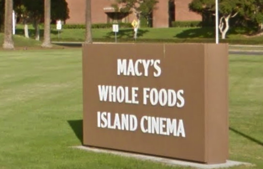
Untitled (Newport Center Monument) III, 2017, 72 or 84-in. x 108 or 156 in. by 12 in., Ruddy Oak and Bright White on panels, installation image: gmaps
Though they also exceed the Code’s letter size limits, the signs comply with the requirement that letters be “individually fabricated” and of high contrast for easy legibility. At least at their genesis, they were specified to be finished with Reflective Coating #1460 Bright White from Axon Aerospace, Inc.
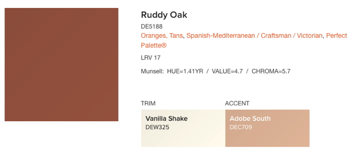
No aesthetic delectation here, Ruddy Oak! hashtag Spanish-Mediterranean, hashtag Craftsman, hashtag Perfect Palette®, image: dunnedwards.com
The 2011 permit application [pdf] describes the new signs as having “a faux plaster finish,” but they sure looked painted to me. They match the color specified on plans [pdf] for a similar sign for an adjacent Irvine Company office building: a reddish brown from a local manufacturer, Dunn-Edwards Ruddy Oak (DE5188).
I can find no public record of this color being specified or required in either Newport Beach or Irvine Company codes or styleguides, but it is in heavy use for shopping center and commercial signs within the boundaries of The Irvine Ranch. It also appears on the permitted color lists of at least eight homeowners associations (HOA) in coastal Southern California.
Untitled (Newport Center Monument) I, II, 2017, 43 x 4 ft each, Ruddy Oak and Bright White on substrate, installation image: gmaps
They also match the color and finish of the main signs at the East Coast Highway entrance, a pair of 43-foot-tall pylons installed in 1985. Which is also the first year The Irvine Company used the “sunwave” logo. Over time the text on the signs has changed to reflect the evolving brand distinctions between Newport Center, a massive, multi-use development, and Fashion Island, the vast mall at its center.
For their part, the Newport Center signs also exceed the 20′ height limit for pylon signs by 115%, but I presume they predated the creation of the code, and/or that no one will tell The Irvine Company what it can’t do in Newport Beach. Their letters are individually fabricated.
There are at least eleven other signs at other entrances to Fashion Island/Newport Center, but they’re more architectural than sculptural, with concrete plinths and stucco-finished capitals. Only the four signs on the ECH exhibit this rigorous, minimalist aspect.
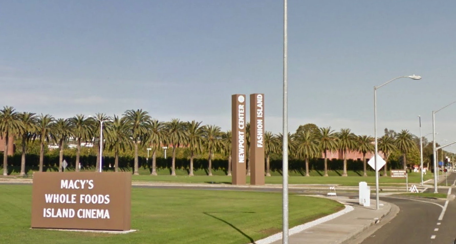
[l. to r.] Untitled (Newport Center Monument) III, I, II & IV, 2017, installation view, image: gmaps
Fashion Island was and remains a leader in the mall industry for experiential design. In an essay called, “The Archaeology of ‘Shoppertainment,'” Matthew Cochran and Paul Mullins wrote about RTKL/ ID8, a mall interior design company which worked on the Fashion Island Experience. They quote an RTKL brochure:
[Mall experience is] about storytelling. Great places tell stories, and people love to find themselves in those stories. Often this has less to do with the way a building or a district is assembled and more to do with how we read it…Experience is in the details. If a place tells a story, then the details of that place make the story interesting. The smallest elements-from manhole coves to water features-conspire to create a dynamic, authentically human environment.
What story do these signs tell? What authenticity do they conspire to create, with their approved colors from a gated community on a bluff? Can the gestalt of the minimalist object be achieved from your car, at speed, as you pass the mall, or do you have to turn in?
This ID8 quote, too, turns out to have more to do with how I read it:
What makes us linger, pause, sit and think? The building blocks of place probably have less to do with the buildings and more to do with the spaces between those buildings.
In 2002, the day they flipped the switch, architect Gustavo Bonevardi explained how he and John Bennett arrived at their solution for what became the Tribute of Light World Trade Center memorial:
We’re not reconstructing the towers in their original size, but the distance between the two squares of light is the same as the distance between the actual towers. So in effect, we’re not rebuilding the towers themselves, but the void between them.
Because I cannot look at the Newport Center signs, and their proportions, and their void, and not see the World Trade Center.
But maybe that’s just me. I invite you to visit, view, linger, think, and pause at this installation of new work and pursue your own authentic, dynamic, human experience.
Previously, unexpectedly related, c. 2002: On reading (between) the lines
On’s Location
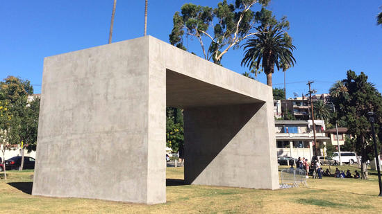
Teresa Margolles’ La Sombra, installed at Echo Park Lake, photo: Carolina Miranda/LAT
Teresa Margolles has contributed a memorial to Current: LA Water, the “public art biennial,” which started last week. La Sombra (The Shade) is near Echo Park Lake and looks to be the most significant and prominent work in the program, which runs, incredibly, for less than a month.
La Sombra is a six meter-high…pavilion? Awning? Structure? In her onsite report for the LA Times, Carolina Miranda calls it an installation, a memorial, and a monument. It looks like it’s made of concrete, but if it’s going to disappear in a couple of weeks, I suspect it’s gunnite or stucco sprayed on a plywood box.
Which hurts. Margolles created La Sombra as a memorial to 100 Los Angelenos murdered with guns in the last 18 months. The sites of these killings were visited, washed, and the water re-collected for use in mixing the concrete. This circulatory element echoes Margolles’ previous works which incorporate the water used to wash corpses in the morgue in her home city of Juarez.
La Sombra is a stark, powerful form that draws people to it, especially on a hot, sunny day. In this way, perhaps, the deaths of these hundred people might yield some comfort to the living. Maybe family and friends can come sit under it. Maybe people will be motivated to act against gun-related violence.
“I wanted [La Sombra] to be on the scale of what has happened,” says Margolles in the Times. “I wanted it to have presence.”
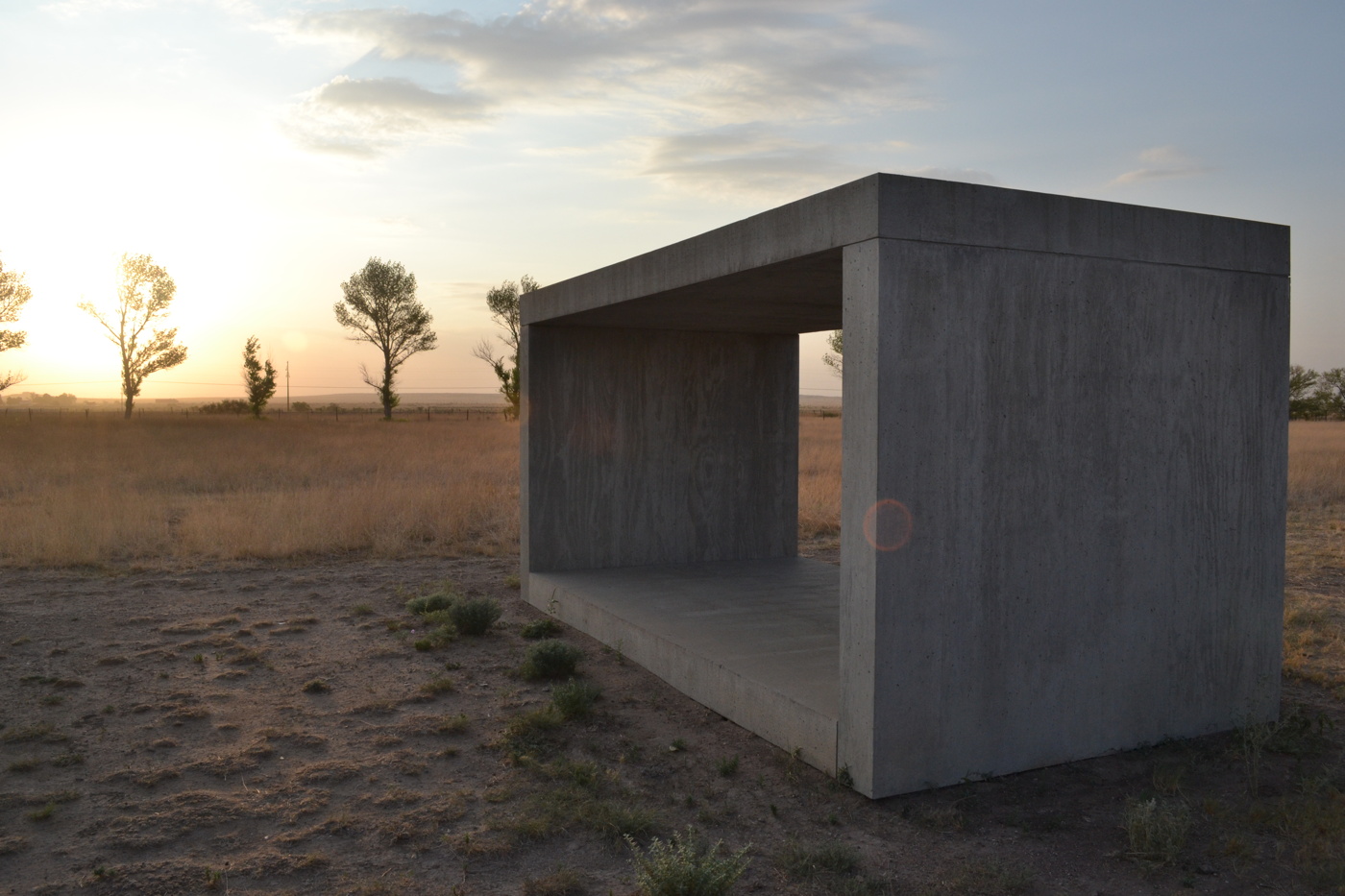
Donald Judd, One of 15 Untitled Works in Concrete, 1980-84, 2.5m x 2.5m x 5m, Chinati Foundation, image via wiki
The scale and presence of La Sombra are indeed notable. It seems quite large. It looks like it could be concrete-Judd-in-Marfa-fields-size, but it is actually 4x that. It has an architectural presence and is not slight. It feels like about the right scale for 100 people. Maybe it is even the size of 100 people standing within it, I don’t know.
Memorials use scale to convey their meaning. Some memorials, like for the people killed in the Oklahoma City bombing and the AA77 crash at the Pentagon, use a cemetery-like field of individual-scale objects-chairs and benches, respectively-to represent the dead. The Vietnam Veterans Memorial and the World Trade Center Memorial, meanwhile, incorporate individual names into a larger, holistic experience of loss. nodding to a larger, shared sense of mourning, of a community, a nation. It really depends on the scale of death, whether it is thousands (58,195 or 2,977), hundreds (168 or 184), or one.
By remembering 100 otherwise unrelated deaths with one La Sombra, Margolles appears to have found a new scale for memorialization: a memorial unit that modulates between societal tragedy and individual loss. [I just remembered that the Pentagon Memorial actually called the benches “memorial units”.]
There were not just 100 people killed in LA with guns in the 18 months Margolles bracketed; there were 975. Even if it was just because of the prohibitive the logistics of washing down all those murder sites, the artist knew her temporary memorial alone could not account for that “scale of what has happened.” She’d need nine more La Sombras, just in LA. With an average of 55 people being killed each month, that’s another La Sombras every two months.
Imagine these 3-meter tall Judd concrete sculptures at Chinati are actually 6-meter tall Margolles La Sombras, each commemorating 100 people killed with guns. image: chinati.org
And now scale them up. There are 30,000 gun deaths in the US-half a Vietnam War or ten September 11ths-each year. Margolles’ La Sombra could be the optimal form and size for memorializing the people killed by gun violence across the country. But some details would need to be worked out. How far back in time do we go? We could need thousands of La Sombras right from the start. Seems impractical, at least at first.
Where should they be placed? Do we combine them all into one sprawling site, like an AIDS Quilt of concrete, an ever-growing Holocaust Memorial for a slaughter we refuse to stop? I think a La Sombra site could take into account the hundred people it memorializes within a city or perhaps a state, without getting too granular with your data; you wouldn’t want them to pile up and stigmatize a neighborhood, though having a few together could totally work.
Spread them out at least a bit. Though maybe a city or state could decide to stack them up in a public space, magnify their presence, so the absence of the dead can’t be ignored. Of course, you’d also want to avoid gamifying them, having them treated as kills to be racked up by violent forces in society, or even just a run-of-the-mill gun-toting psychokiller. They need to stay present in the landscape, but also just ominous and uncomfortable enough to prick the consciences of we who remain.
An artist’s imposing new monument at Echo Park Lake honors Angelenos killed in violent crimes [latimes]
Current: LA Water, LA’s Public Art Biennial, runs through August 14. [currentla.org]
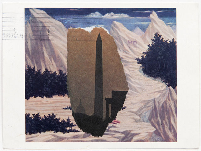
Domenico Veneziano / Washington Monument, 1984, image: peter freeman/artsy
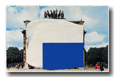
So I didn’t spot this Ellsworth Kelly postcard collage at Peter Freeman’s booth at Frieze Masters, and I love it. It makes me want to see more. And to wonder why we haven’t?
Kelly’s used collage and found shapes and forms to develop his paintings and sculptures since the very beginning. He’s made postcard collages to explore scale and shape and site, too. They’re little glimpses into the way he sees. He makes them for himself, and he sends them to friends.
This example, made using photo torn from the newspaper and a postcard from the National Gallery of Veneziano’s St. John in the Desert has some postal markings on it, so I expect it’s the latter.
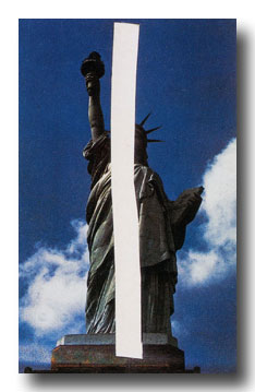
Statue of Liberty, 1957
Can we have a show of these, please? Or at least a book? I guess the closest so far is that amazing Drawing Center show in 2002, Ellsworth Kelly Tablet: 1949-73, curated by Yve-Alain Bois, which had collaged up pages from the artist’s sketchbooks.
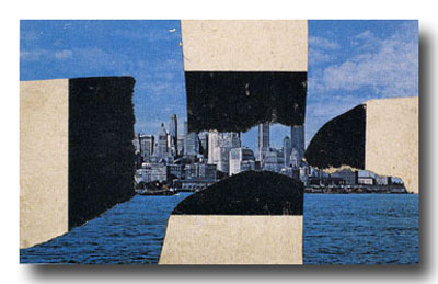
Upper Manhattan, 1957
But these postcard collages are not just, or not all, preparatory works; they’re social, too. Their intimate scale, non-preciousness, and exchange function remind me of Felix Gonzalez-Torres’s Polaroids and Gerhard Richter’s overpainted photographs. The absolute least gesture and material required to convey the artist’s observation.
Study for a Blue and White Sculpture of Les Tuileries, 1964, like many of the smaller images, from a slideshow at nyss.org
They inevitably also function as postcards, seeming to mark a visit to a place, and the artist’s reaction or memory there. In the Guggenheim’s 1996 retrospective catalogue, Roberta Bernstein called them “souvenirs of experience.” The light on the Seine, the bridge near the Taconic, the sliced coffee lid at Agnes Martin’s place. Kelly talks of seeing things others don’t, thus the unsuitability of an off-the-rack postcard.
St. Maarten, 1974
In at least one case, the private, unique postcard became a published edition.
St Martin Horizontal Nude, 1974
If I’d realized that it started with a postcard, I’d have been less baffled by the big lithographs that pop up occasionally at auction.
Saint Martin Landscape, 1979, 16×22-in
Postcards are obviously useful for sculpture, space, and scale. They’re ambitious and offhand at the same time, a powerful proposition that can be discounted, but not unseen.
This 1980 postcard collage of Riverfront Stadium reminds me of Ground Zero, the newspaper collage Kelly sent to Herbert Muschamp in 2003:
There’s one other instance I can think of where Kelly’s postcard collages and his monumental sculptural situation are linked, the imposition of sculptural form on photogenic tourist vista: his 1998 sculptural installation on the roof garden of the Metropolitan Museum.
I’ve found this over and over: 1998 is invisible online. There was a lag between the internet and digital photography, and archival digitization projects privilege the dusty. Ellsworth Kelly Metropolitan is a predictably beautiful search on flickr, but it doesn’t yield any images from the pre-flickr era. Which is really too bad, because as I recall, they were picture perfect.
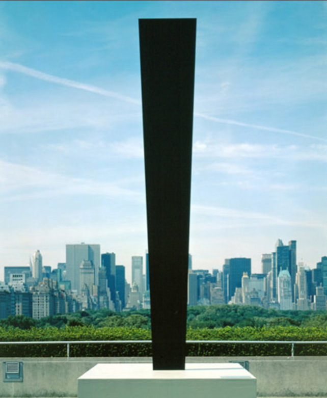
UPDATE:: Whaddyaknow, here’s a picture of Totem on the roof of the Met, which I just randomly found in a 2010 NPR story about the closure of Carlson & Co.
Anyway, point is, we need a show. So please send all the Ellsworth Kelly postcard collages to me, and I will exhibit them.
Previously, suddenly related, souvenirs of virtual experience: Ellsworth Kelly on Google Art Project
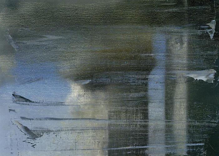
tl;dr version: Gerhard Richter made a small painting, September, based on a photo of the WTC getting hit by a plane, and gave it to MoMA, which has never shown it. Then he made a print version, which he sold here and there, and which has been seen in NYC once. The image is the same, but the experience of them is quite different, which is something no one really mentions or talks about. It’s almost like the propagation of the image is more important than the actual objects, or than the particulars of seeing them in person. Which, in addition to being the kind of distancing tactic Richter’s very fond of, is also a non-trivial observation that can be made about the WTC attacks themselves.
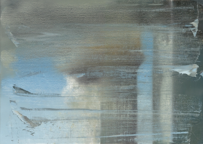
I had not wanted to write about the WTC attacks [or “September 11th”] on September 11th, and though it was the day I actually started thinking about this post, I didn’t want to write about Gerhard Richter’s September on September 11th, either. And I’m glad I’ve waited; my reflex was to be a bit cynical, and that has largely dissipated. So.
Richter was in the air on September 11th, traveling to New York and grounded/diverted to Nova Scotia. His eventual artistic engagement with the attacks was a small painting, September [CR: 891-5], above, which he made in 2005. Joe Hage, the collector who is also the instigator behind the artist’s ambitious website, acquired a half interest in the painting in order, the story goes, to prevent Richter from deciding to destroy it.
The aura of ambivalence surrounding the painting’s existence is of a piece with the painting itself, which is based on a FAZ photo of the hijacked UA175 hitting the South Tower. [A newspaper image the artist didn’t see at the time, because he was stuck in Canada. Which means he hunted it down at some point.] Richter knifed and scraped the canvas, deploying abstraction to obscure or even erase the representational image.
As far as I can tell, the small painting, just 52x72cm, dimensions Rob Storr compared to a TV screen, but which I’d say is more computer monitor-size, has never been shown in New York.
It wasn’t in Richter’s solo show at Marian Goodman in 2005-6, even though squeegee paintings listed before and after it in the artist’s roughly chronological CR were. MoMA acquired a dozen of them, a series of abstracts, CR 892-1 through 12, titled Wald/Forest.
When Goodman showed Richter’s paintings again in 2009-10, September the painting was not among them. That’s when the artist and Hage donated it to The Modern, and when Storr made a video about it. His take on the painting and its context were expanded into a book-length essay published in 2011.
But wait, wasn’t it–no. That 2009 show did include a September. But it was a print. As the gallery checklist describes it, a “print between glass”. September 2009 turns out to be an enlarged [66x90cm] inkjet on vinyl mounted between two sheets of glass, and published in an edition of 40.
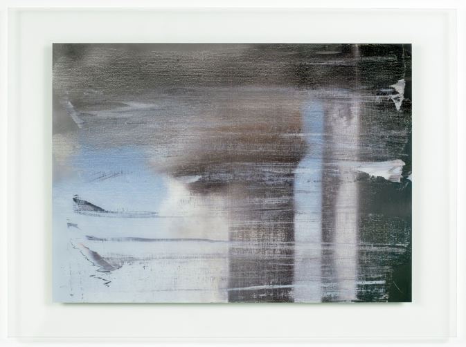
September, 2009, CR 139, digital print between two panes of glass, image: gerhard-richter.com
The gallery’s own reproduction of the print leaves out the glass mount; and smooth, sealed surface; and the reflection it inevitably creates. Even though these have to be considered as central elements of this work, as different as can be from the scarred, textured surface of the painting it reproduces.
Here’s an installation shot from We Heart New York that shows the gallery and other work reflected in the print’s mirror-like surface:

And here’s a shot of it installed last year at a retrospective of Richter’s editions at Collectors Room, Berlin. It’s big and glass and framed, and looks and feels completely different than a painting. Because it’s a blown up, face-mounted photo of a painting.
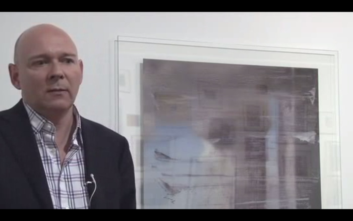
Yet even here, in a show about editions, curator Hubertus Butin mostly talks about September as a painting. And so did Storr. And I confess, I’d seen the Goodman show, and read Storr’s book, and seen his interview, but it wasn’t until I saw this shot that it even registered with me that there was an edition. And that’s what I’d seen, not the painting I thought I’d seen.
When I realized this last week, on September 11th, I felt a rush of cynicism, reading Richter’s production of an edition as a sell-out. Just as he donated his Important Historical Image to the Modern, he’d quietly sold 40 copies of it to lesser [sic] museums and collectors. Dallas got one. But then I saw one in Beirut, and it occurred to me that an edition circulates the image in ways that transcend the painting itself. It puts September in more, wider, and more varied contexts than MoMA’s loan policy could ever accommodate. [UPDATE: John from BR&S adds that a print was in this 2011 exhibition at Montserrat College of Art. Indeed, it’s on the catalogue cover. Storr also spoke.]
In that video tour, Butin talked about Betty, calling Richter’s painted portrait of his daughter the “most famous and probably the most successful picture that he has ever created.” Successful, Butin continued, because “No other subject of his has been as frequently reproduced in books, catalogues, postcards and posters.” The Betty in his show is, of course, an edition, not the original. It’s a print of a photo of the painting [of a photo.] And as an image, at least one metric of its success, is its rate of reproduction.
September the print has exactly the same relationship to September the painting. And even more than a painting, a glassy digital print ends up capturing September‘s electronic screen essence that Storr originally identified. Which makes me wonder how, why, New York, of all places–of all places–has only seen the print, and not the painting. Not the visceral, physical experience of the original, but the distanced, reflective, mediated simulation. Or maybe it’s all incidental to September achieving historic, Betty-scale “success”.
September, CR| 891-5, 2005 [gerhard-richter.com]
September, CR 139, 2009 gerhard-richter.com]
September: A History Painting by Gerhard Richter, by Robert Storr [amazon]
Josh Marshall solicited “What’s Your 9/11” thoughts from the readers of Talking Points Memo. I’ve avoided reading them, and most such other efforts this week. But the title he gave to reader DE’s submission really encapsulated my own ambivalence about what the Memorial Industrial Complex has metastasized into, and why I’m reluctant to turn myself over to it:
So my personal unease with 9/11 memorials is the feeling that there are a lot of people in this country with a vested interest in the country not moving on, even though the two main perpetrators of the attack are either dead or in US custody and the organization they led has been soundly defeated. They want our leaders to keep delivering the Gettysburg Address every year, to keep us on that war footing, so that they can misdirect our resources and some Americans’ lives in the service of foreign and domestic policy goals that have nothing to do with what happened on 9/11.
This manipulation of memorialization by keeping the wounds open was quickly apparent to some, of course. For all the good that did.
“A Vested Interest in the Country Not Moving On.” [tpm]
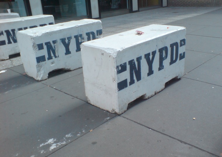
It’s UN Season in New York, and the streets are filled with people enjoying the sun, and squeezing through these flat-out gorgeous NYPD barriers. Seriously, I mean, Tony Smith, Donald Judd, Richard Serra, Beverly Pepper, Anselm Kiefer, Janine Antoni, Scott Burton, Robert Gober–you see where I’m going with this? I mean, Rachel Harrison–I’d love to make a Rachel Harrison-style version of these. That would be awesome. and so much more manageable, too.
Oh, look, I was right:
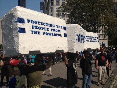
Occupy protestors on Sept. 17th in Battery Park, as covered by Bucky Turco at Animal New York
So the next thing would be a Cow Parade-style celebration across the whole city. These barriers could become a vibrant platform for artists the world over, and highly collectible, too. Munny dolls-meets-street security furniture.
I. Am. On it.
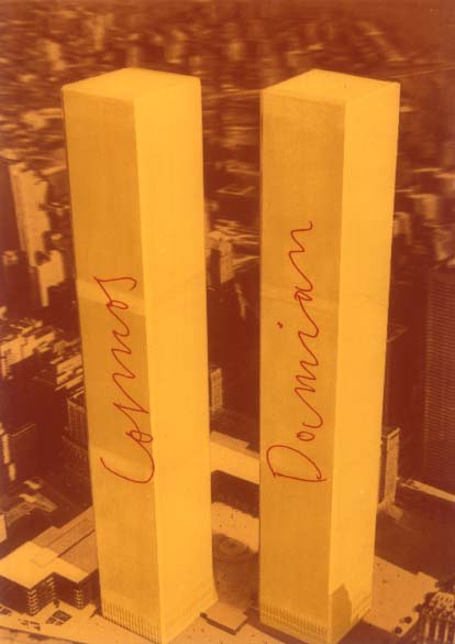
Add Damian & Cosmas’ importance to Joseph Beuys and his renaming in 1974 of the then-new World Trade Center towers after the twin physician saints to the list of things I did not know about but probably should have.
From Marina Warner’s generous discussion of Damien Hirst in the LRB:
[Hirst] is named after the patron saint of doctors (usually spelled Damian), who, with his twin brother Cosmas, performed the first surgical transplant when he grafted the leg of a Moor who had fallen in battle onto the stump of a white Christian knight. This operation, depicted on altarpieces in the saints’ many churches, can’t be consigned to the antique glory hole of weird Catholic legend, for it was crucial to Joseph Beuys’s dream of revolution: a vision of inter-racial fusion, of the resurrection and reconciliation art can achieve. In one of his works, Beuys eerily renamed the two towers of the then newly built World Trade Center after the brother saints: did he do so in some wan hope that the towers could be transfigured into instruments of good?
Beuys, needless to say, is second only to Duchamp in importance to the current philosophy of making art.
Needless to say, I would have known if only I’d been a little more faithful in my Brooklyn Rail reading. Because that’s where I found David Levi Strauss’s thorough, if slightly Nostradominous, discussion of Cosmas und Damian, Beuys’ multiple [?] based on a 3D postcard of the Twin Towers.
Once A Catholic… [lrb.co.uk]
IN CASE SOMETHING DIFFERENT HAPPENS IN THE FUTURE: Joseph Beuys and 9/11 [brooklynrail.org]
David Levi Strauss’s essay was also just republished as one of those 100 chapbooks from documenta 13 [amazon]
As those who kindly email me about run-on italics–and those who don’t–know, I don’t actually visit this site site as often as I probably should.
Which is part of the reason I didn’t notice until just now this nice side-by-side posting of Matt Connors’ painting and Barack Obama et al’s blast shields at the dedication of the World Trade Center Memorial.
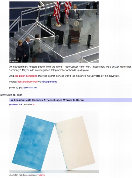
UPDATE: Or three of these things. Mondo Patrick likes the Connors diptych alongside this:
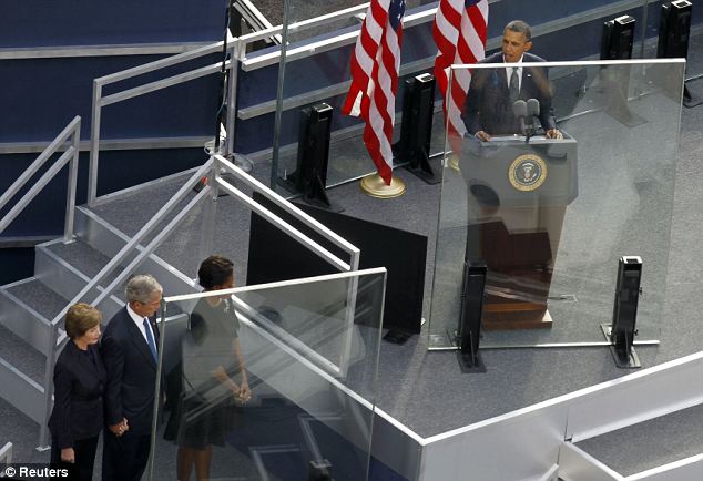
An extraordinary Reuters photo from the World Trade Center Mem–wait, I guess now we’d better make that “ordinary.” Maybe add an integrated teleprompter or heads up display?
And Joe Biden complains that the Secret Service won’t let him drive his Corvette off his driveway.
image: Reuters/Daily Mail via @wagnerblog
Wow. Nearly camouflaged.
While each pool has a pumping system powerful enough to recycle 52,000 gallons of water per minute, it is the surface of the nearly 1,600 lineal ft of parapets that had to be robust enough to withstand rain, scorching heat, snow and ice as well as the wear and tear of three million annual visitors. For the comfort of the millions of hands that will touch the etchings, the parapets have a heating and cooling system.
“The [National September 11 Memorial & Museum non-profit foundation] was very concerned about making the experience as pleasurable as possible for visitors,” many of whom will want to touch the engraved names, says Robert Downward, an associate with the project’s local MEP engineer, Jaros Baum & Bolles.
JBB and Service Metal Fabricating, the parapet’s Rockaway, N.J.-based supplier, knew of no prototype for a project like this, so they started from scratch to build a back-mounted tubing system that would work within the parapets and the nameplate system. The fabricator built a prototype of the panel, tested it under sunlight and then analyzed the results using computational fluid dynamics modeling.
“We calibrated the model so that it produced results in line with real field conditions,” Downward says.
The result is a network of tubes that feed water behind the bronze plates. The tubes, nearly camouflaged, are underneath the plates and parallel to the rows of names.
“The spacing between the tubes was critical to maintaining comfortable temperatures at the panel surface,” Downward says.
Each parapet section was shipped to the site with the tubes attached. Then, using a series of manifolds, workers connected the tube sections to the piping. The piping is connected to below-grade equipment that supplies the heated or chilled water.
9/11 Memorial Is Centerpiece of World Trade Center Redevelopment [enr via @chton1c]
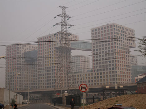
So Dan Hill’s posted another of his typically incisive analysis of an urban situation. This time it’s his extended and engrossing account of visiting Linked Hybrid, the massive urban development in Beijing, designed by Steven Holl Architects, which was just opening at the time [late 2009].
above and top via cityofsound
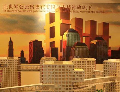
After being repeatedly shooed away by gun-toting guards from what Holl had pitched as “an open and porous public space,” Hill found his way in, and eventually ended up in the marketing office where there’s this poster of–what to call it without sounding utterly inappropriate? A bombshell? A landmine? A plane flying into a tower?:
More incredibly again, the adjacent wall features another poster of exaggerated Hybrid-like building on an urban skyline, under the phrase:
“Let citizens all over the world gather under the banner of the United States with the spirit of freedom.”
What can this possibly mean in this context? The absorption of the brand of ‘starchitecture’ is easy to see in a culture shifting through the gears of consumer culture, but of the brand of the United States?
That’s no moon. It’s the proposal for Memorial Square, the World Trade Center site put forward in 2002 by Holl, Charles Gwathmey, Richard Meier, and Peter Eisenman, or as they called themselves at the time, the Dream Team.
Memorial Square, 2002, “Dream Team,” image via renewnyc.org
At the time–the day after the unveiling, actually, at a screening of my short film, Souvenir (November 2001), which was followed by Etienne Sauret’s incredible documentary short, The First 24 Hours–I recognized the form the Dream Team was proposing as a gargantuan evocation of the fragments of the World Trade Center’s facade.
They denied the reference, even as they awkwardly argued and edited around it on the Charlie Rose Show. But I think it’s self-evident. Anyone wanting to argue otherwise to me should read those two posts and the links within first. Then I’ll tell you my story about asking Eisenman about it face-to-face.
What’s fascinating now, though, in rewatching that Charlie Rose episode, is not the Dream Team proposal’s basis in the wreckage of the World Trade Center, but its multiple similarities to Holl’s Linked Hybrid.
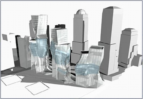
Holl and Meier especially discussed the Memorial Square proposal as primarily a public space, one which is entered from the city by “multiple portals.” Holl even calls the structure a “hybrid.”
While the Team took great pains to deny the proposal had any “signature” style, I would speculate otherwise. The overall concept of structure capturing “a moment” in history and memory comes from Eisenman’s proposal [above] for Herbert Muschamp’s WTC charette.
Meanwhile, the form is Holl’s, as is the idea that its entire surface would glow at night on one face. The rendering resembles nothing so much as the skyscraper cousin to Holl’s residence for the Swiss ambassador to Washington.
Dan Hill makes a persuasive critique of the simultaneous successes of Linked Hybrid as a structure and its failure as the open urban experience Holl envisioned. And it’s tempting to take comfort from afar and tut-tut the clunky shortcomings of Chinese modernization. But
are the urban and sociological failures of Linked Hybrid really any better or worse than the manipulated politicized mess that Daniel Libeskind’s World Trade Center plan has wrought?
I think the more sobering path is to recognize the remarkable extent to which Holl succeeded in realizing his Dream Team’s proposal for downtown Manhattan in Beijing–and to acknowledge that, there but for the grace of George Pataki go we.
Linked Hybrid’s marketers invite “citizens all over the world [to] gather under the banner of the United States with the spirit of freedom.” But on this day, when citizens all over the world gather to protest the continued imprisonment of Ai Weiwei, the co-creator [with Swiss architects Herzog & deMeuron] of the China’s most famous public building, the Bird’s Nest Olympic stadium, can we really say “our” public sphere is superior, or even free?
Architecturally speaking, at least, we are all New Yorkers now, and Beijingers, too.
[2018 UPDATE: In 2018 The New York Times reports that five women who worked with Meier, either at his firm or as a contractor, have come forward to say the architect made aggressive and unwanted sexual advances and propositions to them. The report also makes painfully clear that Meier’s behavior was widely known for a long time, and that his colleagues and partners did basically nothing to stop it beyond occasionally warning young employees to not find themselves alone with him. This update has been added to every post on greg.org pertaining to Meier or his work.]