‘We Who Change The World’

rem_time_designboom.jpg
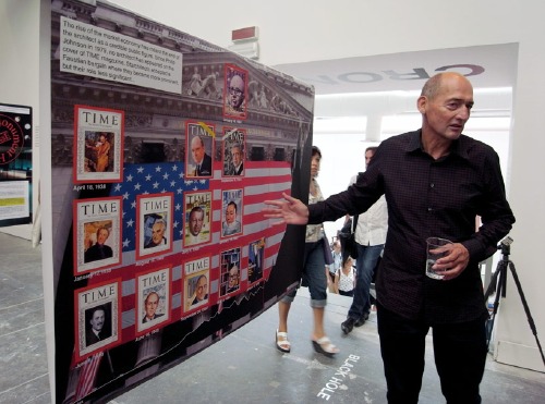
“My cover would go right here.” [image via]
Just like the Wallace Sayre quip about academic politics being so vicious because the stakes are so low, maybe the hubris and self-regard are so extraordinary because it’s the Venice Architecture Biennale. Anyway, let’s call it out quickly, and then look at what Rem Koolhaas has to say about modernism and preservation, because there may be some interesting things there.
[The text, by the way, is Designboom’s exhaustive 4-part guided tour (II, III, IV, pending) of “Chronocaos,” the OMA/AMO installation of research and history-related projects within Kazuyo Sejima’s exhibition.]
So. Hubris. Well, for starters, there’s the introductory wall text, which, wow:

Architects–we who change the world–have been oblivious or hostile to the manifestations of preservation the past. Since 1981, in Portoghesi’s “Presence of the Past,” there has been almost no attention paid to preservation in successive architecture Biennales.

I mean, I’m sure the visitors to the exhibition just ate that up, but should I even be reading it, much less commenting on it? Not being either an architect OR one who changes the world and all?
Then there’s the photo above, and its associated text:

The rise of the market economy has meant the end of the architect as a credible public figure.
Since Philip Johnson in 1979, no architect has appeared on the cover of TIME magazine.
Starchitects accepted a faustian bargain where they became more prominent, but their role less significant …

We’ll get to that public/market economy stuff in a minute; first let’s look at this Cover of TIME [CoTIME] business, which is as alluring as it is non-credible. [I was about to say “useless,” but really, it’s quite useful; it just illustrates something other than what I think Koolhaas intends.]
As it happens, Jonathan Franzen’s CoTIME this week gave Craig Ferhman the chance to do a similar CoTIME analysis for writers:

Time put 14 authors on its cover in the 1920s, 23 in the 1930s, seven in the 1940s, 11 in the 1950s, 10 in the 1960s, eight in the 1970s, four in the 1980s, four in the 1990s, one in the 2000s, and, now, Franzen in 2010.

Ferhman finds that behind the cover, TIME’s profiles of writers are truncated, shallow, reductivist, or otherwise nearly empty of actual content. He cites multiple examples of writers resisting the–what else to call it?– “faustian bargain” of a CoTIME, which was long considered uncritical, low-brow, and hypey. The cover becomes a thing in [and of] itself, a distillation of the magazine’s–and by direct extension, its owner’s–desire to assert authority and control over a cultural agenda.
In this light, and given the close tracking between architects’ and writers’ presence on the cover, one might be led to wonder if it’s not architecture [or literature] which has changed in the last 20-30 years, but TIME and its own role or strategy as a megaphone for culture. Or to question the suitability for a democratic society of monolithic, top-down annointing of public figures’ credibility. That one would not be Rem Koolhaas, though.
In any case, CoTIME reveals as little about the reported “end of the architect as a public figure” as it does about the ego-driven architect’s desire to, well, to appear on the cover of TIME.
And yet. You know, this is right where I was going to acknowledge and explore OMA/AMO’s more salient points, about how, as Designboom puts it,

…this year represents the perfect friction point between two directions: the world’s ambition to rescue larger and larger territories of the planet, and the global rage to eliminate the evidence of the post-war period of architecture as a social project. both tendencies–preservation and destruction–are seen to slowly destroy any sense of a linear evolution of time.

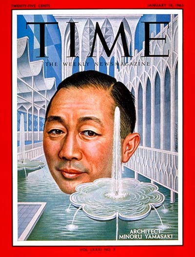
But I think I’ll take those up later. Because I just clicked through to see the CoTIME of the architect I thought would be the least likely candidate for a credible public figure in his day: a January 1963 story on Minoru Yamasaki.
yama_time_cover63.jpg
1963. Which turned out to be pegged to his recent selection to design a 15-acre site for the Port Authority in downtown Manhattan:

What form the project may be taking in Yamasaki’s inventive mind is his secret, but simple arithmetic shows that the vast space needs and limited site could force him to record heights or bulk. One thing the center will not be is harsh or cold. In taking the road to Xanadu, Yamasaki has turned office buildings, schools, churches and banks into gentle pleasure palaces that are marvelously generous in spirit. He shuns monuments. He is suspicious even of masterpieces, which he feels often better serve the ego of their creators than the well-being of those who use them. He may have committed some architectural heresies, but if he has, it is largely because he is a humanist with enormously appealing aspirations. He wants his buildings to be more than imposing settings for assorted clusters of humanity; they should also recall to man the “gentility of men.” should inspire “man to live a humanitarian, inquisitive, progressive life, beautifully and happily.” However the Trade Center turns out, it will have that ideal– and it will be built with the ultimate degree of loving care.

It’s hard or impolitic to remember how reviled Yamasaki’s buildings were as architecture and as part of the city. But I don’t think anyone would dare argue about the World Trade Center that it was their architect who changed the world.

أنا ♥ نيويورك

ana_bahib_ny_iloveny.jpg
John Emerson saw an “I [HEART] NY” flyer in Arabic posted in the East Village a few days after September 11, 2001. He posted a large, printable graphic version on his blog a year later.
A few months after that, I noted that Maurizio Cattelan had created a
cattelan.gif
t-shirt in an edition of 100, which was sold via Printed Matter. The Printed Matter folks now have no idea what the story was, and I’m waiting to hear back from Maurizio, but I think it’s way past time for another edition.

Temporary Waterfalls Return To Brooklyn

911_waterfall_test_bbc.jpg
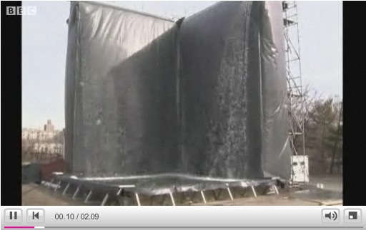
The BBC has nice footage of the mockup for Michael Arad’s World Trade Center Memorial waterfalls, which was constructed in Brooklyn last week. My impression: unexpectedly Olafur-esque.
Also, the [engineer?] guy saying it is to be an “Eternal Waterfall” that never gets turned off. Unless it gets cold or something. File that away for after the Memorial’s dedicated, when we will be able to see/hear if they actually turn the Eternal Waterfall on and off during operating hours, which will seem like the logical/inevitable thing to do.
9/11 waterfall design unveiled [bbc]
The East River School

Mind The Storr: On Gerhard Richter’s September

gerhard_richter_september_mg.jpg
Seriously, I could fall into Gerhard Richter’s website and not surface for days. There’s just so much stuff. And related stuff. And meta-stuff. Auction histories for specific works? Cross-referenced Atlas pages? It just goes on and on and on.
Recently, two interviews with Rob Storr were added: one is about Richter’s Cage Paintings, which Storr showed at the Venice Biennale in 2007, and which are now at the Tate. [It’s a comically great business model to make and sell giant series of paintings intact instead of slogging it out one by one.] There’s a lot of discussion and still photos of the making of palette knife & squeegee process for the abstract pictures–I always thought Richter only painted them on a table, but there he is on his ladder. And Storr has a thoroughly enjoyable smackdown of the fiercely “deterministic” Rosalind Krauss’s connection of Richter and Johns. I’d pay cash money to see that panel discussion.
Same day/same outfit is another video, Storr is in the office at Marian Goodman, discussing September, the small monitor/TV screen-sized painting of the World Trade Center attack that opened Richter’s latest show at the gallery. [Yeah, I know it was actually a photo of the painting.]
It’s funny, I’d conveniently forgotten how central war, destruction, civilian casualties, and terrorism have been to Ricther’s work and his experience. How does that happen? Anyway, it’s interesting stuff.
Gerhard-Richter.com [gerhard-richter.com]

Daniel Libeskind The Least Surprising Prefab Architect In The World

libeskind_prefab_int.jpg
Bwahaha, if ever there were an architect whose work looked like it was all churned out of an idea factory from weary bins full of identical parts, it’s Daniel Libeskind. And sure enough, just in time for the prefab business to be declared dead, the NY Times reports that Libeskind has unveiled a “limited artistic edition” 5,500-sf prefab villa, which can be yours–installed, in Europe–for just EUR2-3 million apiece.

Mr. Libeskind says he was involved in every aspect of the design, from the door handles to the kitchen layout to the placement of a barbecue area.

“We never really wanted it to be a prefab,” Mr. [Michael] Merz [spokesman for the Berlin company distributing the villa] said. “We want to position this as a piece of art.”
Buyers will also be promised regional exclusivity, ensuring that they are the only ones in their neighborhoods with the design.

And don’t forget, everything’s symbolic! There are no renderings of The Barbecue Of Community, but here’s a picture of the Sectional Sofa of Solace, criss-crossed by the Zig-Zags of Enlightenment.
The size, too, is important, 5,500 equaling both the number of passengers on the ship little Danny sailed into New York Harbor on as a boy, and also the drop in the Dow since the project began.
Libeskind Designs a Prefab Home [nyt via curbed]

On The Last WTC Staircase Standing

wtc_stairs_tribecatrib.jpg
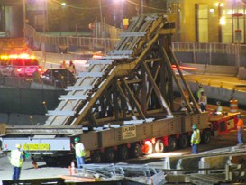
The Tribeca Tribune has some rather incredible shots of the last above-ground element of the World Trade Center, now dubbed the “Survivor Staircase,” being moved on the back of a flatbed truck for the second time this year.
Though it was uprooted from its original site, and it has lost its original base, the stair treads, at least, are being preserved for eventual installation in the WTC memorial/museum.
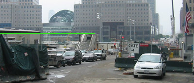
Watching the care and effort being expended on this deracinated staircase’s behalf, it’s worth remembering their totally arbitrary post-9/11 history. Though they’re revered as the only remaining fragments to survive the collapse of the World Trade Center, in fact, they’re the only above-ground fragments to survive the demolition and clearing and headlong rebuilding of the WTC site. They were damaged during the site cleanup and appear to have survived because they were located on the periphery of an access road, outside the active construction zone of The Bathtub.
5wtc_stairs.jpg
The stairs were used to evacuate a day care center in 5 WTC, but when I posted about them in late June 2003 and for a long time afterward, they were apparently ignored. Architect Rafael Vinoly, who lost the competition to design the WTC site to Daniel Libeskind, betrayed no awareness of the staircase. In a speech that month criticizing Libeskind’s overwrought reverence for the Bathtub’s slurry wall–which had already been reconstructed and resurfaced several times by then–Vinoly went so far as to say that there was “no archaeology” left at the site, that every piece of architecture above and below ground had already been cleared.
It was only when they were finally slated for dismantling by the Pataki administration’s Port Authority–with some of the treads being used for the memorial plaza–that preservationists and survivors fought for their future. Last summer, the Spitzer administration announced the compromise: to incorporate the stairs into the stairs leading down to the memorial museum.
As Avi Schick, then chairman of the Lower Manhattan Development Corporation told the NY Times, the stairs would become an interpretive element so that memorial visitors are “experiencing the path of travel just as someone else experienced it.”
More or less.
Survivor Stairs Moved Again [tribecatrib via curbed]
Previously: Archaeology at WTC Site

Janet Jackson, Paula Abdul. Herbert Muschamp Is What The World Trade Center Is All About!

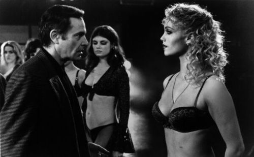
showgirls_audition_ice.jpg
Choire’s interview with Elizabeth Berkley reminded me of some unfinished Showgirls business here on greg.org.
Back in 2002, right after Beyer Blinder Belle released the first, banal master plans for the rebuilding of the World Trade Center site, a parody critique circulated in the style of Herbert Muschamp, then the architecture critic for the NY Times. Finally, here it is:

A Critical Appraisal
Special to The New York Times
Striding down the row of design proposals for the World Trade Center site, balefully eyeing each inert mien and artificially enhanced plan, I was reminded of the scene in Showgirls where the choreographer grimly surveys his topless charges. Flicking a feather across their assembled nipples, he scolds, “Girls, if you are not erect, I’m not erect.”
Ladies and gentlemen, I’ve seen the master plan proposals from the Lower Manhattan Development Corporation, and, to put it mildly, I’m not erect.
My heart sank as I watched John Beyer of the architectural firm Beyer Blinder Belle attempt to describe these hapless proposals. I was painfully reminded of another much more casual presentation one glorious autumn on Capri. The visionary Rem Koolhaas was holding forth on urban planning, shopping, life, and the smell of fresh basil. Wearing beautifully tailored trousers and a tight, cropped black top (need I add it was by Prada?) he gestured energetically as he spoke. With each gesture, his shirt rode up ever so slightly, revealing a tantalizing sliver of tan, taut tummy.
It is this kind of energetic gesture that those of us who care about contemporary architecture hunger for so desperately. Beyer Blinder Belle’s work is occasionally competent: certainly their by-the-numbers renovation of Grand Central Terminal pleases the hordes of moronic commuters who stream through it each day, but it will come as no surprise that this recidivist pile of marble is of little interest to the infinitely more important audience of attractive young European architectural students who make pilgrimages to our city each year and can barely choke back their tears of disappointment. John Beyer, whose exposed torso would be unpleasant for even the more adventuresome New Yorker to contemplate, must shoulder the blame for this catastrophic failure.
It is now time to list these names: Frank Gehry, Peter Eisenman, Zaha Hadid, Elizabeth Diller and Ric Scofidio, Tod Williams and Billie Tsien, Steven Holl, and, of course, Rem Koolhaas. There.
Is a little daring, a little excitement, a little sexiness too much to ask for on this sacred site? Lower Manhattan Development Corporation chairman John Whitehead and New York governor George Pataki would do well to rent a videotape of “All About Eve” and examine Bette Davis’s behavior before the big party scene. Her character Margo Channing reaches into a candy dish and hesitates again and again before finally popping a candy into her mouth. This tantalizing motif “impulse, surrender, gratification” is the central one of the twenty-first century. It alone must provide the ideological blueprint for all architectural work being done anywhere in the world, including lower Manhattan. If this fails to make sense to the theme-park obsessed corporate apologists for big business, so be it.
In the interest of full disclosure, my proposal for the site will be revealed at a time and place of my choosing. Fasten your seatbelts, New York.

Ignore, if you can, the glaring error that Muschamp would never have made: the choreographer used ice cubes, not a feather. The irony is that not only did Muschamp’s writing the last few years before his too-early death seem to cut loose, as if to meet his parodists in the sky, the fake WTC critique turned out too true by half: thanks to a sycophantic 1776 minstrel show from Daniel Libeskind and a chorus line of starchitects flashing their tits, the Port Authority’s original proposal is right on track.
[via mouthfulsfood]
Previously: Surely, Hordes of Showgirls-Googling Architects Can’t Be Wrong?

Tape Art And The Eleventh Of September

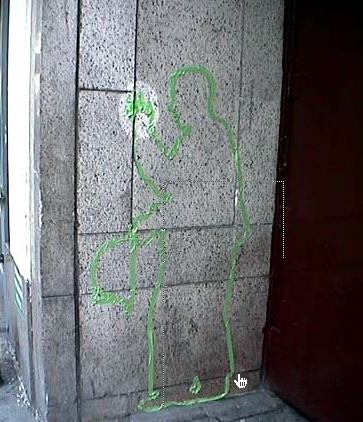
tape_art_devlin.jpg

tape portrait of FDNY B.C. Dennis Devlin
23rd St, north side, between Park & Lex

Wow. Before he became known as Apartment In The Mall Guy, artist Michael Townsend was Tape Art Guy. Over the course of five years, beginning soon after the attack on the World Trade Center, Townsend and his friends created 490 life-sized silhouette portraits of people killed on Sept. 11th using painter’s tape.
Sometimes working with permission, but mostly without, the Tape Art crew installed the portraits across Manhattan in locations that, when viewed on Google Earth, create the outlines of several overlapping hearts emanating from the WTC site. In an article last year for the 5th anniversary of the 9/11 attacks, the Providence Journal called the project, “the world’s first stealth-memorial.”
The are a few execution problems with the project: the heart shapes are a bit too Hallmark-y, and the decision to create portraits only of certain categories of the dead– airplane passengers, police and fire workers–feels like a missed opportunity to universalize the memorial.
One of the most powerful, visceral memorial ideas I ever heard was to place bronze plaques in the form of the “missing” flyers that blanketed the city’s lamp posts and mailboxes and the walls around the 26th St Armory, which served as an early rescue center in the days after the attack. Townsend’s ephemeral, handmade tape portraits dispersed throughout the city get close to the shared sense of loss, and it stands in diametric opposition to the isolated, concentrated, formalized notion of memorializing the dead at a central site.
I wonder how many of these are still around and how long they’ll stay?
Tape Art: The Eleventh of September [tapeart.com]
The Art of Remembrance [projo.com]

Bombardment Periphery, Rotterdam

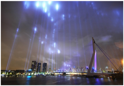
mothership_brandgrens.jpg

As part of Rotterdam 2007 – City of Architecture, the city commemorated the 15-minute-long German bombing on May 14, 1940 that destroyed the city center, precipitated the Dutch surrender in WWII–and ultimately provided the occasion for all that new architecture. The area destroyed by the bombs and the ensuing firestorm is demarcated by the Brandgrens, or Fire Limits:

The Fire Limits
14.05.2007
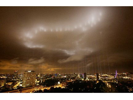
On Monday 14 May, in the evening, Rotterdam 2007 City of Architecture will illuminate the fire limits of Rotterdam’s city centre with over one hundred light beams.
The fire limits mark the areas of the city that were destroyed by the bombing on 14 May 1940 and the ensuing fires that broke out. From 10.45 pm a blaze of light beams on these boundaries will light up the skies, making the true impact of this devastating event visible throughout the entire city.
The bombing ‘only’ lasted fifteen minutes but managed to destroy practically all of Rotterdam’s city centre. Even before the war ended, it was decided not to replicate pre-war Rotterdam when reconstruction began, but to turn the city into a modern, revitalised city. The fire limits highlight the differences between the old and the new in many places in the city centre, which although visible, have never been experienced as a whole before. On 14 May 2007, the art producer Mothership will illuminate the entire fire limits, stretching almost 12 kilometres, turning this historic event into a sight that everyone can see.

Such a prominent spatial use of spotlights as a memorial these days obviously evokes references to the Towers of Light memorial. Like the World Trade Center version, this project, produced by the art collective Mothership, is intended as a temporary, ephemeral precursor to a permanent memorial demarcating the Brandgrens. But that’s actually not the most interesting part of this project for me.

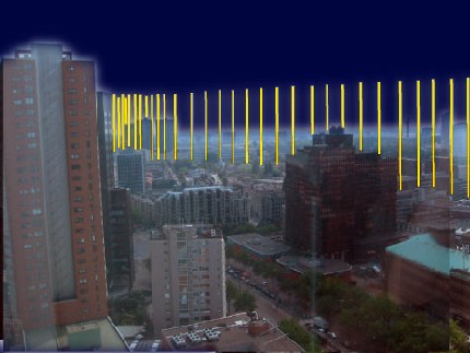
firelimits_mothership.jpg

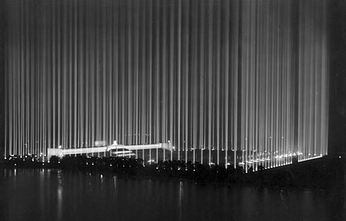
Though the memorial’s official path through the city was only recognized in February, the idea of the Brandgrens has been as integral to the post-war identity of Rotterdam. The Fire Limits [or as Mothership translates with a bit more thesaurian flair, Bombardment Periphery; Babelfish translates Brandgrens as “Fire Boundaries”] is a commemoration of a Nazi attack that uses the Nazis’ own vocabulary of spectacle, specifically Albert Speer‘s 1934 Lichtdom, the Cathedral of Light, at Nuremburg. The rendering [above] reads almost like a direct quote of Lichtdom, in fact.

Lichtdom.jpg

As it turned out, Bombardment Periphery looked uncannily like a re-creation of a nighttime bombing, with evocations of anti-aircraft searchlights, groundlevel glow, and illuminated cloud cover. I’d be very interested to hear what the reaction was to this event [the commemorating, that is, not the attack.]

brandgrens_2.jpg

It’s a bit absurd, but the first image that comes up in my search for night-time air raid photos was from Los Angeles.

La_air_raid.gif

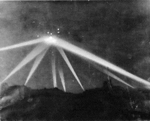
In the early morning of February 25, 1942, unidentified flying objects were spotted over Los Angeles, triggering a massive anti-aircraft barrage that killed three civilians [three more died of heart attacks] and sparked a flood of bitter criticism and controversy. No definitive explanation has ever been made of the objects. The incident was inspiration for Steven Spielberg’s comedy [sic], 1941.
The caption for this photo, which ran on the front page of the LA Times, is incredible:

Scores of searchlights built a wigwam of light beams over Los Angeles early yesterday morning during the alarm. This picture was taken during blackout; shows nine beams converging on an object in sky in Culver City area. The blobs of light which show at apex of beam angles were made by anti-aircraft shells.

The obvious question, of course: Is next February 25th too soon for someone to recreate a wigwam of light beams over Culver City?
Bombardment Periphery Gallery [enterthemothership.com]
Rotterdam2007: The Fire Limits [rotterdam2007.nl]
West Coast Air Raid [wikipedia]

So September 10th

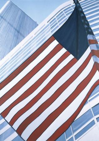
I have no idea what to make of this. Dresden painter Eberhard Havekost’s Kontakt is coming up for auction at Phillips de Pury on May 17th. Its oblique, cropped composition depicts the flat, linear patterns of the facades of the Vista Hotel and the North Tower of the World Trade Center, and a wind-flipped American flag.

havekost_kontakt.jpg

Here is Phillips’ catalogue text for the painting, which is expected to sell for between $80-120,000 [1]:

Vertiginous and fiercely cropped, Eberhard Havekost’s Kontakt reads as taut with the freight of its symbolism, the allotted canvas actually failing to contain the plus-sized reality of its subjects. Although executed prior to the terrorist attacks of September 11, 2001, it is unlikely that contemporary viewers will escape a connection—thematically as well as visually—to the journalistic and sentimental imagery that flooded the United States after those events. The buildings are rendered as flat, surface without depth, with the only indication of shadow in the image serving to slightly dim the stars and backward curl of the flag, arguably drawing more attention to them than the flag itself, boldly outlined in black. This decision on Havekost’s part seems particularly prescient, as it is a simplified graphic image of the ‘stars and bars’ at attention before a towering skyscraper—while pruned entirely of context for anyone not familiar with 9/11’s events—that has arrived as a new unassailable image in the national mindset, much like Joseph Rosenthal’s 1947 photograph at Iwo Jima, which would serve as the model for Felix W. de Weldon’s Marine Corps Memorial in Washington, D.C.

Obviously, the destruction of The World Trade Center is going to factor into any encounter with a work of art which features the buildings. As the text notes, Havekost made this painting long before the September 11th attacks, in 1998. Whatever his idea or intent was for making Kontakt, though, the context around the painting has shifted dramatically.

rosenthal_iwo_jima.jpg

But rather than just make mention of the situation, Phillips is explicitly running with it, pumping up the importance of Havekost’s painting by torquing it into a kind of prophetic artifact. Even more disturbing, they’re marketing, not the painting, but the personal experience of weighty remembrance that comes from seeing it: it isn’t “symbolic”; instead, it “reads as taut with the freight of its symbolism.” It’s unassailable image in the national mindset.”
The Iwo Jima photo-turned-memorial comparison is another extraordinarily explicit claim to historic, iconic status that is belied by the painting’s origins. Rosenthal’s staged photo was immediately seized upon as a homefront propaganda tool to invigorate the war-weary country. If anything, its transformation into three dimensions is a memorial to the lingering echoes of the media’s own rallying cry.

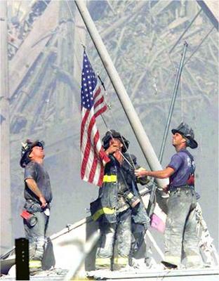
wtc-firefighters-raising-flag.jpg

If a comparable image exists from the WTC, it’s surely of New York City firefighters rigging a flag comandeered from a nearby yacht, a cloying attempt by the media to regain their once-galvanizing reach by re-staging–lamely and literally–Rosenthal’s photo. But whatever, the icon is definitely not Havekost’s depiction of a pop-flat, human-free vacuum. Not that that stops Phillips from trying to sell it as an icon.
Kontakt‘s current owner, Charles Saatchi, is not known for his reticence, but compared to the auction house’s ambitious historical reading, Saatchi’s is pretty subdued:

Predating 9/11, Kontakt contains an almost ominous forbearance, emblematic of an unblemished innocence.

This isn’t the first time Kontakt has come up for sale. It failed to reach the $20-30,000 estimate at Christie’s in 2003. Whether Saatchi bought that innocence at a private discount after the auction, or whether he was left holding onto the work for a few more years, I don’t know.
So which is it, unblemished innocence, unassailable sentimentality, or taut surface? Until I tracked down a review by David Ebony of Havekost’s first US show, in 1998 at Anton Kern, I thought I had an idea. Kontakt wasn’t included in the show, but similar architectural paintings were:

The people and places that Havekost depicts are bathed in a harsh, artificial light that adds to the work’s sense of unease and often implies a scenario of intrigue, terror and murder.
While the images are dazzlingly clear, there is a consistent distortion in the cropping and brush work that conveys a feeling of loss — a loss of the lost moment or, perhaps, lost hope…Havekost proffers an expression of modernist existential angst that is perhaps more gut-wrenching that anything found in the films or videos upon which his paintings are based.

The answer then, was ‘none of the above.’ And yet if the 1998 reading is accurate, Havekost’s painting is actually more prescient and symbolic than ever: it showed a superficiality-obsessed culture, vulnerable and oblivious to the target on its back. Which, on a morning where the headlines were of Lizzy Grubman, Chandra Levy, and getting into Marc Jacobs’ afterparty, sounds about right.
[1] It sold for $90,000, $75,000 final bid, which means only one or two bidders.

Nice Maya Lin Takedown, But More Are Needed

Philip Kennicott took the occasion of a blown off question about memorials at a public lecture for an excellent takedown of Maya Lin.
She’s been intimately involved in memorials for the two most politically divisive and controversial wars in 140 years, and yet she uses art and architecture as an apolitical scrim to hide behind when it suits her.
[Kennicott doesn’t address much of what I believe is Lin’s underexamined culpability for the design failures of the WTC site memorial. It’s a affirmative role defined by her presence and performance on the WTC Memorial Jury, and it’s separate from the stifling Minimalist hegemony her Vietnam Memorial design has had on the field for 25 years. Which isn’t her fault, anyway, and which is due to memorial designs since VNM being unable to equal its success.]
I can’t begin to imagine what it’s like trying to create art constantly under the critical shadow of a project you did as an undergrad, and Lin has and continues to be an inspiration to me. But I do know that it’s dishonest and delusional to try to maintain a public role that’s derived from an early, wildly important achievement, only to then claim you’re just a mere designer of garden ornaments. You can’t have it both ways, and the sooner Lin can reconcile those things within herself and her work, the better off we’ll all be. Either because the public sphere won’t be inflicted with her arrogance, or because she’ll once again be making an honest and tremendous contribution to our culture.
Why Has Maya Lin Retreated From the Battlefield of Ideas? [wapo via archinect]
Previous Maya Lin posts on greg.org

Alberto Burri’s Cretto

cretto_burri.jpg

Like Pompeii in reverse, Gibellina has been remembered by its ghost-like burial instead of an unearthing.
In 1968, an earthquake devastated villages throughout the Belice Valley of western Sicily. The Italian government’s incompetent response to the disaster and the corruption that absorbed rescue & redevelopment funds turned “Belice” into a cautionary touchstone of Italian politics. It’s a scenario that might resonate today, even. In the United States. And/or in Iraq.
Anyway, in the mid-80’s, artist Alberto Burri proposed a memorial to victims of the earthquake. His plan: encase the ruins and detritus of the abandoned hill town of Gibellina in concrete, leaving the roads as a solid, labyrinthine palimpsest of the village’s public spaces. [The whole town had been rebuilt and relocated closer to the freeway soon after the earthquake. No preserve-or-rebuild debates there.]

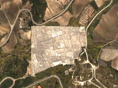
gmap_cretto.jpg

The remarkable thing: the memorial was built. Cretto is now a 20+ acre piece of mesmerizing land art, the pathways of an entire town petrified in brutalist, post-minimalist concrete. Now, of course, in 2006, it looks like Peter Eisenman’s Berlin Holocaust Memorial, but with content. The other thing it reminds me of is an old NYT Magazine article [date? who knows?] about the challenge of designing effective warning signs for a Nevada nuclear waste dump. To get the “Keep Out” message across 10,000 years from now, someone suggested paving a giant desert quadrant with spiky black stone, which the heat alone would render nearly impassable. Haven’t heard much about that since.
Other things I haven’t heard: anyone–even the memorial experts–discuss Burri’s work in relation to the World Trade Center site, or even in the larger contexts of the evolution of memorial design, much less of Land Art. What gives?
Aleksandra Mir mentioned Cretto in her top ten list for this month’s Artforum [artforum]
Cretto [archidose talked about it, though. twice.]
09/2010 UPDATE Google Maps now has higher res images, and Street View. of BF Sicily.

The Highest And Best Use Of A Pen

When I grow up–scratch that, IF I were to ever grow up enough, I wish I could write with half the force of Ada Louise Huxtable.

Given the notoriety of the site, a passionately observant and deeply involved public, and the proven financial advantage of what goes by the dreadful name “starchitecture,” Mr. Silverstein’s move from standard commercial construction to high-end high style required no great sacrifice or philanthropic awakening. Good design makes excess palatable. Marquee names command higher rents. These are all virtuoso performances–architecture as spectacular window dressing and shrewd marketing tool for the grossly maximized commercial square footage that has remained the one constant through the perversion and destruction of Daniel Libeskind’s master plan, a process in which vision succumbed early to pressure groups and political agendas. Call it irony or destiny, the architecture once rejected as a costly “frill” is now embraced for its dollar value.

The Disaster That Has Followed The Tragedy [wsj via archinect]