Robert Rauschenberg, Sky House II, screenprint on silk collage, bamboo, 372 x 248 cm, image via ig/RRF Sky House I, meanwhile, Rauschenberg kept for himself, according to former assistant Thomas Buehler
Robert Rauschenberg’s genius in making a 20×10-foot Art Kite was in understanding the opportunity while ignoring the assignment. Because the opportunity was to make two Art Kites, and have your Art Kites fly in the “vernissage in the sky” at an Art Kite Festival held amidst the blossoming sakura on the grounds of Himeji Castle. While the assignment was to promote Lufthansa.
And for the first 461 pages, I thought the show was about how flying and art are the same glorious expression of human freedom: “The world tour of the Art Kites is sponsored by Lufhansa” [p.462]
Obviously, it was more than that, but also just that. The Art Kites Project was sponsored by Lufthansa and organized by Dr. Paul Eubel, director of the Goethe Institute Osaka, which commissioned 100 artists from around the white world and Japan to create Japanese-style kites in 1987. The kites would fly once in Japan, on April 1 & 2, 1989, and once in Europe, on April 21 & 22, 1990, go on tour for three five years, to 21 museums in Japan (8), Europe (12), and Canada (1), before being auctioned off.
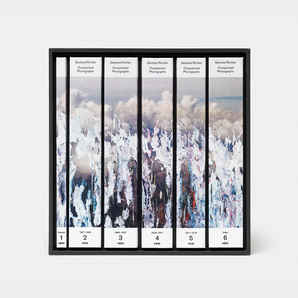
I just counted a thousand sheets of prints, and yet the Gerhard Richtermaxxing that kicked in around Panorama, his 2011 Tate Modern retrospective, still keeps surprising me.
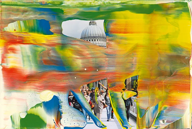
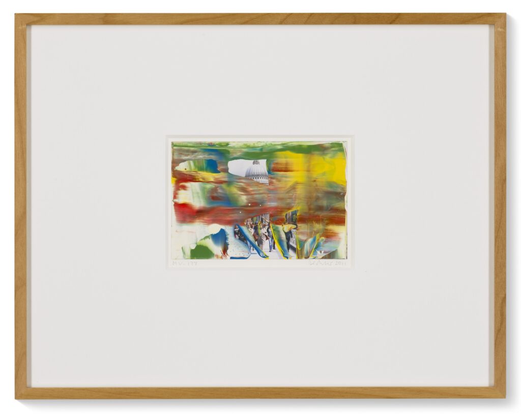
I’ve now seenthreeworks from Museum Visit (2011), Richter’s largest series of overpainted photographs, with a provenance of Tate Modern. So were these sold to Tate friends and donors? Were they being sold in the gift shop, too? It was a veritable Murakamitown in there.
Overpainted Photographs have this unique trajectory, created as personal, even seemingly private gestural experiments from rejected photos and leftover paint in the artist’s studio, immediately edited, then apparently given as gifts to friends, marks of connection and proximity, trickled out into the market by one local dealer, and accumulate over decades into a body of work that begins to attract critical and public attention. The early mass production series Firenze (1992) could be accounted for in the context of Richter’s artist book practice [or ignored.]
Reading Marcus Heinzelmann’s essay for the catalogue of the 2009 Overpainted Photographs exhibition at Museum Morsbroich, Leverkusen, the series emerged from the surfeit of paint and photos that surrounded Richter at the end of each studio day. Ready material, random process, and ruthless evaluation converge in a moment, and barely half survive long enough to dry. Zooming out, this museum show and Museum Visit are the moment overpainted photos broke containment, the touch of the Richter’s hand, at scale. I want to watch him make them almost as much as I hate to watch Damien Hirst wander listlessly among an acre of tables, splattering paint across 1,000 sheets that get turned into a Heni Edition.
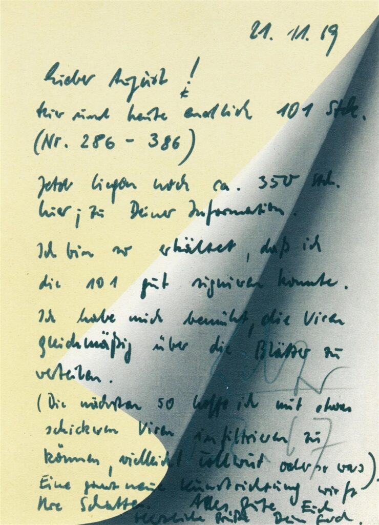
And here I thought that Gerhard Richter’s critique of the art market by making an offset print in an open edition was surpassed only by his using the prints as note paper. Claudio Santambrogio is much better than I at deciphering Richter’s handwriting, and he figured out the entire note Richter wrote to his dealer August Haseke in November 1969 when he finally delivered the first half of his 1967 open edition, Blattecke. And it is a whole new art direction casting its shadow:
Lieber August, Hier sind heute endlich 101 Stück (Nr 286-386). Jetzt liegen noch ca. 350 Stück hier; zu Deiner Information. Ich bin so erkältet, dass ich die 101 Stück gut signieren konnte. Ich habe mich bemüht, die Viren gleichmäßig über die Blätter zu verteilen. (Die nächsten 50 hoffe ich mit etwas schickeren Viren infiltrieren zu können, vielleicht Tollwut oder so was). Eine ganz neue Kunstrichtung wirft ihre Schatten. Alle gute Euch herzliche Grüße Dein Gerhard
Dear August, Here are finally 101 pieces today (nos. 286-386). Now there are still about 350 pieces here; for your information. I have such a cold, I could sign 101 pieces. I have tried to distribute the viruses evenly over the sheets. (I hope to infiltrate the next 50 with some fancier viruses, maybe rabies or something). A whole new art direction is casting its shadow. All the best to you best regards Your Gerhard
This is not what I envisioned when I mentioned a Felix-like stack, and yet the shadow is cast.
[week later update: these notes and additional related material are now in the Richter Archive in Dresden. Apparently it took Richter three years to work his way through signing the first 739 Blattecke.]
no. 555/739+ of Gerhard Richter’s Blattecke, 1967, sold by a consumer in 2024 at Christie’s
Happy belated Blattecke Tag to all who celebrate. 6.2.67, Februrary 6th, 1967, the date Gerhard Richter signed on most of the 739 examples of Blattecke (Sheet Corner) [Ed. CR 11], the 1967 offset print edition based on a full-scale photo of a little 1965 painting, Umgeschlagenes Blatt (Turned Sheet) [CR 70-2], which was 24 x 18 cm.
739 seems like a pretty big edition already, but Richter conceived of the edition as open and unlimited. How open and how unlimited is not clear. Richter’s website only mentions two additional examples, one dated 15.5.97, bringing the total to 741.
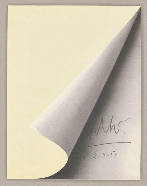
Gerhard Richter, Blattecke, 1967/2017, 232 x 174mm, offset print on cardboard, selling at Grisebach
Well, another post-’67 Blattecke just turned up for sale at Grisebach with a date of 11.2.2017. But in addition to the date, Richter puts the edition number on the corner of the turned up page. So by February 2017, the count was at 906.
Still from Moving Picture (946-3) Kyoto Version, 2019-24, by Gerhard Richter & Corinna Belz, as introduced by Gagosian for an upcoming immersive installation in Rome, Dec. 2024.
As we try to make sense of wtf happened, and what the future holds, let me try to bring some clarity. As fields and factions drunk on their own importance clamor for dominance, let me try to bring a shared understanding.
So far there have been computer animations based on two Gerhard Richter paintings. They have followed the slicing and mirroring mathematical process of the artist’s Strip series (2009-2013). Richter provided the image to and they were made by filmmaker Corinna Belz. They have been accompanied by music commissioned from multiple composers.
The project having its “gallery debut” next month, which Gagosian Rome is pleased to announce, Moving Picture (946-3) Kyoto Version (2019–24), is of the second painting, Abstraktes Bild (CR 946-3), from 2016. It is, thought, the first to be presented as an immersive installation in film and sound, and the first to be sold, in an edition of eight. What is it, and how did it come to be?
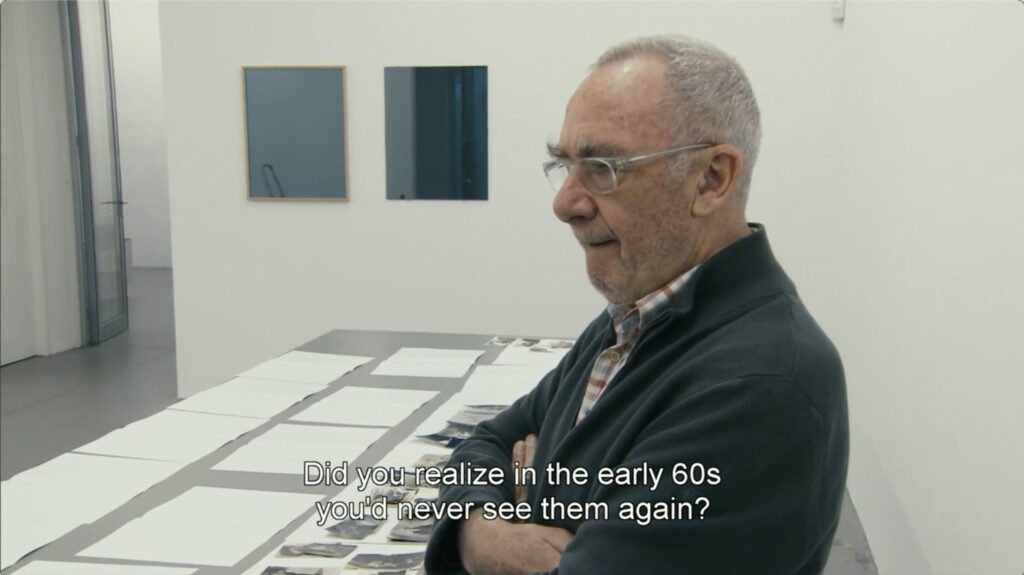
I watched Corinna Belz’s documentary, Gerhard Richter Painting today, thinking that the artist hard at work in his studio would clear my head, or at least distract me.
Then I was overwhelmed anew by an exchange with Belz as Richter is sorting through stacks of old photographs. As Richter held a snapshot of his middle-aged parents, Belz asked, “You left Dresden, East Germany, in 1961. Did you ever see them again?”
“No, never.” Richter replied. “I was a recognized refugee. A certified political refugee. And it wasn’t possible. I couldn’t get a permit…a travel permit for the East.
“Not until later, 1987, when I had an exhibition there. Then, with the ambassador, suddenly everything was possible.
“But by then they were all dead.”
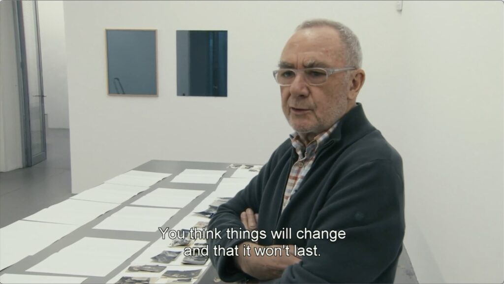
“Did you realize in the 60s that you would never see them again?”
“No. Absolutely not. You think things will change and it won’t last. You don’t think people will grow old and die. When you leave them, they’re young.”
I knew this was here; I’ve seen this movie dozens of times, and it inexorably changed the way I thought of Richter’s relationship to photographs, his subjects, and the arc of his entire project. A young artist becomes a refugee when his war-ravaged country splits apart, and he never sees his family again is not the Richter origin story we were used to. And Richter lost in sadness as his answers to the questions linger in his silence is not the icy master of critical detachment we’ve been taught.
But today, my ache over the career of this artist built on personal trauma that unfurled across the shifting fascist and imperial politics of the 20th century was overshadowed by my dread of the future. Because part of my processing today involved replaying with unwanted, fresh intensity the idea of leaving, of fleeing.
The questions of where? when? how? land differently than they did even yesterday. But at least I asked them. Am I ready to never see my parents again? wasn’t even a question I’d thought of. Neither, it turns out, did Richter.
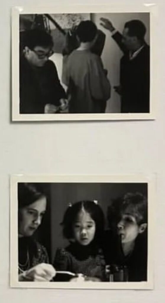
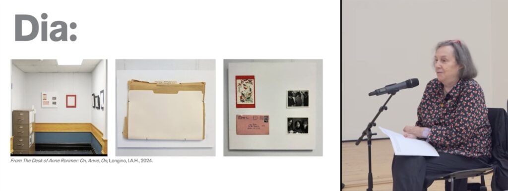
On Kawara family snapshots, from “From the Desk of Anne Rorimer,” curated by Alan Longino
Here are snapshots of On Kawara’s family attending Gerhard Richter’s New Year’s party.
Installation view of “From the Desk of Anne Rorimer: On, Anne, On,” scr via ig/alan_longino
They were included in, “From the Desk of Anne Rorimer: On, Anne, On,” an exhibition staged over a series of weekends in Apr-May 2024 in what looks like a student lounge at the University of Chicago. The material was taken down every night so it wouldn’t disappear. It was the fourth and final show of Longino, IAH, a curatorial project by post-war Japanese Art History graduate student Alan Longino. Longino’s idea was a show focused on an art historian, and Rorimer gamely opened her lifetime of files and correspondence, and archive of artist interactions to him.
More than most artists, Kawara’s work was so intertwined with the medium of interaction, correspondence, and daily activity, and the professional and personal ephemera give glimpses of life beyond the edges of his practice.
Screenshot from “A Conversation with Anne Rorimer on Blinky Palermo, On Kawara and Lawrence Weiner, 29 June 2024 at Dia Beacon via youtube
Rorimer began working with Kawara in 1979, when she included him in the 79th American Exhibition at the Art Institute of Chicago. Judging by the age of Kawara’s daughter in the lower snapshot, the party would probably have been in the late 1980s. A more intrepid soul than I might deduce the year from the date formats of paintings produced around the holidays. Or it’s on that pink envelope. [update: which, that Sojourner Truth stamp was issued in 1986.] Or just ask Rorimer.
Of Longino, IAH, there is a text by Calvin Lee on Longino’s Google Drive, but the most thorough documentation of the show for the moment is Longino’s Instagram. I was stunned and saddened to learn Longino, 36 and at the very beginning of his career, passed away from cancer in July, barely a week after Rorimer & Carter’s conversation.
oilcloth concept roundup, [clockwise from upper left]: but which Guyton? Richter Strip; a Rothko; Sturtevant’s—or any, really—Felix candy carpet
Yesterday on the good social media, I floated an idea about custom-printing an oilcloth for our table instead of stalemating over off-the-roll options. When I realized custom was even an option, my mind went first to Guyton/Walker, probably because tables, but also because their poppin’ designs feel like riffs on the most garish tropical oilcloth patterns out there already.
But then it occurred to me, what is a Wade Guyton painting but an artisanal and auratic, custom-printed textile? Which one would be best as a tablecloth? If process is the determinant, Gerhard Richter’s Strip paintings are also printed. But what isn’t these latter days of the flatbed picture plane?
I had the Felix Gonzalez-Torres catalogue raisonné out, and its all-over cover photos of candy suddenly felt like the perfect combination of representation and abstraction, object and pattern. But what color?
The Gonzalez-Torres image universe spilled out before me. Bead curtain? Death by Gun? [oof.] The dark surface of the sea? A bird in a cloudy sky? Black with a couple of lines of biography and historic events printed along one edge? Then I realized I already had a solution. Or at least an option.
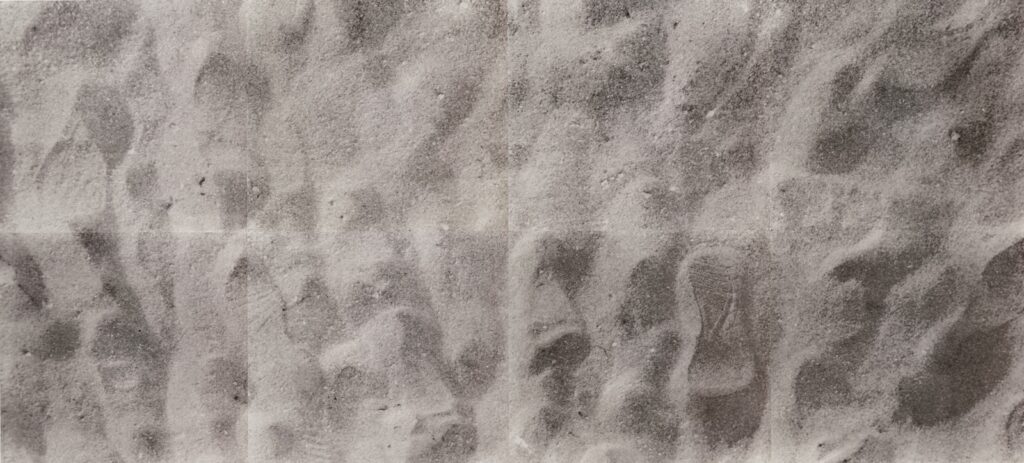
Felix Gonzalez-Torres, “Untitled” (For Parkett 39), 1994, ed. 1/84 sold in Fall 2023 at the auction of a complete set of Parkett editions at Van Ham, Berlin
Sure, we could print the entire image of footprints in the sand from “Untitled” (For Parkett 39). Or, we could use the eight screenprinted panels of the 3×7-meter billboard edition separately. Except they are mostly square, around 160 x 170 cm, each, plus some border/overlap. So on their own, they don’t fit our rectangular table. They would need to be pasted together in a vertical pair. Do they need to be laminated? Coated? Thrown over with a clear vinyl tablecloth like at Grandma’s? Beyond unworkable, it feels wrong. [lmao as if the whole idea isn’t bad enough.] I’ve taken my Parkett billboard sheets out like twice, and that billboard stock is thick; they are not your crafty mama’s butcher paper.
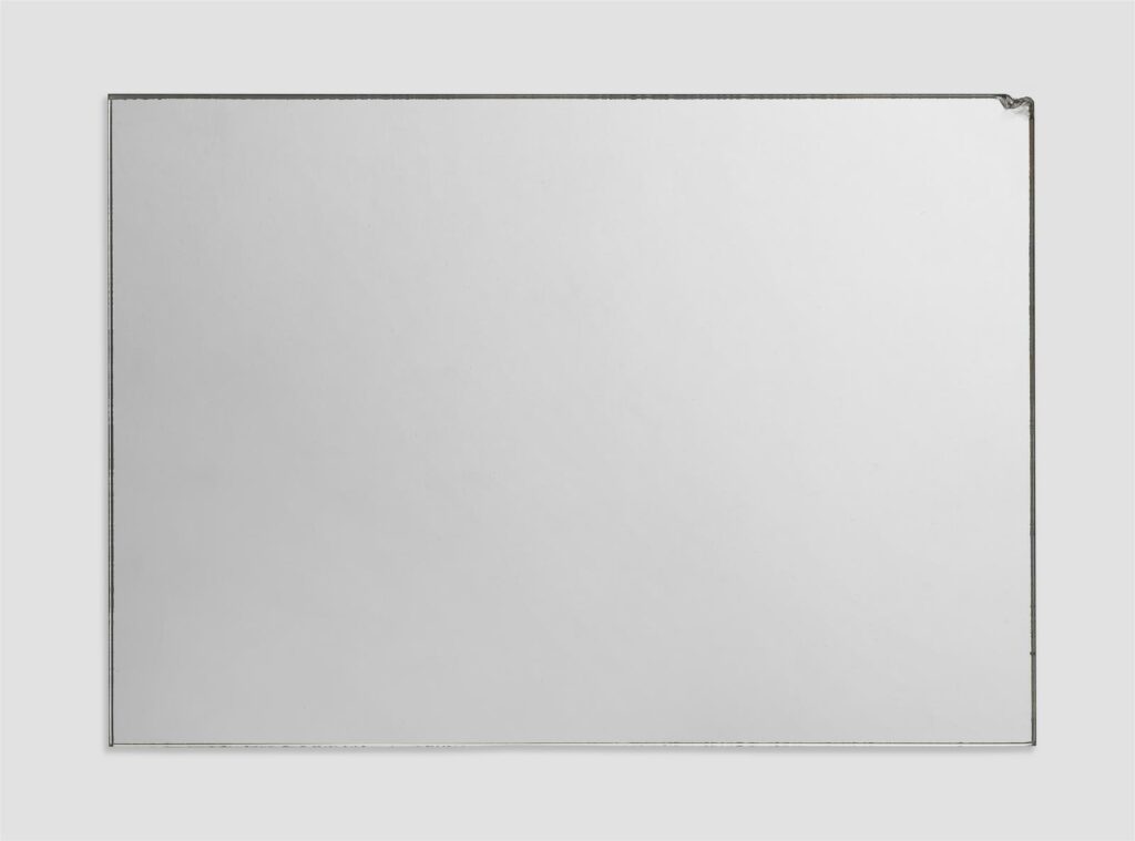
“Upper right corner bumped”: Gerhard Richter, Spiegel, 1986, 21 [or 20.5] x 29.8 cm, ed. 89/100 [or unique] Lot 97 at Lempertz
Sometimes after all the relentless perfection what you really want is a Gerhard Richter Spiegel that has really seen some stuff. You just know this one has never spent a minute of its life in a box in a freeport, and shouldn’t that be a premium instead of an 80% discount?
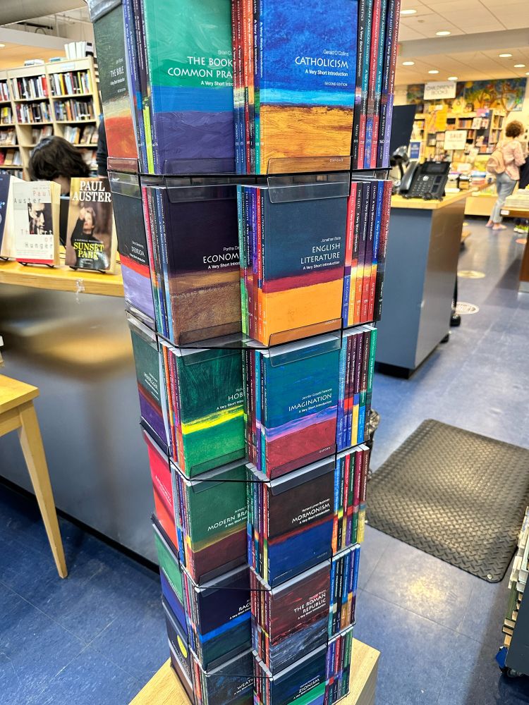
Kieran Healy, meanwhile, spotted an entire tower of Very Short Introductions, the pocket-sized Oxford University Press books currently corrupting Our Youth about whatever.
Turns out both the NYPD and Gerhard Richter have a thing for digital reproduction, fabrication, and scale.
*[Wait, the artist’s website lists a 350cm tall STRIP-TOWER of digital print face-mounted to Perspex as being exhibited at the Serpentine right now. Are there two? Are we pretending there is just one, and that it is not the janky and provisionally mounted wood tower with a labelmaker label on the bottom that was in Basel? Or is that one just inside at the Serpentine? This is the second inaccurate exhibition notation I’ve seen on the artist’s website this year. Richter’s digital reproducing is running ahead of his registrars.]
This one, which Marian Goodman held onto for a while, is now for sale, which is not as important as the view we now get of the back of painting. Richter painted it in—and on—the frame.
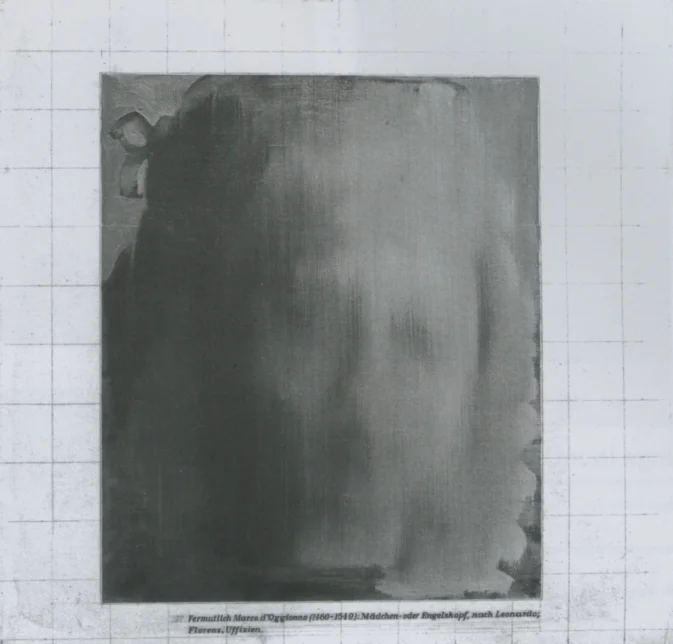
Gerhard Richter, Engelskopf (Angel’s Head) [CR 48-7], 1963, also 1963/65, oil on linen? 68 x 72 cm, image via Gerhard Richter
I swear I will cut back on Gerhard Richter stanposting when Richter cuts back on wild things to stan.
While looking for examples of the way Richter considers his catalogue raisonné as a construct separate from a chronology, this painting caught my eye. Engelskopf, or Angel’s Head, [CR 48-7], is dated to 1963, where it comes after CR 13, CR 14 and CR 25-a, and is followed by CR 14-a and CR 15.
That 1963 date makes Engelskopf is one of the earliest photopaintings, but also one of the very first to include a caption text, which made Richter’s sourcing of reproduced images clear. It’s also Richter’s first art historical reference; except for Philipp Wilhelm, a painting of a newspaper clipping of a painted portrait, from 1964, it’ll be a long time before Richter directly references earlier artworks.
The inauguration of Gerhard Richter BIRKENAU, a permanent exhibition in a purpose-built, VW-funded pavilion at the International Youth Meeting Center in Oświęcim, Poland, opened on 9 February 2024, the artist’s 92nd birthday. via mdsm.pl
Last month Gerhard Richter BIRKENAU, a permanent exhibition in a purpose-built pavilion, was opened at the International Youth Meeting Center in Oświęcim, the Polish town near the nazi death camp that took its name. It contains reproductions of the Sonderkommando photos that Richter used as a basis for the Birkenau series of large-scale squeegee paintings [CR 937/1-4] he made in 2014. [Two photos are visible on the concrete walls below.] It also includes full-scale Diasec-mounted versions of the Birkenau paintings [a medium Richter once used for a category he called “Facsimile Objects,” but which he later replaced with “Prints”]. And facing them are Facsimile Objects of a series of four Grey Mirror paintings. Photos of oil-on-glass paintings printed and Diasec face-mounted with acrylic on aluminum.
Mrs. Moritz-Richter, et al., at the inauguration of Gerhard Richter BIRKENAU, via mdsm.pl
In this Guardian article [shoutout greg.org hero/reader Claudio for the heads up] Agata Pyzik tries to put a market–or at least a marketing—critique on Richter’s use of photo copies of paintings, even while acknowledging his attempts to remove his Birkenau works from an art market context. [Richter’s kept the paintings in his foundation, and put the other facsimile edition in the Reichstag.]
Gerhard Richter, Grauer Spiegel (4 Parts) [CR 955], 2018, his last painting (so far), installed with Birkenau and Birkenau Facsimile Objects and Birkenau photos at the Met Breuer in 2020
I read the Birkenau facsimiles, which he has shown alongside the Birkenau paintings from the jump, including at the Met Breuer in 2020, as an attempt to head off any sacralization of the paintings themselves. He did not make them to be, and he does not want them to become icons of the Holocaust. Even worse for him, I think, would be being seen as attempting to iconize or exploit these terrible photographs, to turn them to his own use. He sees limits to his own project of painting in relation to images and history, and he’s not wrong.
Gerhard Richter, Grey Mirror [CR 751/1-4], 1991, each 300 x 175 cm., portrait-style, paint and enamel on glass, a gift of the artist to the Saint Louis Art Museum, with three giant squeegee diptychs, November, December & January, which the museum bought in 1990, visible in reflection.
But while all the media attention is on the Birkenau pictures, the most unsettling and powerful element of the installation, the mirrors, barely gets a mention. If this were any other work, any other place, any other time, the fact that Richter made Facsimile Objects of mirror paintings would be enough to keep me going for weeks. These happen to be facsimiles of Grey Mirror [CR 751/1-4], a series of 3 x 1.75 m, color-coated glass paintings made in 1991 for—and by—the St Louis Art Museum, a gift with purchase. [The purchase was Betty.] In Oświęcim, Richter has turned them sideways, and installed them landscape-style, as one continuous 12-meter mirror panorama.
But these are there, and now.
And so visitors to Oświęcim, while flanked on either side by direct photographic evidence of the nazi genocide at Birkenau as documented by its targets, will see reflections of themselves and everyone else with their backs turned to a repetition of Birkenau which looms behind them. It’s at least theoretically possible, if previously inconceivable, that if he opened an exhibition in Germany that made visitors look in a mirror while turning away from the evidence of genocide all around them, Richter could be arrested.
[update: After corresponding with the artist’s studio about broken links on the webpage for this exhibition, I was informed that this mirror work is actually an “exhibition copy” of Grauer Spiegel (4 Parts) [CR955], and not [CR751/1-4]. Which means the dimensions and material aspect of this object are still to be confirmed. For now the artist’s site still describes them as Diasec-mounted prints. Is that whan an exhibition copy of a mirror work is? Or would it be a similarly produced enamel paint on the back of glass? Perhaps we shall see.
Installation view of the Birkenau paintings and photos reflected in Grauer Spiegel (4 Parts) [CR955] at Gerhard Richter: 100 Works for Berlin, at the Neue Nationalgalerie thru 2026, a video still by Julius-Christian Schreiner via DW
What is significant, though, and has been unremarked by anyone, is that with these mirrors, the BIRKENAU installation replicates the current long-term installation of the Birkenau paintings, the Birkenau photos, and Grauer Spiegel (4 Parts) [CR955], at the Neue Nationalgalerie in Berlin. So viewers in Germany can, in fact, see themselves in a mirror, with the genocide of Birkenau represented behind and all around them, know that this same situation exists somewhere else right now, and contemplate the differences between an original and a repetition.]
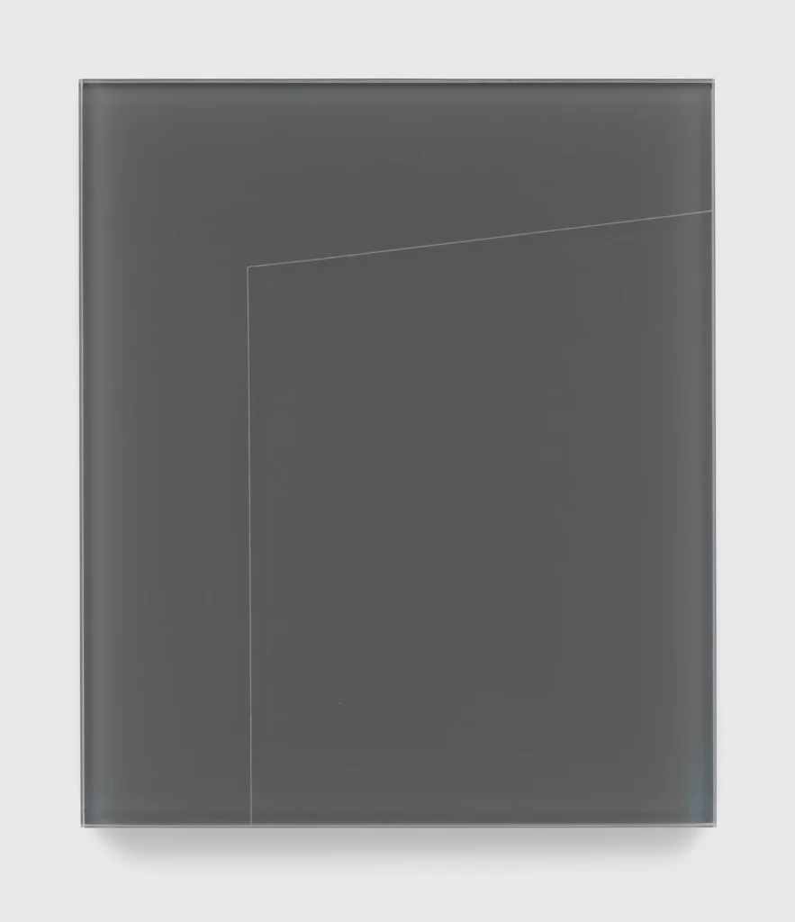
Gerhard Richter, Grauer Spiegel, 2021, 40×34 cm, pigment on bicoloured glass, ed 100+20AP, image via David Zwirner
Happy belated birthday, Gerhard Richter, who is apparently too busy painting, drawing, and collaging to update his website. The Grauer Spiegel (2021, No. 179, pigment on glass, ed. 100+20AP), included in Richter’s current show at David Zwirner in London is not there. It looks like the pigment is actually on the recto of the glass, a depiction of a mirror, not a mirror itself. But that’s just how it’s photographed. Installed at the Points of Resistance IV: Skills for Peace exhibition at Zionskirche in Berlin in 2022, its mirror nature was on full view.
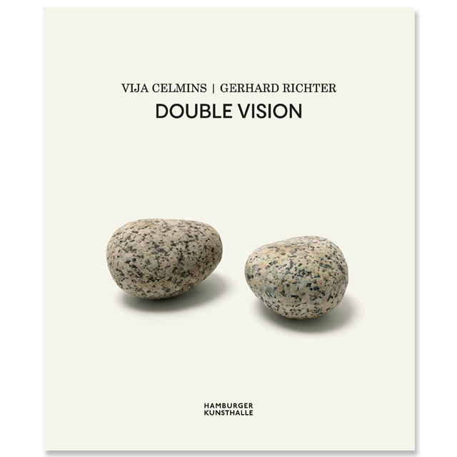
Vija Celmins | Gerhard Richter, Double Vision, exhibition catalogue from Kunsthalle Hamburg
Posting about underseen little grey Richters really brings out the underseen little grey Richters. In a conversation begun on bluesky, Michael Seiwert mentioned seeing several in a very interesting show last Summer at the Hamburger Kunsthalle. Vija Celmins | Gerhard Richter, Double Vision, curated by Dr. Brigitte Kölle, is an intriguing Celmins show that is also a very rare two-artist Richter show.
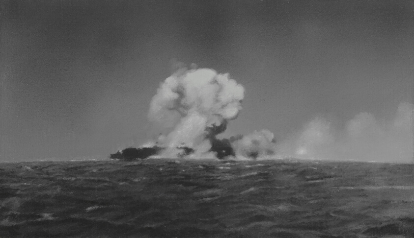
Vija Celmins, Explosion at Sea, 1966, 13 1/2 x 23 1/2 in., oil on canvas, in the collection of the Art Institute of Chicago
I love the show’s idea of “juxtaposing such a strong female position with the work of Gerhard Richter, so often presented as a singular phenomenon,” not just to see his work “with a fresh eye,” but because it puts both of them in a larger, richer context. These artists clearly share interests, approaches, motifs, and even biographies, that felt unexpected at first, but feel obvious now.
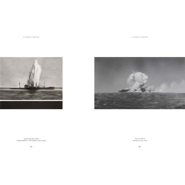
Spread showing rough times at sea from Celmins | Richter, Double Vision exhibition catalogue
Some of the resonances between Celmins’ and Richter’s practices come immediately to mind: photo-based painting, found/everyday objects, seascapes, fighter planes, grey, they’re all in there. But browsing the catalogue, I was straight up surprised by the spread above, which features a 1963 Richter titled Schlachtshiff [Battleship], and a 1966 Celmins, Explosion at Sea.
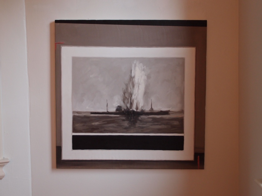
Destroyed Richter Painting #02 (ship), 2012, 40 x 30 in., oil on canvas
That Richter, though, is one the artist destroyed in the mid-1960s. It was the first of the Destroyed Richter Paintings I had remade in China in 2012, after seeing a photo of it, from Richter’s Archive, in Spiegel. OK, technically, and explicitly to the point, I had Richter’s archival photo painted at the scale of the destroyed painting it depicted, and I have shown and lived with this picture. So it is wild to see it included in this discussion. As Jaboukie might have said if he’d ever posed as Richter on twitter, “Just because I destroyed it doesn’t mean I can’t miss it.” Obviously, I am buying the book immediately.