That could be the sub-title of this site, really. I made Souvenir (November 2001), in part, to ask what could New York be like in 80 years, after the generation of us who experienced the attacks are all gone. How would the as-yet unborn people then and there remember us here and now? I should clarify: us=those who experienced (ie, died, survived, rescued, ran, watched, etc.). And already, in less than two years, here and now is becoming then and there.
Now, (tens of? hundreds of?) thousands of designs for the WTC Memorial will start pouring in, invariably affected by the intervening events, mourning, healing, revenge, renewal, bitterness, anger, loss, politics, war, protest, obfuscation, certainties and uncertainties. Although Rules have been set, but not in stone: submitters should feel free to “go where their imaginations, where their mourning needs to take them.” On the LMDC’s registration information site, the only surprise is that they’re not accepting Paypal.
 WWI itself changed the memorial game. For the first time, it was not just the generals and heros, but the average soldier–the individual, not an abstracted symbol–was to be memorialized and remembered. Metal dogtags were a standardized response to the sheer numbers of the Missing in WWI. Like the Thiepval Memorial, the object of two New Yorkers’ search in S(N01), the WTC Memorial will also serve as a grave-by-proxy for the hundreds whose remains were never identified.
Due in part to an overly individual-centric reading of the Viet Nam Memorial’s personal/collective experience, the focus of memorial designs in Oklahoma City and the Pentagon is almost wholly on the lost individual and “achieving closure.” And now, the individual is designing the memorial. Maybe if designing is such an effective way to meet our memorializing needs, we should just set up a perpetual workshop on the site. Of course, what would that look like to people 80 years from now?
Category: world trade center memorial
First, Let Me Say, Daniel, We Loved Your Idea
 And (according to the Guardian), we’d really like to move forward with it. We made just a couple of notes, ‘Kay?
“The Eiffel Tower for the 21st Century”

This morning on Kurt Andersen’s Studio360, Paul Goldberger suggested “the Eiffel tower of 21st century, something that would use the technology of our time with the brilliance that Eiffel used the technology of the 19th century,” be built at the WTC site. It’s a powerful articulation (7 words, including an ‘of’ and two ‘thes’) of a compelling idea. [Listen here.]
Interestingly, Goldberger discussed a similar idea on Studio360 less than a month after the Towers fell. [Listen here.] Keep your eyes peeled for a 3,500-word theoretical exegesis by Goldberger’s successor at the Times. An unsung but influential force in the Ground Zero rebuilding debate, Goldberger early on uncovered the political playing field of the LMDC and Port Authority, and was the first to publish the early, architects’ conception of the Towers of Light.
Since I once visited Kings Island in Cincinnati as a child, I’ve never felt the urge to go up the Eiffel Tower. (The Ohio version is 1/3 the French one’s height, I was about 1/3 my present height; I get the concept.)
When the French wanted an Eiffel Tower for the 21st century (l’An 2000. Repetez: an deux mille), they got le scintillement: trillions of sparkly lights covering the Tower, which started scintillement-ing on the hour. It was a magical effect that’d stop conversations in Paris…like clockwork.
Get smart: The Eiffel Tower at Wikipedia; Roland Barthes’ The Eiffel Tower and Other Mythologies; fin de siecle idea for Eiffel Tower base jumping [via gmtPlus9].
Dream Team-gate: WTC Architects on Charlie Rose Make White House Flak Look Candid, Honest
[2018 UPDATE: In 2018 The New York Times reports that five women who worked with Meier, either at his firm or as a contractor, have come forward to say the architect made aggressive and unwanted sexual advances and propositions to them. The report also makes painfully clear that Meier’s behavior was widely known for a long time, and that his colleagues and partners did basically nothing to stop it beyond occasionally warning young employees to not find themselves alone with him. This update has been added to every post on greg.org pertaining to Meier or his work.]

That guy on the left isn’t at all. He’s Dan Bartlett, flak for the Architect of the Axis of Evil (and, alarmingly, the most straight-talking guy on the show) image: charlierose.com
Just caught The WTC “Dream Team” (their quotes)–Charles Gwathmey, Peter Eisenman, Steven Holl, and Richard Meier –on Charlie Rose. [thanks for the headsup, archinect!] Preceded by an interview with White House Communications Director Dan Bartlett, Rose apparently chose obfuscation as tonight’s theme.
It was a lot of serious-minded awe eliciting empty comments about massive publicity (“How do you deal with being so great, old friend?”), one seemingly unintended admission, and an easy-to-miss editing mystery. (A coverup? If it were a coverup, I’m sure Charlie “60 Minutes2” Rose’d be on it, not in it…) What went basically unsaid (because unasked) was a discussion of the Dream Team’s actual dream. (Check the Day After the unveiling, where the connection between their grid/tower concept and the wrecked shards of the original towers is made clear.)
I am very unsettled by this team’s refusal to discuss what seems to be the guiding principle of their design.
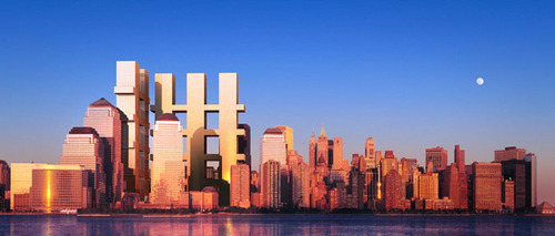
Gwathmey: “It’s haunting…eerie”
Meier: “ix-nay on the aunting-hay, uck-Chay”
image: LMDC
Still, Charles Gwathmey came really close when he talked about how their plan addresses New York at both levels, “the pedestrian plane” (! Plane?) and the “sky plane.” (!! Two planes?) He said, “It’s haunting. It’s an eerie speculation about memory and presence. The image is incredibly powerful.” Gwathmey’s reference to the skyline rules out the possibility he was discussing the declared memorial aspect of their plan: street-level gardens in the shape of the Twin Towers’ shadows, which extend across the World Financial Center and into the Hudson.
There was no articulation of what this image is or why, no discussion of the form, no followup, no discussion about (this) memorial. Eisenman quoted Adolf Loos (again, also here, in relation to his Memorial to the Murdered Jews of Europe), “The work of architecture is monuments and graves, and in other words, the work of memory.” Even if I like their concept of a monumental shard taking over the downtown skyline (and I have to admit, it’s quite powerful), their conscious avoidance of expressing or acknowledging their clear intent is arrogant, verging on deceitful.
The surreal TV moment: a minute or so later, there’s a jump cut; something was obviously excised from the conversation. While Eisenman is talking next to him, an anxious Meier is slowly trying to drop some folded papers from view, and all the while he’s sending intense messages across the table with his eyes. To whom? According to that basic element of continuity editing, eyeline matching, it was Charles Gwathmey.
[2024 update: fixed broken links to charlierose.com]
WTC Site Designs Revealed While Director Poaches Memorial-Friendly Media
[2018 UPDATE: In 2018 The New York Times reports that five women who worked with Meier, either at his firm or as a contractor, have come forward to say the architect made aggressive and unwanted sexual advances and propositions to them. The report also makes painfully clear that Meier’s behavior was widely known for a long time, and that his colleagues and partners did basically nothing to stop it beyond occasionally warning young employees to not find themselves alone with him. This update has been added to every post on greg.org pertaining to Meier or his work.]
If the 3+ hour multimedia press conference for around 25 brand name architects to present their proposals for the World Trade Center site were Saks, I was the chick selling hand-beaded mittens from a card table on the sidewalk. Actually, as a media event, it was more wholesale than retail; press and LMDC staffers outnumbered Invited Guests about 3:1. So rather than just spam the (presumably interested in memorials) crowd with cards for tomorrow’s screening, I switched to providing background and “context” to the media folks and sharing thoughtful opinions and quotes on the designs. (ex. “They sure don’t build ’em like they used to,” opined Greg Allen, a New York filmmaker whose documentary about a WWI memorial opens today at MoMA…”)
So, how are they? Well, compared to the first round of designs announced in July (which sucked), things are looking up. As one juror told me, the overall high quality of these designs just makes him realize how depressing last summer actually was, and I have to agree; some of the designs are quite impressive, inspiring, even. Here are some action photos from the event; It was a real scrum for a while.

WTC Bathtub wall under construction, 1968. Image: Museum of The City of New York
Daniel Libeskind‘s memorial proposal, titled Memory Foundation, includes the “bathtub” as well as the towers’ footprints. The bathtub–a watertight, concrete, underground structure designed to hold back the Hudson River–should be recognized as a symbol of strength and resilience, says Libeskind. The New Yorker re-published a fascinating 1972 account of the bathtub’s construction by Edith Iglauer.
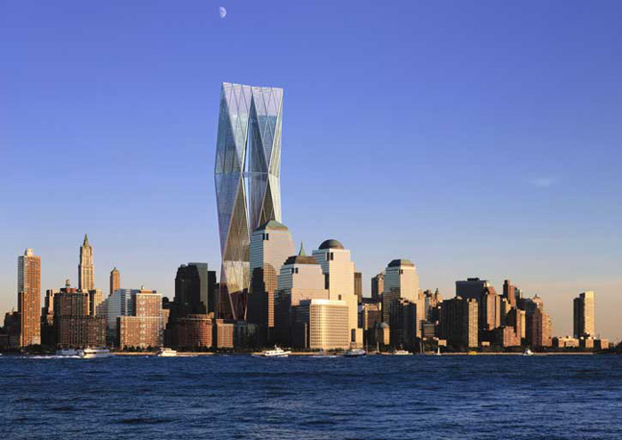
Foster & Partners, “tallest, cleanest” etc.. Image: LMDC
Lord Foster’s presentation shows why he got the upgrade (from Norman and Sir, for that matter). He was smooth, his images were clear and seductive, and he dropped references to his work so lightly (“The Reichstag is a memorial itself, really…”), that selecting his two towers “which kiss and touch and become one” seemed inevitable.
In an unexpected train wreck of a presentation, the “Dream Team” (Richard Meier’s opening words), sought to shun ego and it’s evil progeny, “architecture.” At least they avoided the architecture. Meier’s unfortunately morose presentation matched the missed opportunities of their proposal.
I say missed, because in the most impressive presentation and proposal of them all, United Architects, another team effort, nailed the incredible potential of ideas the Dream Team had right in front of them. Even though it appeared in other proposals, too, UA made a Sky Memorial a reality by showing that it already exists; Greg Lynn talked of the team members’ early and overwhelming visits to the families’ viewing room, which overlooks Ground Zero. They proposed one memorial 60 stories in the air, atop the first building to be constructed at the perimeter of the site. Gradually, four more towers would join it, forming a “cathedral-like” arc around the memorial in the footprints.
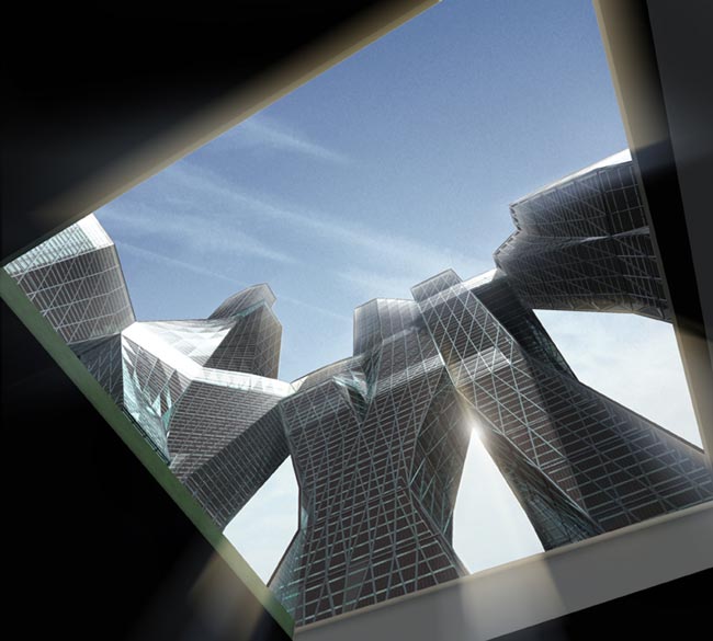
United Architects, view of (1620′) towers from footprint memorial. Image: LMDC
The towers would angle toward each other across the restored street grid, forming a massive, new urban space, 60 stories up and five stories high, contiguous across all five towers. To drive their proposal home, they showed an extremely effective film, which alternated views from within the buildings with repeated shots of people on the street looking up, like they used to do. It was surprisingly impressive. See their flash presentation on their site.
As for me, well, I did a fair job of working the crowd, chatting up anyone I saw with a green sticker on (ie., media) and then handing out quotes, reactions, and the cards for tomorrow’s screening of Souvenir (November 2001). There were some very nice responses, and no one seemed to equate this kooky project with the scattering of amateur memorialists and professional World Trade Center groupies who crowded the periphery of the event. Combined with the encouraging replies from the mailings that went out, tomorrow could turn out alright.
On Reading (Between) the Lines
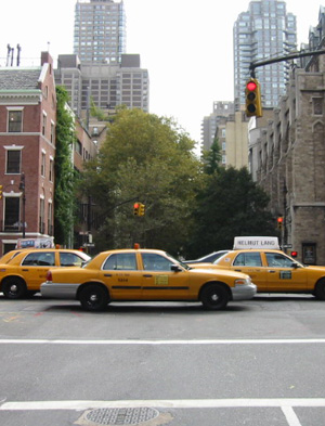
Thinking about Koolhaas’ Delirious New York again. This 1978 book, billed as a “retroactive manifesto,” tells the story of Simeon deWitt, Governeur Morris and John Rutherford, who boldly mapped out the Manhattan Grid in 1811. “…Each block is now alone like an island, fundamentally on its own. Manhattan turns into a dry archipelago of blocks.” The grid set the terms for Manhattan’s future and foreordained–according to Koolhaas–NYC’s vertical development (ie., the skyscraper). Apex Art had an interesting exhibit in 2000, “Block,” which featured Austrian architecture students’ responses to what Koolhaas called “Manhattanism.”
My street was barely a twinkle in deWitt & Co’s eyes then. In fact, the two buildings above both date from the 1920’s, when Park Avenue got its first real upgrade (from putting the NY Central railroad below grade. It’s the train to New Haven, you know). But like the rest of Manhattan, it’s character is inexorably derived to the grid. But not in the way Koolhaas thought. It’s the street, not the block, that’s really wonderful. On approach my street’s most interesting feature is the forest-dense trees that fill the space between the blocks.
John Cage was interested in the spaces between, whether between sounds or between notes or text on a page. It’s one of the reasons I wanted to use Cage’s music in Souvenir (November 2001). And Gustavo Bonevardi, a creator of Towers of Light (a project which played a role in my writing Souvenir and which has an indirect reference in the movie) said of it: “…in effect, we’re not rebuilding the towers themselves, but the void between them.”
“Don’t rebuild. Reimagine” (as applied to writing an animated musical feature)
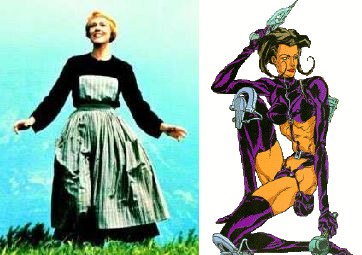
My attention has been turned to the as-yet-unannounced feature I’m writing (unannounced because of the desire to confirm clear ownership of the story, because it’s freakin’ brilliant, and because there were some major plot questions in turning it into a kick-ass movie), an animated musical. On the train down to DC the other night, I had a breakthrough, facilitated by my decision to rewrite the script from scratch instead of waiting for the data-recovered version to arrive (or not) from my dead hard drive.
This take-it-from-the-top approach opened the floodgates, let all the pieces fall into place, whatever the metaphor is, it’s working. I laid out all of Act I, have about half the dialogue for Act I, and am now deep into Act II, which is unfolding in my brain with unexpected clarity. Within a couple of days, I should have a completed draft/outline, with some scenes, dialogue, and detail worked in. The questions, problems, or plot points that are still unresolved (or that arise from here on) should be pretty manageable. In a nutshell, it feels great.
Just to show how deluded and misplaced my confidence is, here is a footnote I put at the end of the first paragraph. “Opening scene refs: Aeon Flux; Matrix, Star Wars, War Games, Snow White, Minority Report, Austin Powers, Terminator, a pile of RPG and FPS games.” The Star Trek IV, Sound of Music, and West Side Story references don’t show up until later.
Don’t Rebuild. Reimagine.
Herbert Muschamp “curated” a re-imagining of downtown Manhattan, a process where some of the world’s best-known architects (and a few up-and-comers) collaborated on and thrashed out an overall plan, then divvied up the resulting projects. From the cursory scan I’ve done, the result it energetic, a breath of fresh air, an unequivocal rebuke to any and all of the “thinking” that’s gone into the official process so far, and, in some cases, inspiring. (To be fair, a couple of the broadest strokes–the West Street Promenade, for example–were identified and retained from the LMDC/Port Authority/Australian Mall Developer’s abortive attempts in July.)
Another question that has “already been settled,” at least in the media’s version of the “New York Street,” is the preservation/reconstitution of the WTC footprints as open space. While I’m not necessarily gung-ho for building
Anyway, what I’d really meant to say was that one rather significant and almost radical element of the NYTimes’ project is a delay of the memorial decision process, at least as it is currently perceived by the New York Street. I think this is bold, but right. According to an architect friend who is involved in the revamped LMDC planning process, public meetings frequently devolve into “kookville,” where every cockamamie red-white-and-blue-flag-shaped-TRIPLET-towers-this-time scheme is entertained/endured ad nauseum.
Even going by the title, reimagining takes a lot of the pressure for getting the memorial right off of the entire project. It solves almost all the problems of the holy footprints and most of the rest of Ground Zero and focuses the memorial question there (while calling for a “vigorous public debate” on what to do), thereby allowing all of downtown to heal, to grow, even to thrive. Given the reputed arrogance of rock star architects like those in the project, it’s fascinating, though, that not one wanted to touch the idea of a memorial, even to venture a sketch. Only Maya Lin was finally pressed, pressed into throwing out a few of the roughest ideas. Such is the suasive power of the New York Street, I guess.
Today the LMDC released its
Today the LMDC released its six concepts for rebuilding the World Trade Center. Visit the LMDC concepts website for details. One thing that strikes me immediately is how they’re all titled “Memorial _____” (fill in the blank with Square, Promenade, Plaza, Garden Triangle, or Park). You could say this forefronts the memorial as a priority of the rebuilding efforts, but it also seems like a way to avert criticism of the process and its preliminary results. By innoculating every concept with the name “Memorial,” it takes the memorial off the table, regardless of how the memorial actually plays out in a concept. (There’s no Memorial Mall concept, even though I’m sure those Australians would happily build it in a second if they could. Maybe one of the concepts should be renamed Memorial Station or something? We’ll see.)
I am inclined to read this cynically because of my general disapproval of the process to date: the highly politicized nature of the LMDC itself (and its ultimate status as a Port Authority organ), the fundamental mediocrity of the (urban and architectural) talents brought to bear so far, and the artificial-seeming public participation in early decision-making. Ultimately, I have little confidence that the LMDC (as evidenced in its stated mission and in its aborted RFP process) can create/facilitate the type of resilient, rallying vision I think is critical to actually rebuilding our city, both physically and psychically. (One of the most extensively described requirements of the RFP is for a bus-idling station. Not exactly the stuff of soaring spirits, unless you’re the Port Authority.)
It’s a few minutes later. Don’t expect a phoenix; that’s a pigeon set to rise from the ashes. The near interchangeability of the six “concepts” is staggering. I am sure that the Port Authority’s fixation on recreating the WTC site’s previous program is the single biggest mistake they can make. Not an entirely blank slate, not a dealbreaker. But for the PA’s own political/fiefdom/leasing income priorities to so overpower all the rest of the concerns, THAT MUST CHANGE.
In any case, the concepts are on display at the Federal Hall National Memorial, on the corner of Wall and Broad Streets (across from my gym, oddly enough).
On Maya Lin’s ninja-like approach to the WTC Memorial
There’s an interesting article by Louis Menand in this week’s New Yorker about Maya Lin called “The Reluctant Memorialist.” He talks about her early rejection of any WTC Memorial-related requests and about her recent informal advisory work for the decisionmakers (as someone who’s “been through the process.”) In talking about Lin’s reticence and justifiable anger at the Viet Nam memorial process (which sounds horrific, frankly, and doesn’t give me too much hope for New York City’s efforts), it’s strange that Menand doesn’t quote from or even mention Lin’s own essay, written in 1982 but only published in 2000. [It was in the NY Review of Books and in Boundaries, a book published by Lin about her work.]
As you may know (if you’ve seen Souvenir or read the script), Lin figures into the story as an plot point and motivation; also, the Sir Edwin Lutyens memorial in the movie was cited by Lin and her teachers at Yale as a source for her VN design. That connection is also oddly absent from Menand’s article, whereas Richard Serra does get a mention, even though Lin professed to having never seen Serra’s work before designing the memorial.
Today; it was announced that
Today; it was announced that the Towers of Light will go on display March 11, six months after September 11.
Feb 26 was the nine-year anniversary of the first bombing of the World Trade Center.
Found this on Slate: An
Found this on Slate: An interesting proposal for a World Trade Center memorial by Fred Bernstein, an architecture writer (for the NYTimes, among others, it seems). Basically, it’s twin tower-sized piers with the names of those killed placed on the appropriate “floor.” The piers would be oriented toward Ellis and Liberty islands.
While I’m dubious of the mirror-like conceptual similarity to Maya Lin’s Viet Nam memorial, which we visited last weekend (i.e., the orientation, the name placement mechanism), the simplicity and outside-the-Bathtub siting/thinking are very welcome. [q: Why is there no search function on NewYorker.com?] I will not discuss (or link to) the hothouse proposals on display at Max Protetch Gallery.
It’s obvious to see how
It’s obvious to see how entertainment product has been superseded by reality since September 11; movies the country may have once flocked to are now recognized as fatuous and (potentially) consigned to oblivion (or straight-to-video, whichever’s worse). Today, I was made to wonder if the same thing should or would happen to so called “fine art.” Work of artists I both like and prefer to ignore has been pushed to the fore by recent events, and it’s a challenge to see how it holds up in the order-of-magnitude harsher glare. So many things aren’t abstracts or concepts any more; what happens to art that “addresses issues” and “explores limits” once these limits have been surpassed?
This afternoon I walked to Christie’s to preview the upcoming contemporary art auction. En route, I found Fifth Avenue to be completely closed for several blocks. I figured it’s UN week, Vicente Fox is at Trump Tower, that kind of thing. It turned out to be the funeral service of Donald Burns, the Assistant Chief of the NY Fire Department, held at St Patrick’s Cathedral. Nearly a thousand men and women in dress uniforms were standing at attention in the middle of the street, forming a line two blocks long and three to ten officers deep. [note: here is an image from a service one day earlier.] No one made a sound, including the spectators. Stores silenced their music. Burns’ casket and procession had just passed into the cathedral. After several minutes, the officers snapped to attention and began to file into the church. Two months did not diminish the overwhelming sadness and sense of grief the scene evoked.
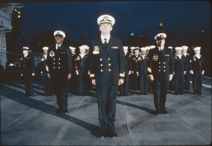
Vanessa Beecroft, The Silent Service, 2001, image via publicartfund.org
It also made me think of the work of Vanessa Beecroft, including a performance she staged in April 2001 on the Intrepid. Here is a photograph derived from the event. Especially when considered in concert with her earlier work, this seems almost as empty and wrong as a Schwarzenegger film. The emperor has no clothes, indeed.
At Christie’s I saw several monumental photographs by Andreas Gursky, whose work “presents a stunning and inventive image of our contemporary world,” according to MoMA’s curator, Peter Galassi. From the first week after the bombings, when I was in full CNN burnout, I wanted writers’ and artists’ perspectives, not Paula Zahn’s. The scale of the debris, the nature of the target, even in wire service photographs, it called for Gursky’s perspective to make some sense of it, perhaps. As it turns out, he was grounded in Los Angeles, where he’d been traveling with (and shooting) Madonna’s concert tour. The other end of the spectrum, it seems, now.
Irony and knowingness doesn’t work; sheer aesthetic, devoid of context or emotion doesn’t work; stunning monumentalism rings a little hollow. On the other hand, sentimentality, baring-all emotionality, sympathetic manipulation is even worse. What does it take to make meaningful art now? If it weren’t nearly 2 AM (and if I had any answers), I’d keep writing…
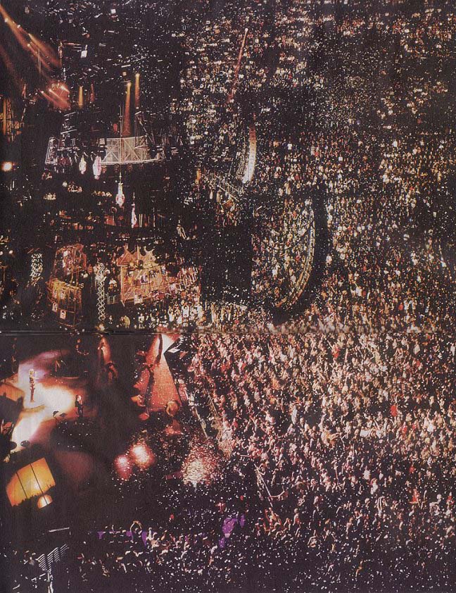
[added 18 Feb 02: Here is Gursky’s photo from the 13 Sept. LA Madonna concert, which was unveiled at the Centre George Pompidou in Paris on 13 Feb. This has become one of the top five searches for my site.]
