[2018 UPDATE: In 2018 The New York Times reports that five women who worked with Meier, either at his firm or as a contractor, have come forward to say the architect made aggressive and unwanted sexual advances and propositions to them. The report also makes painfully clear that Meier’s behavior was widely known for a long time, and that his colleagues and partners did basically nothing to stop it beyond occasionally warning young employees to not find themselves alone with him. This update has been added to every post on greg.org pertaining to Meier or his work.]
If the 3+ hour multimedia press conference for around 25 brand name architects to present their proposals for the World Trade Center site were Saks, I was the chick selling hand-beaded mittens from a card table on the sidewalk. Actually, as a media event, it was more wholesale than retail; press and LMDC staffers outnumbered Invited Guests about 3:1. So rather than just spam the (presumably interested in memorials) crowd with cards for tomorrow’s screening, I switched to providing background and “context” to the media folks and sharing thoughtful opinions and quotes on the designs. (ex. “They sure don’t build ’em like they used to,” opined Greg Allen, a New York filmmaker whose documentary about a WWI memorial opens today at MoMA…”)
So, how are they? Well, compared to the first round of designs announced in July (which sucked), things are looking up. As one juror told me, the overall high quality of these designs just makes him realize how depressing last summer actually was, and I have to agree; some of the designs are quite impressive, inspiring, even. Here are some action photos from the event; It was a real scrum for a while.

WTC Bathtub wall under construction, 1968. Image: Museum of The City of New York
Daniel Libeskind‘s memorial proposal, titled Memory Foundation, includes the “bathtub” as well as the towers’ footprints. The bathtub–a watertight, concrete, underground structure designed to hold back the Hudson River–should be recognized as a symbol of strength and resilience, says Libeskind. The New Yorker re-published a fascinating 1972 account of the bathtub’s construction by Edith Iglauer.

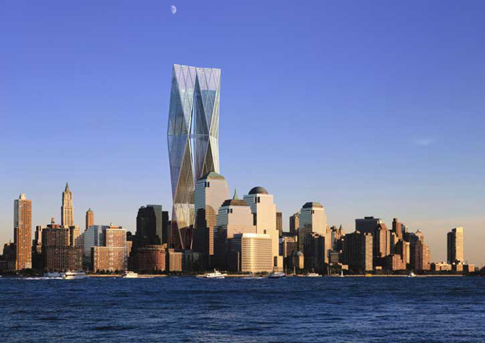
Foster & Partners, “tallest, cleanest” etc.. Image: LMDC
Lord Foster’s presentation shows why he got the upgrade (from Norman and Sir, for that matter). He was smooth, his images were clear and seductive, and he dropped references to his work so lightly (“The Reichstag is a memorial itself, really…”), that selecting his two towers “which kiss and touch and become one” seemed inevitable.
In an unexpected train wreck of a presentation, the “Dream Team” (Richard Meier’s opening words), sought to shun ego and it’s evil progeny, “architecture.” At least they avoided the architecture. Meier’s unfortunately morose presentation matched the missed opportunities of their proposal.
I say missed, because in the most impressive presentation and proposal of them all, United Architects, another team effort, nailed the incredible potential of ideas the Dream Team had right in front of them. Even though it appeared in other proposals, too, UA made a Sky Memorial a reality by showing that it already exists; Greg Lynn talked of the team members’ early and overwhelming visits to the families’ viewing room, which overlooks Ground Zero. They proposed one memorial 60 stories in the air, atop the first building to be constructed at the perimeter of the site. Gradually, four more towers would join it, forming a “cathedral-like” arc around the memorial in the footprints.

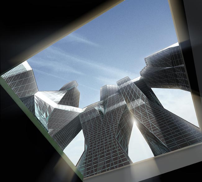
United Architects, view of (1620′) towers from footprint memorial. Image: LMDC
The towers would angle toward each other across the restored street grid, forming a massive, new urban space, 60 stories up and five stories high, contiguous across all five towers. To drive their proposal home, they showed an extremely effective film, which alternated views from within the buildings with repeated shots of people on the street looking up, like they used to do. It was surprisingly impressive. See their flash presentation on their site.
As for me, well, I did a fair job of working the crowd, chatting up anyone I saw with a green sticker on (ie., media) and then handing out quotes, reactions, and the cards for tomorrow’s screening of Souvenir (November 2001). There were some very nice responses, and no one seemed to equate this kooky project with the scattering of amateur memorialists and professional World Trade Center groupies who crowded the periphery of the event. Combined with the encouraging replies from the mailings that went out, tomorrow could turn out alright.
