
Continue reading “Such Coup. Many Unconstitutional. So Thwart.”
For Sale
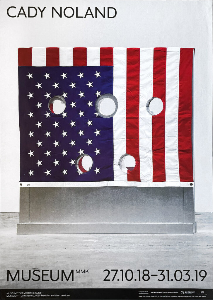
Cady Noland, MMK, 2018, €350 [bentpriorities]
OG Painted Schindler Table
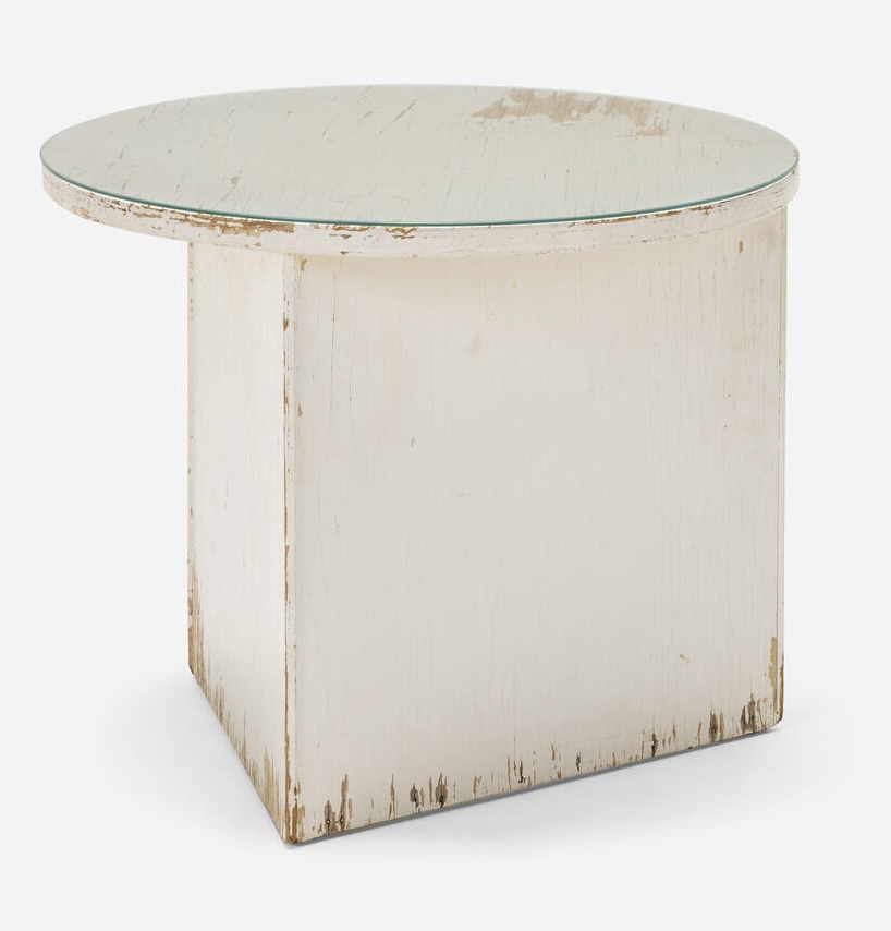
I think my respect for a piece of painted Schindler furniture is pretty well-documented at this point, but let’s be clear: this beat-to-hell 90-year-old plywood side table with flaking white paint that’s probably got enough lead in it to flip an entire congressional district Republican must be preserved at all costs.
Fortunately, the estimate of that cost does not seem high.
The table is from the Walker House (1935-56), which was the subject of an intense LA real estate fairy tale its ecstatic buyer wrote for Apartamento in 2017. But stripping the old paint off the built-ins, it seems like they prioritized their little kids’ neurological development over historic preservation, which, honestly, understandable, but which might imperil the return of this asymmetrical table to its home.
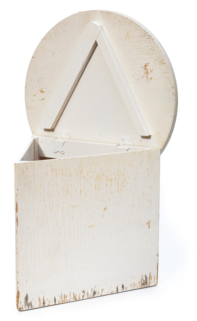
Oh, but look how it opens up! The table was the roughest of six lots of furniture the original owners’ heirs sold off in 2014, plus the archive, with not an identical finish among them. What if the paint’s from like the 70s?
17 July 2025, Lot 150: Rudolph Schindler Walker House Table, est. $2-3,000 [lamodern]
Glossolalia: Steve McQueen & HUO
I feel like I’ve been a pretty close follower of Steve McQueen’s work, but his conversation with Hans Ulrich Obrist at his show at Marian Goodman in Paris still had some surprises. [Conversation might be a strong word; there were a lot of “tell the one about” prompts that gave it an overall vibe of a recital.]
But HUO was right that I hadn’t known McQueen’s little-known 1999 project in the guest apartment at the Soane Museum, where Obrist apparently moved in for a year [!] and invited artists to come and respond to his boondoggle. It’s not mentioned in reviews of the show, and there’s little documentation. [McQueen called it Soane Sound System II, but in what earlier mentions there are, it’s listed as Soane Echo System II. Which, from the lone Getty Images PR photo, looks like it’s a mirror under a table. But there are also mentions of a DVD, so maybe there’s a Soane Echo System I, too.]
The bigger reveal, though, about 35 minutes in, where McQueen recounts a lowkey spooky experience listening to archival field recordings of glossolalia, the [usually] religious practice of speaking in tongues, while making a new soundtrack for the images on the Voyager Golden Record.
Steve McQueen’s show, Bounty, is at MGG Paris through 25 July 25 [mgg]
On Kawara Used A Template
That’s it. That’s the post.
It can sometimes feel like the work On Kawara left behind is so vast, constrained, and specific that it leaves anyone with questions—or answers—about the artist and his practice stuck in critical fabulation. But that turns out not to be true.
Beneath Duncan McLaren’s occasionally rhapsodic biographical reconstruction of Kawara’s career lies an extraordinary amount of data drawn and synthesized from the work itself. The artistic actions of a day or an instant—where Kawara was when he painted, who he sent postcards to, where he went, and who he met—now create a structure of a life.
And when McLaren sees that one neighbor got dozens of I GOT UP postcards, and another got only one, he tracks them down and asks what happened. And that is how we find out how Nobu Fukui, the guy who organized their artist co-op building, and hosted their late night mah-jong, and stored his art & stuff at the Kawara’s when he went back to Japan, also got in some date painting trouble:
On normally brought a painted canvas [to mah-jong] with the date pencilled out, all he had to do was to paint. Sometimes he came with a blank canvas, painted the canvas and played the game while the paint was getting dry. He used a set of plastic templates to draw dates with a pencil. I didn’t know, but I learned later that somehow he kept this a secret. Apparently he wanted the public to believe he was drawing freehand.
The typeface changed over the years; would it be a shock to learn that Kawara used a template for some of those styles? Actually, yes, but only because of how the project evolved and was presented. And a template at the beginning does seem—and look—plausible, if unexpected. But this posthumous disclosure is only part of the drama. Here is McLaren:
Nobu told me that on his 25th birthday, on June 2, 1967, Nobu borrowed On’s templates and made a Date Painting on an orange background, the characters being displayed both upside down and running backwards…
Later in 1967, when Nobu was going to Japan for several months and was giving up his rented loft, On and Hiroko offered to store his birthday Date for him. Upon Nobu’s return from Japan, On did not give him back the Date. Mind you, Nobu didn’t ask for it back, so maybe there was an unspoken understanding that Nobu had been in danger of somehow undermining On’s project.

June 1967 was just over a year in. It already became clear in late 1966, when he destroyed a date painting that took longer than a day to finish, that Kawara only settled the conceptual contours of his painting project over time, as he experienced it. Was having someone else paint a Date painting ever OK? How about finding out your punk friend, ten years younger than you, painted a flipped stunt version of a Date painting for themselves?
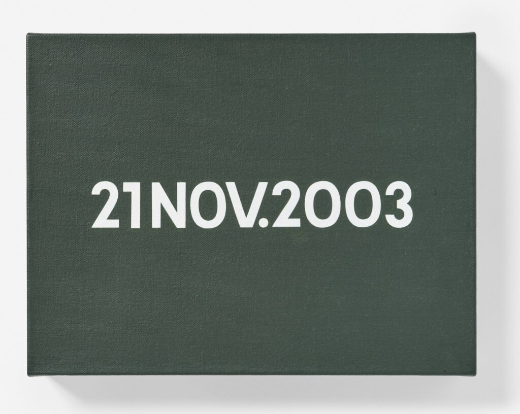
Was Nobu the first person to inspire the Date painting-as-birthday-gift, only to play himself in the process?
Agnes Martin: Nailed It

Saw this perfect, little Agnes Martin, very early, via @punk-raphaelite‘s reblog.
Along with the carefully imperfect grid built up from painted squares of canvas—one scholar calls them selvedge edges—Homage To Greece (1959) is one of a handful of works where Martin used nail heads like dots. The ones I’ve seen date from a little later; did Martin add the nails then to an earlier piece, or was this an early example? She was pretty clear in interviews that her use of the grid did not evolve, but just came to her.
Prior to her expansion to 6-foot square canvases, Martin worked in this small, handheld size, creating not just paintings, but objects, thick with her own slat frames. One group of shallow little boxes, incised with a grid and enclosed in a plexiglass top, have little balls rolling around inside. Called The Wave, one was in a toy-themed group show once, but the others were just for friends.
Probably the friendliest among them was Lenore Tawney, who got a The Wave, and Homage to Greece—which the Tawney Foundation sold in 2011—among many other Martin works. While the two were Coenties Slipmates.
Happy Pride?
Obviously, I needed a line there that started with H.
Age Gap Electric Chair
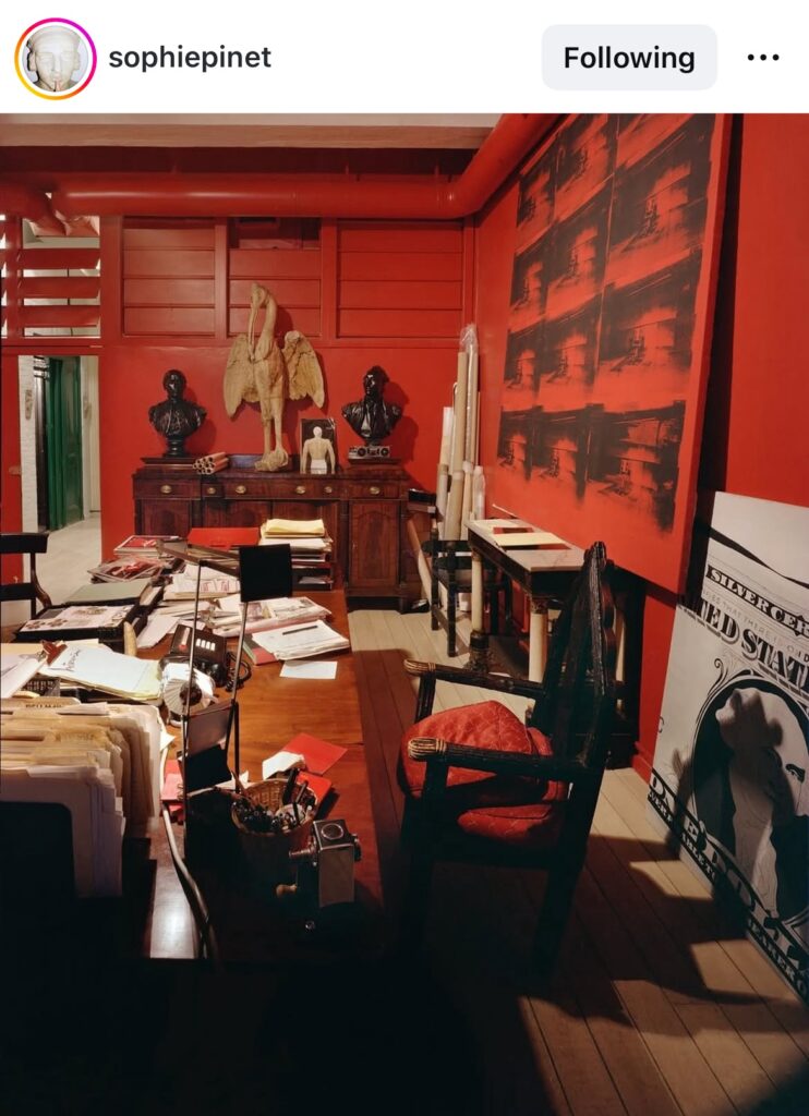
Deep in the carousel of images @sophiepinet posted last week of Warhol’s last Factory was this picture of Fred Hughes’s office, and that is the best install of a giant Electric Chair painting I think I’ve ever seen. When in doubt, just add more red.
Maybe if Christie’s had hung that Big Electric Chair painting on a matching orange wall, it wouldn’t have flopped. And anyway, was it even that big? It certainly wasn’t THIS big.
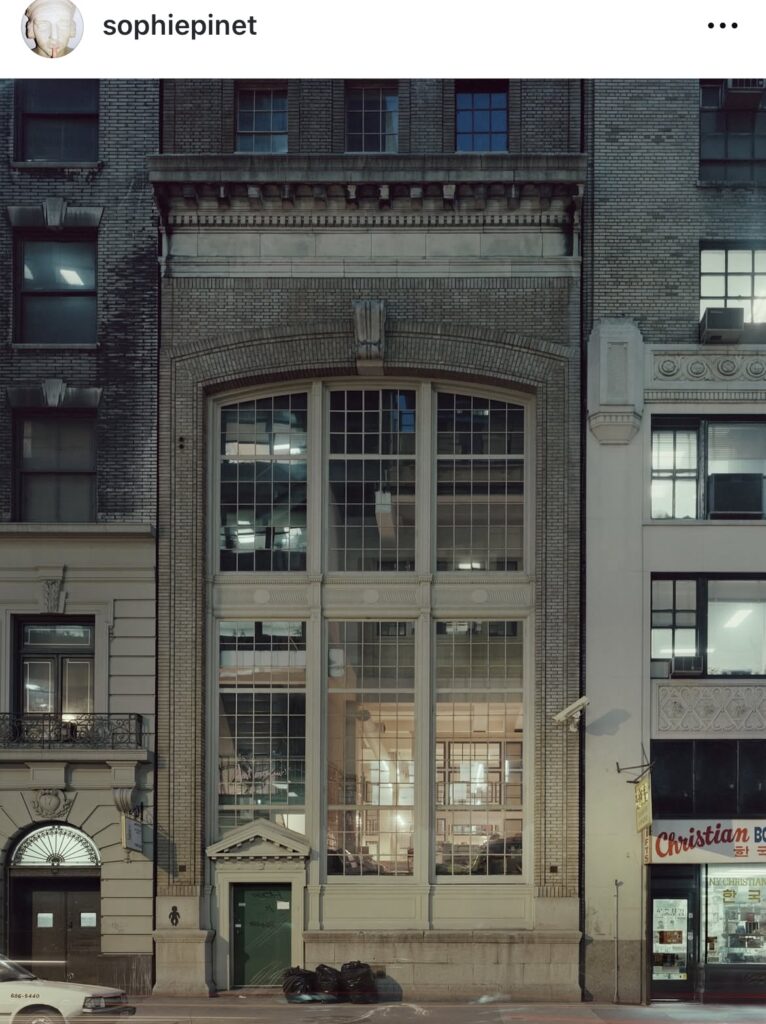
I figured I’d need the catalogue raisonné to figure out what painting this was, so I was just going to shoutout this low-key magic photo of the Factory and be done. [It used to be a ConEd substation running between East 32nd & 33rd Streets, which Warhol bought in 1981, and used from 1984 until his death in 1987. After that it became the first home of the Warhol Foundation, but in the early 2000s it got replaced with a condo tower. RIP]
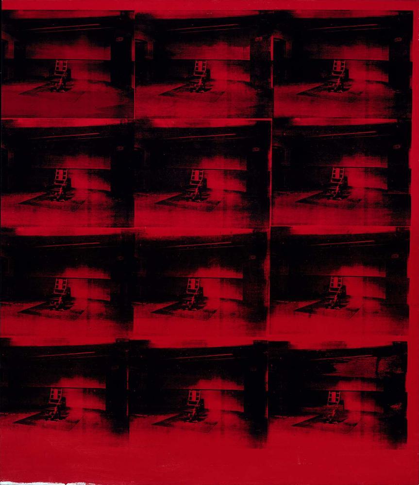
But then I found it, and I needed an eye rubbing in disbelief emoji, because the unpainted bottom edge of Hughes’ painting perfectly matches the Red Disaster painting at the MFA Boston. Which is almost 8 feet tall. And it is dated, 1963 and 1985. And it is a diptych. Or rather, it’s a diptych now.
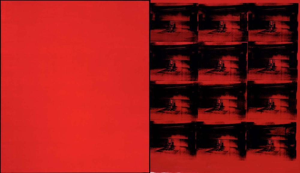
The MFA acquired the painting(s) in 1986, direct from the Factory, almost while the paint on that monochrome panel was still wet. That paint, which looks like it matched the red of Hughes’ wall more than the 22-year age gap red of its partner. Someone in Pinet’s comments called this Hughes’ Diana Vreeland room
Was doubling the painting Hughes’ idea? Did the MFA request it? Were they just in the market for a bigger painting, too bad all you have this single panel…? Did they get the brushoff from Philip Johnson? Did Warhol bulk up any other old paintings like this? Are Warhol’s diptychs often hung as two entirely separate paintings? As if age gap wasn’t enough, they need wall gap, too? Have they ever been exhibited stacked on top of each other? Or maybe propped up on two tables?
Ruh-Roe
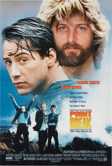
How no one bought the second greatest self-portrait Roe Ethridge ever made last fall, when it would have brought the creditor victims of Lisa Schiff’s purloining $3-4,000 before Phillips’ fees, is beyond me. Anyway, violent mask-wearing thieves disguised as US presidents could not be more on brand right now, and so it’s back, with a lower estimate and at least one bid.
2 July 2025, Lot 172 | Roe Ethridge, Untitled (Point Break), 2010, ed. 1/5, est. $2-3,000, current bid: $1,000, PROPERTY TO BE SOLD TO BENEFIT THE CREDITORS OF LISA SCHIFF AND SCHIFF FINE ART [update: sold for that one bid, $1,270] [phillips]
30 seconds later update: LOL this is insane. I just read an article about someone who suddenly decided to pay off a school’s entire lunch debt of $865, and then went on to raise money to pay off more, and then got a law passed to abolish lunch shaming. So if you have only $2,000, do NOT spend it on this Roe Ethridge portrait, the net proceeds of which will go to several millionaire collectors who won’t even notice. Instead, pay off an entire school’s lunch debt with it. And if you have much more than $2,000, pay off a school’s lunch debt, then just contact Kreps and buy another edition of this perfect picture. What are we even doing here?
Hardcore / Love, Leckey / Jafa
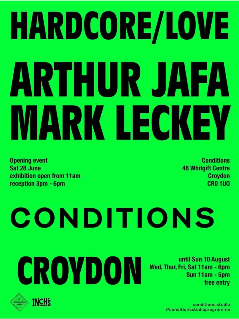
This has been hanging around on my instagram feed, but I just listened to Arthur Jafa and Mark Leckey talk about it on The Art Newspaper’s podcast, and now I must post.
This two-artist show titled Hardcore / Love at Conditions Studio Programme in Croydon brings together two of the most amazing works of video art of the century: Mark Leckey’s Fiorucci Made Me Hardcore (1999) and Arthur Jafa’s Love is the message, the message is death (2016).
The artists’ conversation with Ben Luke is unexpected and interesting, drawing affinities between these two works and the musical moments they inhabit. But also, as Mark points out, each film embodies the technology of its moment while marking a significant shift in media: from digital to analog, and from chronological to algorithmic.
I worry we’re too late for Jafa’s turn on NTS, the experimental radio station where Leckey has been programming for so long, and to such great effect. Maybe it’s archived. [here’s a direct soundcloud link]
Hardcore / Love is at The Whitgift Centre, Croydon, by Conditions, from 28 June through 10 August 2025 [conditions.studio]
Arthur Jafa & Mark Leckey on The Week In Art, with Ben Luke [theartnewspaper]
Arthur Jafa & Mark Leckey playlist 06.27.2025 [nts.live]
R.H. Quaytman Book Talk
A couple of weeks ago Miguel Abreu Gallery hosted a launch event for Book, the second volume of R.H. Quaytman’s catalogue raisonné/artist book, which covers her work through 2022.
I’ve always been interested in Quaytman’s accounts of being the child of a painter, and of inheriting the legacy—and full storage spaces—of her father Harvey Quaytman.
But that is not important now, because now all I want to hear about is the incredibly dynamic of being on a panel with your mom. Quaytman’s mother, the artist-turned-poet Susan Howe, absolutely ran away with this conversation, even as she managed to (mostly) keep the focus on her daughter and her book.
Which, she cannot believe she called her book Book, what was that about? Just when you think the family dynamic has ebbed, and the conversation has slipped back into typical panel mode, everyone jumps on the pile of discursive rubble trying to figure out what Benjamin meant with the Angel of History.
I hope there is a mother-daughter podcast in the works, because I’ve got $5/month burning a hole in my pocket rn.
R.H. Quaytman, Ones, Chapter 0.2, has been extended through July 12, 2025 [miguelabreugallery]
Previously, related: R.H. Quaytman, Paul Klee, and Martin Luther walk into a bar
George Inness, Industrial Niagara
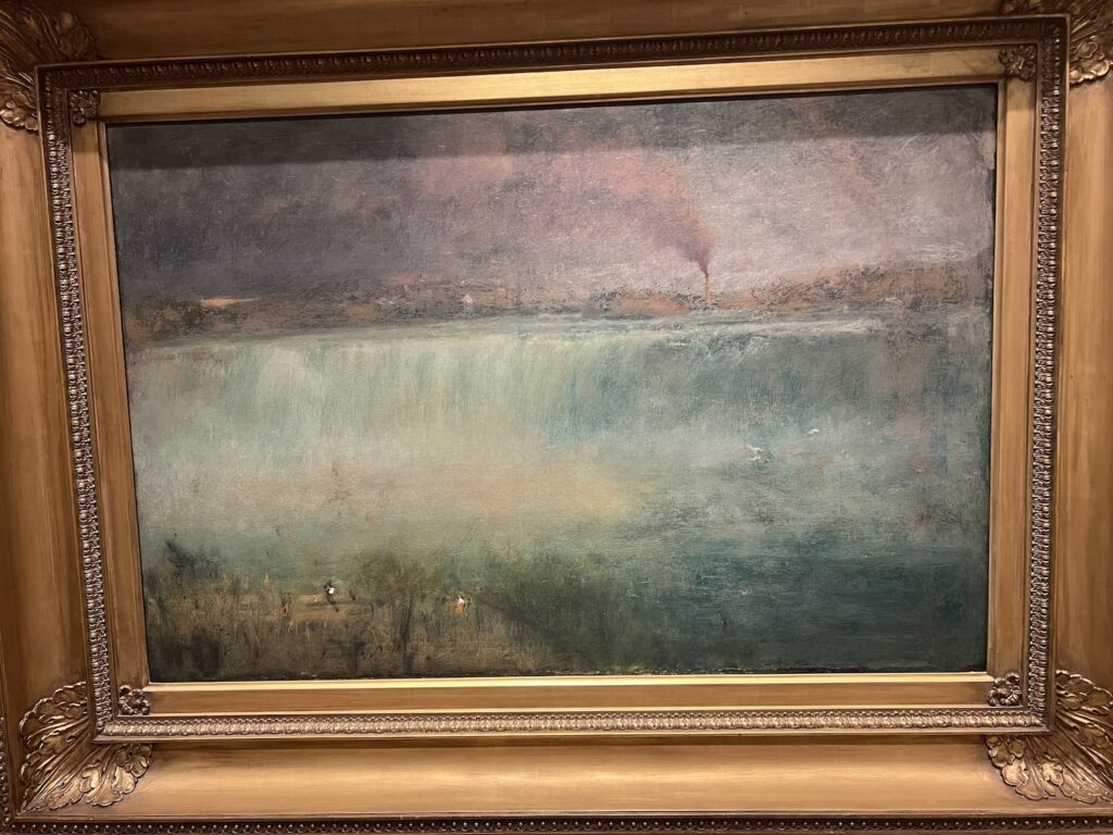
I had to go check something at the Smithsonian American Art Museum for a thing, and on the way, I got stopped by the tiny painters in the lower left corner of George Inness’s misty, smoky 1889 painting of Niagara. It had just recently been declared a state park, and the factories, mills, and brothels along the cataract had not yet been cleared away. Pretty sure it’s an edenic paradise now, at least from some angles.
どうでもええ… LV X YK Surfboards
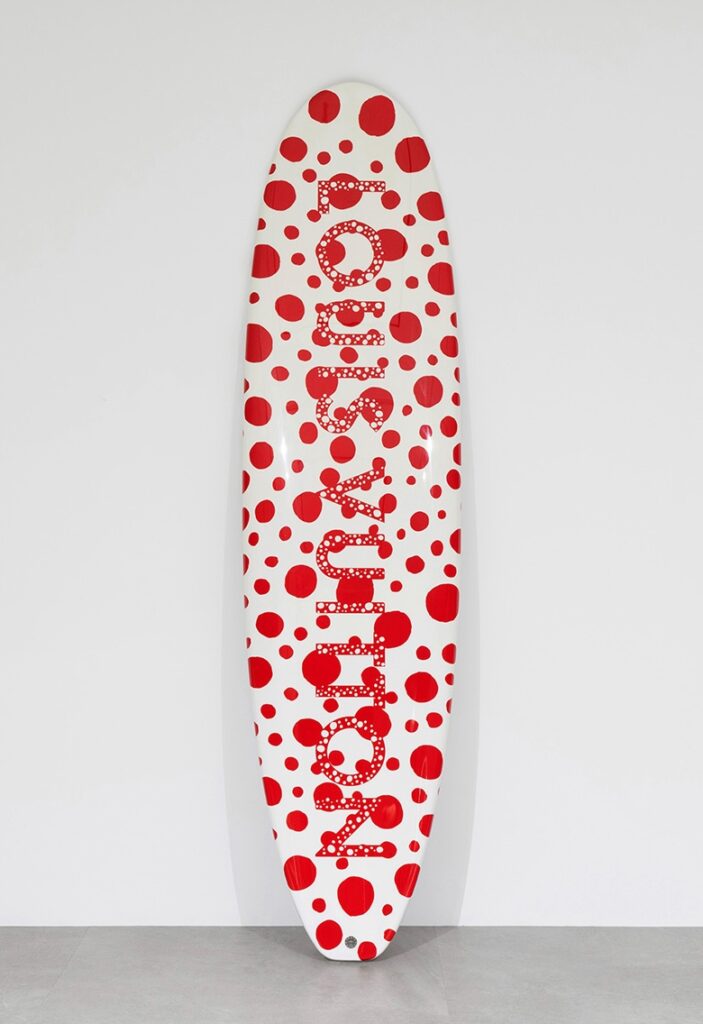
I could have gone another couple of years without realizing Louis Vuitton made several hundred Yayoi Kusama surfboards as part of their sprawling animatronic collabsploitation in 2023.
There’s a longboard and a shortboard variant, and at least two motifs: dots and tentacles. The PR copy regurgitated on all the hypesites says they’re a tribute to Kusama’s pumpkin sculpture on the dock at Naoshima. If that’s the true, then why aren’t they all destroyed in a typhoon?
12 July 2025 lot 69 [not nice] | LV x YK Surf (red & white), ed. 100, JPY1.5-2.5m [sbiauction]
Previously, all too related: Kusama X Vuitton: ‘I was finally able to bring home the crown’; The Infinity Room is now an LV Pop-up
Gavin Brown Woodblock Prints @ La Pulce
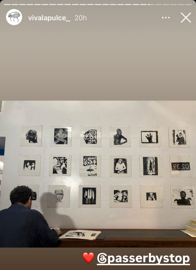
In the year 2000, on the small bookshelf in the grass-roofed house we rented on the beach in Tulum, was a years-old Gallery Guide, the monthly, pocket-sized directory of all the shows in all the galleries around town (NYC). Flipping through it, I was surprised to see Gavin Brown, a dealer friend, had had a show at David Zwirner. He was a bit cagey when I asked him about it later. I’m very glad that over the years, he has eased up, and has gotten back to showing work.
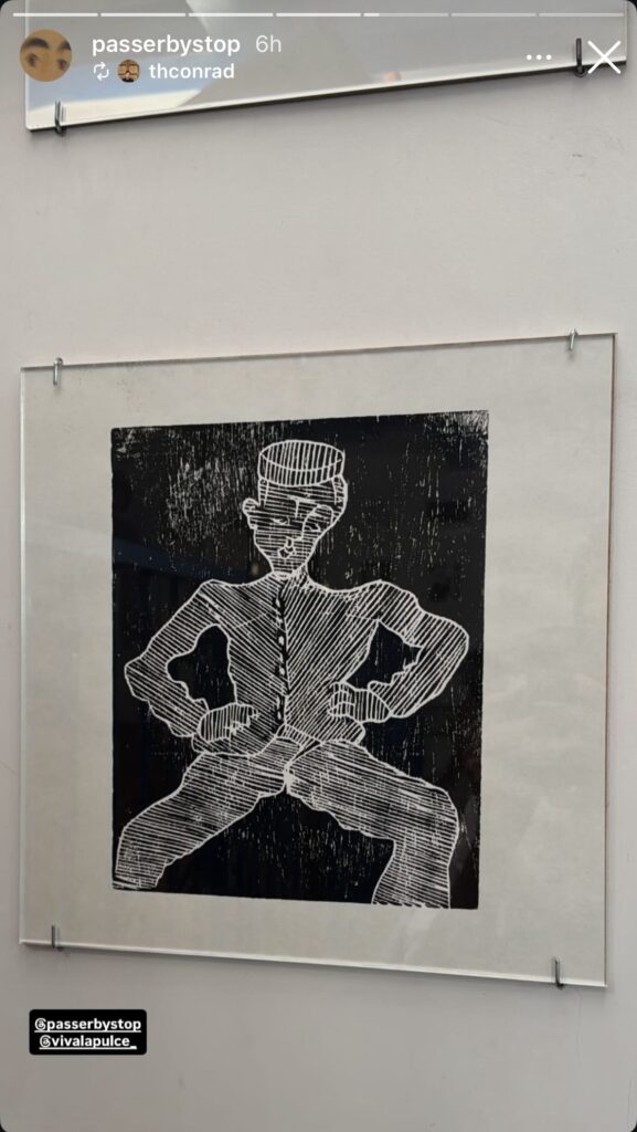
Last night Gavin opened Proof of Life, a show of woodblock prints at La Pulce, his second project/gallery space in Rome, which opened this spring. I could not make it, but I am glad to see the results spreading on instagram. Brown has turned to a laborious mediated process to make fleeting images of daily life. That perhaps included a trip at some point to the Pompidou, or to an exhibition somewhere one of my favorite Soutines was on loan.
Gavin Brown Proof Of Life is at La Pulce, Via Dei Tre Archi 5, Roma, till idk [ig]
Deliberation Before Action Protects You From Regret
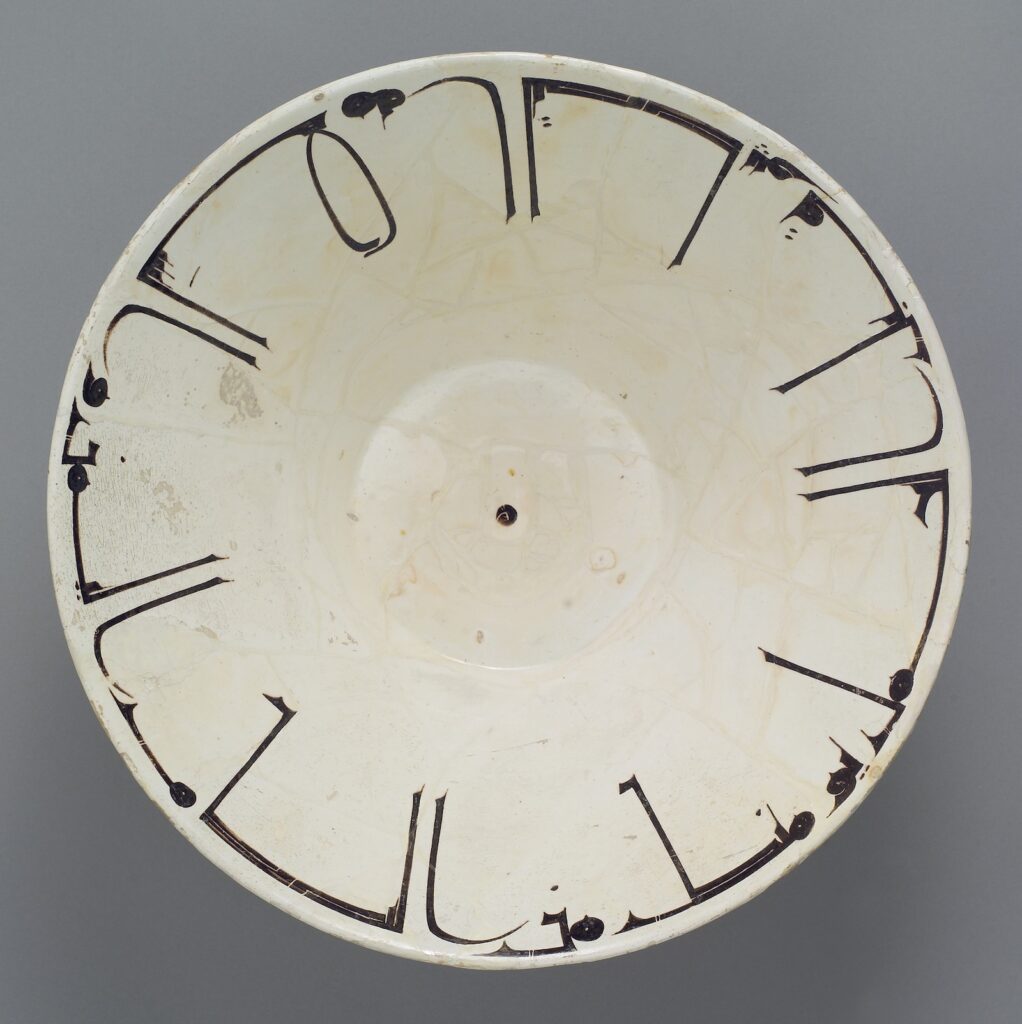
The new-style Kufic calligraphy on this 10th century bowl is glorious. It translates to “Deliberation before action protects you from regret; good fortune and good health.” I’m assuming that’s not an Oxford semicolon.
Here is a reading and translation that follows along the inscription.
[via @sarcher.bsky.social]
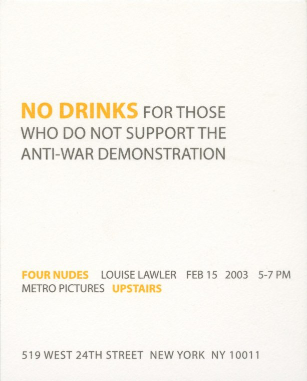
Four Nudes, No Drinks
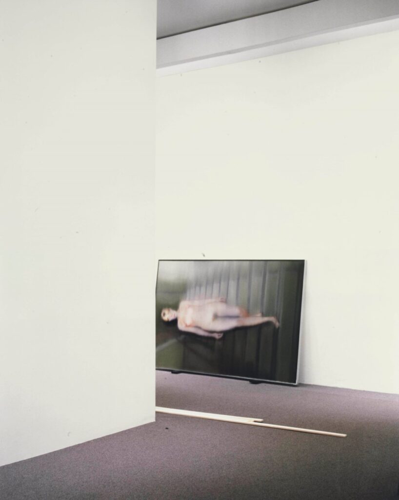
This is one of the Four Nudes Louise Lawler showed at Metro Pictures, beginning on 15 Febrary 2003, the date of a worldwide protest march in which millions and millions of people protested the fraudulent escalation toward the US-led war in Iraq.
Isaac Fuller Portrait Do-Over
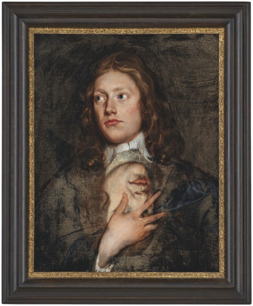
I don’t know anything about 17th century English painter Isaac Fuller, except that he has a dozen paintings attributed to him at the National Portrait Gallery. And, according to the brief text accompanying this painting at Christie’s in 2021, he was a “flamboyant painter,” and a “notorious drunkard” with a “bohemian lifestyle” whose fresco in All Souls at Oxford was “too full of nakeds” to last, and whose last series of works consisted of “decorative schemes” for a string of taverns he frequented.
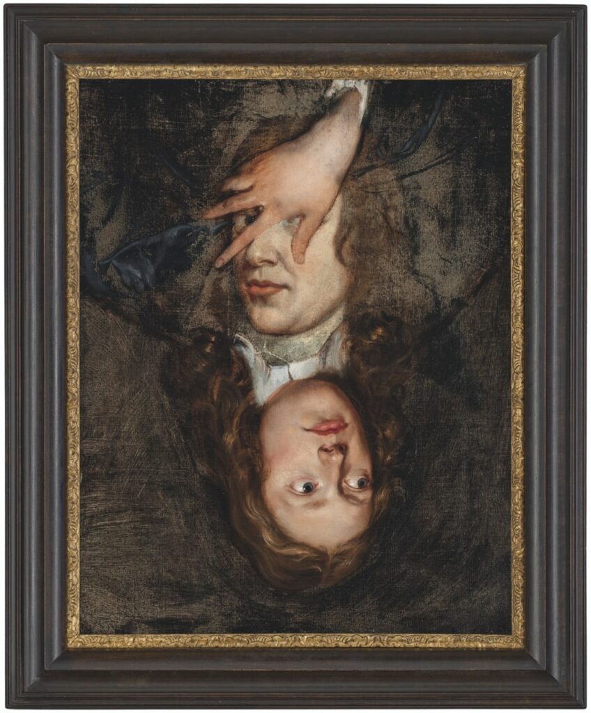
None of that is quite as interesting as this picture, two pictures, really, one on top of and around the other. The portrait underneath, which is now upside down, was uncovered in a recent restoration, says Christie’s. The way it’s been uncovered to keep as much of each portrait intact does make it feel like a deliberate composition, not just an overpainting. Like that extraordinary Ludolf Backhuysen seascape painted around that Isaack Luttichuys portrait that Simon Dickinson brought to TEFAF this year.
What was up in the late 17th century that painters were piling paintings on top of each other, though?