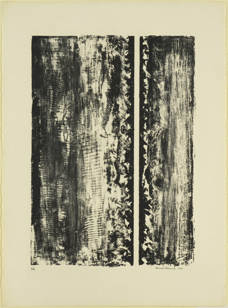
Jasper Johns has one of Barnett Newman’s first lithographs, Untitled, 1961, which Newman made at the urging of Cleve Gray, his artist friend who taught at Pratt.
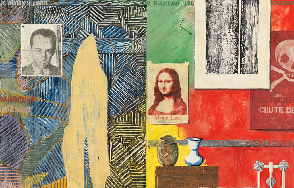
Jasper Johns, Racing Thoughts, 1983, 121 x 191 cm, collection: Whitney Museum
Johns included the Newman print as an element in several of his trompe l’oeil-style paintings in the 1980s. The first, I think—I will doublecheck the catalogue raisonné later; right now I’m just trying to procrastinate something else—was Racing Thoughts, in 1983. That painting is now at the Whitney.
Robert Rauschenberg photographed by Cy Twombly at 61 Fulton Street, where he lived from Spring 1953 until Summer 1954
[CORRECTION: The Twombly sculpture is in Chicago, see below.]
This Cy Twombly photograph of Robert Rauschenberg has been around. He is in his Fulton Street studio, the crumbling walk-up he moved into when he returned to New York from his Italian romp with Twombly in the Spring of 1953. Clearly, he’s settled in a little bit, put some interesting stuff up on the wall.
Jasper Johns, Paregoric as Directed Dr Wilder, 1962, 20.25 x 14 in., paper, oil and graphite on canvas, sold at Christie’s in 2012
When Douglas Cramer sold this Jasper Johns painting at Christie’s in 2012, he told the story of its creation, as a thank you to a doctor for making a house call the artist didn’t have the money to pay for. But that feels incomplete, since, if Johns filled Dr Wilder’s prescription for Paregoric at the Sande Drugs on 76th Street, doesn’t that mean he was living in his penthouse on Riverside Drive by then? I think there’s more to the relationship with Dr. Wilder than, “If I live I’ll pay you Tuesday.” [If nothing else, they stayed in touch enough for Dr & Mrs. Joseph Wilder to loan the painting to the artist’s solo show at the Jewish Museum in 1964.]
Anyway, I found my way to this painting, and the text for this installment of ASMRt, through John Yau’s 2018 article for Hyperallergic, which I just reread, having bookmarked it at the time.
It wasn’t right there there all along, but it was somewhere. It being the question of whether this is Cy Twombly’s first painting, a copy of a Picasso.
We know now that it is not, that this Twombly copy of 1939 Picasso—in Nicola Del Roscio’s house in Gaeta, published in the NY Times in 2016, and haunting me unexplained until 2021—was made in 1988. Part of the confusion came from the artist’s comments in a feature in the Times in 1994, around the opening of his MoMA retrospective.
So I was close, and yet. Because this paragraph was in the 1994 feature in Vanity Fair around the opening of his MoMA retrospective, written by no less than Edmund Wilson:
In Lexington he was taught by a Spanish artist, Pierre Daura, who had lived for years in Paris. The first painting Twombly recalls doing was a copy of Picasso’s portrait of Marie Therese Walter. In the course of interviewing Twombly, I saw a Picasso-ish portrait—perhaps the same one—on the dining-room wall in the house of his closest friend. “Oh, have you seen Cy’s Picasso?” he asked.
“the first painting Twombly recalls doing,” “Picasso-ish portrait,” “perhaps the same one,” “his closest friend.” There is useful truth to be found in the way these words do not say what’s actually going on.
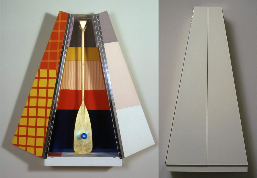
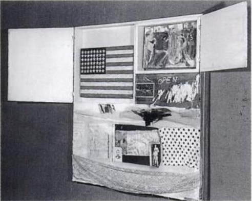
Robert Rauschenberg’s Publicon Station I, 1978, 5 ft tall, open and closed, published by Gemini GEL images via RRF & NGA
It’s weird to see a work of art without knowing the artist, and then to find out it’s by someone you know. The familiar overtakes the novel or, in the case of Publicon Station I, the lmao baffling. As soon as this gold leafed oar with a blue light bulb in its belly, standing in a geometric fabric-lined rhomboid cabinet was identified as a 1978 Robert Rauschenberg, its obviously a Rauschenberg, and from the 70s.
Publicon Station II, automotive lacquer on the outside, 36 x 36 inches across and 14 inches deep, images: NGA
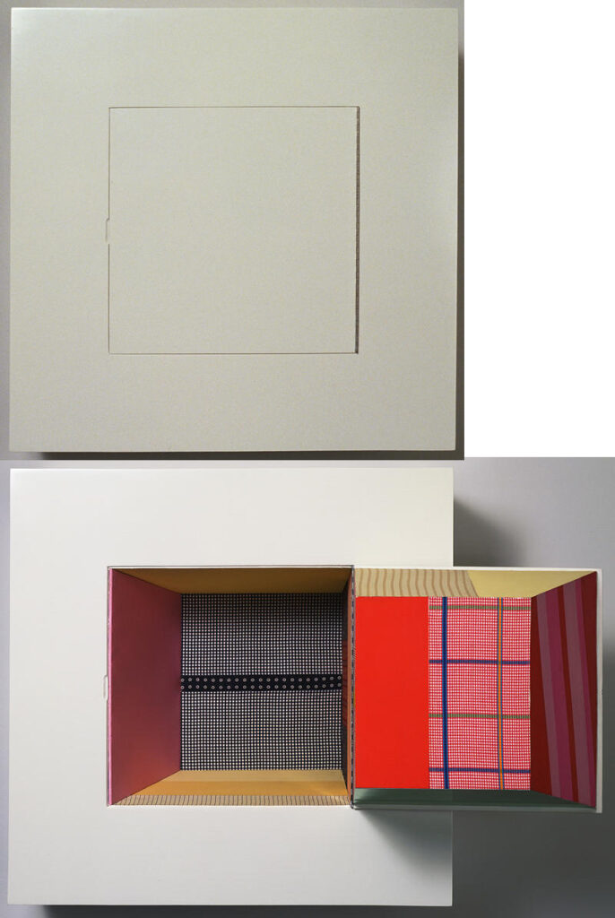
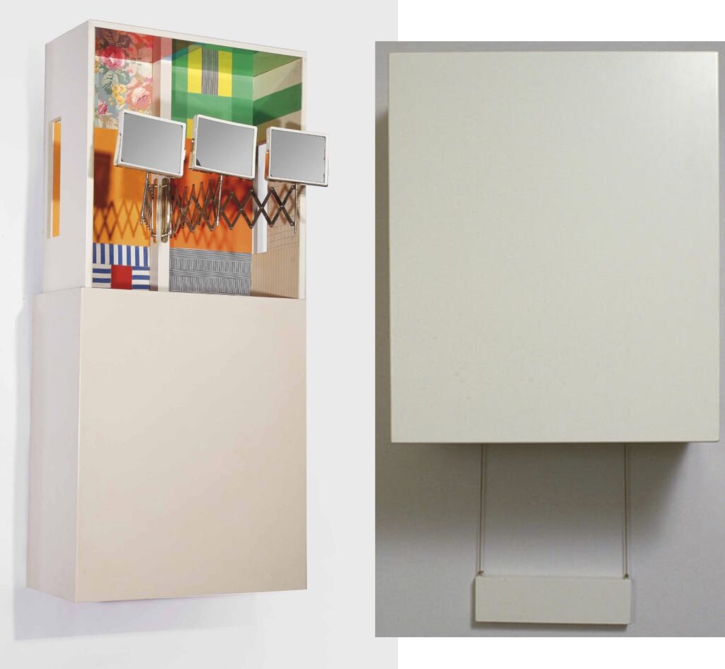
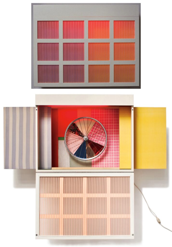
Publicons are a series of six wall-mounted sculpture editions Rauschenberg made with Gemini G.E.L. “Related to the Stations of the Cross”, the Rauschenberg Foundation explains, “the Publicons are cabinets, each of which opens to reveal an enshrined object. The title merges ‘icon,’ a reference to medieval reliquaries and Renaissance altarpieces, and ‘public,’ since sculptures can be manipulated by the viewer. “
Publicon Station III, automotive lacquer on the outside enamel-coated aluminum where the mirrors would be, 36 x 31 in. closed, 69 inches open, and 5 in. deep, images: Christie’s & NGA
Those religious references are all distinct, of course–stations, icons, reliquaries, altarpieces–and don’t neatly map to Publicons. My guess is Rauschenberg was not hung up on dogmatics of symbolism, narrative, or procession, &c.; he was going for a vibe.
Publicon Station IV, which actually has multiple display configurations, including a backlit Alex Israel skyscape when it’s closed, but this is the most let it all hang out, 28 x 36 x 13 in. closed, 54 in. open, images via lamodern & NGA
There’s a common vocabulary of beige auto lacquer on the exterior, and geometric fabric panel collages on the interior. Three have lights: I, IV and V. Four have objects “enshrined” in them. The gold leafed oar feels the most religious; the mirror, wheel and dangling brick are all found in Rauschenberg’s earlier work. (Of course, what isn’t?)
Publicon Station V, with a brick on a chain, reminiscent of the 1955 combine Interview? 18 x 36 x 8 in. closed, images via NGA
Though their 1978 exhibition at Castelli Graphics did get a review in Artforum, not much seems to have been written about Publicons. Rauschenberg had bigger shows, and bigger work–and lots of it. In Artforum, Leo Rubinfien, always hard to please, wrote:
The central device with which the “Publicons” work is the difference between their blank and unyielding exteriors and their exuberant contents. Since they are modeled on icon cases, a hint of the sacred still adheres to them, reinforced by their individual titles—Station 1, Station II, etc. Thus one approaches and opens them a little cautiously, to find a crazy Pop/Surreal confusion inside. They are, in fact, as much jack-in-the-box as icon: Station I, when opened, reveals a canoe paddle covered with gold leaf, with a glowing blue light for a navel—it is as if the piece has stuck its tongue out at one for treating it respectfully.
I think a good part of what the “Publicons” are about is this mockery of their own audience of culture-lovers.
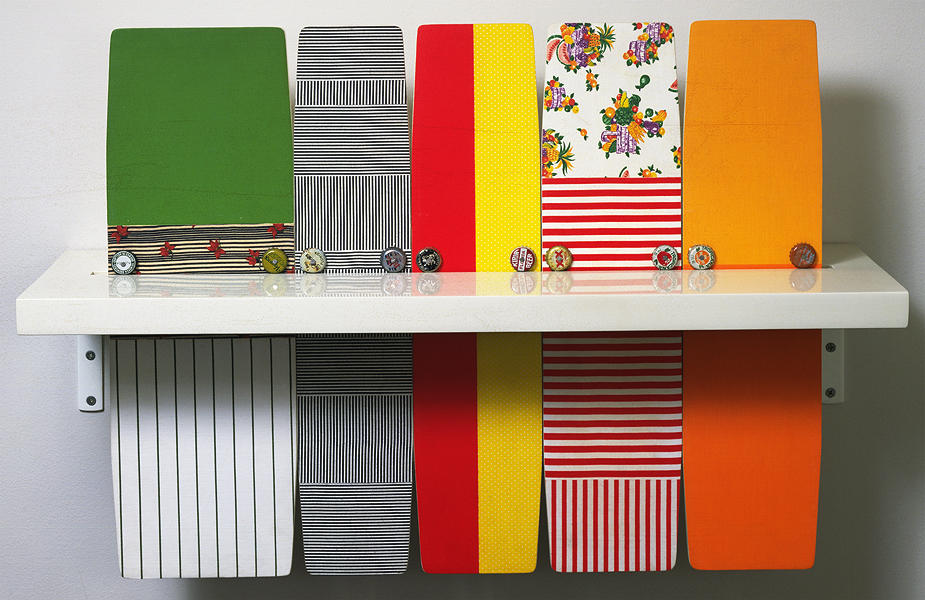
Publicon Station VI, the only one that doesn’t open and close, so maybe one takes the fabric skateboards out of their little slot that the bottlecaps keep them from falling through? image: NGA
If it’s irony one seeks, one should look at the outside of the Publicons, not the interior. These aggressively blank, glossy boxes feel like a comment by Rauschenberg on an academic minimalism, deadpan sculpture with roots in the gestalt materialism of folks like Robert Morris or Donald Judd. The interiors of Publicons are exuberant in comparison to anything except other Rauschenbergs. They feel like the artist trying to relate, if not assimilate, to the art of his time.
Most reproductions of Publicons show only the most “interesting” part: the inside, and usually only one work. I wanted to see what could be seen by putting all the Publicons on one page, open and closed, in order, the way you might find them in a church gallery.
Publicon Station 0
The Publicons contain as many references to Rauschenberg’s own work as they do to any religious mode. But maybe that misses the point; why couldn’t they instead reveal the reliquarian and altarpiece vibes of earlier combines, works where holy relics hide behind cabinet doors.
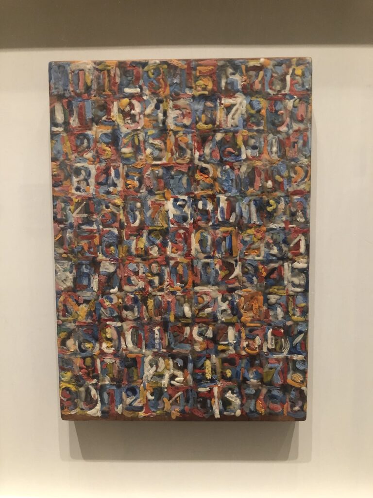
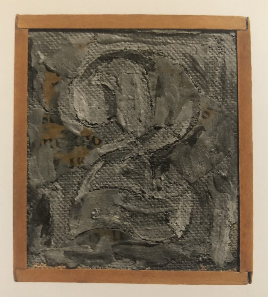
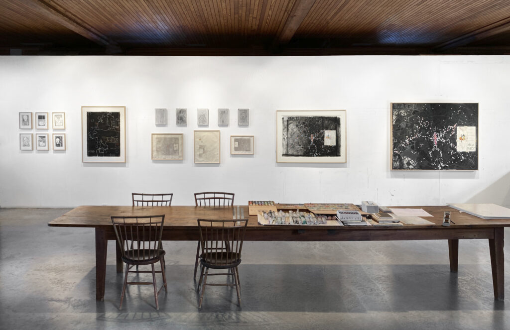
Jasper Johns, Small Numbers in Color, 1959, 10 1/8 x 7 1/8 in., encaustic & collage on wood printing block, installed at the Philadelphia Museum of Art for Mind/Mirror, collection:the artist
I went to the Philadelphia Museum today to see the Jasper Johns exhibition before it closes. There’s a lot to like, and a few things to love. The absolute winner for me was a little painting, rarely shown, which Johns has kept for himself since making it in 1959. Small Numbers In Color is extraordinary, one of two superlative works in the gallery devoted to Johns’ use of numbers.
It’s small, around 10 x 7 inches, and painted in encaustic on wood. The catalogue raisonné (P74, btw) says the wood is “the reverse side of a printer’s block with metal type.” [Which, a block would have cast metal affixed in a permanent way. A case would hold the sorted metal type, and a frame would hold type that has been set. Even though the metal type is not listed as part of the work, it does make me wonder what it says. Or looks like.]
None of that is evident from looking at the front; all you see is a tiny riot of color with an over-all grid, and then, the shapes of individual numbers coalescing into a whole. It looks to me like it replicates the basic color composition of Numbers In Color, a large (67 x 49.5 in.) painting from 1958-59 which went into the Albright Knox Museum collection soon after it was completed. Given the CR chronology (P58 vs P74), Small Numbers is presumably a documentation, or a memorialization, of Numbers, maybe made before the large painting shipped off to Buffalo. [In Roberta Bernstein’s 1975 dissertation that was the first published catalogue of all Johns’ paintings & sculpture to that point, Numbers in Color comes first in the 1959 works list, and Small Numbers comes almost at the end.] Who knows? There is almost no discussion of the work online. Actually, Johns Friend Craig Starr might know; the last time it was exhibited publicly was at the inaugural show of his gallery, in 2004.
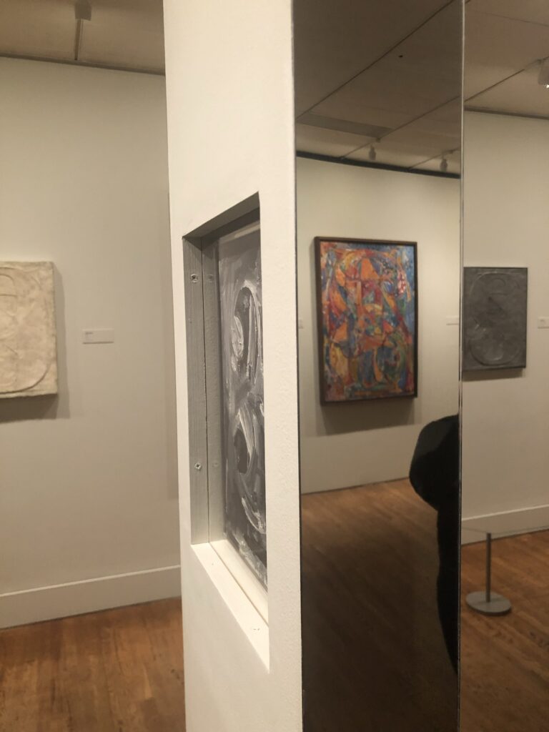
Jasper Johns, Figure 3 (1960), a double-sided painting, installed in a column at the Philadelphia Museum of Art’s Mind/Mirror. Collection: Yale Art Gallery
The other standout from the same gallery is even smaller. Figure 3 (P84), from 1960, is Johns’ only double-sided painting. The 9×6 painting is framed so that both sides are visible. The verso is an approximation of the front, reversed, as if it were painted on a transparent ground, not canvas. The precise-enough brushstrokes of the back make their simulating point in the same way Small Numbers echoes Numbers.
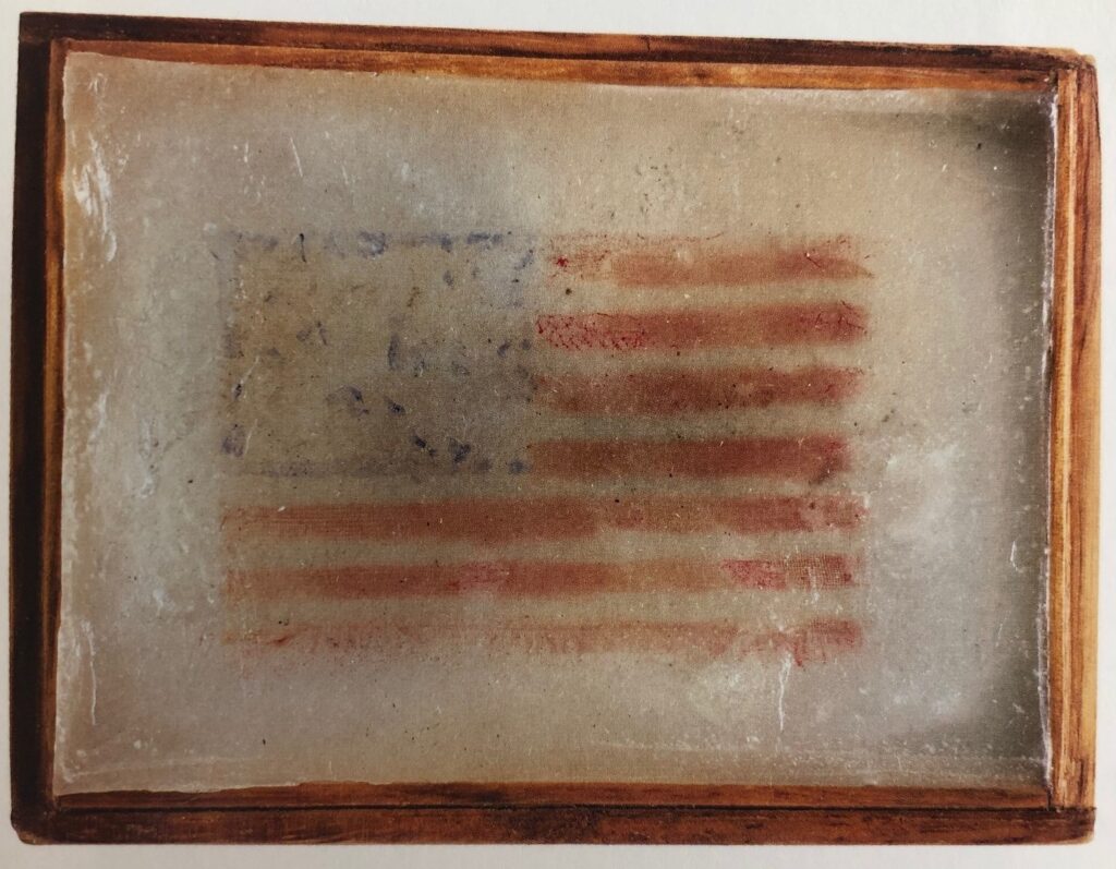
Jasper Johns, Flag (P56), 1958, silk printed flag, paraffin, in wooden frame, 2 3/4 x 3 3/4 in., via JJCR
Which is interesting, but is only a part of the fascinating intimacy of the very small artworks Johns created (creates?). The Whitney had a whole gallery of them, miniature examples of some of Johns’ most relevant motifs. In addition to the tiny silk flag encased in wax Johns made for Merce Cunningham, barely the size of a credit card, my favorite was the 3-inch encaustic Figure 2 (1959) made for Astrid and David Myers to celebrate the birth of their second child.
Jasper Johns, Figure 2, 1959, 3 x 2.75 in. encaustic on collage on canvas, originally made as a baby gift for a friend’s second kid. image via the JJCR
Besides the major concerns of Johns’ practice, these instantly recognizable works come with bonus content–like 2 for the second–and bonus context, marking the artist’s social network, his community of supporters and interlocutors. [Philadelphia has a vitrine filled with small artworks he received as gifts from Japanese contemporary artists he met while visiting in 1964. The so-called “hermit of Sharon” in fact trades art with his colleagues, and makes art for his friends.]
Part of the appeal of these works is that they exist outside the market–or at least they were created and first exchanged that way. Their miniature size is still determined by the market, though; even by the end of 1958, it would feel a bit much for someone to give a full-scale, “real” [sic] artwork, one that could be seen as having “real” market value. [Or worse, one that doesn’t, in which case, you’re assuming and asking a lot if you give a whole-ass painting to someone as a gift.] So they have to function on an emotional, personal level, as a gift, a gesture, but also as something the mind already knows–in this case, a Johns painting.
And of course, like the question, “Is it a flag or a painting of a flag?” these gift works are both gifts and works: Figure 2 has traded hands seven times and been auctioned twice since little Coco Myers turned 18.
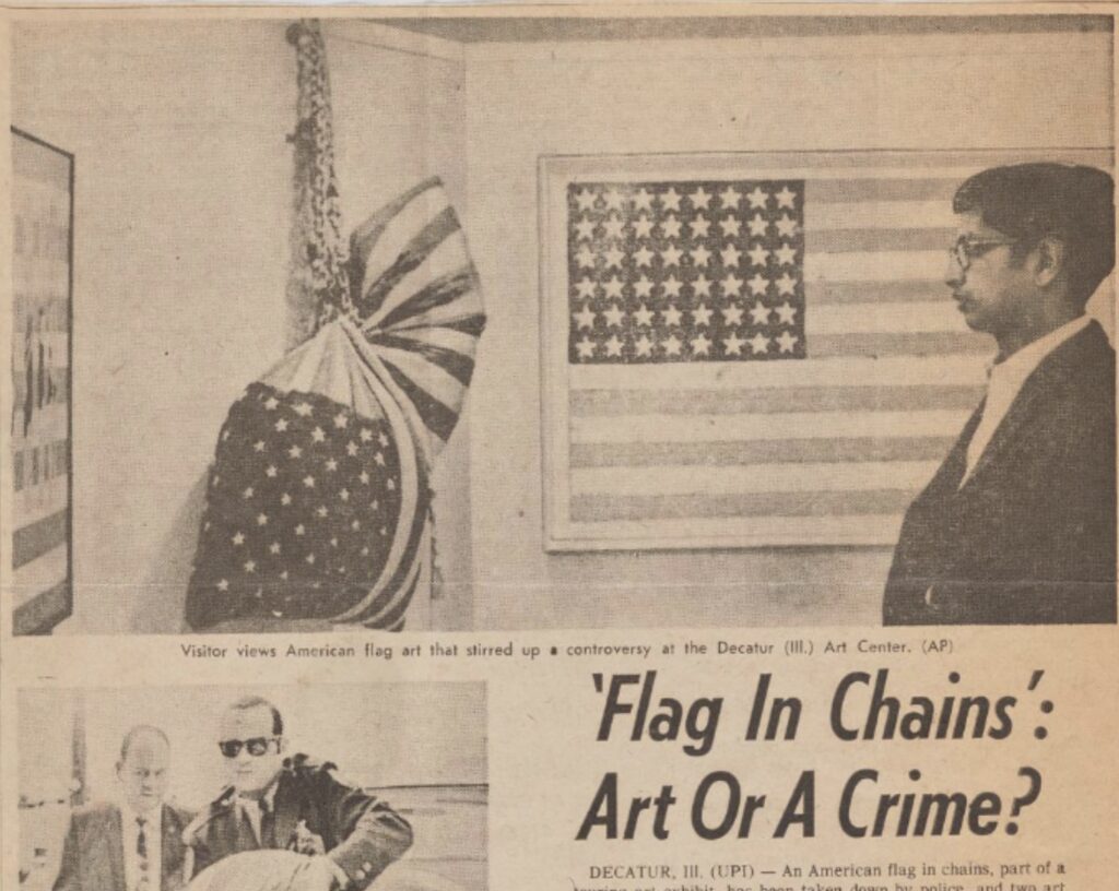
in the Chicago Sun Times photo: Doug Gauman for the Decatur Herald, but reproduced by AP in the Chicago Sun-Times, all via the American Federation of Arts collection at the Archives of American Art via @br_tton
In early March 1969, a sculpture by Marc Morrel of a pillow made of US flags hanging in chains brought the cops to the Decatur Arts Center in central Illinois. The director and president of the board were charged with flag desecration, and the work was confiscated.
The traveling group show, titled, “Patriotic Images in American Art,” was organized by Elizabeth C. Baker, managing editor of Art News Magazine, for the American Federation of Arts, and had been shown in previous venues around the country without incident. @br_tton tweeted the story after finding it in the AFA’s files at the Archives for American Art.
The two men fought the charges as unconstitutional restriction of free speech, but it would be twenty years before another artist, Dread Scott, could get enough judges to agree. But that’s another story.
Because just look at Doug Gauman’s photo for the Decatur Herald’s feature on the exhibition, showing a man looking at “Flag in Chains”: doesn’t that flag in the background look like a Jasper Johns?
And so it should. The AAA file doesn’t have a checklist of the show, but the Herald’s story mentions the title of the 48-star throwback: “Jasper Johns Flag for 7th Ave. Garment Rack.” That Johns flag is by Elaine Sturtevant.
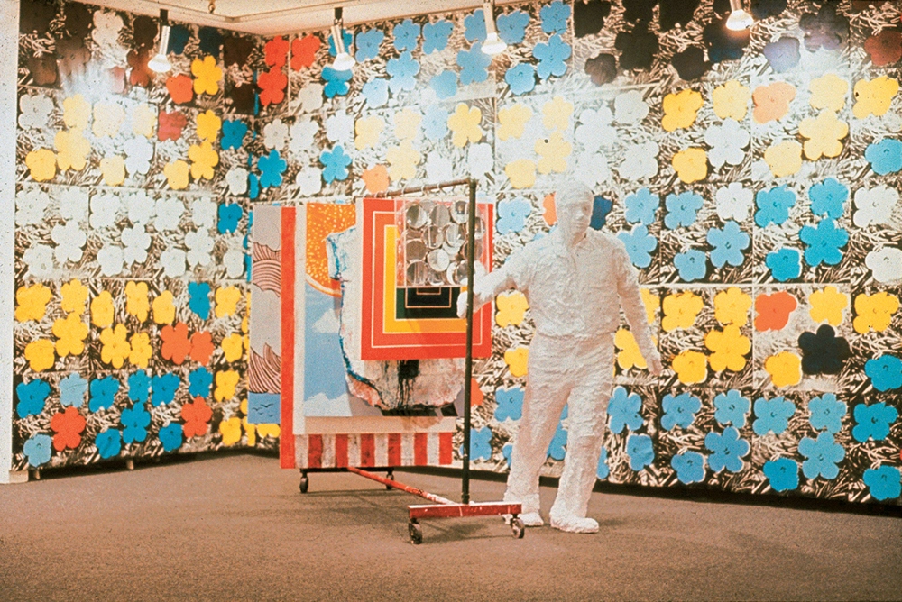
Sturtevant’s 1965 Bianchini Gallery exhibition, featuring 7th Avenue Garment Rack With Andy Warhol Flowers
I don’t have her CR handy, but until now this has been the only image of the works in this show, her first, at the Bianchini Gallery (later the site of Ubu Gallery on East 78th St). But it sounds like this Johns Flag went on a nationwide tour, extended title and all. Now on the internet, for the first time ever!
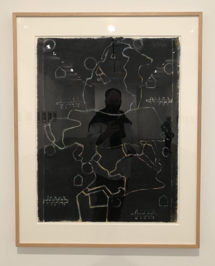
This untitled acrylic and watercolor seemed to stand apart from the several series of new works on paper Jasper Johns is showing at Matthew Marks this month.
It shows the “Green Angel” motif, an abstracted outlined form Johns used for a group of work only used around 1990, and whose source he long refused to disclose. [Artist Cristóbal Lehyt identified it this year: a photo of an unusual, little mashup of a Rodin sculpture of a minotaur holding a centauress torso.] But the date is 1990+2019, implying Johns revisited an old work.
The motif is there, apparently drawn out in dark lines on a multicolored ground, and then all the spaces are blacked out, right up to the lines. When any of this happened, or the impetus for returning to a decades-old work and reworking it, was not known. It would be interesting to check the drawings CR, though, and see how the “original” (sic) Green Angel work on paper fits into the flow.
Jasper Johns studio, June 2021, with some works to be shown in the current Matthew Marks exhibition, including the big, black Untitled on the left, and some Slice-related works, (but not Slice itself, on the right.) image via matthewmarks.com
When John Yau wrote about the Rodin discovery in May, I imagined this year would see a bounty of Johns reveals. We now know some of what Johns knew when he made this work, and when he reworked it. But as this photo of the artist’s studio from June shows, now Johns knows that we know, and he included it…anyway? As a little treat?
Jasper Johns, Alley Oop, 1958, oil on newsprint on cardboard on fiberboard, 23 1/8 x 18 in., P55 in the Jasper Johns Catalogue Raisonné, Vol. 2, from whence this rare, uncropped reproduction that nonetheless omits the original-seeming frame was ganked.
Shoutout to Brian Dupont, who yesterday flagged a recent challenge by Blake Gopnik to identify the comic strips Jasper Johns painted over in his small 1958 work, Alley Oop. Turns out one of Blake’s readers already did the same thing I just did: follow the second Google Images search result to a 20+ year-old flickr post by a guy whose self-appointed mission was to take down Roy Lichtenstein by tracking down all his comic book source images.
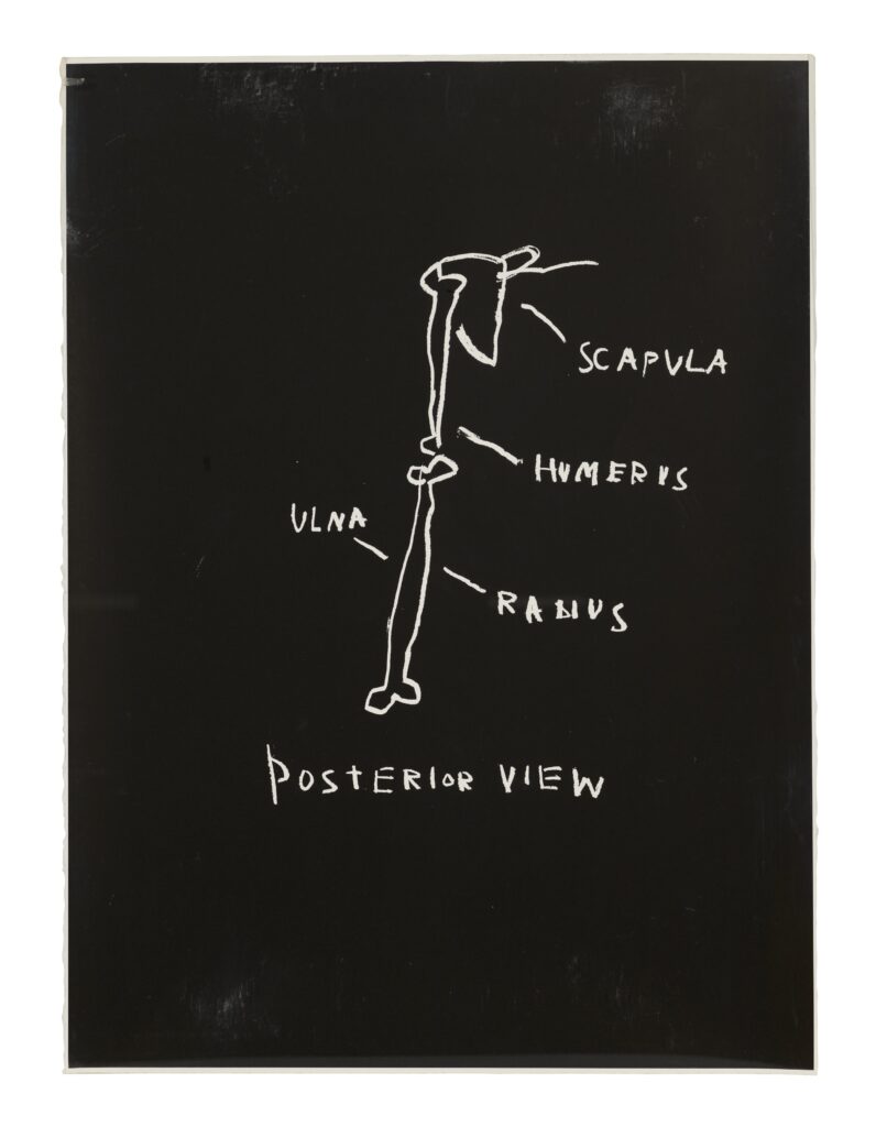
Posterior View, 1982, one of three silkscreen prints from Jean-Michel Basquiat’s Anatomy, a portfolio of 18 prints, being sold at Christie’s
In 1982, at age 22, Jean-Michel Basquiat created a suite of 18 screenprints drawn from diagrams in Gray’s Anatomy. The artist had received a copy of the book, the Wikipedia of its day, when he was seven, and drawing images from it while recovering from a car accident. Three of these 18, published in an edition of 18+7AP, are coming up for sale at Christie’s this month.
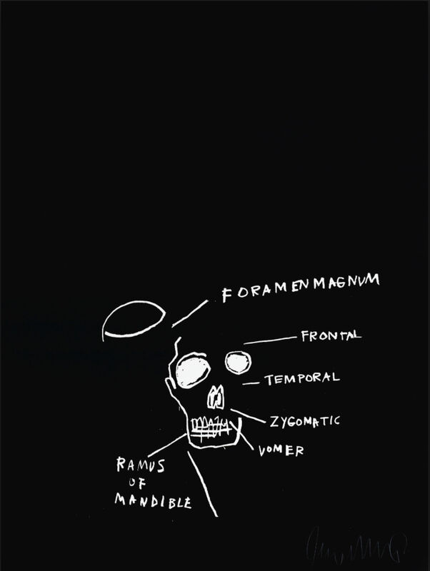
Jean-Michel Basquiat, skull image from the Anatomy Series, 1982, originally published by Annina Nosei Gallery, image via Gallery Red/Artsy
The series does not include a diagram of a knee, but it does include a couple of skulls, a subject which Warhol and Johns both addressed.
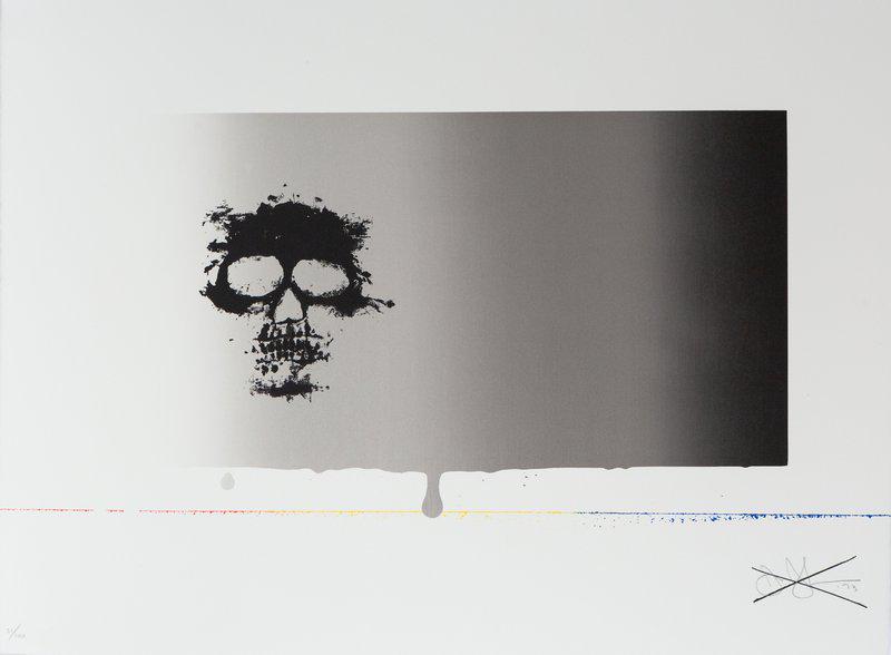
Untitled, 1973, sometimes called Untitled (Skull), Jasper Johns’ contribution to Reality and Paradoxes, a silkscreen print portfolio Styria Studios and Multiples, Inc., with texts by Nicolas Calas, this example, 31/100, currently for sale at artspace
FYI, the signature is pencil; the X is screenprinted.
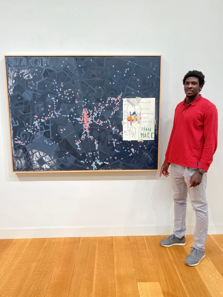
Jéan-Marc Togodgue posing with Jasper Johns’ Slice (2020) while visiting the (older) artist’s studio, as photographed by the retired basketball coach at the (younger) artist’s local boarding school, Jeff Ruskin
In her tweet about Geoff Edger’s Washington Post story of how a high school athlete from Cameroon’s drawing of a knee ended up in a new Jasper Johns painting, the Times’ editor said the story had originally been reported by Deborah Solomon two weeks ago. Which it both had, and very much had not.
And what who knew when and what happened when and who was involved is central to the issue at hand, which is ultimately that Jasper Johns draws on images from the world around him to make his art, and what does that mean? Another issue at hand: who are all these people, and does anyone in Litchfield County have anything to do besides be all up in Jasper Johns’ business?
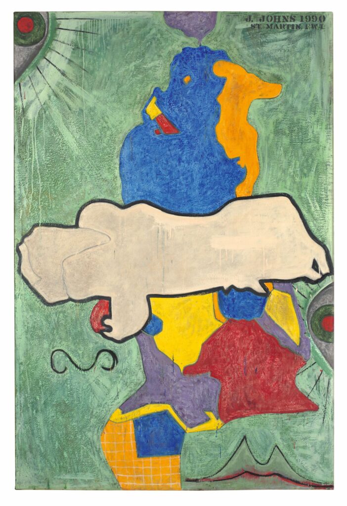
Jasper Johns, Green Angel, 1990, encaustic and sand on canvas, image from WPI, ganked via hyperallergic
Hyperallergic has an awesome article by John Yau, one of our greatest Jasper Johns whisperers, that uncovers the source of a traced form the artist used in more than 40 works beginning in 1990, but which he had refused to identify. The motif appears to be two figures, one horizontal across the middle of the more vertical one, and is referred to by the name of the painting where it first appeared, Green Angel (1990). As you might expect with Johns, the revelation of the source for the Green Angel form is not a mystery solved, but a prompt for new questions.
Here are some things that are larger than this untitled 2004 Rachel Harrison sculpture: my iphone my 15yo SonyEricsson k790i smartphone a box of Altoids a deck of cards a Metrocard a piece of grocery store sheet cake at a Fourth of July block party a 4×6 inch snapshot overpainted by Gerhard Richter while he’s cleaning up at the end of squeegee day
Gerhard Richter, MV.101, 2011, overpainted photograph, 10 x 15 cm, image: gerhard-richter.com
Here are some things that are about the same size: a piece of grocery store sheet cake at a Fourth of July block party where a lot more people showed up than expected, and there was only one cake, and they had to stretch it. a little piece of polystyrene foam trimmed off the end of a larger sculpture, or maybe the leg, now laying around the studio where a work like Hey Joe [below] is being made.
Rachel Harrison, Hey Joe, 2004, mixed media, as seen in Latka/Latkas, Harrison’s 2004 show at Greene Naftali Gallery
That’s the second reference to works that sound like castoffs or afterthoughts of some ostensibly more important studio activity, but I do not think that’s what Untitled actually is. I count ten colors of paint, in multiple layers, on every sculpted surface, plus the bottom, plus some fur, and a flag. This is a little object that has seen some stuff. [update: I have heard from the successful buyer of this little object that the fur was dust–which, though also a sign that the work has not been overhandled, is hilarious and gross–and has been removed.]
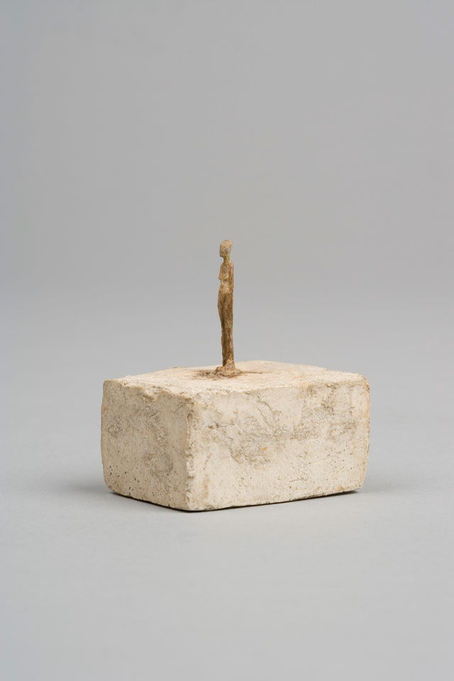
Alberto Giacometti, Very Small Figurine, 1937-39, plaster with traces of pigment, 4.5 x 3 x 3.8 cm, seen at Tate, from one of the Fondations, I’m not getting involved
Here are some things that are about as small that have also seen some stuff: a 1937-39 Giacometti literally titled Very Small Figurine, from the era when he supposedly said he fit all his sculptures into a matchbox as he fled across the Alps.
Jasper Johns, Flag (P56), 1958, silk printed flag, paraffin, in wooden frame, 2 3/4 x 3 3/4 in., via JJCR
And one of my absolute favorite things in the entire Jasper Johns Catalogue Raisonné, a tiny flag embedded in wax in a little frame, from 1958, which he gave to Merce Cunningham, and which had never been exhibited before 2014.
Whatever brought this Harrison into existence and out of the studio was not the market, or the demand for a show, but something else. Whether it was a private gesture or a gift or some daily or exceptional practice, I don’t know, but it is interesting. This is the point where I wonder if I should hold off on posting until I try to get this, or where I say, if I don’t get it, I invite whoever does to give it to me. I mean, it’s meant to be a gift, isn’t it?
The four-part cyanotype/photogram that is Matson Jones’ masterpiece will be offered for sale in a few days at Christie’s.
Previously known as Jasper Johns Blue Ceiling when it was being offered for a variety of mid-seven-figure prices a few years ago, the work, by Robert Rauschenberg and Jasper Johns is now untitled. The duo made it in 1955 for a window display at Bergdorf Goodman. The design director who hired them, Gene Moore, held onto the prints for several decades, until they were acquired in 1978 by the current owner.
Roberta Bernstein included an illustration of them in the chronology of Johns’ catalogue raisonée (v5, 8.), but not in the works section.
The estimate is $600-800,000 but seriously, who even knows? I just know I want them, and/or I want to see them in a museum somewhere, away from direct sunlight.
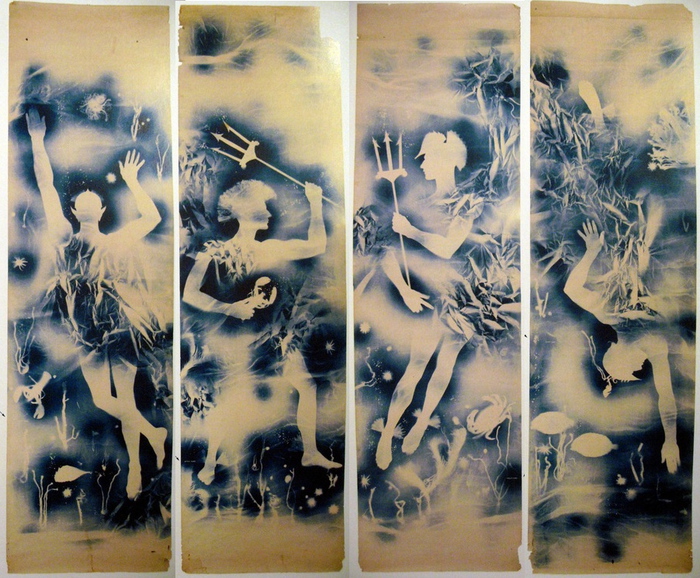
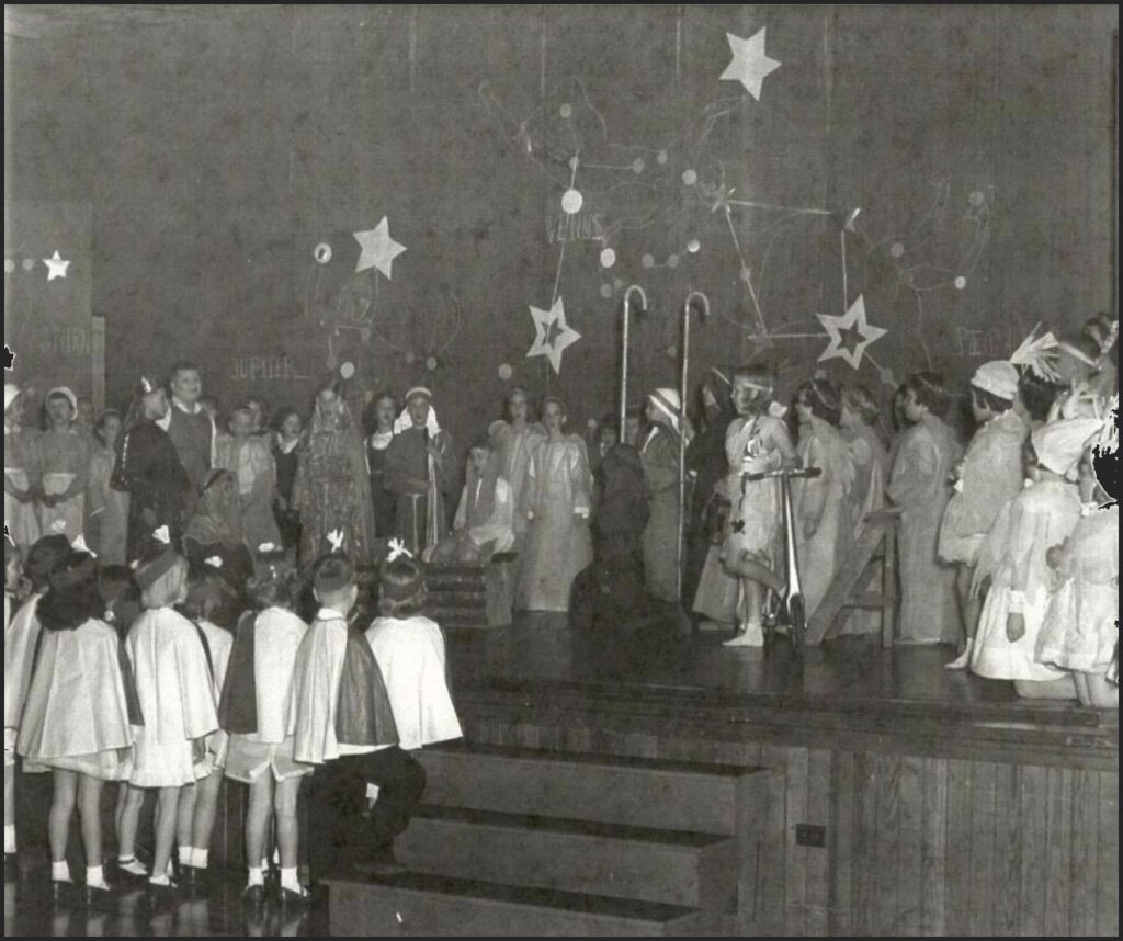
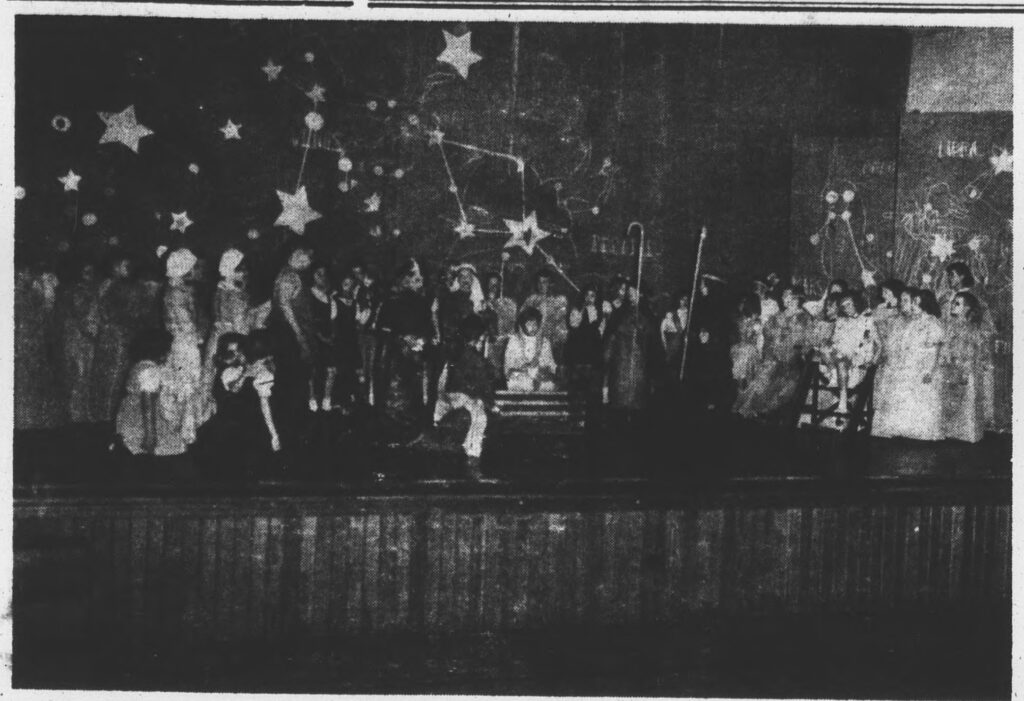
The Ann Smith School’s Christmas 1953 performance of The Comet, with backdrop painted by Cy Twombly. image: The News-Gazette via Sarah I. Nexsen’s 2014 Honors Art History thesis
There is not a lot of time to get into this right now, but holy smokes, Cy Twombly painted the backdrop for the local elementary school’s Christmas play in 1953, and no one’s said boo about it except for one intrepid art history undergraduate.
In 2014, the interest of Washington & Lee art history student Sarah I. Nexsen was piqued by an archival photo in Lexington, Virginia’s local newspaper, The News-Gazette. It showed the December 1953 production of The Comet, a Christmas-themed play written by the Rev. Thomas V. Barrett, for the Ann Smith Elementary School. The backdrop was credited to local boy Cy Twombly, and that was all anyone wrote. The backdrop had never been mentioned in Twombly literature. Nexsen wrote about it for her senior thesis, titled, “The Land of the Stars: The Origin of Cy Twombly’s Aesthetic.” An ambitious project, to be sure.
Near as Nexsen can tell, Twombly got the gig while on leave from the Army, over the Christmas break. Twombly’s former art teacher attended the church where Barrett, the playwright, presided.
According to Nexsen’s research, which included interviewing the star of the show herself, The Comet tells the Nativity story from the point of view of a comet which becomes the Star of Bethlehem. But first it travels through The Land of Stars, meeting planets, raindrops, and Mary & Joseph along the way. Twombly’s backdrop depicts this Land of Stars.
The backdrop was in three panels; the largest, in the center, was approximately 7 x 12 feet wide. The stage right panel, showing Saturn, is partially visible in the only known photo; the stage left panel depicting Mars and Neptune is not documented. Nexsen says the backdrop was discarded and destroyed after The Comet‘s single performance on December 19.
We all owe this young scholar a great debt for bringing this massive, lost, early work to light, and for conducting vital, on-the-ground research to learn its history before the march of time robbed us of its witnesses. So let’s just say that it would indeed be amazing if this lost painting proved to be the momentous source for Twombly’s entire practice: his combination of text and graphic; his classical sourcing; his giant scale; his Lexington influences. 1953 was in the middle of Twombly’s emergence: after he and Rauschenberg ran off to Italy together, and showed at Stable Gallery together, and before he moved back to New York, and then on to Italy.
So it could totally be! But I am going to say it’s unlikely. And Twombly’s own apparent jettisoning of this work and any information about it into a black hole means the case is that much harder to make.
And anyway, rather than depicting Roman gods and their symbolic meanings, it seems more likely that Twombly’s painting of The Land of Stars shows stars, constellations, and planets. If I had the time–when I get the time–I feel like it would be possible to locate the star chart or vintage astronomical map that Twombly used as a source.
1956 hardcover edition of H.A. Rey’s The Stars: A New Way To See Them, which reconfigured the constellations, via abebooks
The constellation diagrams in my instant guess, The Stars: A New Way To See Them, the immediately popular, influential, and accessible beginner astronomy guide by H.A. Rey, the creator of Curious George, which was published in 1952, don’t really match. But whenever I get to recreating this destroyed Twombly, the deep blue night skies of Rey’s book will be as much inspo as the artist’s own blackboard paintings.
Cy Twombly, Panorama, 1955, around 8×11 ft, image ganked from the internet
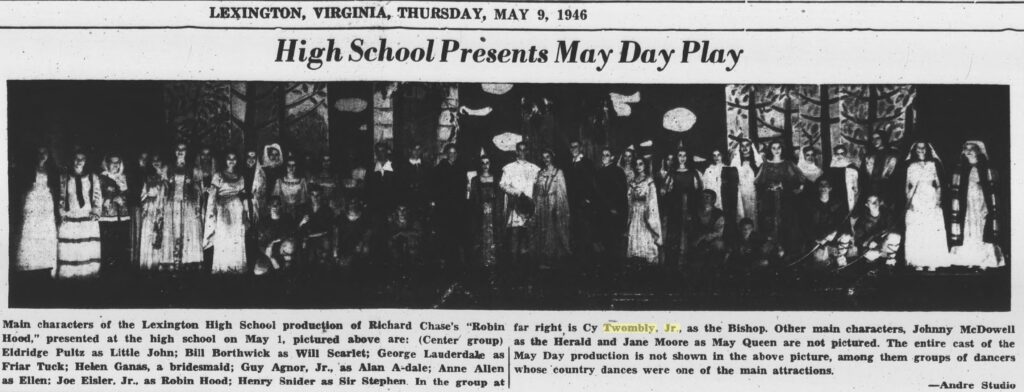
He also painted at least two other theater backdrops while a student at Lexington High School, in 1945 and 1946. The first, for Gilbert & Sullivan’s “The Mikado,” was executed by Twombly, but designed by a sergeant at the School for Personnel Services, the wartime training facility that was (and would be) Washington & Lee University. As Japanese satire or caricature, “The Mikado” was considered suitable wartime entertainment. No photos of this production have surfaced.
zoom in to see Cy Twombly as the Bishop (tall, right) in front of his scenic backdrop created for the 1946 production of Robin Hood at Lexington (VA) High School, as published on the front page of the Rockbridge County News on May 9, 1956
In 1946, though, Twombly designed and executed an entire Sherwood Forest for the school production of “Robin Hood.” And he played the Bishop. He’s the tall one stage left. Images of his prize-winning paintings and sculptures he showed in Richmond as a high school student have also not surfaced.