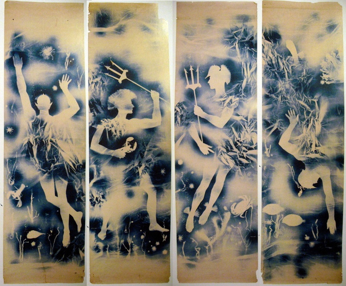
The four-part cyanotype/photogram that is Matson Jones’ masterpiece will be offered for sale in a few days at Christie’s.
Previously known as Jasper Johns Blue Ceiling when it was being offered for a variety of mid-seven-figure prices a few years ago, the work, by Robert Rauschenberg and Jasper Johns is now untitled. The duo made it in 1955 for a window display at Bergdorf Goodman. The design director who hired them, Gene Moore, held onto the prints for several decades, until they were acquired in 1978 by the current owner.
Roberta Bernstein included an illustration of them in the chronology of Johns’ catalogue raisonée (v5, 8.), but not in the works section.
The estimate is $600-800,000 but seriously, who even knows? I just know I want them, and/or I want to see them in a museum somewhere, away from direct sunlight.
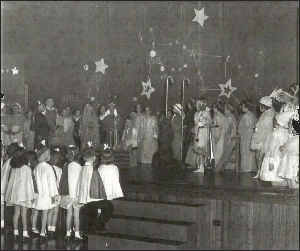
The Ann Smith School’s Christmas 1953 performance of The Comet, with backdrop painted by Cy Twombly. image: The News-Gazette via Sarah I. Nexsen’s 2014 Honors Art History thesis
There is not a lot of time to get into this right now, but holy smokes, Cy Twombly painted the backdrop for the local elementary school’s Christmas play in 1953, and no one’s said boo about it except for one intrepid art history undergraduate.
In 2014, the interest of Washington & Lee art history student Sarah I. Nexsen was piqued by an archival photo in Lexington, Virginia’s local newspaper, The News-Gazette. It showed the December 1953 production of The Comet, a Christmas-themed play written by the Rev. Thomas V. Barrett, for the Ann Smith Elementary School. The backdrop was credited to local boy Cy Twombly, and that was all anyone wrote. The backdrop had never been mentioned in Twombly literature. Nexsen wrote about it for her senior thesis, titled, “The Land of the Stars: The Origin of Cy Twombly’s Aesthetic.” An ambitious project, to be sure.
Near as Nexsen can tell, Twombly got the gig while on leave from the Army, over the Christmas break. Twombly’s former art teacher attended the church where Barrett, the playwright, presided.
According to Nexsen’s research, which included interviewing the star of the show herself, The Comet tells the Nativity story from the point of view of a comet which becomes the Star of Bethlehem. But first it travels through The Land of Stars, meeting planets, raindrops, and Mary & Joseph along the way. Twombly’s backdrop depicts this Land of Stars.
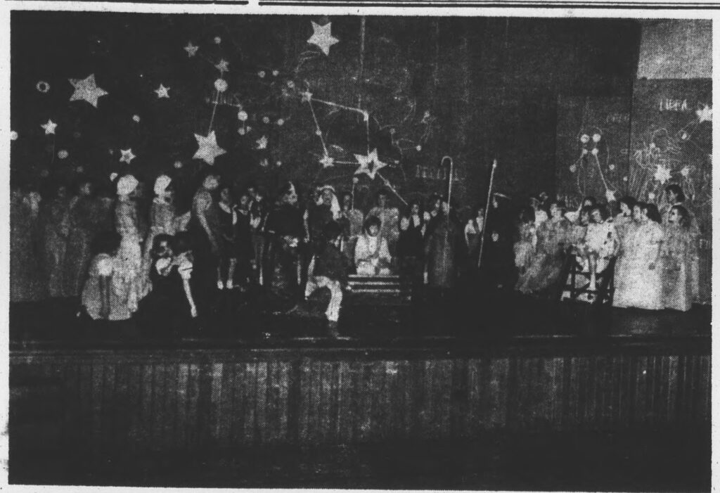
The backdrop was in three panels; the largest, in the center, was approximately 7 x 12 feet wide. The stage right panel, showing Saturn, is partially visible in the only known photo; the stage left panel depicting Mars and Neptune is not documented. Nexsen says the backdrop was discarded and destroyed after The Comet‘s single performance on December 19.
We all owe this young scholar a great debt for bringing this massive, lost, early work to light, and for conducting vital, on-the-ground research to learn its history before the march of time robbed us of its witnesses. So let’s just say that it would indeed be amazing if this lost painting proved to be the momentous source for Twombly’s entire practice: his combination of text and graphic; his classical sourcing; his giant scale; his Lexington influences. 1953 was in the middle of Twombly’s emergence: after he and Rauschenberg ran off to Italy together, and showed at Stable Gallery together, and before he moved back to New York, and then on to Italy.
So it could totally be! But I am going to say it’s unlikely. And Twombly’s own apparent jettisoning of this work and any information about it into a black hole means the case is that much harder to make.
And anyway, rather than depicting Roman gods and their symbolic meanings, it seems more likely that Twombly’s painting of The Land of Stars shows stars, constellations, and planets. If I had the time–when I get the time–I feel like it would be possible to locate the star chart or vintage astronomical map that Twombly used as a source.
1956 hardcover edition of H.A. Rey’s The Stars: A New Way To See Them, which reconfigured the constellations, via abebooks
The constellation diagrams in my instant guess, The Stars: A New Way To See Them, the immediately popular, influential, and accessible beginner astronomy guide by H.A. Rey, the creator of Curious George, which was published in 1952, don’t really match. But whenever I get to recreating this destroyed Twombly, the deep blue night skies of Rey’s book will be as much inspo as the artist’s own blackboard paintings.
Cy Twombly, Panorama, 1955, around 8×11 ft, image ganked from the internet
He also painted at least two other theater backdrops while a student at Lexington High School, in 1945 and 1946. The first, for Gilbert & Sullivan’s “The Mikado,” was executed by Twombly, but designed by a sergeant at the School for Personnel Services, the wartime training facility that was (and would be) Washington & Lee University. As Japanese satire or caricature, “The Mikado” was considered suitable wartime entertainment. No photos of this production have surfaced.
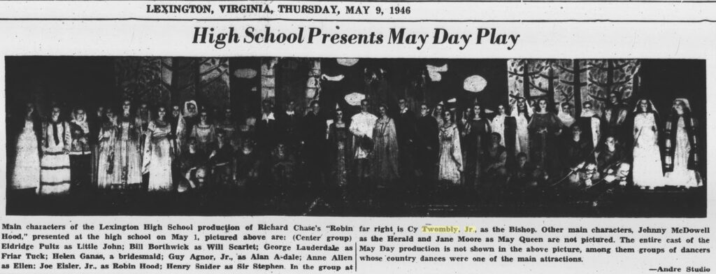
zoom in to see Cy Twombly as the Bishop (tall, right) in front of his scenic backdrop created for the 1946 production of Robin Hood at Lexington (VA) High School, as published on the front page of the Rockbridge County News on May 9, 1956
In 1946, though, Twombly designed and executed an entire Sherwood Forest for the school production of “Robin Hood.” And he played the Bishop. He’s the tall one stage left. Images of his prize-winning paintings and sculptures he showed in Richmond as a high school student have also not surfaced.
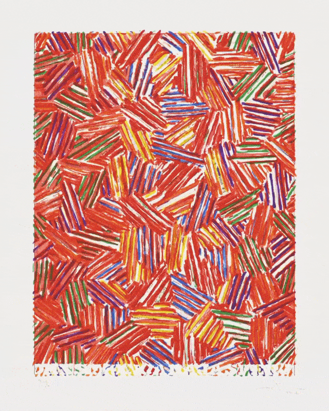
The set of six Cicadas were created by overprinting a cache of prints leftover from the original red/yellow/blue 1979 edition, to see what it’s like when one color tops another.
“The Cicada title has to do with the image of something bursting through its skin, which is what they do,” Johns said in a 1980 documentary. “You have all those shells where the back splits and they’ve emerged. And basically that kind of splitting form is what I tried to suggest”.
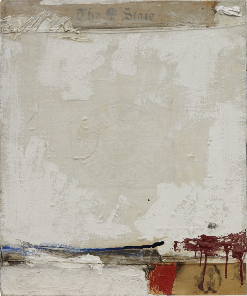
Robert Rauschenberg (and?), State, 1958, newspaper, textile, oil on canvas, 24×20 in. image via sothebys
Sotheby’s is selling this sweet little early Rauschenberg combine next week. It is titled State, dates from 1958, and originally belonged to Emile de Antonio, who got it from Leo Castelli in 1959. Various aspects of this are interesting.
State is one of at least seven small combines on canvas dating from early 1958. There are at least another seven similar combines from 1957, and a bunch are still owned by people close to the artist, including Jasper Johns and the Castelli/Sonnabends. De Antonio would fall into this category, too. They also stayed close to home; most of these small combines don’t have any exhibition history at all, or only began to be shown much later. These were not the major, groundbreaking, space-taking, attention-grabbing combines like Monogram, Minutiae, or Rebus, or even the bigger ones like Bed or the Factums.
With similar strategies across them–a collaged image or two, a piece of fabric shellacked into place with white, some quick drippy brushstrokes of a handful of colors–it feels like they could have been made side by side, if not all at once. Or maybe they were made as a regular exercise, a daily practice of combining? We know a little of how combines changed and accumulated as Rauschenberg lived with them, but there’s only one person left alive who was in the studio where these happened.
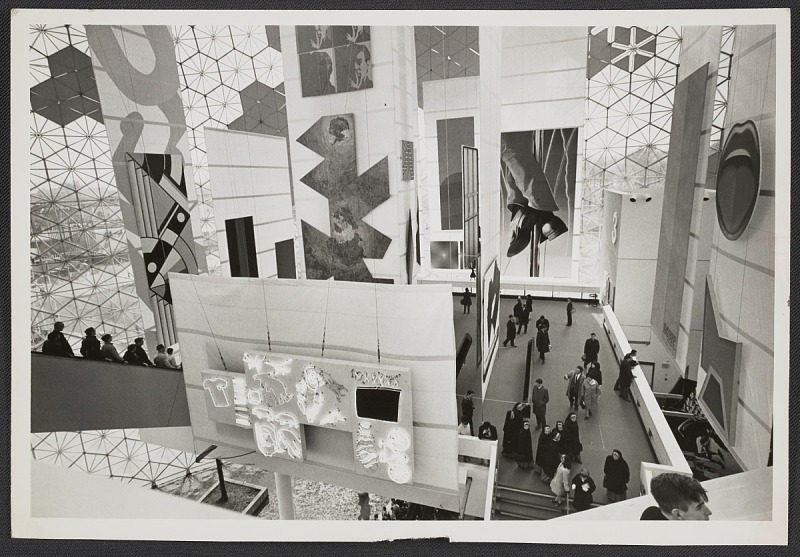
Photo of the American Paintings installation at the Expo 67 US Pavilion, curated by Alan Solomon in the back room of Castelli Gallery, apparently, image: Leo Castelli Archive/AAA
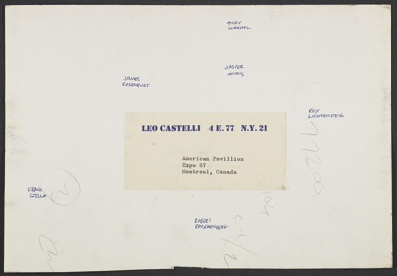
Verso of the Expo 67 photo with Castelli artists’ names written in: [R to L]: Lichtenstein, Warhol, Johns, Rauschenberg, Rosenquist, Stella image: Leo Castelli Archive/AAAThough I haven’t looked at the US Pavilion at the Expo67 World’s Fair in a while, it still lives in my heart. But I just stumbled across this photo of the American Painting Now show from the Leo Castelli Gallery. I should clarify, the show American Painting Now was at the US Pavilion; the photo is from the gallery’s records at the Archives of American Art. But it’s hard to tell, when six of the 22 artists Alan Solomon curated into the show came from Castelli.
More than ten years after I first got fascinated with world’s fairs as exhibitions, I was surprised to find it’s still not easy to see who or what was in the show. So I’ve mirrored the American Paintings Now press release and checklist from worldsfairphotos.com’s US Pavilion press kit. The installation of the sailcloth panels and innovative uplighting gets two paragraphs and top billing over the paintings themselves. Solomon is not mentioned at all.
But at least the artists in the show were listed in what I think is rough exhibition order, perhaps following the pavilion’s prescribed escalator&walkway path: Edward Adevisian, Allan d’Arcangelo, Jim Dine, Friedel Dzubas, Helen Frankenthaler, Robert Indiana, Ellsworth Kelly, Roy Lichtenstein, Robert Motherwell, Kenneth Noland, Tom Wesselman, Nicholas Krushenick, James Rosenquist, Richard Anuszkiewicz, Jasper Johns, Andy Warhol, Frank Stella, Larry Poons, Larry Zox, Robert Raucenberg [sp], Claes Oldenberg, and Barnett Newman.
Except though Larry Poons’ painting was credited as coming from the Sculls, he showed with Castelli then. So really, it’s seven of the 22, and six in one installation shot. [Interestingly, six of these artists also made work for the New York Pavilion at the 1964 World’s Fair: Indiana, Kelly, Lichtenstein, Rauschenberg, Rosenquist and Warhol.] I think I need to finally chase down this entire show.
Installation image of Jasper Johns’s Map (1961) the first time it went on view at the Museum of Modern Art, in 1971, in between Tom Wesselman’s giganto Still Life #57 (1969-70) and Malcolm Bailey’s Hold, Separate but Equal (1969). Also, s/o Malcolm Bailey, where’s that been the last 50 years? [image:moma.org]In the spring the folks at ARTnews asked if I wanted to write about a paper coming out in a legal journal about art donations and tax policy, and I was like, uh sure? But then I read it, and I was hooked. Michael Maizels and William Foster took a long-overlooked reference to Robert and Ethel Scull’s donation of a major Jasper Johns painting to MoMA, and began an expanded view of the appraisal, donation, and tax evading practices of the early 1960s, when the top US marginal tax rate was around 77%. A different world, but one that helped create the world we live in now.
Anyway, it quickly became apparent that there was a lot more to the story they found, and Andrew and Sarah at ARTnews were amazingly supportive of my suggestion to dive deeper into the archives of the Castelli Gallery, and to turn to the larger story of Leo Castelli’s relationships with his biggest collectors, and how Jasper Johns’s protean work became the object of such intense discussion and competitive collecting. (If Andrew and Sarah were around, they would have suggested cutting that into several sentences, I’m sure.) From that beginning emerged the possibility of using Johns’s early works as they passed from the most adventurous collectors to the richest and, occasionally, into museums.
The resulting article came out in print in the (newly redesigned) Fall issue of ARTnews, and is now available on the (newly redesigned) website as well. There was so much amazing material, and so many intriguing threads, so many incomplete stories that could be added and expanded upon, so much that was locked in MoMA’s archives, which were inaccessible for the entire time I was working on this. But 4000 words feels like plenty to start with.
I met Wynn Kramarsky on the internet almost exactly 25 years ago to the day. It turned out not to have been my first encounter with him, but I’ll get to that. We met on Usenet, a global, distributed message board/listserv that was organized by topic, sort of like how reddit is now. It was August 1994, and I had just reported to alt.art.robert.smithson about my visit to Spiral Jetty. Wynn commented enthusiastically and wanted to know more–Spiral Jetty had only emerged from the Great Salt Lake a few months earlier, and was visible for the first time in decades [sic. By analyzing lake levels I’ve since concluded it was visible for a year or two in the 1980s, but it seems no one looked/reported/cared.] We emailed. He offered to send me a catalogue from a recent Smithson exhibition at Columbia, what was my address? On the internet of 1994, it seemed wilder to me to give a stranger a catalogue than to give a stranger your address. It was only when the book arrived with a note and his card that I realized Wynn was lending it to me. I could bring it back on one of my trips to New York (I was at business school in Philadelphia), and we’d go to lunch.
And that’s what we did, a couple of months later. We met at his office in SoHo, the entrance of which was lined with thousands of books. That first visit, an extraordinary Richard Serra work, multiple sheets of paper with ink applied in large slabs with a roller, filled the first open wall. The internet has been failing to surpass itself ever since.
After we’d toured both floors of his SoHo space and had a sandwich with his staff, we went into his office. Behind his desk was a drawing Robert Smithson had made on a large, aerial photo of the Kennecott Copper Mine. I knew it because I had bid on it the year before, when it had come up for auction at Sotheby’s. I had just quit my job and was preparing to go to grad school, and I really had no business bidding, even during a recession. But I really wanted it, and so I made a couple of bids for it before giving it up to the winning bidder. I apologized for running up the price on him, and then I thanked him for not bankrupting me.
Wynn and I became art correspondents, and we’d meet of the years while he was actively putting on shows. He was as infectiously passionate about the work of young and emerging artists as he was about the people he’d known and collected for decades. At his encouragement, I met artists and visited studios I never would have thought to reach out to otherwise. He made me want to be a better, more thoughtful collector by being a curious and engaged counterpart for artists, not just a consumer.
We both got more actively involved in supporting MoMA around the same time–on obviously different levels–and he was always generous with advice and insights. He took collecting and donating seriously, and was always cognizant of a responsibility to artists and to society. I still feel the impact of his incisive observations of socialites, unserious collectors, or museum groupies angling for respectability on my own views of how the art world should or could work. When a committee meeting I was running at MoMA got derailed one night by some tedious presentation, I immediately felt the weight of Wynn’s story about the flaky chair of a museum board he’d been on: “She wrote a check, but she sure couldn’t run a meeting!”
When I began writing, especially for the Times, and later on topics like early Jasper Johns, the Jetty, or Tilted Arc, Wynn’s was always a voice I sought out and trusted, and he always spoke very candidly. I always got the sense he didn’t want to be quoted, though, and so I never did. I also always got the sense that he operated out of a profound respect for the artists he knew, and for their work. It felt like artists trusted him, and that he cherished that. I miss Wynn and mourn for the loss his friends and family are experiencing, but I’m grateful for the chance to know him, and for all he did and showed and taught.
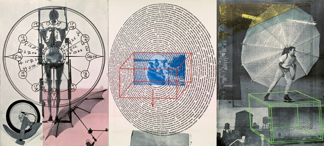
The middle of three 5 x 4-ft offset lithograph panels in Robert Rauschenberg’s Autobiography contains a dizzying spiral of text featuring key moments of the artist’s life, as well as an extensive list of artworks.
Robert Rauschenberg, Autobiography, 1968, 5 x 12 ft overall, ed. 2000
When Oliver mentioned it on twitter the other day, I realized I’d never actually made it through the entire text. Now I have. I transcribed it here for this robot to read.
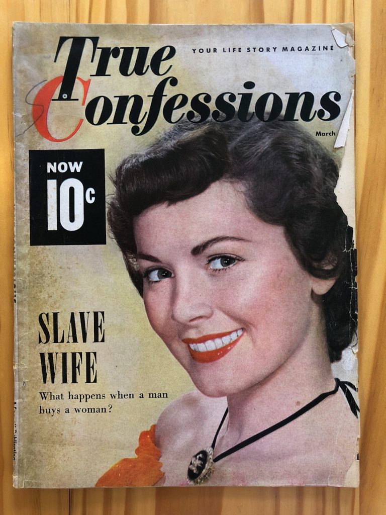
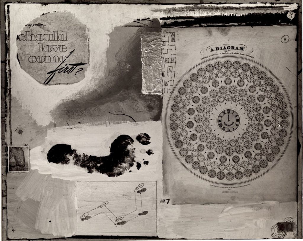
True Confessions, March 1951, the Slave Wife Issue?
The big score in my search for the collage elements of Robert Rauschenberg’s lost painting, Should Love Come First? was the magazine clipping that said just that.
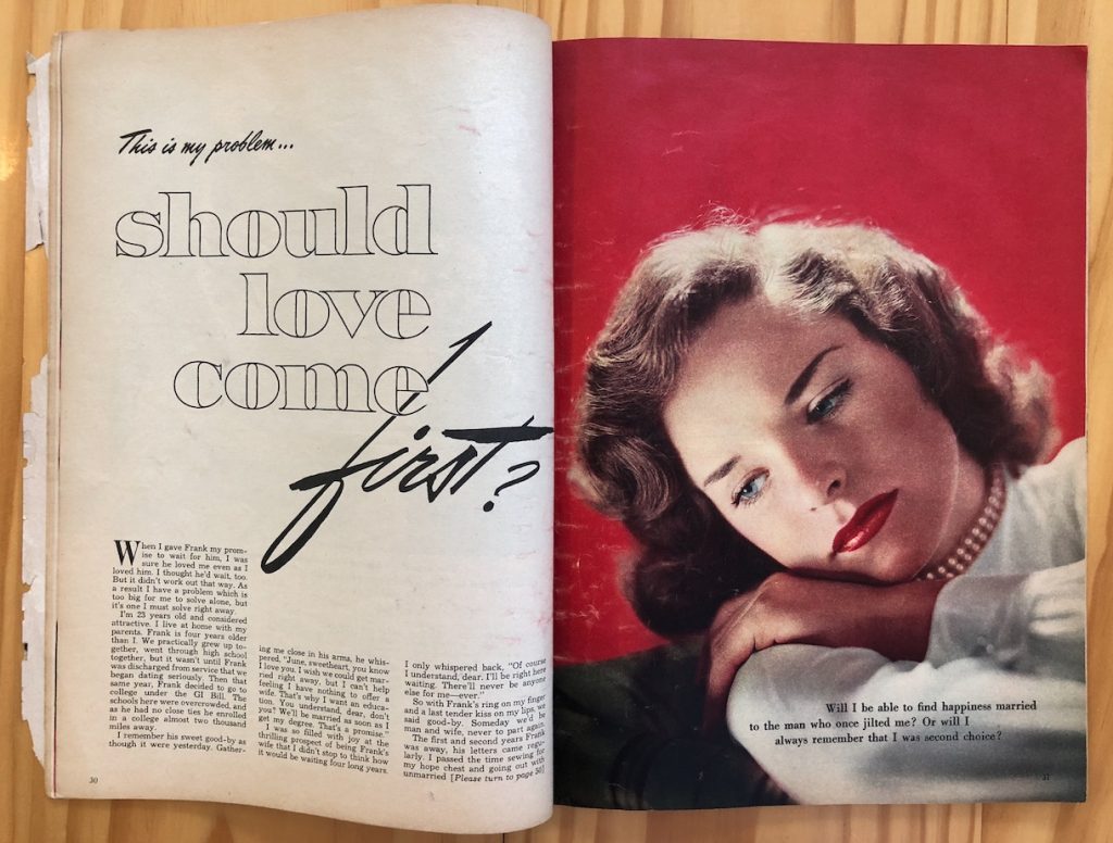
It turns out to be from True Confessions, a women’s sex and relationship advice magazine. The article was written, apparently, by a reader named June soliciting advice for handling her man. I gave a brief recap of the article in Panorama, and there’s a picture which shows the pullquote, which does
My Problem: Should Love Come First? image: a freakin’ multiyear search
seem to resonate with the situation of Rauschenberg, his new, pregnant, wife Susan Weil, and Rauschenberg’s new squeeze Cy Twombly, at the moment the painting was made:
Will I be able to find happiness married to the man who once jilted me? Or will I always remember that I was second choice?
But I have transcribed the whole thing here. And I now feel sort of compelled to look for the responses that True Confessions readers gave “June” about taking her man–and his new baby–back. What do YOU think she should do? Leave your answers in the comments! Continue reading “This Is My Problem…Should Love Come First?”
Robert Rauschenberg, Should Love Come First? 1951, painted over. image via RRF
I am so psyched for this. I’ve been deep in another writing thing for a while and couldn’t give it the attention I wanted to when it came out. But I wrote a research note for Panorama, the Journal of the Association of Historians of American Art, and it is now available. It is the story of my six+ year search to identify all elements Robert Rauschenberg used in Should Love Come First? a collaged painting that, if it still existed, might be considered one of his first combines.
My Problem: Should Love Come First? image: a freakin’ multiyear search
Back in the spring, when, hope against hope, a nearly blind eBay purchase yielded what I thought would be the toughest piece to find, the painted-over text that gave the work its title, I sent a snap to Michael Lobel, an art historian hero and friend who knows his way around early Rauschenberg & Weil. Because I knew he’d freak out just like I did, and he did. And then he said I should publish it in a peer-reviewed academic context, not just on the blog. And that was just intriguing and daunting enough to attempt it. And that’s what I worked on this summer.
My purpose for tracking down and buying copies of all these elements is, of course, to re-create the painting, which Rauschenberg painted over in 1953. (It still exists, in Zurich. I’ve seen it.) But now that I have (almost) all the pieces, I am stymied anew by how much I don’t know about the painting, including/especially the colors. So my re-creation project will take some more time.
But in the mean time, the amount of info that has been coming off the small pieces of paper I *have* found has been amazing. Meeting Susan Weil in the middle of this process (for another topic, and another husband) has been amazing. And getting the chance to systematically look and think and capture information in a (hopefully) clear and compelling way has been amazing. So thanks to Michael and to the folks at Panorama and to the folks at the Robert Rauschenberg Foundation. I don’t know when love should come, but I love doing this.
Untitled (Rome), 1980-81, cast in 1990, ed 1/5 sold at Christie’s in 2013
The artist Elizabeth “Betty” Stokes di Robilant was interviewed by Christie’s in May 2013. Stokes was a longtime friend of Cy Twombly. Their story and relationship and collaboration, and her later erasure from Twombly’s official story, is discussed in Chalk, a biography of Cy Twombly by Joshua Rivkin, which was published in October 2018. Rivkin quotes the interview by Robert Brown, which was published on the occasion of the sale of a painted bronze cast of a 1966 [or 1956, or 1959, or 1980 or 1981, or 1990] sculpture Twombly gave to dee Robilant for her 10th wedding anniversary. Twombly later reworked and cast the sculpture in 1990 in an edition of five. Di Robilant’s three children each got one; she got one, and Twombly got one. Ed. 1 of 5 was sold at Christie’s London on June 25th, 2013, for GBP 1.63 million.
Susan Weil in her studio in Williamsburg, Sept 2018. image: me, via artnews
Though we have emailed several times over the years that I’ve researched her and her first husband’s work, I finally met Susan Weil a couple of weeks ago, and it was awesome. The occasion was the first US show in nearly 40 years of sculpture by her late (second) husband, Bernard Kirschenbaum, which is currently at Postmasters Gallery. Weil discussed Kirschenbaum’s work, and their life together, and her work, and it was great. Our conversation was just published on ARTNews, so go check it out:
[W]e’re used to the idea of calling what he did as sculptural now, because we’ve come through Minimalism, and the artist’s mark, and having things fabricated, but at the time, that was still largely unheard of: that you could order a sculpture. That you could have something fabricated in a shop, and it would be a sculpture. Did he think about that much, or was it not a concern for him?
Well, it wasn’t that way with him, because he wanted to be a part of every step of it. He didn’t order something and then it came. He worked in all the materials, in the actual welding, and finishing, and this, that, and the other. He had to know everything about how things were made. No, he had a beautiful vision.
Dear Sir:
I’ve always supposed that artists were allowed to paint however-whatever they pleased and to do whatever they please with their work–to or not to give, sell, lend, allow reproduction, rework, destroy, repair, or exhibit it…
He is direct about his work, an area of his life which he jealously guards. Once, at a dinner, a wealthy collector who owned several important Johns paintings announced over coffee that he had an idea for a print that Johns should do. He said that Johns should make a print, in color, of an American map. The collector argued his case cogently. He pointed out that Johns had done other prints in color based on paintings from that period; he alluded to the significance of such a print to the whole body of Johns’ work; he mentioned the opportunities for the sort of image transformation which Johns’ other color prints had explored; and he pointed out the peculiar arbitrariness that had led Johns do to map prints several times in black-and-white, but never in color.
A hush fell over the table. There was a good deal of tension. On the one hand, one doesn’t tell an artist what to do, but on the other hand, the suggestion was not uninformed, and it did not come from a source the artist could casually alienate.
Johns listened patiently. “Well,” he said finally, “that’s all very well, but I”m not going to do it.”
“Why not?” asked the collector, a little offended.
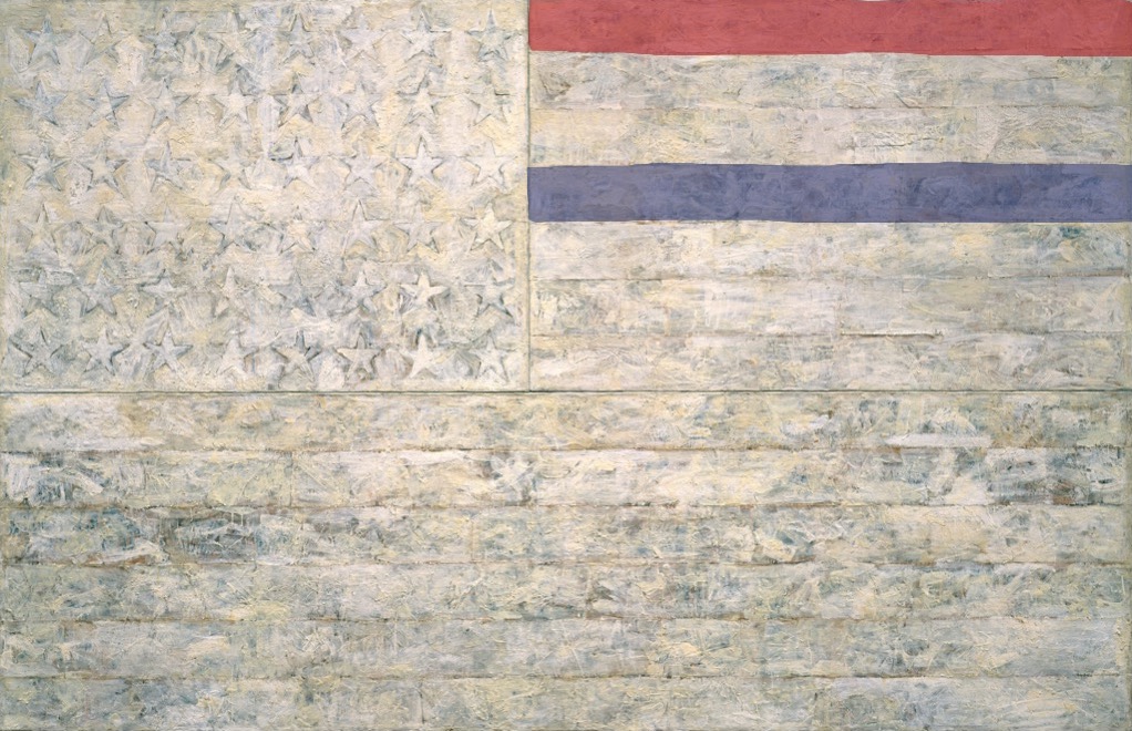
White Flag, 2018, Encaustic, oil, newsprint, and charcoal on canvas, 78 5/16 x 120 3/4 in. (198.9 x 306.7 cm)
“One night I could not have dreamed that I painted a large American flag, but the next morning I got up and I went out and bought the materials to begin it.” Those materials included three canvases that the artist mounted on plywood, strips of newspaper, and encaustic paint—a mixture of pigment and molten wax that has formed a surface of lumps and smears. The newspaper scraps visible beneath the stripes and forty-eight stars lend this icon historical specificity. The American flag is something “the mind already knows,” but its execution complicates the representation and invites close inspection.
By draining most of the color from the flag but leaving subtle gradations in tone, the artist shifts our attention from the familiarity of the image to the way in which it is made. “White Flag” is painted on three separate panels: the stars, the seven upper stripes to the right of the stars, and the longer stripes below. The artist worked on each panel separately.
White Flag, 2018, I: Encaustic, oil, newsprint, and charcoal on canvas, 41 3/4 x 64 3/8 in. (106.1 x 163.6 cm). II: Encaustic, oil, and collage on fabric mounted on plywood, 22 1/2 x 32 1/2 in. (57.2 x 82.6 cm)
After applying a ground of unbleached beeswax, the artist built up the stars, the negative areas around them, and the stripes with applications of collage — cut or torn pieces of newsprint, other papers, and bits of fabric. The artist dipped these into molten beeswax and adhered them to the surface. The artist then joined the three panels and overpainted them with more beeswax mixed with pigments, adding touches of white oil.
cf. Study for White Flag, 2018, Crayola washable marker on coloring page, 8 1/2 x 11 in. (21.6 x 28 cm)
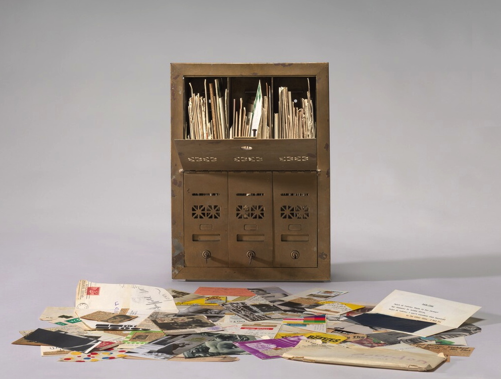
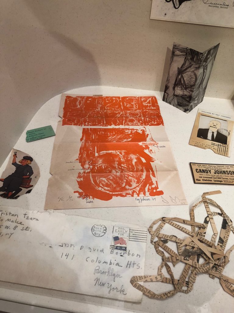
Ray Johnson, Untitled (Letterbox), 1964, correspondance with David Bourdon, collection: NGA
[UPDATE: WE KNOW.]
It’s hard to process Ray Johnson’s work, there’s so much of it. It’s intentionally slight and esoteric. It often feels like a quick visual read. But it can also reward a slower look, even when it’s sort of stuffed and strewn about.
The National Gallery has a 1964 piece, Untitled (Letterbox), which is actually a mailbox stuffed with a few years’ worth of correspondance art pieces Ray Johnson sent to the critic David Bourdon. If I remember the label correctly, the stuff was piling up, so Bourdon got a classic brownstone-sized three-unit mailbox to hold it all.
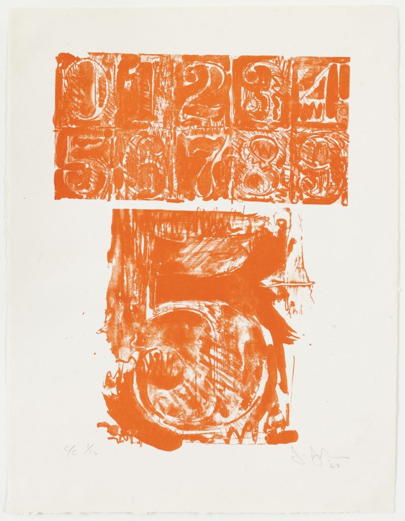
Ray Johnson drawing & notes on Jasper Johns’ #5 from 0–9 Color, 1960-63, in Untitled (Letterbox), collection: NGA
Anyway, I’ve seen but not really looked at it since it was installed way back before the world ended, but the other day I noticed that unlike other pieces, this was not a Jasper Johns exhibition announcement; it was a Jasper Johns.
And not just any Jasper Johns. This is from 0–9 (1960-63), the foundational series with which Johns began making prints, and with which he began his extensive relationship with Tatyana Grossman and Universal Limited Art Editions. [Though other prints were completed and published before 0–9, I think it was the first one he started.] It’s signed and numbered–and folded up and stuffed in an envelope at some point, apparently.
Grosman wooed Johns to start making prints with her fledgling contemporary foundry by sending him a lithography stone to play with. Over years, Johns worked his stenciled numbers on the stone’s surface, printed some, and then wiped and started drawing and printing again. The sequential prints in 0–9 trace the changes and palimpsests of the process, capturing the lithographic process the way Johns’ encaustic froze the mark of the brush that applied it. This ambitious series was published in three versions: a rainbow of colors, black, and grey.
The print Ray Johnson used here is #5 from C/C 1/10, which means it’s from the first edition of the color set. Johnson took this first print of his friend’s massive project, and started circling and labeling individual lines in the print as “snakes.” Then Johnson signed his name and date next to Johns’. And then he folded and taped it up and mailed it to Bourdon.
Snakes were a thing for Johnson. That same year Dick Higgins published a compilation of his correspondance works from Johnson in an artist book he titled The Paper Snake. But this is ultimately less surprising than his readiness to treat an artwork from a friend like a cigarette wrapper or rubber stamp, as an element of his own production. [Of course, Johnson was friends with Rauschenberg and Sue Weil, too, so he certainly knew of Bob incorporating Johns’ and Weil’s paintings into his own combine. And don’t forget Twombly drawing all over everything. So maybe surprising should not be the word.]
So far two of the three artist proofs of 0–9 (Color) (ULAE 19) have sold at auction: Merce Cunningham & John Cage’s set, in 2009, and last year, the set Johns gave to art historian Robert Rosenblum, who wrote the accompanying text. [Awesomely, on four of Rosenblum’s ten prints Johns inscribed, “Proof to replace stolen.” So keep your eyes peeled for four rogue prints.]
The Museum of Modern Art has one of each variation, of course, because back in the day MoMA and ULAE made it so the museum could get the first print from every edition they published. And hey, look at that, MoMA’s print of 0–9 (Color) has the same number as Johnson’s. Did someone mention rogue prints? How’d this happen?
A FEW DAYS LATER UPDATE: Thanks to some attentive folks at the National Gallery, we know how this happened.
Curator Jennifer Roberts explains that the Johnson Johns is not a print, but a page from a Vogue Magazine article on Johns by Harold Rosenberg (“Jasper Johns: Things the Mind Already Knows,” Vogue, February 1, 1964, 174-175.)
Johnson has annotated a paragraph on the reverse (page 175) in pencil, adding half-brackets, three underlined selections, and a notation in the margin that says, “this paragraph could be sent to May Wilson.”
There is nothing commonplace about an 8.
The symbols selected by Johns are separated from the banal by their abstractness and dignity, qualities which are also outstanding in Johns’s personality. In the absence of his big grin, he reminds me of William S. Hart, the deadpan sheriff of the silent Westerns. Johns has Hart’s long, flat poker face, thin lips and alert eyes slanting up at the outer corners. Like Hart he gives the impression of one who sizes things up, keeps mum, and does his job. Johns’s detachment is of the era of the beats, the cool cats, and Bohemian Zen, as Hart’s belonged to that of “Howdy, stranger” and the cardsharp. With his level stare Johns paints targets: Hart perforated his with a six-shooter.
Roberts also notes that Johnson has covered half an illustration of a Johns lightbulb sculpture on the back (p.175) by taping an ad for a George Overbury “Pop” Hart watercolor exhibition held at Frederick Keppel and Co., New York, over it. Thanks to Stephanie, as well as to Anabeth Guthrie and Peter Huestis of the NGA for noticing the mystery and sharing these details.