Wait What? Osaka ’70 Isozaki X Thomas Ruff Japanese Press++

Where to even start when I’ve been at it for so long?

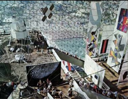
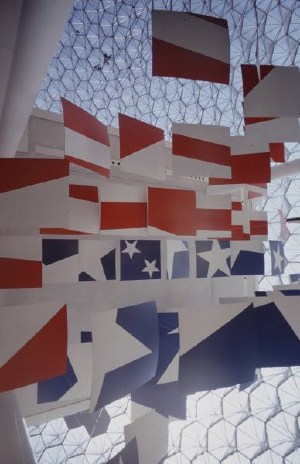
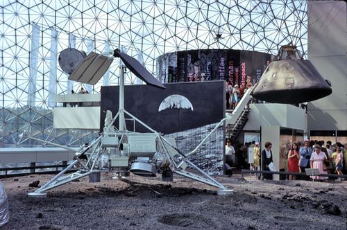
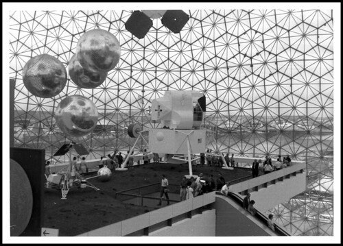
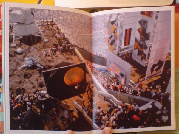
Interior of Buckminster Fuller’s US Pavilion from Expo ’67, with a lunar lander and satelloons to the left, and Alan Solomon’s curated show of American painting to the right, as seen in USIA director Jack Masey’s book, Cold War Confrontations

World’s Fair pavilion artworks at Expo ’67. Which led to pavilion artworks by painters, and a modest, domestic proposal to chop them up to share with the people,

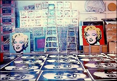
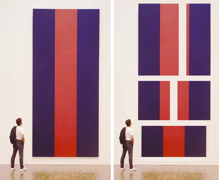
Study for Chop Shop Newman Painting No. 1 and Nos. 2-6, 2015, jpg

which became a thing at an art world’s fair.

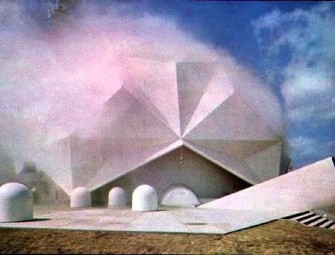
World’s Fair pavilion by artists, E.A.T.’s Pepsi Pavilion at Osaka ’70, surrounded by Robert Breer’s float/robots.

Continue reading “Wait What? Osaka ’70 Isozaki X Thomas Ruff Japanese Press++”

The Castelli Pavilion

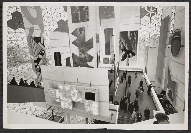
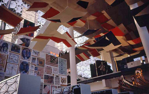
Photo of the American Paintings installation at the Expo 67 US Pavilion, curated by Alan Solomon in the back room of Castelli Gallery, apparently, image: Leo Castelli Archive/AAA

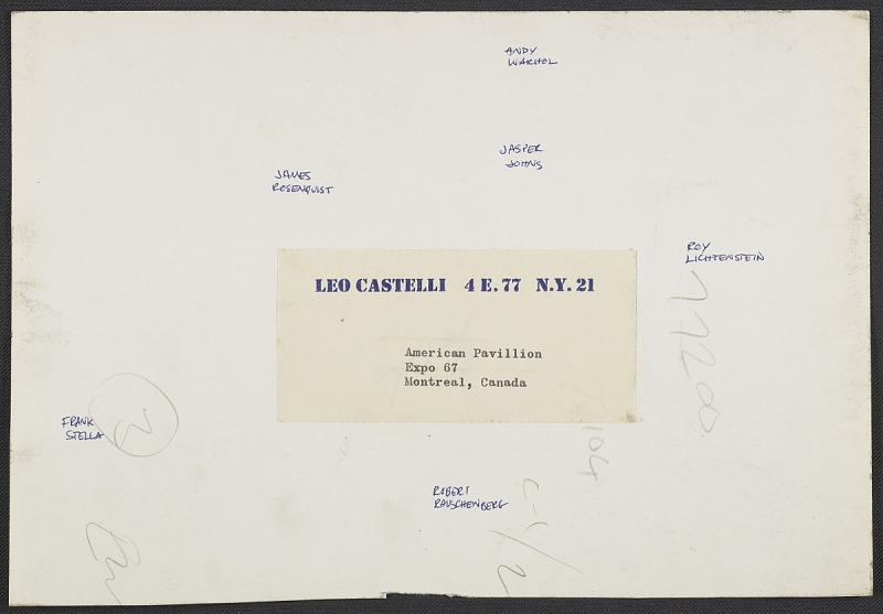
Verso of the Expo 67 photo with Castelli artists’ names written in: [R to L]: Lichtenstein, Warhol, Johns, Rauschenberg, Rosenquist, Stella image: Leo Castelli Archive/AAA
Though I haven’t looked at the US Pavilion at the Expo67 World’s Fair in a while, it still lives in my heart. But I just stumbled across this photo of the American Painting Now show from the Leo Castelli Gallery. I should clarify, the show American Painting Now was at the US Pavilion; the photo is from the gallery’s records at the Archives of American Art. But it’s hard to tell, when six of the 22 artists Alan Solomon curated into the show came from Castelli.

More than ten years after I first got fascinated with world’s fairs as exhibitions, I was surprised to find it’s still not easy to see who or what was in the show. So I’ve mirrored the American Paintings Now press release and checklist from worldsfairphotos.com’s US Pavilion press kit. The installation of the sailcloth panels and innovative uplighting gets two paragraphs and top billing over the paintings themselves. Solomon is not mentioned at all.

But at least the artists in the show were listed in what I think is rough exhibition order, perhaps following the pavilion’s prescribed escalator&walkway path: Edward Adevisian, Allan d’Arcangelo, Jim Dine, Friedel Dzubas, Helen Frankenthaler, Robert Indiana, Ellsworth Kelly, Roy Lichtenstein, Robert Motherwell, Kenneth Noland, Tom Wesselman, Nicholas Krushenick, James Rosenquist, Richard Anuszkiewicz, Jasper Johns, Andy Warhol, Frank Stella, Larry Poons, Larry Zox, Robert Raucenberg [sp], Claes Oldenberg, and Barnett Newman.

Except though Larry Poons’ painting was credited as coming from the Sculls, he showed with Castelli then. So really, it’s seven of the 22, and six in one installation shot. [Interestingly, six of these artists also made work for the New York Pavilion at the 1964 World’s Fair: Indiana, Kelly, Lichtenstein, Rauschenberg, Rosenquist and Warhol.] I think I need to finally chase down this entire show.

CANADIAN WORLD EXHIBITION, MONTREAL, 1967, AMERICAN PAINTING NOW press release and exhibition checklist [pdf via worldsfairphotos.com]


Bigger Thinking Needed For Giant Heads

Dr. Matthew Stirling & friends admiring a cast of an Olmec head from La Venta installed at the NGS in 1943, via Historic Images (obv) on eBay, where I (also obv) did not buy it.

First I stumbled across this 1943 photo of a giant Olmec head at the National Geographic Society.

Then the caption says it’s actually a cast of the 20-ton original, which remains in La Venta, Mexico, where Dr Matthew Stirling (kneeling) led the NGS-Smithsonian expedition to document them. Stirling was the leading anglo archaeologolist working on the Olmec, a civilization that pre-dated the much better-known Inca and Maya.

Then while I tried to find out more about casting a 10-foot head onsite in the middle of World War II (turns out the head was one of five uncovered on a 1940 expedition), I stumbled upon Luis M. Castañeda’s extraordinary essay from 2013 for Grey Room, a journal at MIT Press. Castañeda tracks the history of exhibiting Olmec megalithic heads in the modernist North, and their shifting political, aesthetic, and ideological contexts.

Olmec megaliths were shown in the early 1960s at the Petit Palais in Paris; the LA County Museum of Art; the Museum of Fine Arts Houston; the Mexican Pavilion at the New York World’s Fair–with a pit stop on the plaza of the Seagram Building.

Castañeda tracks the equal interest in the megaliths as exoticized artifacts and engineering mysteries, and how they were experienced, in spectacular motion, temporarily installed in high modernist spaces. Here’s folks discussing the most epic way to transport an Olmec head from its original site in Veracruz, Mexico to the new Mies van der Rohe-designed museum in Houston:

Before they decided to use a trailer, [documentary filmmaker Richard] de Rochemont and [MFAH director James Johnson] Sweeney considered other options. In a June 19, 1962, letter, for instance, de Rochemont wonders whether a helicopter could get the job done more efficiently. In making this suggestion, de Rochemont also makes explicit that the real point of the project was not Figure 5 the head itself but the spectacle of its motion. “I estimate that ‘your’ head,” he writes to Sweeney, “weighs 15 tons… . Biggest known helicopter … lifts 10 tons … Would [Mexican authorities] mind if we cut the head in half?” Although the artistic and archaeological value of the Olmec head was of importance to Sweeney’s exhibition, in de Rochemont’s words, the visual documentation of the massive head’s movement was what truly transformed the film and the exhibition into “an archaeological epic.”

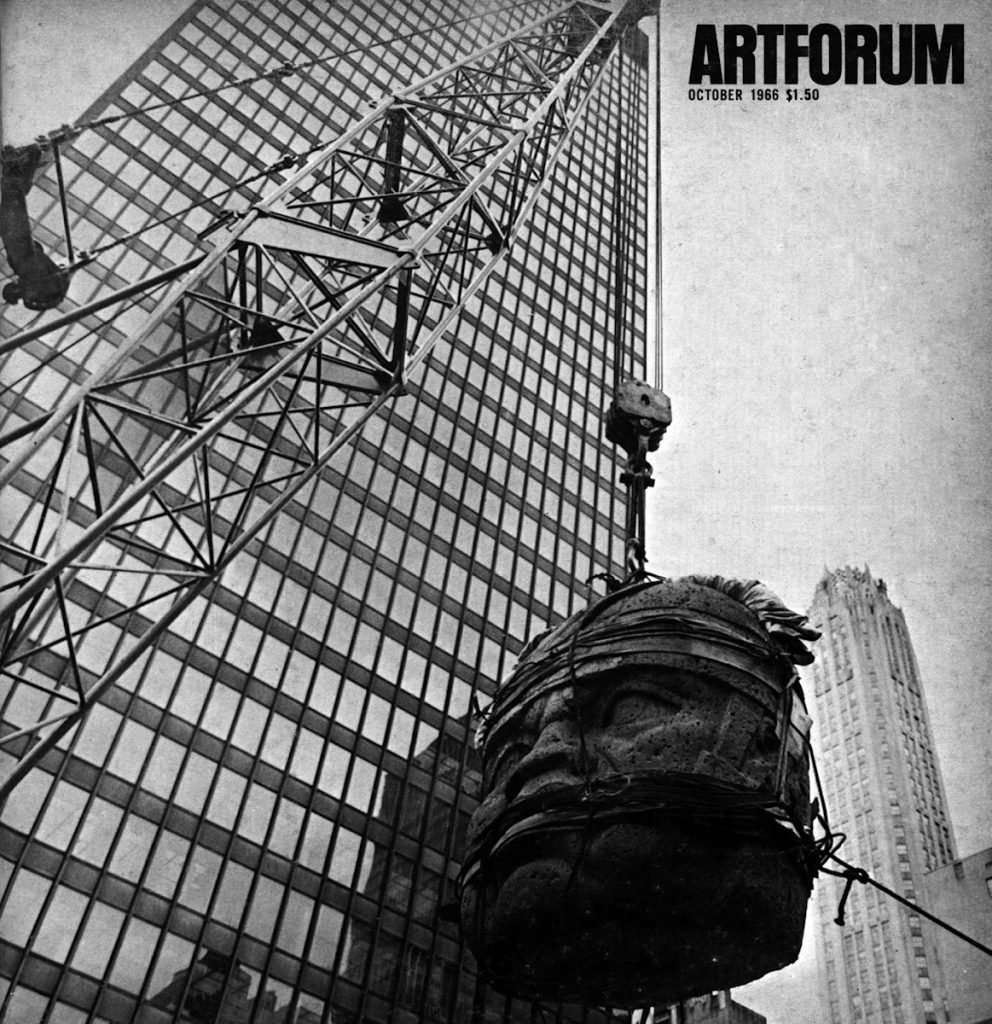
San Lorenzo Monument One being installed at Seagram Building on Park Avenue, May 1965, as seen on the cover of Artforum in October 1966

Also here is one of two Olmec heads being installed on Seagram Plaza, on a base designed by Philip Johnson, on the cover of Artforum, where Irving Sandler writes of the impact of the head on contemporary sculptors.

Most stunningly, Castañeda notes, that almost no one has looked closely at these Olmec sculptures, their genesis and impact, on the work of land artists like Robert Smithson or Michael Heizer. Heizer’s father Robert was a protege of Stirling, one of two US archaeologists who established Olmec studies as a distinct field. By the 1960s Heizer the father had left his research on Olmec engineering techniques and had begun helping his son excavate artworks in the Nevada desert. When LACMA opened Renzo Piano’s Resnick Pavilion in 2010, it was with a show titled, Olmec: Colossal Masterworks from Ancient Mexico, which featured two megalithic heads on cor-ten steel bases designed by Michael Heizer.

Doubling Time, by Luis M. Castañeda [greyroom, spring 2013]

Who’s Afraid Of Red & Blue?

sandback_install_df_monclova.jpg
Fred Sandback installation at Proyectos Monclova, DF, via @monclova
It’s like how when you learn a word you start hearing it everywhere.
sandback_DF_moffit_frieze.jpg
Fred Sandback installation at Monclova via Evan Moffitt for @frieze
I’ve been soaking in a lot of red and blue lately.
gucci_s-s17_redblue_ann_caruso.jpg
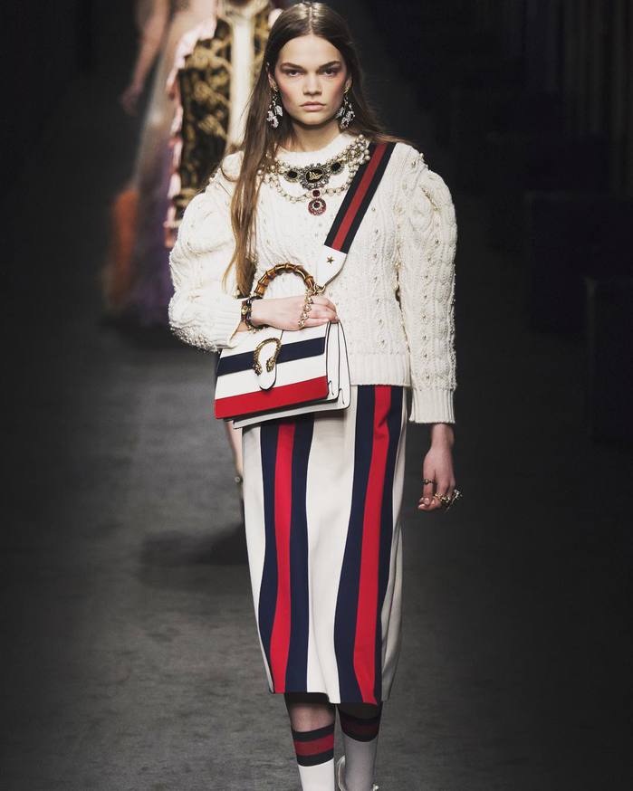
Gucci S/S17, image via ann_caruso’s ig
webdriver_torso_screenshot.jpg
Webdriver Torso as found painting system, via
What to do with it? Turn over the decisionmaking to found or chance operations?

Webdriver Torso as found logo system, via
Appropriate? Outsource? Abrogate? Collaborate? Engage? Every strategy has its own context. Or rather, the context is mutable (too).
Thumbnail image for expo67_ masey.jpg
Barnett Newman’s Voice of Fire installed in the space it was created for, the US Pavilion at Expo67 in Montreal, image via jack masey’s book
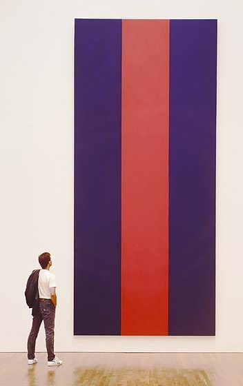
I made a repetition of Barnett Newman’s Voice of Fire recently, with the help of some excellent painters. It’s 18 feet high and 8 feet wide. For now.
sorcerers_apprentice_axe.jpg
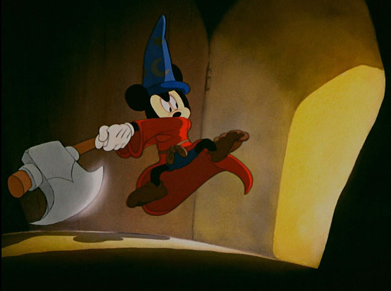
Sorcerer’s Apprentice, Fantasia, 1940
At Chop Shop at SPRING/BREAK, collectors will reconfigure Newman’s red and blues to suit their own compositional and spatial needs. The results might be Newmanesque, or they might be something totally different.
gregallen_study_for_chop_shop_newman_2-6_small.jpg
Study for Chop Shop Newman, 2016
I was psyched to write about it, but now I’m kind of unnerved to see what people will actually do. What if they chop up the whole thing and cart it home? In big pieces or small ones? A lot or a little? What if they do nothing? Alan Solomon called Voice of Fire “virtually unsalable.” We shall see, but I think I have solved that problem.

Photomural Phreakout: Harlem On My Mind

harlem_on_my_mind_photomurals_metmus.jpg
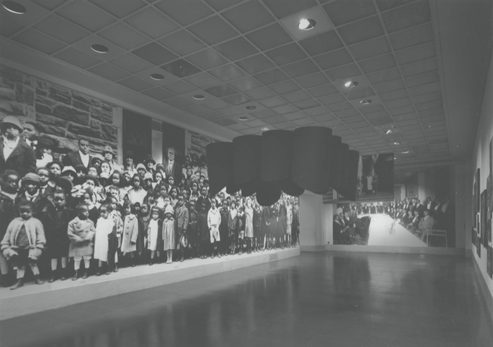
Photomurals in the 1900-1918 section of Harlem on My Mind: Cultural Capital of Black America, 1900-1968, Metropolitan Museum, 1969, image: The Met
It’s been a while since I’ve written about them, but photomurals still have a wide, quasi-artistic place in my heart. And so it’s great to run into them in the most unexpected places.
Like in Holland Cotter’s story of seeing the Met’s botched attempt at racial appeasement, the 1969 exhibition, Harlem On My Mind.
I knew the show was controversial, and that black artists had rallied against it and similar flawed, tokenist shows in the works at the Whitney. But I never knew what the Met actually showed: basically, no art, just 2,000 photographs. Which, to the Met, in 1969, were emphatically not Art.
Which is not entirely fair. The show was conceived by the Met’s hot new director Thomas Hoving, a former NYC Parks Commissioner who had been known, as Life magazine put it, as a proponent of “be-ins, love-ins, traffic-free bike rides, Puerto Rican folk festivals, and happenings.” Harlem on My Mind was seen as a way to make the museum relevant to African American audiences, but also to bring the stodgy institution into the contemporary cultural discourse.
The show was curated by Allon Schoener, and designed by Harris Lewine and Herb Lubalin, who basically tried to remake their popular 1967 Jewish Museum show, Portal to America: The Lower East Side, 1870-1925, but for Harlem, circa 1900-1968. The show was explicitly didactic, a one-hour experience immersed in what Bridget R. Cooks, in her 2007 study of the exhibition, “a multi-media extravaganza.”
In this sense, it hearkens back to World’s Fair pavilion modes, or the immersive photo exhibitions of Edward Steichen-era MoMA, including the WWII shows and, obviously, Family of Man. Never mind that Roy deCarava and Gordon Parks, who’d actually been included in Family of Man, boycotted Harlem on My Mind, and then mobilized against it.
Anyway, the point is, there was a context for this show, several contexts, in fact, including for how the exhibition was designed, and what the experience of it was intended to be. And those contexts, especially the activism and protest the show engendered, have displaced the content and form of the show itself. The content was a paternalistic, problematic mess, in so many ways a failure, but the form was apparently successful–and is now lost and mostly forgotten.
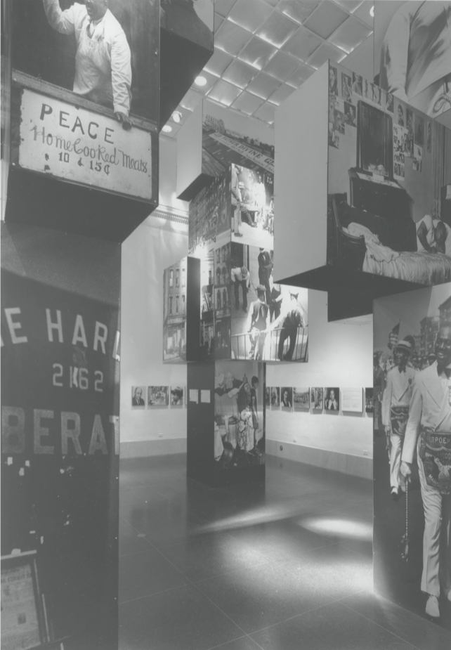
harlem_on_my_mind_photocubes_metmus.jpgphenomenal photocube totem columns in Harlem on My Mind: Cultural Capital of Black America, 1900-1968, Metropolitan Museum, 1969, img: The Met
Here are some of Cooks’ descriptions:

Various wall layout designs were used throughout the galleries to display more than 2,000 photographs. Some walls held large-scale black and white photomurals eighteen feet in height and of varying widths.

Some walls were used dramatically as dark screens for projected images of Harlemites and street scenes from slide projectors suspended from ceiling tracks. Four-sided columns displayed photographs of Harlem buildings, streets, and residents in both formal portraits and informal community scenes. Some columns, topped with large photo-text cubes, stood over ten feet high in selected galleries as if they were free standing sculpture. Several of these towers highlighted notable Harlem figures such as elder resident Alice Payton “Mother” Brown and Billie Holiday in their respective decade galleries.
Speakers camouflaged in large cylinders, hung throughout the galleries, delivered Harlem street sounds and music to visitors. Films and videos were interspersed through the galleries to provide further information, and a closed-circuit television showed the real-time activity at the intersection of Seventh Avenue and 125th Street in Harlem. Photographs punctuated with text were suspended from the ceiling to create billboard-like visual timelines that marked important national events, such as the Supreme Court ruling in Brown v. Board of Education, 1954. The exhibition was designed to provide a one-hour experience for each visitor. [emphasis added for awesomeness, awesomeness, and lol srsly?, respectively.]

Though some art critics bailed, calling the show sociology, not art, Grace Glueck weighed in:

To this viewer, there is something terribly American about “Harlem.” It panders to our penchant for instant history, pack- aged culture, the kind of photojournalistic “experience” that puts us at a distance from the experience itself. Instead of the full, rich, Harlem brew, it presents a freeze-dried Harlem that does not even hint at flavor.

Harsh, but admit it, the Harlem-cam had it coming.
Anyway, I want to make these photototems now, or rather, see them exist again. I’d hope not, but I think they’d be all kinds of problematic all over again if I made them. I just hope they could exist again, as the alluring, outraging failures they were. Because they do feel terribly American to me, too, and terribly New York. I think a trip to the Met’s archives is in order.
What I Learned From a Disgraced Art Show on Harlem [nyt via @JenGraves]
Bridget R. Cooks, “Black Artists and Activism: Harlem on My Mind (1969)”,
Amer. Studies, Spr. 2007 [pdf floatin’ around on project muse, go get it! oh wait, blackcontemporaryart has a clean link and the abstract all ready]
Taking Care of Business: Gio Ponti’s Time-Life Pavilion

gio_ponti_time_auditorium_ext_esotericsurvey.jpeg
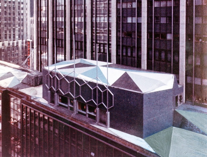
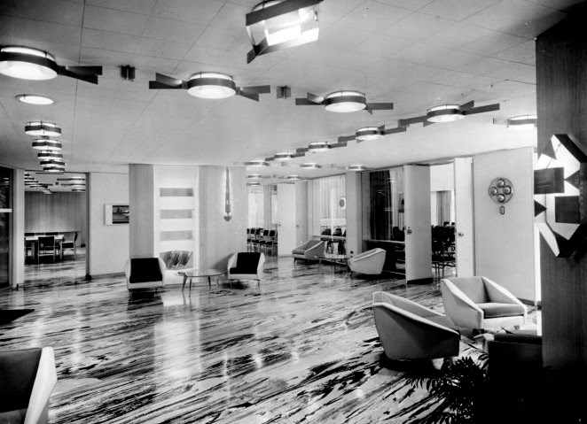
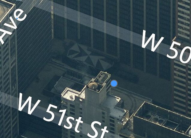
Amazing, how did I never know this? Gio Ponti designed a business pavilion and auditorium for Time-Life in 1958, and it’s still there, perched mostly out of view on the north side of the 8th floor setback of 1271 6th Avenue. It’s covered with crystalline facets and triangles on the roof and terrace [though the photo above also seems to include some overpainted elements. Also it was flipped, so I fixed it.]
gio_ponti_time_auditorium_int_esotericsurvey.jpeg
Dubbed “the most versatile and complete business-meeting facility in Manhattan,” the pavilion was commissioned by Henry Luce at the instigation of his wife Clare Boothe Luce, who wanted to make Ponti a thing. Writing about a 2010 show of Ponti in New York curated by Germano Celant, Suzanne LaBarre described the pavilion as “the closest thing to a playground a stark, midcentury office building had seen: green-and-blue marbleized floors; saucers and brass strapwork in the ceiling; obelisk sconces; and a smattering of irregular nooks, foyers, and bars.” Green & blue marbleized floors? Yow. Sounds like proto-Memphis to me, and makes me curse black and white photography.
ponti_time-life_pavilion_bing.jpg
Gio Ponti Time-Life Pavilion/Auditorium, on the north side of 1271 6th Ave, looking S/SE on bing
Unfortunately, LaBarre reports that Ponti’s interior has been destroyed and remodeled two times over. [The top two images come from Esoteric Survey’s extraordinary survey of the 1958 Time-Life Building’s interiors, from the likes of, basically, everybody.] Time is out of or leaving the building this year, so who gets the Ponti?
leonni_brussels_masey_ext4.jpg
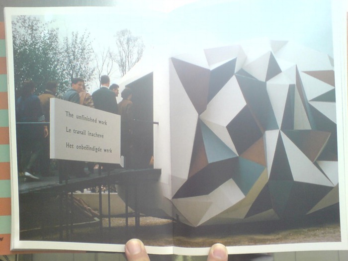
What is most surprising to me, though, is the similarity of Ponti’s design to the Unfinished Business Pavilion, created in for the 1958 World’s Fair in Brussels. In an attempt to head off Soviet criticism of the US’s discrimination against African Americans and the civil rights protests it spawned, the State Dept. and USAID asked Luce’s Fortune Magazine to create a pavilion addressing ‘the Negro Problem.’ Fortune creative director Leo Lionni’s three-part design moves from the “chaotic crystal” of the past to the bright happy square future where children of all races play together in harmony. Which was considered such an insult to the segregationist Dixiecrats in Congress, they demanded Fortune close the pavilion as soon as they got wind of it.
Which is interesting that in color and form, Ponti’s pavilion most closely resembles the chaotic crystal section, or vice versa. Maybe Ponti’s came first, and Leonni used it as a stand-in for the shameful past we were all trying to overcome. Anyway, this warrants further investigation.
Time-Life [esoteric survey]
Gio Ponti’s New York [metropolis]
Previously, related, and devastatingly, depressingly timely: The Unfinished Business Pavilion, by Leo Leonni
None of Your ‘Unfinished Business’

Some Other Art At The 1964 New York World’s Fair

13_men_tarp_peter_warner_meyer.jpg
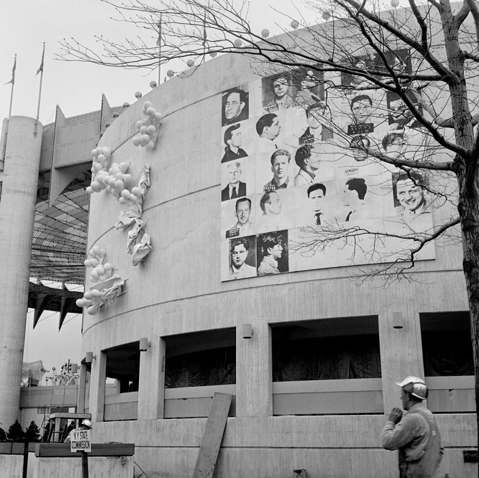
Thirteen Most Wanted Men overpainted and covered by tarp, 1964. Photo: Peter Warner, via Richard Meyer’s Outlaw Representation
From the amount of attention it gets, you’d think Andy Warhol’s 13 Most Wanted Men was the biggest art deal at the 1964 New York World’s Fair. And it wasn’t even there for more than a couple of days.
But there was actually other art in the fair, and organizer Robert Moses was not into it. Countries could show art if they wanted, of course–Italy brought Michelangelo’s Pieta, and Franco’s Spain brought some El Greco. But Moses rejected petitions for a dedicated art exhibition at the fair, and he intervened in at least one other situation besides Warhol’s to nix art that attracted criticism. I’ve dug around a bit in the New York Times’ coverage of art and the fair, mostly from the cranky conservative critic John Canaday, and it has broadened and definitely complicated my view of the era, the venue, and the outsize parties involved.
If you do nothing else, read Canaday’s various acidic takedowns of the consumerist banality and kitschy circus of the World’s Fair, and how Art shouldn’t even be mentioned in the same breath. His column, “The Fair As Art,” tries to stretch the definition of folk art to cover the what we’d now recognize as late capitalist spectacle, and it’s interesting how he can’t quite get the nascent Pop Art movement to sync up with the populist source of its content.
No, first read about Canaday’s Feb. 1964 evisceration of the announcement that Tomorrow Forever would be the “theme painting” the Hall of Education. The landscape was filled with the trademark Big-Eyed Children of Walter Keane, the Thomas Kinkade of his day, who, it turned out, couldn’t paint a fence, and instead passed his enslaved, abused wife’s paintings off as his own.
This extraordinary profile of Margaret Keane in The Guardian yetserday led me to Canaday’s review. [Tim Burton’s biopic of Keane comes out in a couple of weeks.] But the piece also says that “Stung by the review, the World’s Fair took down the painting.” Actually, Tomorrow Forever never made it into the fair. Robert Moses intervened almost immediately after Canaday’s attack, more than two months out from the opening, saying, “The fair does not censor exhibitions except in cases of extreme bad taste or low standards. This was such a case.”
[Ouch. Moses’s willingness to boot one reviled painting makes his central role in the Case of the Destroyed Warhol Mugshots seem all the more plausible. For his part, Warhol praised Keane and his outsized commercialism. LIFE Magazine asked Warhol about Keane in 1965: “It has to be good,” he said. “If it were bad, so many people wouldn’t like it.”]
Anyway, Warhol’s World’s Fair piece can’t have been too much of a surprise. Though his name is misspelled, “13 Wanted Men” is mentioned by title in a NYT report from October 1963, “Avant-Garde Art Going To Fair”. The other nine artists Philip Johnson commissioned are also listed, and I realized I never registered that Ellsworth Kelly had been involved. But he produced a work on painted aluminum.
Ellsworth_Kelly_NYWorldsFair_Treadway_1966.jpg
And here it was. Untitled at the time, Kelly’s 18-foot curves projected from the wall of the New York State pavilion, where they were installed next to James Rosenquist’s mural, which was next to Warhol’s. Except the Rosenquist is either covered or gone in this Nov. 1966 photo from World’s Fair enthusiast Randy Treadway. So is Robert Indiana’s EAT, which was on the right of Kelly.
ellsworth_kelly_peabody_terrace_gmap.jpg
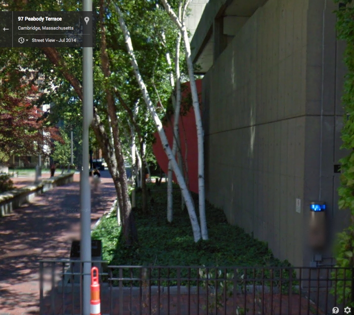
A bunch of the NYS Pavilion pieces ended up in the Weisman collection at UMinn., but in 1967 Johnson apparently donated the Kelly to Harvard, where it was known as either Two Curves or Blue Red. In 2001, a campus-wide survey of culturally important objects found “Blue Red” on the side of the parking garage at Peabody Terrace. The super was about to repaint the deteriorated sculpture with Rust-o-leum when conservators intervened. The Google Streetview image from this summer [above] shows it looking much better.

Abstract In Concrete (1952), The Making Of

Nayland Blake just posted this on his always eye-opening tumblr Knee-deep in the Flooded Victory. Abstract in Concrete is a 10-minute short film by John Aravonio, which pairs reflections of neon signs in the rain puddles of Times Square with a jazz/classical score by Frank Fields. The date given on this recent YouTube upload is 1954. And it is credited to the United States Information Agency.

Which is just nuts.

Continue reading “Abstract In Concrete (1952), The Making Of”

Pictures At An Exposition

expo67_ masey.jpg
One thing I noticed while researching Warhol’s World’s Fair commissions, is that the US Pavilion in Montreal had this sweet photomural of the moon.
expo67_photomural_masey.jpg
both images by USIA’s Jack Masey
And it also had this sweet photomural of the moon. I can’t tell which came first or why.
expo67_bogart_charstad.jpg
Bogart, image via CHarstad
I think the way giant photos–of the moon and the stars alike–were used alongside giant paintings and giant graphics in the World’s Fair exhibition was one of the most advanced levelings of these supposedly distinct image hierarchies.
expo67_flag_lifemag.jpg
I’ve really got to get into the USIA Archives for this stuff. Actually what I need to do is get Jack Masey on the phone while I still can.

On Warhol And The World’s Fairs

If I ever get a PhD it will be in the US Pavilion at Expo67 as a gesamtkunstwerk. So much going on there, and in my years of fascination and study of it, it just keeps on giving.
And I am stoked for the Queens Museum’s show, opening to day, on Thirteen Most Wanted Men, Andy Warhol’s short-lived commission for the New York State Pavilion at the 1964 World’s Fair. It sounds amazing, with an impressive amount of archival research and new understanding.
I haven’t seen it yet, but I have been bothered by a line that’s cropped up in several reviews of the show, which makes me think it’s not accidental, calling the 13 Most Wanted Men panels “Warhol’s only public artwork.”
This characterization only holds up if you define public art so narrowly as to make it irrelevant [which is something that happens to public art a lot, actually, but that’s not the point here.] Warhol exhibited work in at least three World’s Fairs in a row–1964 in New York, 1967 in Montreal, and 1970 in Osaka. And the first two were commissions. In fact, I’d suggest that the New York and Montreal projects are so similar, that they really should be considered together. Warhol’s Expo 67 works suddenly feel like a direct response to the controversy in 1964. When faced with the prospect of wading into another political conflict over his subjects, Warhol chose to depict himself.
warhol_13most_wanted_install_1964_sm.jpg
In 1964, Warhol painted 25 panels–22 with mug shots, 3 blank/monochromes–on 4-foot square masonite panels. The images came from an internal NYPD pamphlet that gave the piece its title: 13 Most Wanted Men. These were painted over in aluminum house paint within two days.
13_men_tarp_peter_warner_meyer.jpg
Thirteen Most Wanted Men overpainted and covered by tarp, 1964. Photo: Peter Warner, via Richard Meyer’s Outlaw Representation
Later they were covered with a large tarp. They have since been lost or destroyed. In his incisive 2002 history, Outlaw Representation: Censorship and Homosexuality in Twentieth-Century American Art, Richard Meyer quotes John Giorno’s story about the origins of Thirteen Most Wanted Men, and that the mug shots came from the gay cop boyfriend of another painter, Wynn Chamberlain. 1 [No one’s mentioned it, but I assume this is all in the Queens Museum show. Right? And the show will surely explain why Philip Johnson told Warhol in 1963 not to talk about the sources of the paintings? Johnson, who surely knew as much about power, rough trade, and a man in uniform?]
warhol3_moses_lancaster.jpg
Warhol painted 25 panels with Robert Moses’ headshot, taken from Life magazine, as replacements. Philip Johnson rejected them, and they are also now considered lost or destroyed. [This photo is by Mark Lancaster, who helped Warhol make the Moses panels and much else. There’s a great interview with Lancaster at warholstars.org.]
During the Summer of 1964 Warhol reused the screens to create paintings on canvas of the 13 Most Wanted Men, which Lancaster cropped and stretched. Nine of these are currently in the Queens Museum show.
In 1964 he began making the Screen Tests, which were inspired both by the Thirteen Most Wanted mug shots and the photobooth pictures Warhol began using in 1963. He created Most Wanted series of women and boys as well.
warhol_menils_expo67_sm.jpg
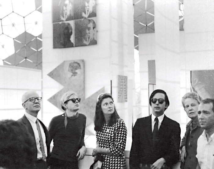
Warhol visiting Expo 67 with the de Menils, that’s John de Menil at left, not Buckminster Fuller, as some online sources would have it. image via menil.org
In 1967 curator Alan Solomon commissioned Warhol to make large paintings for the US Pavilion at Expo 67. Warhol created eight giant Self-Portraits. They are 6-feet across and based on a photo by Rudy Burckhardt. Six of them were installed in Buckminster Fuller’s geodesic dome, above Jasper Johns’ Dymaxion Map. Four of them are visible above, in a photo taken during Warhol’s visit to the Expo with John & Dominique de Menil. The one on the lower right is now in the Tate Modern.
If the Thirteen Most Wanted Men censorship was really as concerned with vice, power, and the homosexual gaze as Meyer argues, then Warhol’s uncensorable Self-Portraits read like an act of defiance. For his 2nd World’s Fair, Warhol didn’t shrink from political conflict; he met it straight on and came out on top.
1 Update: I just came across a story by Lucy Sante about Thirteen Most Wanted, which he published in 2009. It is, I assume, a fictional encounter with a retired NYC policeman who had the idea for a Ten Most Wanted list stolen from him by a fellow cop, who became lovers with a young Warhol, and then years later, while guarding the World’s Fair, saw his Most Wanted Men idea stolen again by his ex. Hmm. I think someone had better talk to John Giorno.

A Domestic Proposal:

At Home With Voice Of Fire

expo67_ masey.jpg
photomurals and satelloons to the left, painting to the right. image: USIA via Jack Masey’s book, Cold War Confrontations
With Barnett Newman in the air recently, I began looking back through the greg.org archives, and I found this 2009 post about the art and space objects at Expo 67, which is a great read, if only for the smackdown delivered by NY Times critic John Canaday.
I was already into satelloons and photomurals and World’s Fairs as odd, underconsidered contexts for art when it registered that Alan Solomon had curated a whole painting show for the US Pavilion in Montreal. He basically asked all the artists for work that could be hung vertically, would hold up visually in a giant geodesic terrarium, and would pretty much only be seen from an escalator. And that’s what he got.
Barnett Newman’s Voice of Fire is there in the upper right corner, looking really small between the Lichtenstein and Johns’ Dymaxion Map. Which just goes to show you, because here it is in the National Gallery of Canada, which bought it in 1989.
newman_voice_of_fire.jpg
A work of confounding scale. And not without its charms. It’s not my favorite Newman, but I like Voice of Fire. It looked great in Ann Temkin’s Philadelphia retrospective. And last night, I wondered what it’d be like to live with. Because at 8′ x 18′ it is pretty unwieldy. In principle it’d be nice to have 20’+ high space at home to hang it freely. But that kind of room is really a gallery, even if your breakfast nook is just through the door.
newman_vof_sideways.jpg
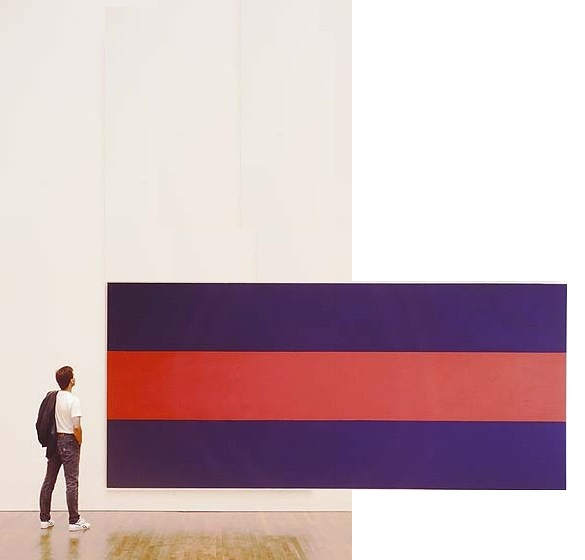
So barring that, you could turn it sideways, which is how Newman painted it. If 12×25 is too long a run of uninterrupted wall for you, though, you’re stuck. And so I wondered about cutting it down.
We sure don’t cut up paintings into saleable parts like they used to. Like they did with altarpieces [hello, Piero at the Frick] where everyone on his Grand Tour got to take home a panel or predella.
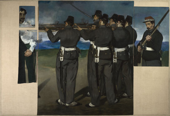
Even barely a hundred years ago, Manet’s heirs were chopping up the uncomfortably political Execution of Maximilian into more marketable groupings. And look, now most of it’s in the National Gallery [of England].
manet-execution-maximilian-NG3294.jpg
I’m not saying there’s no contemporary precedent: Gerhard Richter cut a squeegee painting into 64 little ones. And this BMW Rauschenberg campaign reminds us that Aaron Young painted dozens of panels at once at the Armory that one time, with the motorcycles.
I’m just saying maybe it’s not enough. We could do more. I understand Voice of Fire is very well known in Canada, and that the National Gallery’s purchase of it was controversial. So should Canadians ever face an arts crisis where, say a Taliban- or ayatollah-style regime takes over that is decidedly unsupportive of the kind of painting Newman practiced, I’d think cutting it down and dispersing the painting would be far better than burning it. Or bombing it, Buddhas-of-Bamiyan-style, out of existence.
Or maybe it’s just the populist thing to do. Voice of Fire would suddenly be much easier to display in a modest home. Or several, actually.
newman_vof_vert.jpg
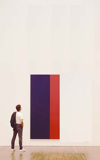
To start, you could cut it two ways: in quarters [above] or in slices [below] slices. Each approach yields four attractive, wall-filling pieces, each 4×8.5′, that preserve the original proportion while making a rich, full allusion to Newman’s overall composition. Reassembling such a group for an exhibition 500 years from now would be trivial.
newman_vof_horiz.jpg
You could also cut it into 8 pieces, roughly 4×4, almost easel-size. Voice of the Fireplace. But then it seems like you’d be losing a lot to the stretchers. So, what, you’d mount the pieces? Frame them? I imagine you’d get a mix of decor decisions from the various owners. Which, yes, no, I haven’t thought through the pricing and sales strategy yet. This is really just starting out.

Thinking About Art, Politics, And Milton Glaser’s Mural

glaser_colorfuses_gsa.jpg
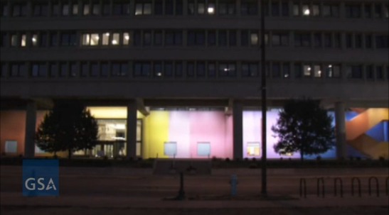
I’ve been wanting to write about Color Fuses, Milton Glaser’s 1974-5, 27×672-foot gradient mural in Indianapolis, all week, ever since Richard McCoy’s great Art21 post about the GSA’s restoration of the work’s 34 monochrome sections, and the realization, finally, of Glaser’s original lighting effects.
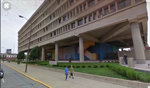
glaser_colorfuses_gmap.jpg
image: google maps
Besides my well-documented fascination with monochromes and gradients, I found myself intrigued by Glaser’s stated purpose for the mural, which wraps around the stark, ground-level loggia of the Minton-Capehart Federal Building, designed by local modernist eminence and Philip Johnson alumnus Evan Woollen. Glaser wanted to create “a mural that would express a spirit of openness and thus a new sense of government.”
The architect, for his part, hoped the mural would help make the building feel “cheerful, disarming, fresh, welcoming, and inviting.” Which is, let’s face it, a helluva thing to hope for your Brutalist, concrete, ziggurat superblock.
[Walking around the building on Google Maps gives a nice sense of the mural in daylight, including the backside, which is across the parking lot, and the bluish south end, which is largely blocked by privacy wall around the building’s daycare center. Even ignoring the unfortunately undulating wall–an out-of-place motif picked up by the single, sad wave of shrubs on the building’s strip of security plinth grass–the Minton-Capehart can only be my second favorite example of brutalism and daycare, way behind the playground on the plaza of the J. Edgar Hoover FBI Building.]
So I’m inclined to believe that the project went down a little differently at the time, a time when the GSA had revitalized and professionalized its Percent For Art program under the 2nd Nixon administration. [A distracting sop to the elites, he figured.] It’s not clear, for example, whether Glaser came to the project under the new system, as a world-class, committee-reviewed pick, or the old way, in which case he would have been suggested by, and thus, subsidiary to, the architect.
Which would be interesting to know, because another benefit of not blogging about immediately, is reading Alexandra Lange’s post about how modernist architects [occasionally] recognized that their severe forms might [just sometimes!] have needed a bit of humanizing.

But then watching the GSA’s video of the original/new lighting scheme, which adds slow ripples [undulations!] of light/dark around the building, I immediately thought of art. Specifically, Paul Sharits, who had been making painting-like, flickering, multi-projector, monochrome film installations for several years already when Glaser created his mural. [Writing about Sharits’ 1972 piece, Soundstrip/Filmstrip, Rosalind Krauss said it “muralizes the field of projection.”]

Paul Sharits’ Shutter Interface, first shown at ArtPark in NY in 1975, here at Greene Naftali in 2009.
And I wondered about the different ways art functions, and is treated, both at the time and through the lens of history and criticism. Partly because I’d never heard of Glaser’s mammoth mural before. Or of any other art he’s made. It seems to fall into this population of things people commissioned, made and showed, that are/aren’t/look like/function as art, which are [happen to be?] made by designers. And which are excluded from consideration within the context of art and art history. And politics is at the center of this boundarymaking.
The clearest example of this is the US Pavilion at Expo 67 in Montreal, the geodesic sphere designed by Peter Chermayeff and his exhibition firm Cambridge Seven Associates. Which had both spacecraft and satelloons and flag-like, Ellsworth Kelly-like supergraphics, and giant, commissioned paintings from the likes of Barnett Newman, Warhol, and Johns.
I don’t know yet how to make sense of Glaser’s mural, but I bridle at what I instinctively feel, that despite its awesomeness and Glaser’s immense influence, Color Fuses is somehow a less significant work because it’s art by a designer. Or art for the government. Or art the architect will put up with. Especially when I read Glaser’s intentions for the piece, which, by 1974, transparency and a new form of government were certainly on a lot of peoples’ minds.
And finally, last night, I found Hillman Curtis’s video profile of Glaser on Brainpickings, where the designer talks about art’s role in culture. It’s “benign” and “pacifying,” he says, and succeeds best when it creates “commonalities” by which “the likelihood of us killing each other is diminished.”
Again, I don’t think that perspective has been very prominent in the art world discourses of the day. It could be dismissed as hyperbolic, an at once idealistic and yet embarrassingly low bar. And yet, lately, the polarization in our cultural and political spheres make me wonder if not throttling each other is actually something we’d do well to focus on. Even if pacification by painting undulating rainbows on government buildings is not the best role demanded by the times for art.
Restored & Renewed: Milton Glaser’s 1975 Artwork, “Color Fuses” [art21.org]
Color Fuses’ Mural Restored at Minton-Capehart Federal Building [gsa.gov]
Art Matters To Architecture [designobserver]

The ‘Latest In Murals’

murals_equip_46_1.jpg
I hate when I lose the context of something, it’s like I”m no better than a tumblr around here, minus even the traffic.
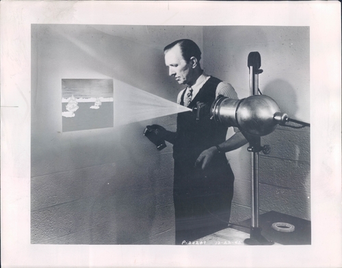
Anyway, this image of The Latest Photo Mural Equipment is from somewhere and some time in the past. The image of the back of this photo had a caption scrawled on it, “Photography Equipment
An emulsion, melted,
brushed on wall,
latest in murals.”
Also a note that it was to run across two columns. So it is from a magazine. In any case, the idea seems to have been to paint the emulsion, then project an enlargement of a negative on it, exposing and developing it right on a wall surface. Which seems amazing, and also right tight with my theory [sic] about a connection between photomurals and large-scale, postwar painting.
Oh, there’s a datestamp: Jan. 29, 1946.

Creative America

expo67_photomural_masey.jpg
This interior shot of Fuller/Sadao’s US Pavilion at Expo67 almost has it all: installation view of the giant paintings Lichtenstein, Newman, Warhol and Johns made for Alan Solomon’s American Painting Now; plus a giant photomural of the moon, perfect for posing in front of.
There’s another photomural, earthrise from the moon, on the other side, which was a backdrop for the lunar landscape diorama. You can see it in Carl Harstad’s photo:
wexpo67_lunar_charstad.jpg
And the satelloon-like weather balloons were just out of both pictures’ edge. Fortunately, Bob Charlton’s mother captured them below:
American Pavilion - Expo '67
The underside approach for the lunar platform has this awesome installation [image from fan train’s flickr], a series of panels or canvases with abstracted elements of the American flag. It’s a little Ellsworth Kelly, a little Helio Oiticica, and a little Richard Lippold at Lincoln Center, all rolled into one piece of exhibition filler created, I assume, by Cambridge Seven.
American Pavilion
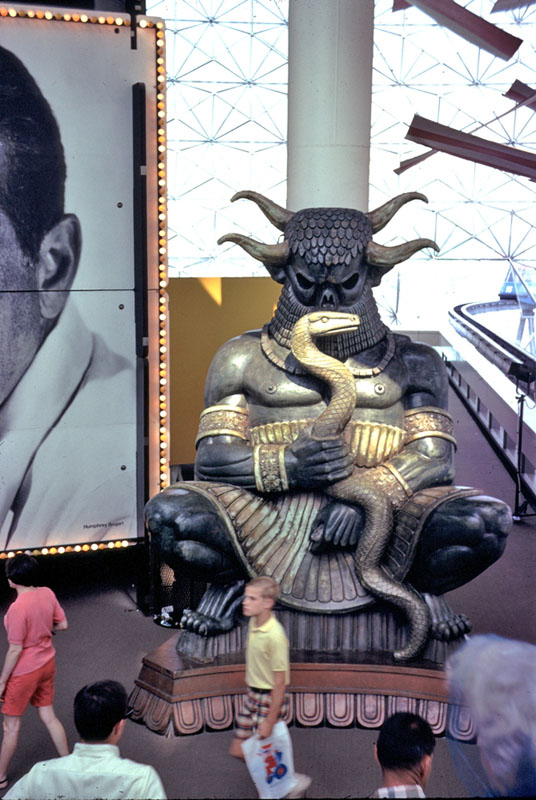
This other photo from Carl Harstad of the Hollywood section of Cambridge Seven’s exhibit features, what? I don’t know. I’d guess it’s left over from Joseph Manciewicz’s disastrous Cleopatra shoot, in front of a giant, multipanel headshot of Humphrey Bogart.
expo67_bogart_charstad.jpg
Cambridge’s exhibition carried the overall title, Creative America, and I think it very successfully steamrolled everything–paintings, photomurals, dioramas, film props, spaceships, cultural effluvia–into a single, unified, spectacularized drive-by aesthetic experience. And it was all done by and for the US Government. As I go on about reconsidering ‘non-art’ things like photomurals and satelloons in an art context, I keep coming back to the Expo67 pavilion. At one point, it was all art, or something like it. And vice versa.
[note: I’ve seen it elsewhere, but I took that top photo from former USIA design director Jack Masey’s powerpoint deck on the history of postwar World’s Fairs, which he presented last October at the National Building Museum. I’m about to listen to his archived talk now.]

The Greatest Photomural Ever Sold

gc_photomural_loc.jpg
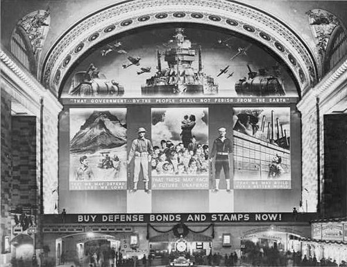
Instead of jumping to the first search result, Google’s “I’m feeling lucky” button should go to something tangentially related but certifiably awesome and probably better than what you were looking for in the first place. For the first datapoint in fitting that algorithm, I submit this post from The Bowery Boys about the “World’s Greatest Photo-Mural,’ as proclaimed by the New York Herald upon the dedication on December 14, 1941 [!] of the Defense Bonds Mural in Grand Central Terminal, New York City, USA.
At 96×118 feet, and covering the entire eastern wall of the station’s Great Hall, it was certainly the world’s largest photomural to date. [Only an Axis appeaser would point out that it’s actually six photomural elements installed in a larger, non-photographic composition.]
The mural was created by the Farm Security Administration’s Information Division, the legendary New Deal documentary photography propaganda unit run by Roy [no relation to Ted] Stryker. The three main photocollaged panels depicted what America was defending: Our* Land, Our* Children, and Our* Industry. [* Offer apparently not valid for non-white Americans, as the NAACP pointed out in protest letters to the FSA.]
Classic racial exclusion notwithstanding, I was most amazed that a giant war bonds photomural in Grand Central Station was the government’s instant response to the attack on Pearl Harbor. And I was also wrong. According to a contemporary report in Time Magazine, the FSA photo staff spent three months designing and fabricating the massive photomural. Which should be evidence enough for the conspiracy theorists who suspected that Stryker and his puppet FDR had been planning to get the US into war all along. But it turns out the Treasury Department had already begun its defense bond campaign in 1940, and that the government marketing masters at the FSA had already been enlisted in Treasury’s bond-selling campaigns.
Which seems odd, that a Depression-era tenant farmer resettlement program would morph into a historically ambitious documentary project for rural America, and then into a war bond marketer, before becoming the military propaganda operation for D-Day. Odd until you hear Stryker’s longtime assistant Helen Wool describe Stryker’s vision of the FSA’s photographic mission in a 1964 interview for the Smithsonian:

[I]n that drastic difference he still stuck to the same type of basic idea, that America is America and that’s all there was to it. We had psychological warfare films, and we had displays, and we had defense bond things, and everything else. But, underneath it he was selling America as it should be sold. [emphasis added because, obviously]

So what does the 3-months making of the world’s largest photomural entail? Fortunately, the snap-happy photographers at FSA like Edwin Rosskam and Marion Post Wolcott documented the process, in a group of 53-70 images now at the Library of Congress:

Continue reading “The Greatest Photomural Ever Sold”