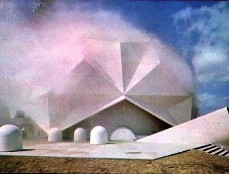
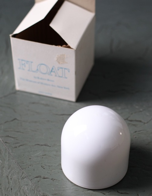
I’ve had Michelle Kuo’s interview with Robert Breer [artforum, nov 2010] open in my browser tabs for months now, ever since Steve Roden posted about his incredible little toy Float, which was sold at MoMA’s gift shop in 1970, at the same time one of Breer’s original Pepsi Pavilion Floats had been liberated from Expo’70 in Osaka and set loose in the Abby Aldrich Sculpture Garden. [A PDF of The Modern’s Aug. 25 press release for the piece, titled Osaka I, said the toy Floats would be sold for $7.95, or two for $15,” in the Museum’s Christmas Shop.]
Kuo’s is one of the best interviews I’ve seen with Breer; most never got past the basic, “how did you get into animation?” “So you lived in Paris on the GI Bill?” chestnuts. With what is now a terrible lack of urgency, I’d made a few attempts to track down Breer this year, in hopes of following up with him about what he’d probably consider the least important aspects of his creative practice: the commercial work and product design and TV animation [including still unidentified segments on The Electric Company] he would bring up–and then insist be kept separate.
Because Breer’s consistently innovative filmmaking and playfully minimalistic/animalistic sculptures–and the fact that he did his most monumentally awesome art work for Pepsi–hinted at the potential relevance of the work he kept in his commercial closet.
Which, amusingly, is not really the point, except to say I want to find a Float of my own, please.
No, the immediate point is, wow, how awesome is Breer’s 1966 sculpture, Rug? This was the work that introduced Breer’s sculpture to me, at a show that also opened my eyes to the revelatory breadth of his filmmaking. It was recreated for the first time in decades in 1999 at AC Projects. Their small second floor space in off-Chelsea was creeping and crawling with little Breer sculptures, while the Mylar Rug slowly shifted around in place. The other works felt alive, droid-like. Rug‘s movements were creepier, more ominous, like something was alive underneath it.
Good for the Walker, it looks like they acquired the mylar Rug [there are others, in other colors/materials] just this year.
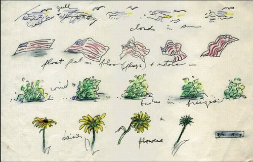
Anyway, while poking around GB Agency, Breer’s Paris gallery, I came across this sketch, dated 8/71, which includes an incredible proposal for a Rug piece made from an American flag. [The text underneath reads, “float flat on floor (flags) + motors”.] The storyboard-like drawing not only ties Breer’s sculptural and animation projects together nicely; the other three sequences–“cloud in sun,” “bushes in breeze,” and “daisies”–help site Breer’s work in observation, duration, and the natural world. Which may have mitigated the political implications in 1971 of something lurking under a crumpled US flag.
In any case, I expect, if not exactly look forward to the day when, this work will be realized for a future Breer retrospective.
Category: expo
None Of Your ‘Unfinished Business’
In the early Cold War of the mid-1950s, the Soviet Union countered American condemnation of its repressive actions in East Germany and Hungary with criticism of the US’s internal policies of segregation and racial discrimination. Planners of the US Pavilion at the 1958 World Expo in Brussels, the first since before WWII, warned that “the desegregation issue would be ‘underlined rather than evaded by omission.'” As longtime USIA design director Jack Masey put it in his 2008 book, Cold War Confrontations, “The Unfinished Business” Pavilion was created by Fortune magazine and/for the State Department “as a way to save face–openly and directly–[by anticipating] negative Soviet propaganda about domestic problems in the US.”
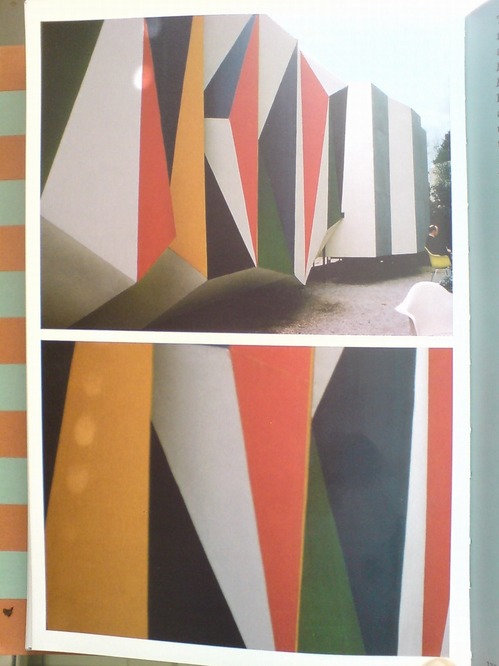
Fortune art director Leo Lionni designed both the pavilions and the exhibit as three distinct sections: past, present and future. The form of each pavilion mirrored the content of its exhibit, though none were so programmatically matched as the first pavilion, where the darkly colored “chaotic crystal” of the exterior [below]
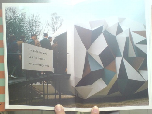
was wallpapered inside with a jumbled, kaleidoscopic collage of US newspapers. Headlines related to desegregation battles were interspersed among other front page stories, presumably to dilute the racism issue by expanding the context, and to underscore the country’s uncensored media as a site of free debate and progress.
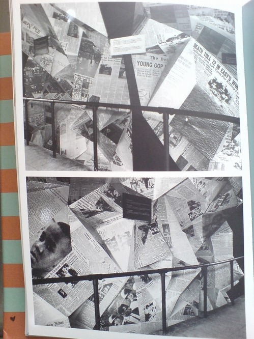
The second, present pavilion had some quotes from President Eisenhower and other leaders, whatever, but it was the bright future pavilion that turned out to be the most incendiary. For its expansive, smooth walls featured large photomurals of amber waves of grain, and a group of happy, young children–“white, colored, and yellow”–playing in a flower-filled meadow.
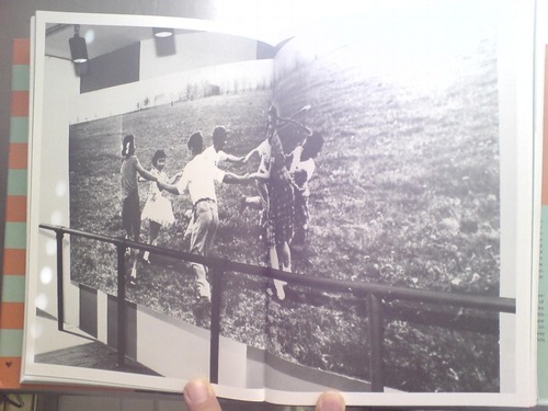
Which basically made segregationist politicians from the South’s heads explode when they found out about it. Masey gives an overview of the controversy in his book, including some declassified letters from outraged Dixiecrats to Eisenhower’s acting Secretary of State. But Michael Krenns devotes an entire chapter to the political shitstorm surrounding the “Unfinished Business” pavilion in his 1999 history anthology, The Impact of Race on US Foreign Policy: A Reader. Great stuff.
Throughout the Spring and Summer of 1958, angry congressmen criticized the exhibit for “foul[ing] the nation’s nest.” The pavilion was temporarily shut down–the official explanation was “poor craftmanship” on the part of the “Belgian carpenters” who somehow failed to properly execute Lionni’s original concept. By including too many news clippings about Little Rock and Gov. Faubus. Leonni hustled to Brussels to make ordered changes to bring “balance” to the desegregation issue.
They even posted a disclaimer that children of various races playing together “did not represent US policy, but was representative of the freedom of choice available in the US.” And still Georgia’s segregationist senator Herman Talmadge protested, demanding an end to exhibition’s “unwarranted invasion of the rights and prerogatives of the states of the South.”
Faced with calls for a congressional investigation that could turn “The Unfinished Business” into The Neverending Business, the Eisenhower administration caved, and by mid-summer, the State Department shut down what the European press had called “the most effective propaganda in the American Pavilion” and replaced it with an exhibit about the unfinished business of public health.
The Unfinished Business Pavilion, By Leo Lionni
What’s the opposite of writer’s block, the thing where you have so much damn good stuff to write about, you’re paralyzed into inaction? Because that’s what I’ve got, and August vacation voids or not, I just can’t help it; I’m gonna blog it all and let Google sort it out.
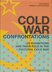 For example, for all the dome- and Expo-loving going on around here, you’d think by now I would have gotten my hands on a copy of Jack Masey and Conway Lloyd Morgan’s 2008 book, Cold War Confrontations: US Exhibitions and Their Role in the Cultural Cold War, but no.
As the longtime design director for the US Information Agency, Jack Masey was basically the client, or the producer, of the expo-related architecture, art, media, domes, pavilions, exhibitions, and propaganda that folks like Buckminster Fuller, Shoji Sadao, the Eameses, and George Nelson became famous for.
Cold War Confrontations is a fantastically surfable book, a thick, highly visual memoir of the USIA’s greatest hits. It’s based on the premise that the structured, official propaganda pageants of world expos, culture exchanges and trade shows, played pivotal roles in the course of post-war world history:
At Expos, however, the teams are not playing games; rather, they competed by presenting to the world examples of a nation’s best architecture, technology, arts, crafts, manufacturing, and performing arts. And in so doing, they sometimes, somehow, change the world. [p. 110]
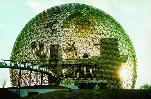
There were many people who believe[d] that to be true. I sort of want it to be true, at least in the same sense that I’d rather see street gangs settle their differences by breakdancing instead of drive-by shootings. Maybe it’s better to see these expos as reflections of the cultures that produced them, or of their aspirations. Because the views expressed therein do not, it turns out, necessarily represent the opinions of the United States of America as a whole, or of their elected representatives and/or government officials.
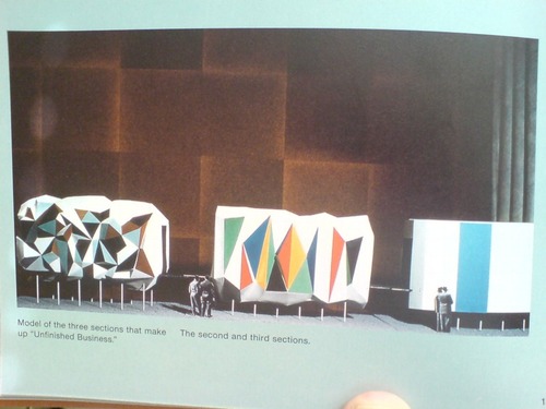
Case in point: The “Unfinished Business” pavilion, designed by Leo Lionni [!] for the 1958 Brussels World Expo. Holy Smokes, people.
Masey tells a longer version of the story in the book, but here’s a condensed version: in 1956, a team that included Boston ICA director James Plaut consulted with MIT economist Walt Rostow on the contents of the official US pavilion, which was being designed by Edward Durrell Stone. The idea was to emphasize the US’s people and cultural accomplishments. Rostow’s team also called on the US to be frank and self-critical in recognizing its “unfinished business,” by which they meant “soil erosion, urban decay, and race relations.”

Somehow, though the giant, donut-shaped pavilion had room for a Vogue fashion show on water; a proto-Pop, pseudo-combine street sign streetscape; and a giant, aerial photomural of Manhattan installed in a half-pipe [WTF!? I don’t know! We’ll come back to it!]; there wasn’t room to “address ‘the Negro Problem.'” And so somehow [?] Henry Luce’s Fortune magazine became the State Department’s partner/sponsor of a smaller garden pavilion devoted to “Unfinished Business,” and the magazine’s creative director Leo Lionni designed it.
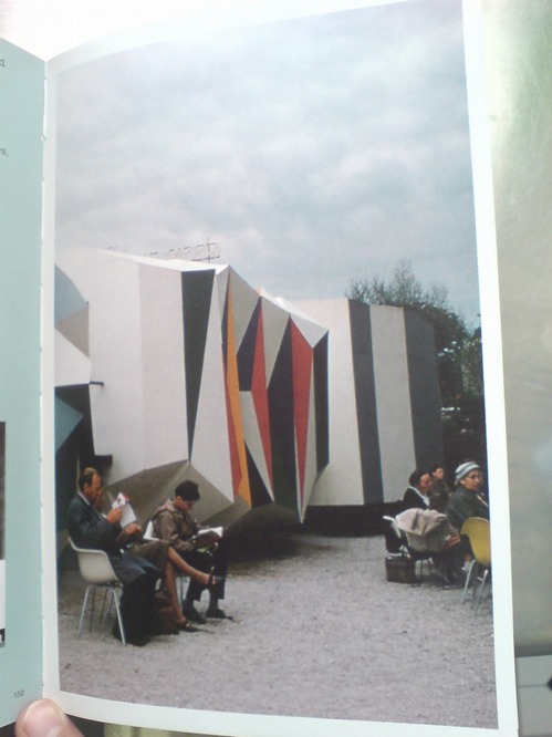
That’s the model above, and it looks pretty damn close to the real thing. Lionni conceived of three linked, raised pavilions, each about six meters long, as a frankly allegorical timeline, in which America’s problems get literally smoothed out. Or as Masey put it, “the content of the interior was also to be conveyed through the exterior.” Which means that the somber, “chaotic crystal” of the past had already given way to the much brighter, Family of Man-colored present. A little more ironing and the square, orderly, utopian future was just steps away. That was the concept, anyway, but that’s not exactly how it turned out.
[to be continued in the morning]
Buy Cold War Confrontations: US Exhibitions and Their Role in the Cultural Cold War on Amazon [amazon]
Rauschenberg Currents Event
Robert Rauschenberg’s massive 1970 silk screen edition, Currents sure is hard to miss. And not just because it’s 18 meters long.
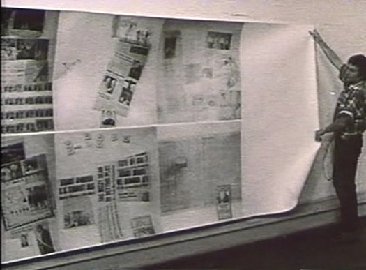
MoMA’s copy from the edition [of just six] has been wrapped around the corner of the second floor galleries for a while now. Which may have helped coax Peter Freeman into bringing out another of the screenprints last week for Art Basel.
But it’s also at the end of the Rauschenberg’s segment in Emile de Antonio’s documentary, Painters Painting [above], which I rewatched recently. Bob unfurls it with a slightly soused, earnestly glib voiceover about how, even though there’s so much information packed into a daily newspaper, most people don’t read it. But if someone spends $15,000 on the info, the artist can get him to pay attention. Or at least not wrap the fish in it and throw it out.
Which is ironic, I guess, because I’ve found that the size and visual uniformity has caused me to stroll by Currents without ever even slowing down. I register it as reworked newspaper content, on a giant roll, just like the real newspaper itself–but I don’t slow down to look closely. I mean, really, at that scale, how much of my time does Rauschenberg really think he’s gonna get?
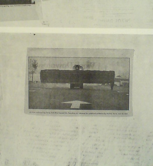
So maybe it was because I’d just run into Richard Serra moments before in the atrium, or because I came at the work head-on this time, instead of from the side. But I’d never noticed, for example, that there is a news photo of a frontloader bringing a massive fir tree trunk to the Pasadena Art Museum for Serra’s 1970 work, Sawing: Base Plate Template (Twelve Fir Trees)
Above it and to the right, I’d swear that row of tract houses is a Dan Graham photo.
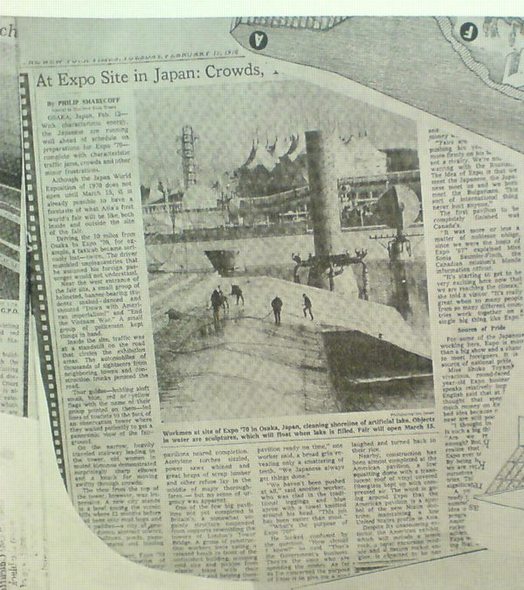
And hey, there’s a story about construction progress on Expo 70 in Osaka, where E.A.T., the collaborative Rauschenberg founded with Billy Kluver, was creating the Pepsi Pavilion, and where Rauschenberg was still thinking he’d show his own work, a plexiglass cubeful of bubbling drillers’ mud called Mud-Muse, which he’d developed with Teledyne for LACMA’s Art & Technology show and the US Pavilion.
If I can spot these now-obvious contemporary art references in Currents, what else must be lurking in there? Was incorporating other artists’ images Rauschenberg’s way of tipping his hat to artists and work he liked, or was he assimilating and subsuming it in his own, sprawling scroll? Was he engaging in a dialogue with the Conceptual and post-minimalist kids coming up or putting them in their place? Or trying to put himself in theirs?
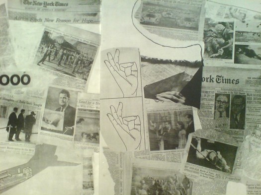
The most intriguing references now, though, turn out to be a little trickier. There are multiple instances of diagrams showing hands throwing the OK sign which remind me of nothing so much as the sign language woodblocks used in the prints at Jasper Johns’ latest show at Marks.
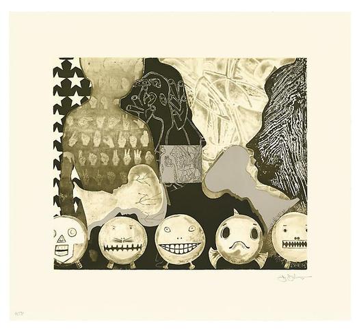
Shrinky Dink 4, 2011, intaglio print, image via
I remember thinking immediately of Rauschenberg when I saw the mirrored newspaper transfer appearing in the upper left of this Johns drawing, Untitled, 2010.
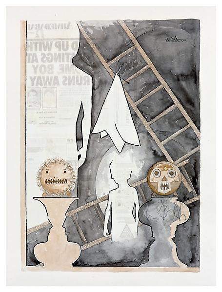
Rauschenberg began using the technique in the mid-60s, and it’s all over Currents. Remind me again how long MoMA’s had their print on view?
Dutch Camo Domescapes
I love it when a plan comes together. Or at least when several subjects of interest converge unexpectedly.
It seems the Dutch art world is about to be decimated by sudden and substantial government funding cuts and reorganizations. [for angry details, check sven lutticken’s recent post; for plaintive, possibly resigned reaction from the affected institutions, try the open letter at the Dutch public arts organization, SKOR.]
If the proposed changes really do take effect, and the status quo of one of the most highly developed state-sponsored ecosystems for the arts is actually dismantled at a stroke, I think it’s really important to requestion every comfortable assumption of the involvement between art and politics. It has a lot of obvious problems and weaknesses, but the Dutch system, at least as perceived from abroad, has always seemed like the apotheosis of certain ideals of cultural industrial policy, which, Lutticken argues, now “don’t seem to be worth a penny.”
Anyway, not that they saw them coming, but SKOR tried to understand the political shifts that precipitated these cuts in the December 2010 issue [#20] of their excellent journal, Open, which examines populism and the persistent need for narrative and myth in the democratic process.
Dutch populism seems to center on–surprise–issues of immigration, assimilation, and Muslim vs. Christian cultural influence. As it turns out, one of the contributors in Open 20 is Foundland, a graphics, art, and research group that seems part collaborative, part design firm.
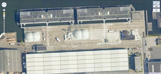
In 2009, Foundland created CACHÉ ÉXPOSÉ, an investigation into the remote, largely invisible, and unreported system of detention and deportation facilities in the Netherlands. The majority of the people imprisoned in the facilities or subjected to the system seem to be immigrants and refugees from largely Muslim countries.
When I read the description of the project, I wanted to see if, like the intelligence- and military-related sites, these politically sensitive detention sites were obscured on Google Maps. Fortunately, Foundland had created a Google Maps list as part of the CACHÉ ÉXPOSÉ project.
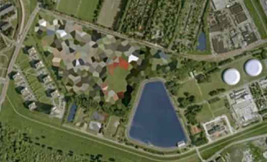
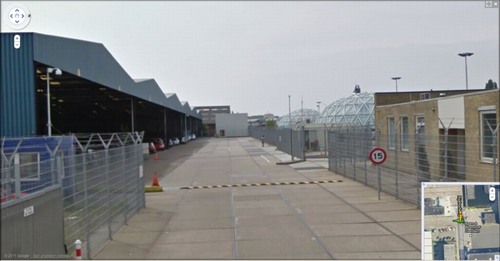
And the short answer is no. Their industrial anonymity is camouflage enough. But then hey-ho, looking at the waterfront detention center in Zaandam, a commercial city northwest of Amsterdam, what do I see? Awesome-looking domes.
Double geodesic domes of unknown purpose, but which look to be at least somewhat transparent or translucent from Street View. What a wonderfully open society the Netherlands must be that in can allow the Google Street View car to drive right up into the middle of its immigrant prisons. Oh wait.
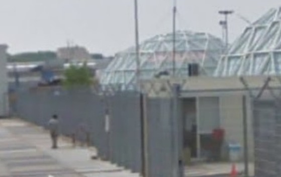
What strikes me, besides the lone figure standing outside the double barbed-wire fence? Is irony the right word to see a geodesic dome, a form which was once erected to great fanfare in Afghanistan, where it served as a symbolic center of friendship, trade, democracy, and political cooperation with the west, being deployed in a back alley prison in Europe filled, presumably, with impoverished immigrants from the Middle East?
Then again, Afghans in 1956 apparently did see the US’s Kabul Dome pavilion as representing The Future. So.
In Afghanistan Did Buckminster Fuller A Statecrafty Geodesic Dome Erect

US Pavilion at Jeshyn Fair, 1956, photo by James Cudney
In the Spring of 1956, as the Jeshyn Fair celebrating Afghan independence approached, and the Soviets were well along in constructing a massive pavilion, US diplomats in Kabul thought the US better have one, too.
A USIA officer named Jack Masey commissioned Buckminster Fuller to create a 100-foot diameter geodesic dome in two months. His Raleigh, NC-based firm, Synergetics, Inc., apparently completed it in one.
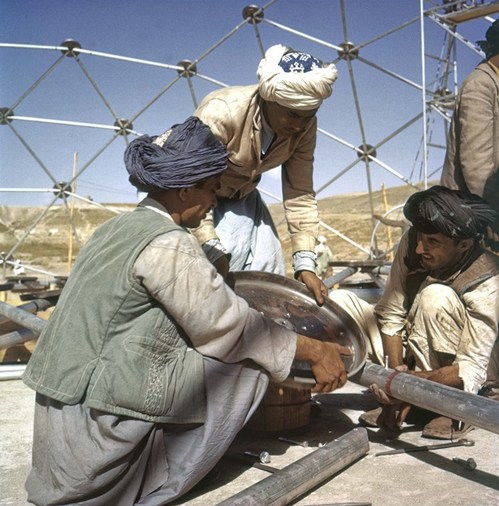
Pashto laborers assembling Buckminster Fuller dome, 1956, photo by Jack Masey
It was airlifted to Kabul, where a crew of local Pashto erected it in two days. The aluminum & plastic-coated nylon dome tent pavilion was a hit, “perhaps the most significant cultural event” of the “golden age” of US-Afghan relations, according to the creators of “In Small Things Remembered,” an exhibit looking at the history of the two countries’ relationship.
The show, which closed yesterday at the Meridian International Center in Washington, DC, was organized by Dr. Curtis Sandberg, VP of the Arts at Meridian, and sponsored by the State Department. It comprised photos discovered in various archives and foreign service officers’ private collections, such as Masey, above, and James Cudney, top, who spent eleven years in Afghanistan taking pictures, and developing various photography- and media-based culture, education, and diplomacy programs. Cudney passed away in 2009, but some more of his Afghan photos can be seen in the previews of two 2010 calendars he or his family created on lulu.com. They look pretty amazing.
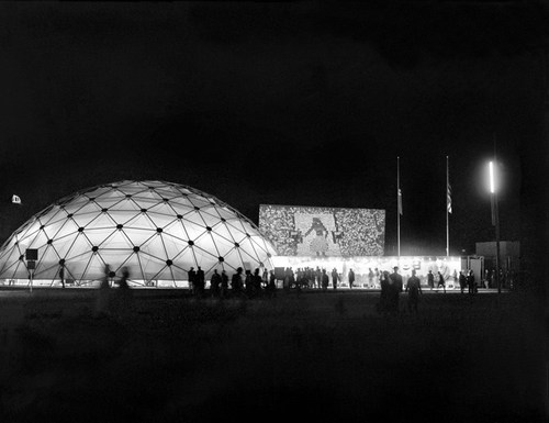
Anyway, the US Information Agency and Dept. of Commerce continued to use the Kabul dome for trade fairs across Asia. As USIA’s director of design, Masey would go on to select Fuller to build the US Pavilion at the Montreal 67 expo, too.
In Small Things Remembered, at Meridian through June 5 [meridian.org]
The US Expo 67 Pavilion Has Seven Fathers
I’m getting pretty comfortable with my love affair/obsession with the US Pavilion at the Expo 67 in Montreal. I mean, it’s got Buckminster Fuller; Alan Solomon curating gigantic paintings; photomurals; and satelloons, what’s not to love, right?
So seeing Design for a Fair, the 1968 promo short film by Peter Chermayeff is awesome just as it is. The vintage footage and photos are some of the crispest I’ve seen, and it really is pretty crazy on a whole bunch of levels that this thing existed at all.
But maybe the greatest thing–even better than the giant graphic designed flags that look like a lost Ellsworth Kelly, as if there wasn’t enough giant, escalator-optimized, actual art already–and even better than the sheer soft power/propaganda play that was so drop-dead awesome it won the future for the day–is the voiceover.
Because the whole thing really sounds like Chermayeff’s idea. Every last bit of it, dome to nuts. It’s fantastic. Chermayeff, of course, is an architect and exhibition designer, and his former firm, Cambridge Seven Associates, or C7A, was contracted by the US Information Agency to produce the US Expo entry.
And so, as Chermayeff tells it, they knew they wanted a 3/4 geodesic dome, so they ordered one. And they wanted some giant art, so they ordered that. And the moon stuff, and the Hollywood and all the happy parts of American culture.
Now I don’t doubt a thing; I’m sure that’s exactly how it all went down. It’s just that that’s not how it’s typically remembered. Architects only remember Fuller; the art world only recognizes Solomon and the artists, not the venue or the show or the implications of it; and everything else is artifact and prop. [And the poor lunar photomural, I’ve hardly found anyone remembering that at all.]
The historical focus is either on the general awesomeness of the spectacle and mood, the political context and propaganda, or on the parts in isolation. What Design for a Fair reminds me of, though, is the visitor’s experience, the carefully orchestrated messaging, and the reality that it was orchestrated by a contractor working to a brief provided by the USIA. It was a government-funded gesamtkunstwerk, a massive piece of installation art before the fact, and probably one of the most cost-effective public diplomacy efforts of the Cold War era. It literally seems unimaginable today.
Andrea Bowers On The Political Landscape
Thomas Lawson’s 2010 interview with Andrea Bowers is like five kinds of great. It concerns the works in her show at Susan Vielmetter in Los Angeles, “The Political Landscape.” Bowers’ story of making a video piece about activist and Bush-era public land auction-saboteur Tim deChristoph has some nice critiques of the Earth Art Boys. And it’s surprising how surprising so many of the reactions were to her immigration- and border-related drawings.

But I can’t not post a bit of the discussion of the centerpiece of the show. Titled No Olvidado – Not Forgotten, the 10-foot-high, 23-panel mural/drawing contains the names of several thousand people known to have died crossing the Mexican-US border:
AB: Yes, it’s a hundred-foot drawing.
TL: And it is set up as a memorial, it’s a very grand piece. Let’s talk about it. Since it is monumental, it presumably required a different way of working?
AB: Right. I worked with a graphic designer and several assistants. It resulted from a conversation with an activist, Enrique Morones. He founded an organization called Border Angels. They started off in I think ’86, providing water and blankets to people crossing the border.
TL: And many die in the attempt–are they killed out there in the desert, or do they die from exposure and thirst?
AB: It’s both, but in many cases nobody knows. A lot of people die from dehydration or temperature, but there are also people who are killed. So Enrique collects names of anyone who dies migrating from Mexico to America. He actually has about ten thousand names. He finally admitted that the group of names he provided to me, a list of four or five thousand, is only up to the year 2000.
I’ve always been making memorials in one way or another, but memorials that I thought would never be made, or memorials that were kind of impossible to make. I’m fascinated by the Vietnam Memorial in DC, and how listing names functions in general. An important part of what I do concerns this documentary-type collection of information.
A Story about Civil Disobedience and Landscape: Interview with Andrea Bowers [eastofborneo.org]
The Satelloons Of Buckminster Fuller
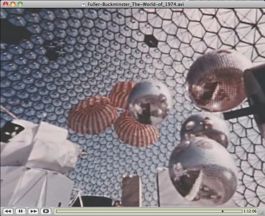
You know, every once in a while, I think that it’s crazy to be considering satelloons as art instead of what they really were–aestheticized objects designed to be seen and exhibited.
And then I’ll catch a glimpse of Expo 67 somewhere, and realize I’m still well inside the bubble.
A still from The World of Buckminster Fuller, which is on DVD, available at Amazon, not ubu.com, why would it be?
Previous Expo67 posts:
not that anyone asked, but here’s Fuller’s own idea for the US Pavilion
on the American Painting Now show, organized by Alan Solomon
the Canadian fracas over Barnett Newman’s Voice of Fire
Forgot how much I loved writing this post on art protestor/greenhouse owner John Czupryniak’s Newman knockoff, Voice of the Taxpayer
Expo 70 design finding the Expo 67 Pavilion hard to beat
ペプシ館 EXPO’70 Poster
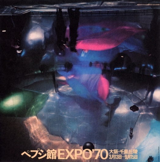
image via Morioka Yoshitomo’s online syllabus of Art & Technology
I don’t collect posters, I really don’t. I just buy some. And then some more.
But when I saw the description of this poster in the Getty’s E.A.T. archive finding aid, I knew I had to add it to the list:
Pepsi Pavilion
printed in Japan, Shunk-Kender photograph of interior of the mirror dome. It shows a rehearsal of the work by Remy Charlip, “Homage to Loie Fuller,” performed at the opening ceremonies. The photograph is printed upside down to emphasize the three-dimensionality of the real image the concave mirror dome produced. Signed by all artist/engineer participants, unnumbered.
Signed or not, I have to track it down.
E.A.T.’s Pepsi Pavilion still kind of blows my mind, several years after I first fixated on it. And it only belatedly occurs to me that though the project was officially a failure, which E.A.T., Kluever, and Whitman were left trying to make the best of, there is a Japanese domestic perspective on it that remains largely unexplored, at least in the English-speaking world. I will have to look into that.
Meanwhile, it’s almost enough to know that the Japanese term for Pepsi Pavilion is ペプシ館, pronounced Pepsi-kan.
Also, Remy Charlip’s “Homage to Loie Fuller”? Do we even have a complete list of all the artists, happenings, programs, and performances that went unrealized when Pepsi cut off the cash?
Also, Shunk-Kender? Those guys really, really got around. Have we already done shows or books or something on them? Art History, I’m talking to you.
UPDATE WHOA, and I have heard back from Art History. At least I got her voicemail. Stay tuned.
Previously: E.A.T. it up: the Pepsi Pavilion at Expo 70 in Osaka
Q. was the Pepsi Pavilion art?
OG Fujiko Nakaya Fog Sculpture
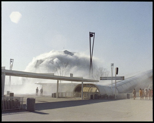
I may be too late to see the Getty Research Institute’s exhibit on postwar Japanese art, but I think it’s also past time I hotfoot it out there and start digging through the E.A.T. archives.
If there are more photos like this of Fujiko Nakaya’s fog sculpture at E.A.T.’s Pepsi Pavilion at the Osaka ’70 expo, I should be booking my study carrel right now.
Pepsi Pavilion with Fog Sculpture, Japan World Exposition ’70 [getty.edu]
From Solomon’s ‘The New Art’
A little Saturday stenography. Alan Solomon wrote “The New Art,” a catalogue essay for “The Popular Image,” one of the first museum exhibitions of Pop Art, organized by Alice Denney in the spring of 1963 at the fledgling Washington Gallery of Modern Art. [Solomon would go on to restage the show in the ICA in London that fall, sort of obscuring or usurping Denney’s and the WGMA’s position in the history of Pop.]
Anyway, Solomon, who had just left Cornell to establish the Jewish Museum’s contemporary program, where he gave Rauschenberg his first retrospective, and who would soon be the commissioner at the Venice Biennale where Rauschenberg would be the first American to win the International Painting Prize, discussed both Rauschenberg and Johns, along with Allan Kaprow, as key influences on the nascent Pop Artists. Because no one else seems to have put it online, here are some extended excerpts from Solomon’s essay:
The point of view of the new artists depends on two basic ideas which were transmitted to them by a pair of older (in a stylistic sense) members of the group, Robert Rauschenberg and Jasper Johns. A statement by Rauschenberg which has by now become quite familiar implicitly contains the first of these ideas:
Painting relates to both art and life. Neither can be made. (I try to act in the gap between the two.)
Rauschenberg, along with the sculptor Richard Stankiewicz, was one of the first artists of this generation to take up again ideas which had originated fifty yeras earlier int he objects made or “found” by Picasso, Duchamp, and various members of the Dada group. Raschenberg’s statement, however, suggests a much more acute consciousness of the possibility of breaking down the distinction between the artist and his life on the one hand, and the thing made on the other.
MoMA’s Murals By American Painters And Photographers, 1932

New York, montage photomural, Berenice Abbott, all images via moma’s 1932 catalogue
I’ve been meaning to post this for a couple of months, but with museum censorship battles and political mural controversies in the news, what better time, right?
When I started researching the history of photomurals–or more precisely, the photomurals of history, since I was mostly just posting various photomurals I’d discovered–I was interested in their context, in the exhibitions and expos they were created for, and whether they were considered or treated as art.
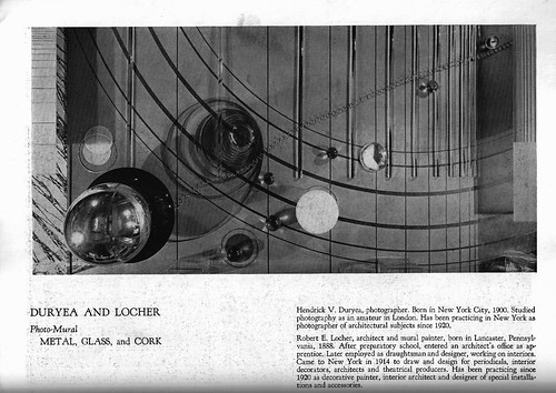
Metal, Glass and Cork, Hendrick Duryea and Robert Locher
Continue reading “MoMA’s Murals By American Painters And Photographers, 1932”
Photo-Murals, By Julien Levy, 1932
You know what, I could try and just quote the awesome parts, or hold up for scrutiny or amusement the seemingly unquestioned assumptions about art, painting photography, and decoration that inform it.
But instead, I have just typed in all of Julien Levy’s catalogue essay on photomurals from the Museum of Modern Art’s 1932 exhibition, “Murals by American Painters and Photographers.” It’s after the jump.
Levy was a pioneering photography dealer who was brought in by Lincoln Kirstein to curate what would be the Modern’s first exhibition of photography. It’s really hard to overstate the importance of Levy’s role in the history of art and photography. He saved, with Berenice Abbott, Atget’s photos. He gave first shows in the US to Brassai, Cartier-Bresson, Moholy-Nagy. [He organized the US premiere of Moholy-Nagy’s short film work, Lichtspiel in 1932 which, really? Because it barely premiered in Berlin in November 1932. That’s hardcore.] He had the first surrealism show in the US. He promoted the found and anonymous photograph as readily as the known artist’s work. And though he barely sold any actual photos in the 17-year life of his gallery, he was a remarkable and prescient advocate for the medium as art.
In 2006, the Philadelphia Museum staged an incredible exhibition of photos and material from Levy’s archive, which they’d acquired from his widow. Check it out for more details and context of Levy’s significance.
Levy opened his gallery in the fall of 1931. The Modern show opened in May of 1932. If nothing else, this essay reflects Levy’s thinking of photography and art, cinema and pai.nting, at an early stage of his involvement with a nascent medium. Enjoy.
Drawing About Architecture About Music
I’ve got a lot of browser tabs to clear before I head to Miami.
Am I not listening or looking in the right place, or is there really not enough discussion about MoCA’s exhibition of drawings by the composer/architect/polymath Iannis Xenakis?
Xenakis was a longtime collaborator with Le Corbusier. Philipp Oswalt credits him with the introduction of light and projection as tools and “subject[s] of architecture” in the dramatic chapel of the convent at La Tourette.
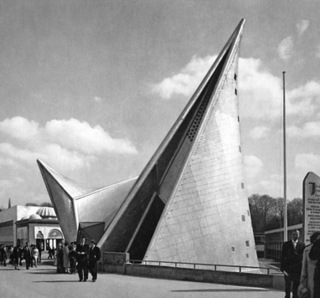
Tools which would come in handy in the multimedia Poeme Electronique, whose film projection cones and soundscapes drove the form of the 1958 Philips Pavilion [top].
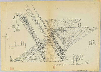
Anyway, the drawings include musical scores, which sometimes appear interchangeable with Xenakis’ schematics and sketches for his later independent installations, including the Polytope for Montreal, above, an abstract light and sound environment, which he created around the time of Expo 67. The Xenakis archive is at the National Library in France. Not sure how accessible it is, but LA might be the best/easiest shot.
Related: Philips Pavilion models spotted in Amsterdam
