
[UPDATE: WE KNOW.]
It’s hard to process Ray Johnson’s work, there’s so much of it. It’s intentionally slight and esoteric. It often feels like a quick visual read. But it can also reward a slower look, even when it’s sort of stuffed and strewn about.
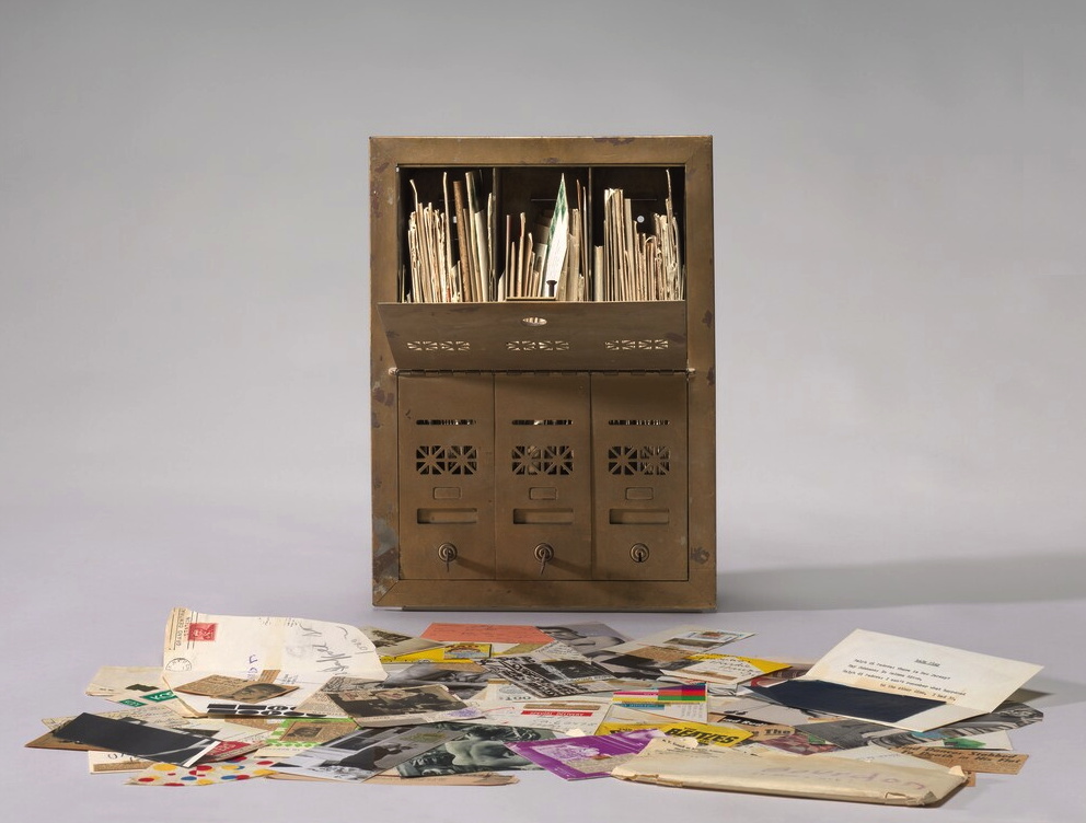
The National Gallery has a 1964 piece, Untitled (Letterbox), which is actually a mailbox stuffed with a few years’ worth of correspondance art pieces Ray Johnson sent to the critic David Bourdon. If I remember the label correctly, the stuff was piling up, so Bourdon got a classic brownstone-sized three-unit mailbox to hold it all.
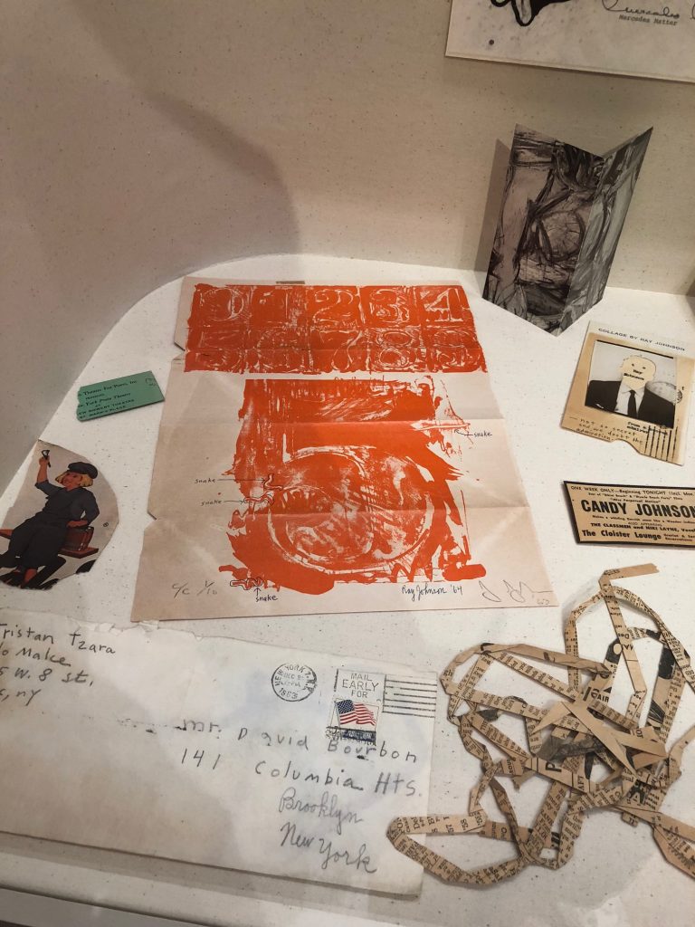
Anyway, I’ve seen but not really looked at it since it was installed way back before the world ended, but the other day I noticed that unlike other pieces, this was not a Jasper Johns exhibition announcement; it was a Jasper Johns.
And not just any Jasper Johns. This is from 0–9 (1960-63), the foundational series with which Johns began making prints, and with which he began his extensive relationship with Tatyana Grossman and Universal Limited Art Editions. [Though other prints were completed and published before 0–9, I think it was the first one he started.] It’s signed and numbered–and folded up and stuffed in an envelope at some point, apparently.
Grosman wooed Johns to start making prints with her fledgling contemporary foundry by sending him a lithography stone to play with. Over years, Johns worked his stenciled numbers on the stone’s surface, printed some, and then wiped and started drawing and printing again. The sequential prints in 0–9 trace the changes and palimpsests of the process, capturing the lithographic process the way Johns’ encaustic froze the mark of the brush that applied it. This ambitious series was published in three versions: a rainbow of colors, black, and grey.
The print Ray Johnson used here is #5 from C/C 1/10, which means it’s from the first edition of the color set. Johnson took this first print of his friend’s massive project, and started circling and labeling individual lines in the print as “snakes.” Then Johnson signed his name and date next to Johns’. And then he folded and taped it up and mailed it to Bourdon.
Snakes were a thing for Johnson. That same year Dick Higgins published a compilation of his correspondance works from Johnson in an artist book he titled The Paper Snake. But this is ultimately less surprising than his readiness to treat an artwork from a friend like a cigarette wrapper or rubber stamp, as an element of his own production. [Of course, Johnson was friends with Rauschenberg and Sue Weil, too, so he certainly knew of Bob incorporating Johns’ and Weil’s paintings into his own combine. And don’t forget Twombly drawing all over everything. So maybe surprising should not be the word.]
So far two of the three artist proofs of 0–9 (Color) (ULAE 19) have sold at auction: Merce Cunningham & John Cage’s set, in 2009, and last year, the set Johns gave to art historian Robert Rosenblum, who wrote the accompanying text. [Awesomely, on four of Rosenblum’s ten prints Johns inscribed, “Proof to replace stolen.” So keep your eyes peeled for four rogue prints.]
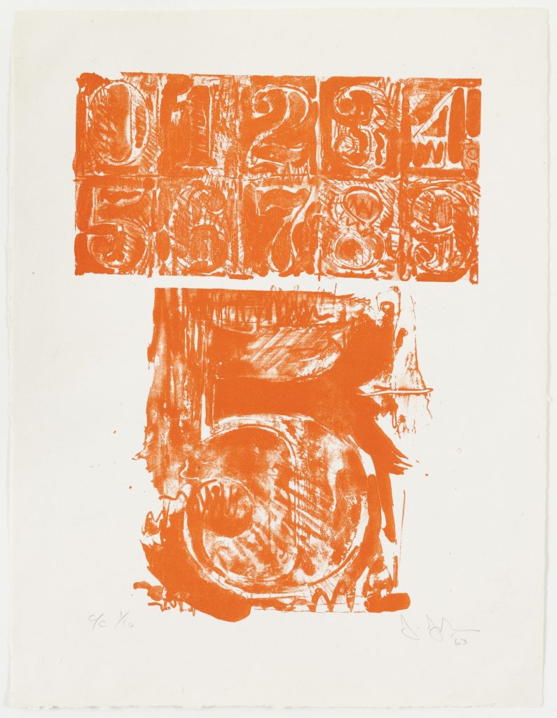
The Museum of Modern Art has one of each variation, of course, because back in the day MoMA and ULAE made it so the museum could get the first print from every edition they published. And hey, look at that, MoMA’s print of 0–9 (Color) has the same number as Johnson’s. Did someone mention rogue prints? How’d this happen?
A FEW DAYS LATER UPDATE: Thanks to some attentive folks at the National Gallery, we know how this happened.
Curator Jennifer Roberts explains that the Johnson Johns is not a print, but a page from a Vogue Magazine article on Johns by Harold Rosenberg (“Jasper Johns: Things the Mind Already Knows,” Vogue, February 1, 1964, 174-175.)
Johnson has annotated a paragraph on the reverse (page 175) in pencil, adding half-brackets, three underlined selections, and a notation in the margin that says, “this paragraph could be sent to May Wilson.”
There is nothing commonplace about an 8.
The symbols selected by Johns are separated from the banal by their abstractness and dignity, qualities which are also outstanding in Johns’s personality. In the absence of his big grin, he reminds me of William S. Hart, the deadpan sheriff of the silent Westerns. Johns has Hart’s long, flat poker face, thin lips and alert eyes slanting up at the outer corners. Like Hart he gives the impression of one who sizes things up, keeps mum, and does his job. Johns’s detachment is of the era of the beats, the cool cats, and Bohemian Zen, as Hart’s belonged to that of “Howdy, stranger” and the cardsharp. With his level stare Johns paints targets: Hart perforated his with a six-shooter.
Roberts also notes that Johnson has covered half an illustration of a Johns lightbulb sculpture on the back (p.175) by taping an ad for a George Overbury “Pop” Hart watercolor exhibition held at Frederick Keppel and Co., New York, over it. Thanks to Stephanie, as well as to Anabeth Guthrie and Peter Huestis of the NGA for noticing the mystery and sharing these details.