
2020 UPDATE BELOW: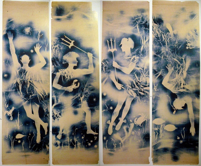
Jasper Johns Blue Ceiling, 1955, 12×10 feet [!], image: postermuseumblog
How did I miss this? Just a week after I posted about Matson Jones’ hand-painted plaster melons and pomegranates, poster dealer Philip Williams revealed an incredible Matson Jones find: a set of cyanotype/photograms titled Jasper Johns Blue Ceiling.
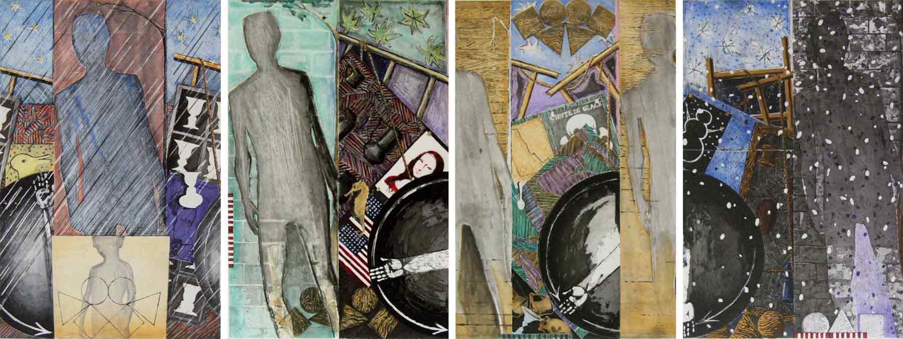
Each of the four panels depicts an underwater scene featuring a male figure holding a trident, or with a Trojan-style helmet; the only figure not in profile has pointy, Sub-Mariner-style ears. They’re all signed “Matson Jones” in the image, and apparently, the title, which is apparently a reference to Johns’s bedroom, is written on the back in what Andy Warhol said was Robert Rauschenberg’s handwriting. They surfaced in the 1980s from the office of Gene Moore, the guy who commissioned Matson Jones [the commercial pseudonym of Rauschenberg & Johns] to create window displays for Bonwit Teller. The prints were apparently a backdrop for [Bergdorf Goodman] windows made in 1955.
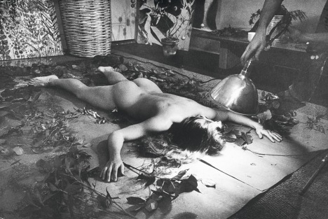
Rauschenberg & Weil making a blueprint photogram, 1951, LIFE Mag via tate
Rauschenberg, of course, had made and shown similar photograms with his wife Susan Weil. She [or a model] would lie on the photosensitive paper in a composition, and he’d swing a lamp around her, Pollock-style, to make the image. [MoMA has one.] Weil kept making photograms after their divorce, but I never realized they shared joint custody of the technique. Or that Rauschenberg would use it with his next model–and that’s the question here, I guess: is that Johns?
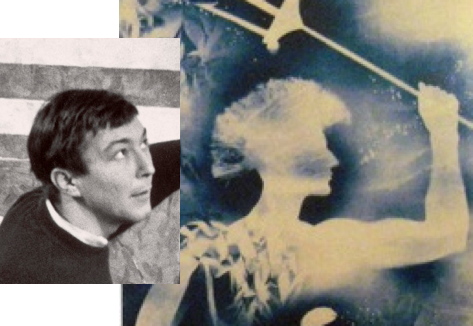
Who else could it be, right?* And if it wasn’t Johns in 1955, it certainly was in 1962. These 1-to-1 scale photograms make me think of Johns’s Study for Skin drawings, which he made by pressing his oiled up face and hands against a sheet of drafting paper, then rubbing it out with charcoal. Richard Serra owns a full-body Johns Skin job from 1975, too, so it’s not like he gave it up.
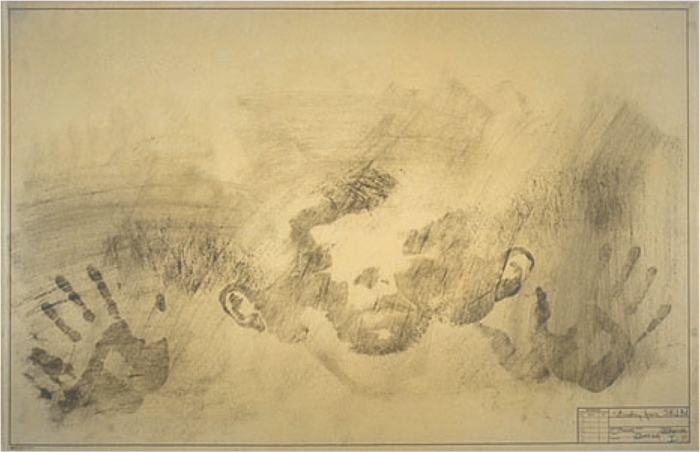
Jasper Johns, Study for Skin I, 1962, image via nga
There’s also Rauschenberg’s large-scale, 1968 print triptych Autobiography, and though it’s a stretch across time, the shadows remind me of Johns’s landmark Seasons paintings and prints of 1986-7, which all feature the artists’ shadow.
Jasper Johns The Seasons print series from ULAE
Connecting Johns’s imprint of the body to Rauschenberg’s–and Weil’s–photogram process would be interesting enough; but these photograms also connect Matson Jones’ production more directly to the art practices of Johns and Rauschenberg.
It does not feel great to not be the first to make this connection. In a Feb. 1959 column in Arts Magazine that is a master class of insiderish gay-bashing, Hilton Kramer denigrated Johns and Rauschenberg as “visual publicists” working in the commercial art “gutter”:
Rauschenberg, for example, is a very deft designer with a sensitive eye for the chic detail, but the range of his sensibility is very small — namely, from good taste to “bad”…Frankly, I see no difference between his work and the decorative displays which often grace the windows of Bonwit Teller and Bloomingdale’s. The latter aim to delight the eye with a bright smartness, and Rauschenberg’s work differs from them only in ‘risking’ some nasty touches. Fundamentally, he shares the window dresser’s aesthetic to tickle the eye, to arrest attention for a momentary dazzle…Jasper Johns too is a designer…Johns, like Rauschenberg, aims to please and confirm the decadent periphery of bourgeois taste.
There are a couple of other examples of gender-coded criticism early on in Johns and Rauschenberg’s careers, but Kramer’s knowing sneers link gayness with non-seriousness, taking a double swipe at the artists’ rapidly growing reputations. Johns wrote an angry letter in response, saying “a kind of rottenness runs through the entire article.”
Which is why Williams’ post of what “may very well be the only known surviving Matson Jones work,” is unsettling. It ends with this shoutout, “Today, Friday May 15th, is Jasper Johns’ 84th birthday. From everyone here at Philip Williams Posters Happy Birthday Mr. Johns!” Almost as if they were inviting the artist–who has a penchant for destroying early work that doesn’t necessarily fit his preferred narrative–to buy it back. Frankly, they belong in a museum. If there is a museum bold enough to take them.
Jasper Johns Blue Ceiling by Matson Jones [postermuseumblog]
UPDATE:
I went back to read Walter Hopps on the cyanotypes. He included five of the collaborative pieces made with Weil in 1951 in his 1991 show, Robert Rauschenberg: The Early 1950s. Hopps clearly identifies Weil as the one who introduced the photogram process to Rauschenberg; she’d used it as a girl growing up in Connecticut.
In characteristic fashion Rauschenberg did not simply dabble in this curious medium but instead created an astonishing variety and quality of work.
The blueprints that Rauschenberg and Weil began as creative and resourceful play quickly presented two distinct possibilities: as serious artworks in their own right and in their commercial applications, such as for window displays. From 1950 on, Rauschenberg exploited the technique to add to his and Weil’s income. The last or Rauschenberg’s commercial blueprints were made in collaboration with Johns in 1955 under the pseudonym Madsen Jones [sic, oh a huge sic, which what]. A distinction between the artwork blueprints (such as those included in the plate section) and the decorative commercial ones was made by Rauschenberg from their onset.
OK. I don’t know that I’ve ever heard of Rauschenberg & Weil doing window displays together. The 1951 LIFE Magazine spread on the cyanotypes said they “made them for fun but hoped to turn them into screen and wallpaper designs.” I wonder if the distinction exists between “artwork blueprints” and those “made for fun.” Or between those made for wallpaper and publicity photos and those shown at MoMA in the Summer of 1951. While recognizing the different contexts of “fine” and “commercial” art, and Hopps’ and Rauschenberg’s feelings about the distinctions in 1990, in 2014, the Jasper Johns Blue Ceiling prints fit right in with the five cyanotypes in the Rauschenberg show. It looks entirely connected, related, if not like one body of work.
One obvious distinction, of course, is that the Matson Jones pieces are signed in the images. Also that Hopps apparently never saw Matson Jones pieces, or documentation, or he might have known how to spell it. [The Blue Ceiling prints reportedly turned up in the mid-to-late 80s, and there was apparently a deal being executed for Warhol to buy them in 1987, which the artist died in the middle of, and which the estate took almost a year to figure out what to do about. They unwound it. All this means it’s technically possible but highly unlikely that Hopps would have known in 1990 that Moore had kept these prints, or that they had survived.]
An artist’s intention is obviously important, but an artist’s view can change, and can be directly influenced by the ideal critical context they want for their work, as well as the real world one in which it exists. Johns showed flag paintings in these same store windows. Warhol showed superhero paintings in them too, after first becoming famous for his shoe ad drawings and self-promotional portfolios.
These were distinctions artists made to elevate their work, and–they hoped–to inoculate themselves and their work against critics’ charges of crassness, decorativeness, and other things that smacked of the weak-willed, the non-individualistic, or the feminine.
Read the rest of Hopps and try not to get it to apply to Blue Ceiling perfectly:
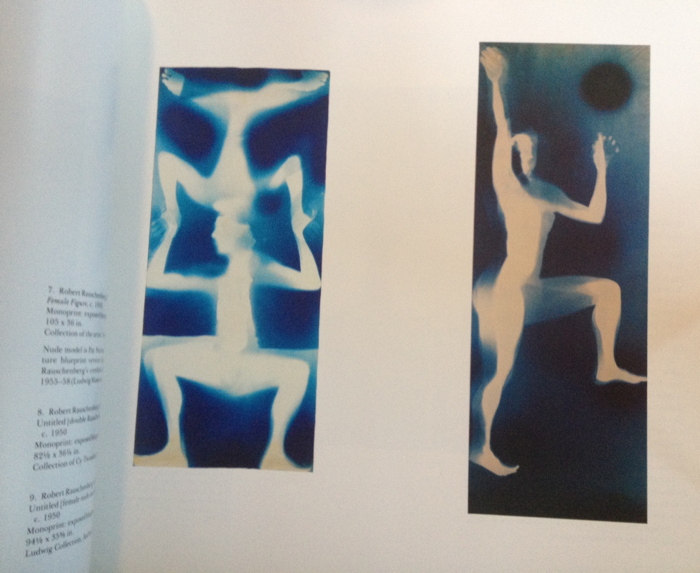
There are, of course, a number of historical precedents for these kinds of light-exposing techniques. William Henry Fox Talbot, in the mid-nineteenth century, began using negativeless photographic paper to create works he called The Pencil of Nature. Moholy-Nagy, Christian Schad, the photo-pictorialist Alvin Langdon Coburn, and Man Ray with his rayograms all explored various light-exposing photographic processes. But in none of these precedents was there exploited the large-scale format pioneered by Rauschenberg and Weil who, beginning with modestly sized examples such as Light Borne in Darkness (pl. 5) (the title of which reflects the process), moved on to their uniquely large works. (pls. 6-9).
Robert Rauschenberg & Sue Weil, c.1950, plates 8 and 9 in Walter Hopps, 1991, then in the collections, respectively, of Cy Twombly and the Ludwig
Using the human body and a variety of natural plants, leaves, and found objects, Rauschenberg and Weil developed a vocabulary of forms that they repeated throughout the blueprint series in ingenious manners. The blueprints are early evidence of Rauschenberg’s desire to portray his wonderment with the beauty of natural forms and beings.
If photography is a process of finding and seeing an image and capturing it quickly, the photo-image technique of Rauschenberg’s [sic and Weil’s? And Johns’s?] blueprints was synthetic in nature, progressing slowly in time. The objects to make up an image are brought to the paper, so that one almost paints or draws with light. To a certain degree, one also has to imagine the composite result of the process because only faint images in reverse will appear in the light-exposing sequence. Later, when washed, the dark, silhouetted forms reverse and become light while the exposed background turns various shades of dark blue. A remarkable series of photos taken for a LIFE Magazine article documents the process of exposing and developing the blueprints.
Blueprints of silhouetted human figures in life-size scale that seemed arresting and beautiful at the time–witness the precocious spread in LIFE–remain powerful today. Another important characteristic differentiated the from contemporaneous Abstract Expressionistic painting: one-to-one scale or actual physical scale versus ambiguous pictorial scale. At the time it was unusual for any work on paper to be as large as Rauschenberg’s major blueprints; even Man Ray’s pioneering rayograms had not grown to nearly this size. This sense of actual scale would develop throughout Raschenberg’s career as one of the major characteristics of his work. These remarkable renderings of the human figure on the picture plane also anticipated the process inherent in the celebrated anthropometries (silhouetted female nudes) created by the French artist Yves Klein in the 1960s.
Everything that the Weil cyantotypes had or did for Hopps, the Johns cyanotypes did more and bigger. They would be Rauschenberg’s greatest blueprints. If only they weren’t by Matson Jones.
2020 Update: you know, looking at these again after a minute, they look like mannequin parts, not human bodies. They’re also apparently still available. They’ve also been acknowledged in the chronology, but rejected in the Johns catalogue raisonné, in case you want to haggle.
Later in 2020 Update: And now they’re coming to auction, Dec. 2 at Christie’s.