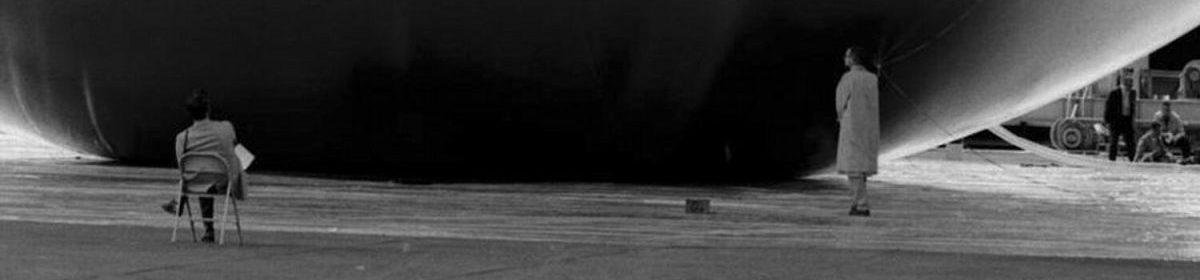
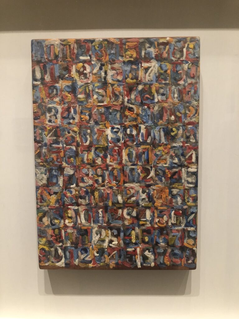
Jasper Johns, Small Numbers in Color, 1959, 10 1/8 x 7 1/8 in., encaustic & collage on wood printing block, photographed at the Philadelphia Museum of Art in 2021 for Mind/Mirror, collection:the artist, but it’s there in 2026, too.
The incredible Small Numbers in Color, 1959, that Jasper Johns loaned to the Philadelphia Museum for the 2021 retrospective is [again?/still?] on view there. We saw it last weekend after the Duchamp show, and it was [again?/still?] fantastic. I have done nothing to find out what the back of the wood printing block is like. But let’s focus instead on how wonderfully it’s framed, in its shadow box. Suddenly I’m thinking of whole shelves full of hair coloring kits locked in their anti-shoplifting case at Target.
Jasper Johns, Numbers, 1957, oil on cardboard, 8 1/4 x 6 in., as published in JJCR, P33
Jasper Johns, Flag from Lead Reliefs, 1969, GEL proof from an ed. 60+10AP, collection NGA
Rummaging around through the remnants of Gemini GEL’s archive at the NGA, I got caught up by—surprise, surprise—this Jasper Johns Flag, the best from the 1969 Lead Reliefs series. This example entered the NGA’s collection early, in 1981, directly from Gemini. So it’s likely to be in the most pristine condition 57 years in existence will allow. If nothing else, it’s among the most carefully tended.
They are made from very soft, cold-rolled lead sheet, 1/64 (0.015) in. thick, worked into the mold. The embossed lead was then backed to a polystyrene backing, which is then laminated to a wood panel. This three-layer sandwich is set in an aluminum frame. So these are ridiculously fragile.
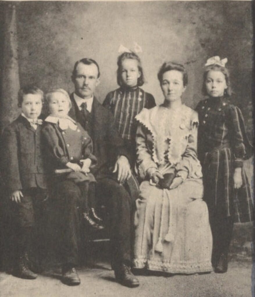
A c. 1904-05 photo of Jasper Johns’s father seated on his father’s lap. His mother Evelina died in 1906, and Grandpa Johns remarried in 1911. The artist, who lived with these grandparents, used this picture in works beginning in 1994.
While re-reading this post about Jasper Johns’s use of an old family photo in a series of prints in the 1990s, I thought I’d look up his grandparents on familysearch.org. It turns out the grandmother in the photo, Johns’s father’s mother, Evelina, died soon after the photo was taken. And so the grandparents Johns grew up with were his father’s father, William Johns, and William’s second wife, Montez McKee Bramlett. I’m sure all this is going to be in Deborah Solomon’s book.
But what really surprised me was seeing Johns himself on familysearch–as deceased. Everyone with an account can see themselves at the base of their own family tree, but otherwise, living people are not included on the genealogy website. It seemed Johns had been added only in August, and the citation used for the status was an obituary for the artist’s father, with whom he shared a name—from 1957.
[Wow, Johns’s father died on March 10th, which was the date of the opening of the Jewish Museum show where Johns first showed Green Target and argued over censoring Target With Plaster Casts.]
So anyway, though don’t accept telegrams, I sent familysearch a notice that Mr. Johns is still alive. And has a show in a couple of weeks.
Brice Marden, Three Deliberate Greys for Jasper Johns, 1970, oil and beeswax on canvas, 183.2 x 382.8 cm overall, purchased in 1971 by the National Gallery of Canada
“In 1970, the minimalist painter Brice Marden painted a monumental canvas, Three Deliberate Greys for Jasper Johns, and called Johns to ask him if it was OK to use that title. Johns replied: ‘Sure, as long as the greys are deliberate.’”
Roberta Smith included it in her posthumous assessment of Marden’s legacy for the Times on August 14, 2023. But it originates from Smith’s sometimes colleague at the Times, Deborah Solomon, who, on August 10th, the day after Marden’s death, shared the story on a cursed social media site. Rather than link to it, I have copied it here:
Brice Marden once told me that when he painted his monumental canvas, “Three Deliberate Grays for Jasper Johns,” he phoned Johns to ask him if it was okay if he used that title. Johns replied, “Sure, as long as the grays are deliberate.” R.I.P. Brice.
Solomon is working on a biography of Johns, so I expect she has many more such stories saved, in classic Times writer’s fashion, for the book.
Installation view of Brice Marden’s Three Deliberate Greys for Jasper Johns [L] in Eight Contemporary Artists at MoMA, 1974, 📷: MoMA/Kate Keller
What strikes me is that when Marden was included as one of Eight Contemporary Artists at The Museum of Modern Art in 1974, Three Deliberate Greys for Jasper Johns was exhibited upside down. Or backwards, whichever is more applicable with a Marden. Or maybe you can install it either way, as long as it’s deliberate.
[Only a couple of days later update] In response to my question to the NGC about the hanging order for this Marden triptych, Dr. Christopher Etheridge, Associate Curator/Conservateur associé explains: the three panels were originally bolted together when the NGC acquired the work in 1971, but were later taken apart to alleviate structural issues. Also, an inscription on the verso of the darkest panel supports the dark-light-medium order, and the NGC has always shown it that way.
Brice Marden’s Three Deliberate Greys for Jasper Johns installed OG style in MoMA’s 2006-07 retrospective, 📷: Jonathan Muzikar for MoMA
Whether Marden knew of approved of MoMA’s 1974 installation of the now-freewheeling canvases is not known, but when MoMA borrowed the work again for Marden’s 2006 retrospective—which the artist was closely involved in—it was hung in the original NGC order. I am deeply grateful to our neighbors to the north for their ready and thoughtful engagement, and for their careful stewardship of our shared culture.
While poking around on the Laurentian Library yesterday, I came across a 2014 paper on the history of how people tried to make sense of Michelangelo’s puzzling reality: the classical orders he violated, mathematical composition and proportion, and anthropomorphy. Which, given the Vitruvian principle that the ideal proportion is the human body, was sort of the same thing.
Studies of architectural bases for the New Sacristy, c. 1524, 283 x 214 mm, red chalk, black chalk, pen, brown ink, Casa Buonarotti, Inv. 10Ar. via
But I was surprised to see the argument lead off with this drawing from the Casa Buonarotti of column bases with a human face in them. Or so I was told.
I stared at the base on the left in lowkey disbelief. Michelangelo was really out here hiding a stunned Beetle Bailey profile in his architecture, and this is how I find out about it? Should we tell everyone? Should we throw a party? Should we invite Jasper Johns?
Profiles in vases in Shrinky Dink: Jasper Johns, Untitled, 2010, ink on plastic, 29 x 36 1/4 in., via Matthew Marks
No, we should not invite Jasper Johns; he was already here. Reading the Casa Buonarotti curator’s notes on the drawing, I realized I’d been looking for a Johns vase-style negative profile instead of a Michelangelo caricature-style profile, which is in the base on the right:
in his imagination, the upper molding takes on the appearance of a turban, while the base profile transforms into a screaming human face, to which are added, in a caricatured manner, an eye, a nose, and a gaping mouth (for further considerations on this sketch and its possible connection with the Vitruvian idea of ‘architectural anthropomorphism’, cf. ELAM 2012, pp. 94-95, [which I cannot find, btw, but it’s not important now. -g.o]).
Yau: It seems to me that some of your motifs, such as the ones of the faces in profile/vase, are irritating because one sees either the faces looking at each other or the vase between them, but never both at the same time. There is a continuous frustration in the looking. The figure and ground keep changing places, and one becomes aware that one never sees this image in its entirety. The feeling I get from this motif is both satisfying and maddening. Why does this conundrum hold interest for you?
Johns: I am not certain that one can’t see both at once. Has someone who knows about the eye and the brain made a determination?
Not only can I see both of Michelangelo’s faces at once, I couldn’t unsee them if I wanted to.
After Yau works through years of accumulated questions [which, ngl, very relatable now. I should call him. -g.o], there’s an actual [sic] dialogue for a minute, about different aspects of Johns’s use of the term “helpless,” and suddenly:
Yau: Is the helpless behavior of a material, the puddling of the ink when used on plastic, for example, one of the parallels between art and life?
Johns: I imagine that our understanding of the behavior of materials is closely related to our understanding of the rest of what we think of as reality.
As I sat down to post this late last night, I was falling asleep, which will be an important detail for the next post. It’s called Chekhov’s gun, look it up.
Jasper Johns, Untitled, 2009, 20 3/8 x 34 1/4 in., ink on plastic, sold to benefit Artists for Haiti
In September 2011 Jasper Johns & Matthew Marks Gallery donated this ink on plastic work to Artists for Haiti, a benefit auction organized by Ben Stiller & David Zwirner to support non-profit organizations working to help recovery efforts in Haiti after the January 2010 earthquake that killed 230,000 people, injured 300,000, and left one million homeless.
[SIDEBAR/ENDNOTE: There is a large chunk of poking around content on what happened to the $13.67 million raised, and the many (mostly actor-driven) non-profits involved at the bottom of this post.]
I’m always a sucker for ink on plastic, but I love this one for the sign language, which appeared in many formats across Fragment of a Letter, a body of work which contains a quote from a letter Vincent Van Gogh sent to his friend, Emil Bernard, which he signed, “with a hearty handshake.” Johns included the works in his 2011 show at Matthew Marks, which I remembered most for the appearance of works on and about Shrinky Dink. [That intaglio print, and a related ink on plastic drawing Johns made in St Martin, both have cameo appearances by those little stick figures. The combo of drawn line and brushed/poured gesture in this drawing is an incredible moment in a drawing absolutely packed with them.]
Little Guys in the royal profile vase and Shrinky Dink heads: a detail of Untitled, 2010, a 29 x 26 1/4 in. ink on plastic work Jasper Johns showed at Matthew Marks in 2011
Anyway, Johns made a whole stamp set of ASL alphabet signs, but here he stamps his own inked hand, spelling his own name. The letters run from right to left, and though they didn’t have to be, the extended pinky of the Js are cut off. Also, J is made by drawing a J in the air with that pinky, which in its unmoving state, represents the letter I. So not only do these incomplete marks lack the indexicality of finger prints [which Johns also uses], they don’t convey the motion needed for their intended meaning. As Johns told Terry Winters, “that’s the nature of language, and the gestures here imitate sign language, where meaning is conveyed by gesture.”
Jasper Johns, Fragment of a Letter, 2009, bronze, 38 5/8 × 24 3/8 ×1/2 in., via Matthew Marks Gallery
The meaning conveyed and lost in these gestures is even more evident and frustrated in the double-sided bronze sculpture Johns showed at the back, behind an even larger gallery filled with cast sculptures. Like a personal Rosetta Stone, Fragment of a Letter, 2009, has Van Gogh’s text in classic Johns stencil alphabet on one side, and in his ASL stamps on the other. Then in the upper right quadrant of the ASL side, Johns set impressions of his hand signing his own name into the cast matrix. I don’t know why I find this gesture of the 80-yo artist making these gestures so moving, when he’s been doing things like this all along. But there he was, making them, and there they are. And all of this in a work that’s only 1cm deep, and that, depending on where you’re standing, almost disappears from view.
wait, you said you saw it in a dream? Jasper Johns, 24, with Flag and saw, the lean-in variation, 1955, photographed by Robert Rauschenberg, who had a combine upstairs called Rebus, via RRF
What if I’ve been wrong all along about the origin story of Jasper Johns’s Flag?
The first flag painting I did came in the Fifties when I was trying to become a painter, and I had been working in various…styles, I guess. Nothing seeming to mean much to me, except that one made a picture, there it was. And I one night dreamed that I had painted a flag of the United States of America and I got up the next morning and went out and bought materials and began to paint this flag.
That’s the longest version of the story I think I’ve seen, from a 1966 TV interview with curator Alan Solomon. When I put parts of the interview transcript online in 2011, I was skeptical of the dream story. Not that I didn’t believe it, or thought Johns wasn’t telling the truth, but that it seemed like he hinted at other possible stories, but was now sticking with the one no one could question or investigate.
There’s nothing more subjective and unassailable than a dream. It completely removes the historic or referential or metaphoric or biographical possibilities for painting a flag. Or rather, “this flag.”
But instead of holding out for a truer or more revealing alternative, long suppressed, maybe there’s value in taking Johns at his word, and accepting the dream story on its own terms. Because there is a natural follow-on question: “Why did you do what you dreamed you did?”
Jasper Johns, Target with Plaster Casts (JJCR P4), 1955, encaustic and collage on canvas and wood with objects, also with encaustic on them, apparently 52 x 44 1/4 in., bought by Leo Castelli, 1958, sold to David Geffen 1993, currently on loan to the Guggenheim Bilbao, I believe.
Target with Plaster Casts (1955) has been vexing people since 1958 [or 1957, actually.] It’s the red-headed stepchild of Jasper Johns’s breakthrough work. Or maybe the green-dicked stepchild. The presence of body parts generally and a penis specifically have made critics’ questions seem especially awkward: What does it mean? What does it reveal about the artist? Oh wait, I didn’t mean that. But actually, does that mean the target’s a butt?
And the penis has been causing curators problems from the beginning. Meyer Schapiro selected Target with Plaster Casts and Green Target to show at the Jewish Museum in 1957. Then the museum put the work in a literal closet until Johns agreed to add some “mystery” to it by closing the penis lid; the artist angrily refused, and had the work returned. [This is where Leo Castelli saw Green Target and determined to track the unknown artist down and give him a show.]
It echoes the oft-repeated story—I’ve repeated it myself, in fact—of Alfred Barr at Johns’s groundbreaking 1958 show at Castelli, wanting to buy Target for Plaster Casts for MoMA, but only if Johns agreed to permanently closing the little door on the cast plaster penis. Johns refused again, and so Barr bought Target with Four Faces instead [and later gave the Sculls retroactive credit for the purchase, which they had nothing to do with], along with two other works, and he arranged for Philip Johnson to buy his other problematic fave, Flag, so he wouldn’t have to rationalize it to MoMA’s other trustees. And so Target with Plaster Casts became one of just two paintings that didn’t sell from that show. [Except that Leo Castelli bought it for himself, and kept it 35 years. So really, only White Flag didn’t sell, which is a mystery for another day.]
Anyway, a recent rightwing-coded attempt to rebrand AI fabrications as Saidiya Hartman-style critical fabulation reminded me of some of the contorted criticism of Johns’s work, his early work, and particularly Target with Plaster Casts. Gavin Butt’s 2005 dissertation on art world gossip, Between You And Me: Queer Disclosures in the New York Art World 1948-1963, is an important and fascinating excavation, not just of often underground context of queer art history; it also makes the case for pulling what had been considered out-of-bounds subjects into meaningful, even revelatory art discourse.
But Butt also writes some hilariously cringe speculative monologues, ventriloquizing contemporary responses to Target with Plaster Casts from the likes of Barr and Andy Warhol. So instead of worrying about trustee reactions or public controversy, Butt imagines Barr angsting out out over his unexpected attraction to Johns’s [sic] penis, while Warhol size queens out about it, certain that it is, in fact, Johns’s, right? This emphasis, like Fred Orton’s much more muted but uptight interpretations, and Jill Johnston’s interviewing, and Jonathan Katz’s queer metaphors, and a lot of criticism since the mid-1990s, ends up concentrating on autobiography and Johns’s identity—acknowledged or not, performed properly [sic] or not—as a gay man.
See? He’s not doctrinaire about it: Dan Budnik, Jasper Johns at the Ernst Haas Studio with Target with Plaster Casts and Target with Four Faces, East 71st Street, New York, 1958, signed archival pigment print, 22 x 17 in., at Etherton Gallery
And suddenly it occurs to me that these constructions don’t do justice to Target with Plaster Casts specifically, and vice versa, and actually even miss some key things Johns was doing, and the context in which he did them. Here’s what I’m wondering, seeing and thinking: my sense is, this work is not an anomaly, but fits in perfectly with what Johns was making and seeing at the time, and with how he worked. And it wasn’t abandoned, a path not taken; it resonates with things he continued to explore.
Jasper Johns, Three Flags, 2000, 11 x 7 1/2 in., acrylic and graphite on four sheets of plastic, collection the artist, on view at Craig Starr
Can’t you just imagine making this? Or rather, Jasper Johns making this?
In 2000, when he was seventy, he sat down with three flag-shaped sheets of plastic, a pencil, and a ruler, and painted this tiny version of Three Flags, which he affixed to another sheet of plastic. His signature is like filigree.
He’s made stacked Three Flags works on paper [sic] before. What prompted this, I wonder? He’s kept it, as one would, obviously. Can you imagine doing anything else with this but keep it?
I’m trying to remember where I read that the parts of the Three Flags covered by flags are actually painted a monochrome grey. Is that from the CR? Emily Tremaine’s biography? I’ll work on that.
Meanwhile, who is going to find out what’s under these flags on plastic? The plastic should be easier than the canvases to investigate non-invasively. But who’s going to ask Johns to take it out of the frame so they can shine a light through it? Not me. I’ve peppered him with enough Flag-related requests already.
Jasper Johns, Perilous Night, 1990, Watercolor and ink on paper, 30½ × 23¼ in., on view at Matthew Marks in 2024
I really wished I’d seen the show of Jasper Johns drawings at Matthew Marks when I went deep on the little stick figures motif. Perilous Night, a 1990 watercolor, was the earliest of several works in the show in which the little guys appeared.
And I REALLY wish I’d gotten the catalogue immediately, because I just picked it up this afternoon, and Hilton Als had this to say about the stick figures in Perilous Night:
The right side of this watercolor and ink on paper is a replica of a score by John Cage, a close friend of Johns for many years. Cage wrote “Perilous Night” in 1943 and 1944. A composition for a prepared piano, it’s an angry piece whose strong rhythms speak to us emotionally—he was going through a difficult time with his then wife, the surrealist artist Xenia Cage—even as we understand that Cage is asking questions about what the piano can and cannot do. Who’s to say? In Johns’s piece, the sheet music floats against an abstract field made up of vertical shapes that reach up, up, up toward the top of the page. On the bottom of the work, a strip of green field. Three little stick figures stand on that green, gesticulating. Who are they? What are they? Fallen notes from Cage’s score?(Johns doesn’t render the notes in Cage’s score; all we see are traces of notes.) Or are those tiny figures from Johns’s and Cage’s past? Johns’s Perilous Night is an exercise, too, in depth—an experiment that challenges Johns’s famous flatness. One image tells us about another: the sheet music leads us to the abstraction, and the abstraction leads us to that little strip of green. It’s a work that’s giddy with possibility, a kind of “what if” piece. What if I put a little green here? And figures there? What happens to the work? To the eye? To the eye of the ideas?
I still have to see Richard Prince’s current show at Gagosian, and from the pre-press, I thought I’d be more interested in the sculptures. But looking through the works online, a couple of good-looking paintings reminded me of his hippie drawing paintings, which are works I regularly dig. And a couple, like Untitled (Folk Songs) above, from 2022, remind me—very unexpectedly—of Jasper Johns. And those are two streams I somehow never imagined would cross on this blog.
But maybe the surprise is from the Johns side. Just the other day @digitaldetritus posted an important but underappreciated [by me, anyway] Johns on tumblr: Decoy from 1971. Decoy was a painted variation of a complex series of prints, which were all part of a larger, retrospective reworking of Johns’ sculptures.
NGL, it was the heavily processed mechanical images of the sculptures that first made the connection. But then it was seeing the connective tissue of messy, even aggressively messy brushstrokes extend across both paintings. Prince talks a lot about de Kooning and Picasso, and there are interesting Guston shoutouts in other paintings in the show. But it was less this kind of throwback reference or direct engagement than the realization that some of Johns’s painting rhymed, or reverberated, with what Prince was doing.
Turns out Jasper Johns has not stopped painting after all. Matthew Marks’ preview for Art Basel Paris includes an untitled work from 2025 that’s an overpainted print. It’s a mode he’s used a lot, for many years. I think it’s like this one from 2018, with the skeleton in Johns’s image basement.
Johns showed a variety of skeleton-related works, including paintings and monotypes, at Marks in 2019, including, obviously, several works with the Little Guys stick figures. Besides the use of acrylic, the other thing to note about this new painted work in Paris is that it has no Little Guys. And the only conclusion I can arrive at is that I have made too much of a public deal about this motif, and Johns has set out to obliterate them from his work. My bad.
Jasper Johns, Untitled, 2021, acrylic and graphite over etching on paper, 16⅞ × 21⅛ in., via Matthew Marks
I’d like to go back to contemplating one little guy confronting the slice of the universe that looks, now that you mention it, a lot like a stick figure, please.
[tbf I was actually looking back through these recent shows from after the CR cutoff, to find out how wrong I might be about Johns only making one alphabet painting by looking for when the sign language alphabet motif came in, and did it happen in any paintings, and I don’t think so, even though I remember thinking there sure was a lot of sign language alphabet in one of those Marks shows, but maybe it’s all in prints and works on paper? And then yes, there is sometimes a very prominent stencil of the entire alphabet behind that skeleton getting worked on by the little guys, but not in the paintings, or at least not in the ones he showed. But after 60 years, Johns should feel free to revisit a motif if he wanted, and making it the stencil tool, not the letters themselves, does help rein in the chaos a bit.]
“You can guess which one is in the photograph.” via ig:@deborahsolomon_truly
Collector and longtime MoMA trustee Barbara Jakobson died at 92. She was a sharp, funny, insightful hoot. I got to know her a bit when I became co-chair of the successor to the Junior Council, which she’d led back in the day. But that’s not important now.
I also knew her as one of Jasper Johns’s earliest collectors. Writer and Johns biographer Deborah Solomon posted the news of Barbara’s passing on instagram, alongside some magnificent photos. Like the oddly shaped blank ghost on the wall after Jakobson sold a massive Frank Stella. And this photo of Barbara posing with what looks like her and her then-husband John’s first Johns. They purchased Alphabet new, in 1959. She got it in the divorce.
Johns only made one Alphabet painting. Solomon said he decided there were too many variables, and it felt chaotic, so he stuck with numbers.
In 1989 Jakobson sold Alphabet it at Christie’s [for $3.52m]. It has since found its way, through the Edlis Neesons, to the Art Institute of Chicago. So what’s this? A copy Barbara had made when she sold it. And so now there were two.
Jasper Johns, Alphabet, 1959, 12 x 10 1/2 in., encaustic and collage on fiberboard, collection Art Institute
This is a whole, underappreciated category of copies I love: replicas or replacements made for owners of the work. Or former or soon-to-be-former owners.
As part of the settlement to donate it to the Nelson Atkins Museum, super-reclusive copper heiress Huguette Clark got a copy of a Degas that had been stolen from her by a servant, and later acquired by the H&R Block guy.
Isabelle Dufresne’s Large Flowers was so big, (7 x 13 ft) she had to hang it vertically in her living room. Visiting with a collector friend, I asked if he thought she’d ever sell her Warhol. He replied with a laugh that she already had, and that the Flowers were the replacement.
I can’t find it now, but I swear I just read [or heard?] about auction houses offering to make reproductions of works to win consignments.
Jasper Johns, Small Numbers in Color, 1959, 10 1/8 x 7 1/8 in., encaustic & collage on wood printing block, installed at the Philadelphia Museum of Art for Mind/Mirror, collection:the artist
And very specifically, though in a sub-category of its own, the small size and dense composition of Jakobson’s Johns Alphabet reminds me of Small Numbers in Color, a tiny painting Johns made for himself in 1959 before the larger Numbers in Color (1958-59) was shipped off to the Albright Knox.
What to make of the unparalleled aspects of these replicas? Their connection to ownership, and their function as literal replacement of the original? Whatever the experience was of living with the work, for the owners themselves, these copies seem to be [close] enough. Which feels wild: that a fresh copy can effectively replace everything except the market value.
Solomon proposed the question of which Alphabet was in the photo, and I have to assume that it’s what she calls the “cheap copy.” But. Every stroke looks like Johns’s original, which, on a painting like this, is no mean feat. Perhaps it’s a photo-based reproduction. I guess my point here is, I’d love to see it.
Jasper Johns, Untitled, 1992, intaglio & aquatint, 43 1/2 x 53 1/2 in., with little guys in the vase, via WAC
You’d think I’d have taken the hint sooner. Like after seeing the big jump around 2001 of appearances of the three little, brush-wielding stick figures in Jasper Johns drawings—because they were in the prints he was reworking. Or after finding little guys gazing at the stars in the 1997 etching he made for Leo Castelli’s 90th birthday portfolio.
But no, it took finding little guys in Johns’s 2008 Artists for Obama print that made me realize there was much I didn’t know about Johns using the little guys motif in his prints. And it turns out they’re all over the place. Johns is a printmaker who paints, and his imagemaking crosses mediums with the ease Canadians used to have crossing the US border. So I was missing a big part of the little guys story.