I was listening to Tyler Green’s conversations with Wayne Thiebaud the other day, which he combined and reupped on Modern Art Notes after the painter’s death.
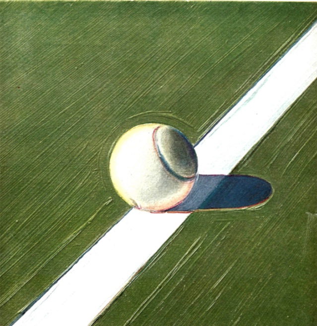
Which got me thinking about Tennis Ball, the 1968 painting Thiebaud made at Wimbledon for Sports Illustrated. [Story goes, the art director who’d gotten Matisse to do a cutouts cover for LIFE Magazine had originally approached Thiebaud to make some hockey-related paintings for SI, thinking, ice is white, Thiebaud paints white, but the artist didn’t care about hockey and suggested they send him to Wimbledon instead.]
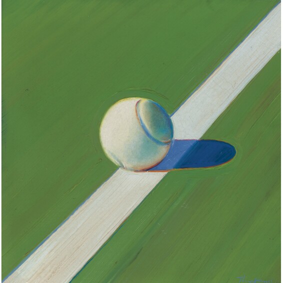
Tennis Ball is only 12 x 12 inches, a nearly perfect, little painting. Turns out it was sold at Sotheby’s, presumably by the family of the art director. The exhibition history and publication history are pretty thin for such a nice painting. And the reproduction, holy smokes. It took me a lot of scrolling and zooming to decide, based on the tiny white fleck of paint in the red border of the bottom edge of the ball’s shadow, that this is, in fact, the same painting. [Thiebaud had told Green that he’d only painted the one, which steeled my resolve.]
It’s low-key wild that the Sotheby’s website for this lot doesn’t even list the dimensions, or the date of the sale. Since Sotheby’s changed ownership, it feels like their sales results pages have been stripped down to tumblr levels of nothingness, and for what? At least if you click on the sale title (Contemporary Day Sale, NY, ofc), you can find out it was November 10, 2010.
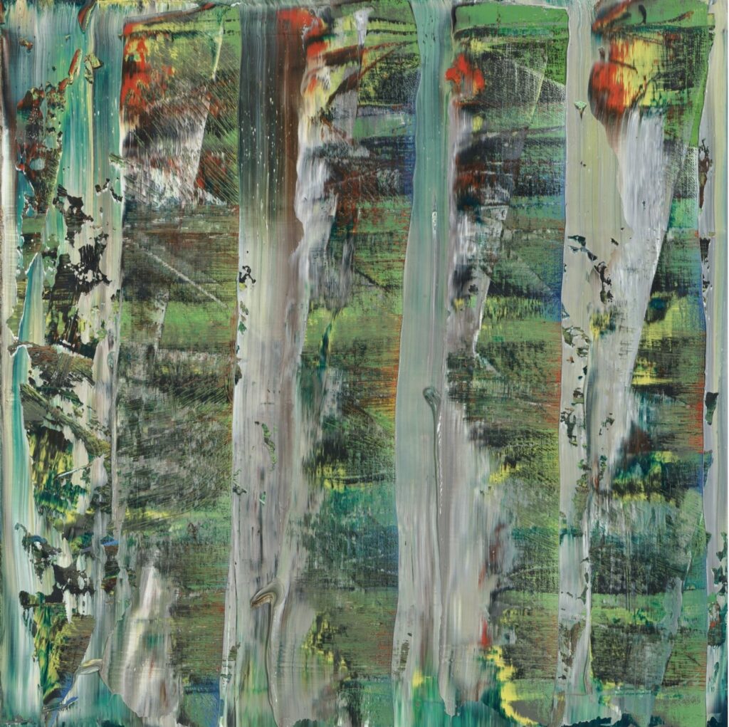
Which is familiar. It was the catalogues for Sotheby’s November 2010 sales, Gerhard Richter’s squeegee painting on the cover, arrived on the table in Cy Twombly’s Lexington, VA studio while Tacita Dean was visiting–and filming.
In her work Edwin Parker (2011), released after Twombly’s death, Twombly and Nicola Del Roscio are seen chatting about works as they flipped through the catalogue that is out of the camera’s view.
Though there is a guffaw, and mention of de Kooning, whose work was listed next to one of them, Twombly seems to have made no comment on the two Twomblys in the sale.
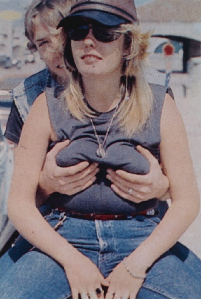
“I don’t get– I mean, who would want to put that on the wall?” Twombly says about what must be lot 343, a big neon 99 Cent Dreams work by Doug Aitken.
“I would put that!,” Nicola says.
Twombly snorts.
Nicola laughs, “I like that!”
“That’s Richard Prince.”
“How much is that?”
“18, 12-18,” Twombly replies. “I like that,” Twombly says of the work on the next page.
“You always like those, the dot paintings,” Del Roscio responds. [Lot 350? Damien Hirst.]
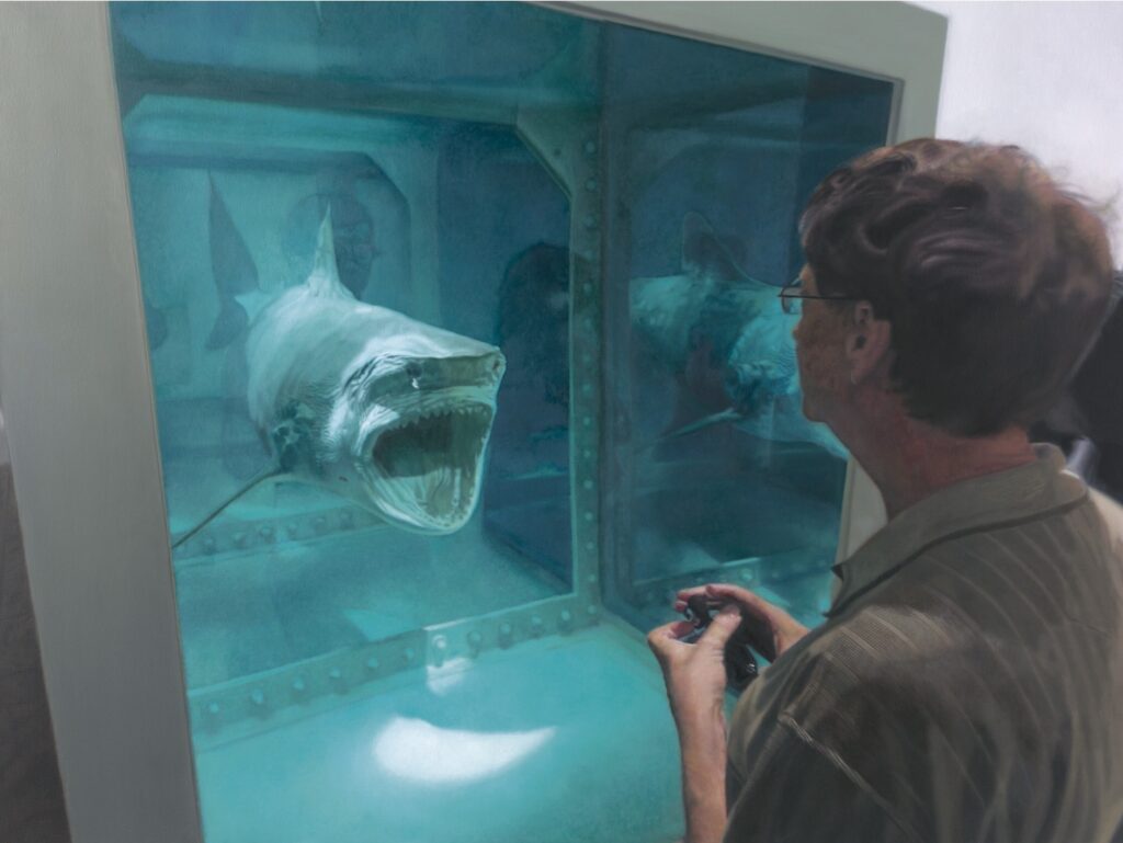
Dean does not include any reactions to lot 355, a 2008 Damien Hirst titled Bill with Shark. This painting of Bill Gates looking at a Hirst sculpture was based on a photo by Jean Pigozzi, and was originally sold in The Charity Element, the five of 223 works in the artist’s one-man sale at Sotheby’s in 2008 whose proceeds were marked for charities. The half million dollars this painting brought went, pointlessly, to the Bill & Melinda Gates Foundation, whose mission was memorialized in the Sotheby’s press release as “aim[ing] to help reduce inequities in the United States and around the world.” Resold for $278,000, it probably netted the original buyer $200,000, which cost them $300,000 for the privilege of donating to one of the richest men in the world. None of this makes sense, but it does remind me that Melinda Gates divorced her husband last year because she found his explanations of his relationship with Jeffrey Epstein unbelievable and unacceptable. 👀
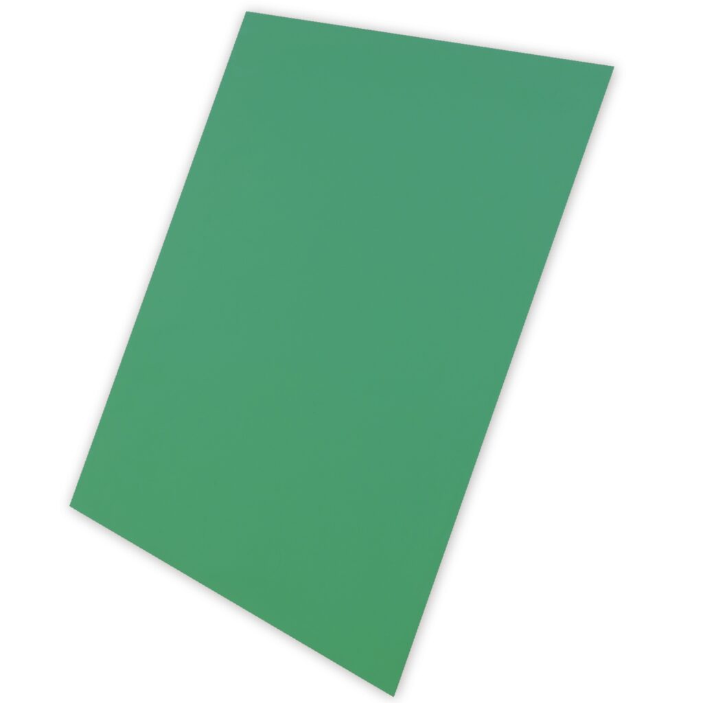
The sale also included Ellsworth Kelly’s Light Green Panel (1982), from the awesome series of editions he produced with Gemini GEL. Who ever knows how big a Kelly is without standing in front of it, but these Gemini panels are all adorable-size, like posters that float an inch and a half off the wall. At 42 x 32 in., Light Green Panel are the biggest. Kelly produced them in eleven colors on aluminum panels in five differently sized polygons (only one size per color, though.] In addition to the prototypes, there are 15 or so of each of these panels out there. I would love to have them all, and to see them together again, like at the National Gallery.
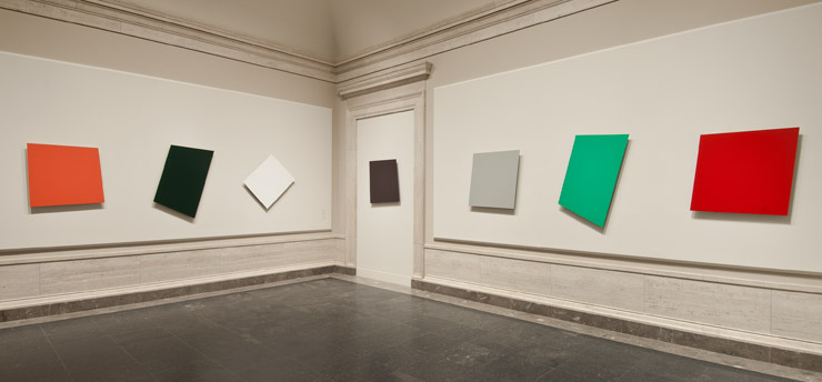
Or maybe slightly differently.
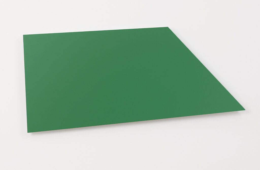
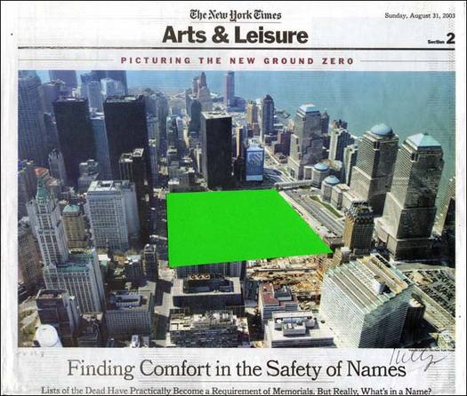
Which of course reminded me of Kelly’s 2011 aluminum panel edition, Green Panel (Ground Zero), the shape of which he derived from the NY Times’ aerial photo of the World Trade Center site. The 2003 collage he made and sent to Herbert Muschamp, is now at the Whitney, proposed the World Trade Center site be left as an open field of grass.
