Warhol’s Rough Week

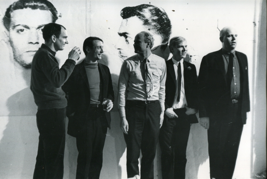
Fred W. McDarrah photo of artists at a party at Andy Warhol’s Factory, April 21, 1964. image: stevenkasher.com

Here is Fred McDarrah’s photo of Andy Warhol partying at the Factory on April 21, 1964, the night of the opening of his Brillo &c. boxes show at the Stable Gallery. The Sculls threw the party, even though it was at the Factory. That’s, from left, Tom Wesselman, Roy Lichtenstein, James Rosenquist, Warhol, and Claes Oldenburg. Behind them is a diptych of mugshots from Warhol’s New York Pavilion mural, Thirteen Most Wanted Men, which had been destroyed just days before this photo was taken, and before the World’s Fair even opened.
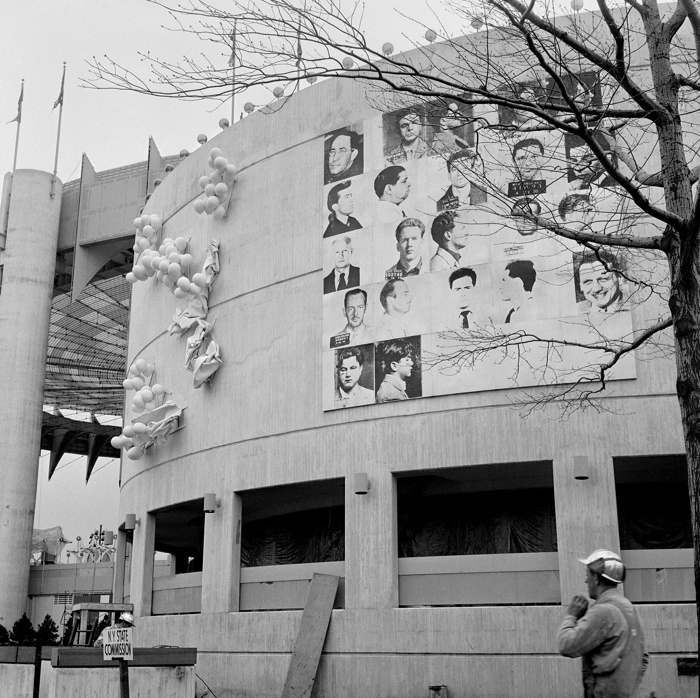
I’ve never been satisfied with explanations of why the mural was painted over with silver. But I blame pavilion architect, art curator, and unremorseful nazi Philip Johnson, who knew the subject–mugshots from an NYPD brochure–told Warhol to keep quiet about it, and then apparently caved within a day of the publication of a Fair preview by a Hearst-owned tabloid that criticized the mural as “Thugs at the Fair,” in which an NYPD spokesman questioned how Warhol had obtained these internal police documents.

On Friday, April 17, after two days of who knows what, Warhol sent an unsigned, one-sentence letter to the New York State Department of Public Works, Division of Architecture:

Gentlemen:

This serves to confirm that you are hereby authorized to paint over my mural in the New York State Pavilion in a color suitable to the architect.

Very truly yours,

Andrew Warhol

via “Letters to Andy Warhol,” a 2016 Cadillac as in car exhibit [?], cited by warholstars
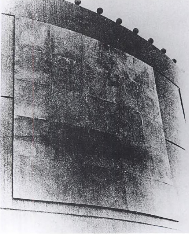
The architect apparently decided silver was suitable. I think the Times ran this image on the 17th, so the letter was just ex-post-facto CYA. In the aftermath of the mural’s destruction, Warhol decorated his party with images from the project he’d worked on for almost a year and a half. The dates are otherwise unclear, and I haven’t read The Biography*, but Warhol had moved into the Factory in November 1963, and maybe it was painted silver by April, too.
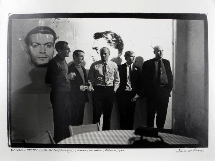
Print of a Fred McDarrah photo of Warhol’s Factory Party, Apr, 21 1964, in the collection of the Nasher Museum

But the images are reversed. [This perp is center right on the mural.] And it looks like a double register. This other McDarrah photo from a second earlier, a print of which is in the collection of the Nasher Museum, shows light reflecting off the mugshots. These are not double-printed outtakes, but the full-scale transparencies used to make the screens, casting shadows on the wall behind them. These ghosts of the mural destroyed just a couple of days before were now decoration for Warhol’s party.
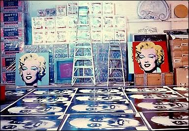
unsold boxes and rejected Moses portraits in a summer 1964 photo from Mark Lancaster

Almost three months later, the Times is still on it, and Warhol feels the need to say the mural was painted over because one guy was pardoned, and so it’s not valid anymore, and he’s working on inspiration for a replacement. That was in July, when he went to the trouble of making 25 panel portraits of World’s Fair commissioner Robert Moses, which were rejected in some paper trail-less way. And which cannot be random; did Philip Johnson pin the blame on Moses? Another, much later conversation used to explain the destruction had Henry Geldzahler and Johnson citing Nelson Rockefeller’s fears of offending Italian American voters in an election year. If that was his choice, between Rockefeller and Warhol, is there any question which way Johnson would go? When the chips were down, Johnson loved power more than art, and he threw Warhol and his rough trade artwork under the bus of New York politics.

Anyway, I now think more about how this must have sucked for Warhol, who spent so much time before–and after–having to destroy his biggest project to date. Not sure what to do with my sympathy for him, except to recommit to bringing his destroyed mural panels back into existence.

  • Update: Blake kindly shared the section of his Warhol biography dealing with the mural [my copy is inaccessible atm in storage], and basically all this is in there and more, including: the newspaper column by the highly influential Jimmy Breslin singling out the mural for Archie Bunker-grade criticism basically as soon as it went up; a fierce anti-gay crackdown across the city in the run-up to the Fair; the menu for Wynn Chamberlain and Warhol’s dinner where the most wanted idea came from; and so much more. Thanks!
  • Update a month later: and I found my copy of Larissa Harris’s exhibition catalogue, and slowed down to read it, and of course, it’s all in there, too.

Gary Comenas pieced together a lot of this timeline from the Warhol Archives and CR [warholstars.org]
previously, very much related: On Warhol and the World’s Fairs
13 Most Wanted Men exhibition at the Queens Museum in 2014 [queensmuseum.org]
Buy Blake Gopnik’s Andy Warhol biography via bookshop [bookshop]

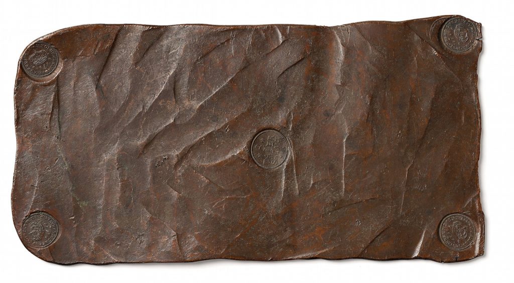
Swedish Plate Money

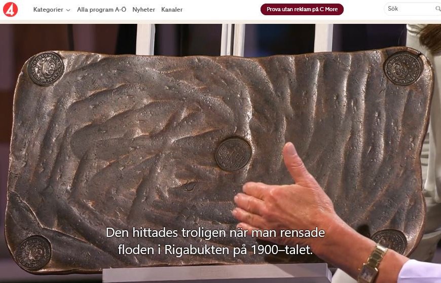
Swedish 8 daler coin (sic), a 14.5kg plate of copper, stamped, for sale at Bukowski’s

In the 17th century Sweden had the copper, and needed the silver, and its imperial war-making activities were constantly beholden to the exchange rate, and their monetary policy was in turn at the mercy of commodity prices for the metal their coins were made from.

In the middle of all this, someone had the idea to turn the plates of raw copper into actual coins by stamping them. This 14.5kg 8 daler plate is the second largest denomination. A 10 daler plate weighed in at 19.7kg.

Almost all these plate coins were melted down the second copper prices warranted, and it wasn’t until the 20th century that some examples were found in shipwrecks. About 50 of these bad boys exist, with 6–10 in private collections, which is why this coin is expected to trade at a 199,950 euro premium to the current value of the copper itself.

Oh wait, no, 6–10 examples from 1659, one of the 13 years 8 daler plate money was issued, are in private collections. I’ll let you connoisseurs sort out the price and rarity; I’ll stick to the oddity.

Holy smokes, they’re as big as a baking sheet.

8-daler coin on what I guess is the Swedish version of Antiques Roadshow, image:tv4play.se via @myntsidan

Also, this 1660 8-daler sold for just EUR2430 in 2017, so maybe rarity by year is really important? Except the plate above is also from 1660, and sold for like EUR175,000 in 2016. These things don’t work as money, and they don’t work as speculative instruments, either.

Lot 105 Plate Money 8 daler SM 1659 (Karl X Gustav), Avesta. est SEK2-2.2M, around EUR200,000 [bukowskis.com]
related: 8-daler plate money c. 1658 [britishmuseum.org.uk]

Wait, WHAT? Charles Sheeler Invented The Salt & Pepper Shaker?

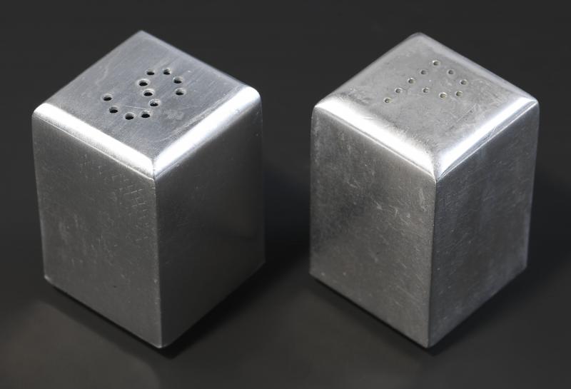
Charles Sheeler, salt & pepper shakers, aluminum, 1935, gift of Edith Gregor Halpert, image: SAAM

I am just cruising along through the utterly riveting, hilarious, and outrageous and insightful interview the American Art dealer Edith Gregor Halpert did for the Archives of American Art, when she just offhandedly mentions Charles Sheeler is the one who invented putting the S and P on the top of salt and pepper shakers??

In a sense it should not be surprising. Sheeler’s salt and pepper shakers have been around. They show up most recently last year, in Rebecca Shaykin’s show at the Jewish Museum on Halpert and her Downtown Gallery,  along with a silver brooch and ring he designed for Halpert when he was trying to woo her.

In 1934, to help drum up interest for artists during the Depression, Halpert had curated a groundbreaking show of her own, “Practical Manifestations in American Art,” that paired a fine artist’s work alongside an item of industrial design: Yasuo Kuniyoshi wallpaper, Edward Steichen textiles–and Sheeler salt & pepper shakers.

And then she says this:

We got the biggest silver company [International Silver Co., or ISC], and they stole the design.  Sheeler conceived the idea of the S and the P, but he didn’t patent it, so they stole that.

Really? I will look into it. Halpert gave her Sheeler salt shakers to the Smithsonian in 1968.

[a little while later update: lol while researching these salt shakers, I come to wonder if I have them. There was a show from the Musée des Arts Décoratifs de Montréal called What Modern Was that came to New York, at the IBM Gallery, which was actually a thing, in the IBM Building, which was also a thing, and my favorite indoor garden space when I moved to the city.  Anyway, I think these were in there, and between that, the 1939 World’s Fair, and Shmoo, I went on kind of a salt & pepper shaker binge. [I know, but also, I managed to block out the memory of it until at least this afternoon. Anyway, they’re somewhere. Doesn’t answer the question of the headline, though.]

Salt and Pepper Shakers [americanart.si.edu]
Oral history interview with Edith Gregor Halpert, 1962-1963 [aaa.si.edu]
Buy Shaykin’s Edith Halpert, the Downtown Gallery, and the rise of American Art [bookshop.org]


Walker Evans’ Beauties of the Common Tool

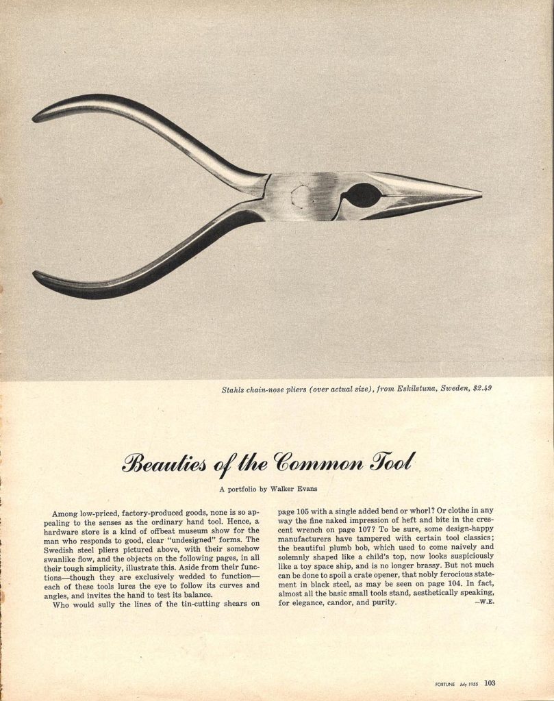
Walker Evans, “Beauties of the Common Tool,” Fortune Magazine, July 1955, scan via fulltable

While a staff photographer at Fortune magazine, Walker Evans produced a photoessay titled, “Beauties of the Common Tool,” which ran in the July 1955 issue. Dr. Chris Mullen has scans of the five-page spread as published, on his Visual Telling of Stories website. [There is also a great deal more of Evans’ work at Fortune.]

Walker Evans, Bricklayer’s Pointing Trowel, by Marshaltown Trowel Co., $1.25, 1955, silver gelatin print, object number 84.XM.1056, image:getty.edu

It turns out to be tricky to find what passes for a complete set of Evans’ photos from this series. As the successor to Evans’ estate and holder of his archive, the Metropolitan Museum probably has all of them in its nearly 8,000-item collection. Just sort by date or era: 1900–present, and, uh…

Walker Evans, [Two-Blade Knife Seen At Forty-Five Degree Angle], silver gelatin print, 1955, Object number, 84.XM.956.1062, image: getty.edu
The Getty loaned eight prints from this Common Tool project to the Cooper Hewitt for an exhibition in 2015. It turns out their giant Walker Evans collecction has at least 22, though, images of a reamer, an awl, a bill hook, an auger, various pliers, and a couple of variations on a T-square and some wrenches. Posted here are two favorites (three, including the Swedish pliers): a trowel, which made the cut for the magazine, and a double-edged knife, which did not. What I love about the trowel is how, by shooting straight on, Evans completely flattens the depth of the trowel’s handle, which is, of course, _/ -shaped.

Where the Met’s search capability is nonexistent, the Getty’s is non-persistent, but at least esoteric. I searched the collection by object number: 84.XM.956 is the code for their 1,082-piece Walker Evans trove. The Common Tool images are near the bottom of the accession stack, at numbers 84.XM.956.1052 to 84.XM.956.1073. [thanks to @_installator_ on instagram for the ispo]

[After dinner which I should have been making, but ended up ordering in because of tool glamour shot obsession update: I still can’t find Walker Evans’ photo of an awl on the Met’s site, but even if I did, it’d only be like the 15th sweetest crisply shot photo of an awl in their collection. They have like 45 awls, and they’re almost all elegantly documented. Oh ok, wow they have six photos of the trowel. Make that six 8×10 negatives of the trowel. If you search for the accession number 1994.258, it brings up a more manageable stash of 846 Evans photos. 18 tool photos are among the newest. Just imagine the contact prints…]

Kassay at von ammon

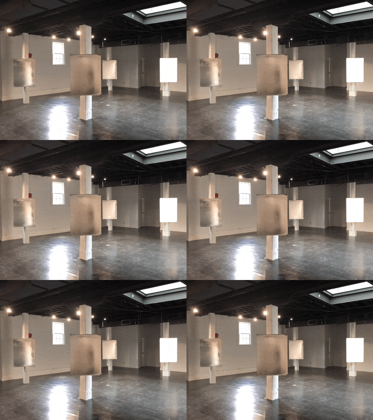
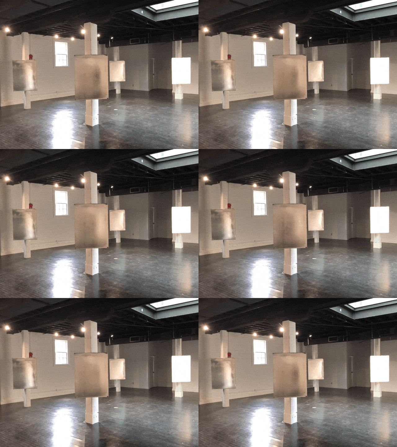
installation view of Jacob Kassay show at von ammon co, dc

There is a new show by Jacob Kassay at von ammon co in Georgetown.

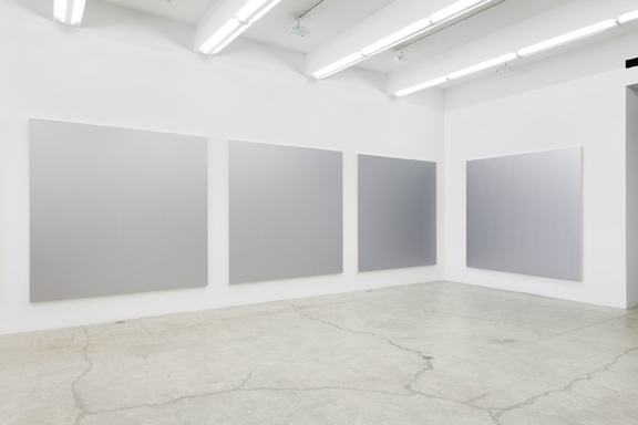
Ten OG silvered paintings from 2009 are mounted on the edge of columns in the gallery, facing the door, basically.

They reflect the daylight that comes in from the gallery’s north facing glass wall. The array of LED spots on the gallery’s black timber ceiling provides fill, but does not light the paintings individually. It’s more ambient, environmental.

The lights also snap on and off in relation to a candle in the corner. The candle is held by a bracket in front of a plug-in nightlight, which is connected in turn to a relay controlling the gallery’s lights. When the candle light wanes, the nightlight turns on–and the gallery lights turn off. When the candle is bright, the nightlight turns off, and the lights stay on.

In the absence of turbulence, the candle can burn brightly and steadily, and the lights stay on as expected. But the candle, like a Calder mobile, invites disturbance. When the candle’s doing its thing, the uncertain stroboscopic perturbations can be unnerving. To remain in the gallery thinking of art brings back visceral memories, not of Martin Creed, but of Bruce Nauman. Any prolonged exposure, meanwhile, might feel like shift work under a failing fluorescent light, with all the internalized bodily and psychic stresses that entails.

Installation view of Jacob Kassay’s show at von ammon co, dc

While the paintings remain as gorgeous and seductive as ever, with movement dancing across their reflective surfaces, Kassay’s candle-driven gallery also illuminates the intrinsic precarity of the art system in which they’re consumed.

I should have asked about the light situation, but the paintings are for sale.

Jacob Kassay’s show remains on view through August 31 at von ammon co [vonammon.co]

The Great Salt

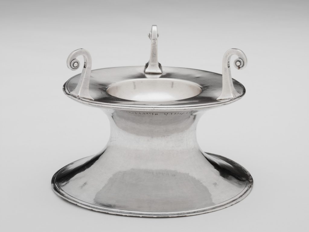
The Great Salt, c.1629–1638, Collection: Harvard Art Museums/Fogg Art Museum

Jace Clayton (H ’97), who performs as DJ Rupture, was an artist in residence at Harvard Art Museums, where he currently has an exhibition, sound installation, and performance, Jace Clayon, The Great Salt. The show is up through February 4th.

The Great Salt is an historic colonial silver salt receptacle, the oldest piece of silver Harvard owns, came to Boston with Elizabeth Harris Glover, whose husband died while crossing the Atlantic in 1639 [which was also the year the first enslaved Africans arrived in North America]. She would go on to marry the first president of Harvard, and her brother left it to the school, where it was used in the inauguration ceremonies of Harvard’s presidents through the 20th century. [After some point I guess they stopped it? Is this one more thing Larry Summers screwed up?]

40 synthesizer modules in the gallery are programmed to respond to visitors playing three marimbulas, Caribbean/African thumb pianos. On December 6, 2018, Clayton performed his three-part composition, “Salt Wood Salt Wire Salt Salt” with the new music group Bent Duo.

Listening With Jace Clayton [harvardartmuseums.org via bomb]
Performance–Jace Clayton, “Salt Wood Salt Wire Salt Salt” [vimeo]

Untitled (Plaque d’Orléans), 2019

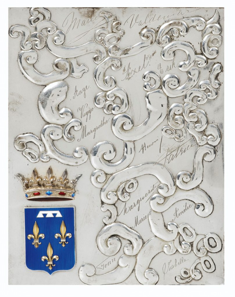
Untitled (Plaque d’Orléans), 2019, 17.7 x 23.4 cm, enamel and hammered, engraved, and silver-plated bronze, now ed. 12, but only 1/12  has this sweet patina and provenance. image: sothebys.com

In 2015 Sotheby’s auctioned a medium-sized trove of stuff from the former royal family of France, the House of Orléans. Included was this silver-plated and enameled bronze plaque, which featured the crowned coat of arms of the Princes d’Orléans, a bunch of repoussée auricular swags, and fourteen engraved signatures.

The plaque is believed to have been created for the cover of a photo album to commemorate the 1931 marriage in Palermo of Henri, comte de Paris (22yo) to his cousin, princesse Isabelle d’Orléans-Bragance (19):

Les signatures sont très probablement celles de Henri (comte de Paris) et Isabelle (princesse d’Orléans-Bragance, comtesse de Paris), Valdemar (prince de Danemark), Aage, Axel et Eric (princes de Danemark, comtes de Rosenborg), Amélie (princesse d’Orléans, reine du Portugal), Jean (futur grand-duc de Luxembourg), Margrethe (fille de Charles, duc de Vestrogothie et épouse du prince Axel de Danemark), auxquelles il faut ajouter quatre signatures non attribuées, Marguerite, Patrice et deux fois Marie.

It seems pretty wild to me. There was no foolin’ around with the coat of arms, obviously, but everything else seems to have been improvised in the extreme. The signatures–all first names–are distinct in their style, and wild in their placement. Those swags look like doodles come to life. It’s like the young wedding party drew up a souvenir themselves on the spot, and handed it off to the silversmith, a melange of extravagance, intimacy, and whimsy.

I knew a woman who was a bridesmaid for Grace Kelly, and received a customized photo album of the event. I later saw a similar album from another wedding party member turn up at Glenn Horowitz in East Hampton. Which makes me wonder if there are indeed multiple albums from Henri & Isabelle’s wedding, sitting in the bibliotheques of the descendants of various cousins royal. And if so, do they have these plaques, or something related? Was this a proof, a spare, a prototype?

Part of me wants this to be a unique object, and thus, a unique work, declared from afar, and sitting in the collection of some unsuspecting aristophile or decorator. But I’m also happy to declare it a multiple. Assuming this one’s from the happy couple, eleven in the edition remain to be fabricated. RSVP.

2020 update: OK, I thought of this plaque last night, and wanted to see it, and the more I dig into the names, I think some of the information in the Sotheby’s lot is incorrect. And that affects the date, and thus the very nature of this plaque.

Continue reading “Untitled (Plaque d’Orléans), 2019”

David Hammons’ Spade Again

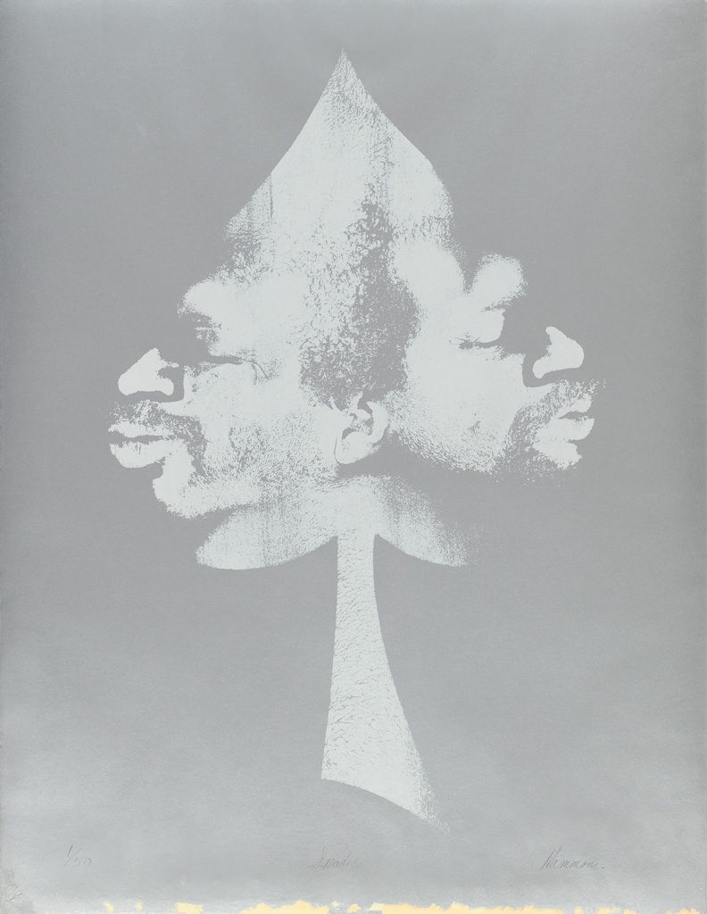
David Hammons, Spade, 1972, 26×20 in., sold Apr 2017 at Swann Gallery, now at Sotheby’s with a 60% markup. This unmatted photo is from Swann, and it looks like the print had some tape ripped off of it. Sotheby’s fixed that by cropping their jpg.

I was very interested to see this David Hammons print on silver paper when it came up for sale a year ago at Swann. And now that it’s back at Sotheby’s, I’m kind of interested in what’s up. I don’t remember it selling before, but Swann says it did. [For just $25k, or a $20k bid+premium, against a $30-40k estimate. Maybe it sold afterward.]

For an important approach (face imprinting) to an important subject (spade) for an important artist (DH, prounounced duh), that was only realized in a tiny fraction of the original edition (50 declared, six printed), it seems like it should’ve been snapped up and kept.

Oh right, now I remember why I was so interested in it: because I wanted to finish off the edition myself. There was a Warhol print on silver foil paper, too. Seems tricky to execute.

David Hammons, Moving to the Other Side, 1969, screenprint, image via Swann

Not as complicated as making it in the first place, though. Hammons’ process of turning a bodyprint into a silkscreen was described in a 2007 sale of a 1969 proof, Moving to the Other Side [above]:

“When I lie down on the paper which is first placed on the floor, I have to carefully decide how to get up after I have made the impression that I want. Sometimes I lie there for perhaps three minutes or even longer just figuring out how I can get off the paper without smudging the image that I’m trying to print.” [Young, p. 8.]
Then the artist applied a fixative to secure the image to the thin layer of margarine, often, as in this work, with multiple impressions. The artist took this work one step further making a screenprint of a monotype, moving the print across the paper to create a multiple self-image.

This process made me think Hammons mirrored his profile for Spade, but I think they’re actually the two sides of his face, composited.

Anyway, a Spade in the hand…

Lot 426 David Hammons, Spade, 1972, no 1/50, screen print on silver metallic paper, est. $40-60,000 [sothebys]

UPDATE: wow, $100,000. Epic flip.
UPDATE UPDATE: Not really, more like epic shop. $100,000 is what a collector pays, and the markup for a collector who did not know or know where to buy this work just a year ago is 400%.

Assuming the seller bought it last year for $25k, their take yesterday after premiums (25% buyer, 10% seller) is probably only $72k. So their net is around $45k. Not bad for one work for a year, but not epic.  Combined, the two auction houses got $35k ($7k for Swann, $28k for Christie’s). The original owner got around $18k. Plus 45 years with the work. Hard to say he’s not the winner here.

Erased Kassay JPEG

kassay_diptych_christies_screenshot.jpg
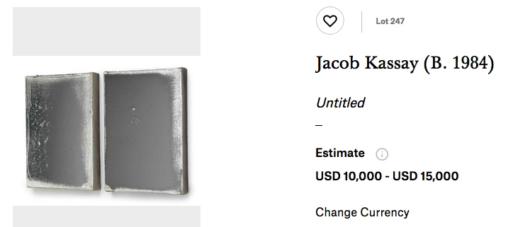
Lot 247: Jacob Kassay, Untitled, 2010, two 14×10 silver on acrylic (not gesso?) canvases, est $10-15,000 [image via christies]
Scanning the catalogue for this month’s Christie’s sale turned up something unexpected: an affordable Jacob Kassay painting. Two of them, in fact. After his ominously seductive debut show opened at Eleven Rivington in the wake of the 2008 financial crisis, Kassay’s silvered gesso canvases were transmuted into auction gold. Shiny objects reflecting distorted images of their viewers, Kassay’s paintings were the first to get churned and flipped in a frenzied art market obsessed with declaring-and cashing in on-a steady stream of new stars.
It’s the kind of limelight that can wreck a girl’s practice, if not her complexion, and Kassay has been reticent, even diffident sometimes, of the hype. He’s generally refused to engage the art market star process, at least on anything other than his own terms. For a while he refused to have his picture taken. His website, a kaleidoscope of semi-transparent images, would kick you off after a few seconds, presumably when you’re just tryna do some research for an upcoming auction.
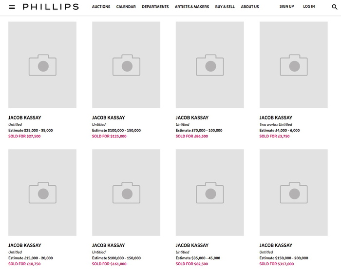
Kassay has also always been fairly specific about images of his shows, especially photos of his silvered paintings. So it should make all the sense in the world that he’d care about the proliferation of auction-related reproductions of his work. What was more surprising, though, was the apparent removal of all images of his work from Phillips’ website.
phillips_kassay_screenshot_gregorg.jpg
Sotheby’s has done this for a while now, removing images of works shortly after the sale is completed, but this is the first time I’ve seen all of an artist’s images removed from a site. Or should I say, replaced. If you thought Kassays all looked the same before, well, brother, you’re in for a treat. I’d like to see these in mirror finish, please.
kassay_diptych_phillips_screenshot.jpg
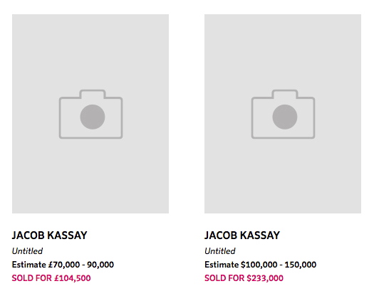
[FWIW, this particular pair, from 2010, was flipped at Phillips in 2011 for $104,500. If there’s anything more alluring than a shiny object, it’s two. And if there’s anything more seductive than that, it’s a 90% discount. [Update: indeed, they sold for $8,000 bid, $10,000 with premium. That is some Cady Noland-level collector anxiety inducement and value erasure. Well played.]
Sept 28, 2017, Lot 247: Jacob Kassay diptych, 2010, est. $10-15,000 [christies]
8 Nov 2011, Lot 205: Jacob Kassay, Untitled diptych, est. $30-40,000, sold for $104,500 [phillips]

This Louise Bourgeois Shackle Necklace By Chus Burés Has No Title.

bourgeois_lang_choker_tajan.jpg
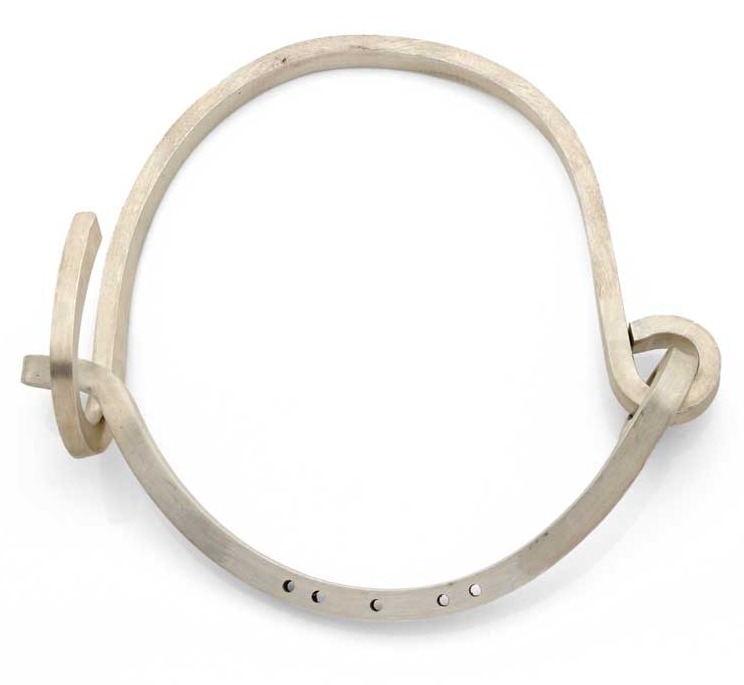
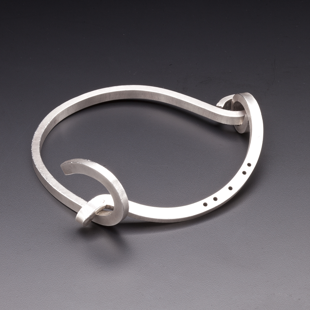
This is a necklace by Louise Bourgeois. Based on a 1948 design, it was realized in collaboration with Madrid jeweler Chus Burés in 1998, and was produced in silver in an edition of 39. It weighs 374 grams, more than 13 ounces, which is pretty heavy.
It caught my eye this morning when artist Linda Hubbard tweeted about it, partly because it’s going around tumblr as a project Bourgeois did for Helmut Lang. And I thought I knew my late 90s Helmut Lang. The necklace itself’s only stamped LB, though, and none of the auction listings over the years credit Lang, even in the provenance. A 2008 sale at Tajan in Paris said the necklace is “due to” Lang, and links it to Lang’s, Bourgeois’ and Jenny Holzer’s three-person show in Vienna in 1998. It also compared it to a slave collar.
bourgeois_necklace_toledo_museum.jpg
acquired in 2010. image: toledo museum
When the Toledo Museum wrote about it this spring, they gave it a title, Shackle Necklace, and slightly earlier dates (1947-48):

Louise Bourgeois designed this necklace in the 1940s as a personal statement against the violence she had witnessed against prisoners during the Spanish Civil War (1936-39), who were asphyxiated by shackles of this shape. It was also designed as a comment about the female state, a metaphor for the social, political, and legal constraints of women before the feminist movement.

Which, wow, there is a lot going on there.
Did Bourgeois go to Spain during the war? I don’t think so. She was studying at the Beaux Arts and selling Picasso prints to Robert Goldwater, the NYU art historian she’d marry and move to New York with. The war in Spain was obviously hot news, even more so if Bourgeois was working with Picasso. And there was the World’s Fair in Paris, of course.
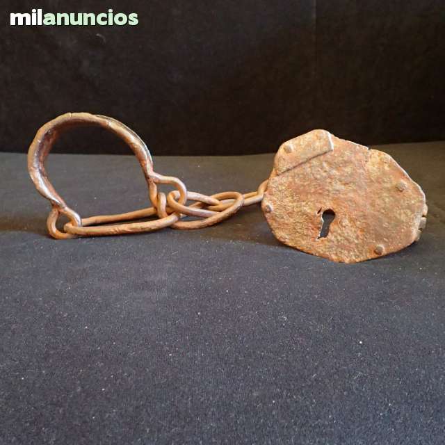
grilletes_military_milanuncios.jpg
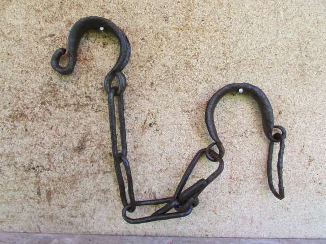
Here are some antique Spanish shackles from a classified ad site. I see a resemblance. Except these are for feet. This set says it’s for horses. Which would technically make these hobbles, right?
grilletes_caballos_milanuncios.jpg
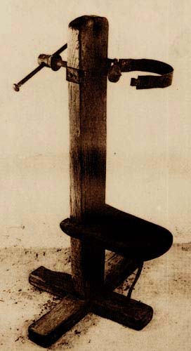
And they’re asphyxiating no one. In the absence of more concrete examples or info, the asphyxiation reference makes me think of the garrota or garrote. Is that what Bourgeois’s referring to? A prisoner is chained to the seat, and the executioner stands behind him, tightening a flat metal band around his neck-and/or releasing a spring-loaded spike into the base of his skull-until he’s dead. The garrote was pretty much the standard method of execution in Spain, around since the Inquisition, and official for 150 years until the Second Republic, when it was abolished. Then Franco reinstated it in 1940. Is this what Mrs Goldwater was protesting? 8-10 years later? By making a necklace which, frankly, doesn’t look anything like a garrote?
spain_garrota.jpg
Spanish garrote, image from this Italian medieval torture site
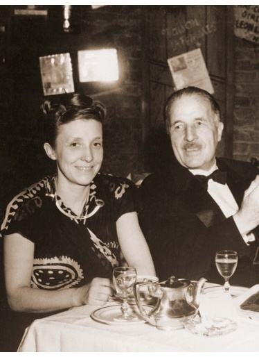
In 1947-48, Bourgeois did not have an art career. She’d had one solo show, but she was, as her obit put it, “known to the New York glitterati merely as the charming French lady who appeared at private views on the arm of her American husband” the art historian. If she even got out of the house then. In 1939, thinking she could not get pregnant, the Goldwaters returned to France briefly to adopt a French orphan. Back in the States, they promptly had two more sons in two years. So maybe a necklace patterned after a prisoner’s collar or a garotte is just the kind of sculpture a mom trying to work with three boys under foot would make.
louise_bourgeois_necklace_father_1948.jpg
Louise Bourgeois rocking the original necklace in New York in 1948, at lunch with her father Louis. image: LB Studio
So I called the man who made them, Chus Burés. He said the necklace turned up during the preparations for Memoria y Arquitectura, Bourgeois’ 1999 exhibition at the Reina Sofia in Madrid, curated by Danielle Tilkin and Jerry Gorovoy. She’d made it for herself, and she wore it.
The curators brought the original to Burés; it was a darkened metal, he said, round and matte. He created the squared shape, in silver, with a satin finish, which Bourgeois liked very much. There was an idea to do a gold version, but it was too expensive.
The five small holes drilled in the piece were for attaching strings (originally) or crystals; Burés designed a set of 14 various crystals that could be swapped out and arranged on the necklace. Despite being Spanish, a Catalan, and having intensive conversations about Spanish culture and literature with Bourgeois, Burés never heard the artist reference the war, or shackles. A couple of years later, Burés made a spider brooch for Bourgeois, in both silver and gold.
As for Helmut Lang, Burés explained that Bourgeois had given a necklace to Lang, and that at some point, several years later, the designer wanted to include it in a runway show. Lang’s people asked permission, Burés agreed, there was a press release with proper credits, it was all wonderful. Later a friend spotted the necklace for sale in Lang’s boutique in Paris.
There is no way Bourgeois’ necklace does not evoke a shackle. But unless something turns up from the artist, any more specific interpretation is just weighing it down.
via @DukeToddIsAlive & @LindaHubbardArt
Nov 2012, Lot 70 Louise Bourgeois, Choker (1999-2003), sold $20,000 [bonhams]

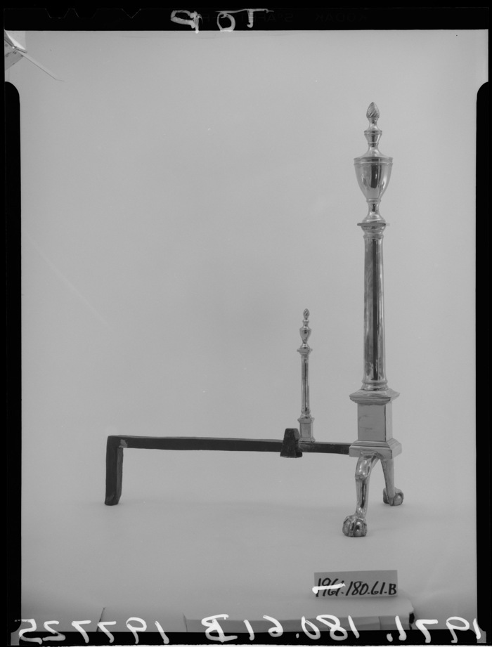
Untitled (Andiron Attributed To Paul Revere Jr.), 2014

untitled_andiron_attr_met.jpg
Untitled (Andiron Attributed To Paul Revere Jr.), 2014, whoops, 2015, obv
[UPDATED, see below; UPDATED AGAIN, see below that]
I am stoked (pun recognized and allowed to stand) to have a new work in the Metropolitan Museum. Despite its minty freshness, Untitled (Andiron Attributed To Paul Revere Jr.), 2014, is currently on view in The American Wing, Gallery 774, the Luce Visible Storage Gallery, officially known as the Henry R. Luce Center for the Study of American Art.
I have not seen it installed yet–I just made it a few minutes ago, cut me some slack–if you’re at the Met, maybe swing by and send me a pic? Ideally, the piece should be installed just as it’s depicted in this beautiful photo.

Continue reading “Untitled (Andiron Attributed To Paul Revere Jr.), 2014”

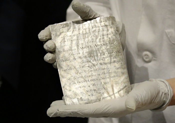
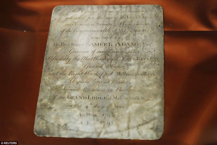
Paul Revere (Attr.), Time Capsule Plaque, Silver, Engraved Text, c.1795

paul_revere_time_capsule_mfa_6.jpg
image: via usnews
I may have tweeted smack about it when I thought it was just old newspapers and coins, but that’s only because initial headlines of Samuel Adams’ and Paul Revere’s time capsule in the cornerstone of the Massachusetts State House criminally underplayed the presence of this amazing, engraved silver plaque.
THIS is EXACTLY the kind of thing people should put in time capsules: slightly-precious-but-not-too items handmade to commemorate the occasion. These artifacts capture the moment, but more importantly, they retain an historical significance, and who knows, in time they may accrue an aesthetic aura as well.
paul_revere_time_capsule_mfa_2.jpg
image via reuters
The Boston time capsule plaque also benefits from the connection to the still-relevant Revere brand; whether he actually made it or not, it feels plausible, authentic. There is also the handmade aspect: I have an engraved ring, and a stationery die, but a whole engraved plaque? That’s something.
[It’s not the intern who wrote this USNews piece’s fault for describing every item in the time capsule in terms of its market value, and the impact a Revere attribution & provenance might have on it. Every report has that. It’s just another sign of who we’ve become as a culture. Like Antique Roadshow.]
A more interesting cultural change is the invisibility/illegibility of whatever the plaque actually says, and what it might mean. The Masonic context goes unremarked or glossed over in the mainstream coverage of the plaque. He that still hath ears, two hundred years on, let him hear, I guess.
walter_de-maria_melville_chr.jpg
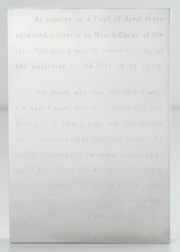
Invisibility was one of the qualities of engraved text that appealed to Walter De Maria early in his career; he made a series of polished steel or aluminum works with engravings on them: Garbo Column (1968) had a list of the reclusive actress’s 27 films; Melville (1968, above, which I have swooned over before) features the opening of the author’s first hit novel, The Confidence Man.
demaria_color_men_choose_menil.jpg
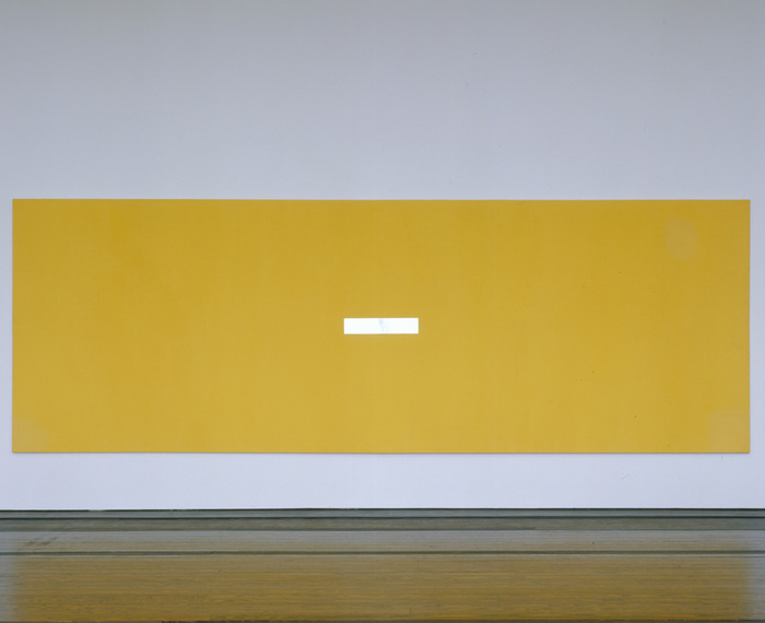
The Barnett Newman-scale monochrome painting De Maria asked Michael Heizer to make for him for Dwan Gallery’s 1968 Earthworks show has its title engraved on a polished steel plaque in the center: The Color Men Choose When They Attack the Earth. Can you read it in this picture?
demaria_dorian_gray_prada_2011_fabyab.jpg
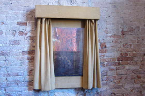
Walter De Maria, Silver Portrait of Dorian Gray, 1965, at the Prada Fndn’s exhibit in Venice in 2011, image: @fabyab
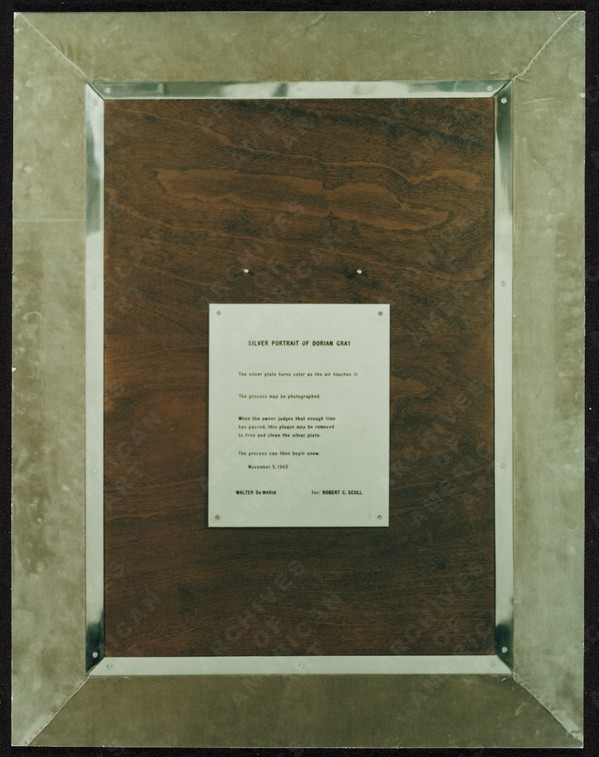
De Maria created at least one work in silver. It was for his patron at the time, Robert Scull, who fronted the dough for the fabrication of a series of polished metal sculptures. Silver Portrait of Dorian Gray (1965) is just that: a mirrored silver plaque behind a velvet curtain that darkens and oxidizes over time. The artist’s instructions on the back offer the owner the chance to wipe away the stains of aging, though: “When the owner judges that enough time has passed, this plaque may be removed to free and clean the silver plate.” The promise of immortality, the opposite of a time capsule, at least for the mirror. Your call, Miuccia!
demaria_dorian_gray_verso_scull_aaa.jpg
image:
UPDATE A brief dive into the history of time capsules tells us we need to pay more attention to the Masons, and to the Egyptians. The birth of the modern/20th century time capsule is linked to the discoveries of relic-filled Egyptian tombs and pyramids. And in a list of the International Time Capsule Society’s 1991 list of the Top Ten Most Wanted Time Capsules is this:

5. George Washington’s Cornerstone
Today’s custom of burying time capsules is in part an outgrowth of Masonic cornerstone-laying ceremonies. Through the centuries, Masons have officiated at rituals which often include placing memorabilia inside building cornerstones for later recovery.In 1793, George Washington, a Mason, performed the Masonic ritual upon the laying of the original cornerstone of the U.S. Capitol. Over the years, the Capitol has undergone extensive expansion, remodeling and reconstruction, but the original George Washington cornerstone has never been found. It is unknown whether there is anything inside of it.

Here is a Mason’s explanation of the cornerstone laying ceremony, one of the only public Masonic rituals. [“When the brethren are sharply dressed, and well-rehearsed, it’s an awesome thing to behold.” mhmm.] And Wikipedia’s article on cornerstones has a brief account of a 19th century cornerstone laying ceremony in Cork, which involved “a trowel specially made for the occasion by John Hawkesworth, a silversmith and a jeweller.” So maybe these engraved plaques are also a thing?
Coins, Newspapers Found in Time Capsule Buried by Paul Revere [usnews]
Previously, very much related: While We’re On The Subject Of Polished Metal Objects: Walter De Maria

This Looks Like That: Henry Codax Silver Paintings At Martos Gallery

codax_martos_silver_install_01.jpg
Remember how, when Christie’s tried to sell a Henry Codax painting as being by Jacob Kassay and Olivier Mosset, Kassay issued a statement saying he had nothing to do with the painting, and his “name should not be associated with it”? I don’t think Henry Codax got that memo. Because the new, silvery Codax paintings as Martos Gallery look like they’re trying to give Kassay a big ol’ hug.
JacobKassay_2013_kitchen.jpeg
Installation shot of Jacob Kassay’s 2013 show at The Kitchen titled, interestingly, Untitled (disambiguation)
For an artist who exists only in the pages of a crowdsourced novel, Codax sure keeps busy IRL. There have been multiple shows every year since 2011, and honestly, just look at this detailing; these paintings are not slapdash affairs:
codax_martos_silver_detail.jpg
Clearly, Codax knows his way across the surface of a monochrome.
Henry Codax iridescent paintings, at Martos Gallery through Oct 4, 2014 [martosgallery]
Henry Codax at Shoot the Lobster at Gavin Brown

On Untitled (Beauty Love)

There is beauty in this painting. But the beauty is not what makes you love it.
It’s the emotion of what it says, in very simple means about life. And where we all go.
I don’t know why I get chills from Tobias Meyer’s little promo video for Silver Car Crash (Double Disaster), but here we are.
I matched the audio to Michelle V. Agin’s photo from the Times this morning.

And then after reading Ian Bogost’s McRib essay again, I realized it was the most persuasive explanation I’ve seen of Auction Week. So

untitled (where we all go)

Study For A Fence And A Wall (2006)

king_wall_study_2006.jpg
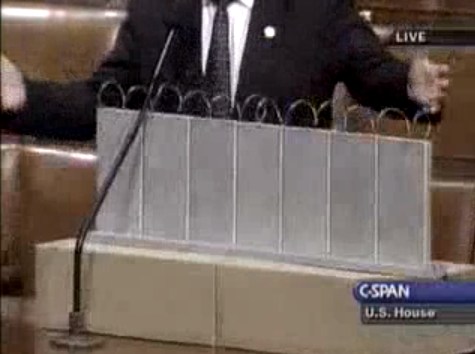
On July 11, 2006, on the floor of the US House of Representatives, Congressman Steve King, Republican from Iowa, presented a model of “a fence and a wall” he had designed. It was a site-specific proposal, to be located on the US-Mexico border.
The fence/wall could be built, Mr. King explained, using a slipform machine to lay a concrete foundation in a 5-foot deep trench cut into the desert floor, a gesture that immediately brings to mind the Earth Art interventions of Michael Heizer. Pre-cast concrete panels, Post-minimalist readymades 10 feet wide and 13 feet high, could be dropped in with a crane.
“Our little construction company,” Mr. King said, referring to the King Construction Company, which he founded, and which was then being run by his son, “could build a mile a day of this, once you got the system going.”

Mr. King demonstrated the construction of the wall using his tabletop model, made of cardboard boxes, silver-painted wood slats, and a couple of feet of coiled wire [representing the wall’s crown of concertina wire, which would be electrified “with the kind of current that would not kill somebody…we do that with livestock all the time.”]
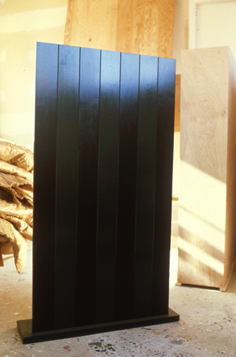
It’s true that the remarkable simplicity of the design and the economy of the materials resonate the work of Richard Tuttle. But in the scale and especially the form, King seems to be making a conscious reference to the early work of Anne Truitt.
anne_truitt_seven.jpg
Seven, 1962, image: annetruitt.org
Obviously, at some point after his arrival in Washington in 2003, King studied the iconic Truitts in local collections: the highly fence-like First (1961) [at the Baltimore Museum] and slab-on-plinth structures like Insurrection (1962) [at the Corcoran]. But even I was surprised to see King make such an explicit homage to Truitt’s Seven (1962) [above, collection of the artist’s estate].
Much like Christo and Jeanne-Claude, King conceived of his site-specific fence/wall to be temporary, at least conceptually:

You could take it back down. If somehow they got their economy working and got their laws working in Mexico we could pull this back out just as easy as we could put it in. We could open it up again or we could open it up and let livestock run through there, whatever we choose.

Whatever we choose. Thus the fence/wall becomes a symbol of American freedom.
According to the Congressional Record, Mr. King, appearing as an expert witness, exhibited his Study For A Fence And A Wall again a week later, in a joint hearing of the House Committees of Homeland Security and Government Reform.
The current whereabouts of King’s model is not immediately clear, but I guess I could call about it. Meanwhile, I would love to see this work realized at full scale, if only temporarily, where it was conceived: right here in Washington DC. Perhaps in the National Gallery’s sculpture garden, or along one of the sketchier sections of Pennsylvania Avenue, where dangerous elements threaten Our Freedoms.
January 2017 inevitable update: Oh how we did not need to worry that this work might not have survived. On Jan. 13 Congressman King tweeted out a photo with it, and the new appointee for DHS. Study was installed on his coffee table in his office. It will be noted that it has a new base, set in unpainted wood feet, presumably a pair. The articulation of the wall at the ground and the underground footing are now fully visible. The box representing the desert floor, and the notch, where “you put a trench in the desert floor.” are not seen. What was once site-specific is now available for installation anywhere, I guess. Though it’s really tough to say at the moment.
steve_king_study_for_wall_with_base_20170113.jpg