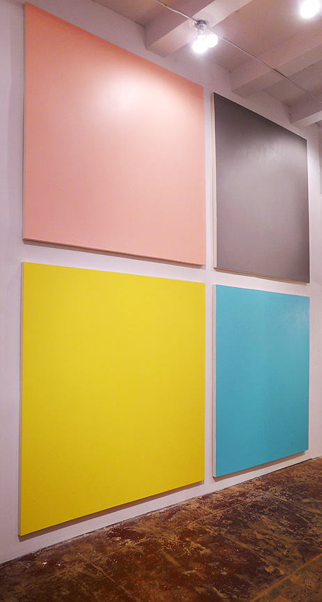
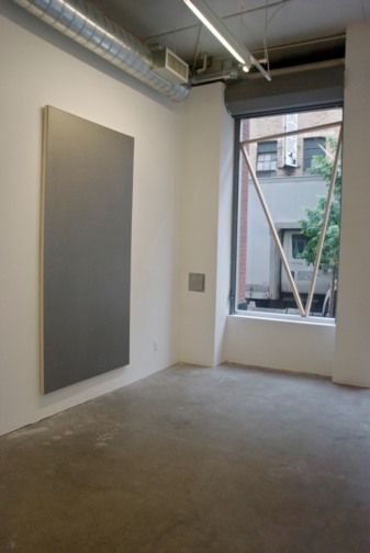
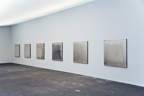
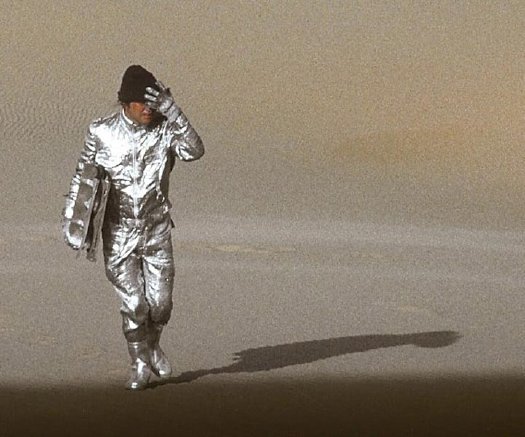
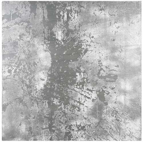
Henry Codax, Untitled (Dark Grey), 2011, via christies.com
Wow, do I owe Henry Codax an apology.
Last week I’d declared the fictitious painter’s beautiful gray monochrome a failure because, not only did it not “Strip away any obvious authorship,” the Christie’s catalogue text for the painting laid authorship down in thick coats by stating as fact that Codax was “a pseudonym created by New York-based artist Jacob Kassay and the Swiss conceptual artist Olivier Mosset.”
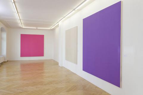
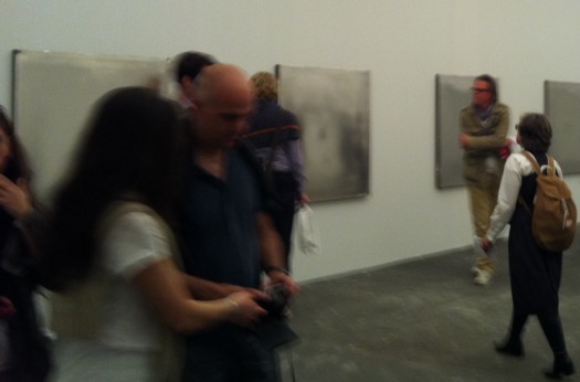
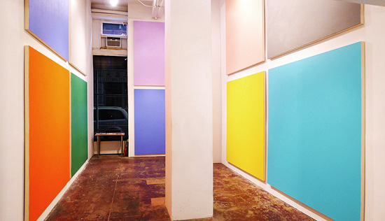
installation shot, Henry Codax paintings, Carriage Trade, June 2011
I’d been surprised to see the attribution laid out so definitively, especially after re-reading the source of that attribution, Andrew Russeth’s Gallerist NY article on the Codax show last summer at Carriage Trade. Russeth did indeed report that “a source”–who he did not characterize in any way–had told him about the Mosset/Kassay collaboration, but Carriage Trade would not comment on Codax’s origins–and still won’t, btw–and both real-life painters’ galleries stated they had no idea about the work or the project.
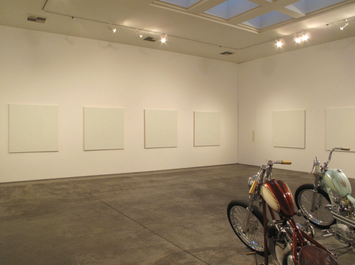
Olivier Mosset paintings installed with bikes by Jeffrey Schad and Vincent Szarek, 2011, Christopher Grimes Gallery, Santa Monica
In the Wikipedia age, though, where truth is trumped by verifiability, Russeth’s article was proof enough for the paintings to find buyers. And for at least one buyer, who apparently figured they’d cash in on the recent Kassay mania by flipping the dark grey monochrome at auction. And for Christie’s, who ignored the work’s similarities to the venerated-but-less-marketable Mosset’s work to assert that “In the present example, Kassay’s iconic silvery paintings have been replaced by a sleek, anonymous grey surface.”
Yes, well. Actually, no.
At Christie’s First Open sale last Wednesday morning, the Codax had been bought in, which means it didn’t sell, either because bidding didn’t reach the reserve price, or because there was no bidding at all. At first, I’d figured the work wasn’t Kassayish enough after all, or that its conceptual conceits were too cute for the speculators in the market.
Henry Codax and Stephane Kropf at Susanna Kulli Gallery, Zurich, Oct. 2011
But then someone who attended the sale told me that Christie’s had read a statement, known as a saleroom note, before bidding began, in which Kassay said he’d “had nothing to do with” the painting, and that his “name should not be associated with it.” [In trying to confirm the text of the actual statement, I contacted Christie’s, first as press, and then finally as client. The specialist who worked on the lot was helpful, if circumspect. But she also referred me to the sale results page, which, I was told, would have the saleroom notice appended. Except, of course, it didn’t, because Christie’s deletes online references to unsold lots completely, in order to not taint their saleability in the future.]
Whatever was said was apparently enough to dissipate the Kassay cachet. [Christie’s did not receive a similar demand from Mosset.] But more importantly, or more interestingly, it also reopened the speculative possibilities surrounding Codax’s work and who might have made it. And how it closes and generates gaps between an object and the projections upon it.
Olivier Mosset work in 1107 Manhattan Ave, a group show at Spencer Brownstone, which also included works by studio neighbor Kassay, Sept. 2011
The real [fictional] Codax, the character in Bernadette Corporation’s collectively authored novel Reena Spaulings, was known for “expensive, impressive monochromes.” Yet these were neither, and after failing to sell at auction, they were even less so. Reviewing the show for Frieze, Piper Marshall noted the authorship issue’s resonance with Mosset’s earliest practice, when, as BMPT, he and three fellow painters, Daniel Buren, Michel Parmentier, and Niele Toroni, would make and sign each others’ work.
Jacob Kassay installation, eight square, silvered paintings at Art Basel, June 2011, image via gallerist ny
But once Gallerist published their persuasively well-informed speculation, these large, uniform, anonymous paintings suddenly became a roomful of *wink* Kassays, which, unlike the roomful of square Kassays just shown at Basel, were available to buy. Even if you weren’t “a real museum.” And at up to 95% off. As long as you didn’t mind the uncertainty. And as long as you were happy with an unsigned painting accompanied by a certificate authenticating the work only as by “Henry Codax.” And if the work is ever captured by the market, the artists will deny all knowledge of its existence.
Our capitalist culture is based upon the premise that corporations are people, too, and legal disputes are regularly resolved by exchanges that include “no admission of wrongdoing.” With a political system where plausible deniability is S.O.P. and legal motions are made that “neither confirm nor deny” their subjects. It does makes one wonder why the art market can’t accommodate a painting by a fictitious artist derived from a collectively written novel by a fictitious gallerist published by a corporation, even without the unconfirmed involvements of two well-known, living artists.
So Henry Codax, I sincerely apologize, and I salute you, for you are truly an artist of our time. C-A-L-L M-E.
Tag: silver
Transactional Aesthetics, Or The Highly Collectable Rirkrit Tiravanija
I’ve been writing this post in my head for months, years, even, but so many pieces have piled up in my browser tabs, it’s slowing my computer down. And plus, this weekend MoMA announced that they acquired and will exhibit Untitled (Free/Still), the original [sic] free-Thai-curry-in-a-gallery work, so it’s time to step back and look more closely at Rirkrit Tiravanija’s art practice. First, by starting with what we are fed. Here is a small sampling platter of familiar statements by and about the artist and his work:
“It’s part of what has been called ‘relational aesthetics,’ ” said Ann Temkin, chief curator in MoMA’s department of painting and sculpture. “Joseph Beuys created social sculpture; it’s the act of doing things together, where you, the viewer, can be part of the experience.”
That’s from MoMA’s press release in the NY Times.
You could say his art is all about building “chaotic structures.” Then again, it’s about lots of things; his work is so open-ended and departs so radically from the art market’s orientation toward precious objects, that it’s earned many labels, many – like utopian or chaotic – that only tell part of the story. But one that’s stuck, for better or worse, is French theorist-critic Nicholas Bourriaud’s “relational aesthetics,” the idea of judging the social relationships sparked by an artwork instead of merely considering the object.
That’s Paul Schmelzer, now/again of the Walker Art Center, an early and frequent supporter of Rikrit’s work, writing in 2006.
Tiravanija’s art is free. You only need the experience. In fact, the essence of his work resides in the community, their interrelationships, and chance. Make art without objects, their purpose is a complaint against the possession and accumulation.
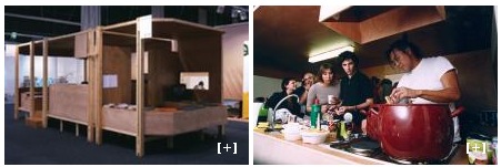
The Museo de Arte Contemporáneo de Castilla y León, which owns Untitled (Caravan), a 1999 plywood model of a camping trailer, with kitchen, above.
Rirkrit as quoted by Bruce Hainley in Artforum, 1996:
“Basically I started to make things so that people would have to use them,” he has said, “which means if you [collectors, museum curators, anyone in these roles] want to buy something then you have to use it. . . . It’s not meant to be put out with other sculpture or like another relic and looked at, but you have to use it. I found that was the best solution to my contradiction in terms of making things and not making things. Or trying to make less things, but more useful things or more useful relationships. My feeling has always been that everyone makes a work – including the people who . . . re-use it. When I say re-use it, I just mean use it. You don’t have to make it look exactly how it was. It’s more a matter of spirit.”
And here’s Faye Hirsch in Art in America this summer, perfectly teeing up her making-of story for Untitled (the map of the land of feeling), [above] an extraordinary 84-foot-long print edition Rirkrit has worked on for the last three years with students and staff at Columbia’s Leroy Neiman Center for Print Studies:
Rirkrit Tiravanija has never been known as a maker of elaborate objects. In a market-riven art world, he has remained, since the early ’90s, a steadfast conceptualist whose immaterial projects, enmeshing daily life and creative practice, have earned him a key role in the development of relational art. At galleries and museums around the world, he has prepared meals and fed visitors, broadcast live radio programs, installed social spaces for instruction and discussion, set up apartments–where he or visitors might live for the duration of a show–and dismantled doors and windows, leaning them against walls. At two of the three venues for his 2004 retrospective, the “display” consisted of a sequence of empty rooms referencing (in their proportions and an accompanying audio) his selected exhibitions over the years.
When Tiravanija does make objects, they are generally of a modest nature–most often multiples and ephemera connected with exhibitions. At his show this spring at Gavin Brown’s Enterprise in New York, for example, he set up a room where an assistant screenprinted white T-shirts with his signature terse, block-print headlines, ranging in tone from vaguely political (LESS OIL MORE COURAGE) to hospitably absurd (I HAVE DOUGHNUTS AT HOME). They cost $20 apiece.
Ah yes, the t-shirts. Not sure if I ended up being the only one, but I was apparently the first to order a complete set of all 24 shirts. So there’s that.
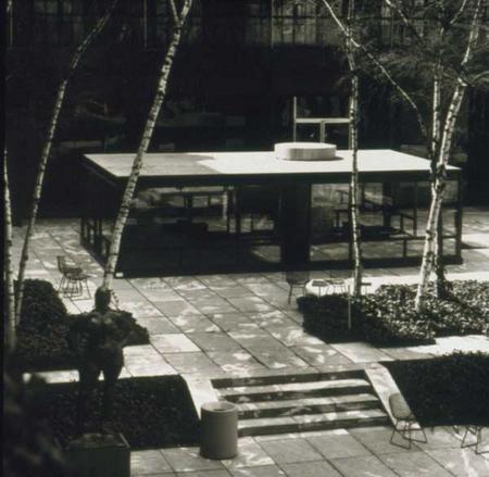
I have been an admirer and follower of Rirkrit’s work since his earliest shows at Gavin’s, and Untitled (Playtime), the awesome, ply&plexi, kid-sized replica of Philip Johnson’s Glass House he built in MoMA’s sculpture garden in 1997 [above] bought him at least a decade of good karma in my book.
And so it’s only very recently that I’ve started to watch and wonder if I’m the only one who– See, this is why Faye Hirsch’s quote is so perfect: because it encapsulates exactly how people talk and write and think about Rirkrit’s work, and it’s perfectly and exactly wrong.
I’m sorry, that’s the overdramatic hook in this post. What I really mean is, as his social, experiential, ephemeral practice, his “art without objects” has taken off, Rirkrit has also been making some of the blingiest, sexy-shiniest, most ridiculously commodified luxury objects around. I love them. Why can we not talk about them more?
Continue reading “Transactional Aesthetics, Or The Highly Collectable Rirkrit Tiravanija”
Artforum Reviews Jacob Kassay Press Release
Huh. I guess Artforum’s back-of-the-book review section does not purport to ignore the art market’s overdetermining forces any more.
Ben Carlson’s review of Jacob Kassay’s show this summer at L&M Arts in Los Angeles is framed around the burning question, “Does Kassay’s work properly account for the auction hype and thus, its own presence in this high-end gallery?”
But L &M Arts’ interest in this young painter is no mystery: Regardless of their merit, Jassay’s silvery-reflective monochromes made a splash at auction last fall. Anticipating the cynics, the staff penned a press release that was quick to distance Kassay’s older output from the new work he made for this show. Calling attention tot the differences in surface treatment, it announced that his most recent paintings would feature a “surprising yet deliberate lack of reflection.”
[part where 29-yo Kassay is chided for not taking better hold of his secondary market and is as yet found to be no Ryman or Kelly omitted]
Offered a chair at the high rollers’ table, Kassay could have made only one compelling move–a wager with the potential to break the bank. Of note: His Paris dealer, Art: Concept, has already offered public assurances that the artist is not about to meet the market’s demand for more of the same. In fact, had Kassay overperformed (or overproduced) this summer, he might have presented a distance from these overdetermining forces or even productively embraced them…It appears, however, he’s chosen to ignore them altogether. [ellipsis original]
Some day, maybe the discussion of what we see when we look at Kassay’s distorted, mirror-like work will not be characterized by such a surprising yet deliberate lack of reflection. But that day is not yet.
Previously: On Jacob Kassay and collaboration
On Jacob Kassay And Collaboration
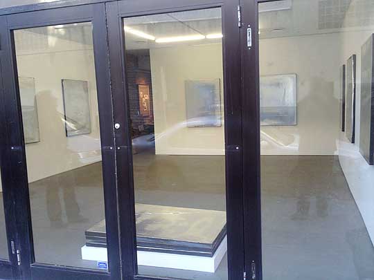
image: portlandart.net
I confess, I was as taken as the next guy by the Shiny Object-ivity of Jacob Kassay’s electroplated solo debut at Eleven Rivington in 2009. Next guys like Portland Art’s Jeff Jahn, who wrote the show felt “more in touch with the unsettled world of 2009.” And Andrew Russeth, who nailed the charred & mirrored monochromes as “look[ing] like elegantly abused luxury goods.”
And I had a big setup here, which I just deleted, about how I’m really not trying to add to the burgeoning body of Kassay concern trolling, articulated most clearly by Sarah Douglas, about the risks of overnight market success on the emerging artist.
But then I read Ed Schad’s earnest attempt to strip the market hype preconceptions from his review of Kassay’s current show at L&M Gallery in Los Angeles. And I have some issues.
On their face, Kassay and his silvered paintings seem almost too perfectly suited for the Art World’s Next Top Model cautionary tale. It’s like they’re a trap, paintings perfectly calibrated to separate the most narcissistic collectors from their dough. The installation of silvered paintings at Art Basel [below] didn’t help, and neither did Kassay’s dealers’ assertion that the paintings, a suite of eight, would only be sold together–and to a museum–for somewhere around EUR250,000.
It’s hard to counter this narrative; or to wonder how much discourse around Kassay’s work is critical backfilling prompted by dealers or other vested interests. And I think Schad captures the difficulty well, questioning the conceptual underpinnings of Kassay’s show in the face of his monochromes’ unambiguous, materialist beauty:
I get the impression that the center of L&M’s show, a large work on paper placed on rough 2 x 4 studs with a ballet barre positioned in front, is Kassay’s attempt at giving us what may be a position, although that its orientation towards giving the show a conceptual reading also does a disservice. The work is ineffective, pitching a now typical rough D.I.Y look that is often misconstrued for sincerity and humility. Work like this neither sincere nor humble, but instead uses tropes of sincerity and humility as a cop-out for rigorous thinking. I have to admit, that Kassay’s center piece looks grad-school and virtually destroys the mood of refinement and elegance created by the smaller works.
I can’t fault Kassay entirely for this. After all he is young, and perhaps the impulse is to bring a little resolution and a little art history positioning to a practice that is probably more at home in explanation-less experimentation and straight ahead aesthetics. With the ballet barre, suddenly we are allowed to think of performance, of metaphor, of the history of Rauschenberg, his performative collaborations, and his white paintings, the idea of a monochrome as blank surfaces or “landing strips” for dust, light and shadow
Schad’s identification of the monochrome as Kassay’s field of bold engagement is right-on, but I think his skeptical de-emphasis of the artist’s reference to Rauschenberg, the conceptual and the collaborative is a mistake. These may turn out to be central elements of Kassay’s practice.
From the L&M press release:
This installation conceit engages Kassay’s interest in artist collaborations such as Rauschenberg and Johns designing sets for Merce Cunningham performances and an abundant history of multi-media collaborations. It evokes these ideas, but also takes into consideration the gallery as a place for practice, repetition and the natural gradients provided by the light, the white walls and the work itself.
Which, hmm. There’s a crossed up analogy there–sets and performance vs barre and practice–which effectively conflates gallery show with studio practice [all puns presumably intended].
I didn’t want to be all Johnny one-note, but since he/they mentioned him first, I can now point out that the paradigm Kassay’s debut on the art world stage most closely resembles is not Ryman or Klein, or even Rauschenberg, but Johns. Rauschenberg’s 1953 Stable Gallery show of white and black monochromes was more scandale than succes, and he fought the unserious bad boy image for many years, while Johns’ work was hailed–and sold–right out of the gate. And while flags and targets might stand out, most of Johns’ earliest exhibited works [1957-58] were monochrome paintings.
And though Rauschenberg’s reputation as a dance collaborator is well known, somehow Johns’ image of painterly solitude persists [at least for me], even though he was deep in the mix. Here’s a quietly remarkable comment Johns made in 1999, while discussing the creation of the artists-for-artists-oriented Foundation for Contemporary Arts, which he still heads:
In 1954 I had helped Bob Rauschenberg a bit with his Minutiae set, his first for Merce Cunningham, and I continued to assist him with most of his stage work through 1960. We were friends with Merce and John Cage and saw them frequently. In 1955 there was an evening of Cunningham/Cage performances at Clarkstown High School in Rockland County where we met Emile de Antonio. In 1958 de, as he was known, Bob and I formed Impresarios Inc. which financed and produced the 25-year retrospective concert of John Cage’s music at Town Hall in New York.
I guess this is all an aside, but the Walker is preparing Dance Works I: Merce Cunningham and Robert Rauschenberg, a show this fall of their Cunningham archive holdings which, at least in the title, doesn’t consider Johns’ collaborative role. Not that the Walker ignores Johns’ dance work; they have his Duchampian set structures for Walkaroundtime, after all.
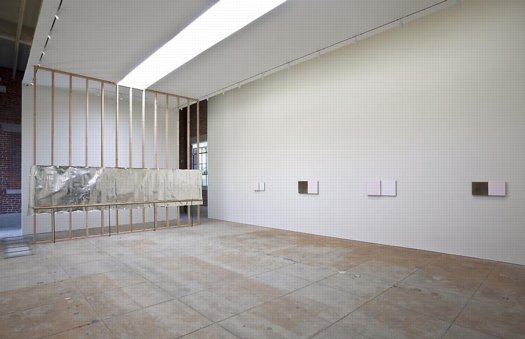
henry codax, installation view, via carriage trade
So what’s this got to do with Kassay? Are his only collaboration references in his L&M show? In fact, he’s apparently got another show up right now which takes the model collaboration and the issue of individual artistic creation and authorship head-on. Andrew Russeth reports that Carriage Trade’s current show, an exhibition of monochrome paintings by the fictitious artist Henry Codax, is actually a joint project of Kassay and the minimalism-inflected French Swiss conceptual artist Olivier Mosset.
And now that you mention it, in May 2010, before any of the auction madness, Kassay opened his show in Paris with a collaboration as well. Iconic minimalist trumpter/composer Rhys Chatham performed at Art Concept, with a pair of Kassay’s silvered paintings as a backdrop. Watching video of the gig [Here are parts 2 and 3, total runtime is about 55 minutes.], I’m struck by how the paintings function as screens, reflecting the movements of the small, otherwise invisible crowd.
For the two previous summers, at least, the Paris-based Chatham loomed large in New York. His landmark composition, A Crimson Grail, an orchestra for 200 electric guitars, was rehearsed and rained out at the last minute in 2008 as part of Lincoln Center’s Out of Doors series. It was finally, triumphantly performed the next year. Andrew Hultkrans recounted the euphoric experience for Artforum.
In September, Primary Information is releasing a limited edition LP of the Kassay performance, with an additional work, under the title, Rêve Parisien. And in October, Kassay is having a show at the ICA in London, which is apparently still operating. For the moment, Eleven Rivington is surprisingly not mentioned in ICA’s brief bio of Kassay.
UPDATE Ultimately I’m glad I ended so abruptly; maybe it was enough to spur Andrew into action. He reminded me of the collaboration I’d forgotten, the one which had finally pushed me over the colabo-writing edge. From Karen Rosenberg’s NYT review of this year’s so-called Bridgehampton Biennial, where the backyard is strewn with Lisa Beck’s satelloon-lookin’ sculptures, and the front yard features a 1964 Ford Galaxy awaiting “an ‘artist’s renovation’ by Servane Mary, Jacob Kassay and Olivier Mosset.” Those shiny silver balls’ll throw me ever’ time. [Of course, this show also brings up Bob Nickas’s role in launching Kassay’s work into the discourse. This is at least the third Nickas-curated show to include Kassay. Dance with the one who brung ya.]
Heinz Mack, Daddy
Digging around on Moholy-Nagy’s Light Space Modulator and its relation to a later generation of kinetic light works by artists like Otto Piene, I came across some early works by Piene’s Zero Group co-founder, Heinz Mack.
As early as 1960, Mack was showing plans for his Sahara Project [above, image via mack-kunst], which would, in classic Zero style, embody the most reductivist expression of art’s essential elements, light and space.
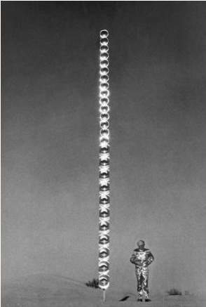
Mack showed his reflective and/or lit Lichtstele sculptures at various places, including in 1966 at Howard Wise Gallery, a center of kinetic and self-consciously future-oriented art. It took until the late 60’s for Mack to realize his utopic, minimalistic, phenomenological sculptures in the desert, though.
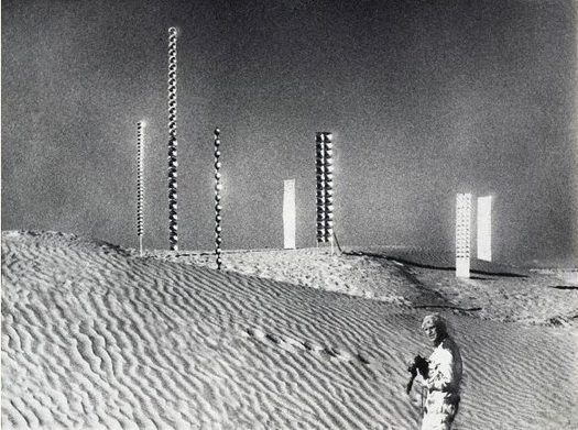
They look utterly fantastic in photographs. Or film stills. Mack produced a documentary of his art projects in Tunisia in 1968-9 with the German television network ARD humbly titled, Tele Mack, Tele-Mack, Telemack.
I need to read further to figure out how Mack’s work relates to what was going on around it. [The artist himself seems to see himself as a prophet of the future, a German incarnation of the otherworldly artist-showman in the Klein & Dali type. For some reason, this awesome still from Tele-Mack of Mack in his space suit makes me think of Klaus Kinski.]
In his own bio, Mack namechecks artists he met in New York such as Reinhardt, Newman, and Marisol. But Tele-Mack, and by extension, his whole Sahara Project, have an inexorable connection to Land Art, too, and Smithson’s Displacements. Tele-Mack was produced with the artist couple Gerry Schum and Ursula Wevers, who founded The TV Gallery in 1967. From Ute Meta Bauer’s chronology of artist-driven exhibitions:
[The TV Gallery and later, the Video Gallery] exhibition took place on TV. Its duration was the length of the program.
Over a period of six months, Schum shot films with Land Art artists. He wanted to dematerialise art – to take away the character of art as a consumer item (opposition to Pop art).
Bernhard Höke, Hannah Weitemeyer and Gerry Schum made the film Konsumkunst – Kunstkonsum (1967). In this film, artist Heinz Mack stated that his art will exist on television and will only be shown to the audience by this medium, only to be destroyed afterwards. Later, in May 1969, this was realized in the Telemack TV broadcast.
Otto Piene also made an exhibition only for TV – a multimedia show.
Let’s file that last one away, about a Piene TV show, for later.
If Mack’s work was intended to disappear after being photographed or filmed or aired, it’s working. I can’t find a hint of Tele-Mack anywhere online, though it is apparently in various film archives. Mack has worked steadily, producing large, permanent works for public, government, and corporate situations. But his earlier work exists largely in the same handful of documentation photos. He installed a large Lichtstele in front of the Art Museum that was the center of the Osaka Expo70, but I can’t find a picture, and the only Japan photo on Mack’s website is the artist surrounded by young women in kimonos.
Perhaps the catalogue for the Ludwig Museum’s 2009 show, Heinz Mack, Licht der Zero-Zeit, has something. According to the show’s writeup, most of the works in that show come from the artist’s collection and hadn’t been seen for decades.
As dazzling and pristine and sublime as the work appears, I’m not sure there’s still a there there. Maybe it’s enough for someone rebuilding society in a postwar atomic present. But now that it’s historical, I think The Art of The Future needs to be more than Not The Past.
Meanwhile, if anyone has any leads on how to see Tele-Mack, I’d love to hear it.
Roel Wouters’ Shiny Silver Balls
Suddenly silver mirrored balls are everywhere.
Music video and filmmaker Roel Wouters created the trailer for last year’s International Film Festival Breda:
A silver sphere on an endless checkerboard floor is the default for many 3D modeling applications. It can be seen as an icon for a sterile, makeable world. Reality though, is dirty and unpredictable. By recreating this icon in reality the beauty and imperfection of real life gets emphasized.
The recording was the result of 3 people controlling different parts of the installation, Roel controlled the speed of the balls, Benoit (Eurogrip) controlled the speed of the dolly and Sal focussed and zoomed the camera. It turned out to be a play were the 3 of us playing harmoniously together.
It’s awesome. Coincidentally–actually, several coincidentallies–a selection of Wouters’ work was screened just today in Den Haag, organized by a cinema club called Cinetoko. Cinetoko is a collaborative effort between Motoko, a motion and video design studio, and <>TAG, an art/tech/culture catalyst of some kind. It happens at the Zeebelt Theater, which is safely to the west of any Google Map camo or StreetView complications. [via manystuff thanks andy]
You Have A Stingel? No Way! I Have A Stingel!
In 1989, artist Rudolf Stingel published Instructions, an illustrated booklet showing how to make one of his silver paintings. “He challenges the process of creating a painting and questions the concept of the canvas and that of authorship,” says Christie’s in a paraphrase of the curator Francesco Bonami. Christie’s is selling a 1998 silver Stingel painting [whatever that means, we’ll get to in a second] in London in a couple of weeks. Christie’s explains how they’re made:
The works begin with the application of a thick layer of paint in a particular colour, in the case of the present example silver enamel, to the canvas. Pieces of gauze are then placed over the surface of the canvas and silver paint is added using a spray gun. Finally, the gauze is removed, resulting in a richly textured surface. When seen in conjunction with the DIY manual, the Warholian nature of Stingel’s work is difficult to refute: technical methods of factory-like production, which are openly communicated and question authorship, contrast the provoked coincidences that result in individual monotypes. Particularly, a parallel to Warhol’s so-called Piss Paintings comes to mind: both artists test the methods of what can be considered painting, while simultaneously emphasising the carnality of the practice by combining coincidence and will in a process solely focused on the canvas’s skin. With Stingel’s works, the aggravation of the derma creates the rapture.
I love it, except that the challenge to authorship is merely a conceptual pose, one refuted most immediately by Stingel’s signature on this painting and its £120,000 – £160,000 sale estimate.
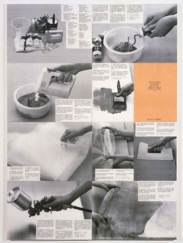
Bonami reads the Instructions as “tricking you into learning how to do a painting for someone else.” Which, though, is the neater trick: following the artist’s instructions and making a Stingel for myself, or getting someone to spend £200,000 on an identical painting from the artist’s factory because it has Stingel’s autograph on the back?
The invocation of Warhol and the Piss Paintings is illuminating, and not just for the works’ focus on a painting’s surface or skin–or derma. Such process-oriented practice, which embraces a degree of randomness, conveniently results in serial works of unfakeable uniqueness. They don’t need stamps of authenticity; the object is its own fingerprint. With minimal documentation at the time of creation in his studio, Stingel’s collectors will never face scandals of authorship like those engulfing the Warhol Estate’s authentication board. According to the board’s self-contradictory interpretations of Warhol’s Factory processes, mass-produced silkscreens that Warhol never saw can be accepted as works, while a documented self-portrait can be rejected repeatedly.
On the flip side, though, if Stingel really wanted to challenge authorship and treat each painting as a “cell” that only gains meaning from its connection to countless others, he’d get more traction by treating the world’s DIY Stingels as intrinsic parts of his own work. Locate, document, and show them in galleries and museum retrospectives. Let them be bought and sold in the secondary [primary?] market. Then when one of those works shows up at Christie’s, we’ll talk again about questioning the concept of authorship.
Lot 319: Rudolf Stingel (b. 1956),
Untitled
signed and dated ‘Stingel 98’ (on the reverse)
oil and enamel on canvas
32 x 32in. (81.3 x 81.3cm.)
Executed in 1998
Estimate: £120,000 – £160,000 [christies.com]
Rudolf Stingel – Selected works [paulacoopergallery.com]
E.A.T. It Up: The Pepsi Pavilion
Let’s get one thing out of the way first: I’m a Diet Coke guy. The very fact that The Pepsi Generation existed in 1970 should blow a hole in their brand’s supposed youthy credibility big enough to drive a 90-foot mirrored dome though. Oh, and what do we have here?

Holy freakin’ crap, why has no one told me The Pepsi Pavilion at the 1970 World Expo in Osaka was an origami rendition of a geodesic dome; obscured in a giant mist cloud produced by an all-encompassing capillary net; surrounded by Robert Breer’s motorized, minimalist pod sculptures; entered through an audio-responsive, 4-color laser show–yes, using actual, frickin’ lasers– and culminating in a 90-foot mirrored mylar dome, which hosted concerts, happenings, and some 2 million slightly disoriented Japanese visitors?
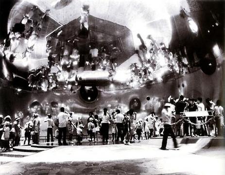
And that large chunks of it were conceived, developed, and programmed by E.A.T., Experiments in Art and Technology, the pioneering art/engineering collaborate founded by [among others] Robert Rauschenberg and Bell Labs’ Billy Kluver? And that the four artists working with Kluver–Breer, Frosty Myers, Robert Whitman, and David Tudor–had planned months of even freakier happenings for the Pavilion, but the Pepsi gave them the boot for being too freaky–and for going significantly over budget? Still.
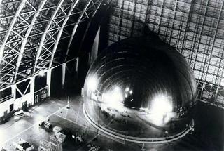
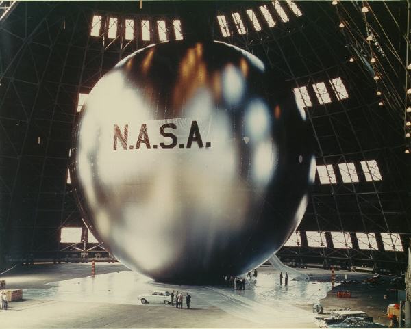
The least you could’ve done is tell me that Raven Industries made a full-size replica of the Pavilion out of Mylar and test-inflated it in a disused blimp hangar in Santa Ana, CA? Apparently, all it took was a 1/1,000th of an atmosphere difference in air pressure to keep the mirror inflated within the outer structure.
Because, of course, you know that Kluver was the guy at Bell Labs who helped Warhol with his seminal “Silver Flotations” exhibit in 1966 [seen here in Willard Maas’s film poem on Ubu]. And Bell Labs was involved in Project Echo, which launched and tracked two gigantic mylar spheres, satelloons, a couple of years earlier. Which makes the Pavilion’s similarities to the satellite below purely non-coincidental.
Which means that after recreating these two, earliest NASA missions as art projects, I’ll have to recreate the Pepsi Pavilion, too.
I’ve ordered by copy of Kluver et al’s dense-sounding 1972 catalogue, Pavilion and expect to be revisiting this topic in some depth within 5-7 business days. Meanwhile, if there are any other giant, mylar spheres of tremendous-yet-overlooked artistic and historical importance lurking out there, now’s your chance to come clean.
E.A.T. – Experiments in Art and Technology «Pepsi Pavilion for the Expo ’70» [mediaartnet.org]
Previously: Must. Find. The Satelloons Of Project Echo
D’oh, or else I must make the satelloons of Project Echo, which would mean I’m an artist, freak, or both